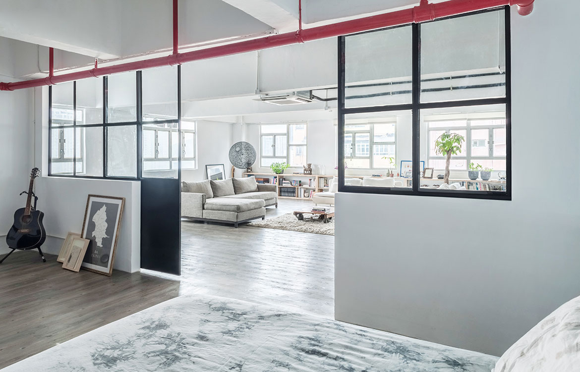
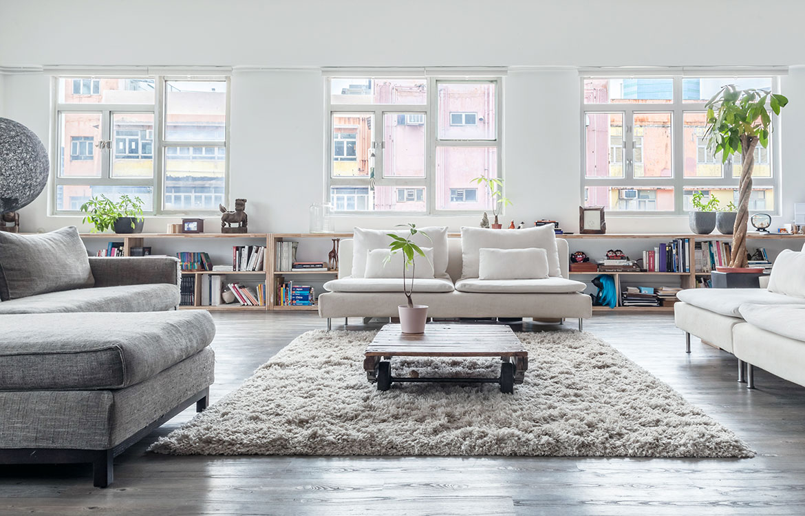
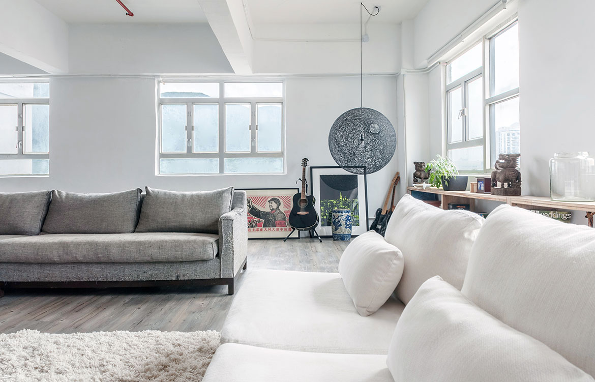
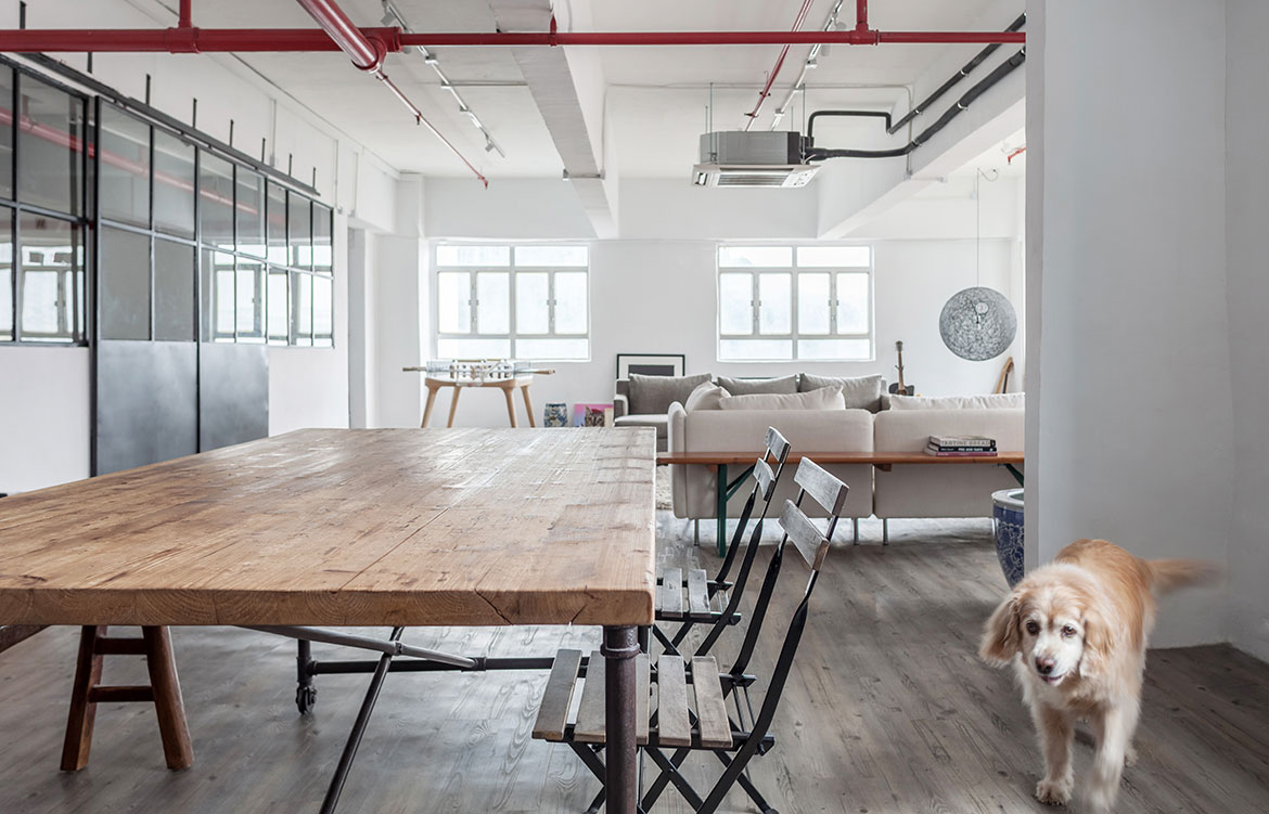
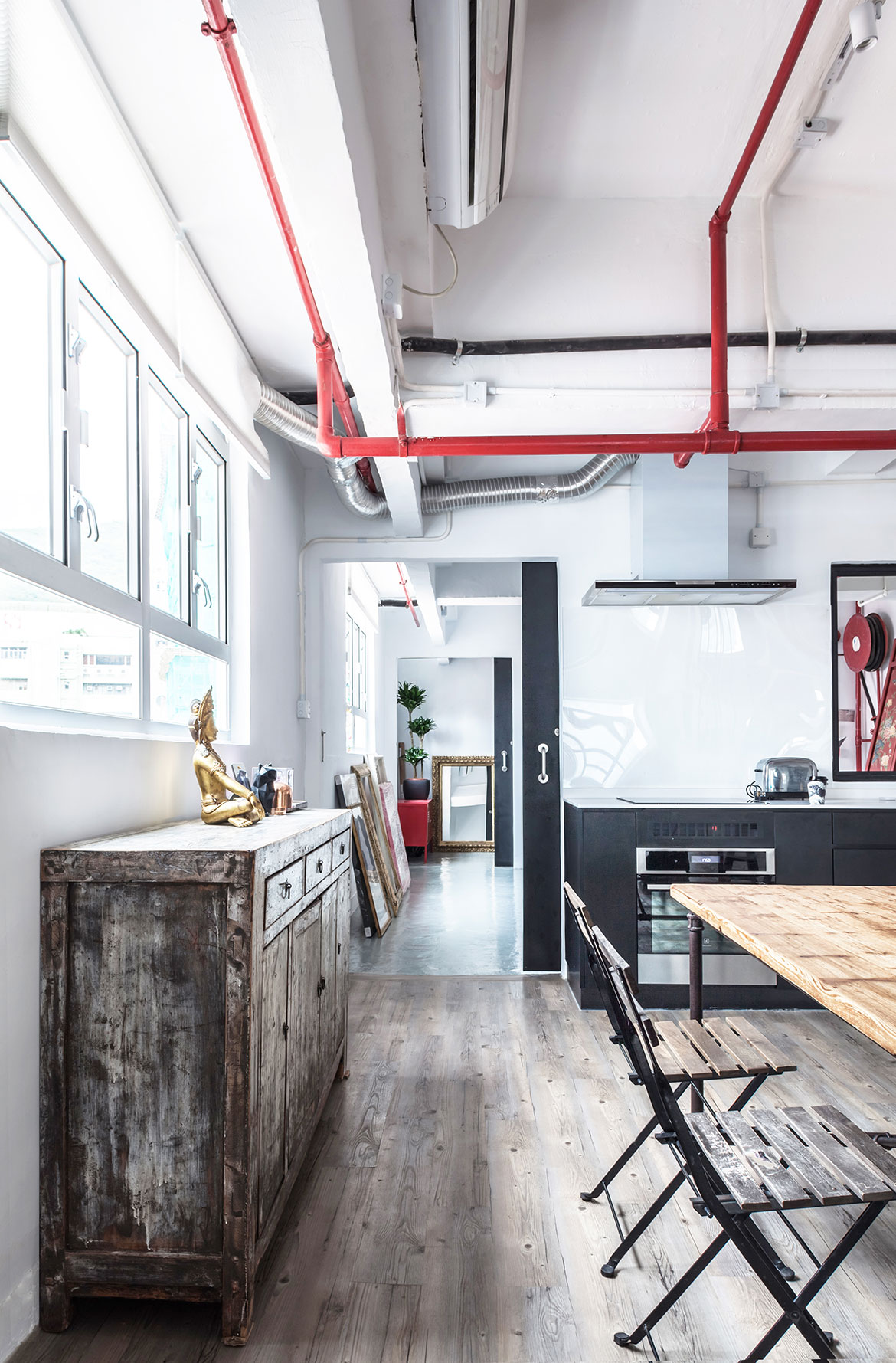
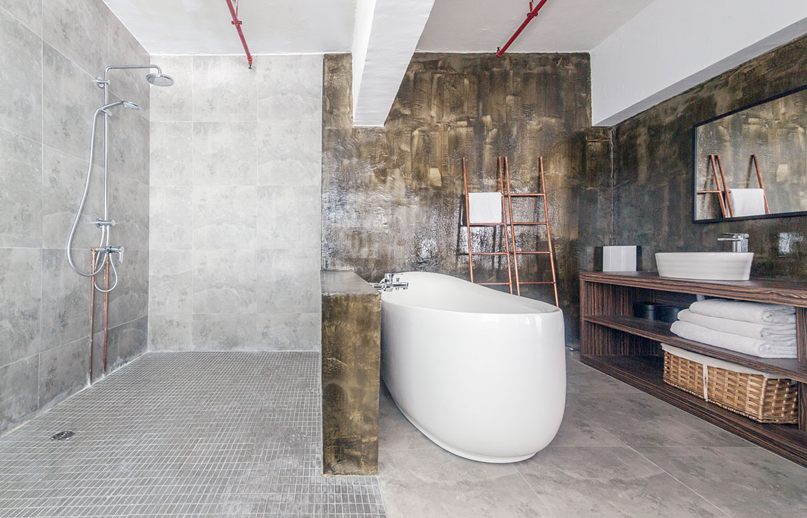
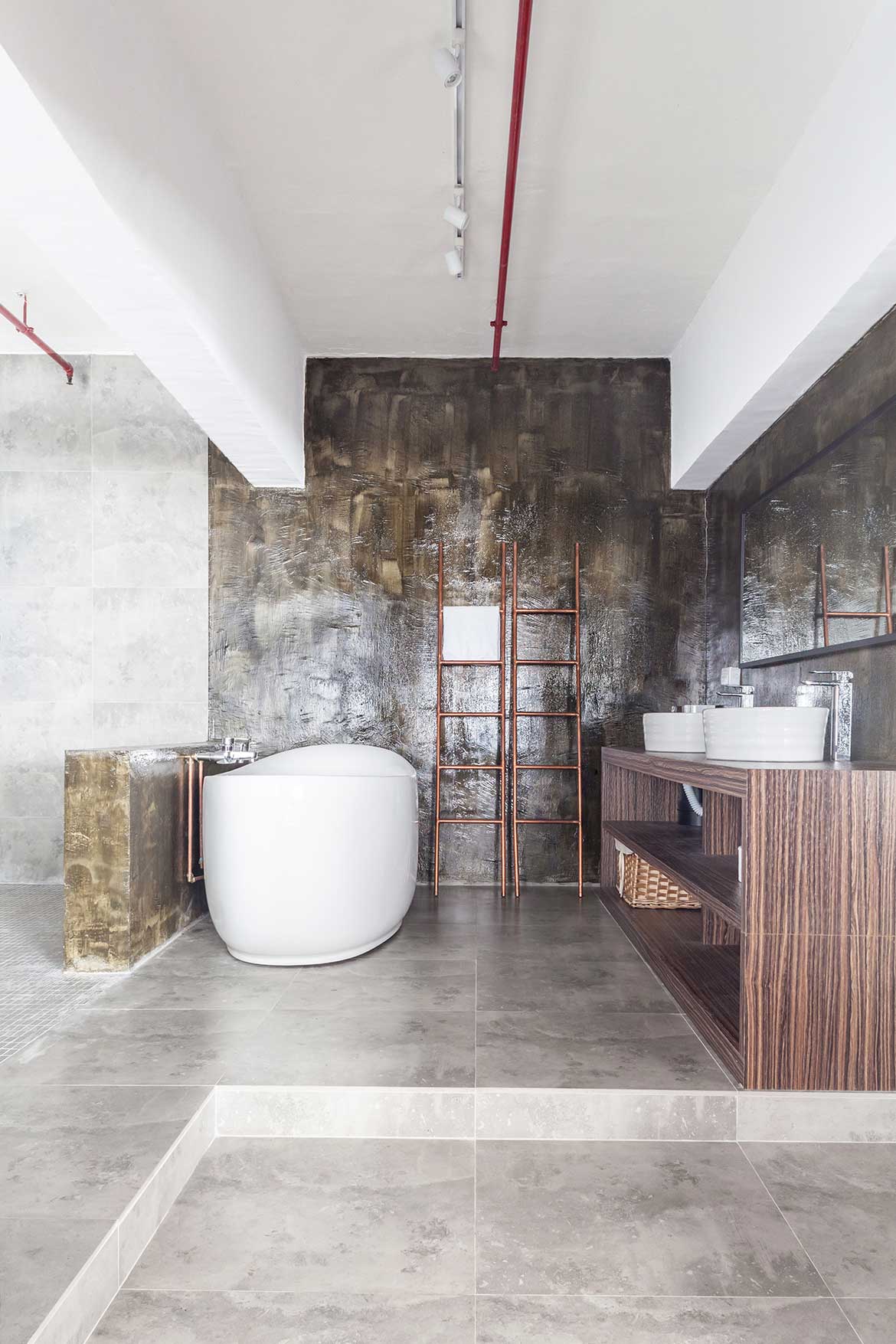
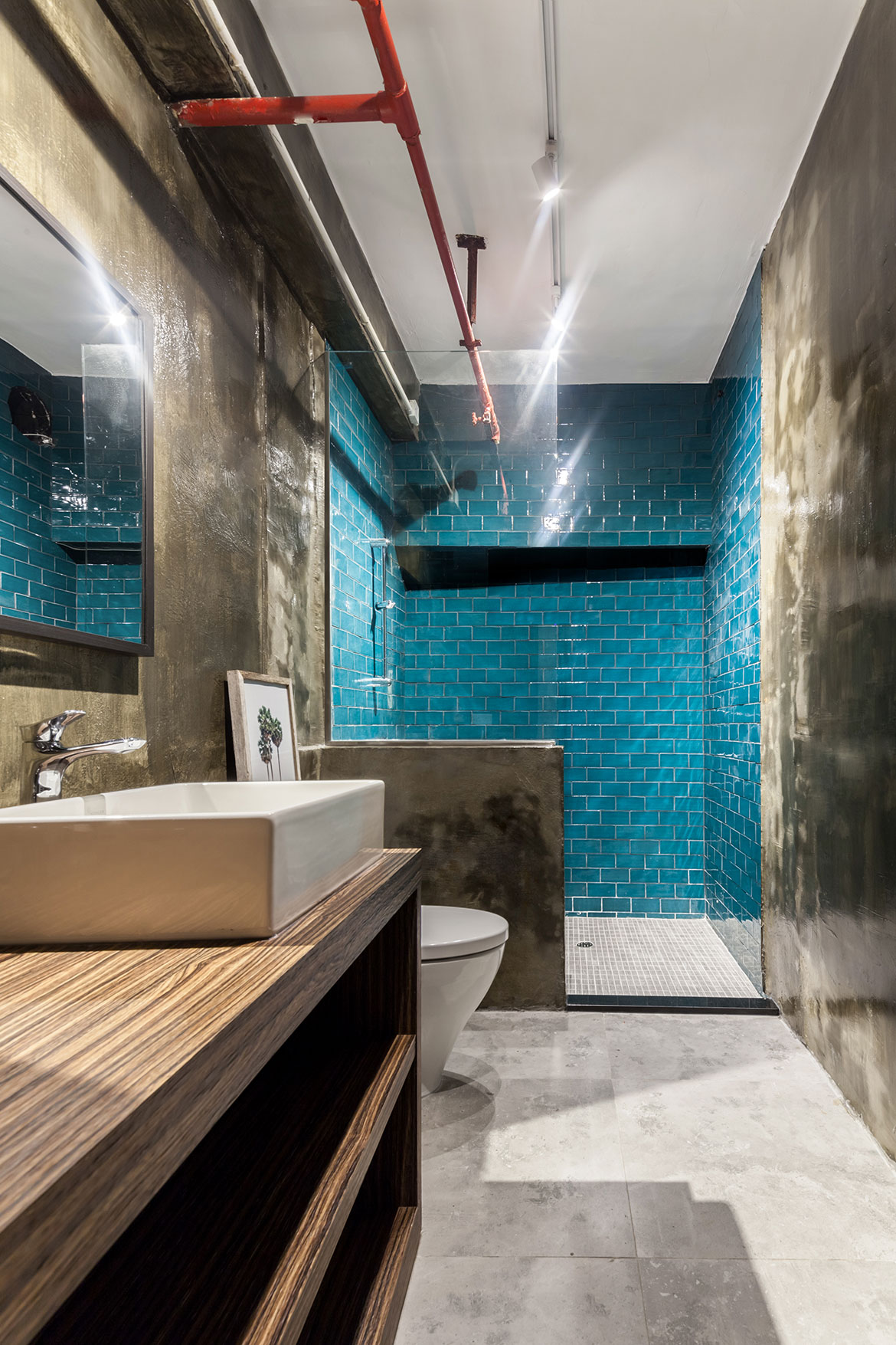
Conceptualised and realised by Vincent Lim and Elaine Lu of award-winning design studio Lim+Lu, the 2,600 square-foot warehouse looks nothing like its former self. Having been transformed into a spacious and flexible family home that doubles as a workshop space for not only the painting and cooking classes which the highly social couple teaches, but also the dinner parties that they frequently host.
The modern décor of the apartment, which is concealed behind the original door of the warehouse – intentionally left untouched – is largely inspired by New York, the city that left the deepest impression on the couple who spent time in the Big Apple before moving to Hong Kong. And if there are any designers who know New York, it’s Lim+Lu, who co-founded their eponymous studio while living in Manhattan.
“When inside the space, without looking out the windows, one is transported to a loft in the Lower East Side of Manhattan. When you look out, you are immediately connected to Hong Kong,” say the couple.
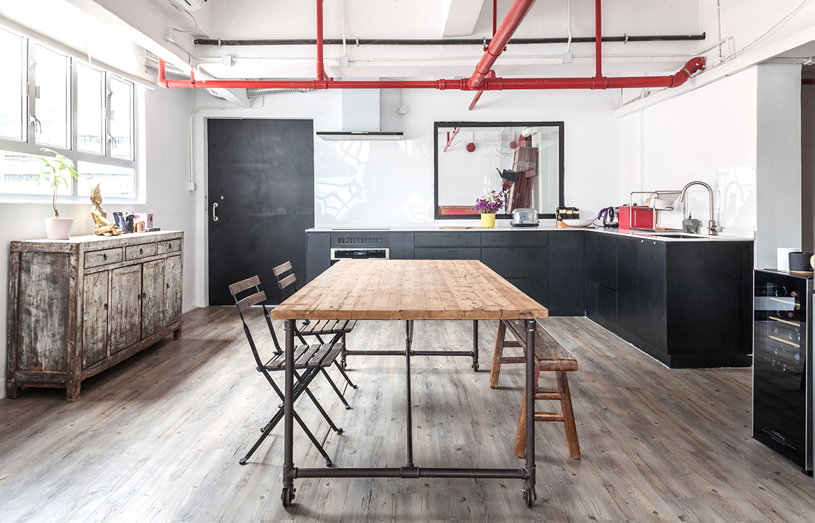
“We design with the context in mind; being mindful of the surroundings as well as the inhabitants,” Vincent Lim points out. “In this instance, we were working with a space neighbouring many industrial complexes for a client who had a deep connection with New York. We saw this at the perfect opportunity to harmonise western and eastern cultures.
“We borrowed elements from those industrial surroundings and intertwined them with the idea of a loft in New York. When inside the space, without looking out the windows, one is transported to a loft in Manhattan’s Lower East Side. When you look out, you are immediately connected to Hong Kong,” Elaine Lu adds.
Lim+Lu’s first and biggest challenge was to plan – strategically – the layout of the apartment, which, at the beginning, had no divisions, bathrooms or even a kitchen. Then came the question of how to distribute natural light, as the former warehouse had windows only on one side.
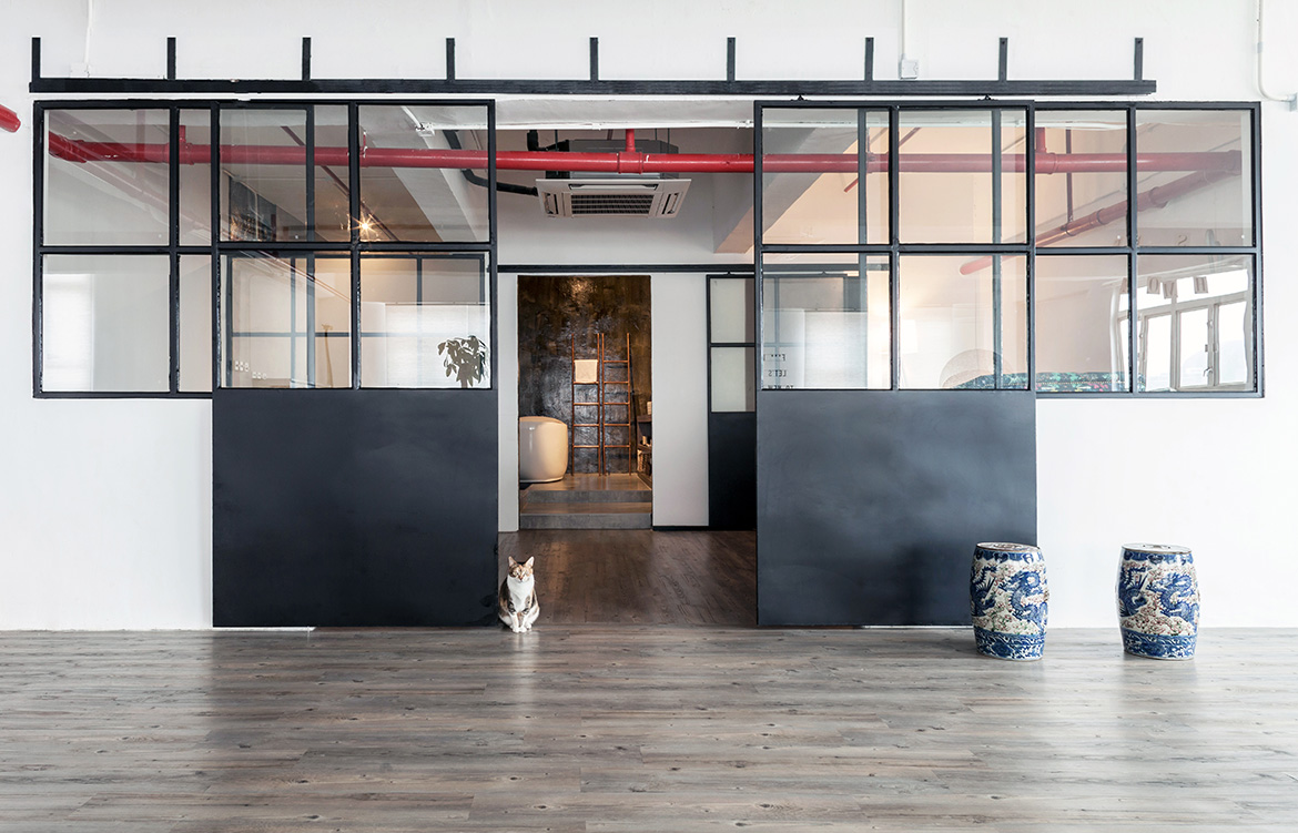
The solution came in the form of handsome, black steel doors that slide together or apart to easily divide or connect the living and workshop spaces. And because the top halves are made from glass, natural light passes through to the bedroom and master bathroom more effectively – just like a loft in New York.
Lim+Lu
limandlu.com
