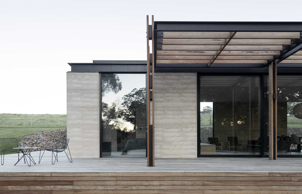
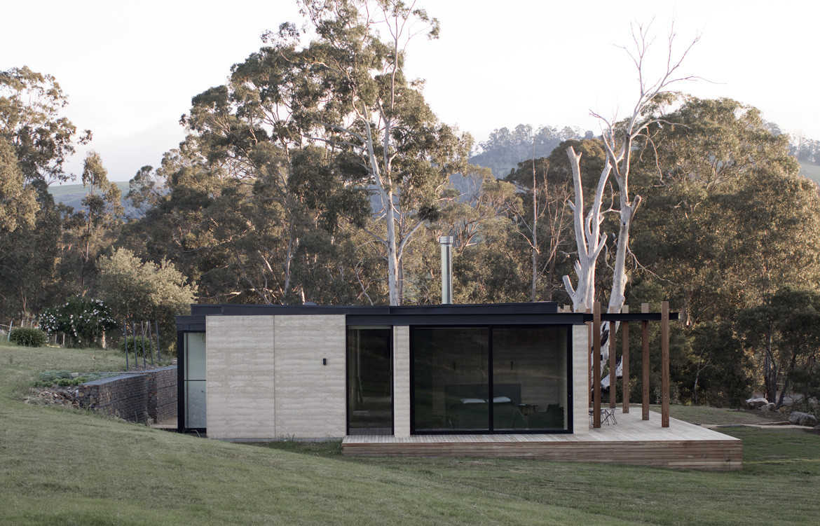
They say it’s all in a name, but sometimes it takes some digging to excavate all the layers of a concept, physical or theoretical. In the case of Matilda House, a residential project by Melbourne-based architecture firm Templeton Architecture, the name refers on the surface to the Australian bushland setting among the granite hills of northeast Victoria. But if one looks beyond this to its etymological roots, Matilda – meaning ‘container for personal belongings’ – also refers to the deep personal resonance of the project. Built on the site of the client’s upbringing, Templeton Architecture’s design came to embody a container for childhood memories.
“It was quite a romantic brief, in some ways,” says director Emma Templeton. “The location is on the client’s family’s farm, where he grew up, and [he] wanted to build a place where they could go visit the extended family, who still live in the main homestead.”
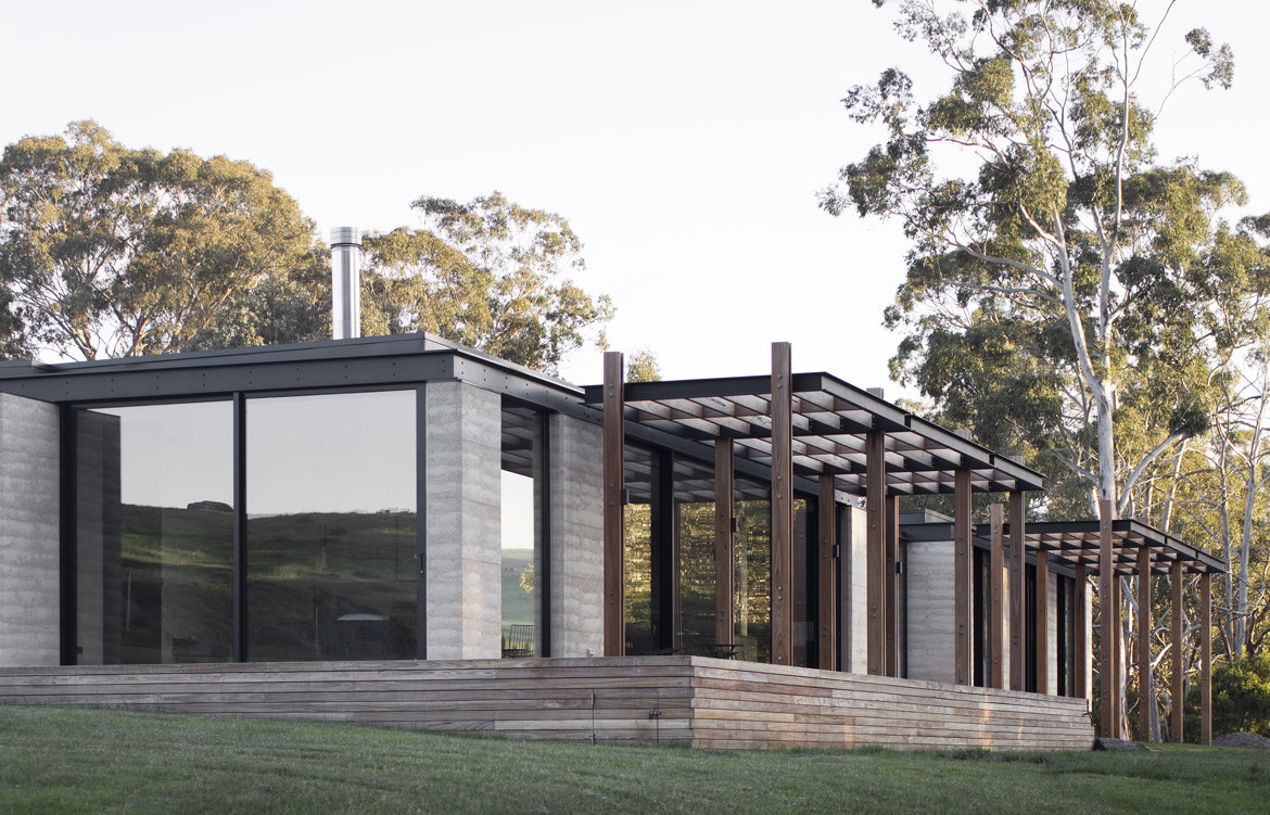
The romantic, memory-box aspect of the project that Emma refers to was the client’s request that the new build frame and recapture the views he had over the river as a child. To do this, Templeton needed to contend with less romantic, more pragmatic realities, such as the existing infrastructure of the site (all of the services already ran to a specific location on the farm, limiting where they could build) and climactic constraints (the harsh climate – cold in winter, hot in summer, and often windy – dictated what the material palette could comprise).
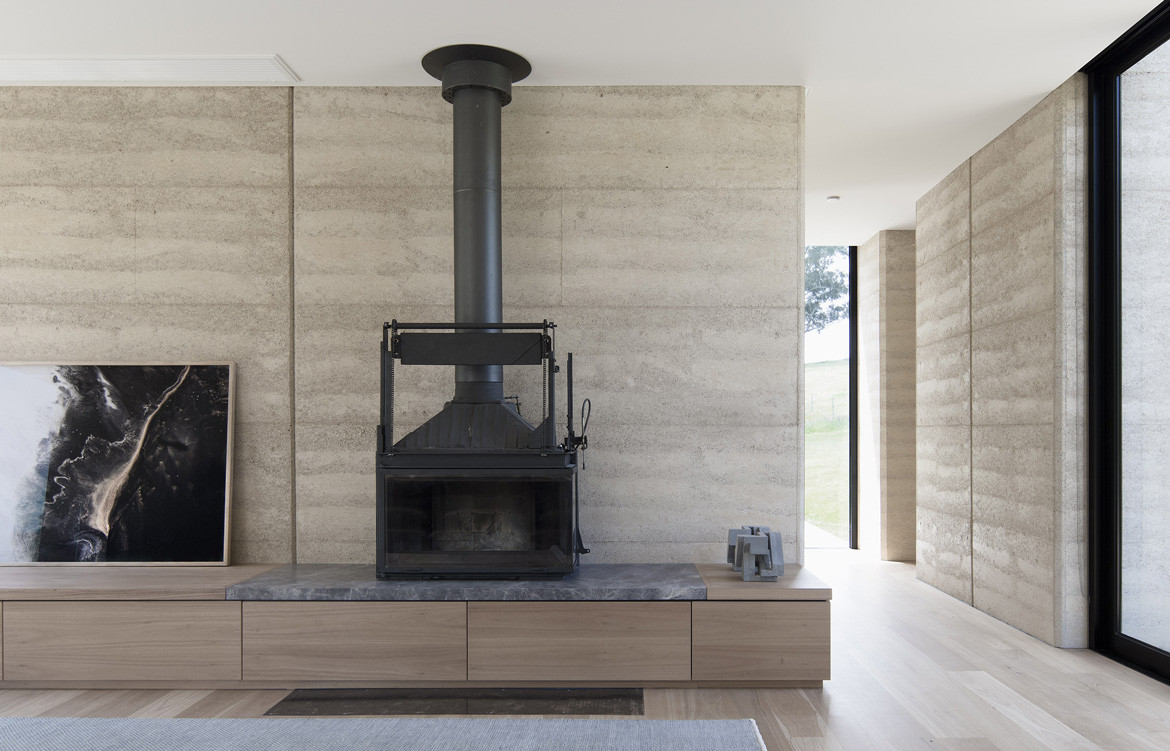
To combat the latter, rammed earth was chosen as a primary material that could deal with two birds of thermal regulation and young kids. “Part of the brief was the issue of durability, so rammed earth seemed really appropriate, and it also had this natural beauty,” explains Emma. “This allowed us to deal with the issue of thermal mass and to give the internal spaces a robust quality for the young boys, who run up and down the hallways with their scooters. A plasterboard wall just wouldn’t cut it.”
A lot of time was spent trying to reconcile the necessity of a less-than-ideal west-facing location with the brief’s strong focus on connecting with landscape. While Templeton struck a compromise by integrating a couple of spaces that could capture northern light, they also dug deep – both figuratively and literally – to find more creative solutions.
For west-facing spaces, glass was specified for its high-performance glazing. This was rounded out with awnings that could mitigate harsh sunlight while expressing the view in all its majesty. “We didn’t want the enclosed space of a traditional eave because the views are quite vertical and you really wanted to see the full floor-to-ceiling views,” explains Emma. “We wanted not to cap the sky.”
Adding a different perspective, a sunken courtyard was integrated along the eastern edge. Nestled into the contours of the land, this benevolent external space provides a solid connection to the landscape that is at once protected and intimate.
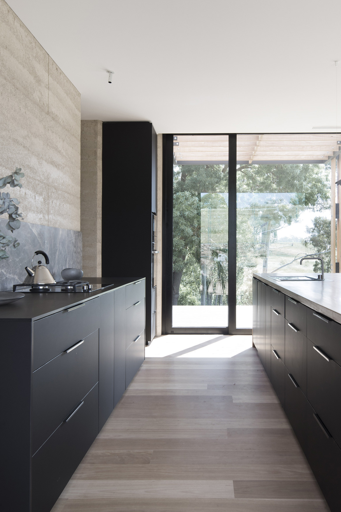
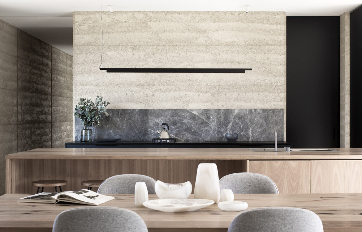
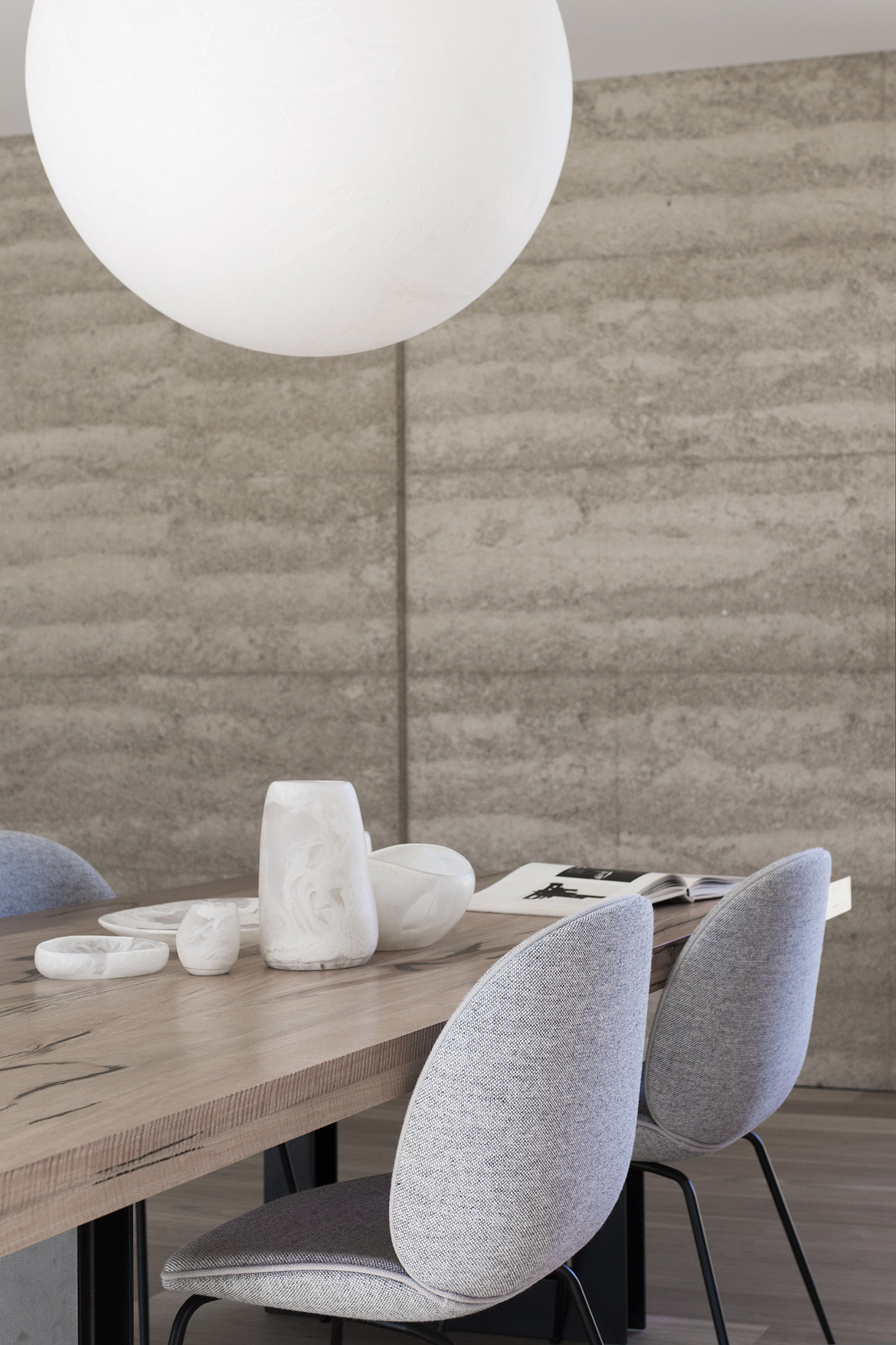
This connection with landscape continues throughout the interior with the raw beauty of rammed earth walls, Australian hardwood flooring, and graphically contrasted details such as the limestone kitchen splashback. These are able to be fully appreciated thanks to all of the time that was spent crafting a deceptively minimalist scheme of fixtures and fittings.
“We spent a lot of time trying to make the furniture look quite integrated,” says Emma. “It is in some ways a minimalist and robust house, with large dining and sitting areas but not a lot of loose furniture. The fireplace has the build-in toy boxes beside it, all concealed, and there was a lot of storage area so things can be put away. The avoidance of plasterboard walls really exposed the rammed earth, to tie it all together.”
Templeton
templeton.com.au
Photography by Ben Hosking
Dissection Information
Glass from Viridian
Paint from Dulux
Portsea Grey stone from CDK Stone
White Mahogany Timber floor
Rammed Earth and Gabion walls
Rug in living room by Armadillo&Co
Beetle dining chairs by Gubi
Bowls from Dinosaur Design
Photograph in living room by Brooke Holm
Sculptures by David Umemoto
Compendium light by Daniel Rybakken over kitchen island
Moon 80 Pendant by Davide Groppi in dining room
Chic 50 by Davide Groppi in master bedroom
Cooktops from Bora
Build-in microwave and oven from Neff
Refrigerator from Fisher & Paykel
Wine Fridges from Vintec
Taps from Vola
We think you might also like Gresham Street House by Jackson Teece
