Inspired by Doctor Who’s illusory Tardis, this cliff-top home in Tasmania may look small and private from the street but is deceptively open and spacious inside. Keith Westbrook and Cumulus Studio designed the three-bedroom house for a young family, who wanted to make the most of natural light and views of Pittwater and Kunanyi/Mt Wellington beyond. Planning requirements of the subdivision stipulated a tight building envelope, to which Cumulus Studio responded with voids, split levels and double-height ceilings to create an illusion of scale.
The subdivision requirements and the client’s brief informed the envelope of the building. The local planning scheme defined the building area as 11 metres long by 6.2 metres wide, resulting in a 123-square-metre footprint set back from the street and cliff edge. It also specified the 8.5-metre height limit, which follows the steeply sloping site. The client’s wanted privacy from the street while also capturing northern sun, and to make the most of western views but minimise glare and heat gains and loss.
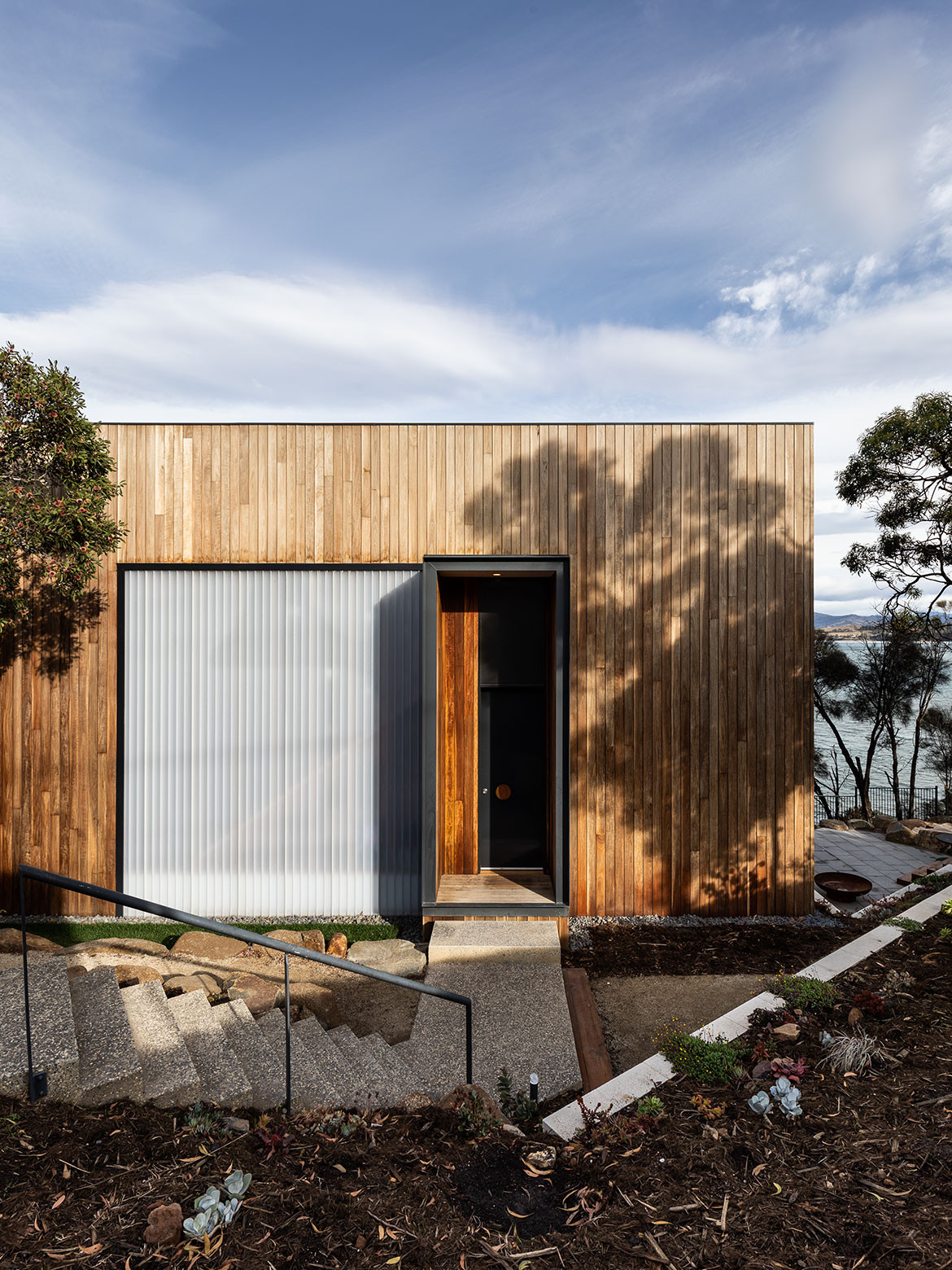
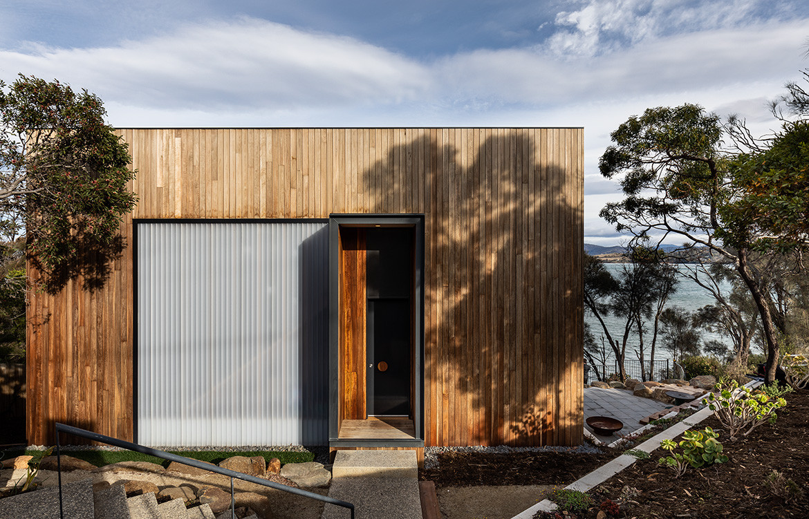
The oversized, recessed entrance creates an ambiguity in scale.
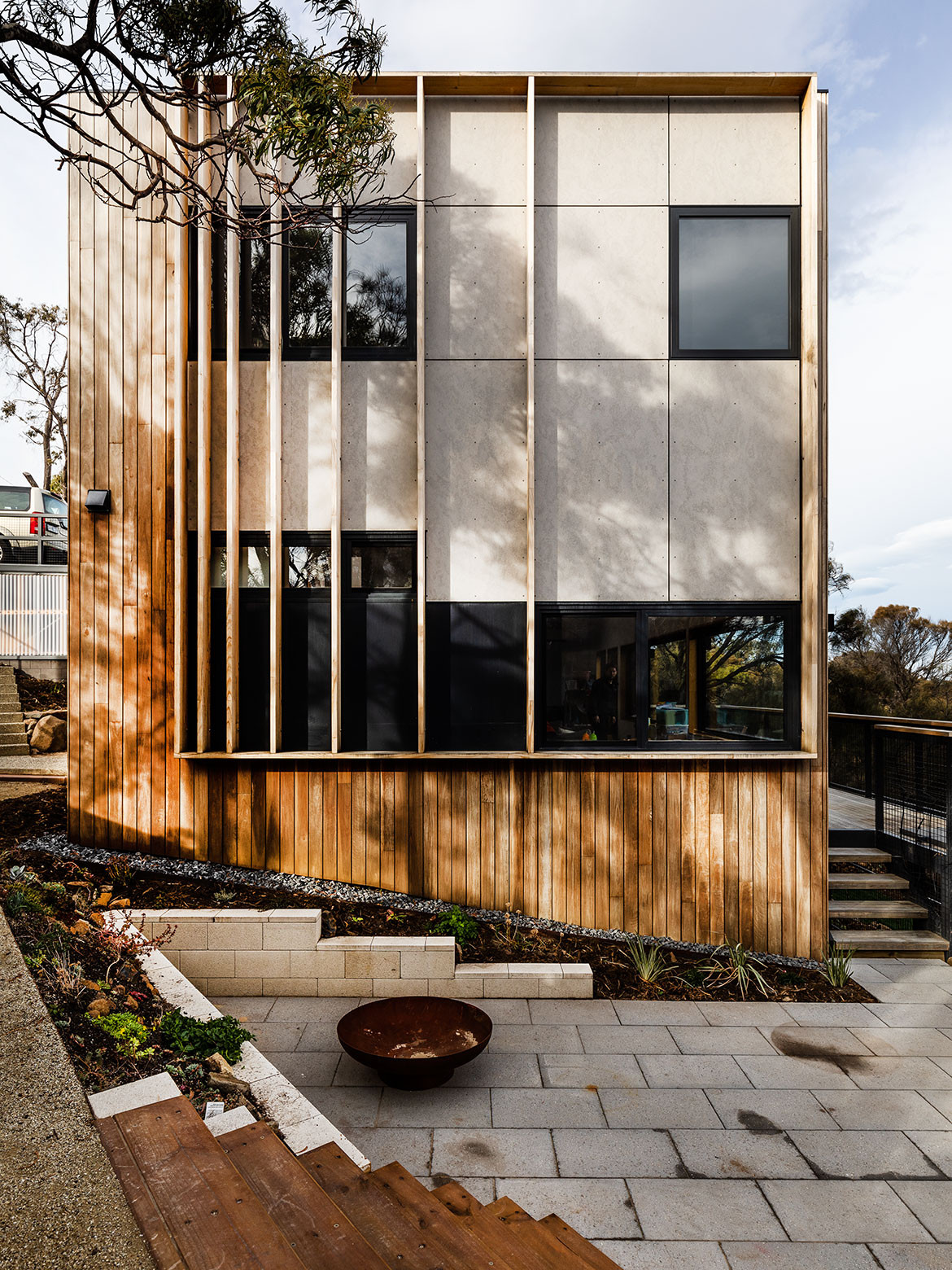
Cumulus Studio met all these requirements with an emphasis on prioritising water views and natural light. By exaggerating the scale of apertures on the façade and creating voids, split-level and double-height spaces inside, the interior looks and feels more generous than the exterior might suggest.
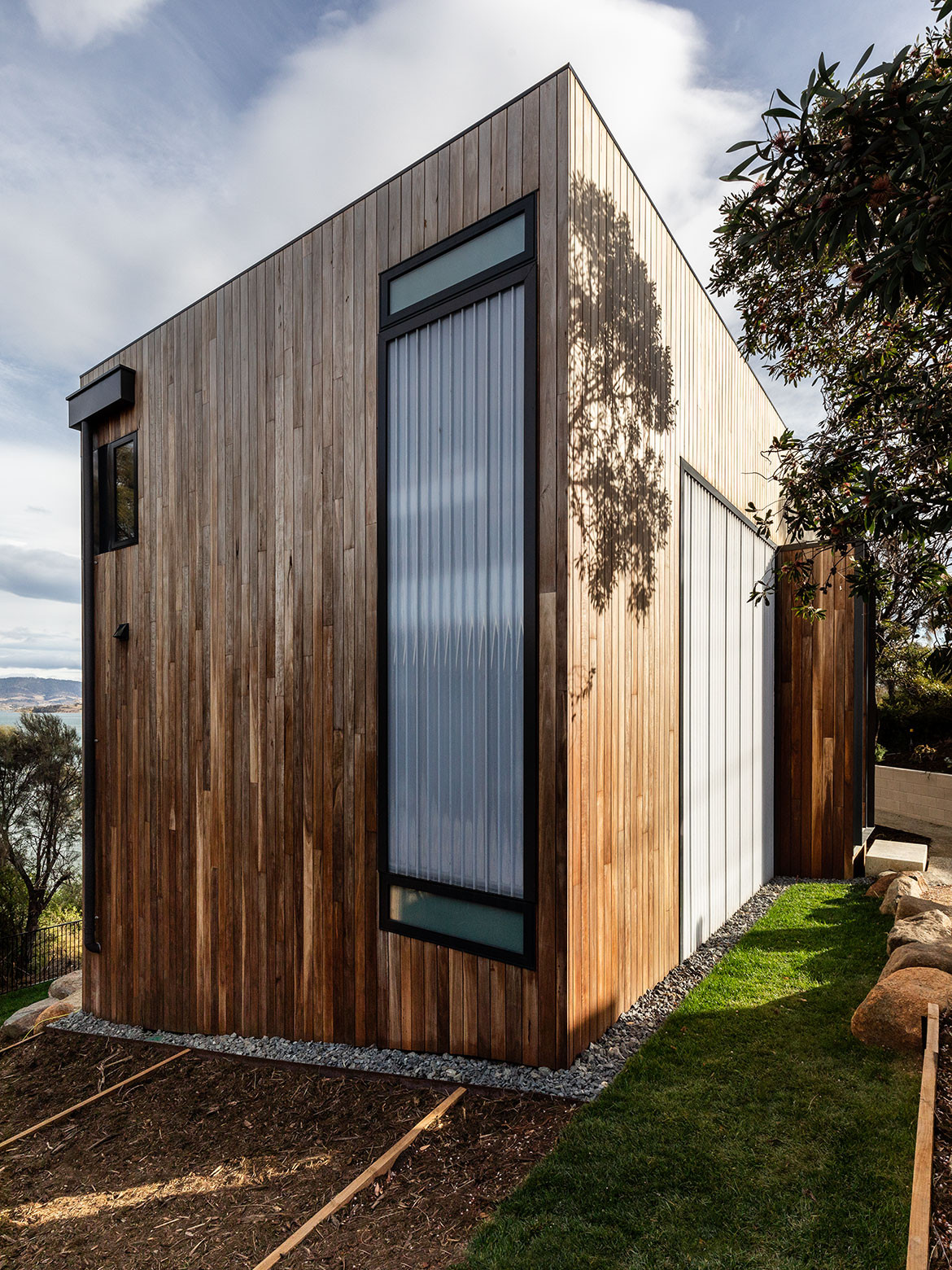
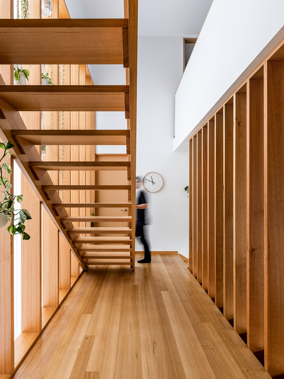
The 11-metre-long elevation of the building is presented to the street, and the oversized, recessed entrance – like a portal into the Tardis – creates an ambiguity in scale. It opens beneath the first-floor landing and then to a double-height space, with the staircase within a void and the living area a split level below. Translucent polycarbonate on the front façade brings in natural light, and ribbon windows wrap along the western and northern sides to provide a panoramic view. “Opening the front door and stepping down the split level reveals a spectacular view to Kunanyi/Mt Wellington,” says Keith, director of Cumulus Studio.
A small study and bathroom are tucked into the southwest corner, and a deck (additional to the footprint) extends in front of the living area and dining/kitchen. There are three bedrooms and a lounge upstairs, and bathrooms on both levels.
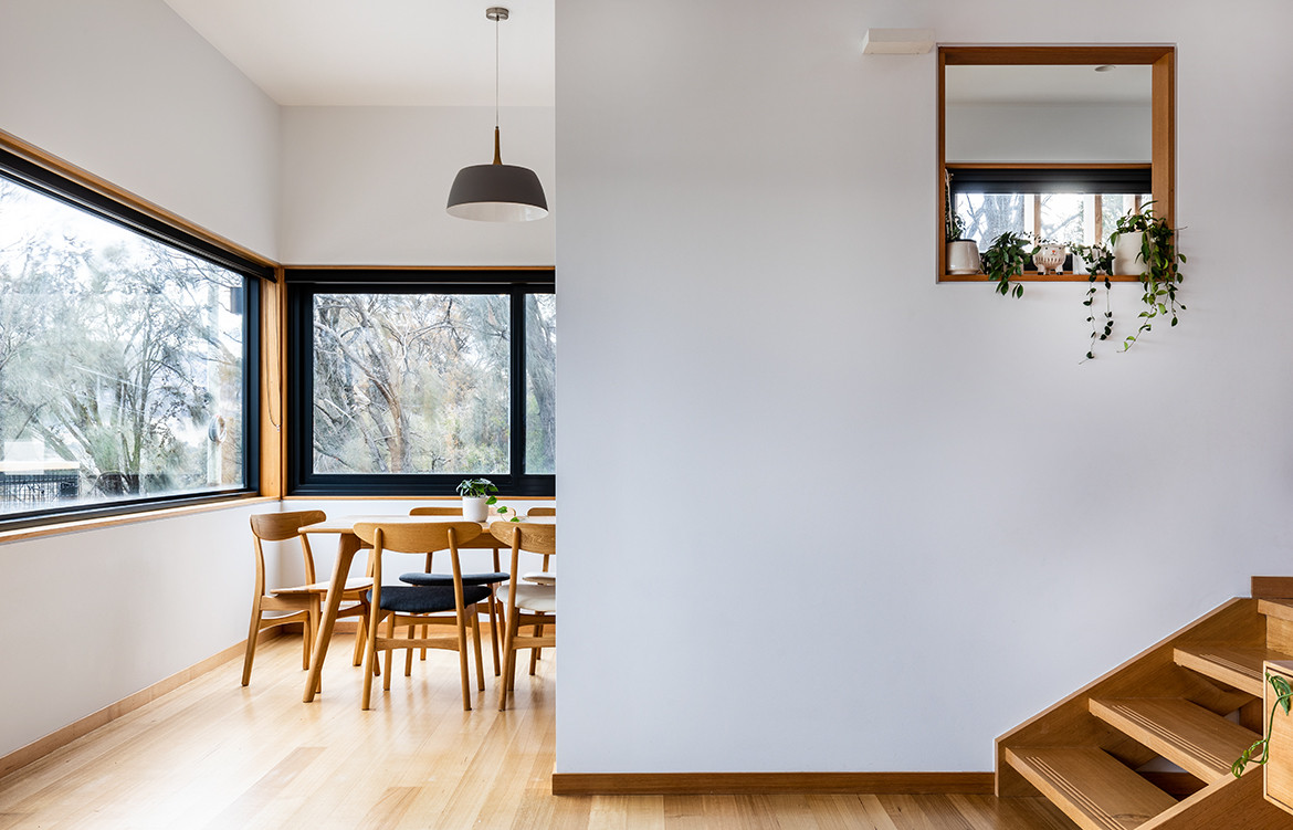
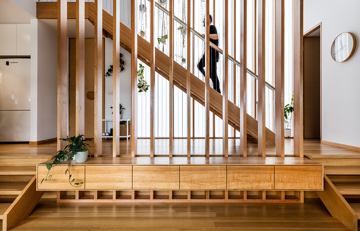
The material palette is inspired by the warmth and minimalism of a Scandinavian-style interior, with white walls and ceiling, and Tasmanian Oak for interior floors, joinery and architraves throughout. It provides a comfortable setting, with the timber developing a patina with age and blending into the leafy site. Built-in joinery reduced the need for additional or excessive furniture, maximising the use and sense of space. Wide timber battens screen the entrance and stairs without obstructing the light or space, the translucent polycarbonate provides light and privacy without the need for curtains or blinds.
“I’m really interested in creating diverse spaces and volumes, and the configuration of a split level and a void over the stairwell makes this modest-sized home feel more spacious and very special,” Keith says.
Keith Westbrook + Cumulus Studio
cumulus.studio
Photography by Adam Gibson
Dissection Information
Spotted Gum with Cutek oil CD50 for external cladding
Everbright E610 polycarbonate
CSR Cemintel Barestone External
Residential series windows 502- 504 with insulated glazing unit from AWS
Dulux Paint
Fisher & Paykel 90cm dishdrawer
Big O Designed doorhandle by IN-TERIA for entry
We think you might also like Worker’s Cottage by Clayton Orszacky
Translucent polycarbonate provides light and privacy without the need for curtains or blinds.
