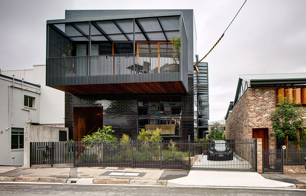
The genesis of 102 Mill House is well worth noting because it underscores a remarkable sensitivity to protecting Balmain’s industrial fabric by both the clients and the project architects – Carter Williamson. “Originally, our client came to us with a Development Application that approved the demolition of all structures on the site (an existing warehouse and woolshed), and the construction of a new residential apartment building,” explains Carter Williamson director and principal architect Shaun Carter. “However, as a long-term landowner and resident of the area, our client wanted to do something special.”
The project team’s suggestion was to re-use remnants of the warehouses and create four individual dwellings (102 The Mill and Truss House are two of these transformations.) “The ambition was to preserve the industrial and varied history of Balmain while creating an inspiring and generous home,” adds Shaun. “It’s vital for our suburbs to grow and change, however, The Mill serves as an opportunity to balance the use of existing industrial materials with a sensitive selection of new elements that continue to tell the story of the area, while adapting to new uses.”
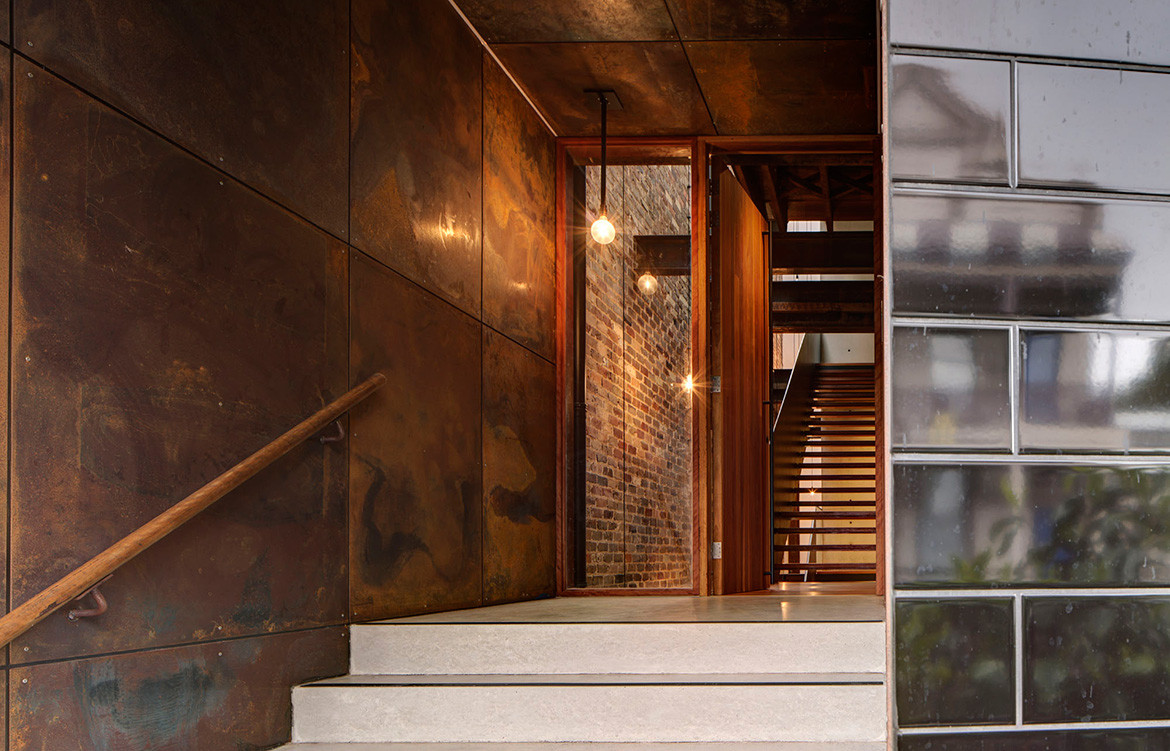
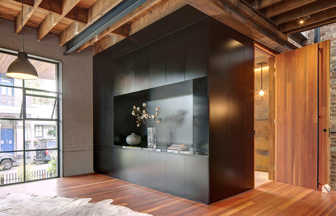
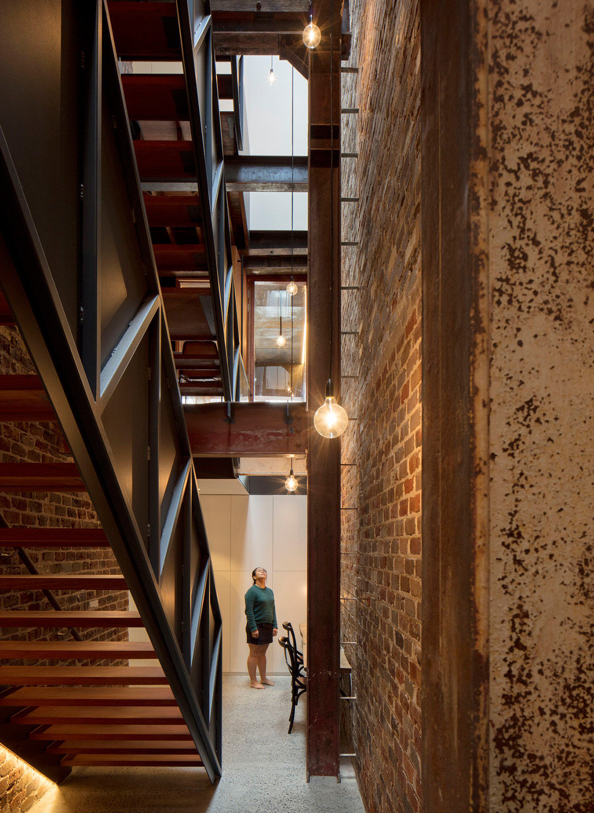
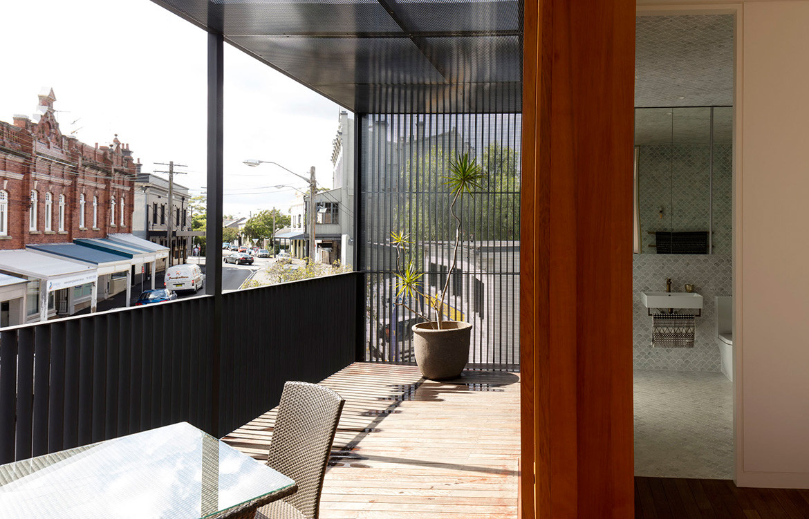
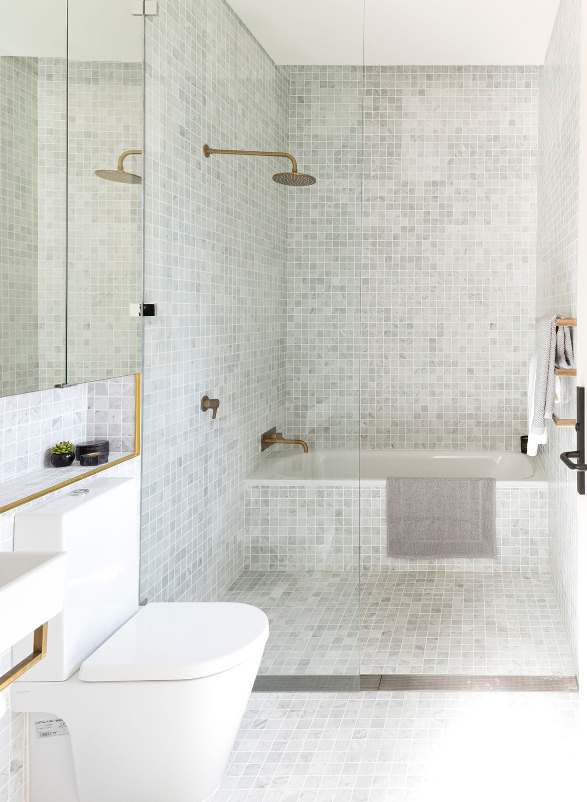
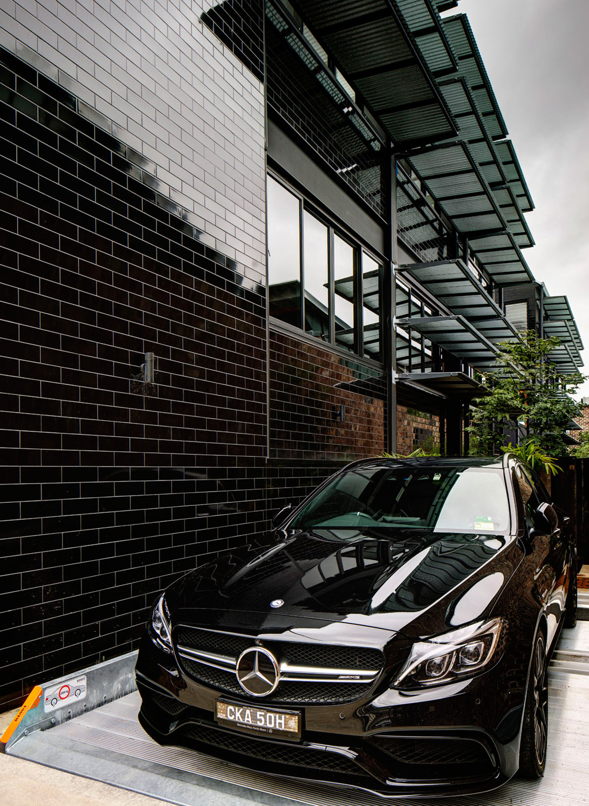
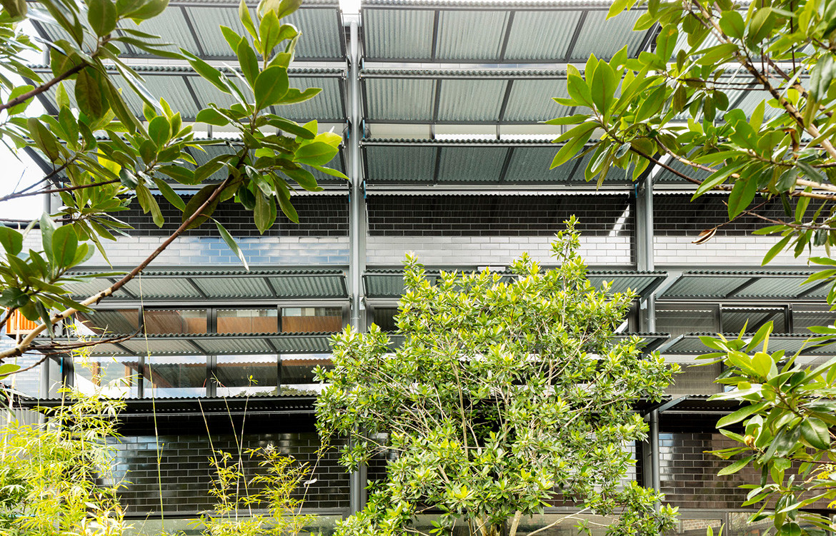
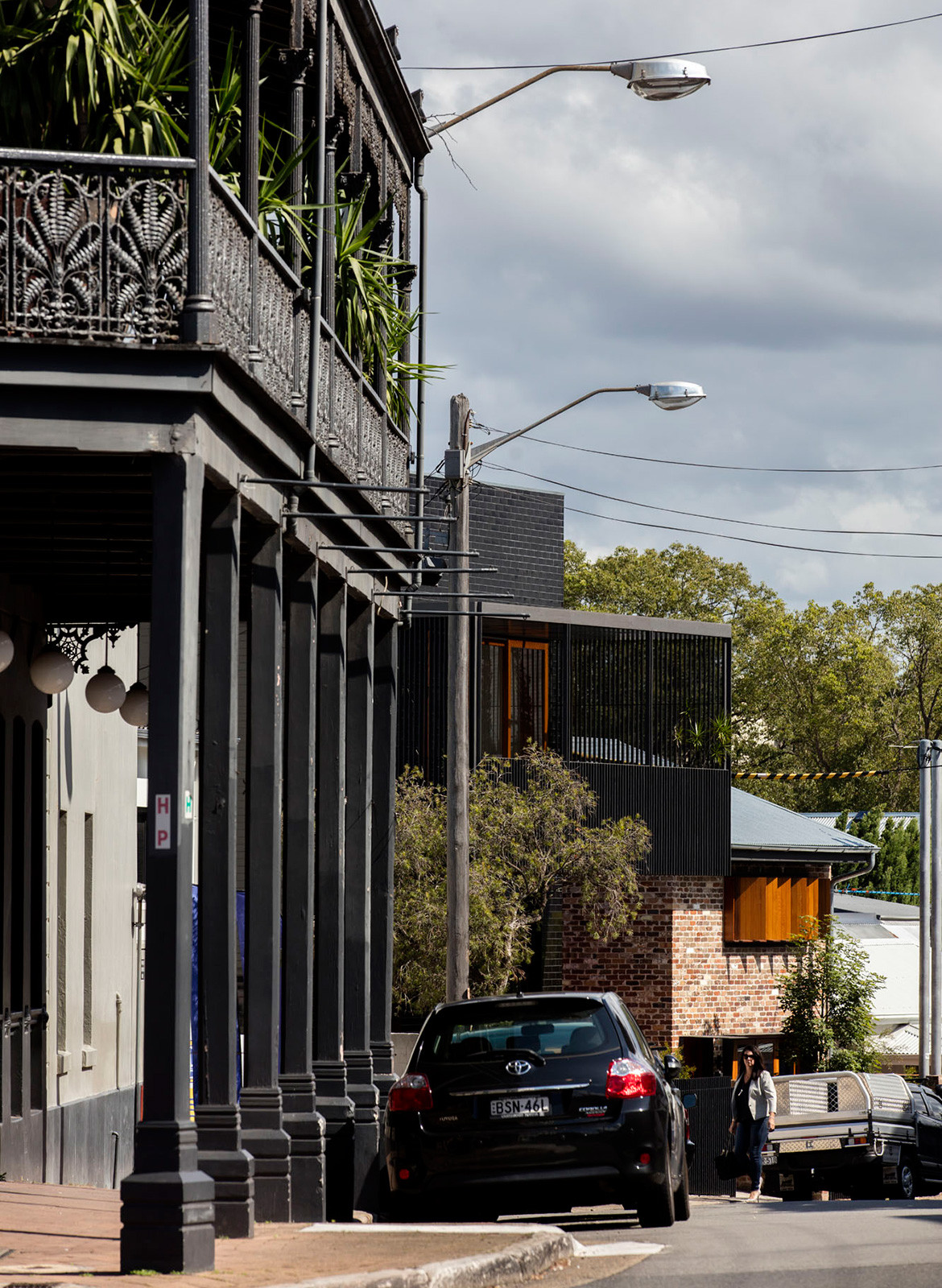
Carter Williamson has taken a robust approach to convert the warehouse into a home by retaining key elements and inserting bold and appropriate materials into its reinvigorated iteration. A recycled, three-storey brick wall is complemented by a new steel-beamed staircase. Rich black tiles that line the warehouse façade create a new sophisticated identity for the home. The use of natural materials is underscored internally wherein the master bedrooms ensuites are clad with light grey fan tiles, perfectly complimented by patinaed steel fixtures. The kitchen’s black benchtop and joinery are juxtaposed comfortably against the original, untouched wooden ceiling.
By leveraging the existing warehouse structure, beautiful volumes have also been achieved, including a 12-metre high void that brings light down four levels of stairs.
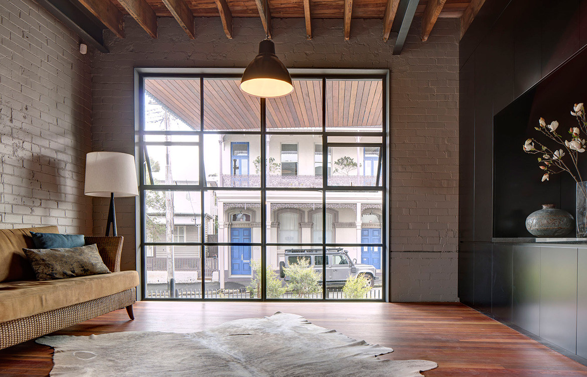
Landscaping at 102 The Mill has also been prioritised, in the form of a large courtyard, which flows from the kitchen via floor-to-ceiling sliding glass doors. It is lined with natural stones and recycled ironbark fencing panels, which have been recycled from the fire damaged factory and capped in black steel. A small pond lined in recycled brickwork, skirted by the familiar aged steel, is set under the master bedroom balcony.
From a planning perspective, the home is divided into three areas. “From east to west; vertical circulation, a service wall and place for living, is freed from the plan to look outwards,” explains Shaun. “This design strategy allows the most used spaces to experience maximum amenities of light, air and openness through the north, west and south façade.” He notes the living area as a case in point: “A matte black joinery suite forms the service wall spine releasing the western façade to be a ribbon of sliding windows.” In addition, a 6-metre kitchen island bench dominates the centre of the space, acting as a sculptural meeting point for family and friends to congregate.
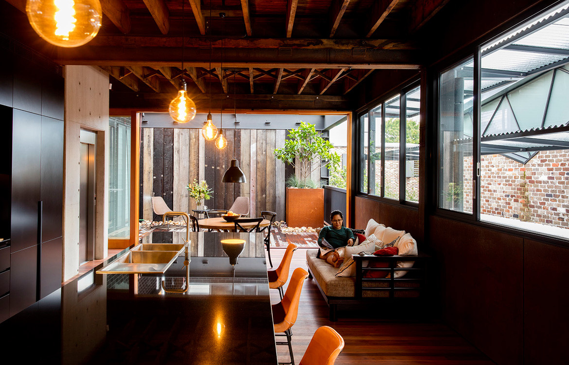
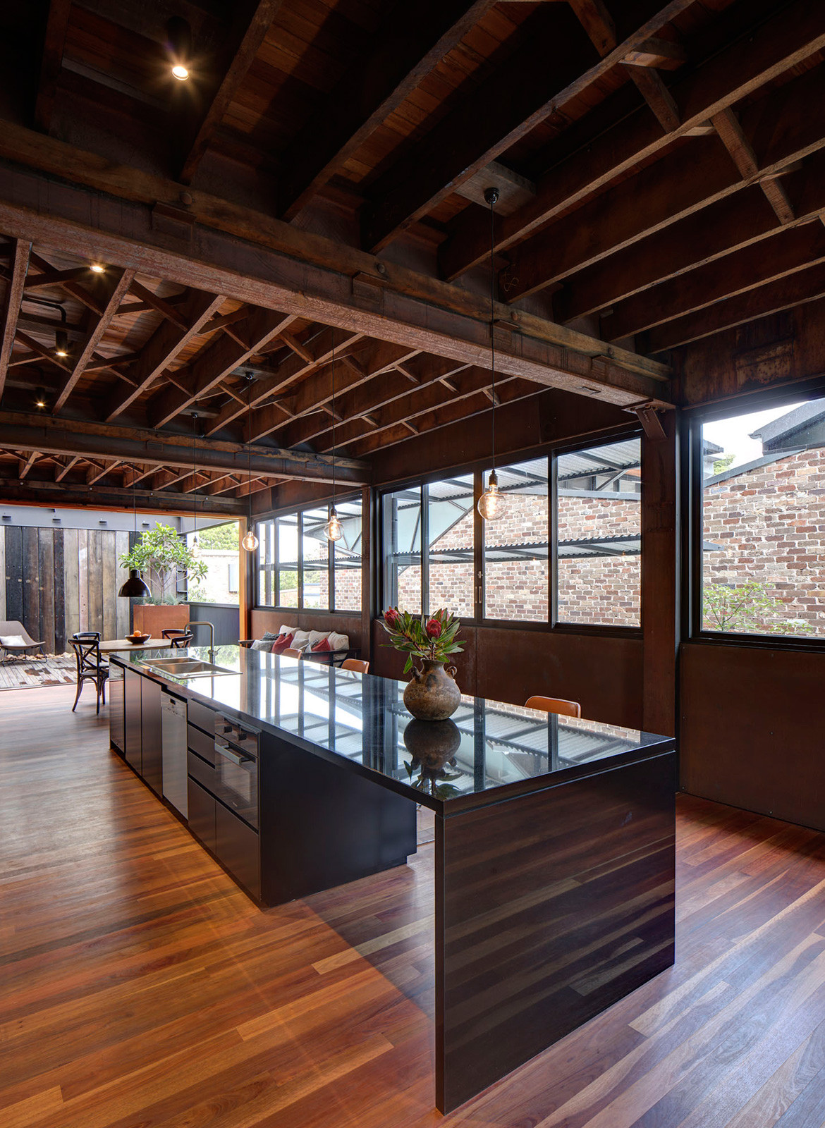
The primary sustainability aspect of the home is evidently the adaptive reuse of a warehouse that was previously approved for demolition. In detail, this includes the re-use of structural steel, including heritage BHP hot rolled sections, timber flooring, the ground floor slab and brick walls. “Through the adaptive re-use of 102 The Mill, the embodied energy inherent in these materials continues to be locked up,” adds Shaun. “102 The Mill enjoys north-facing living spaces while corrugated shutters provide protection from the western sun.”
Carter Williamson’s approach to this project demonstrates exceptional skill and sensitivity, resulting in a scenario where an existing building has resulted in the impetus for designing a generous, robust, and character-filled home.
Carter Williamson
carterwilliamson.com
Photography by Brett Boardman
Dissection Information
Fittings and fixtures from Roger Seller
Kitchen appliances from Miele
Modernist industrial pendant light from Repurposed
Steel structure feature from Repurposed
We think you might also like Screen House by Carter Williamson.
