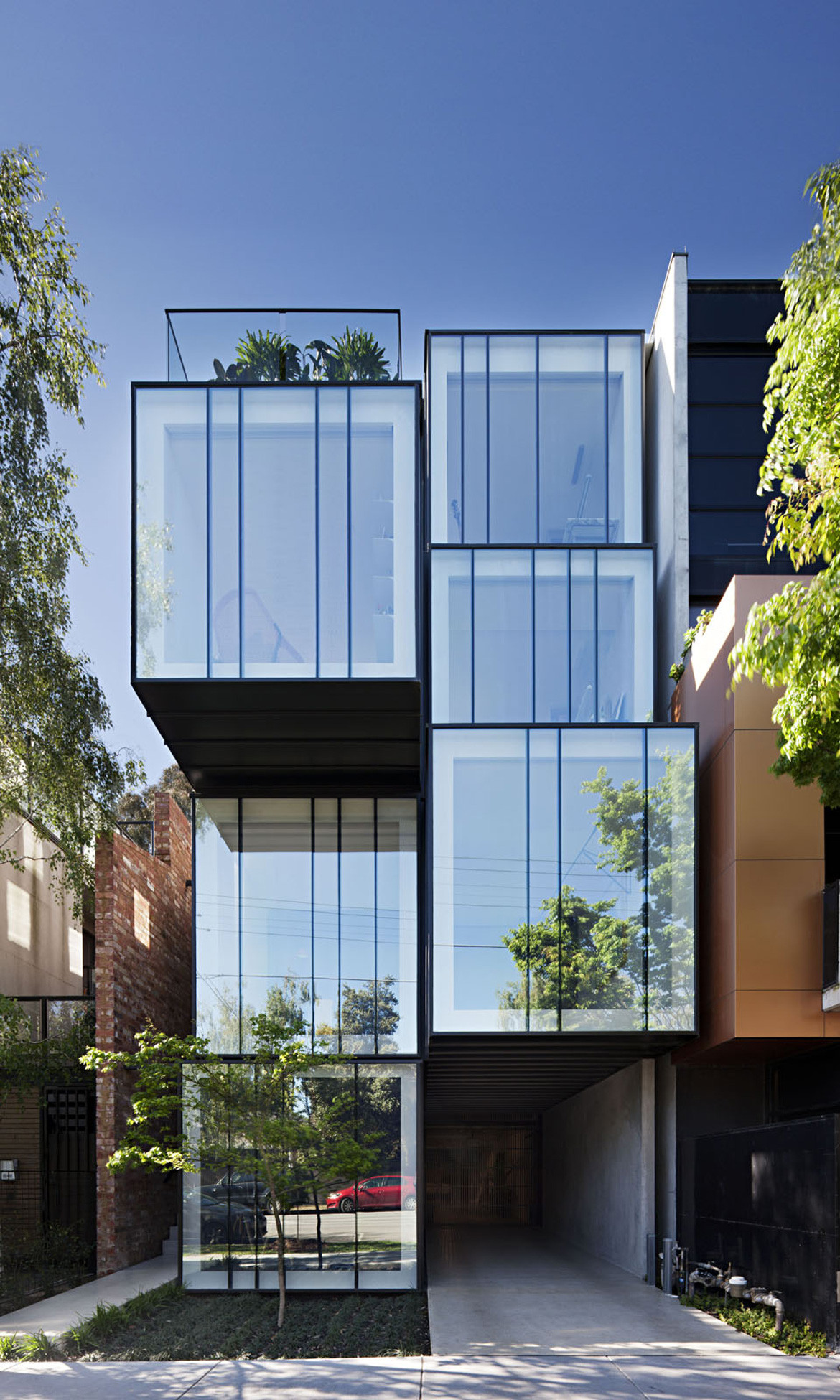
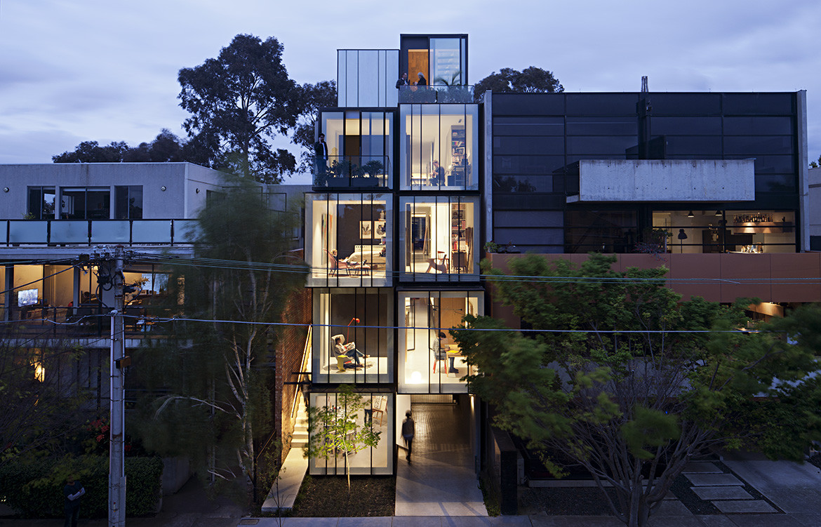
When harangued drivers take the Wellington Street rat-run between Dandenong and St Kilda roads in Melbourne, there are a few choice words on the tips of their tongues, but ‘exotic’ probably isn’t one of them. Yet, if they slowed down for a second, they might notice a house that’s just that. In between the low-rise office buildings, nondescript blocks of flats, and freestanding houses converted to consulting rooms, an extraordinary new house has appeared, six metres wide, five storeys high, the likes of which we’d expect to see in Tokyo or Amsterdam, but not in Melbourne and certainly not on this street.
The house was designed by Matt Gibson Architecture + Design in collaboration with their clients, a builder and an interior designer. Having bought and renovated several suburban homes, the clients were interested in a new challenge and a different kind of lifestyle.
The Wellington Street site, then occupied by an old house being used as an office, had been on the market for months, and the clients would drive past it every day on the way to their youngest daughter’s school. Eventually, perhaps inevitably, the idea for a new way of life and the opportunity represented by a house that wouldn’t sell coalesced.
To the architects, the block of land they had to work with must’ve appeared, well, small. Particularly when they were handed a brief for a home to accommodate the clients and their daughter as well as two adult children, each with a partner. But for the bold, constraints generate opportunities, and Matt Gibson and his team saw this project as a chance to explore a new model for Australian living.
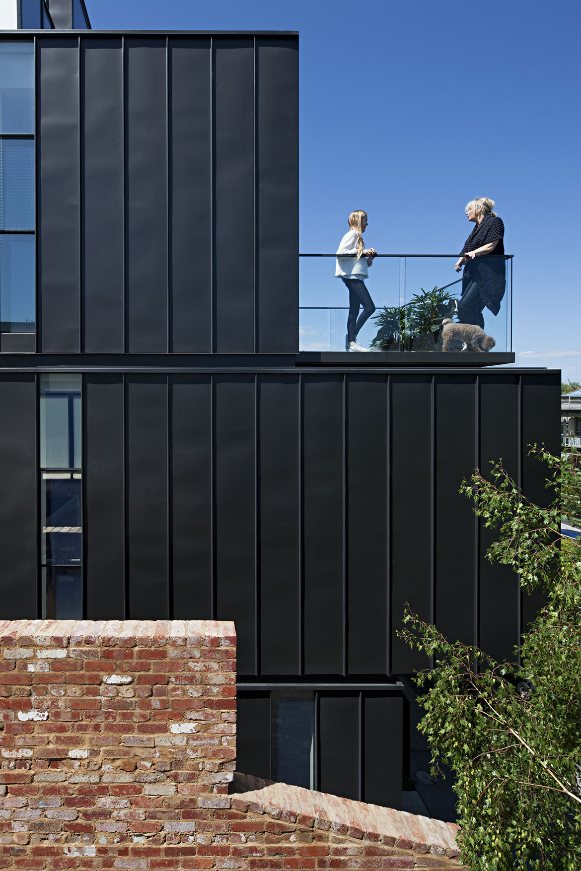
From the street, the house appears as a series of zinc-and-glass boxes, stacked in two columns, some set back and others brought forward. The boxes break down the visual bulk of the building, and create a modular rhythm that resonates with the more human-scaled grain of terrace houses on the other side of the street. The ground floor is given over to car parking and an office, the latter a compromise with council to allow a residence to be built on land previously zoned as commercial (hence the project being called the Mixed Use House).
As a result, the entry to the house is on the first floor, at the top of a narrow external stairway at the western edge of the site.
After the original brick house was demolished, its own western boundary wall was rebuilt. This silhouette of the old house screens the neighbouring apartments, and the warmth and texture of the brickwork help the entry to read more clearly as residential. Climbing the stairway – the space constricted between the brick wall and the house, open sky above – visitors’ eyes are drawn inexorably upward. It’s a fitting precursor for the experience inside the home.
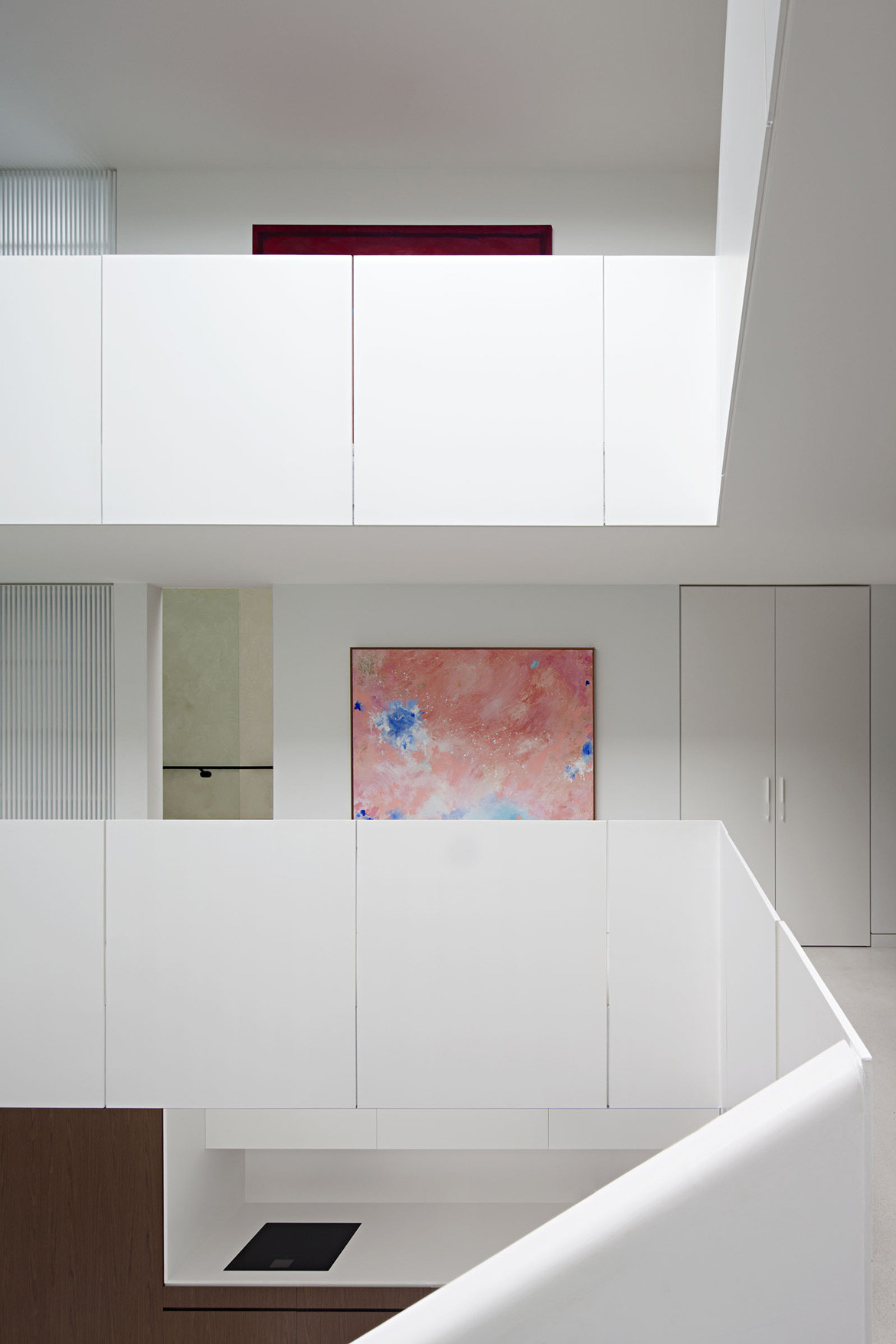
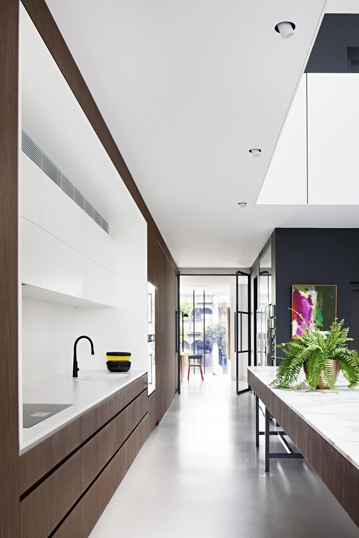
At the top of the stairs, a pivot door delivers visitors into an open-plan kitchen anchored by an incredibly long marble island bench. The kitchen flows through to a dining zone and into a living area, with fantastic views down into the neighbouring park and out over the traffic of Dandenong Road. But again the eyes are drawn upward. The kitchen sits at the base of a large atrium, designed to bring natural light deep into the heart of the home. The prevailing colour palette of whites and pale greys maximizes every ray of sun, and the entire volume is awash with light. Except for the few hours on summer days when panels slide across the glass roof to block the hot sun, the light here is soft and seemingly all-pervasive. For new arrivals subconsciously anticipating a skinny house split into four discrete floors, wringing every last square metre out of the building’s small footprint, the effect of the light and the sense of spatial generosity are surprising and delightful.
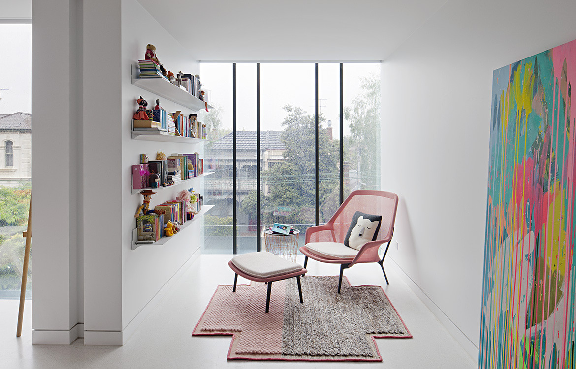
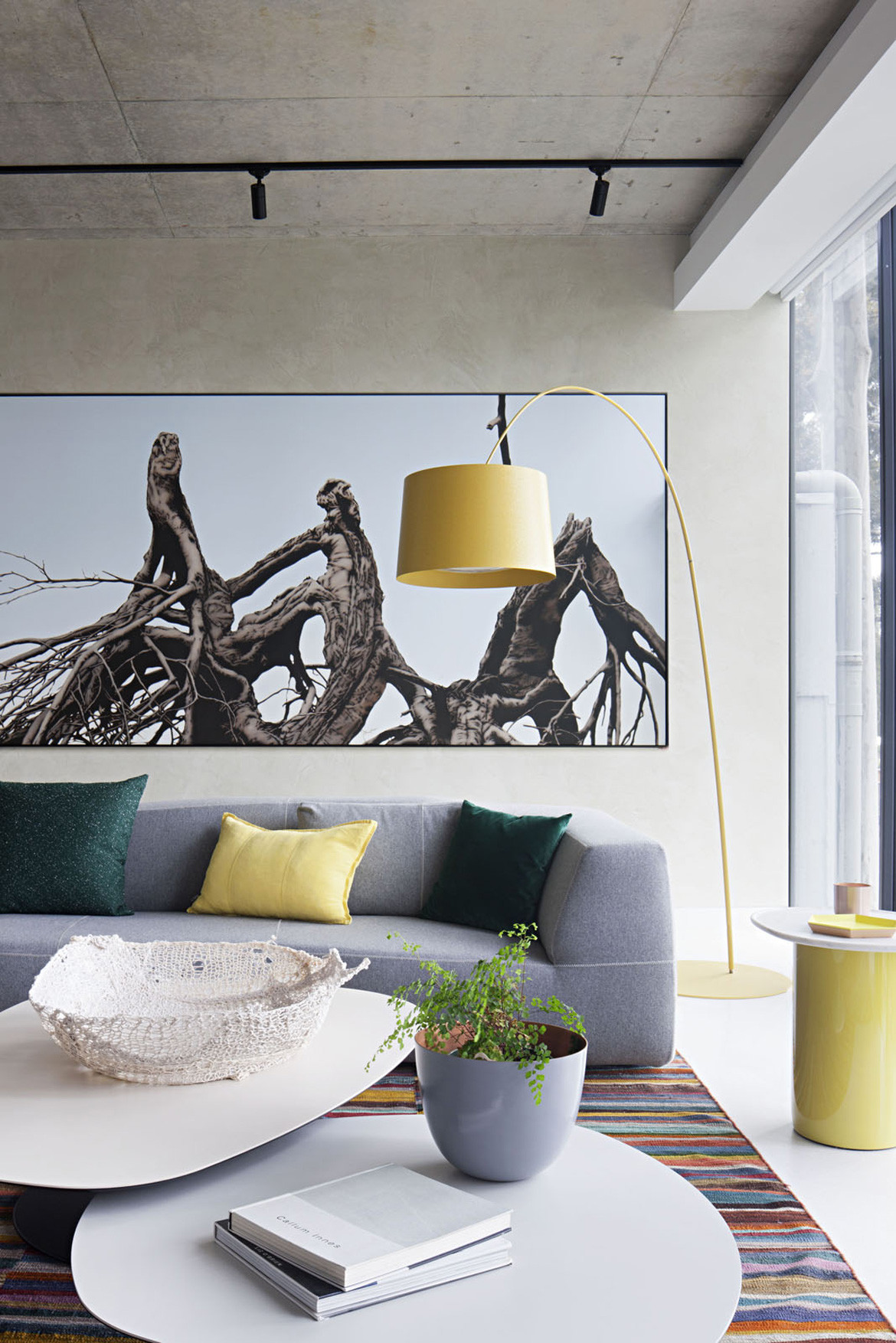
A core element of the brief, at the instigation of the two adult children, was that the house must bring family members together. For them, the idea of multigenerational living was about having independence and flexibility but also sharing their lives with their broader family. To this end, each level in the house looks out into the void over balustrades and through windows, across to other spaces and down to the kitchen. And each is zoned according to different modes of occupation: the first floor is the communal zone; the second and third floors comprise bedrooms and discrete living zones for the smaller “family units”; and the fourth floor is described as a “retreat” (although surely it’s also the “party zone” – there’s a lounge/media room, a roof terrace with panoramic views of the city and surrounding skyline, and a well-stocked galley bar and kitchenette).
The extreme verticality of the house demanded an elevator, but there are also two stairways. One ascends from the first floor to the second, a sculptural insertion into the atrium and angular counterpoint to the rectilinear geometry of the kitchen bench.
The second connects the upper three floors via a single, long flight of timber treads. Sandwiched between high walls, with a sliver of glazed roofing overhead, it offers a sensory reprise of the narrow entry stair and its tension between horizontal constraint and vertical expansion. The experience of climbing these stairs is emblematic of the house as a whole: it offers myriad moments like this, different spaces, different feelings; volumes expand and contract; circulation paths turn corners and open into different rooms; spaces are arranged around each other and flow together, to create connections and separation, but not segregation. In the context of Melbourne’s well-documented challenges around population growth and housing affordability, the Mixed Use House offers a model for greater residential density and multigenerational living that is anathema to the glut of low-quality, small apartments currently being served up as a solution. It’s a bespoke architectural project, so it can’t exactly be rolled out across the city, but the thinking at its core can be applied wherever there’s a fissure in the urban fabric, even in places not currently thought of as appropriate for housing. We just need more landowners and more councils to be bold and look for opportunities when they see constraints. And then perhaps a house like this one won’t seem quite so exotic.
Photography by Shannon McGrath
