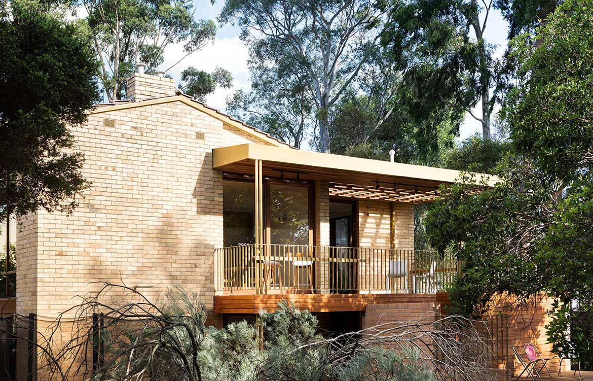
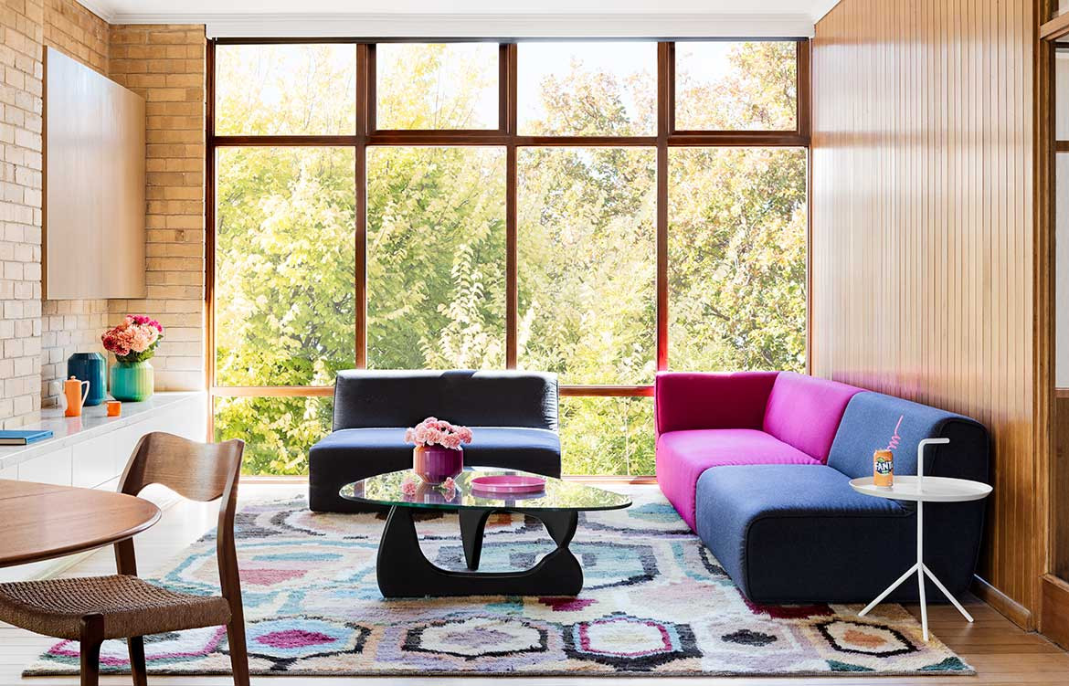
On a sprawling, leafy property in Balwyn North, Melbourne, stands a delightfully unconventional house. From the street, its 1960s brick exterior and distinctive windows give only a subtle clue to its modish inner life. The driveway slopes down to a discreet glazed door: the entrance to Paulina and Chris’ polychrome home.
Having lived in the house for some time, the pair decided a renovation was necessary to better accommodate their three young children and reflect their love of entertaining. Paulina first came across WOWOWA Architecture, a Melbourne-based studio, years ago in an article on emerging architects, while Chris had spotted the practice independently online. The decision to approach them felt natural.
“We had a bit of a vision – I wanted colour everywhere, and we both knew how we’d like it to function. But we left the rest to Mon and Scott,” says Paulina, referring to Monique and Scott Woodward, partners and practice directors at WOWOWA.
A plan was developed to redistribute internal spaces to better suit modern family life, with a design that would remain sensitive to the home’s original aesthetic. The bones of the existing building were left largely intact.“For us it was about working with the quirks of the original house, finding ways to celebrate what was here,” says Monique.
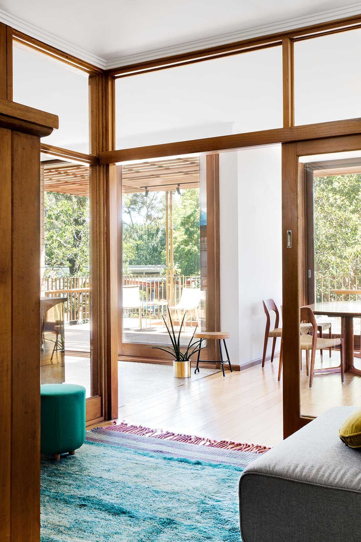
The unique positioning of the two-storey structure on the inclined site, as well as the removal of outdated heating and cooling units, made it possible to extract incidental pockets of space throughout the home. This strategy shows in the shelving unit built into the cavity of the small entertainment room at the ground floor.
“In the summer that room is naturally cool, being under the main house, so you automatically want to spend time there,” says Paulina. “And in the winter, it’s just so cosy.” Ahead of the second television’s arrival in the main living area, this comfortingly insular space, initially meant as a kid’s retreat, is where the family converge most evenings.
“It’s always nice to find that clients occupy the space in ways we wouldn’t have expected,” quips Monique.
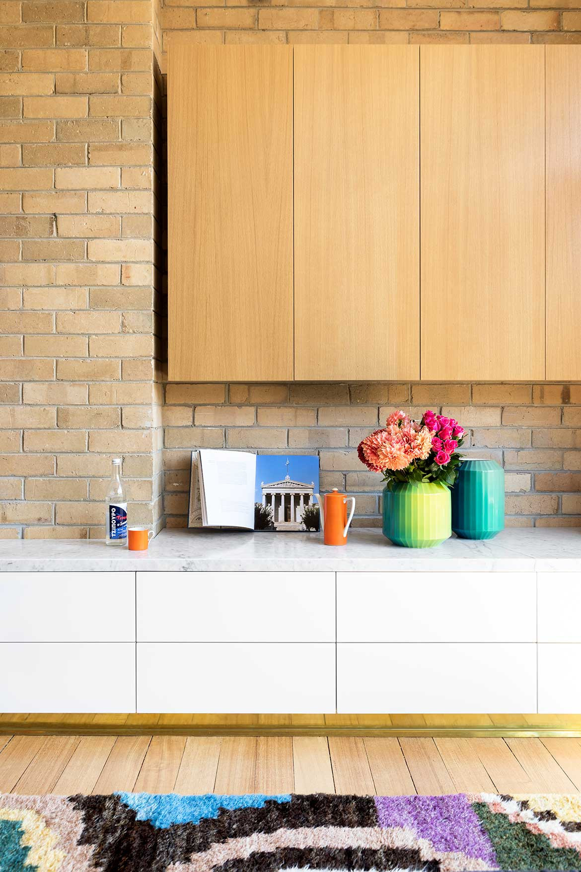
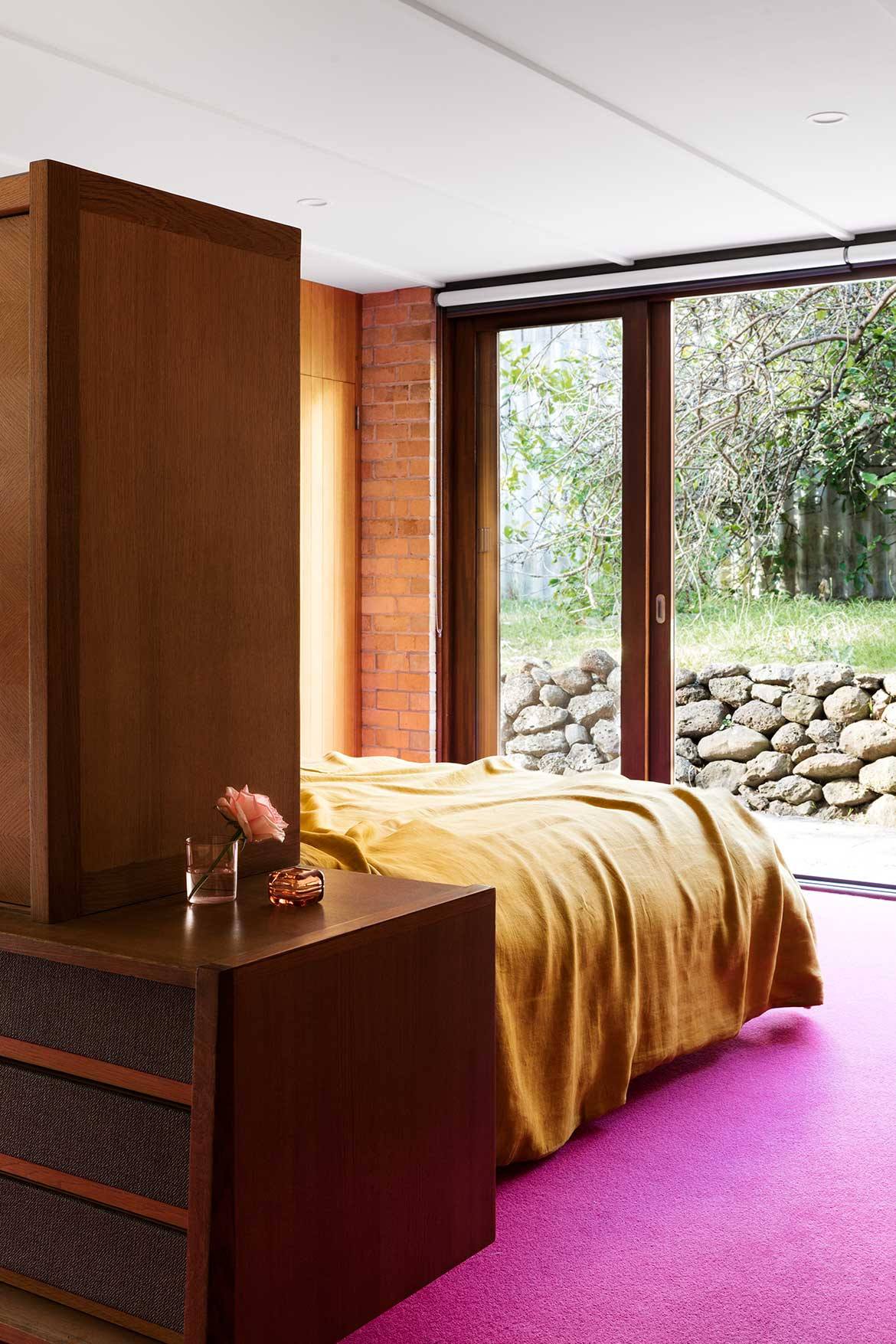
Further along the ground floor is the master bedroom, an exceedingly sumptuous space lined in original timber panelling. Here, every detail – from the brass closet handles sourced by Paulina from the U.S. to the vintage robe doubling as a bedhead and storage unit – oozes plush indulgence. Particularly so the deeply saturated, salaciously pink wool carpet.
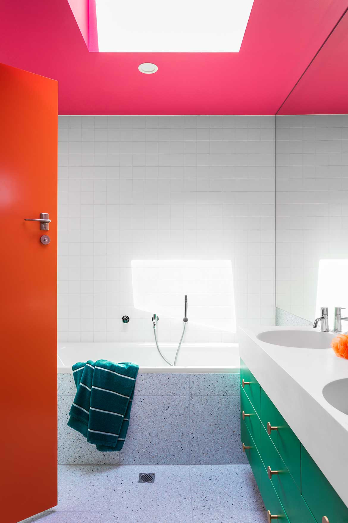
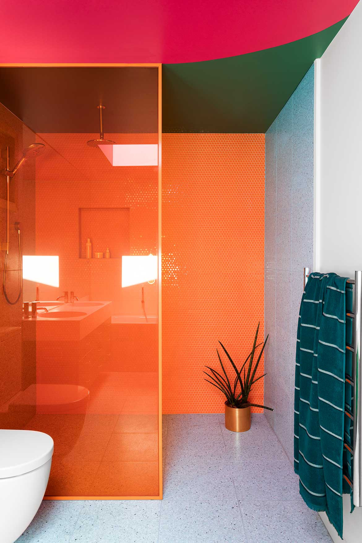
The unapologetic hue is one of five specific colours Paulina had in mind for her new home; alongside yellow, blue, green and orange. These appear on brightly painted doors, in the ambient glow of feature lighting, and on the floor of every carpeted room, bar one: the household’s eldest daughter opted for grey. Both the master ensuite and the upper floor bathrooms, where most all these colours converge, are a kaleidoscopic treat.
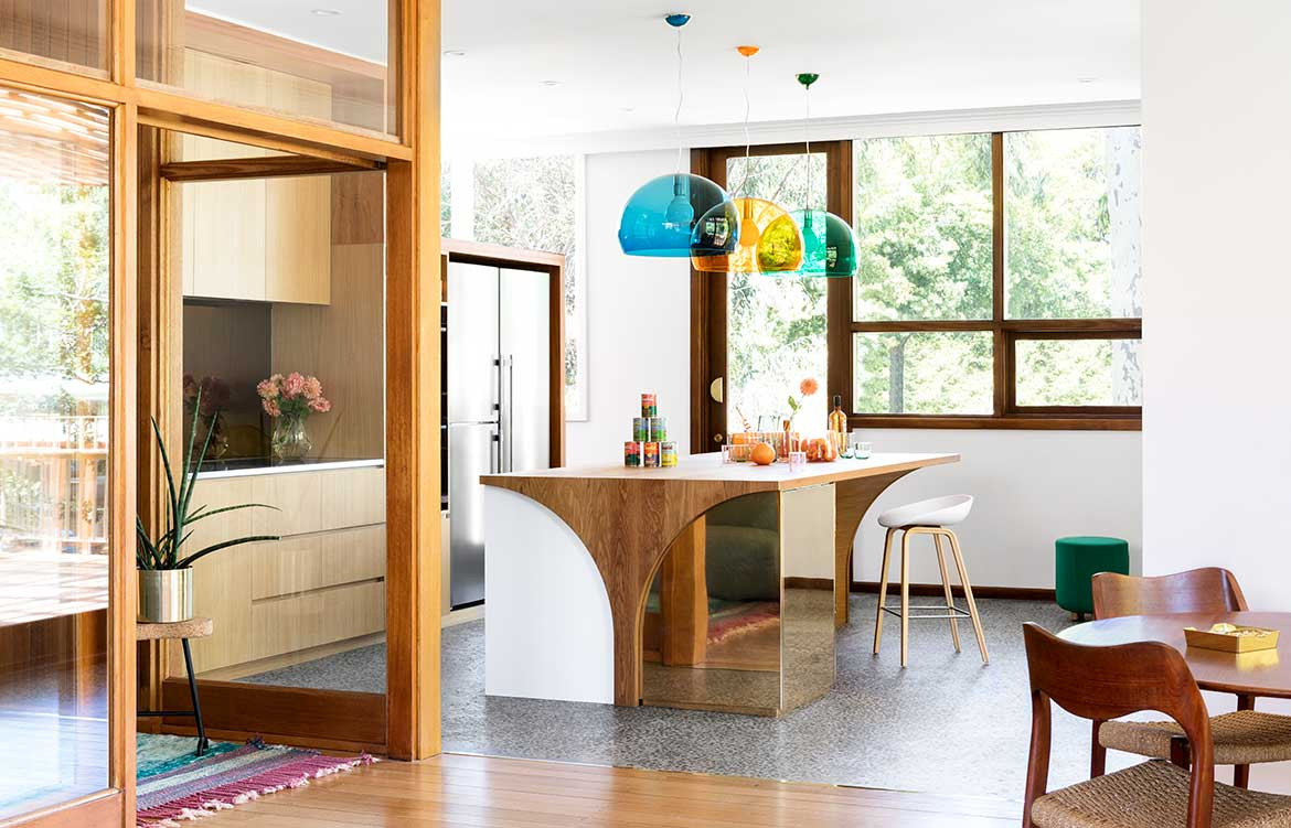
Heading upstairs, the transition between floors is a gradual ascension into a more open, extroverted space. In the light-filled meals area, a prime corner position once taken up by the laundry, the brass-clad island bench echoes the gleam of the tinted mirror splashback.
Under a row of Kartell FL/Y pendant lights, a wide timber island benchtop emits a warm tactility, with space enough for table settings either side of a whole spit roast – an important detail for the party-ready Greek-Australian family. The curved motif on the bench’s side profile was inspired by the shape of lamb chops, and, in a finely-executed flourish, this curve also defines the cavity carved out underneath the bench.
The kitchen joinery cleverly conceals a butler’s pantry, featuring a wide sink and long bench, ending in a compact desktop workstation. Large glazed windows span the length of this secret space, looking out onto the street below. The beauty of having the kitchen cabinetry built low is that the kitchen beyond has unobstructed access to this peripheral natural light. “And the family has privacy from the street as well, so it was really a two-pronged solution,” says Monique.
In the living area, simplicity was key. To make way for the repositioned dining table, it became necessary to compress the original lounge area slightly, though its generous new couches suggest the proportions of a much larger space.
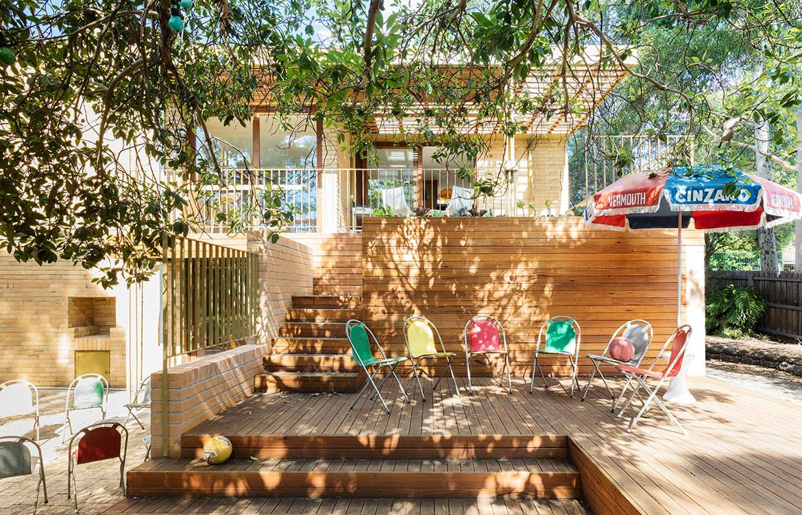
Outdoors on the deck, stepped platforms lead down to a huge backyard, shaded over by gorgeous gums. Ample space to continue the interior colour scheme? “I’m trying to convince Chris to paint the old lemon tree hot pink, but he won’t let me!” laughs Paulina.
“The steps were designed to provide different tiered spaces for people to hang out,” Monique explains. An additional brick wall ties the renovation to the original cladding and enforces WOWOWA’s overall strategy of creating opportunistic spaces in and around the old structure. The resulting cavity provides storage and an undercover area where outdoor parties might gravitate in inclement weather.
At this vantage point below the house, the flowing nature of the building becomes fully apparent. From its central staircase to the sprawling deck and terrace, the design encourages circulation around, underneath and through the property.
“In referencing the era, we were conscious of designing a home that was very much its own space,” says Monique. “We didn’t want it to be kitsch, or feel nostalgic in a way that was pastiche. Just optimistic.”
“It was important for us to stay true to that style, and we worked together to get the best result,” says Paulina. “It’s just a joy to live in, and so comfortable. We love it.”
WOWOWA Architecture
wowowa.com.au
Photography by Martina Gemmola
Dissection Information
