Carole Whiting’s client wanted her home to be completed in stages, starting with the kitchen and master suites, so Whiting master planned the project to maintain design cohesion though it would be completed over two years. And then along came Covid. That said, having a clear end goal, enabled progress to be elastic.
Wanting a modern and timeless design that would suit a family and grow with it, Whiting’s design has been highly flexible. For example, the client has young girls and wanted them to have a play space: “There were several iterations which were much more complex before we simplified it down to just lots of space, beanbags (Collective) and lots of under bench storage so they have a lot of room to play and imagine in,” says Whiting.
Taking a leaf from Shaker community hall design, large sculptural hooks (Fat Boy) have been placed on the walls to hold extra chairs (Design By Them), toys and anything else, out of the way for when the full room is needed. A rug by Armadillo, artwork by David Band and a stool with K5 screw base, are paired with a large eight metre working table for painting and craft.
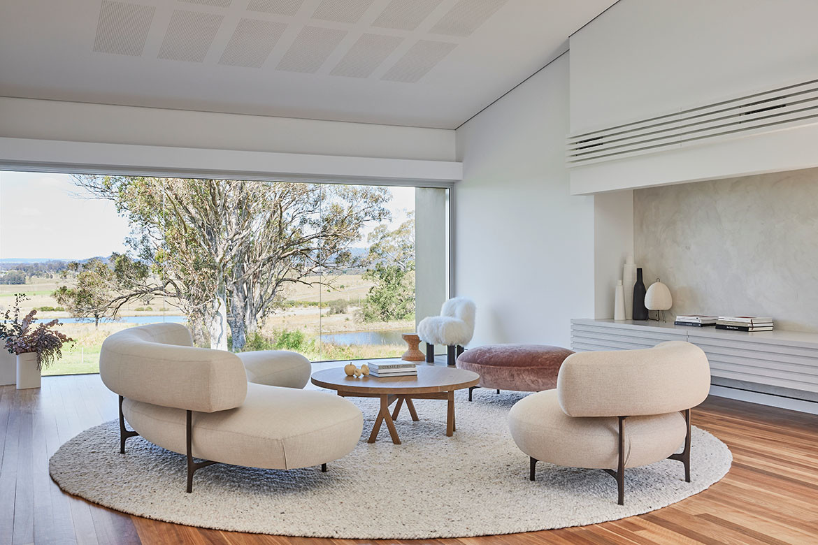
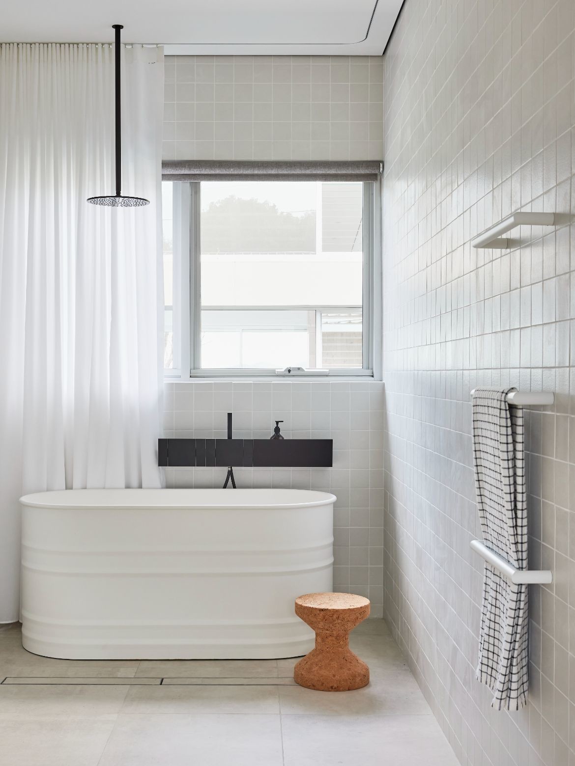
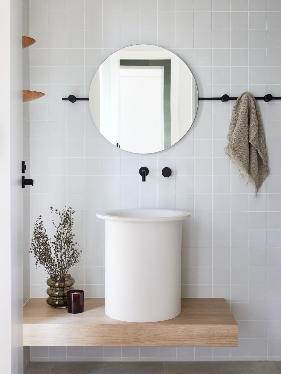
Throughout the rest of the home large expanses of glazing allows for fabulous light and sweeping views. Adding warmth and texture through timber, ceramic tiles and marble, Whiting has layered each room from Australian hardwood floors up: “It’s a nod to the views beyond,” says Whiting, adding, “We wanted to keep the house light and uncluttered with a modern edge.”
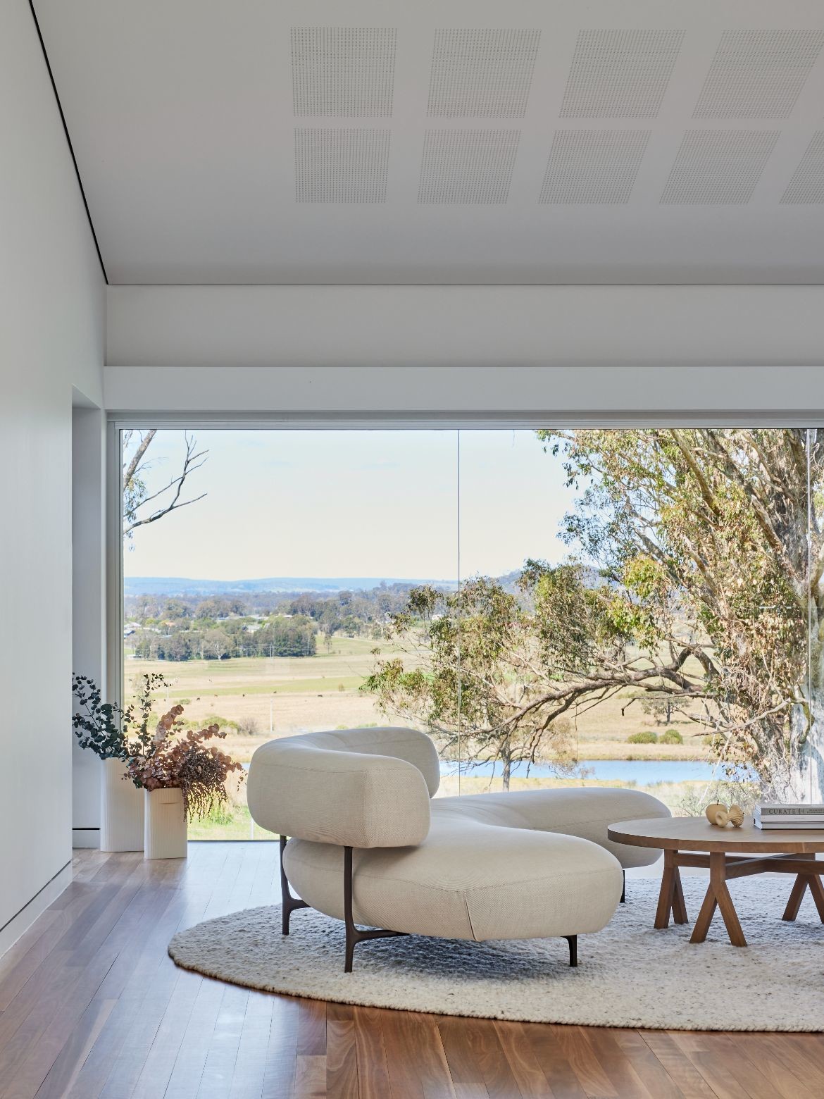
In the living room, a large felted wool rug (salsa Jamaica – Halcyon Lake) defines the space and creates the first of the circular motifs visited throughout. Piet Boon lounge and armchair (Mobel) continue the curve, as does the Arflex chair (Space), Vitra Cork Stool, Noguchi lamp and gorgeous lilac velvet pouf also by Piet Boon.
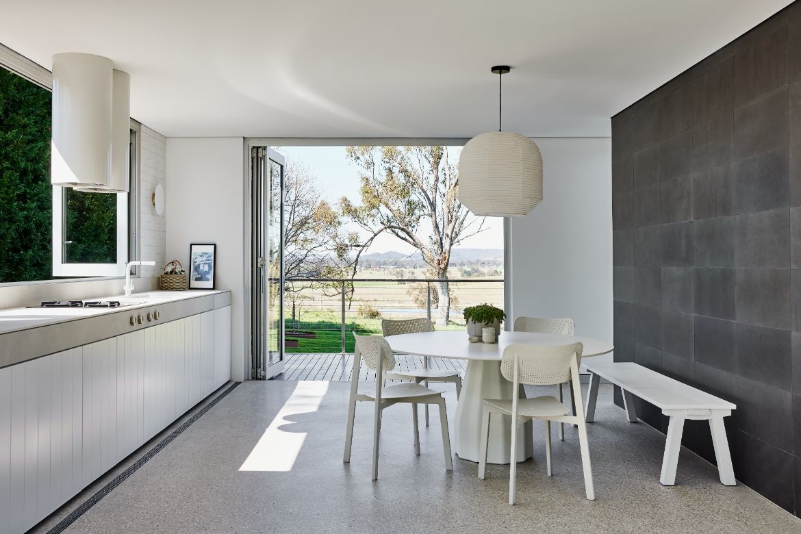
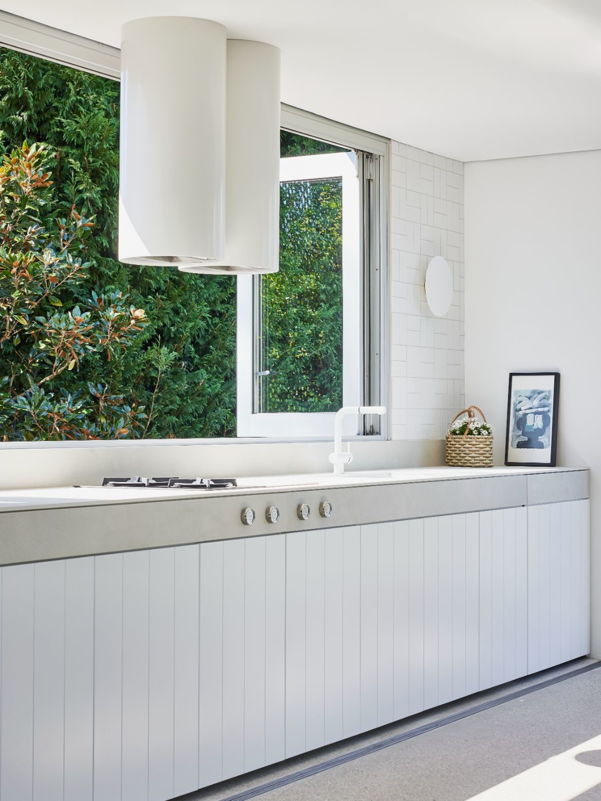
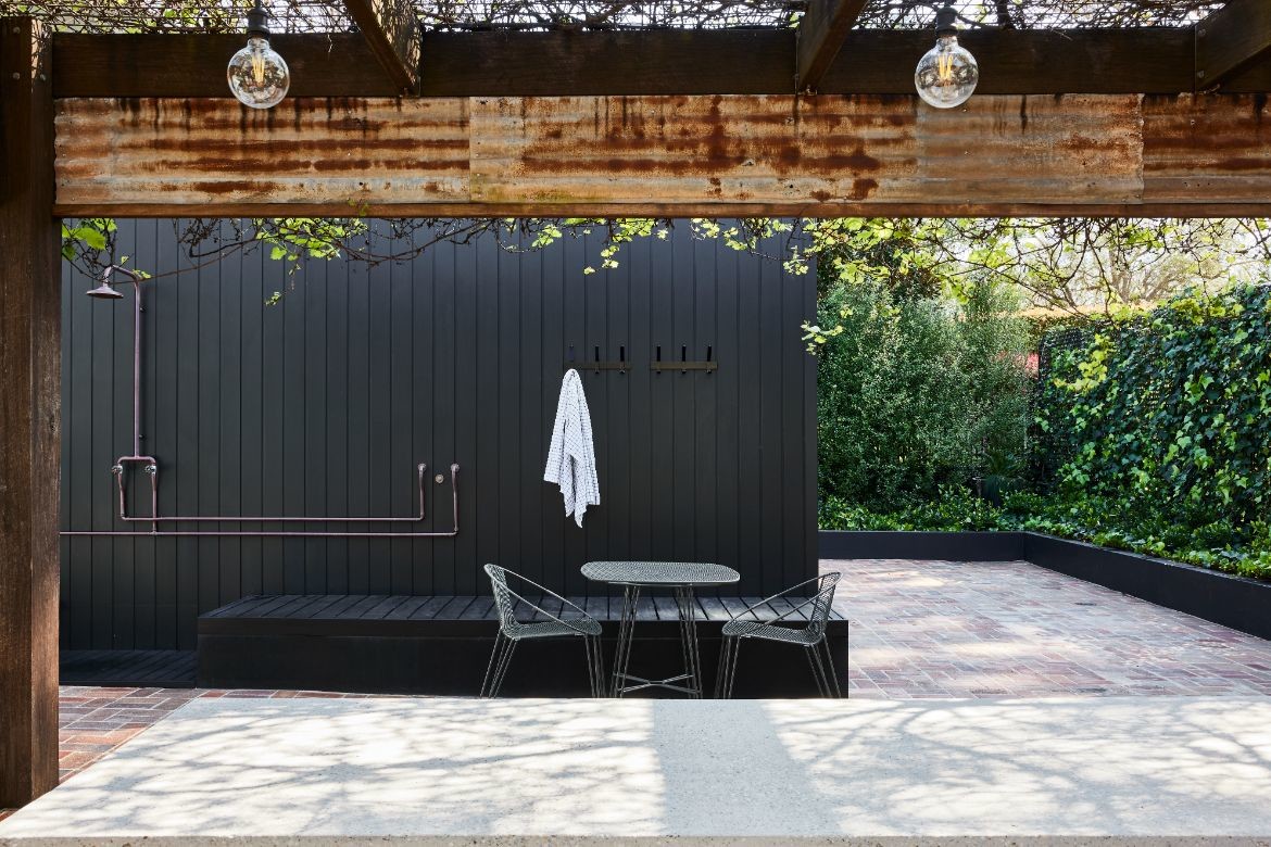
The home is in fact large with an indoor-outdoor room opening onto a large outdoor living space. For the interior portion, Whiting has reduced the palette to concrete with white tiles and cabinetry with a facing wall of deep slate grey. Here a Viccarbe Burin table from AJAR furniture is paired with Hux chairs, an artwork by Marcus Payne and large pendant light (Space).
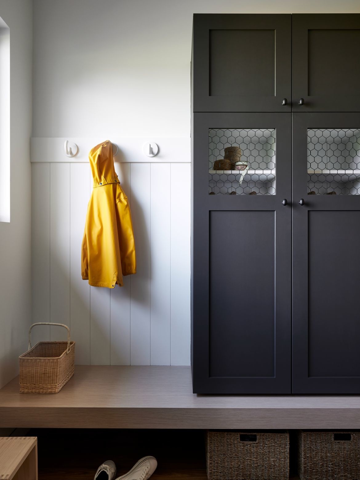
Also an indoor-outdoor room of sorts is the mudroom: “It was designed for everyone to have their own ‘locker’ and to keep all the day-to-day school bags, hats and coats etc. in one place,” says Whiting of the beautifully designed space that perfectly contains clutter.
Light filled but directionally strong, the kitchen layout has been simplified from an obtusely angled entry point and dysfunctional wedge-shaped butler’s pantry, to an open and flowing arrangement. “We started by squaring up the spaces through ‘packing out’ the hallway and pushing the kitchen forward into the space enabling a larger pantry,” says Whiting. Adding a glass panel between the kitchen and hallway further expanded the space, while rounded edges guide traffic through the kitchen.
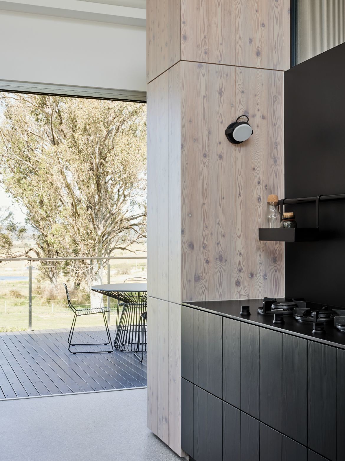
The palette is typical of Whiting’s oeuvre with natural timber and stone carrying the mood. However, drama has been woven into the design with Larch panels (Admonter) in whitewash paired with black stained cabinetry, and large format black porcelain tiles (which house the gas hobs directly). Marble and handmade tiles (Artedomus) have been incorporated into the island bench to add texture. Expanding the kitchen outwards through tonal cohesion is a large timber dining table (Lowe furniture) and Nikari dining chairs (KFive).
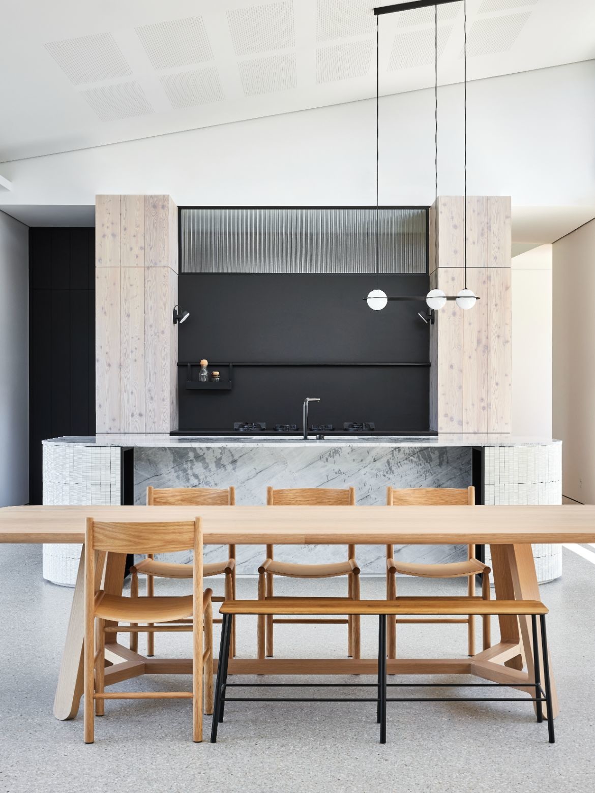
Maximising space through considered arrangements, the fridge and freezer (Sub Zero) have been moved to the rear of the pantry, while the ovens (V-Zug) have been located on the side wall closest to the butler’s pantry for minimal mess. Further light has been brought into the kitchen via a glass panel above the cooktop area: “This was achievable because we used in-bench exhaust fans to extract cooking steam. This also gave us a clean wall behind the cooktop area where we could add a rail with a ‘caddy’ for oil or herbs and follows a theme we have incorporated through the other spaces in the house,” says Whiting. Indeed, the black rail is repeated in the pantry area for ease of access to kitchen tools.
Complexities of existing electricals were a challenge, however by using a combination of wall sconces, a diffused light above the ovens, and a decorative pendant over the island bench offers a good balance between functional and aesthetic. More importantly, the result is organic to the space and no hint of the challenge is revealed.
In all ways a considered and harmonious design, Whiting has brought her sense of balance and functional flow to bear, adding texture and warmth, but also championing the view and creating a flexible home that will grow with her client’s family.
Carole Whiting Studio is a Melbourne-based multi-disciplinary office with an emphasis on authentic design and considered, tailored solutions to client needs. The studio works across residential, multi-residential and commercial.
Project details
Interior design – Carole Whiting
Photography – Pablo Veiga
We think you might like this story on the evolution of Carole Whiting’s aesthetic.
