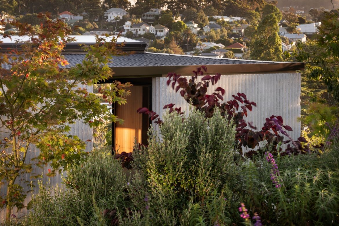
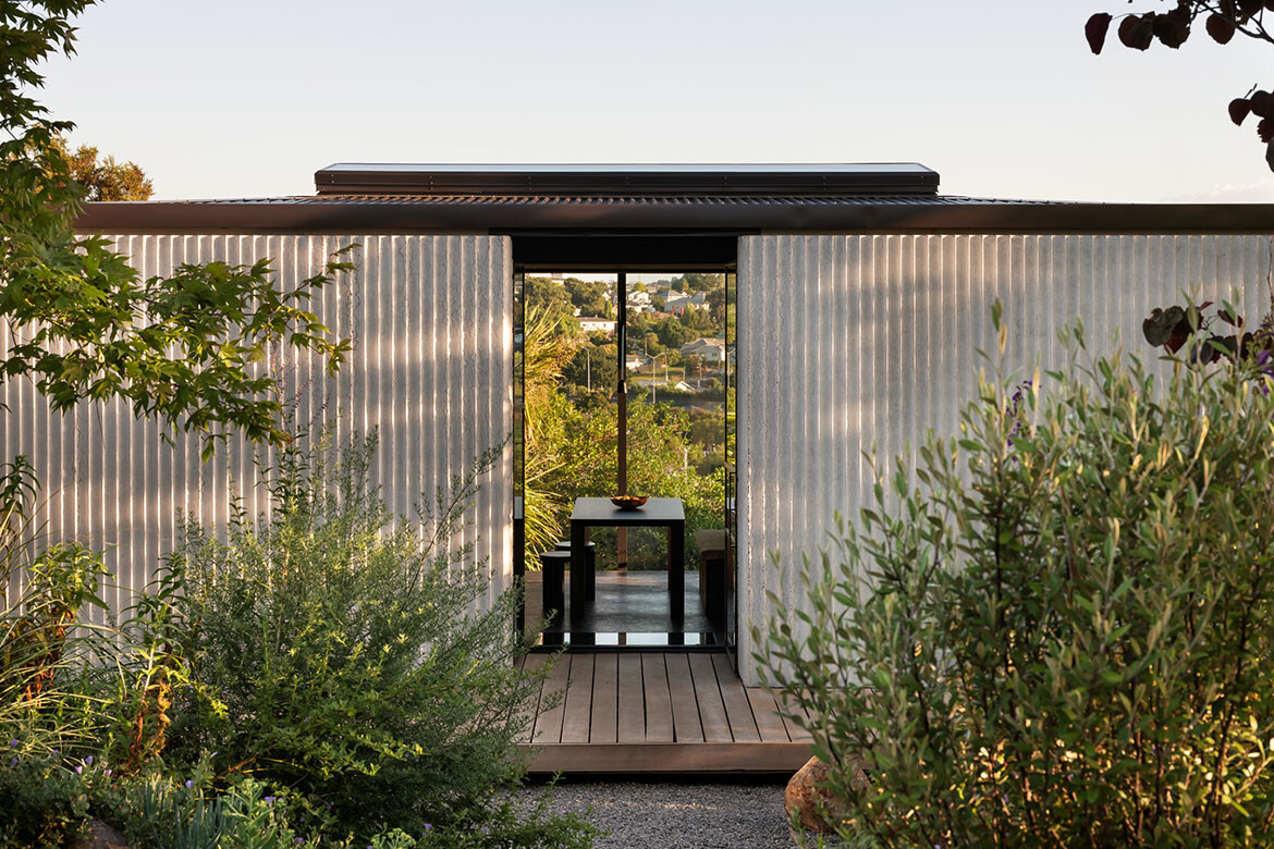
In the design of this home, the whole site was considered with the living space at the lower end of the block, while a separate studio is located at the top end of the section. In doing so, the whole of the block is utilised with a central courtyard garden that is wholly usable and comparatively large.
“It’s a reaction against typical bungalows and villas around lots of New Zealand towns, where they occupy the centre of the site, and you end up with these redundant spaces, which are your outdoor living areas,” says designer Booth.
This approach has then created a more generous living space incorporating both indoors and out. Effectively this allows the footprint of the main house to be as small as possible while fully functional and seemingly spacious. At 85 square metres split across two floors, Booth is seriously living his intentions.
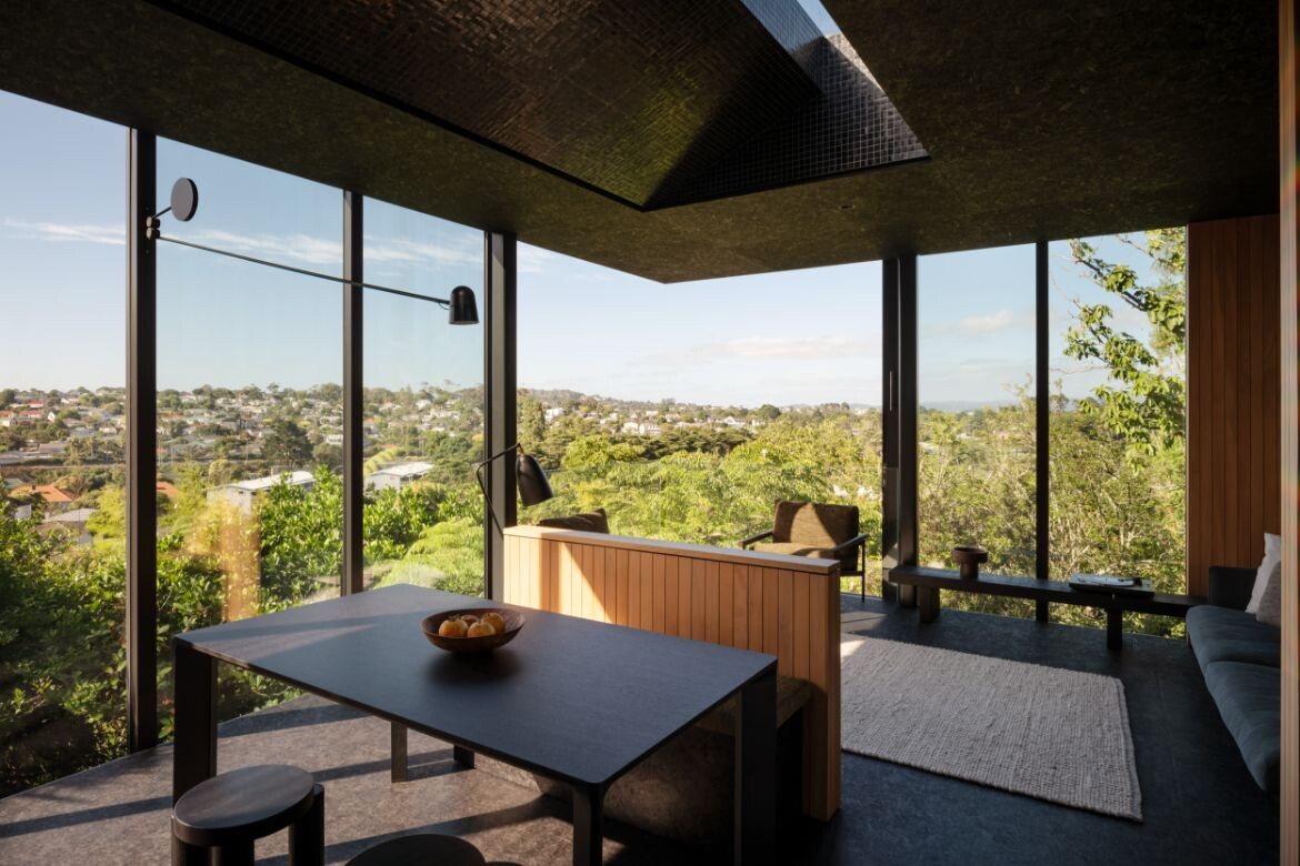
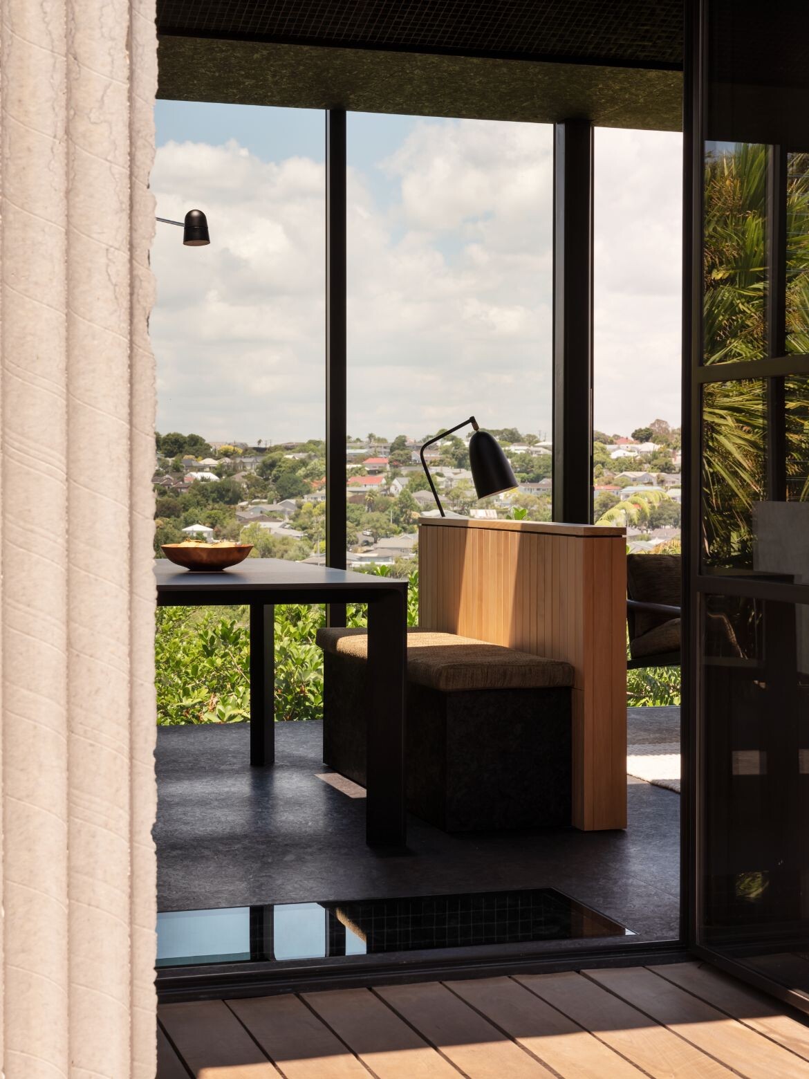
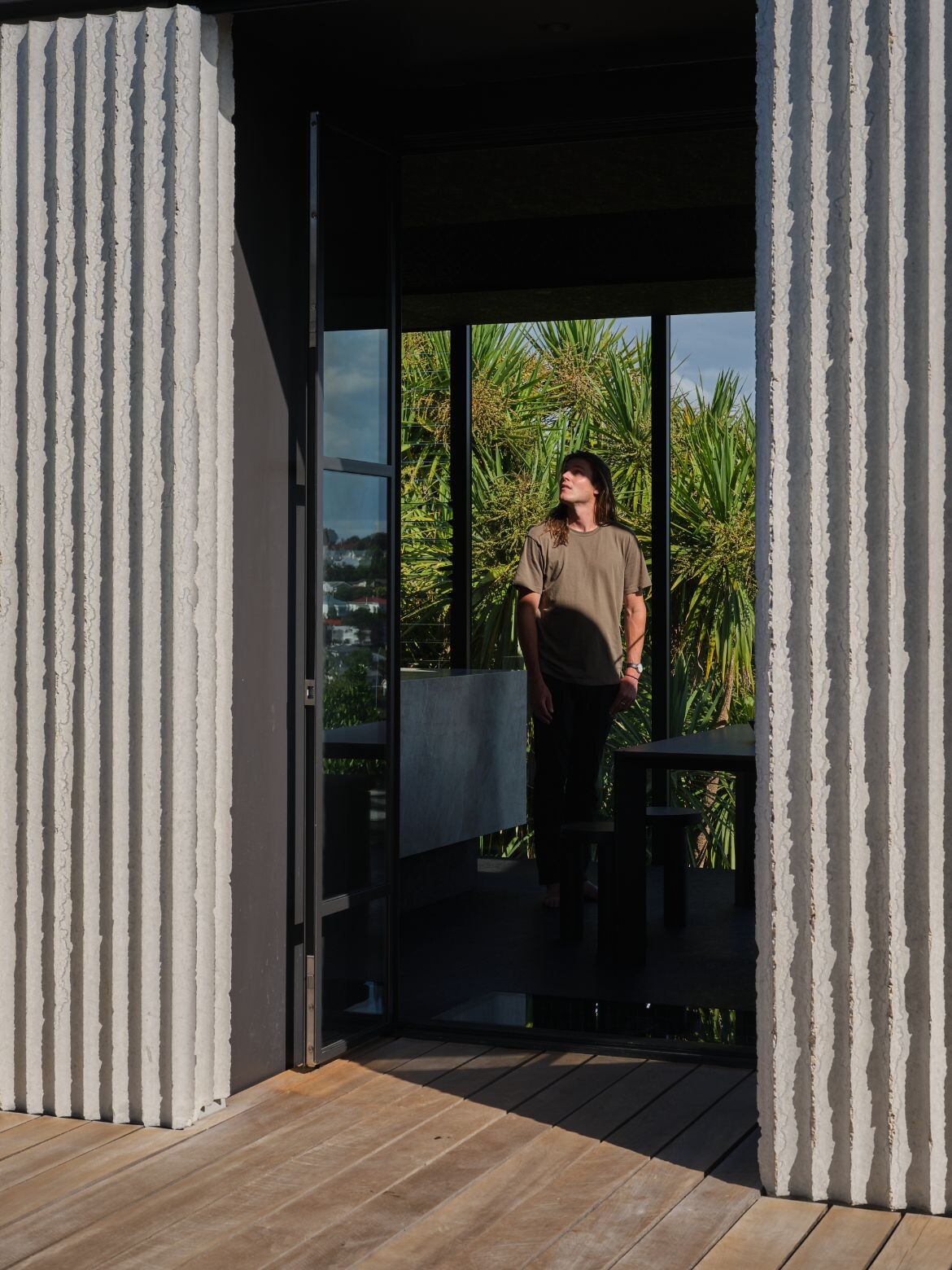
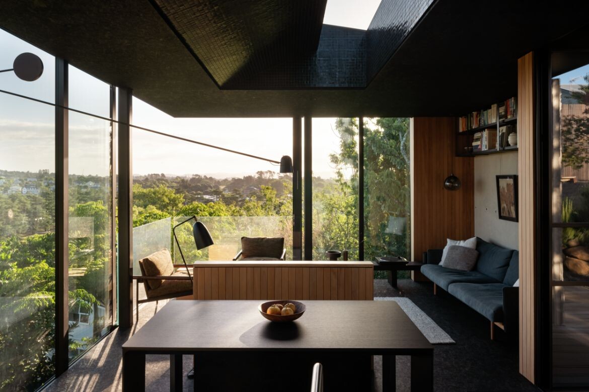
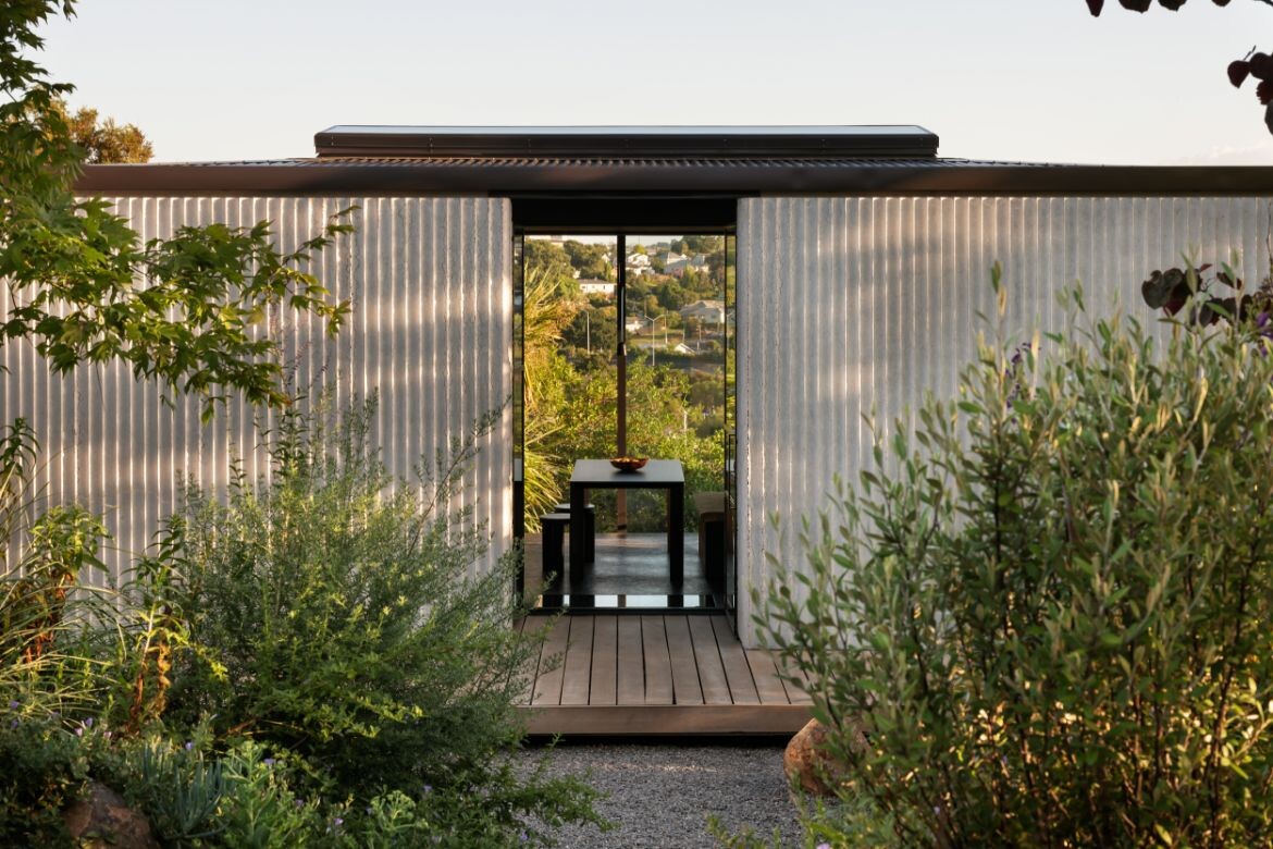
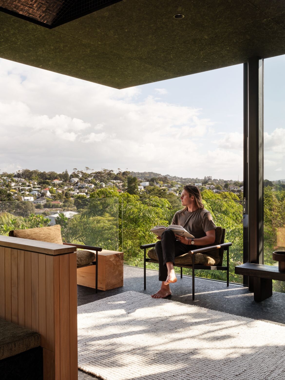
The design engages a gamut of methodologies to increase the experience of space. The upper floor, for example, has a cantilevered roof line that juts over the space. Below this, a pair of concrete walls are joined by two walls of glass with the outer windows operable. A short glass balustrade secures the space without interfering with the view so that when the large glass doors are opened the interior is unencumbered as it visually spills outwards into space.
“It was intentional in the sense that once you came into the house, you’re so high, and above everyone else, you get this feeling of the expanse that’s around,” explains Booth. Compounding this was the decision to remove all horizontal lines from the space by placing all joinery below the floor and all utilities above the ceiling.
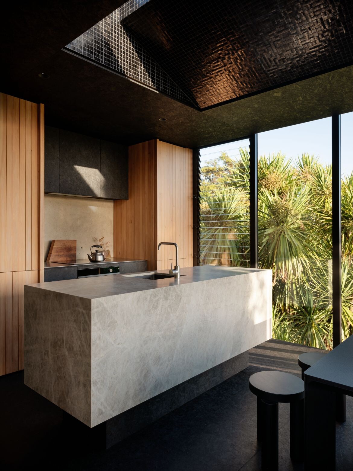
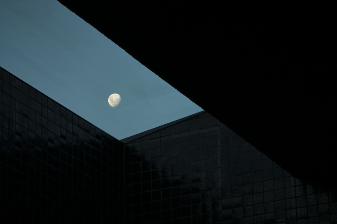
This configuration and the large skylights (which are lined with glossy brass-toned tiles that refract light as it comes into the home) ensure the home is continuously bathed in different qualities of light.
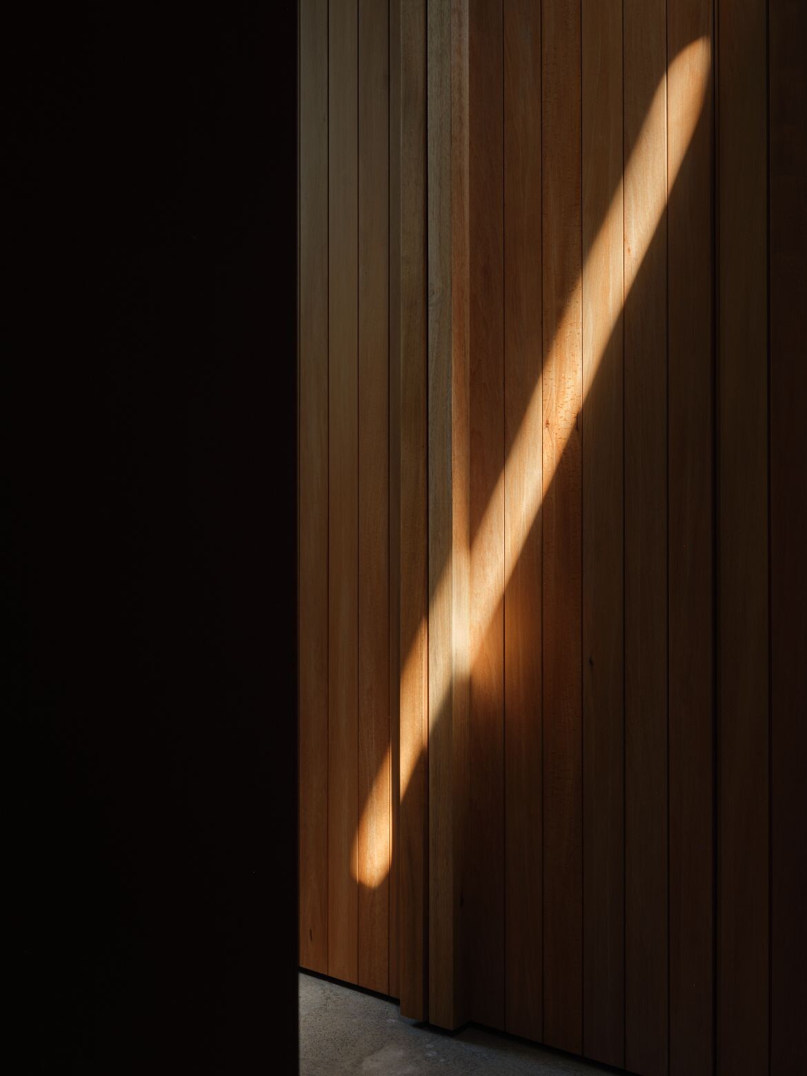
“We decided to insert the light screw, which is a narrow slot in the ceiling that draws light into the living spaces. And it means that we get a lovely play of light through the day, but not overwhelming,” says Booth, who points out that an aperture of glass similarly pulls light into the lower floor. “The front door mat is the width of the door and glass so that it throws light into the bedroom spaces downstairs and in the bathroom.”
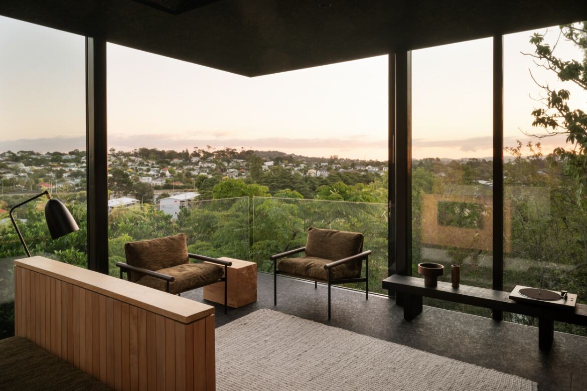
This last piece is important as Booth elected to face the house south: “We made a decision early on to put our back to the sun for two reasons. One, it offered privacy from neighbours. And two, there needed to be a consideration for how to let the sun back in,” says Booth.
Moreover, he points out that many homes that face north are bombarded by light intensity and heat. With Lightly Weighted the opposite could be an issue, however, he has countered this by placing concrete panels on the two elevations to give privacy while forming a heat sink that absorbs the heat of the day and moderates the internal temperature.
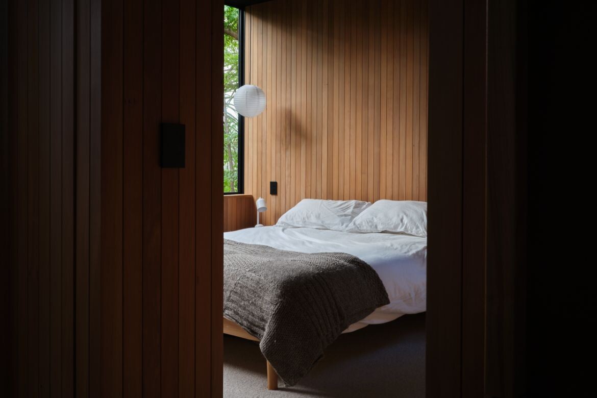
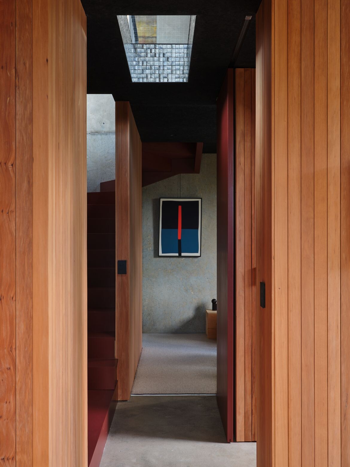
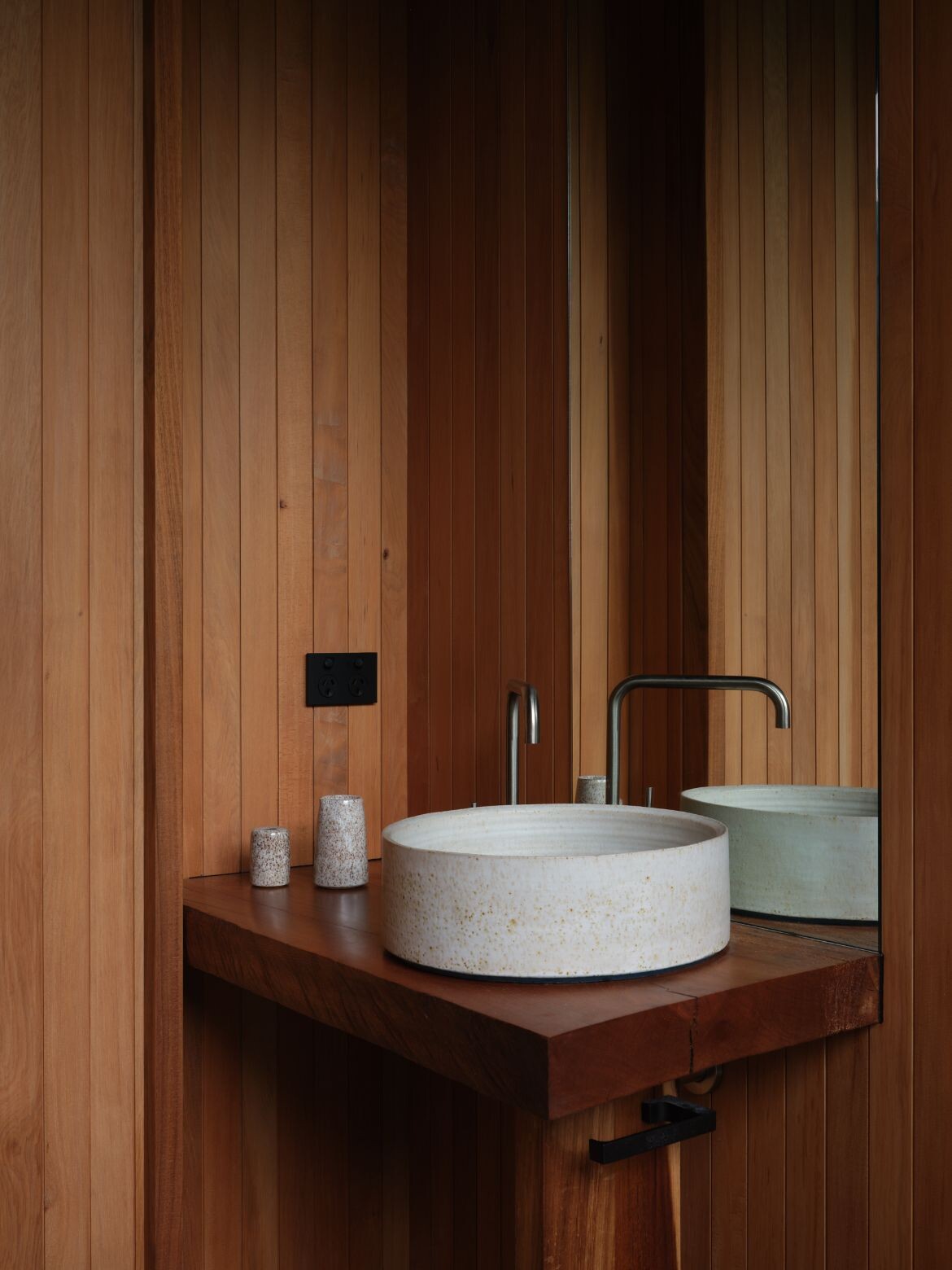
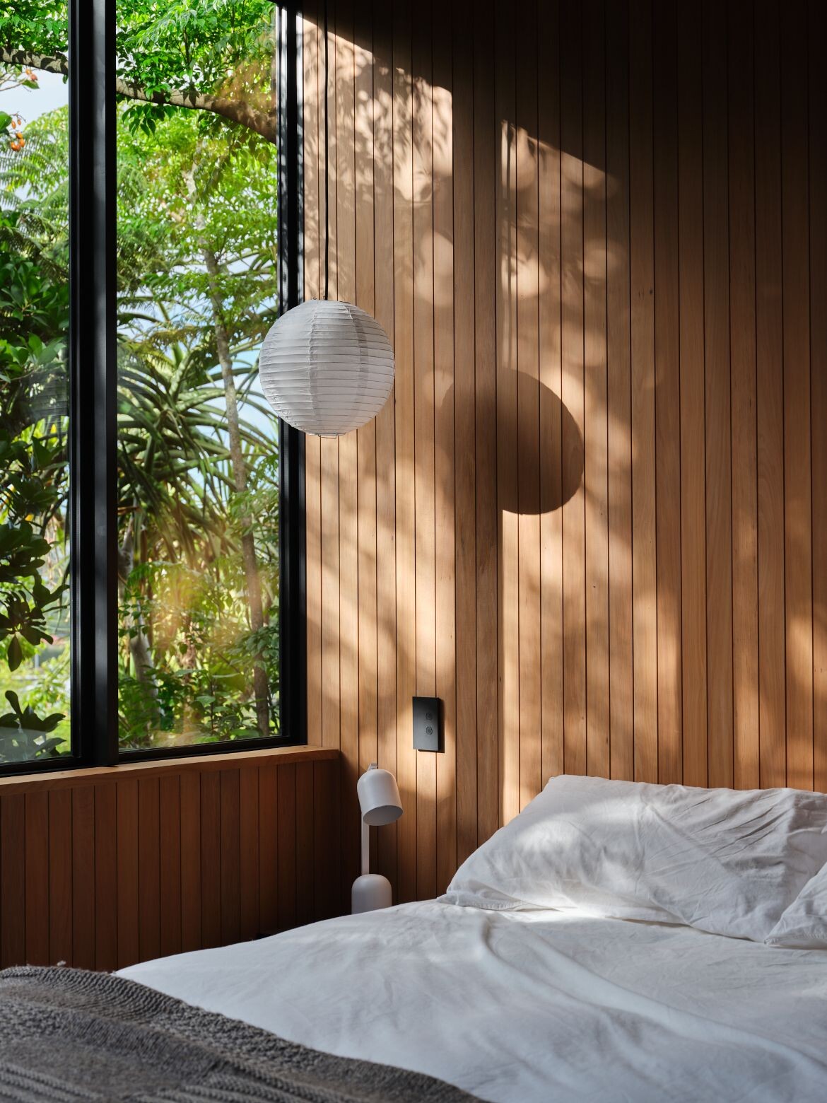
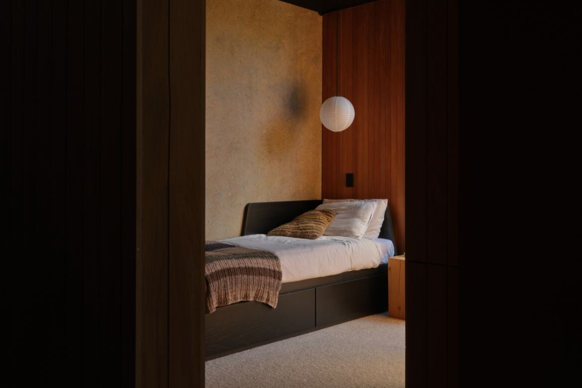
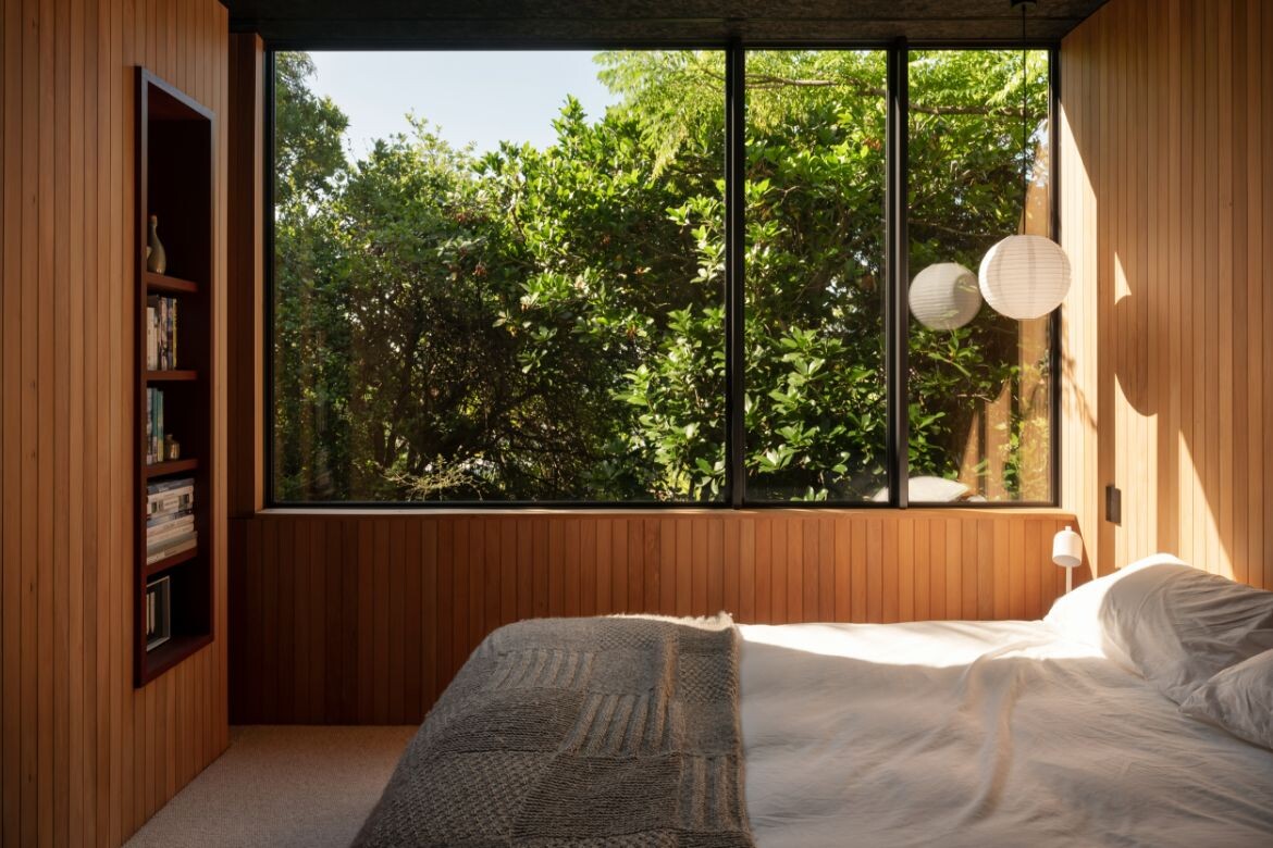
Comprising two bedrooms and a bathroom, the lower floor has a focused meditative relationship with nature that is immediate in comparison with the upper floor which is eyrie-like. The arrangement of the lower floor is clever with sliding doors creating a spatial flow
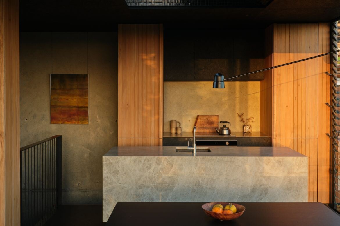
On the upper floor, space is open and delineated by furniture composition with a diagonal light that swivels between the zones without truncating space. The large skylight allows the home to be lit minimally and only as needed. As Booth explains: “That allowed us to have a more intimate light over the dining table, but then we can swivel that out over the island. So it occupies the whole living, dining or kitchen space, depending on where it’s needed, which has been quite helpful.”
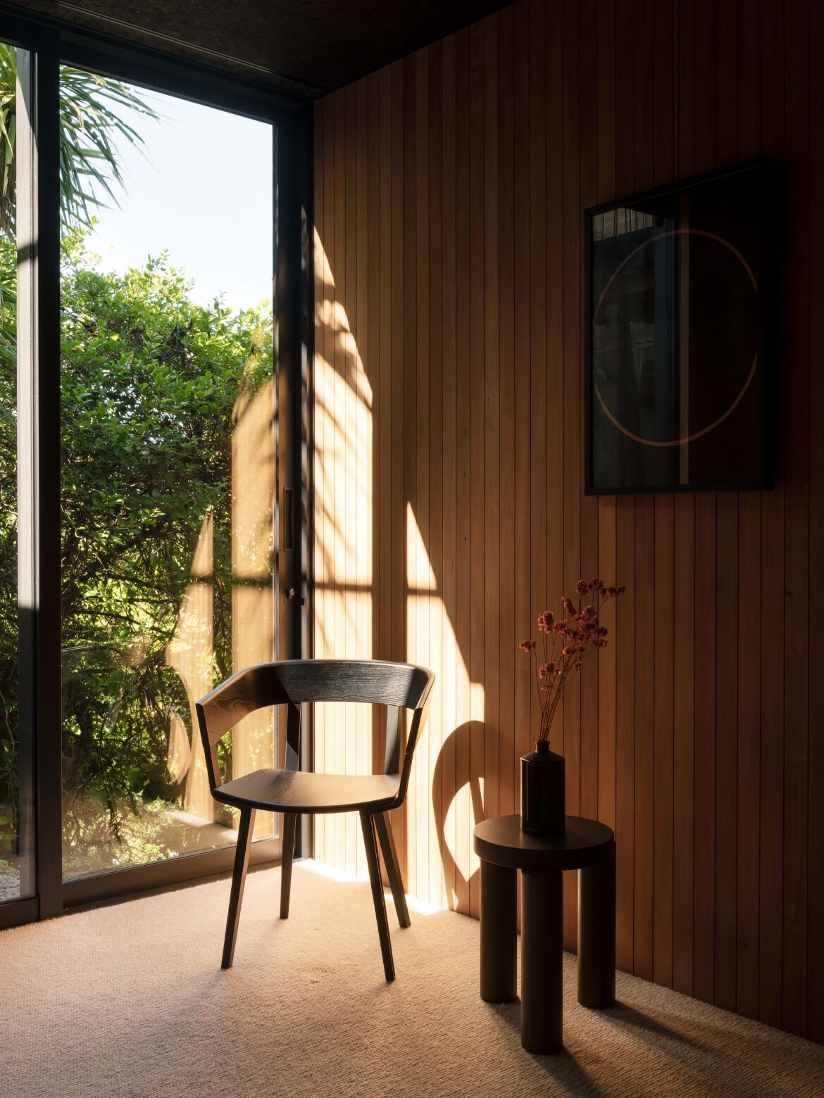
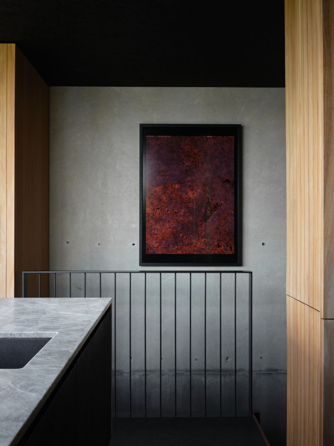
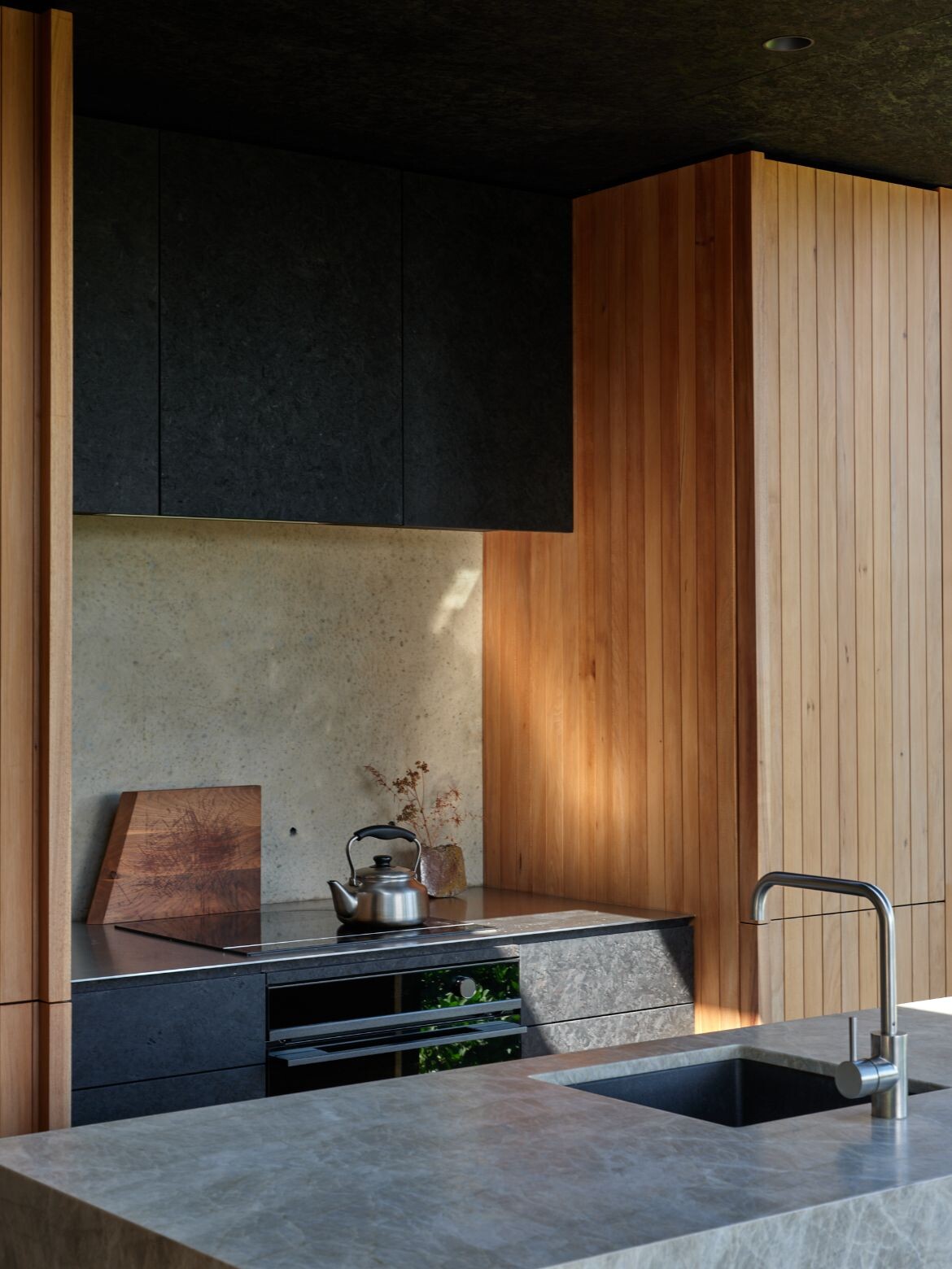
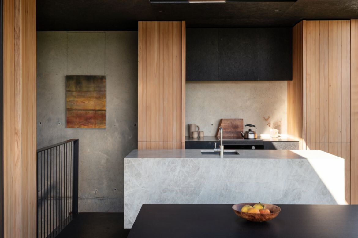
While Lightly Weighted House is a clever and fabulous use of space, these aspects are not what is apparent. Indeed, what strikes is the rich textural variety of materials and the beautiful quartzite kitchen island that sits between everything as a sort of grand monolithic statement.
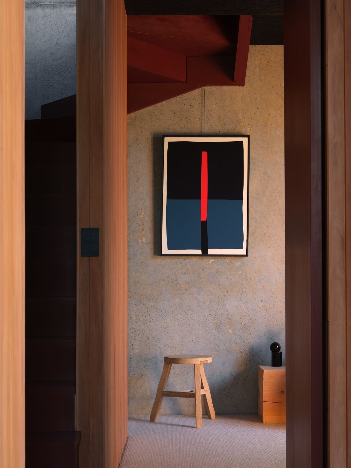
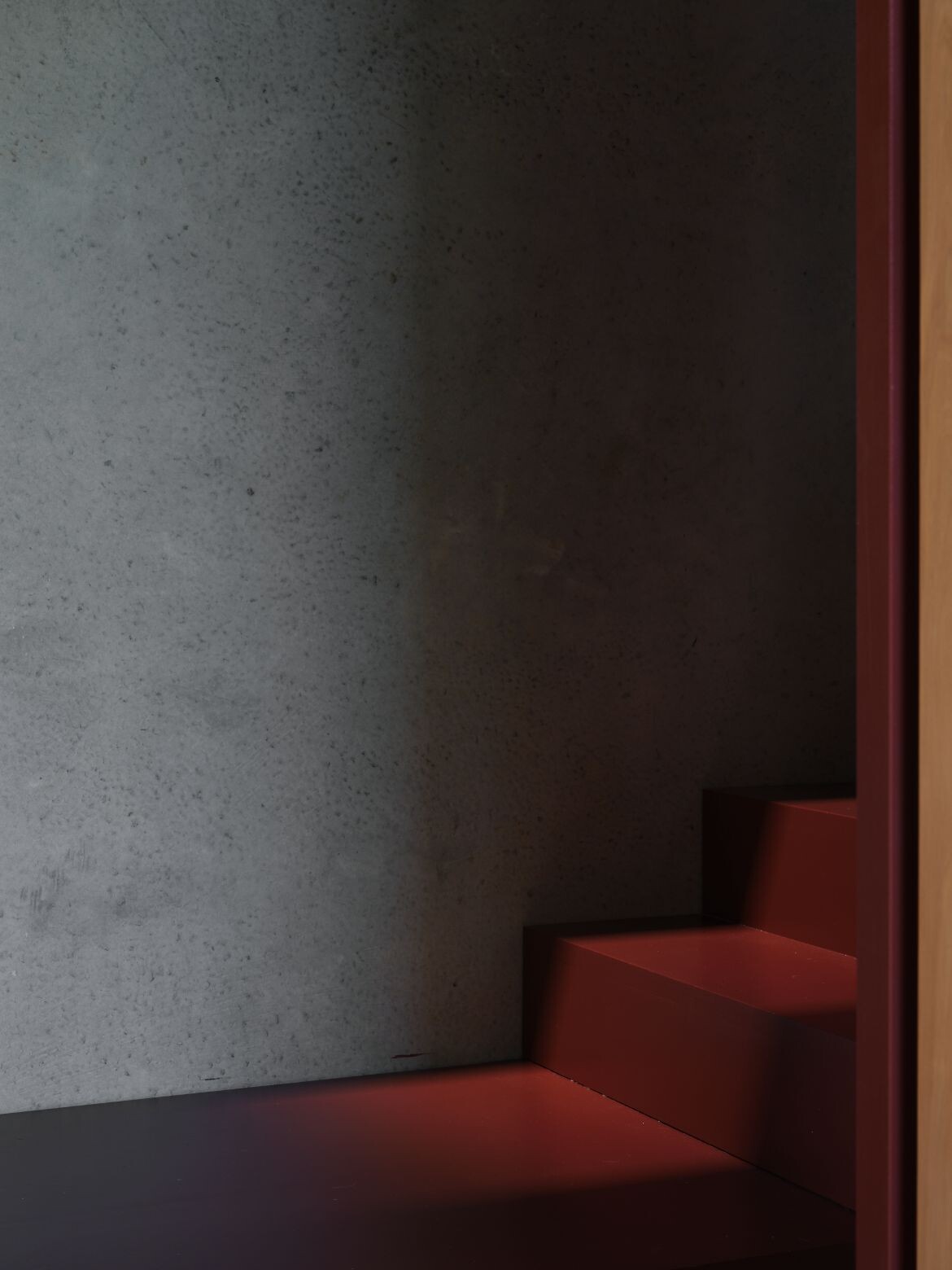
Timber, concrete, stone and glass are layered and expansive with very delicate details of steel, such as the stair steel railing that is so linear as to appear drawn. It is this combination of weight and line, expanse and detail that make the project sing, and all its liveability, while the driver, is elegantly concealed.
Project Details
Lightly Weighted House
Oli Booth Architects – Oli Booth Architects
Photography – Sam Hartnett
Grey Lynn, Auckland, New Zealand
