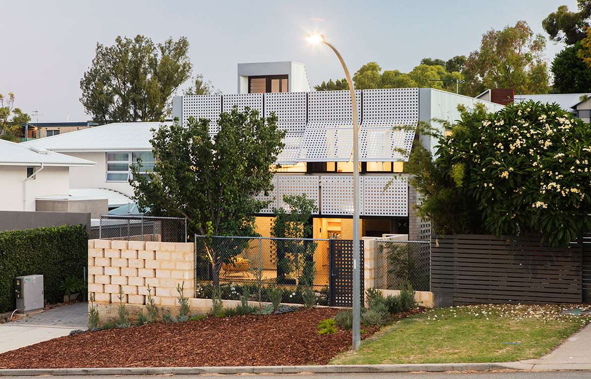
Having a sense of home is important for fly-in-fly-out workers as they transition from one environment to another, repeatedly adjusting their lifestyle and mindset for short periods of time. The client of this house was a single off-shore FIFO worker who wanted a laidback and robust home that would help him adapt to his city-based life every second month. “The home needed to allow a gradual adjustment, a connection with Fremantle and a place that was gentle on the senses, yet also engaging,” says Philip Stejskal. Creating a variety of spatial experiences, the project team designed a home to support the client’s recuperation, solace and grounding.
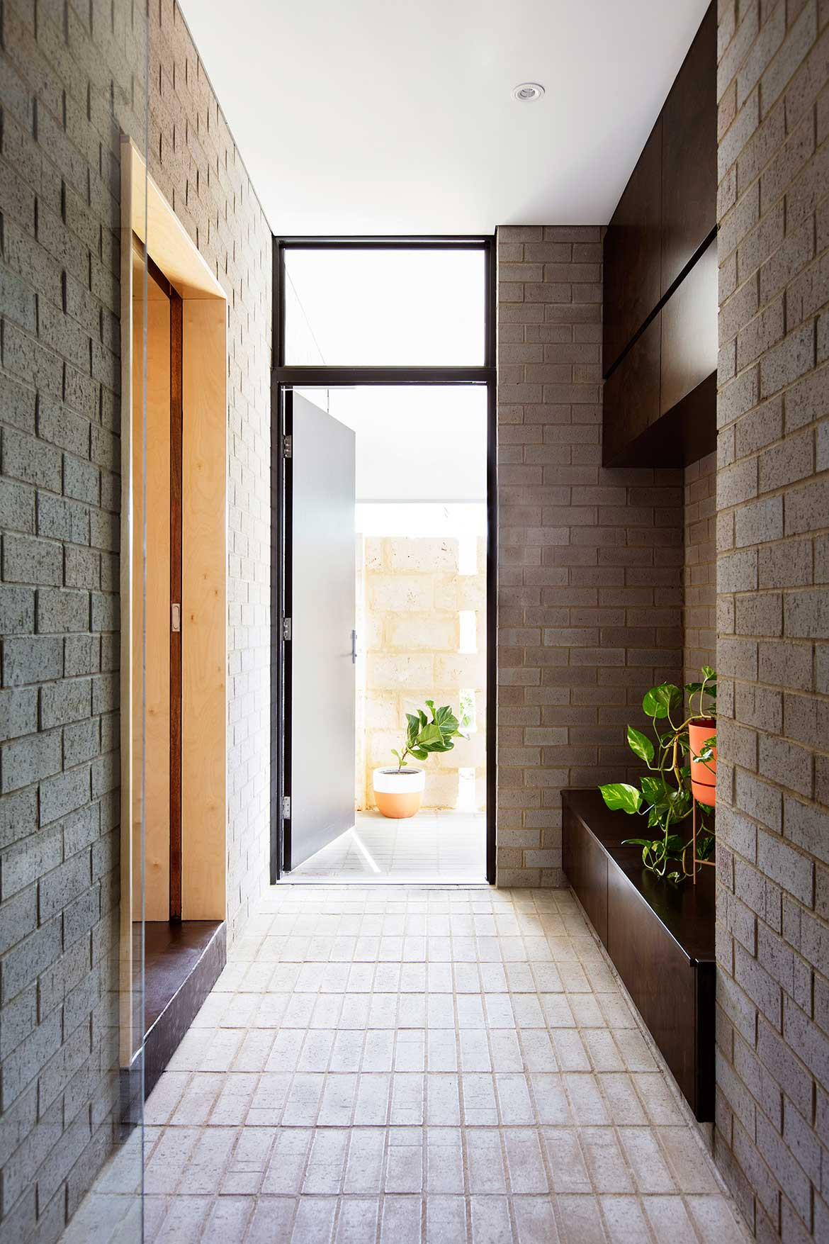
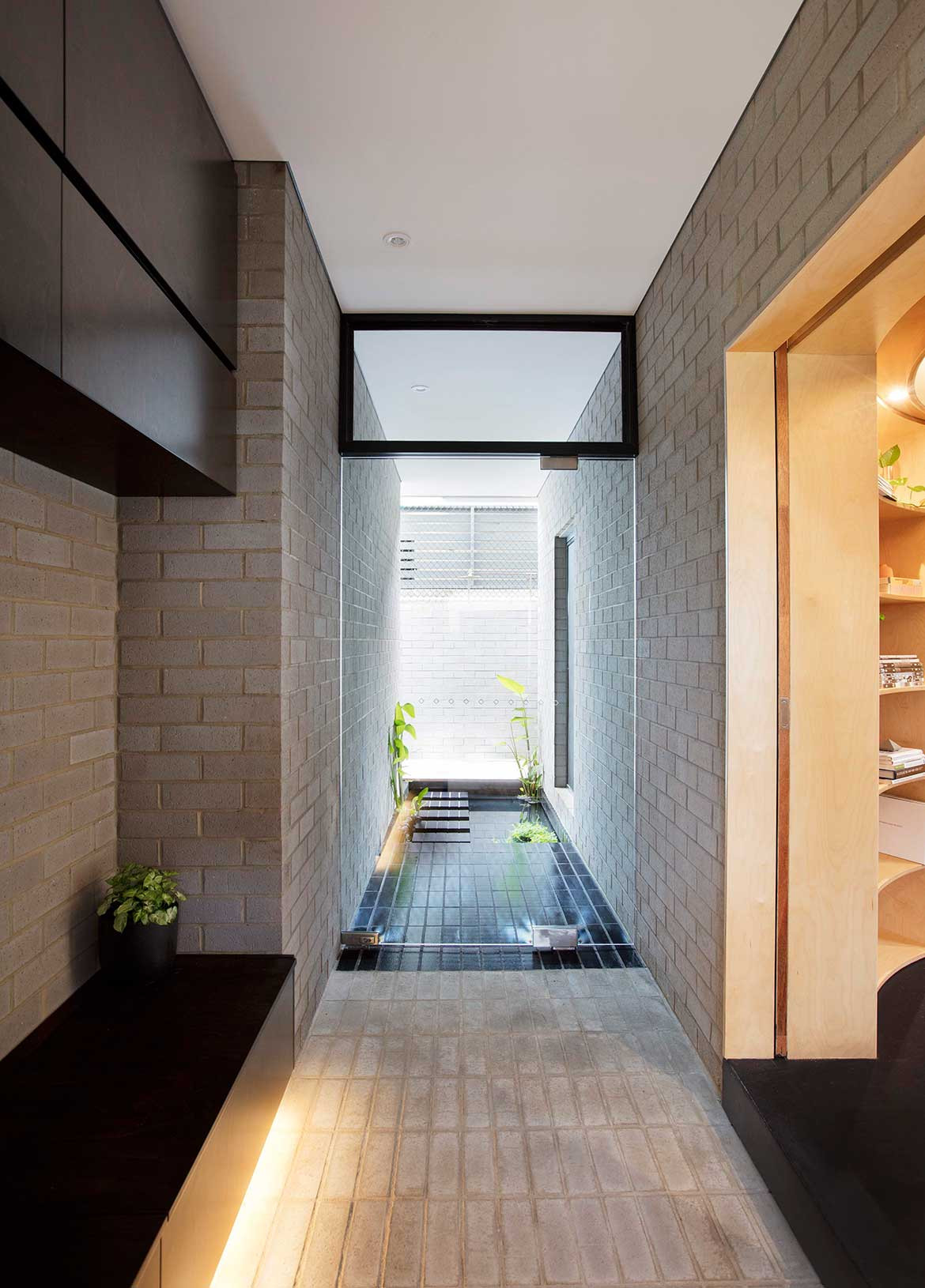
The entrance sequence via a series of compressive and contemplative spaces aids the client’s initial reset. A back-gate entry from the garage leads to a protected porch where the front door opens into a narrow space with brick floor and walls and dark-stained plywood cabinetry. A pond is visible through a frameless glass door in front, and a right turn leads into a low-ceilinged circular library space, which serves as a circulation nexus, linking to the kitchen, living area, bathroom and staircase. “It acts as a compass to reconnect our client with artefacts and memories, before passing through deep thresholds to parts of the house where local living can begin,” says Philip.
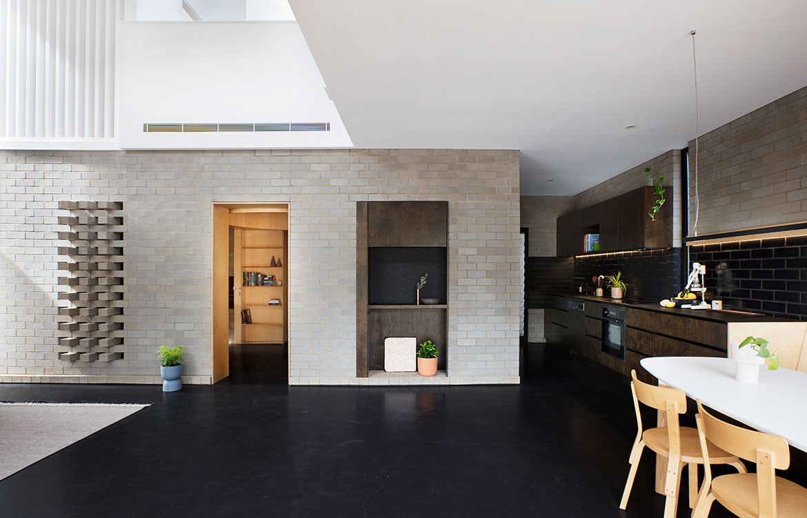
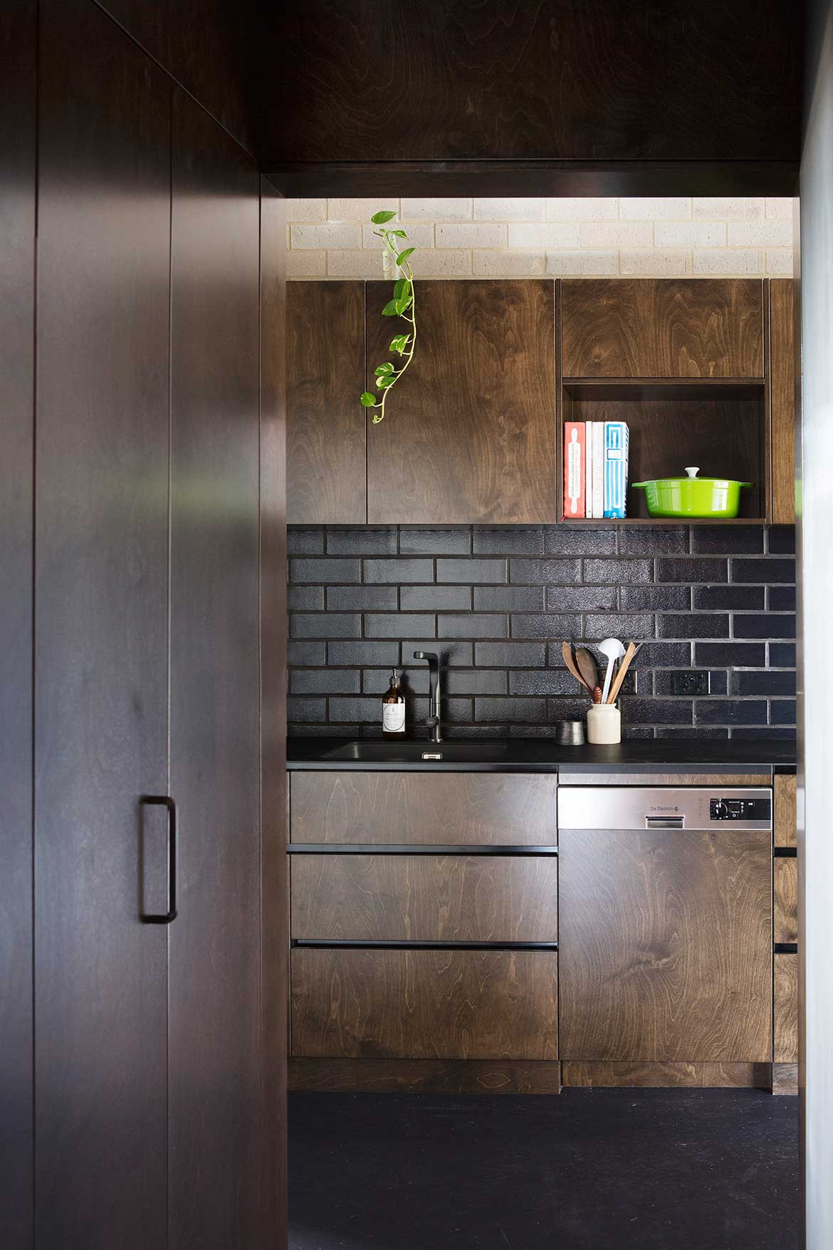
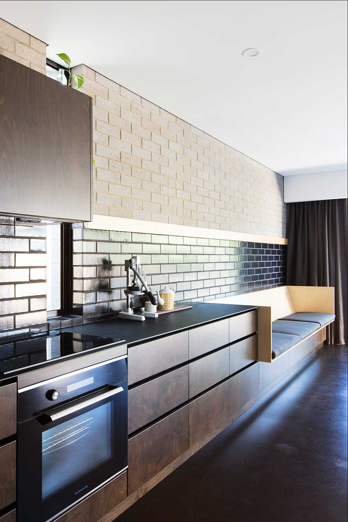
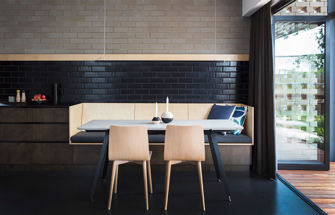
The L-shaped, open-plan kitchen, dining and living wrap open to the front garden and streetscape. The galley-style kitchen is a dimly lit space with dark timber joinery, black tile splashback and built-in dining booth. Sitting beneath a single-storey ceiling, the kitchen and dining area are more dimly lit and intimate in contrast to the light and lofty living area with a double-height ceiling.
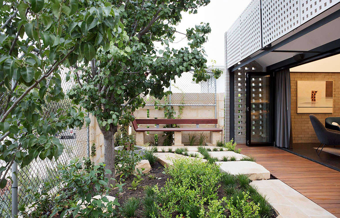
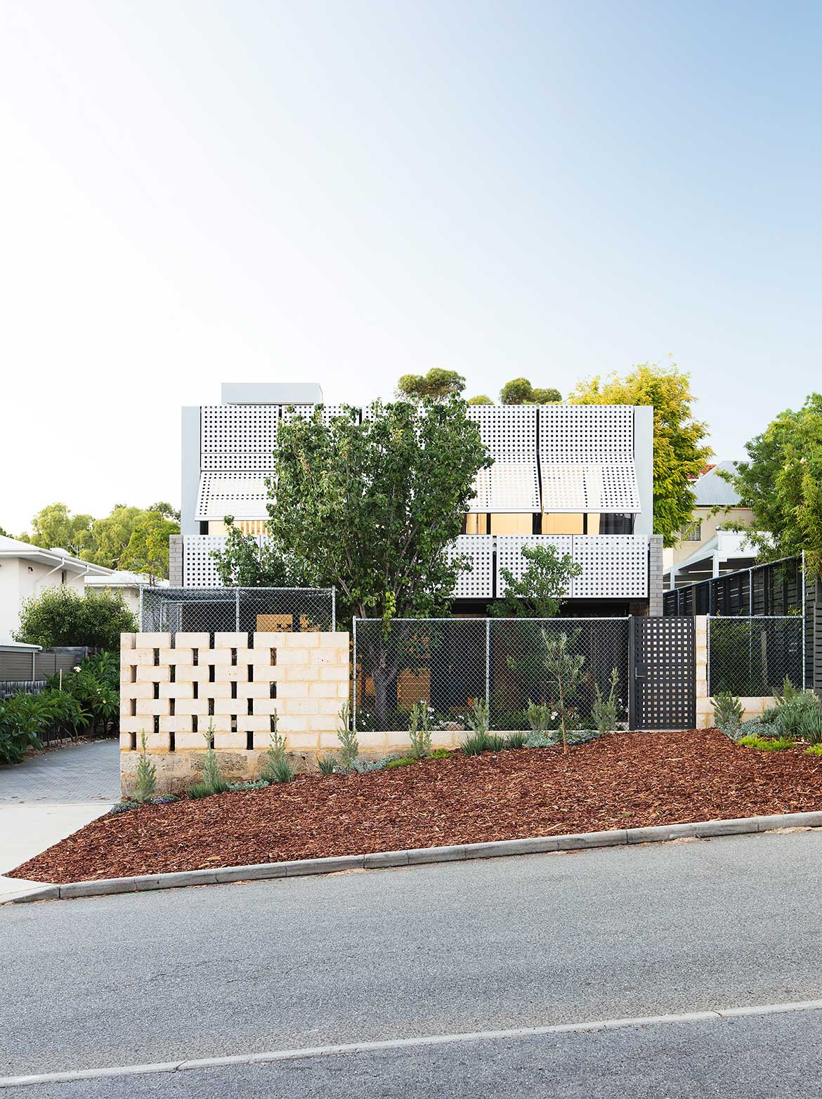
A spiral staircase leads up to the first-floor bedrooms and then to the roof-level terrace. The first floor offers glimpses of the sky and surrounds and north-facing operable lattice screens provide sun protection and privacy. “The screens reference the traditional use of lattice in the area, and an Australian domesticity more generally,” Philip explains. “They are cost effective, decorative, functional and humble and give the building its predominant aesthetic.” Perforated and internal screens also enable glimpses between rooms.
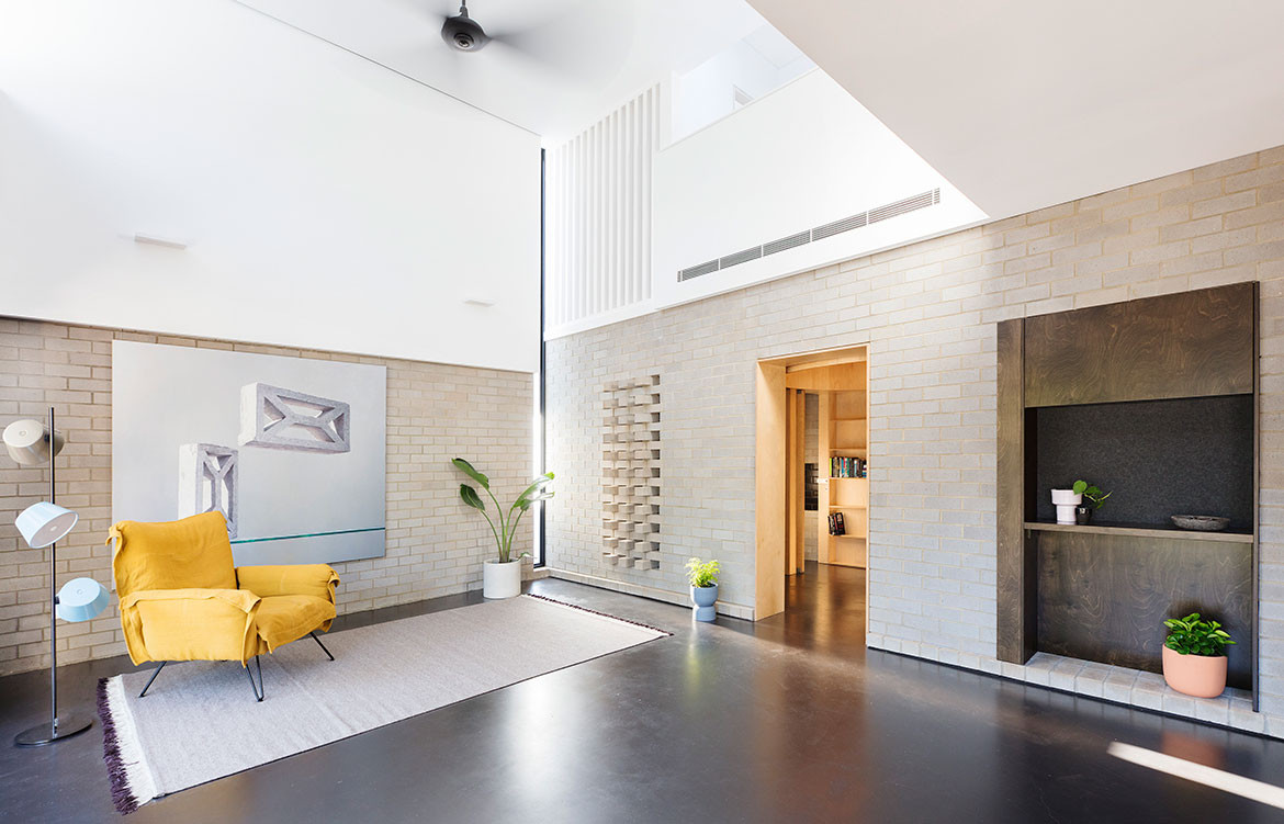
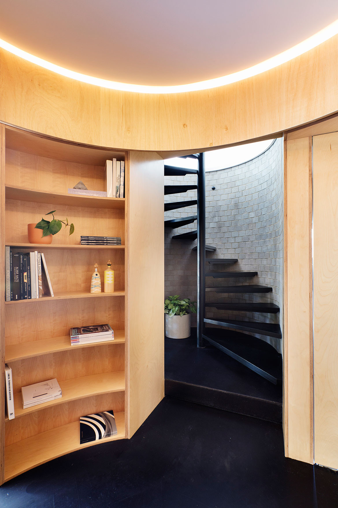
The ground floor is designed for solitude while the first floor offers a more outward-looking approach. The distinction is created through spatial experience and material palette. Robust materials such as face brick, dark-stained timber, plywood and painted concrete on the ground floor offer a rudimentary and relaxed feel. “The client wanted to kick off his shoes, walk in off the beach and have his friends over without worrying too much,” says Philip. Upstairs is lighter and brighter with white walls, white tiles and limed plywood. This differentiation is visible in the living area as well as the spiral staircase where black-stained treads give way to lime-washed treads as they reach the first-floor landing.
The client’s circumstances changed between the start and end of the project, as he became one half of a couple and shifted his career. “It then became a building that was comfortable and seamless to live within, offering a suitable hardiness with ample amounts of spatial delight,” says Philip. Because no matter the circumstances, there’s no place like home.
Philip Stejskal Architecture
architectureps.com
Photography by Bo Wong
Dissection Information
Metal Roof Sheeting and wall cladding from Lysaght Bluescope
Ceiling fans from Bigass Fans and Hunter Pacific
Hardilattice Screen Panels
Plywood paneling from West Coast Panels & Veneers
Face brick walls and paving from AustralBricks
Bi-fold doors from Hume
Natural finish timber from Sikkens
Black-stained timber from FeastWatson
Bathroom tiles from Original Ceramics
We think you might also like House A by Whispering Smith
