The Italian word piccolina translates to ‘little one’. This was what Sandra Foti’s grandmother called her when she was growing up and, years later, it was what Sandra called her first gelato store in the inner-north Melbourne suburb of Collingwood. It is a name that honours family and memory, and harks back to a time when Sandra first fell in love with traditional Italian gelato.
It is that sense of time-travelling that Hecker Guthrie wanted to capture when engaged to design the third iteration of Piccolina in the more coastal Melbourne suburb of St Kilda. It is here, by the sea, that the existing brand identity was able to fully embrace the store’s Mediterranean heritage, paying homage to the client’s roots and a very Italian sense of la dolce vita.
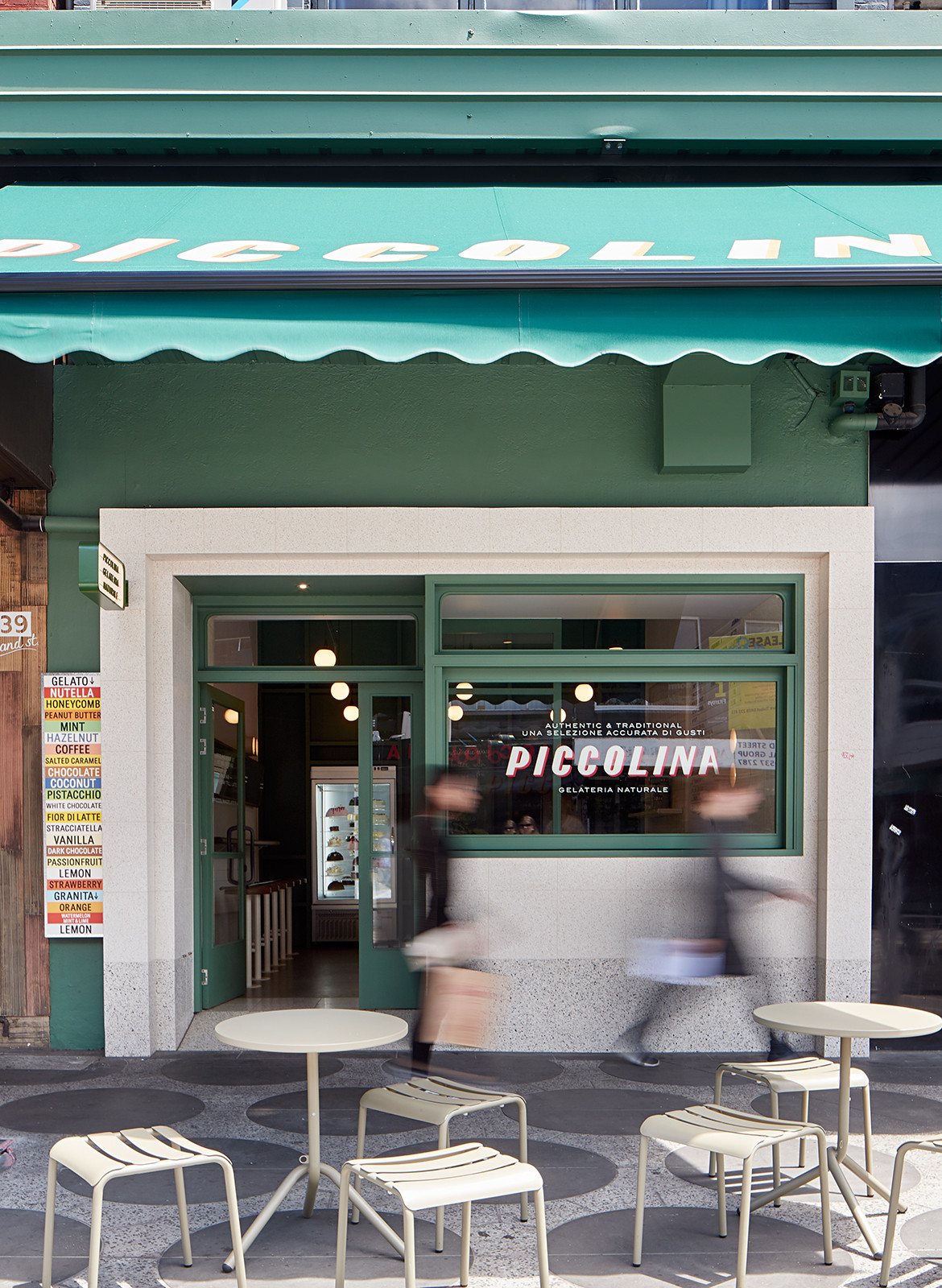
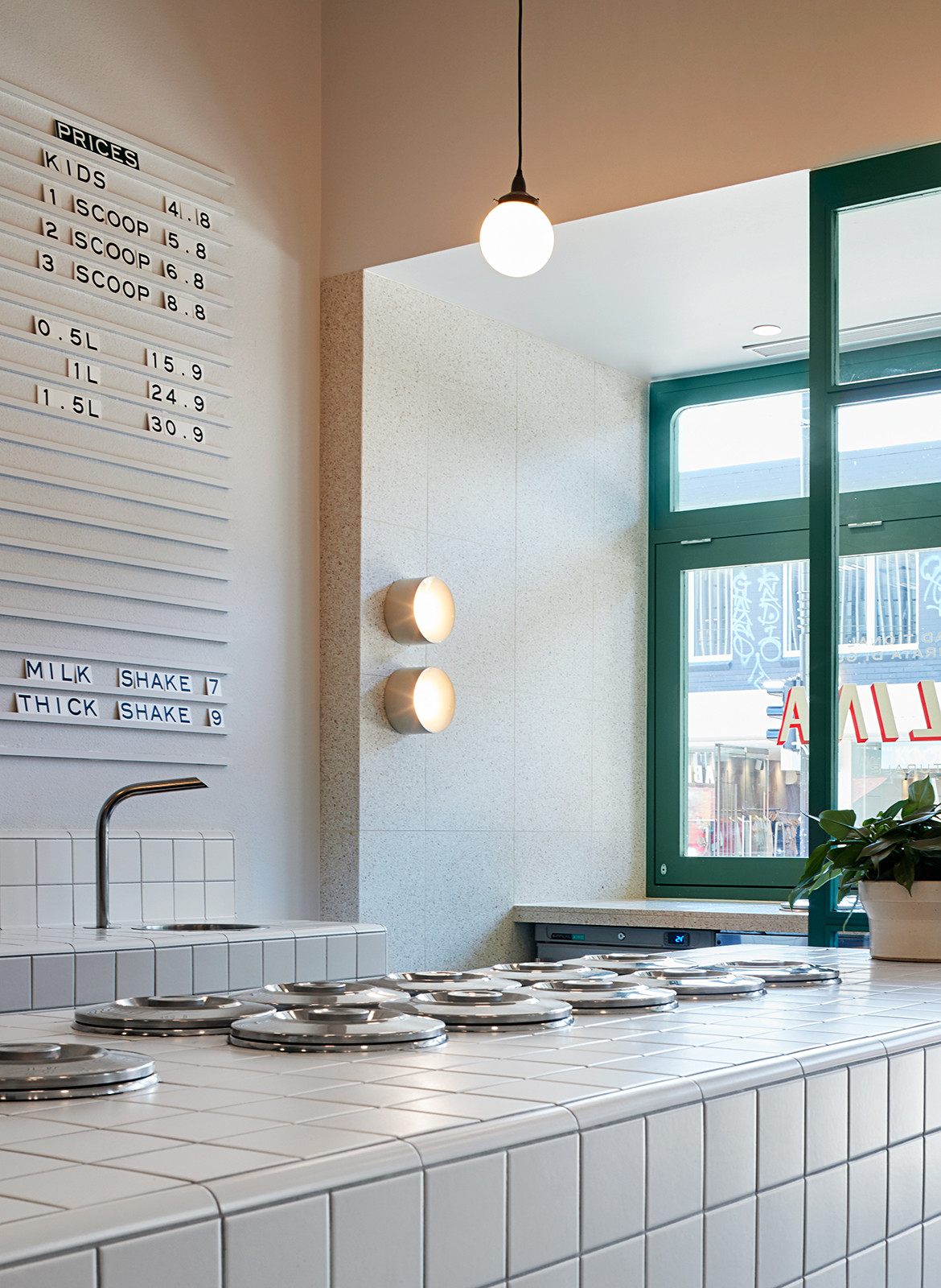
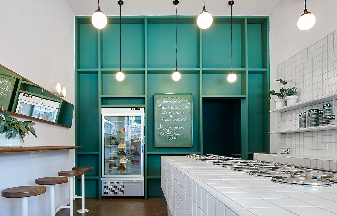
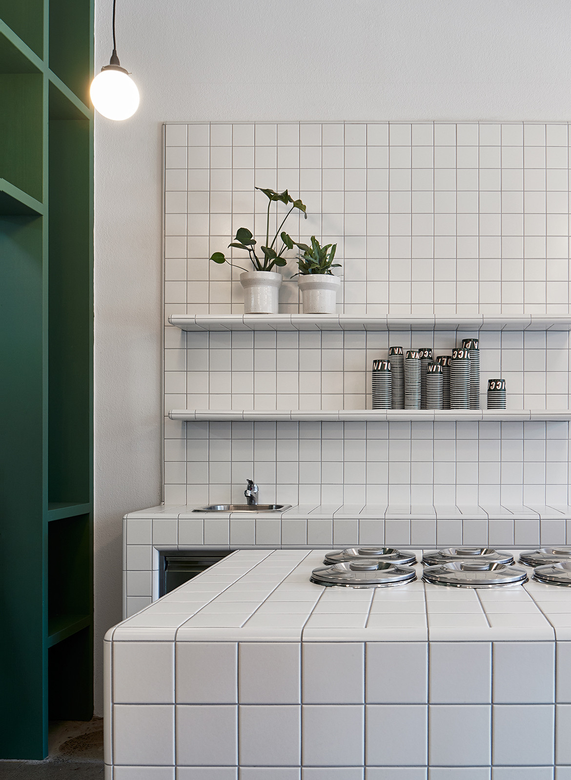
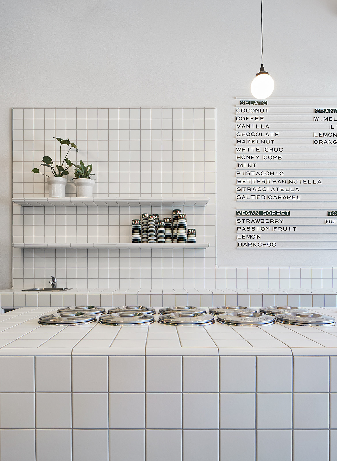
Walking into Piccolina is like walking joyfully back into the mid-1950s; a version of the decade that is stripped down to the essentials: sun, sand, colour and community. The new St Kilda store is washed in a mid-century palette of sea green timber woodwork and internal joinery. This saturation is balanced with more subtle elements that nonetheless speak specifically to an era: square-cut warm white Italian tiles that cover serving areas and soft curves etched into the store’s interior detailing.
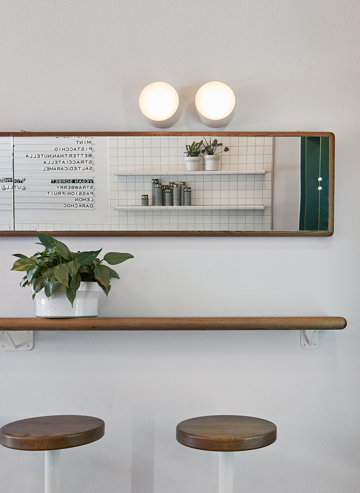
In fact, a curved counter is the only truly prominent design feature of the store. Easily seen from the street through the wide-open entrance, the central counter – covered in tiles and punctuated with pozzetti, the sunken metal containers traditionally used to store gelato and regulate its temperature – welcomes in passers-by from the street and ushers them immediately into a ceremony of sharing. This wide and white-tiled space is what fills the space and catches the eye, keeping gelato at the centre of the experience. Other thoughtful details support this hub and fill out the theme: sculptural feature wall lighting from Volker Haug, green timber portal frames, touches of crisp terrazzo, a simple seating arrangement of timber stools against a mirrored wall, and a minimal menu design of individual letters placed on white railings. Although the shop is small – a hole-in-the-wall gelataria that you might find in Florence – it feels spacious because of bright, fresh details that rejoice in a theme without overpowering the senses.
Hecker Guthrie
heckerguthrie.com
Photography by Shannon McGrath
We think you might also like High St Society by Ricci Bloch Architecture + Interiors
