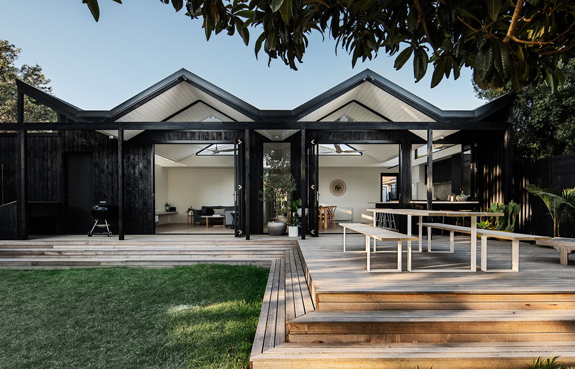
Located in a low-lying street in Highett, (two kilometres from Port Phillip Bay in Victoria), Pleated House by Megowan Architectural references “the simple and unpretentious built forms and materials” in the Melbourne neighbourhood. “In our minds, the design straddles the fine line between that casual context, while still making a design statement,” explains Christopher Megowan, director of the Melbourne-based practice.
Christopher is referring to a house that strikes a balance between honouring the past and architectural statement-making. “Given that one of the clients was a roof plumber by trade, a simple flat-roofed box out the back just wasn’t going to be an option,” he says when asked about the striking roof form. The folded structure of the roof, which undulates over the extension, makes strong reference to mid-century Modernism. “The house references [the work of] Donald Wexler, Barry Berkus, Pierre Koenig, to name a few and the iconic bathing boxes which dot Port Phillip Bay,” explains Christopher.
The folded structure of the roof, which undulates over the extension, makes strong reference to mid-century Modernism.
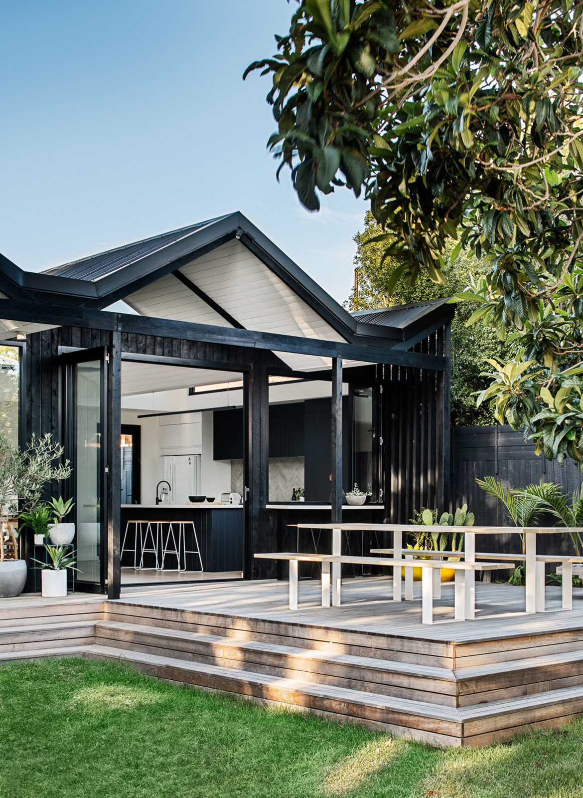
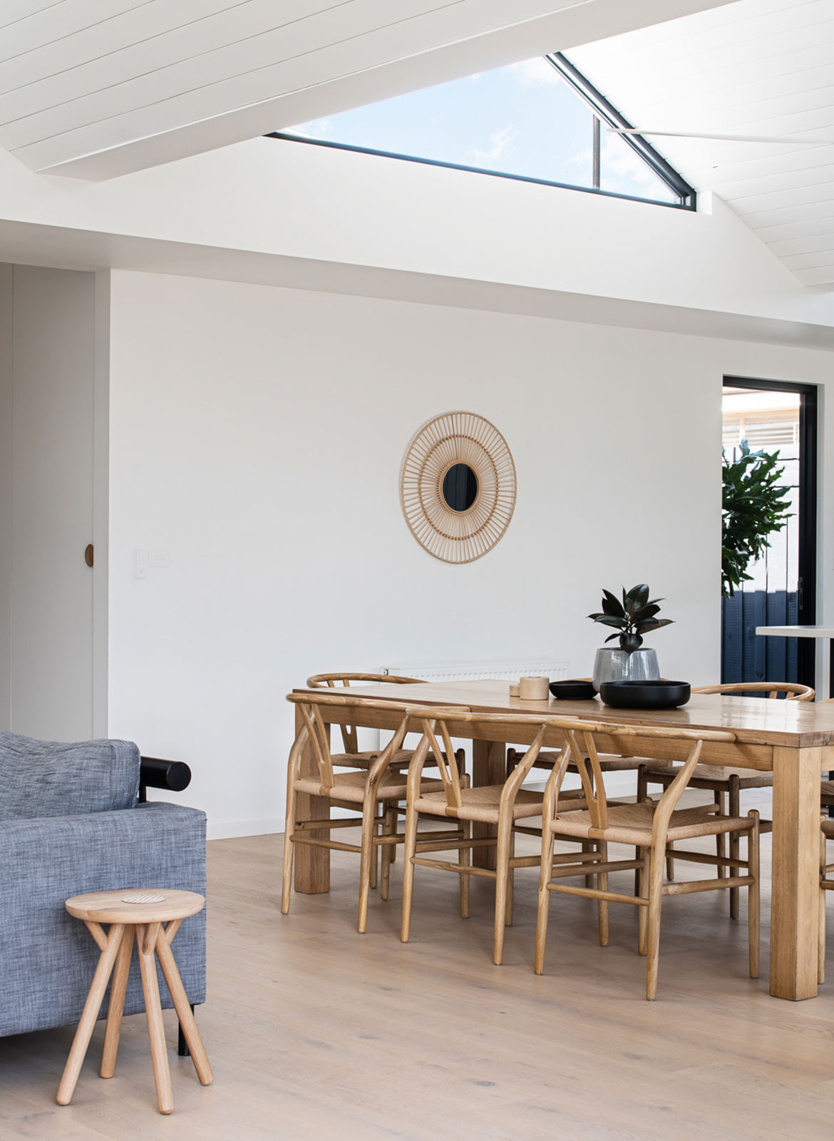
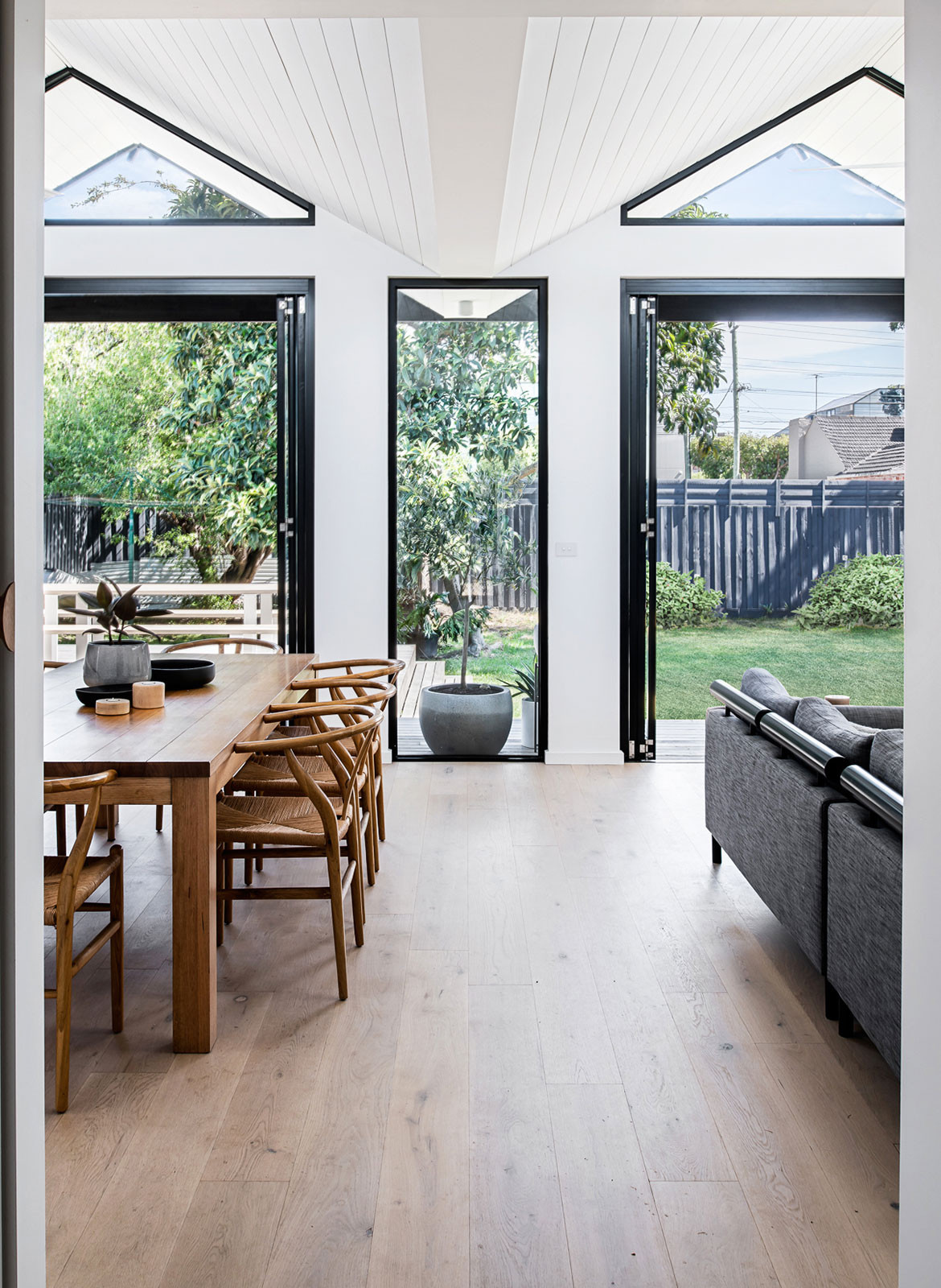
The folded roof was also utilised to allow for six clerestory windows that draw light deep into the living spaces of the extension, addressing the daylight issues that resulted from having a South-facing rear yard. Structurally, a large box gutter separates old from existing and conceals unattractive elements, whilst the central valley frames a view to the yard.
“The design straddles the fine line between [a] casual context, while still making a design statement.”
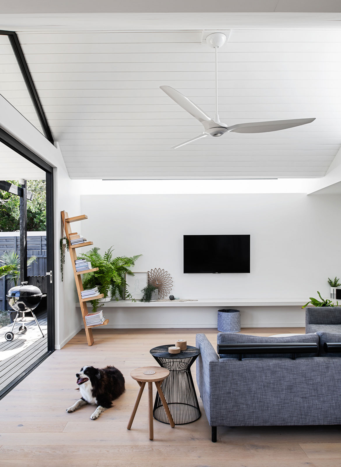
The clients – “a design-aware couple with a border collie” – requested a relaxed, refined and budget-conscious approach to effectively transforming their “light-starved weatherboard”. “The house was going to be built by one of the client’s himself, and the budget was almost half of what we would normally allow for a house of this size, so it wasn’t going to be a project filled with hundreds of expensive or tricked out details,” says Christopher. “Instead, it was about creating a couple of impactful gestures and working carefully within the existing conditions; and even reusing many items that the client’s already had.”
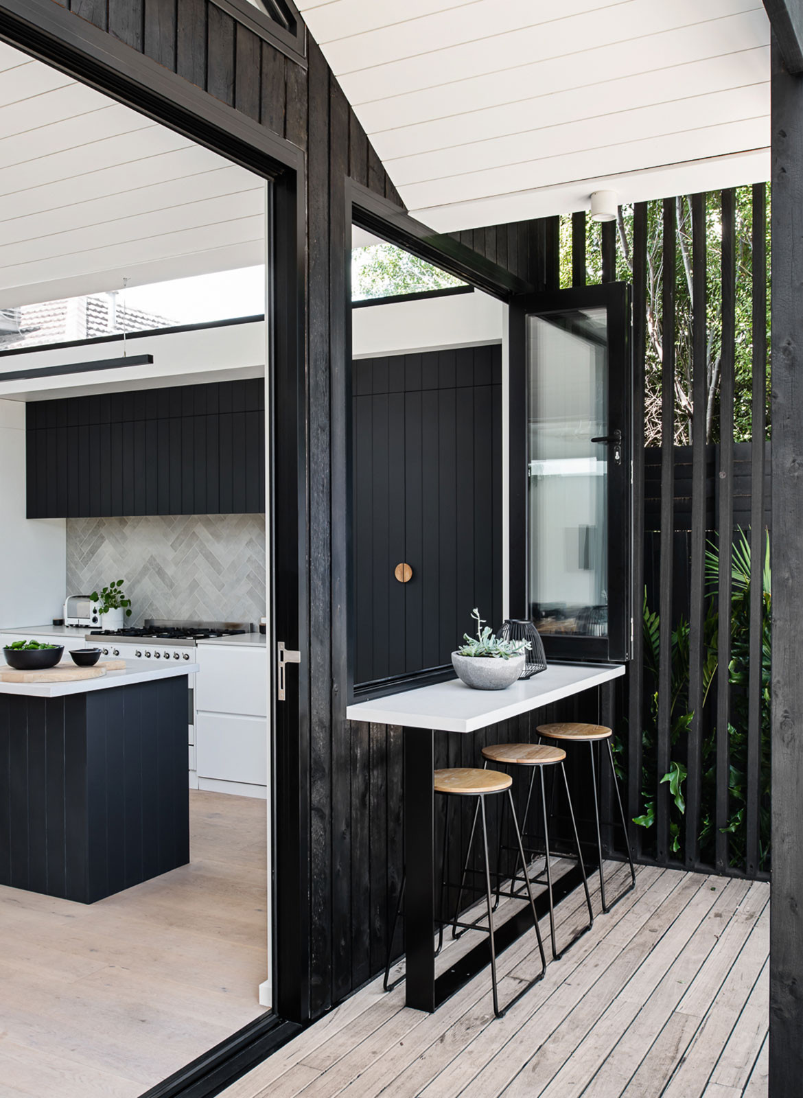
From a layout perspective, the architects re-worked and re-purposed the front three rooms of the existing house by overhauling the original bathroom and converting the existing living room into a master suite with ensuite and walk-in-robe. A direct connection to the garden and living areas was created by aligning the centre of the rear pavilion with the existing front door and a new garage for roomy storage was created and connected to the house via a new versatile space housing the laundry, storage and a mud room.
Megowan Architectural’s extension is predominantly clad in charred and oiled cypress, shiplap, a finish achieved by the client during construction. “Given that the extension is to a weatherboard house, the lightweight nature of the shiplapped timber cladding seemed like a logical and thematic choice from the get-go,” says Christopher. “The charred timber was chosen to relate to, but also contrast with, the existing weatherboard. Elements of the charred cladding were brought into the verandah structure and garage extension at the front of the house to create a link between the front and back yet still differentiate between old and new.”
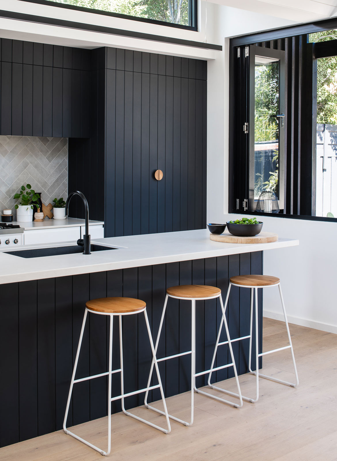
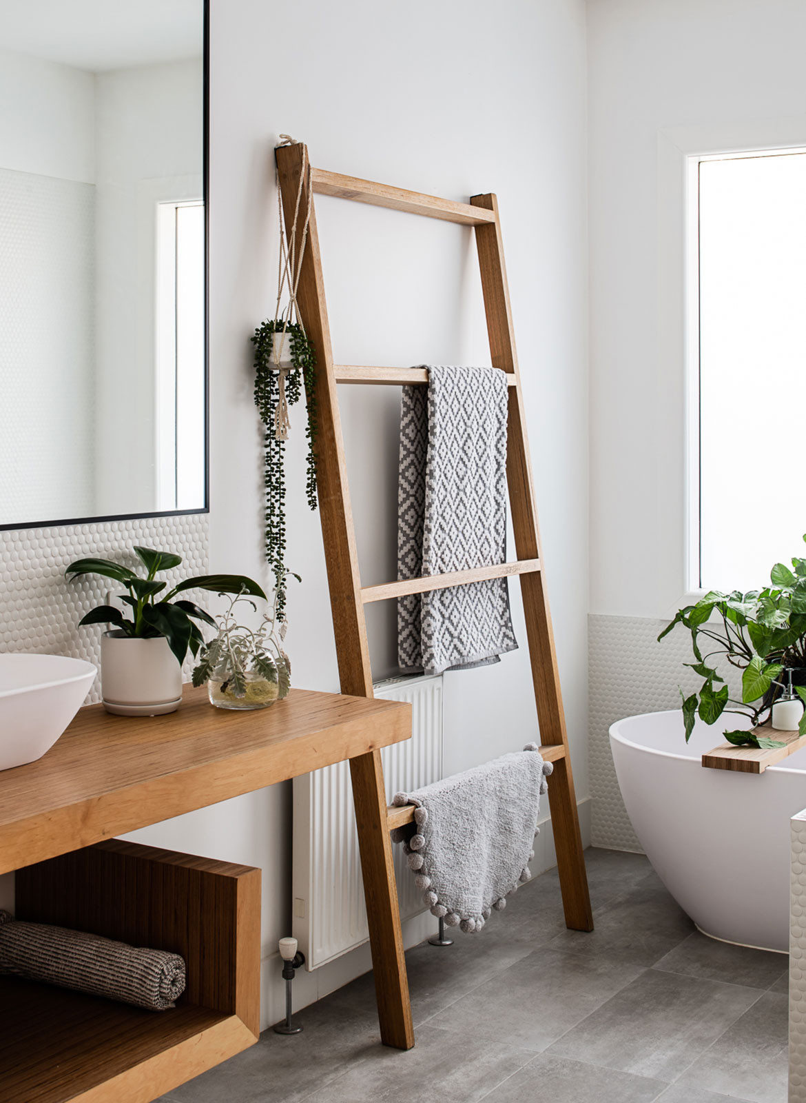
The material palette and styling (credit here goes to one of the clients Claire Taffe, who is an interior stylist), was carefully considered from a budget and aesthetic point of view. For example, the timber grooved ceilings and kitchen joinery create a connection between the interior and the external cladding and to the Silvertop Ash used for the external decking (which has been allowed to grey to a neutral silver.) The main bathroom was designed around a towel ladder that the client had constructed and offset by sparing use of basic porcelain tiles and penny rounds and a custom cross-laminated vanity and bath caddy. The approach ties in with the architectural restraint and it’s worth noting what can truly be achieved within a tight budget and carefully curated design parameters.
Megowan Architectural
m-a.com.au
Photography by Tom Blachford
Dissection Information
Belgium Stone tiles from National Tiles
Oak flooring from Tongue n Groove
Appliances from Smeg
Table from Mark Tuckey
Roof from Colorbond
“[The project] was about creating a couple of impactful gestures and working carefully within the existing conditions.”
We think you might also like The Art Of Charred Cedar: Shou Sugi Ban
