Something of an establishment in Sydney, Poepke first opened the doors to its Paddington boutique back in 2001. Since then the ground floor of the quaint terrace that is 47 William Street has been home to an ever-changing, always-stunning collection of fashion and lifestyle brands from around the world, personally curated by the store’s directors, Juliet Kember and Nicola Lie. Over the course of that time, the space had been organically adapted – as they often tend to be – to suit Juliet and Nicola’s needs as Poepke evolves and grows.
After 18 years of a somewhat sporadic approach to spatial and experiencial design, Nicola and Juliet couldn’t shake the feeling that the space wasn’t coming together as well as they would have liked. Turning to MAKE Creative, Poepke and its directors embarked on a journey of transformation. While the budget for the store refurbishment was tight, the brief was open and the trust between client and designer was strong. “Nicola and Juliet gave us great freedom, and encouraged MAKE to explore an experimental solution,” Antonia and Patricia explain, “[they said that] they were open to an unconventional, even weird, approach.”
The decision was made to think of the project not as a complete refurbishment, but rather as a series of strategic instalments.
The MAKE Creative team didn’t have to be told twice, truly embracing a playful, experimental and collaborative approach to design. Observation, store visits, and role-play exercises helped to identify key insights into how the space was used, what about it was working well, and what was not – some of these insights were even news to Nicola and Juliet. “In its previous incarnation, Poepke felt like three separate spaces,” Antonia and Patricia recall, “with the back room feeling like an afterthought.” In addition to the disjointed flow of the space, core problems to solve included poor lighting, an awkward point of sale location, and a lack of storage downstairs on the shop floor.
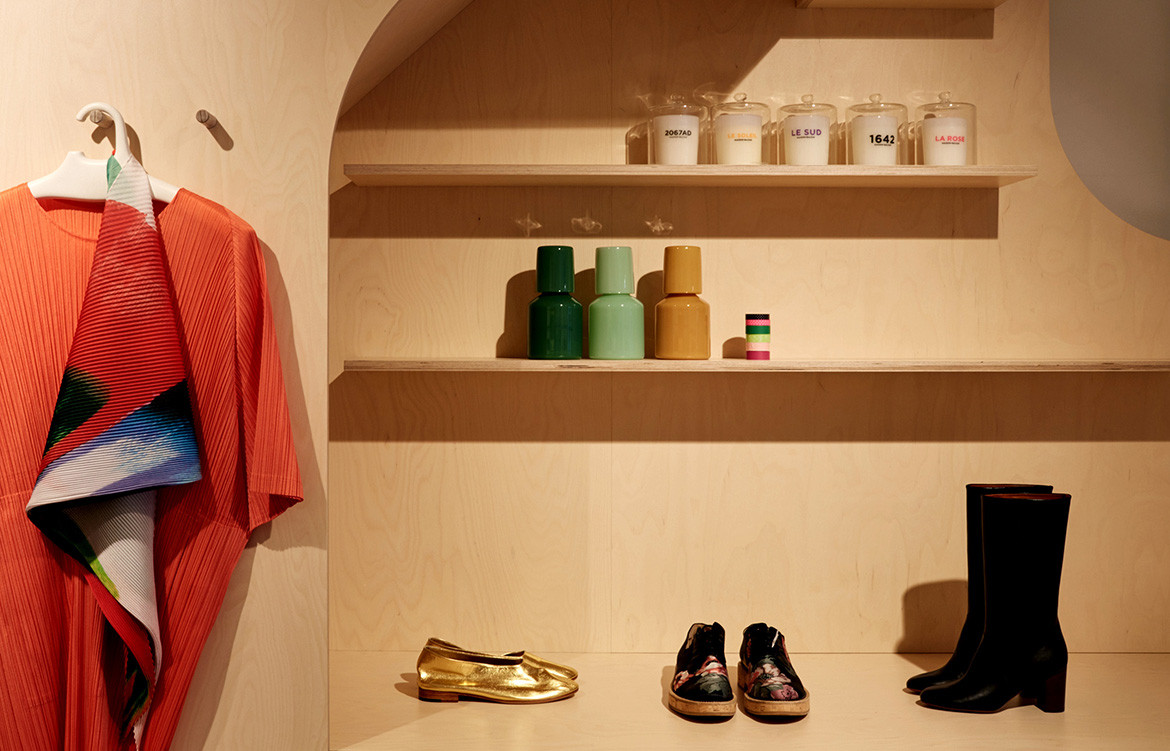
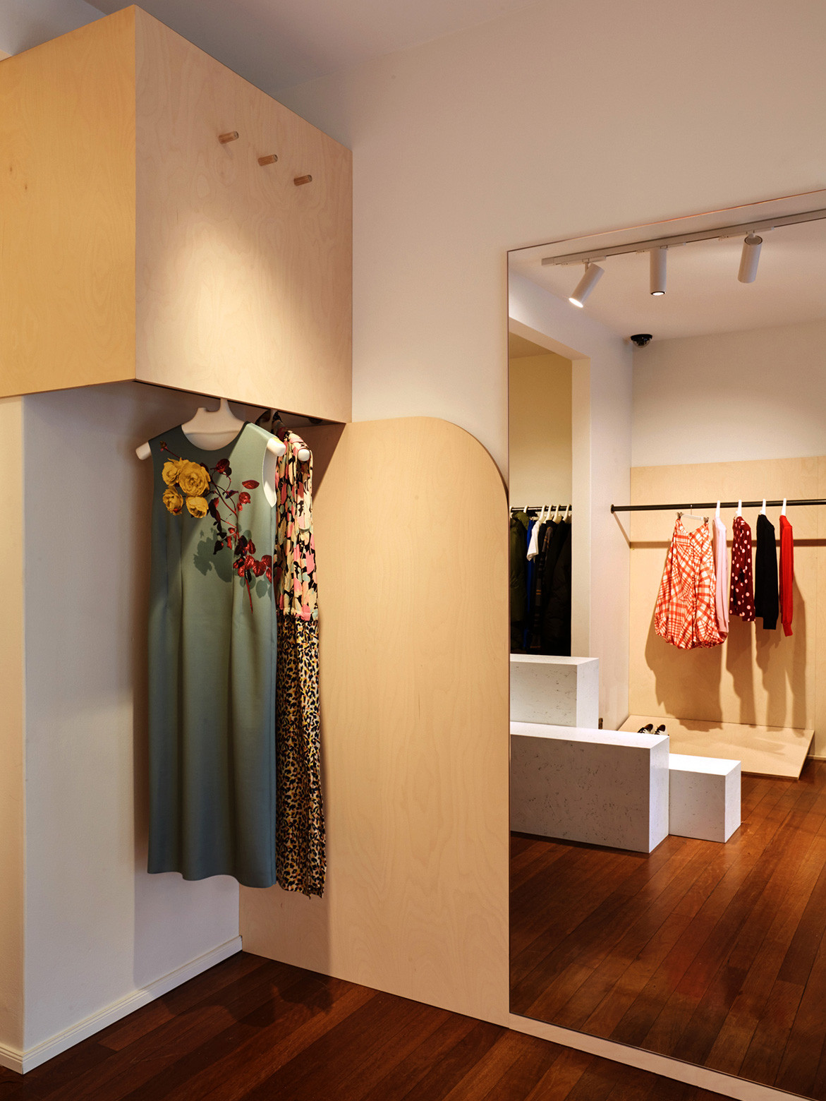
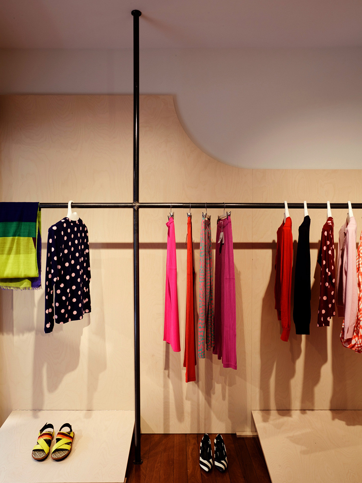
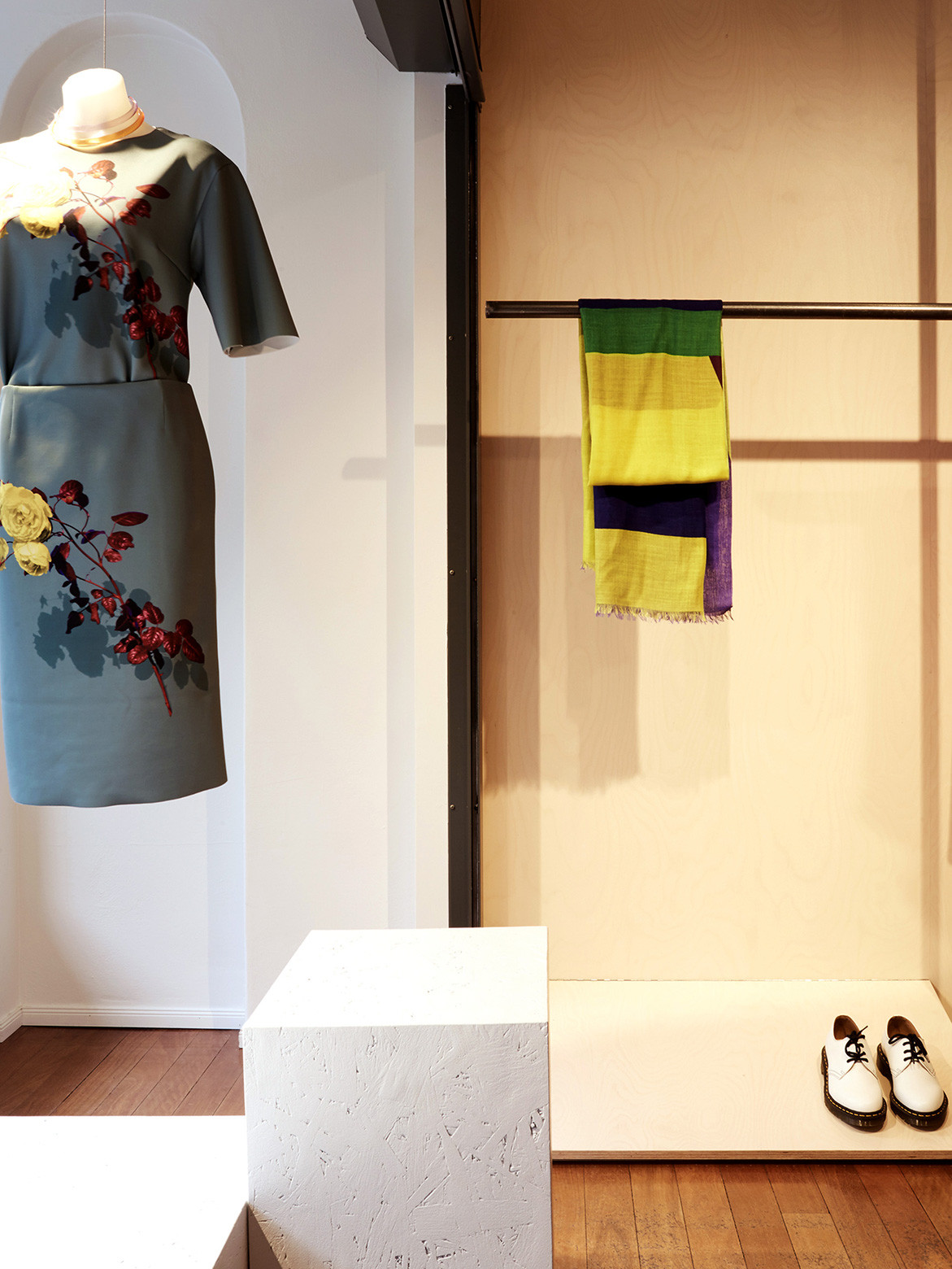
With Nicola and Juliet’s modest budget in mind, the decision was made to think of the project not as a complete refurbishment, but rather as a series of strategic instalments, working around what was already structurally in place. “We designed a series of hinged and folding plywood compositions inspired by the shapes of paper sewing patterns,” explain Antonia and Patricia, “each composition created a different type of display and at the same time resolved functional issues.”
“We were careful to keep that flexibility and gallery-like quality to the new store.”
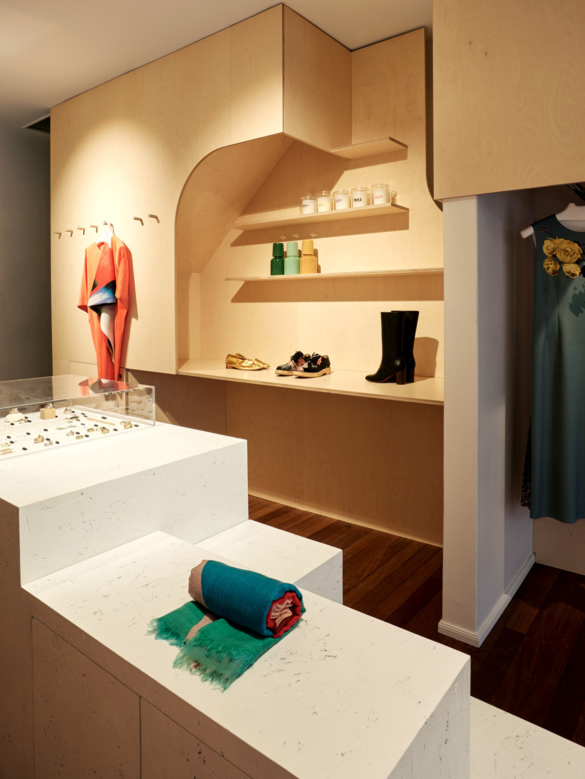
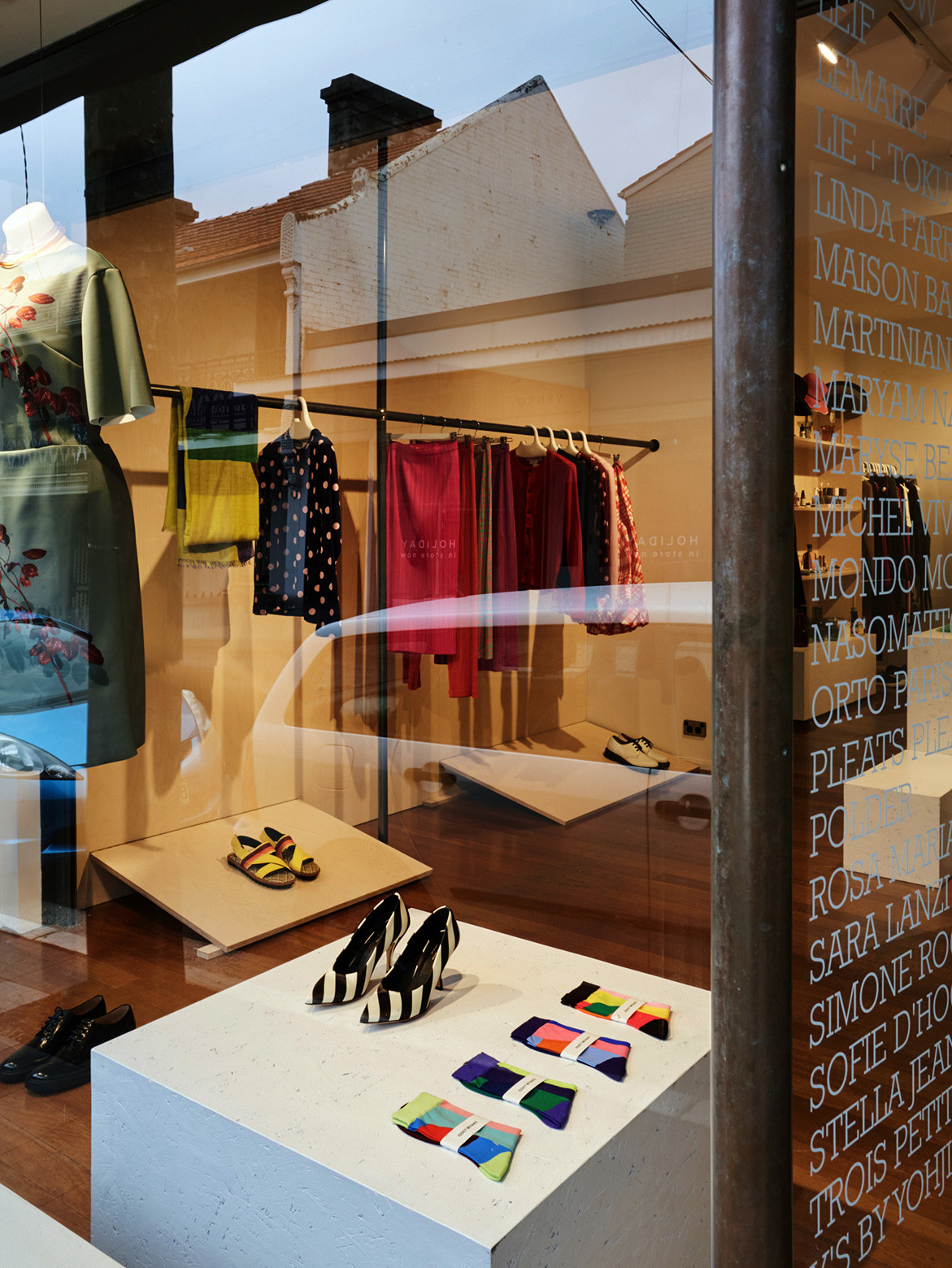
Another key insight early on in the project that later became central to design decisions was Nicola and Juliet’s tendency to frequently rearrange the store layout – moving furniture around and bringing different items into focus. “We were careful to keep that flexibility and gallery-like quality to the new store,” say Antonia and Patricia. This was achieved with the design and installation of a central plinth, composed of fixed and moveable blocks that can be reconfigured with spontaneity and ease to create displays of merchandise.
True to form, the contribution of the plinths to the store is not purely aesthetic – they also serve as secure storage on the shopfloor and a way of bringing the previously disjointed space together into one seamless spatial experience. “Having installations in each space, and the linear plinth composition, has really worked to stitch together these previously disconnected rooms, creating an intriguing journey through the space,” Antonia and Patricia reflect.
MAKE Creative
makecreative.com
Photography by Maya Vidulich
Dissection Information
Plywood compositions from Gunnersens Designer Ply in Birch Limewash with Powdercoat finish
Reconfigurable plinths from Gunnersens OSB with painted finish
Lighting from Lighting Partners Australia
Construction by Big City Constructions
We think you might also like The Architects Bookshop by SJB
