Pop Up House in Essendon presents the dramatic transformation of what was once a dilapidated single-storey weatherboard home into a striking two level home. “Our clients were looking for a home that would evolve with their family, planning for and accommodating different demands at each stage,” says FIGR director Adi Atic, co-founder of the Melbourne-based architecture studio.
“Our design approach was to create an environment that could adapt to the needs of their young children as they grow up and provide the necessary programs to have a comfortable shared home for the next 20+ years.”
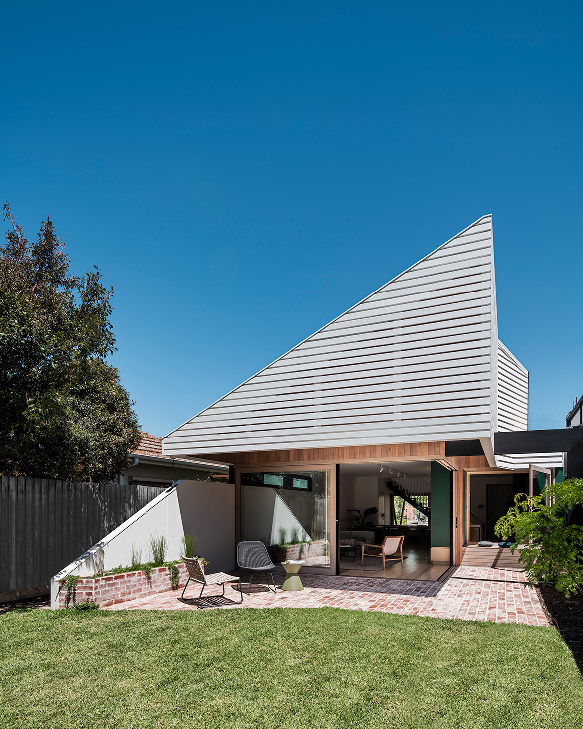
Faced with a compact site – only 340-square-metres in area – and hemmed in on all sides by single storey homes and a double-storey multi-unit building on the rear boundary, FIGR has performed some significant architectural gymnastics in creating a house that not only provides ample space for a family to grow, but also features a number of playful, integrated elements, as well as what seems to be a counterintuitive gesture at the front of the house.
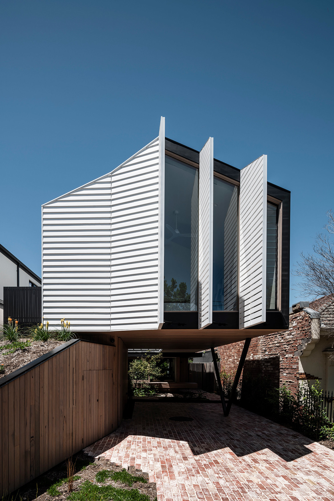
“A common approach with new houses in the area is to occupy the majority of the site while retaining minimal front setback with a fortified sheer-built form that shuts itself off from the public interface,” Adi explains. He is referring to the idea that within the private realm, there remain opportunities to actively engage with the public by inviting interaction between inhabitants, visitors, and neighbours to promote a sense of community engagement.
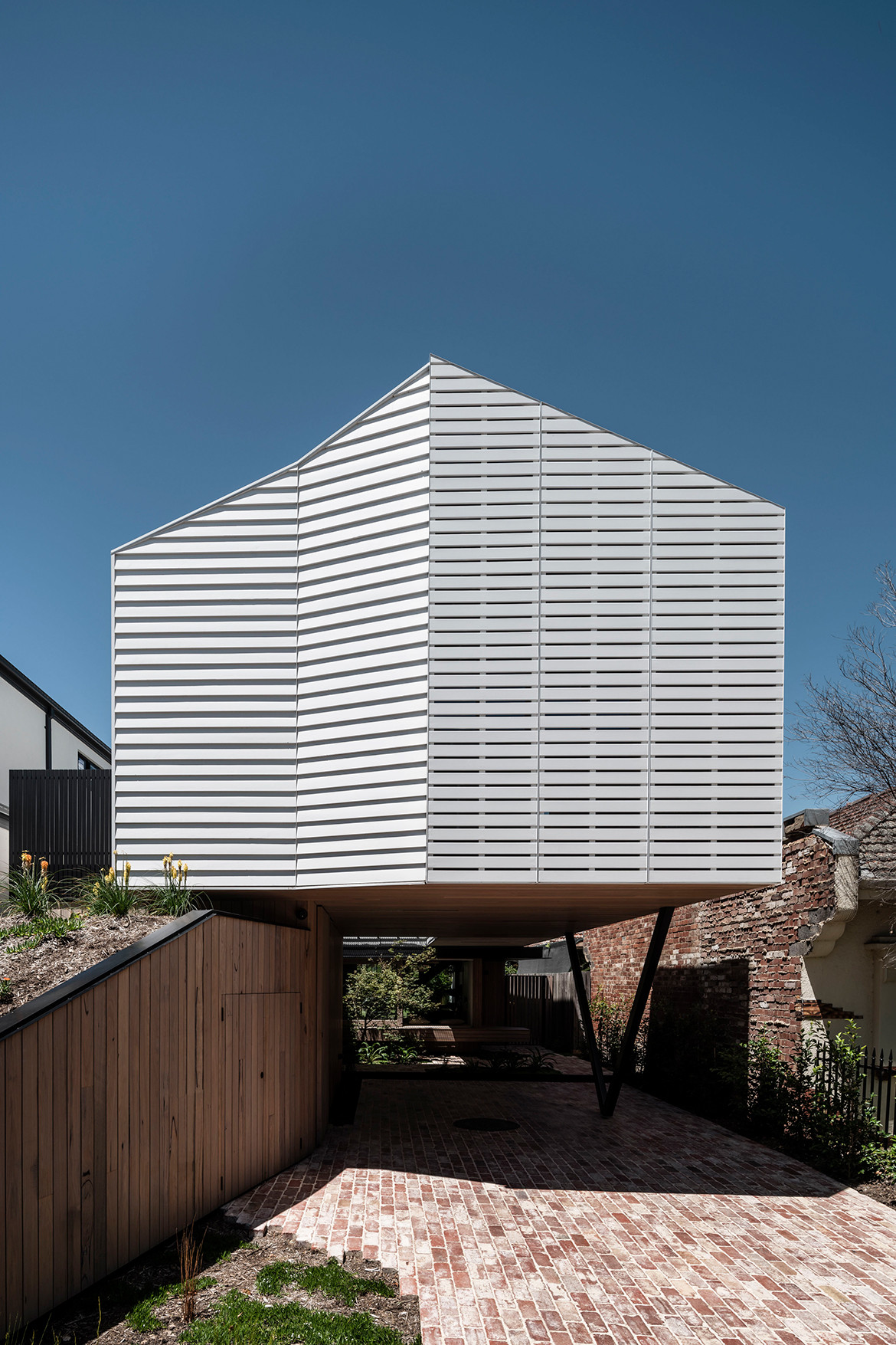
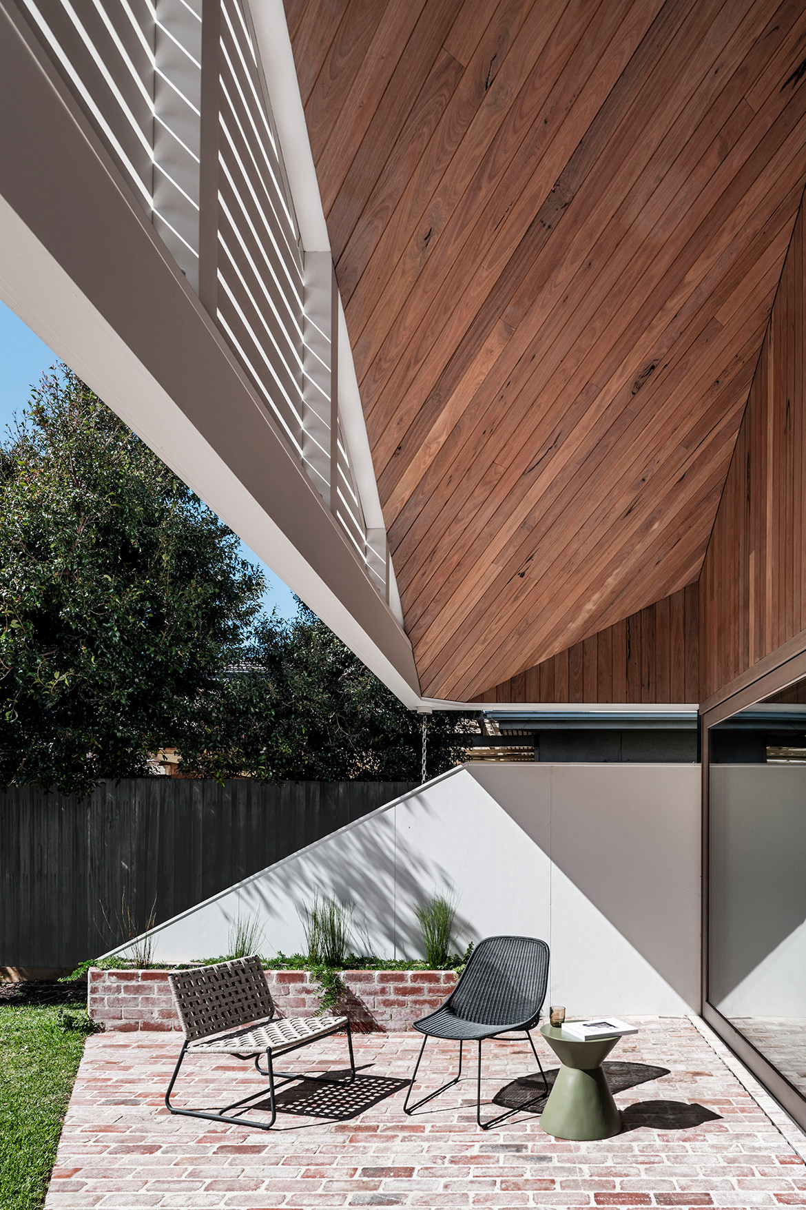
The team has achieved this goal by creating a generous open space at the front of the house. The upper volume of the building hovers above a sloping landscaped wedge that creates the beginning of a journey into the house. “The wedge gently slopes back to the street frontage, creating an element that engages the public realm,” continues Adi.
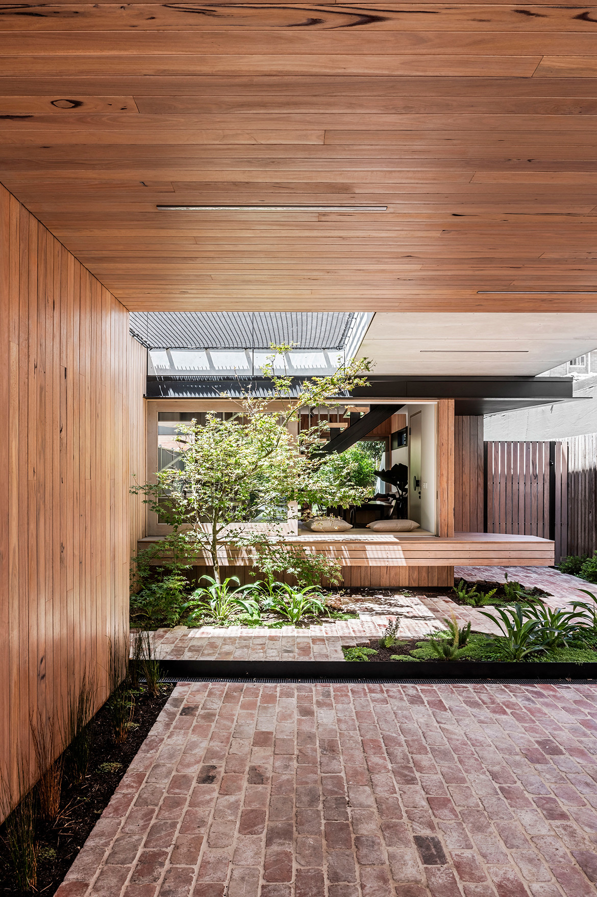
Visitors to the house enter by passing through this underbelly open space – which doubles up as a carport – past a storage area housing a workshop and powder room. The underbelly is also an extension of the workshop and informal entertaining area thereby further activating the space and providing a duality, which provides long term flexibility and adaption of use.
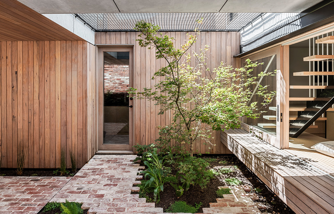
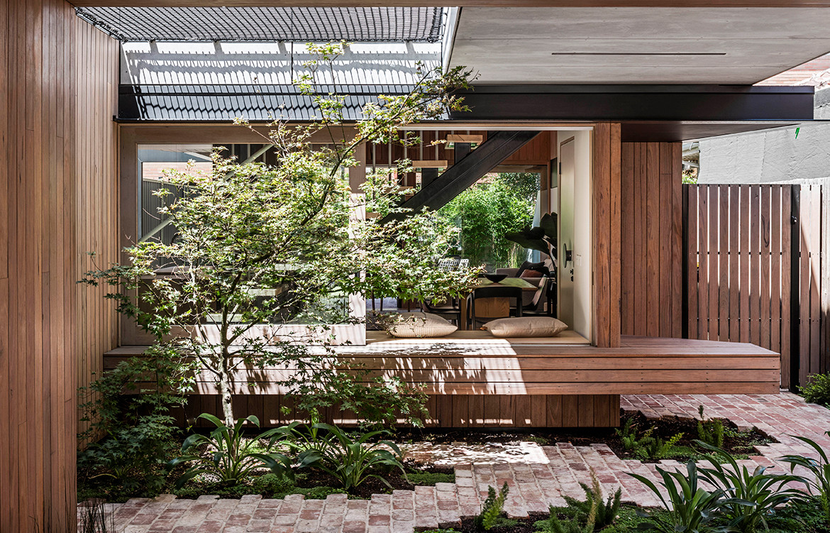
The ground floor of the house supports open-plan living with a linear kitchen arrangement tying together the dining and living spaces, flanked by the backyard to the east and central courtyard to the west. As one moves further into the site, brick paving gives way to patches of greenery, while a double-height void cuts an opening into the centre of the house. “Dappled light created by the maple and netting overhead falls onto a timber window seat which establishes the boundary between outside and in,” adds Adi. “There is a great sense of connection for family members in the living spaces of the house,” continue the clients. “A seamless connection from the street front, to carport, to living space to back yard. We never thought a carport would be an area that we would want to spend time and relax in!”
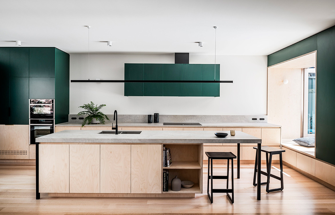
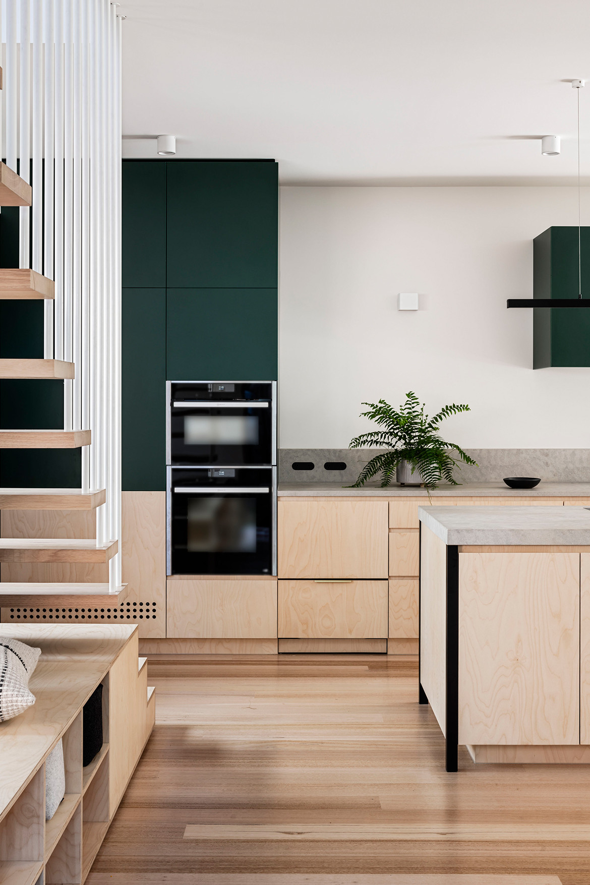
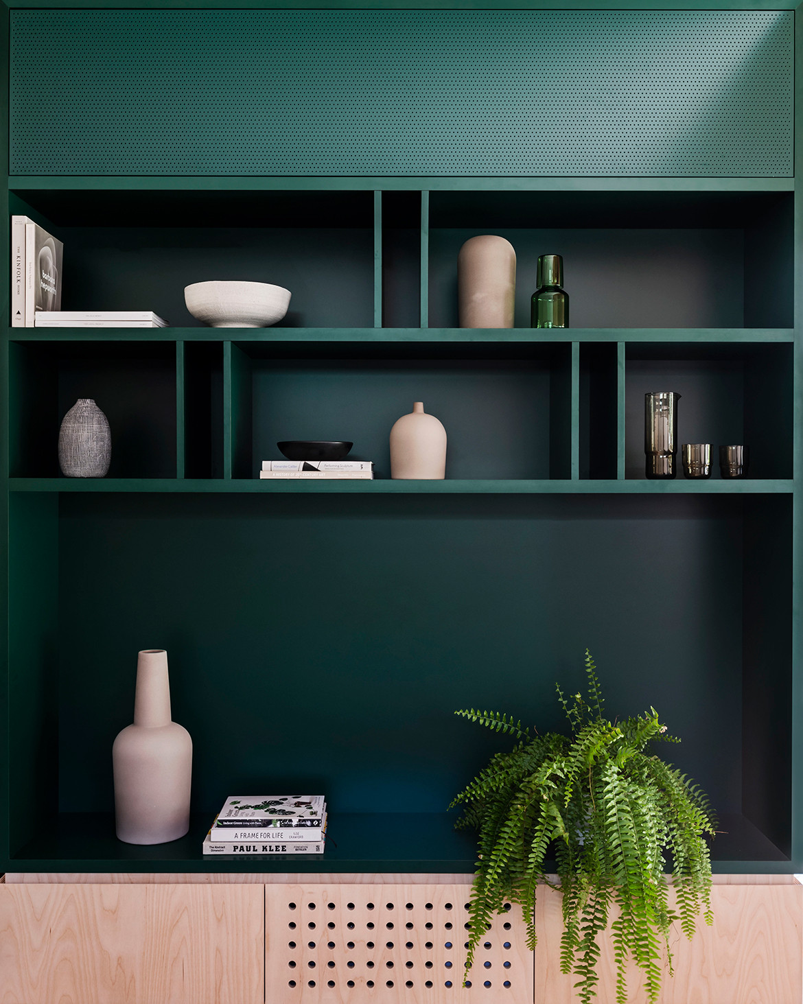
The lower living zone itself reinforces the home’s commitment to dual function. An example of this is the extruded kitchen bench which creates a seating platform. “The kids can do their homework or read while the parents are preparing dinner,” adds Adi. “The aim was to promote engagement and the sharing of these spaces.” A deep green laminate adds a level of play against the more restrained palette of the home. It extends the length of the space to tie the zones together playing further on the colour and memory of the old relics of the house (the grandfather’s leather chair).
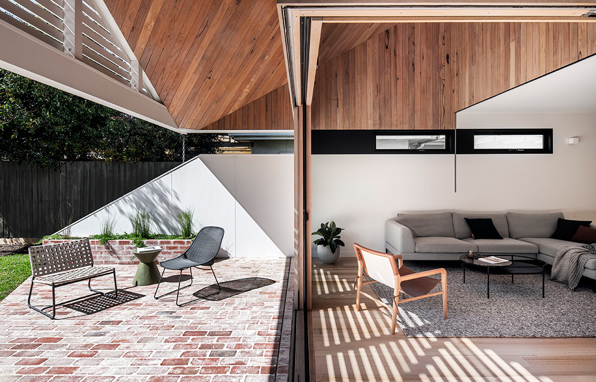
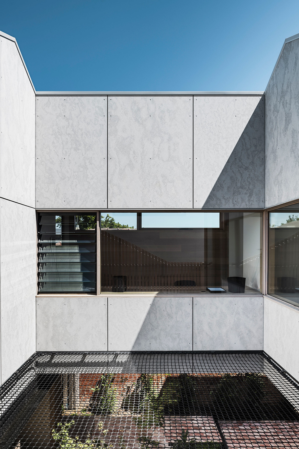
The upper level is divided into two zones through a shared study space that creates a bridge between the main bedroom, ensuite and retreat, and the childrens’ bedrooms and bathroom. The central courtyard has been covered with a net to create a trafficable zone while protecting the amenity of the ground floor below. The outdoor terrace extends into a netted area, creating additional zones for play and activation while allowing light to penetrate the ground level through the central courtyard.
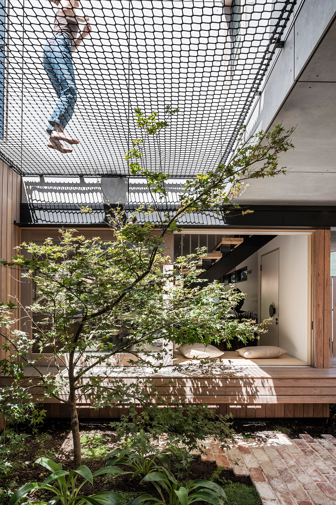
Externally, the finishes are modest, and the weatherboard cladding and recycled brick are a cost-effective and appropriate response to context. “In addition, The extensive use of recycled brick establishes a language for the external materials underfoot, stitching the programs from entry through to the rear,” concludes Adi.

Project Details
Architecture – FIGR Architecture Studio
Builder – Natural Build Vic
Engineer – The Meyer Consulting Group
Styling – Ruth Welsby
Photography – Tom Blachford
We think you might like this home in Hobart that blends shelter, sanctuary and spectacle, by Room 11
