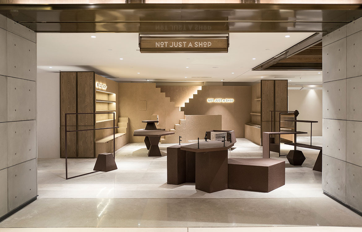
Not Just a Shop is a lifestyle concept store renowned in Shenzen, China for its eclectic assortment of fashion, home and lifestyle products, collected from around the world. And so, when the owners – both well-travelled and design-conscious – decided on a new space for their next retail outlet, they decided to tread an unconventional design path. Their idea was to create an authentic brand and in-store experience for visitors and buyers, in turn promoting stronger brand recall. To bring their interior vision to fruition, the duo engaged Yatofu Creatives, a Helsinki-based creative studio working across product and spatial design.
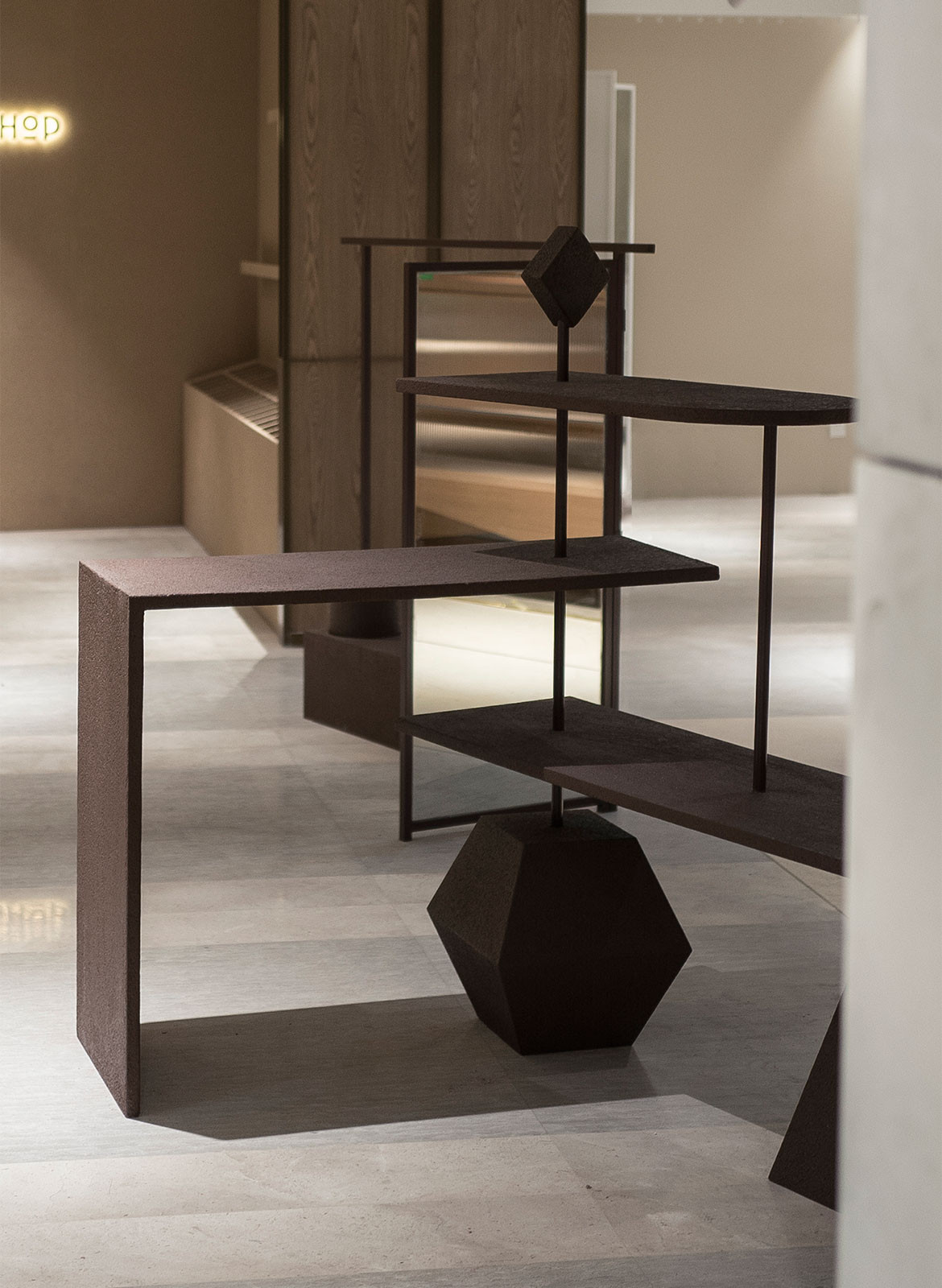
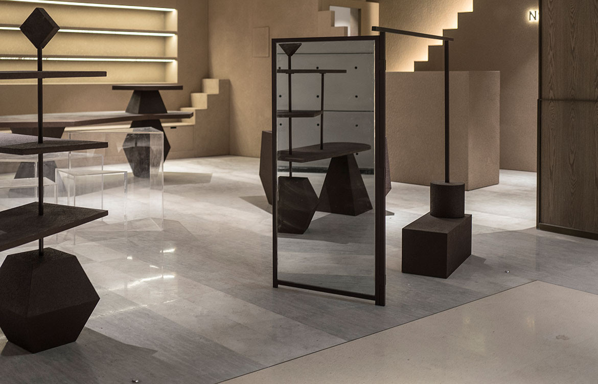
Not only does the store’s aesthetic reflect the brand’s core values and philosophy, but there is also an artistic slant that shines through in its interior design. The 64-square metre retail space references a lot of monumental architecture and abstract sculptural forms.
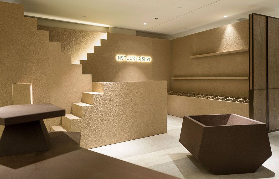
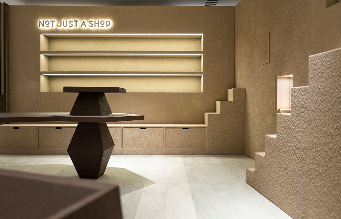
Interestingly, the design challenges the density typically seen in many departmental stores. While there is a sense of consistency within the larger context, the interiors present a visible contrast to the polished and uber-finished interiors of the neighbouring stores. “Due to their nature, department stores are usually organised with a strong sense of logic, which can often become very cold and clinical. We wanted to disrupt this sense of artificial perfection by evoking emotions and memories through an artistic and sculptural approach,” adds Angela Lin, Yatofu Creatives.
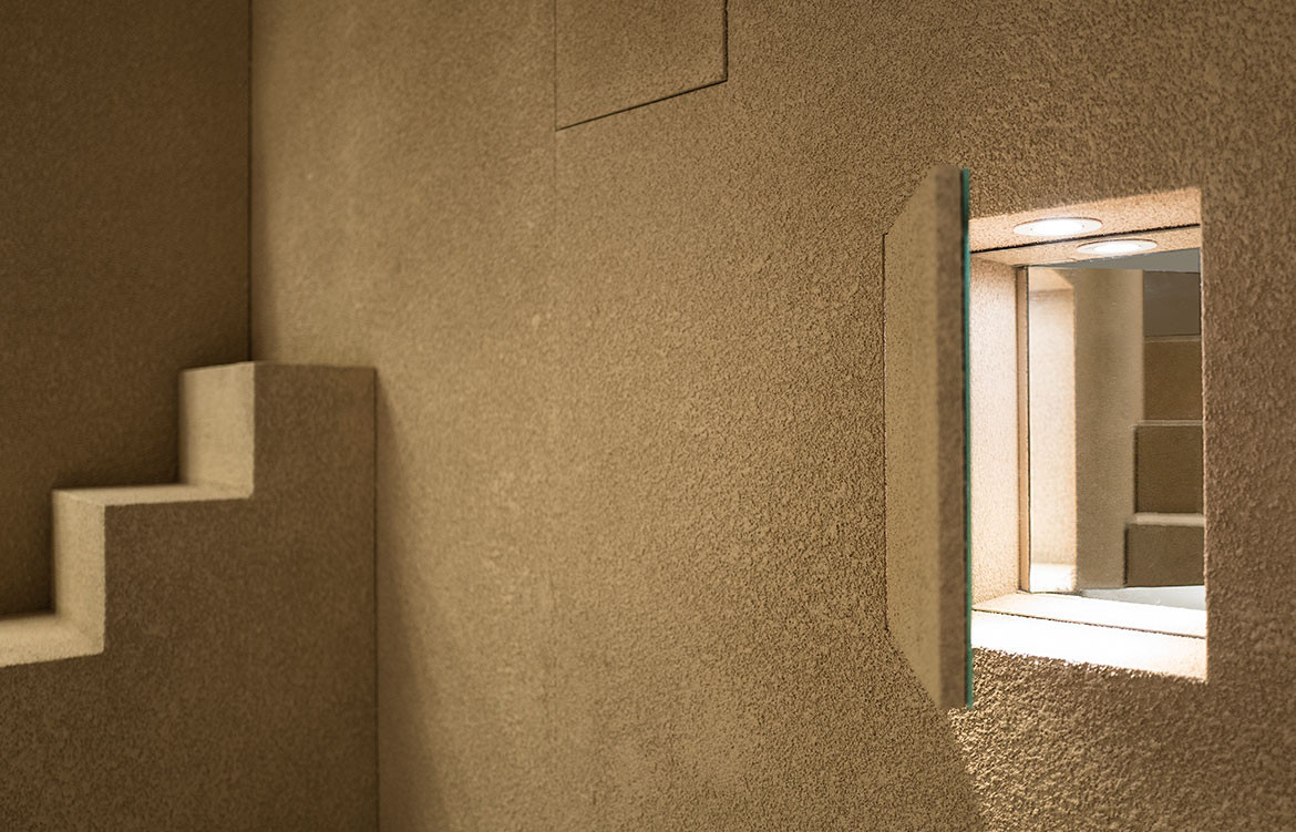
The design also sought local inspiration, specifically designer Jini Chu’s research project on makeshift concrete bases and barriers and the beauty of their necessity. The display fixtures appear both artistic and with a strong sense of proportion, but also with lots of functionality built in.
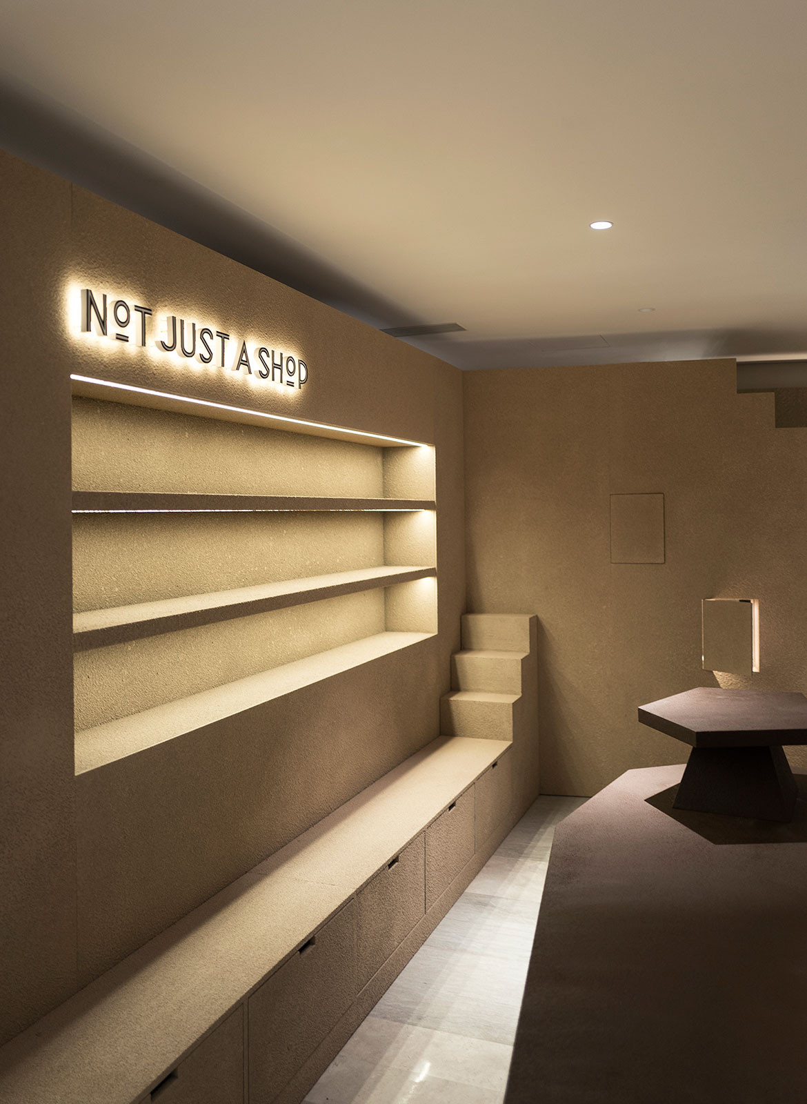
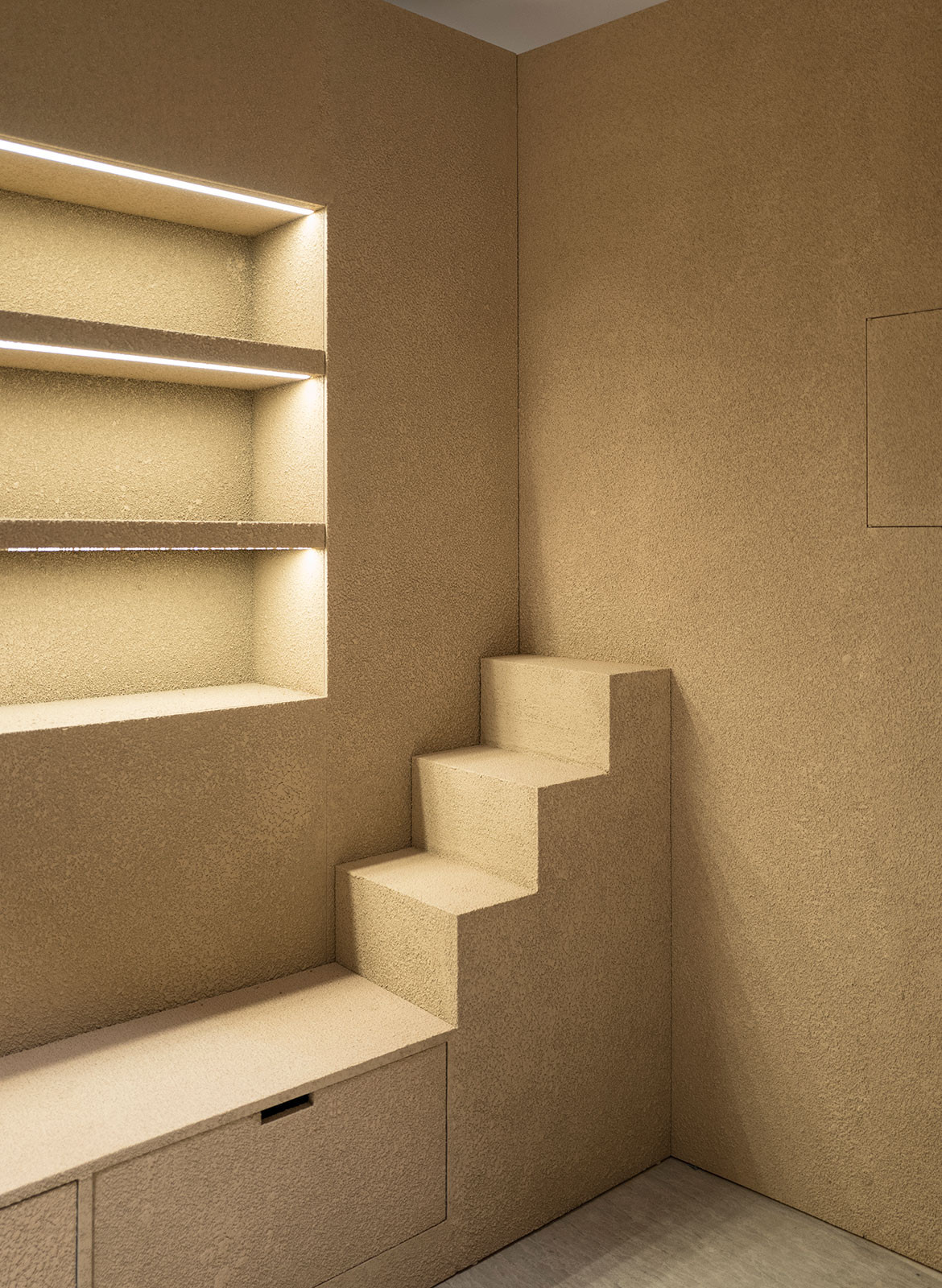 To foster a sense of emotional connectivity, the designers chose to address physicality and tactility in the store’s surface treatments. They’ve covered the surfaces of the sculptural forms with a rock-like stucco material. Neutral earth tones dominate the store’s colour scheme, accentuating the rough appearance of these forms.
With a disruptive design approach, this lifestyle store makes for a unique case study in retail design.
Yatofu Creatives
yatofu.com
Photography by Sheen Tao
We think you might also like IN BED‘s Concept Store
