The Japanese are known for replacing the more recent past with contemporary buildings -not surprisingly, given land is scarce even in areas such as Shimada, a village on Japan’s central south coast.
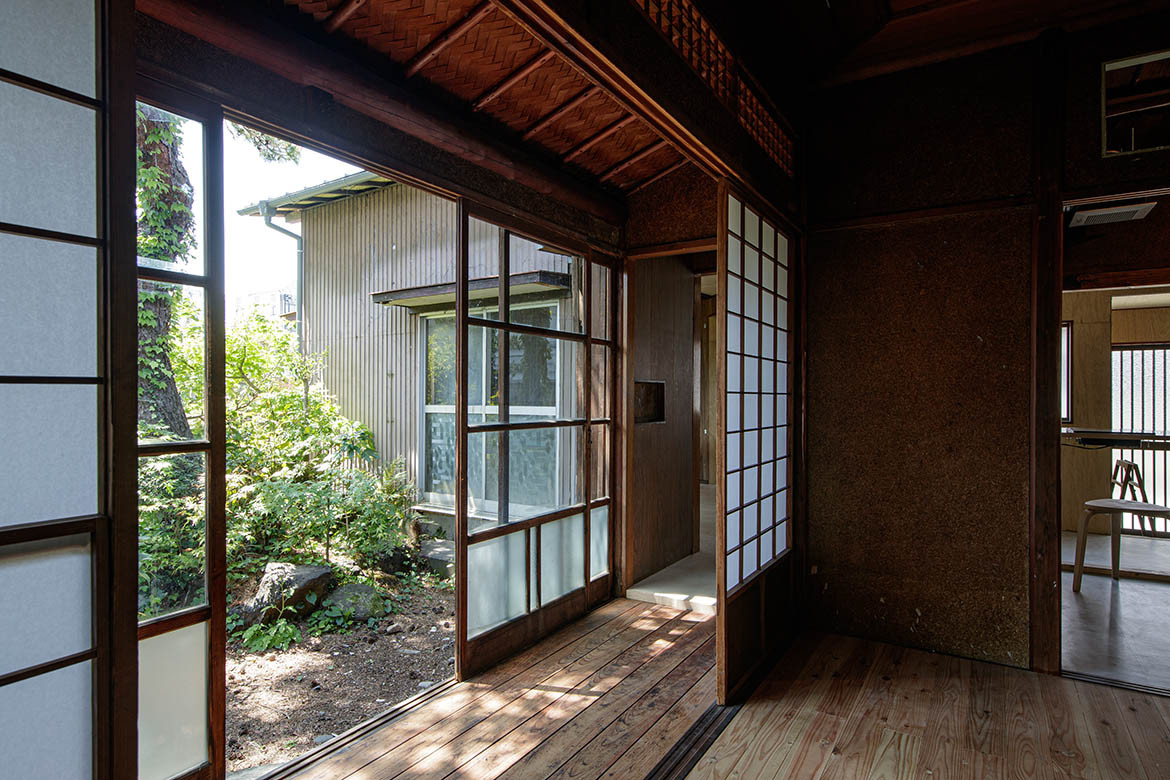
Most locals were expecting this simple and modest building to be demolished when architects Roovice put up their shingle. Locals must have looked on in surprise as it carefully stitched together this traditional house to create a new office space. However, unlike many of the highly polished offices in downtown Tokyo, this one offers a considerably more rustic, almost wabi-sabi approach to architecture and design.
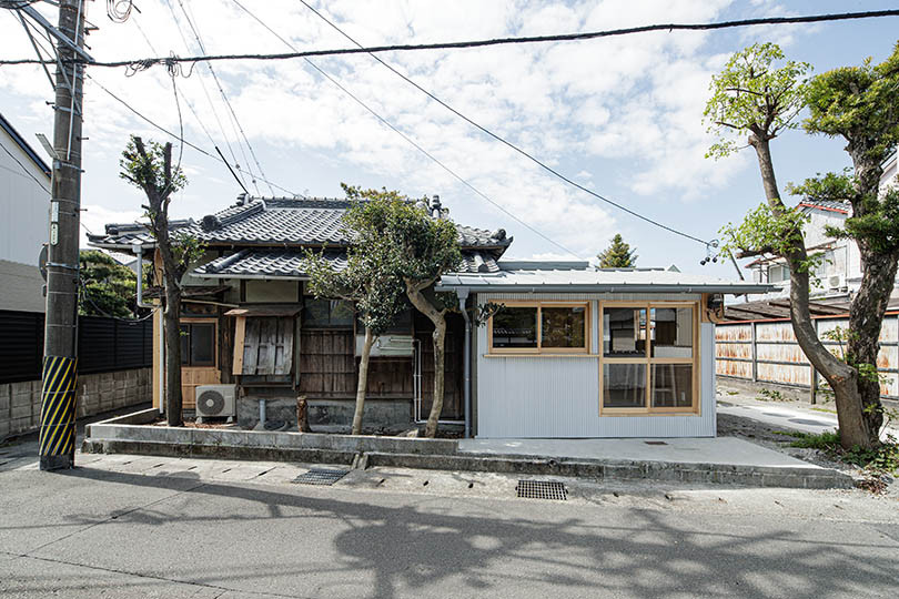
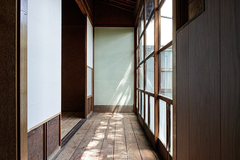
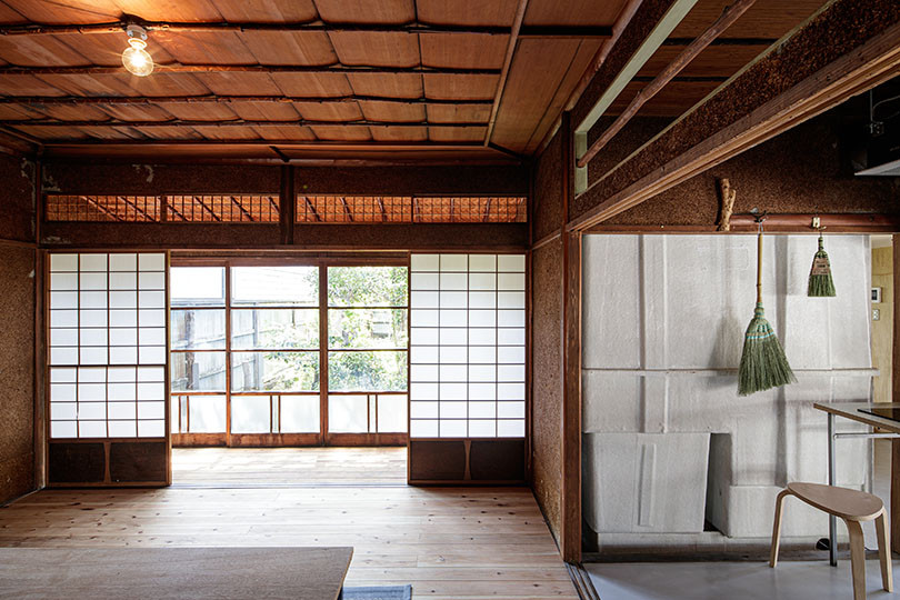
The high steel fence was removed and, once again, the 100-year-old building formed part of the streetscape. The corrugated steel roof, a powdery pink due to rusting, was replaced with a grey corrugated roof, in the same profile as the original. And while some windows were repaired by Roovice, other new timber-famed windows were added with the effect of creating a considerably lighter and more pleasurable interior.
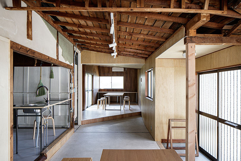
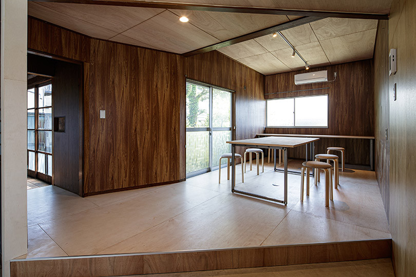
At Shimada House, there’s a wonderful combination of the past and present. There’s now a concrete floor upon arrival, a step below the pod-like offices, in keeping with the Japanese-style entrance named ‘Doma’.
Other features such as the tile-framed basin the bathroom, dating from the 1920s, has been preserved to allow the history of this building to be ‘read’. But there’s also a new sink for staff to wash their hands, treated in a rudimentary manner, almost deconstructed with the basin exposed below the bench top. Other combos include a new toilet, but still set into a cubicle where a popular colour from the 1920s and ‘30s, a mint green, was retained.
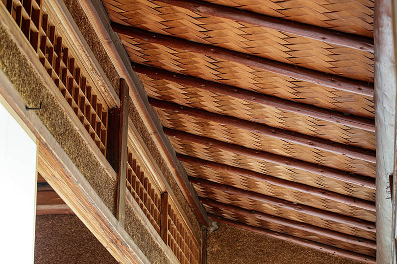
Other structural interventions now combine new plywood walls where they were once lagging and exposing the original timber trusses from the early 20th century. There’s even an original shoji screen that’s been put to good use to create a separate office. And while some floors are new, others show the hallmarks of well-worn paths.
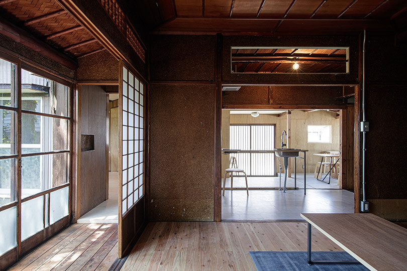
Given this is an office, not simply a shrine to the past, Roovice ditched some of the old furniture that was well past its used-by date, and brought in simple contemporary furniture, timber benches and stools. Shimada House still has the vestiges from the past. But these traces can now be enjoyed by staff who work here and locals passing by.
Project details
Architecture – Roovice
Photography – Akira Nakamura
We think you might like this home in Japan, Nara House
