Since Shaun Lockyer established Shaun Lockyer Architects (SLa) in 2009, he’s been prodigious in his residential output. The Brisbane-based architect is recognised for a ‘regional modernist’ style that responds both efficiently and elegantly to the Queensland climate. Little wonder the practice is in high demand and its large portfolio ranges from small and modest to breathtakingly sublime.
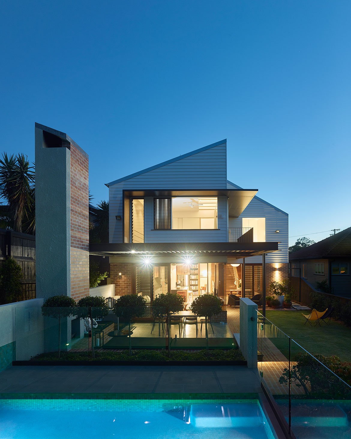
The recently completed Folkhouse sits somewhere in between; a bold yet contained extension to a character pre-war cottage at the crest of the Balmoral hillside. It was a highly personal project for Shaun and his team as the clients are the parents of a SLa staff member, which actually proved quite advantageous during the development process. “Because they’re friends it afforded us a very honest and open line of communication in order to achieve the right outcome,” he says.
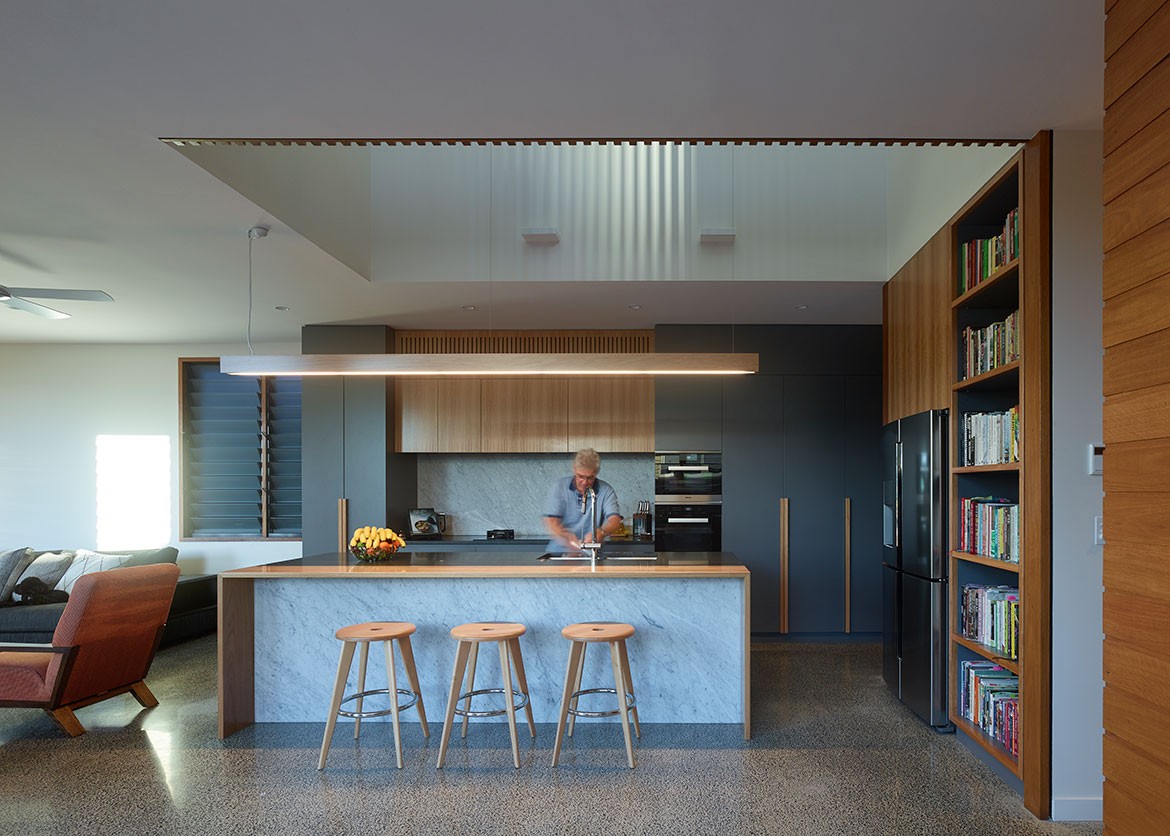
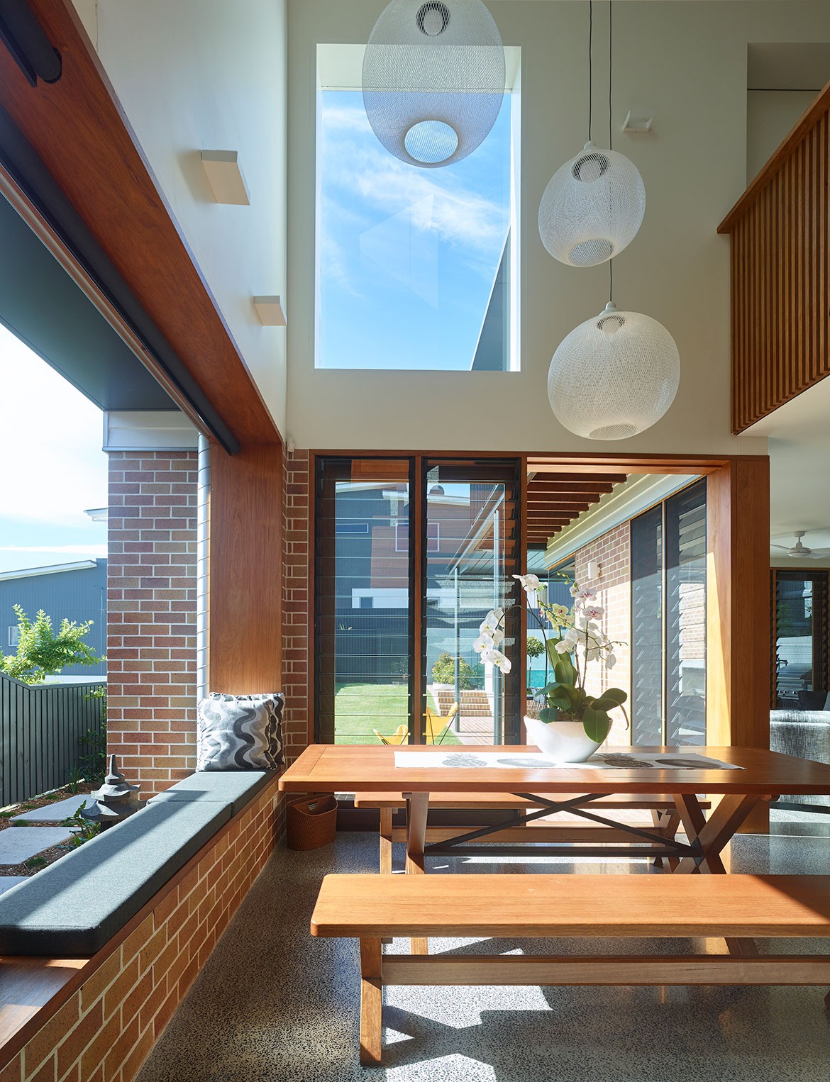
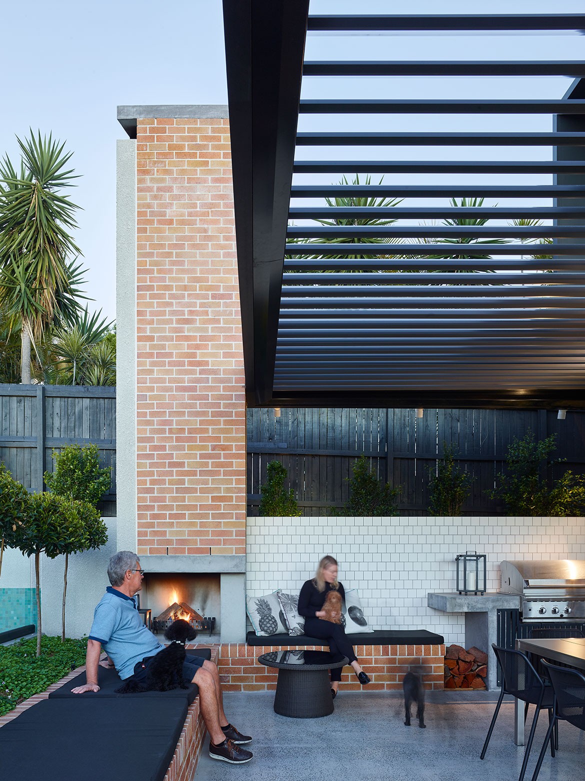
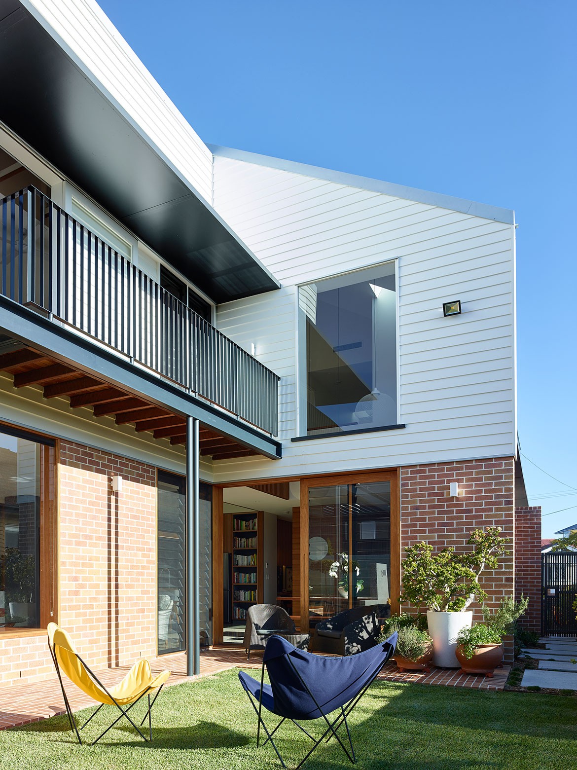
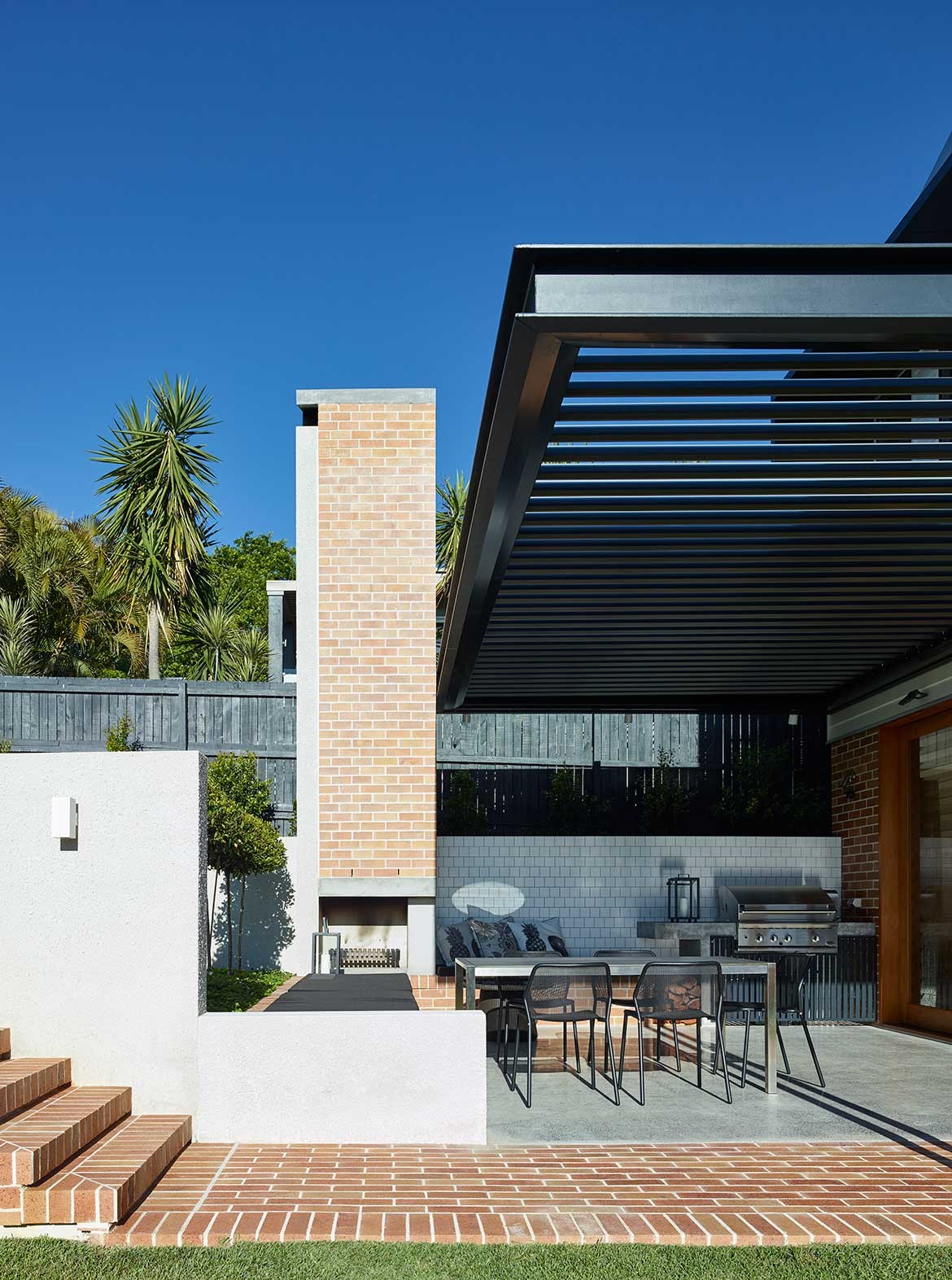
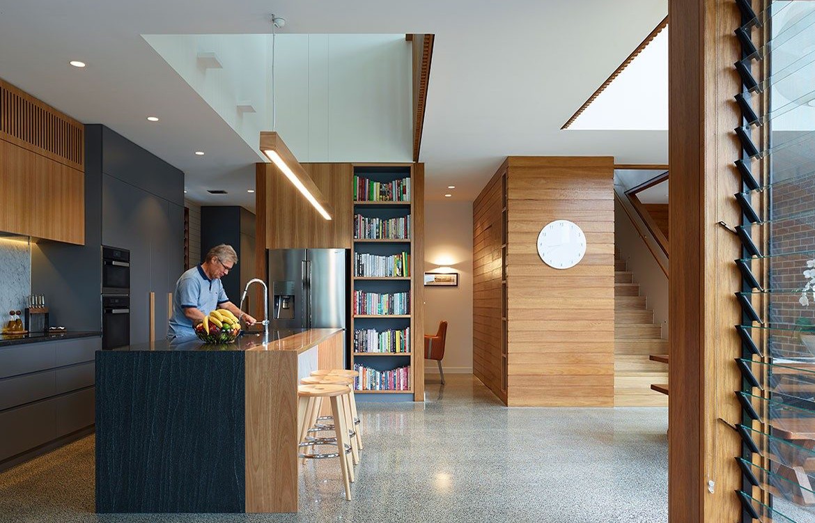
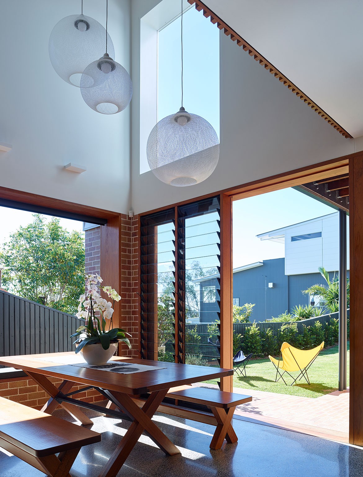
The brief had a strong focus on hospitality and social gathering and this informed the bulk of the design decisions. While the extension houses the main bedroom and living areas, including a generously proportioned outdoor dining room, it’s the kitchen that’s pivotal to the layout. This space is the heart of the home and the place all family members spend most their time. The open plan makes the ground floor of the two-storey extension even more welcoming and large windows and window seating add to a feeling of spaciousness by extending the inside outside. It also allows for plentiful ventilation resulting in a naturally cool interior.
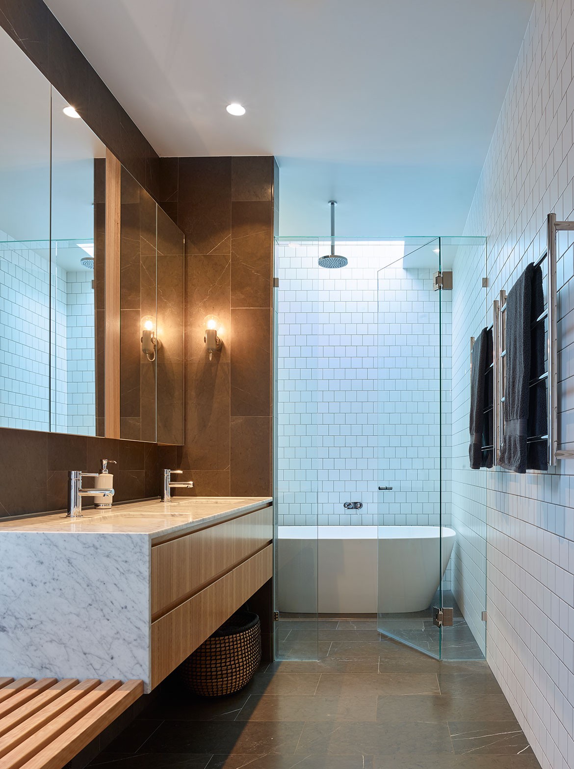
Shaun Lockyers’s material palette is a robust yet clean mix of brick, timber, marble and polished concrete. The brick carries on the narrative from a previous post-war extension and honey-coloured timber as the kitchen joinery, stair and upstairs balustrade, accents the lightness of the overall scheme. As Shaun reflects, “It’s a simple house with a simple idea about scale, occupation and light. And it’s about how one revitalises these beautiful homes within Brisbane’s inner city suburbs.”
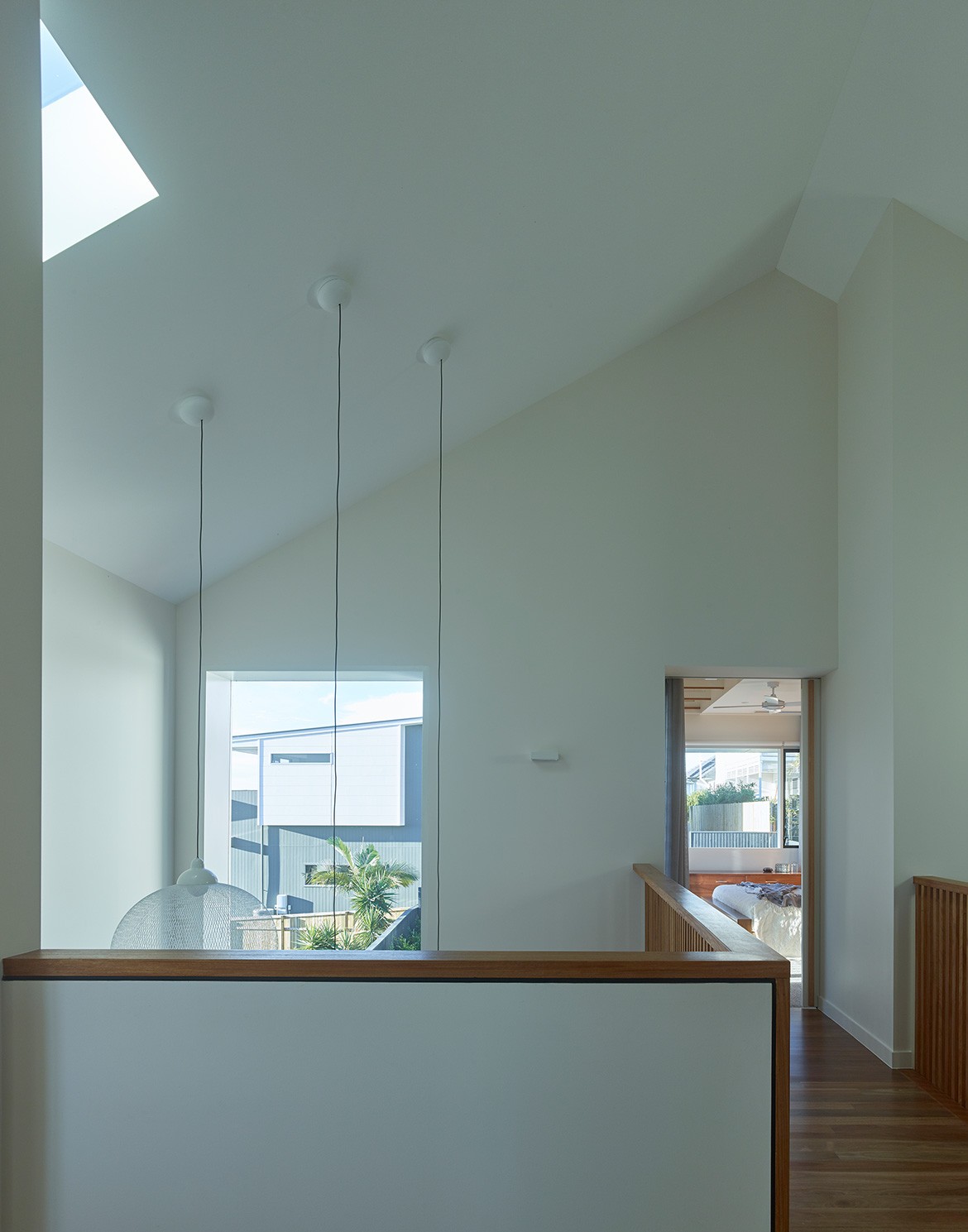
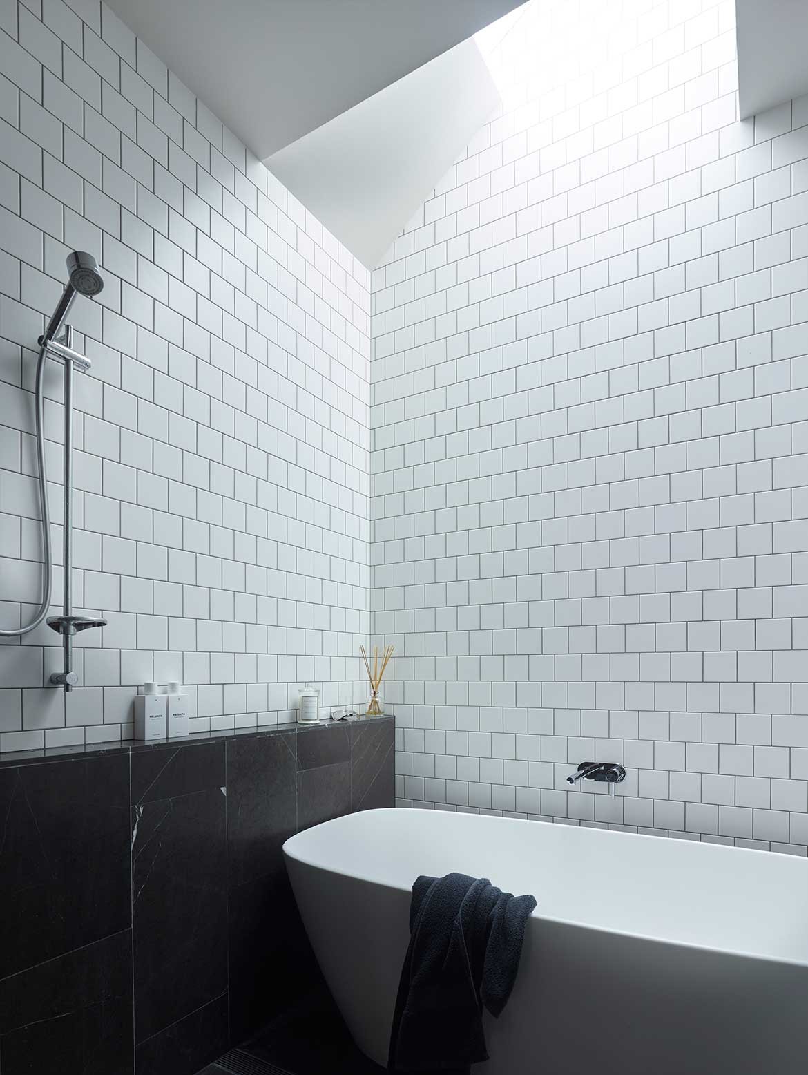
The adult children’s bedrooms remain in the existing cottage and the threshold between old and new is distinguished by a large void traversed by a bridge. There’s a playful visual dynamism to the ceiling volume, thanks to the extension’s steeply pitched gabled roofs. Not only does it accentuate the scale of the space, but it also assists with the distribution of light, evened out by a number of strategically placed windows and skylights. This is a home to be admired as much for its robust architectural integrity as for its warmth, intelligence and the liveability of its human-focused plan and arrangement.
Shaun Lockyer Architects
lockyerarchitects.com.au
Photography by Scott Burrows
