EC: This interior renovation tackled a number of design challenges. What was the quality and character of the home’s existing fabric?
KS: The house is located in a Victorian heritage inner city suburb. The house was built in the early Victorian period, so while each room is grand in scale, the overall planning of the house is very simple and almost Georgian in its characteristics. The house had been renovated in the late 1980s, and while there was some existing maintenance and construction issues to attend to, the basic structure of the house has remained pretty intact. The original brief by the client was for a very minor upgrade to the house, probably about 20 per cent of the final scope, so the biggest challenge was to keep the house cohesive while giving individual personalities to each of the spaces in the house.
What key architectural interventions were made?
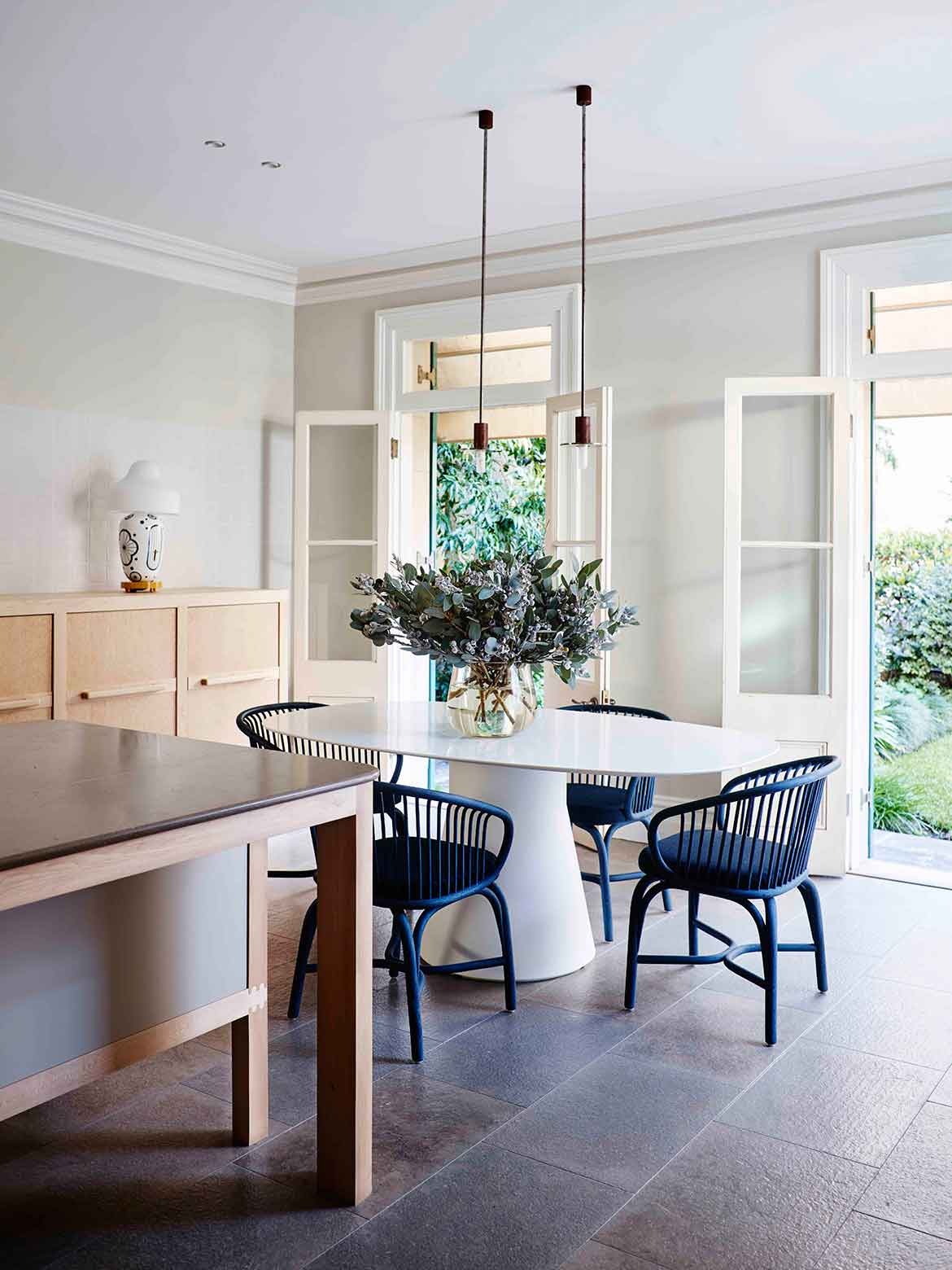
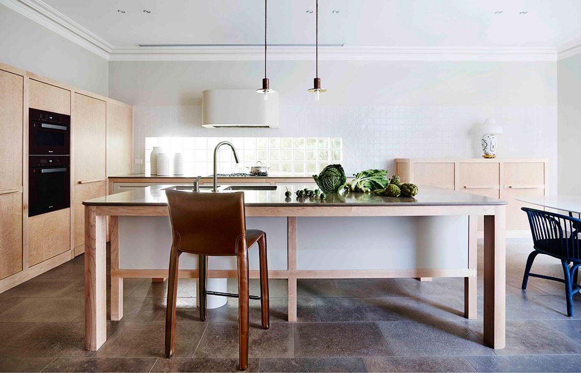
The base plan for the house was already pretty simple and there was no real reason to make changes for the sake of it. The biggest intervention was probably expanding the original kitchen and meals rooms to make a very large eat in kitchen, which was based on the principals of a Victorian Mansion, but detailed in a contemporary way. The idea of leaving original details and past interventions in a building, whether they are that cohesive or not quite interests me. It’s an interesting and often challenging way to develop concepts and ideas and gives a space a complexity and a patina which is difficult to achieve in any other way.
What was the client brief and how did you add value to their ideas?
I had worked with the client previously (in a commercial capacity), so I have a good understanding of who she is and what drives her. It was very important to her that the house did not feel fashion driven, however she is certainly not conservative in any way, which was fantastic. As a result, we were able to explore concepts and details that we based the properties of the materials and the overall experience of the house, while taking into consideration the practicalities that the client was also very keen on, such as accessibility.
How did you layer your studio aesthetic with the heritage features and the client’s own vision?
Generally as a studio, we like to keep our concept palette fairly lean and to thoroughly explore a tight set of details, which gives us the best ability to develop and work through new ideas both in the studio and on site. Although the project might look as though there are quite a lot of different details, there is actually quite a lot of repetition, which keeps the story together. The client challenged me quite a lot in a number of ways, but if she was satisfied that the interiors were well considered, crafted, practical and not fashionable she was happy.
The interior has a luxurious aesthetic. What key materials did you select?
We didn’t really seek to design a house that looked particularly luxurious. We were interested in exploring the capabilities of each of the materials we were using, and thinking about them in a three dimensional format. Maybe using the materials in this way, brought about a sense of luxury. We also had really great trades on site and a fabulous joiner, so the quality of the workmanship was very precise, and I think that also gives the project a sense of luxury.
How has this manifested in the kitchen?
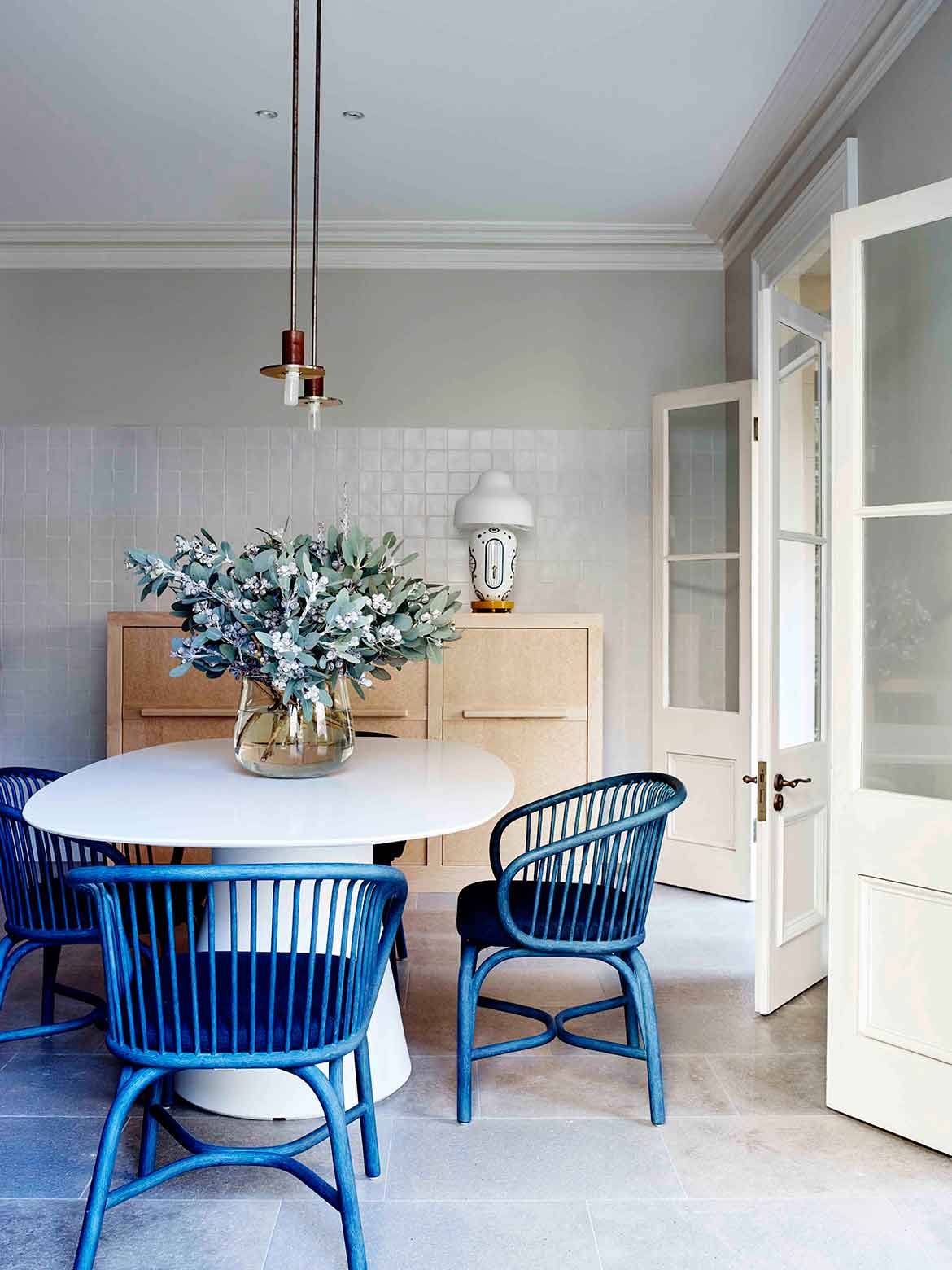
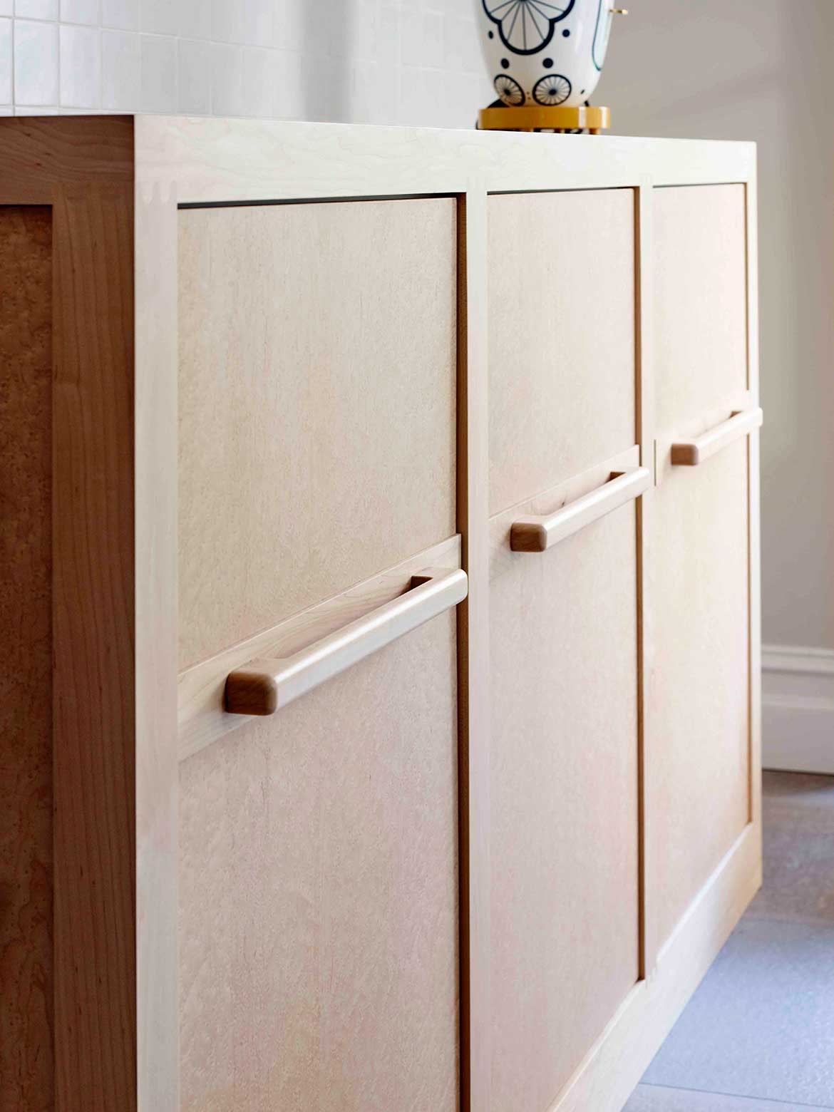
In the kitchen we used Figured Maple, French limestone and hand-made wall tiles from Domenico Mori. Each material has quite varied textures but the colour palette is fairly limited. I think that this gives a stronger reading of the natural characteristics of the materials and I think there is a sense of beauty in that. The edges are slightly rounded to bring some softness to the design.
. . . and in the living and dining room?
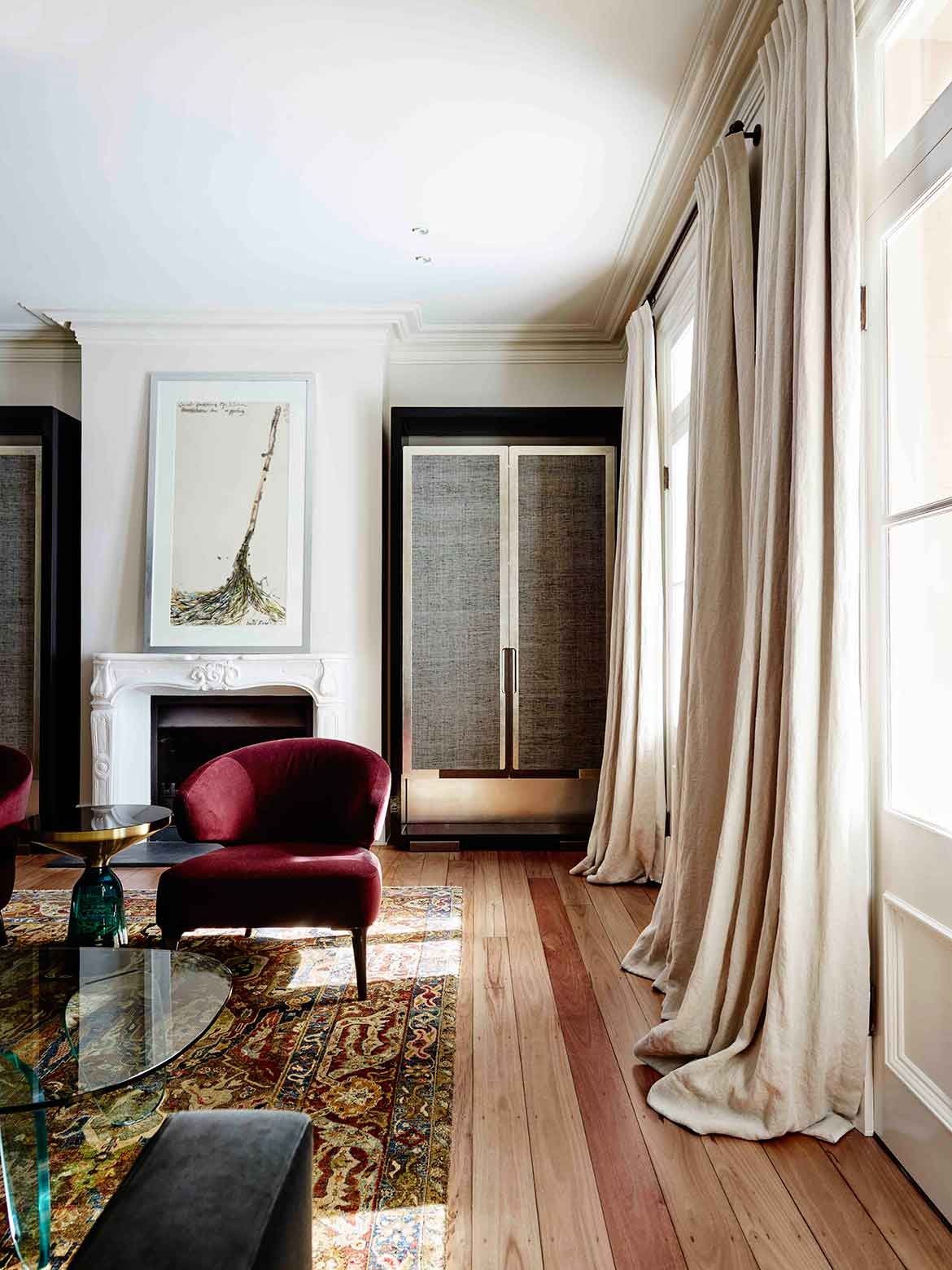
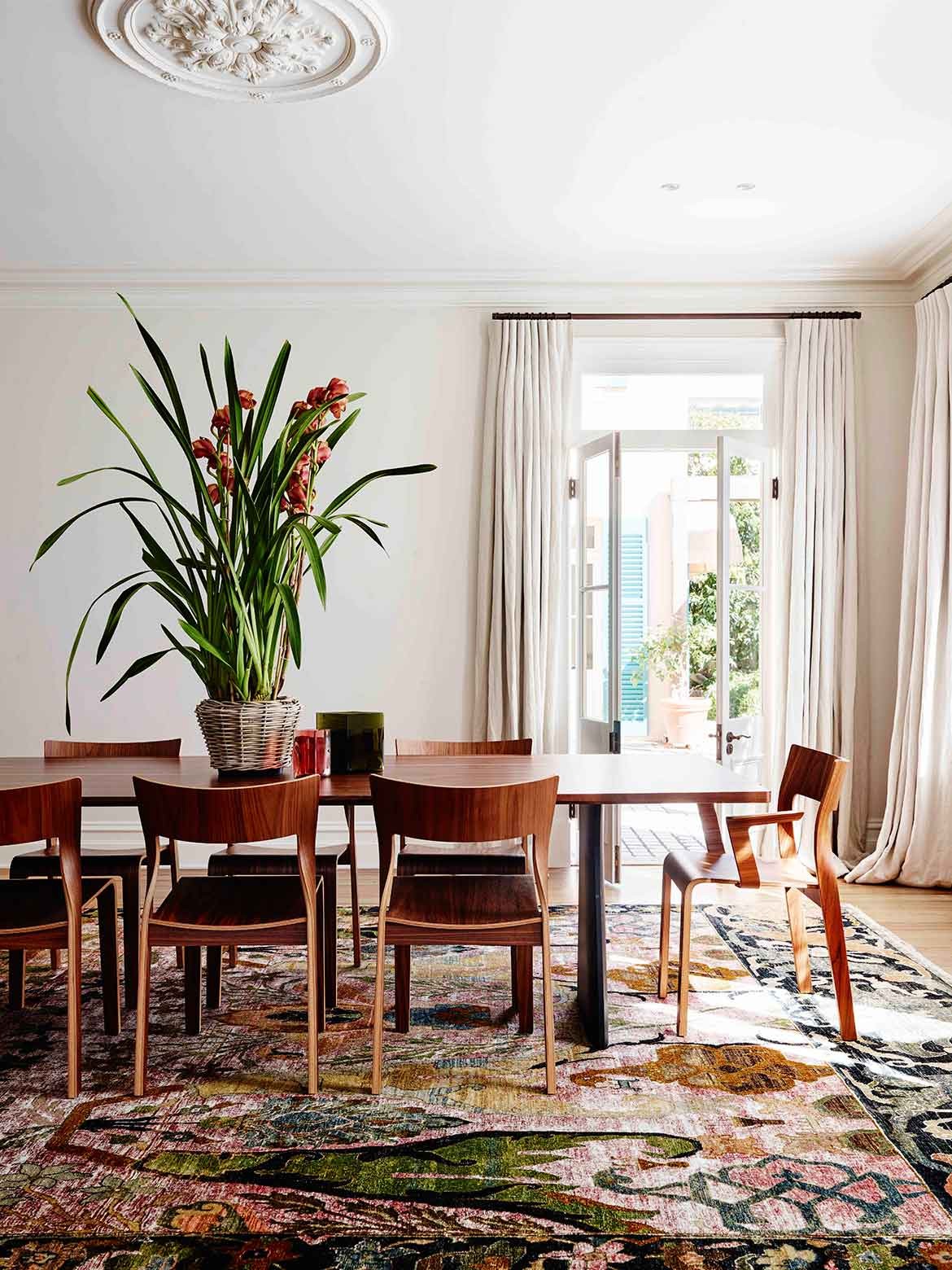
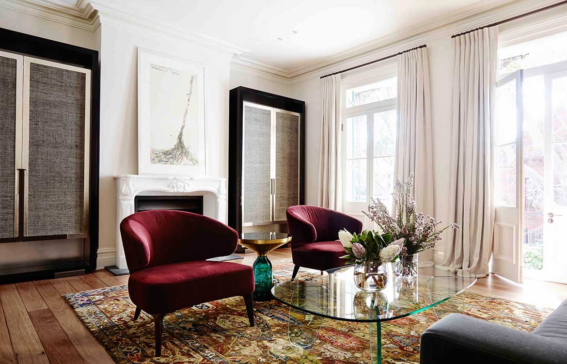
The existing black-butt floors were returned to their former glory, providing a foundational layer, while large Anatolian rugs in rich and muted tones create framed portions, while flowing seamlessly. Furnished with opulent pieces in rich tones and textures, the interior decoration in these areas is intentionally sophisticated. In the lounging area the Minotti Arm chairs in muted burgundy, for example, are paired with the deep sea green and gold of Classicon’s side table. Concurrently the glass Italia coffee table echoes the green of the side table and allows the pattern of the rug room to breathe, while bringing a light and airy mood to the whole. In the dining area the fine lines of a Rothlisberger dining table and chairs are countered by a slightly larger motif on the rug selected for this area.
How have you addressed the notions of accessibility in the bathrooms whilst still managing to create a very refined, seamless environment?
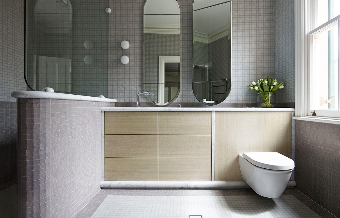
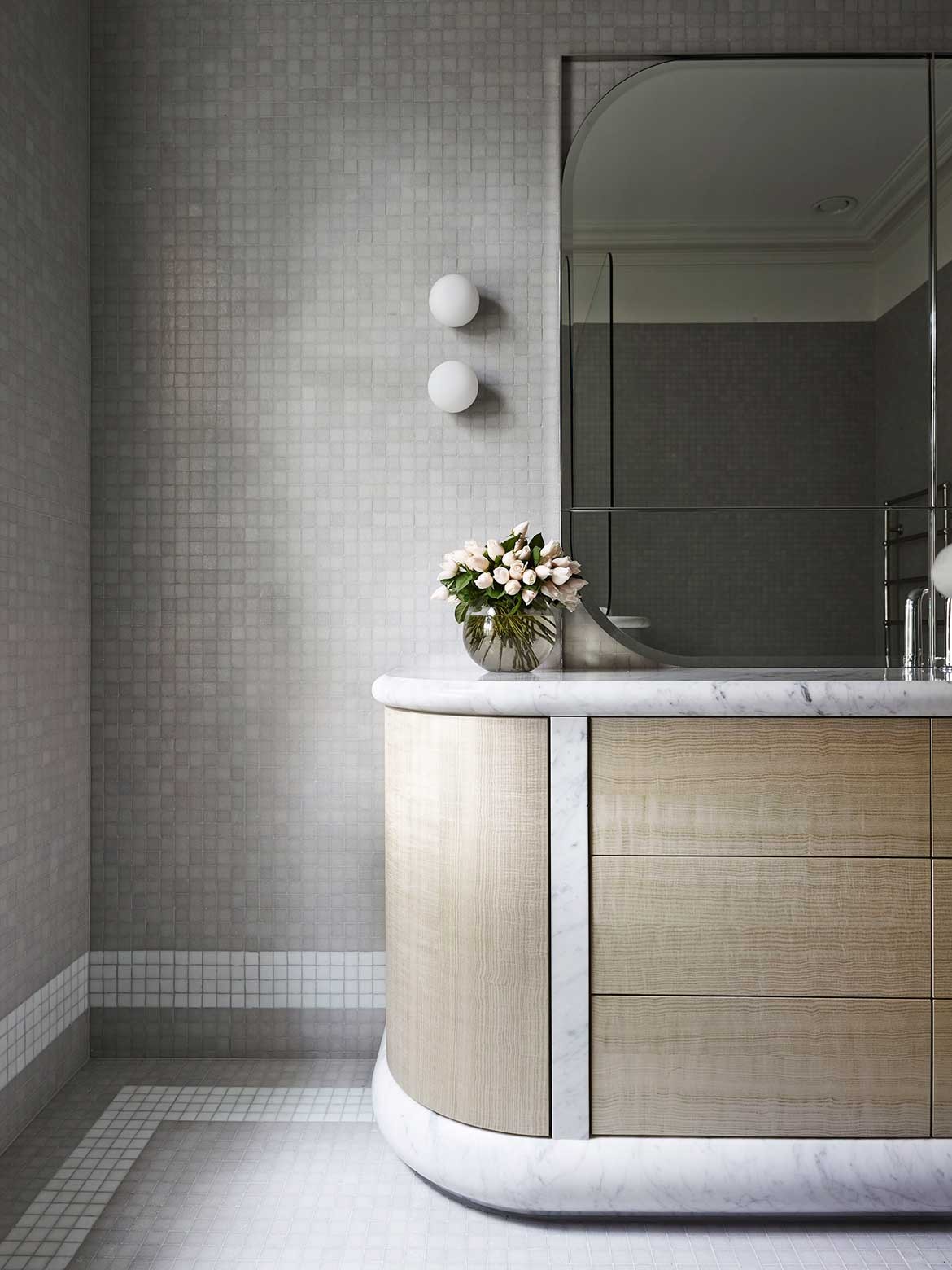
Colour, texture and a sculptural nuance have been used to reject the notion that the requisites of an ageing client be met with clunky rails and ugly seats. Yet the bathroom design is wholly sensitive to accessibility. Tiled floors and surfaces are secure, curved and without steps or edges. Positioning of cabinetry is such that stable surfaces suffice for hand-holds and are inherently where they need to be. Very importantly, the aesthetics of the bathroom provide assurance that the client is in fact fabulous, rather than a constant reminder that they are perhaps less-firm than they once were.
SJB Interiors
www.sjb.com.au
Photography by Anson Smart
