Orama | 2015
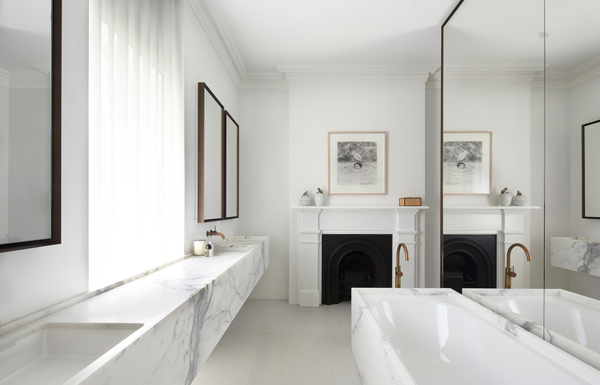
“We wanted to pull the two structures apart to bring light into the centre. People think concrete will look industrial but it has a lightness.”
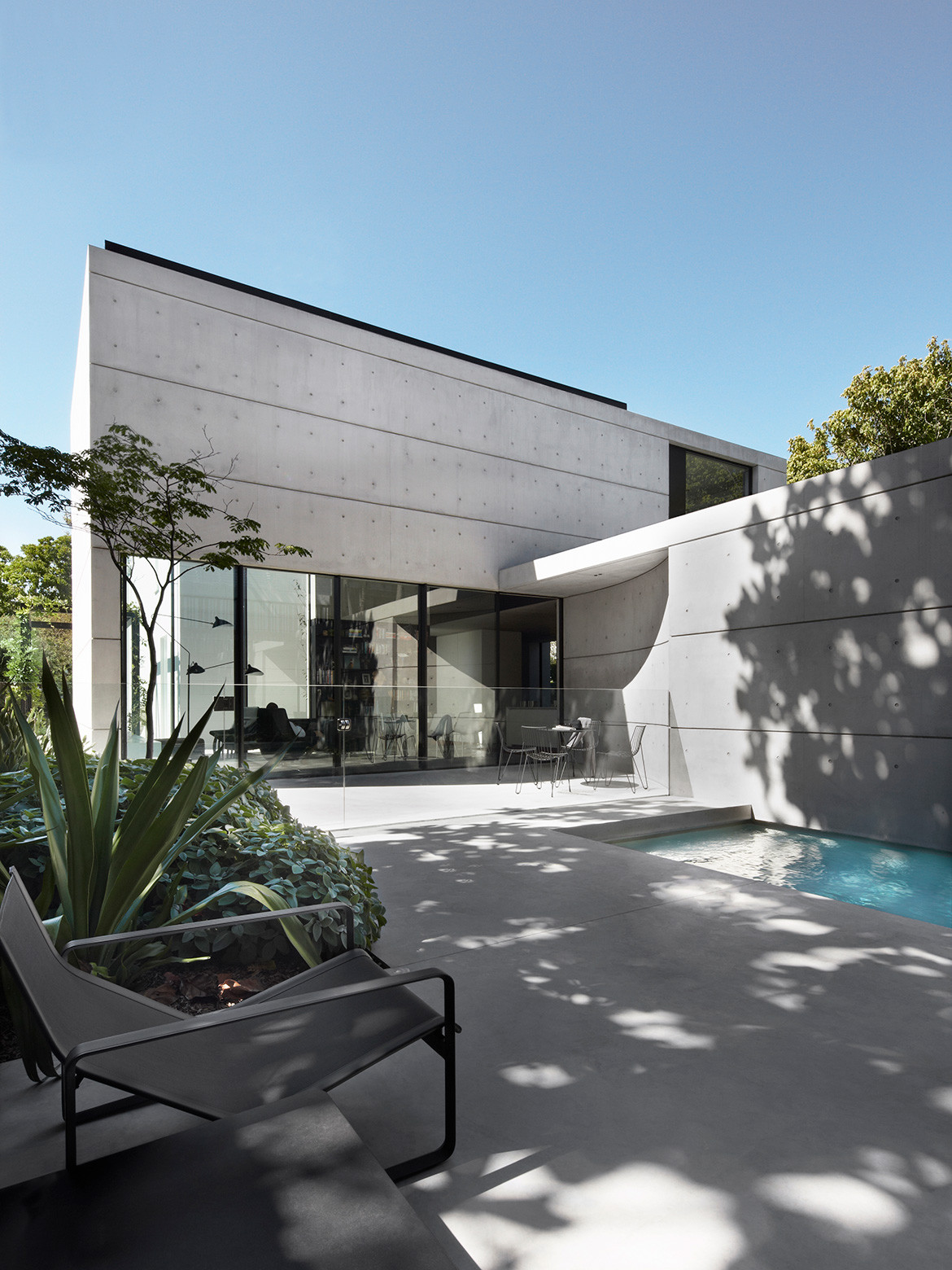 Photography by Sharrin Rees
Crown 515 | 2016
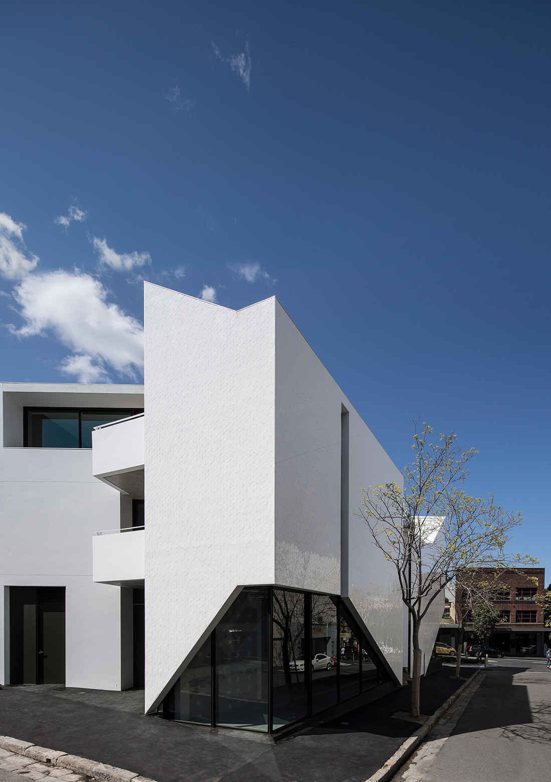
On a prominent corner in Surry Hills, Crown 515 presents a dynamic form to the street, reinterpreting the traditional terrace in a contemporary design of angular shapes and shimmering tessellated tiles.
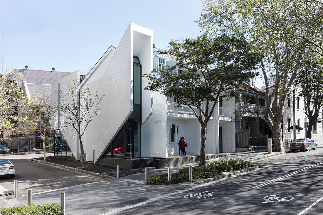
“Derived from the pitched roof forms of the surrounding structures and with a conscious nod to the vertical portals of the adjoining terrace typology, the architectural language of the building represents a challenge to the conventional terrace row.”
 Photography by Ross Honeysett
Arbutus | 2020
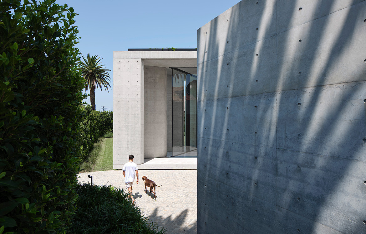
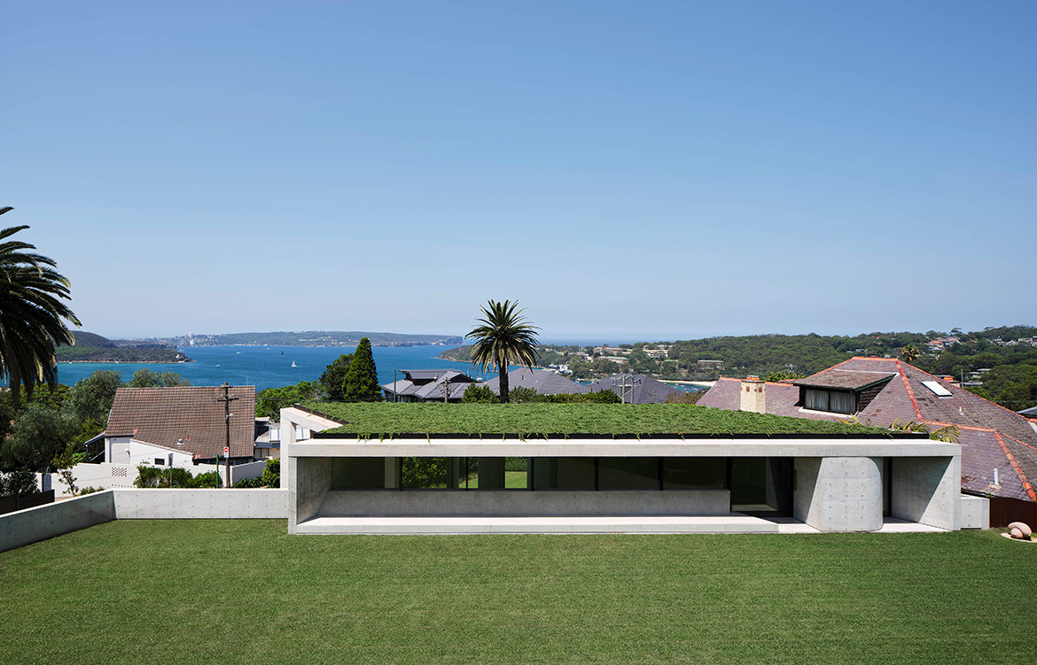
“Using landscaping and distinct concrete spines, the extension to this family home appears as a single- storey addition.”
 Photography by Romello Pereira
Indigo Slam | 2016
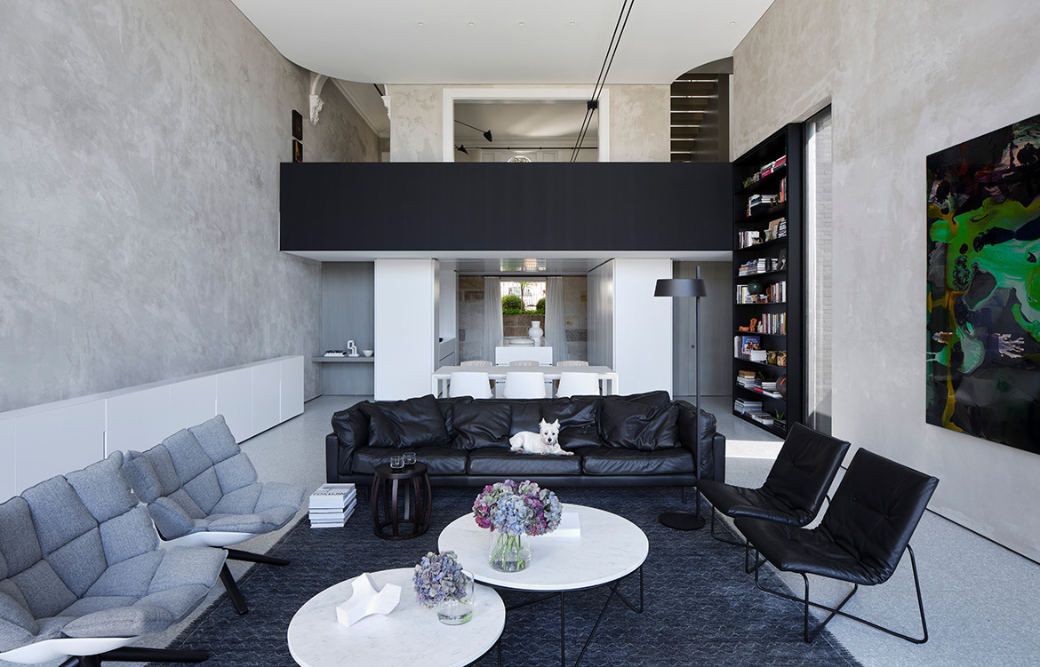
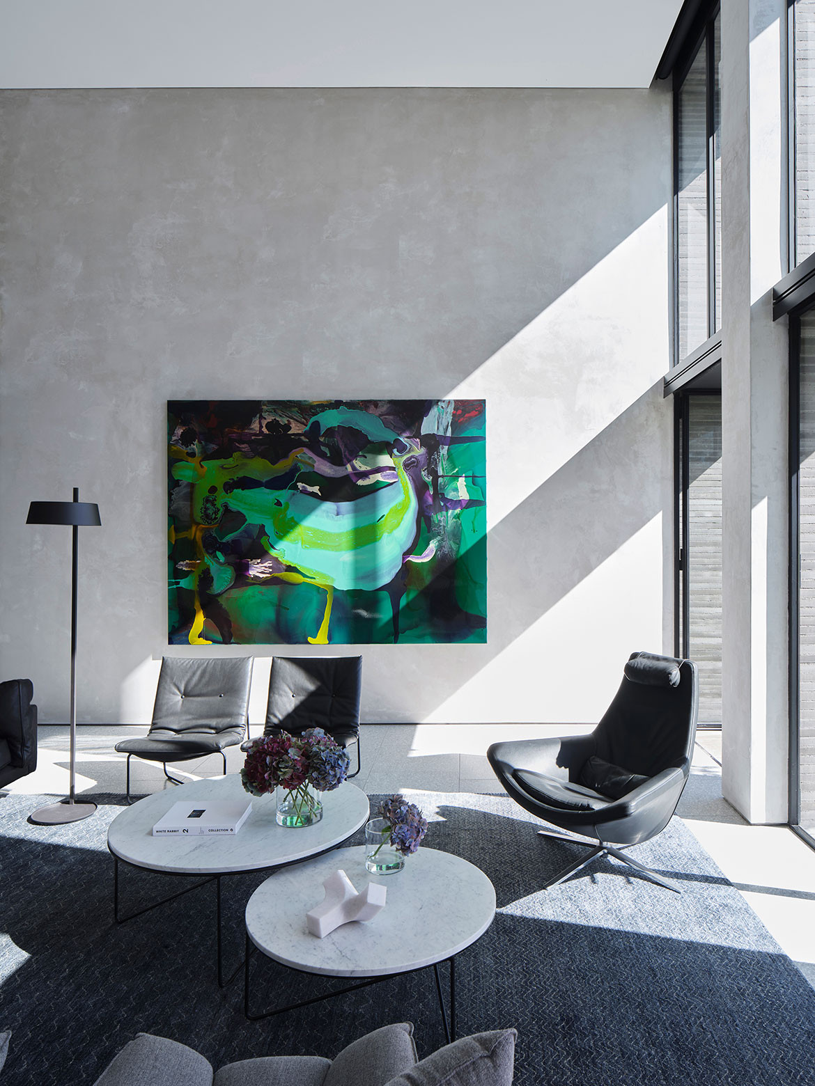
A piece of sculpture to be lived in. Indigo Slam is a home of distinction for an art collector. Behind the organic, curving concrete façade, serene living spaces and monumental halls create a dynamic spatial interplay of minimalist interiors in which the main decorative element is light.
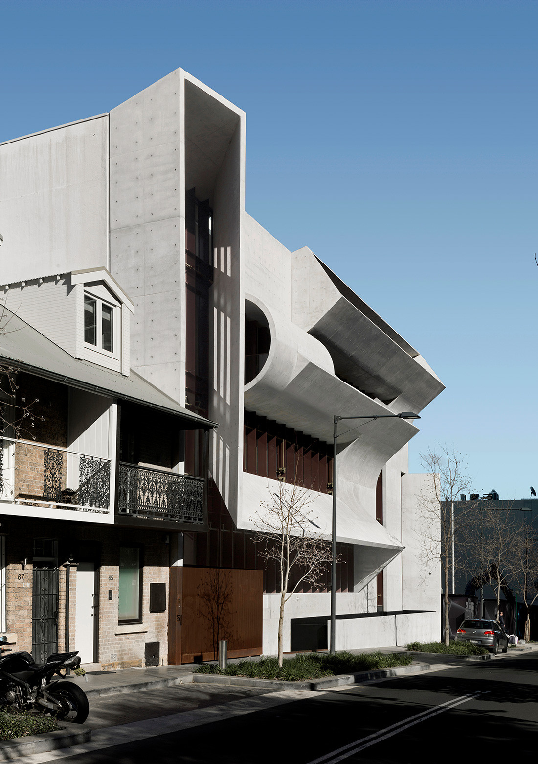
“The brief was for Indigo Slam to last 100 years. Materials were selected to wear and endure and the fittings to last. There was consideration for operable elements to be mechanically operated rather than digitally.”
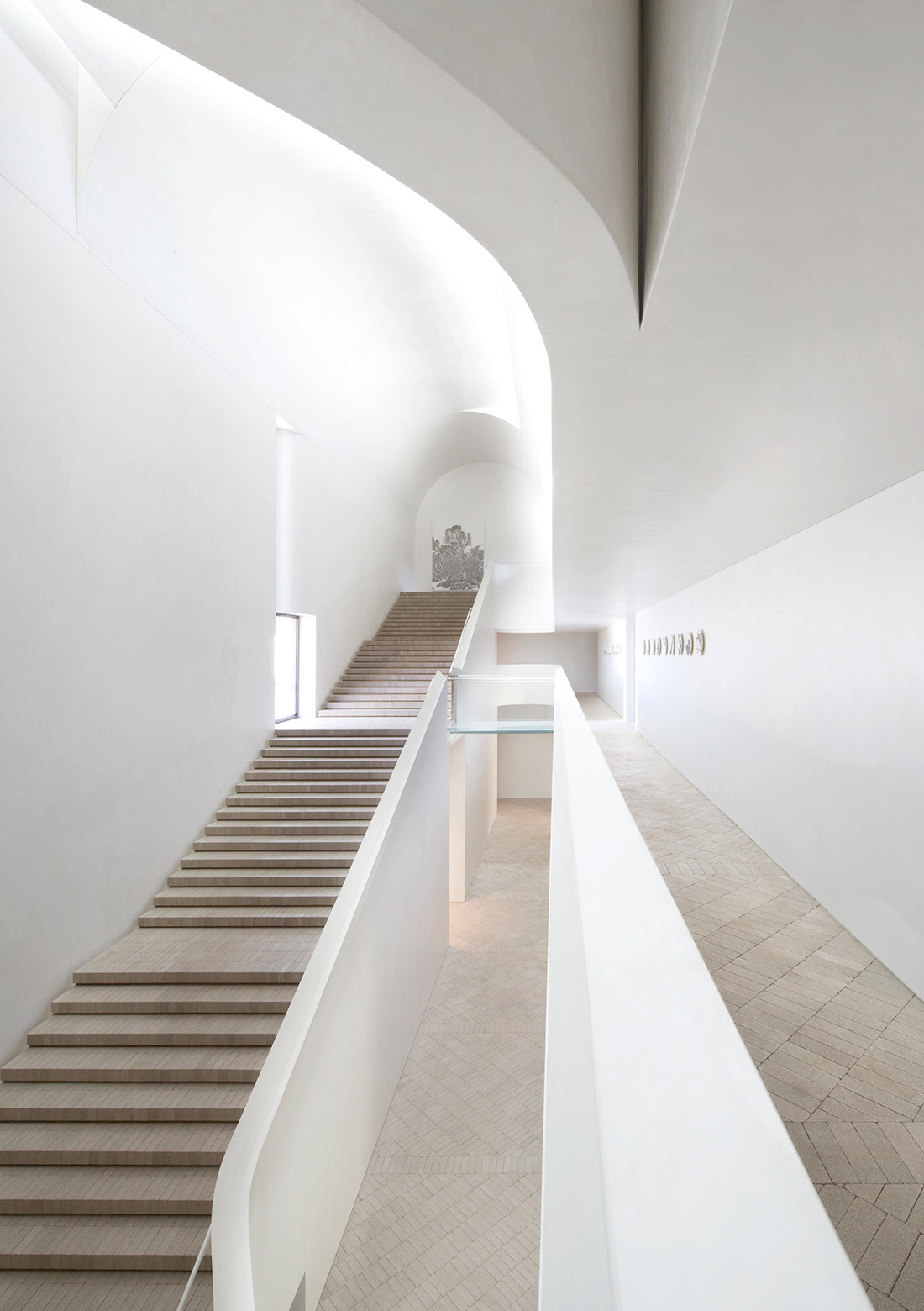 Photography by Sharrin Rees and David Roche
Bourke Street Apartment | 2004
The Bourke Street apartment sits atop Smart Design Studio’s terrace conversion in Surry Hills. The building’s glass louvred sleeve extends above the old façade to create a light- filled rooftop dwelling.
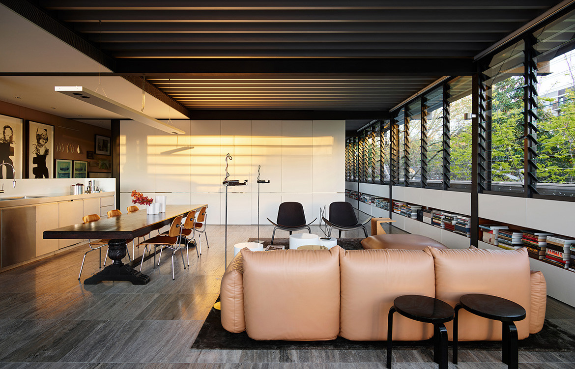
“It’s like a treehouse in the city; you feel like you have completely escaped. I love the very Australian aesthetic of the louvres; mostly they’re driven by aesthetics, but practically they’re a great way of ventilating the space.”
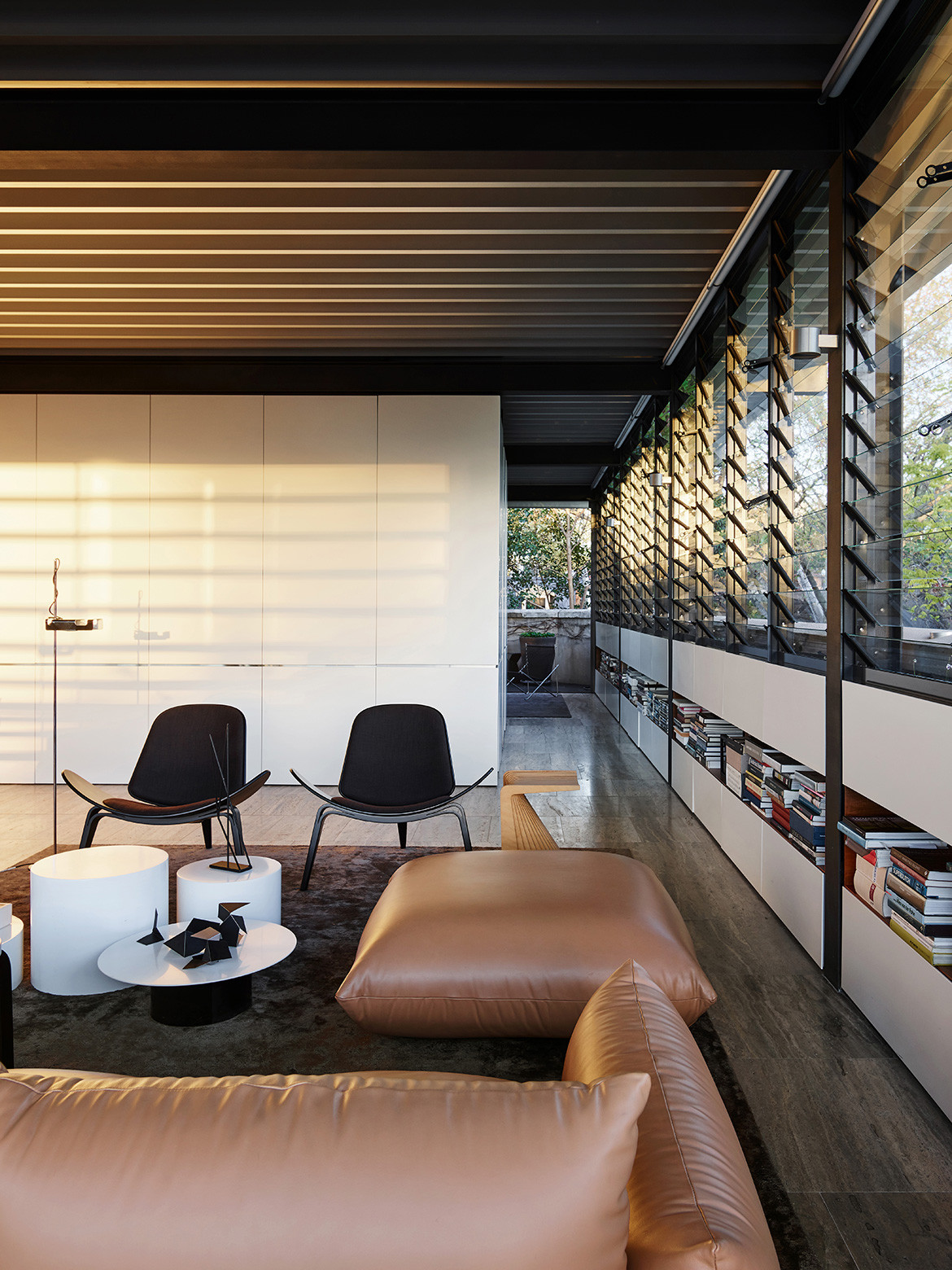 Photography by Anson Smart
Lamble | 2011
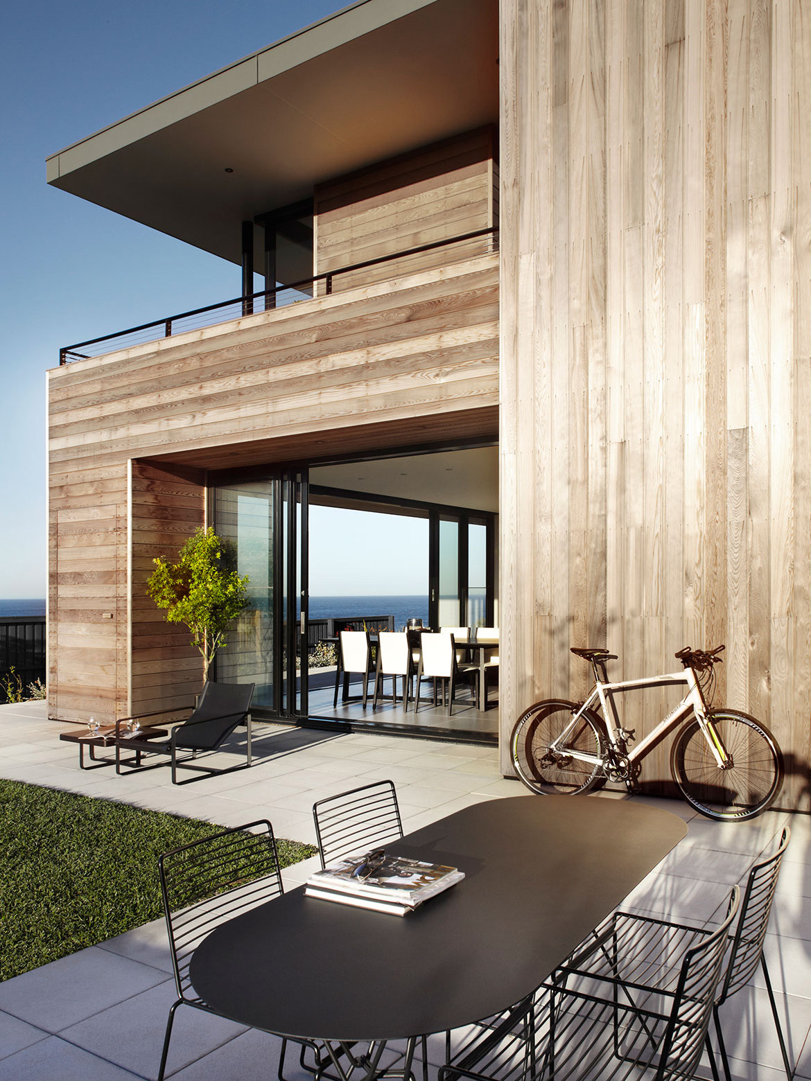
A pair of coastal homes that challenge convention, Lamble on the South Coast of New South Wales makes the most of the incredible views and expresses a simple but confident form.
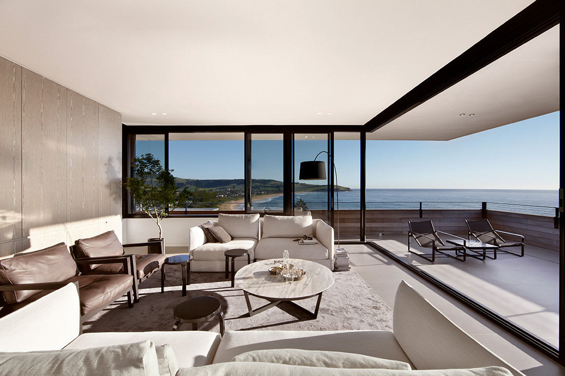
“The strong natural light allows sun and shade to animate the architecture, making the house part of the ever-changing scenery of the ocean.”
 Photography by Sharrin Rees
Tusculum | 2012
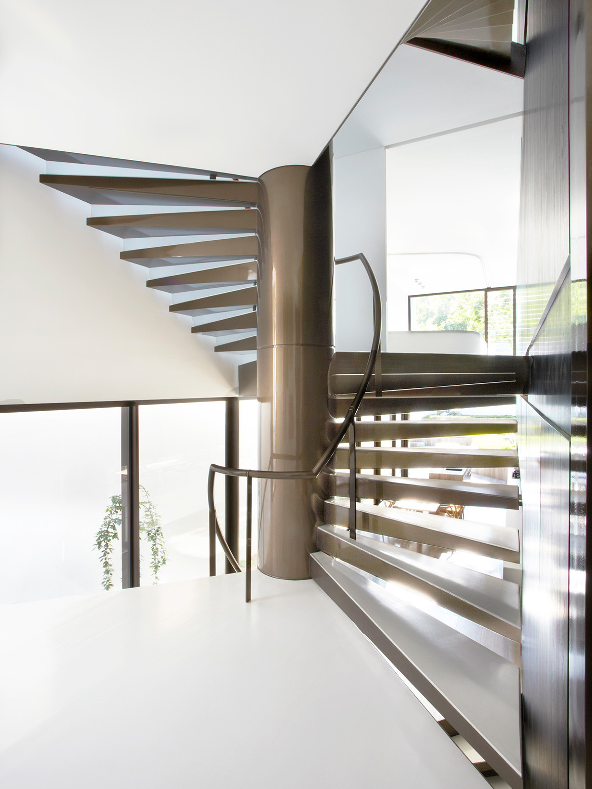
An extension of a turn-of-the-century terrace house in Sydney’s Potts Point, this renovation focuses on a grand and gracefully spiralling stair that forms the pivotal junction of the old and new parts of the house.
“This house offers extraordinary spaces complemented by confident forms, understated design and exquisite detail.”
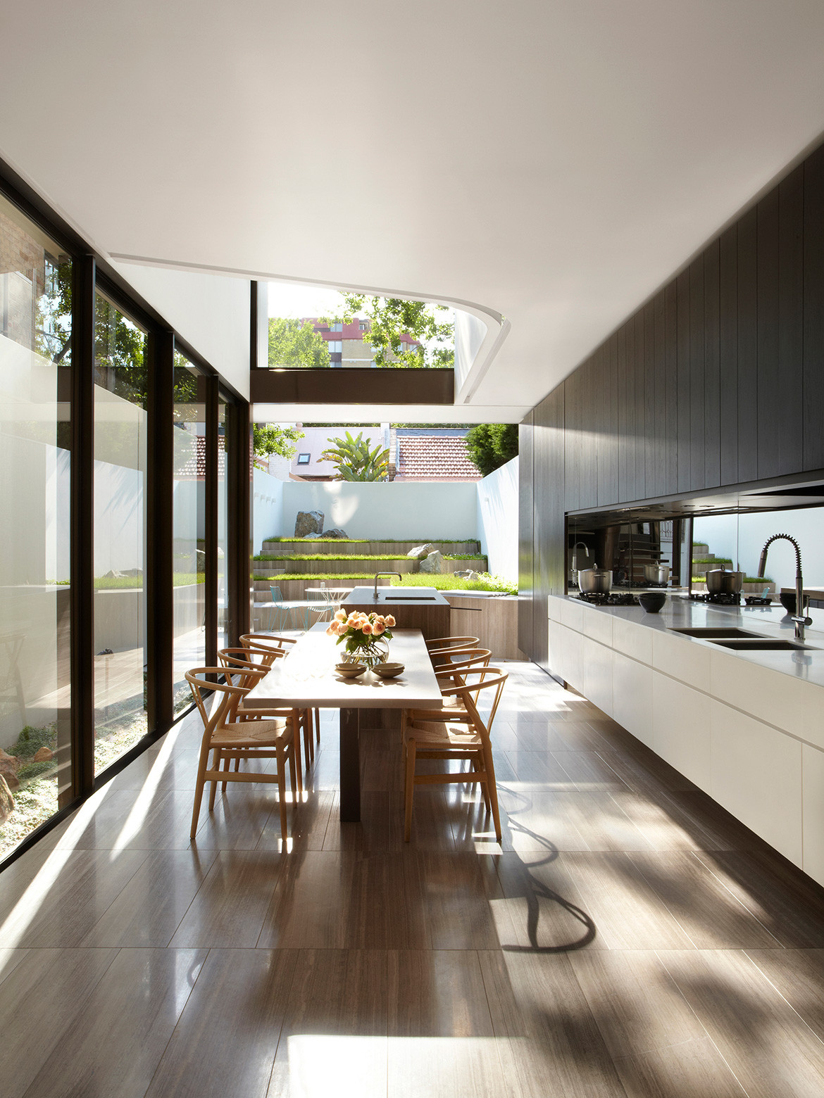
“We have broken the house in two, leaving the existing house as old and adding a modern extension grafted on via a glass link and a spiral staircase.”
 Photography by Sharrin Rees and Ross Honeysett
Lena | 2020
“For us, there was no other material other than brick for the new addition. We needed a material that would complement the painted rendered walls of Paddington yet read in a contemporary way.”
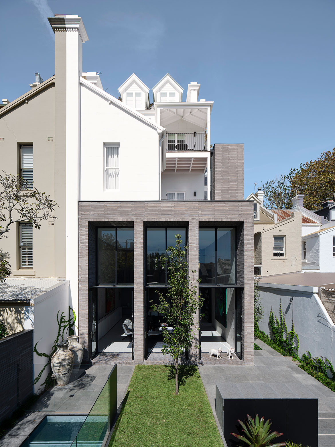
A void gives so much more than it takes – providing incredible drama and making the rooms below feel very alive, airy and bright.
 Photography by Romello Pereira
Arlington Grove | 2017
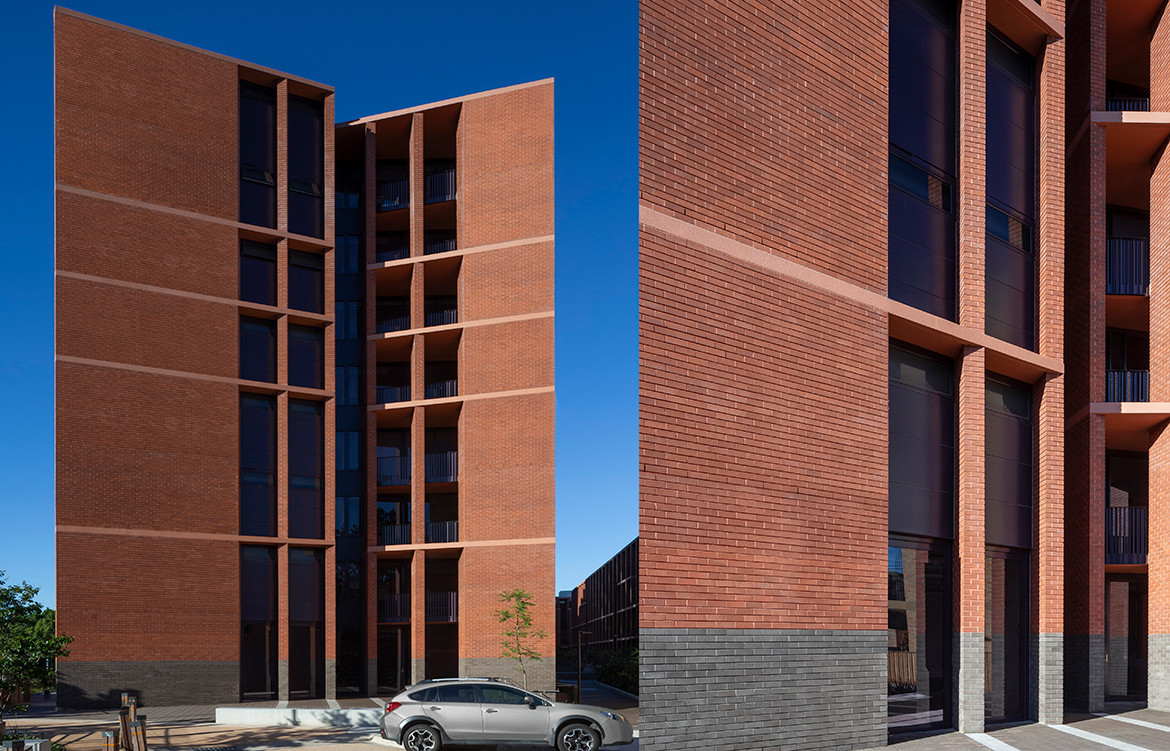
The architecture of Arlington Grove utilises carefully composed but long elevations, with principles borrowed from classical buildings, framed by articulated corners.
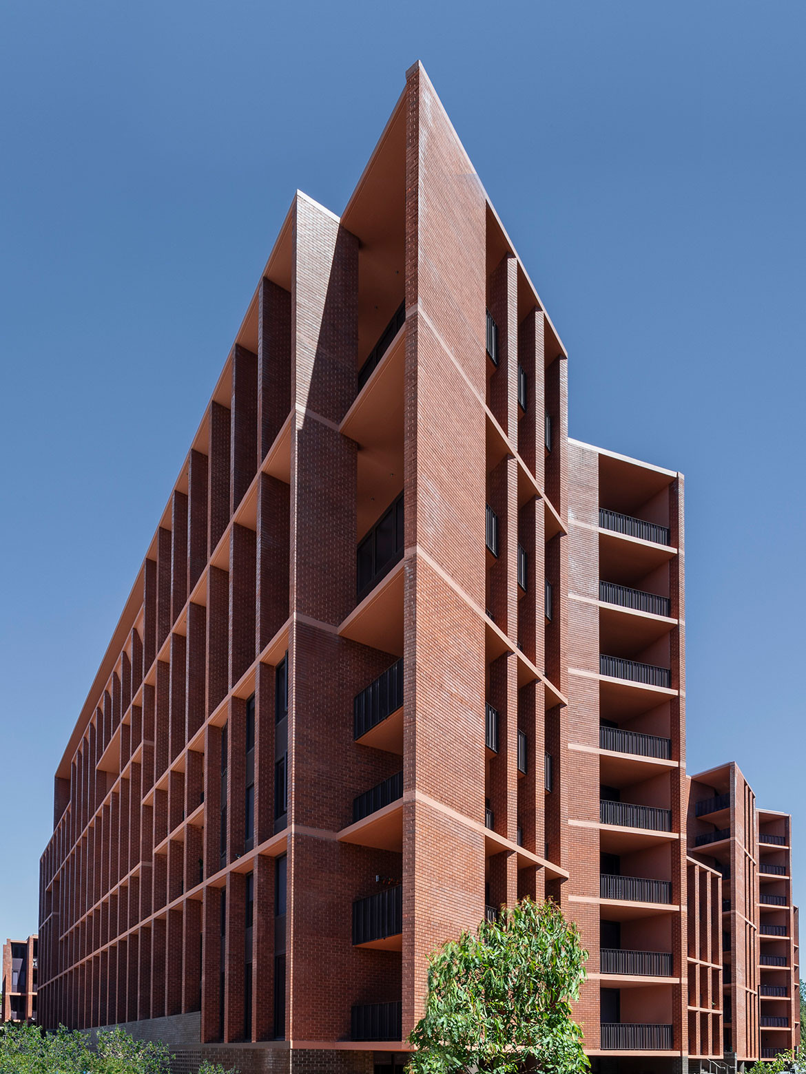
“The use of brick unifies each of the subtly different building forms, and provides a nuanced grain to the project, while its diversity and texture soften the exterior.”
 Photography by Ross Honeysett
Smart Design Studio
smartdesignstudio.com
This visual essay originally appeared in issue #50 of Habitus. We think you might also like to see the new Smart Design Studio HQ
