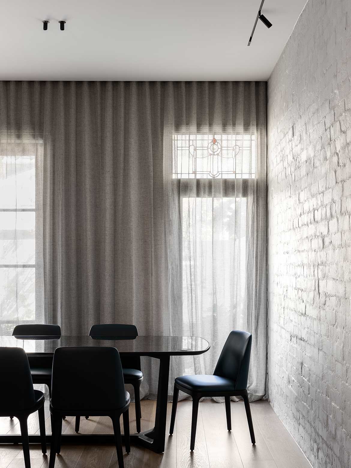
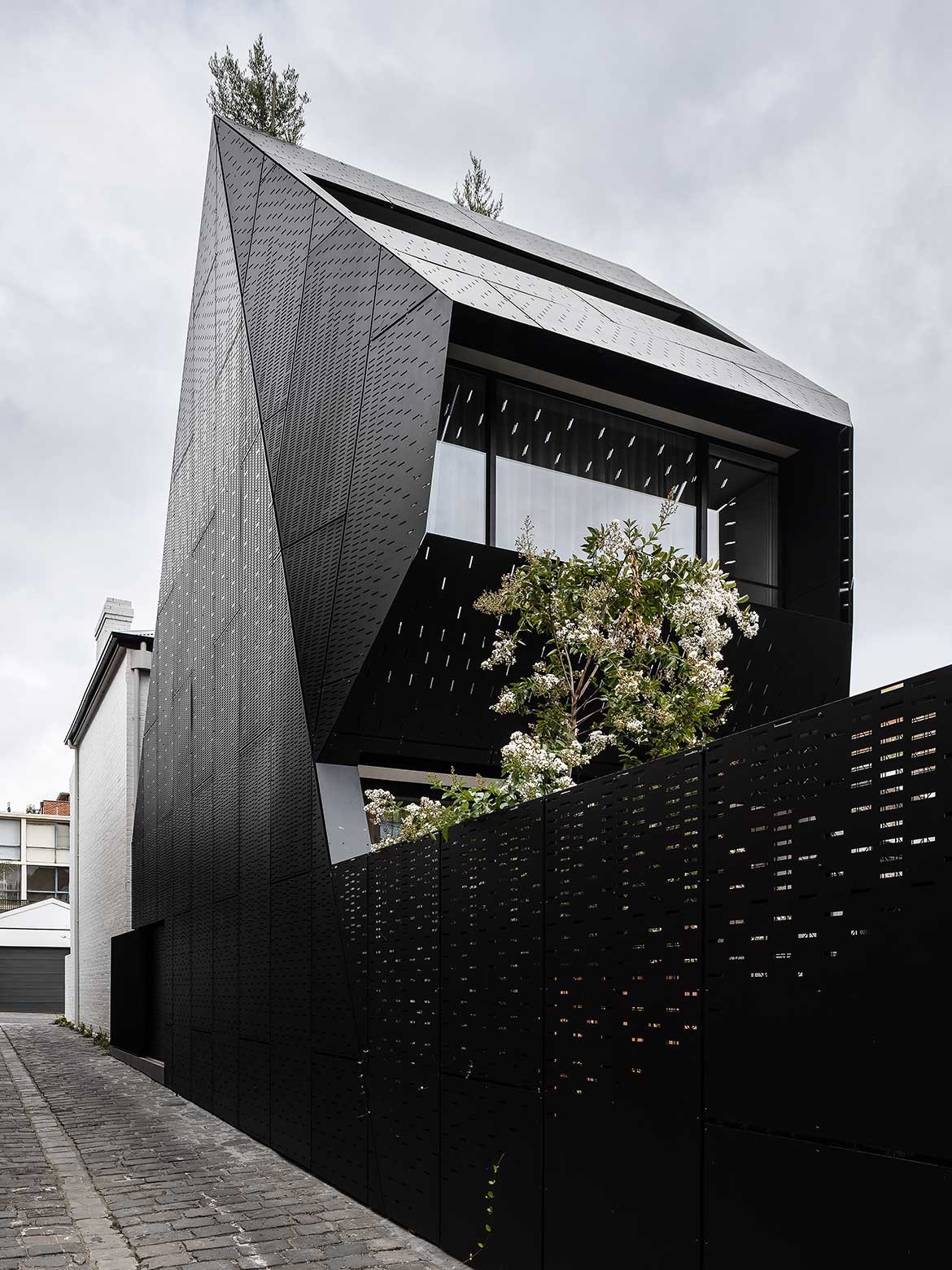
Expanding on the idea of a European interior aesthetic, Kestie Lane’s intent for this four-storey terrace was to explore materiality without limiting space. As such, the minimal palette is alive with understated variation and textural distinction.
“When we first met the clients, they were just about to start their family, we really wanted to make a beautiful, warm, textured family home,” says Lane. As such, surface, pattern and texture are used throughout the home, often with a geometric overlay.
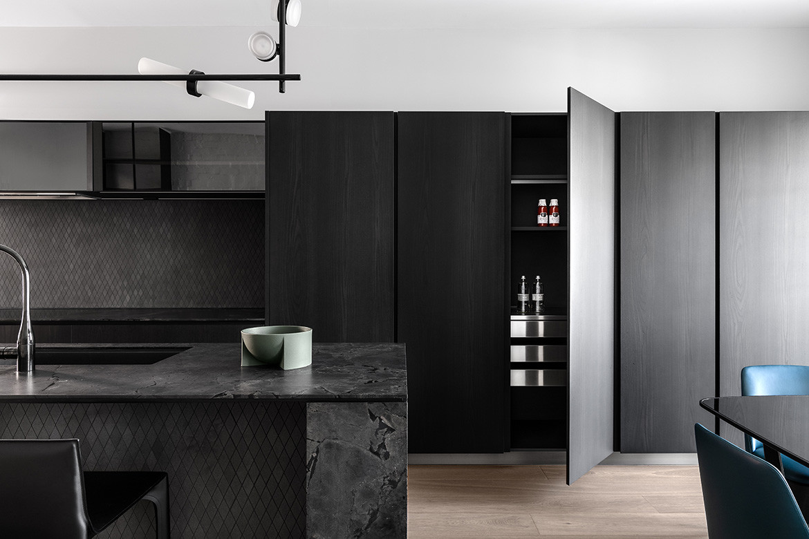
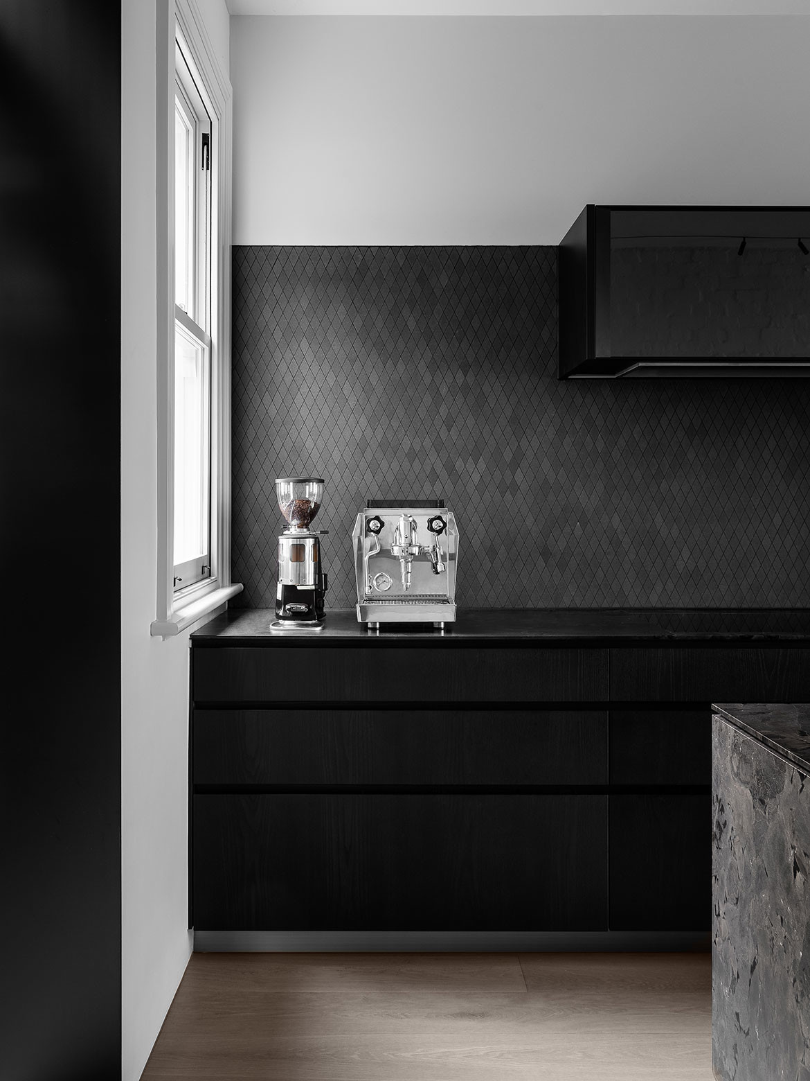
The kitchen makes this point well with a monolithic stone island in a leathered black and bronze Magnesia stone from Artedomus, clipped at each end to deliver geometric interest. The under-counter and splashback are both finished with a quartz limestone diamond tile in shades of black, while the Poliform cabinetry in dark timber provides another surface pattern.
The strong horizontal of the island and verticality of the cabinetry is then broken by the custom Typography pendant light with adjustable light fittings to suit the kitchen workspace.
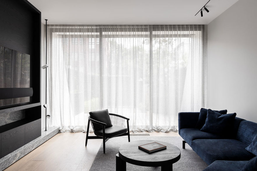
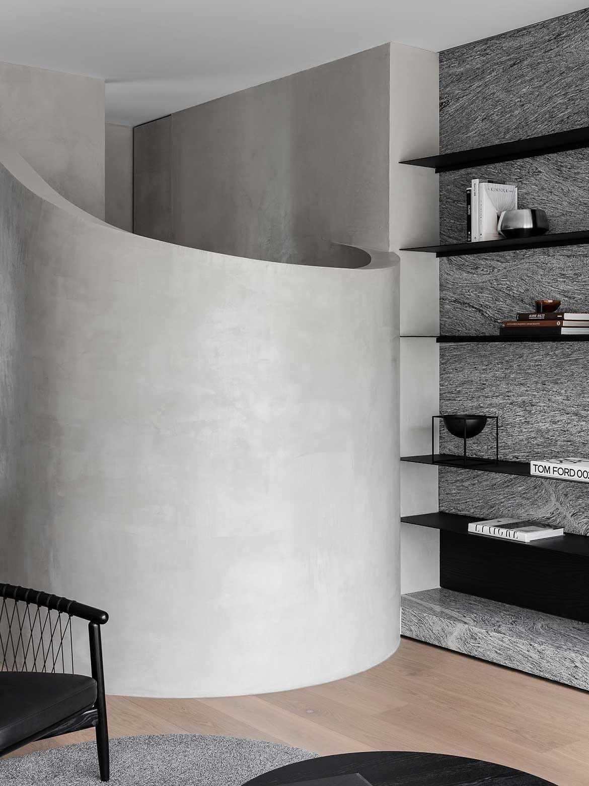
Her use of stone in the interior has been incredibly considered with a specifically cut Italian granite in the main living room: “We love working with quite interesting stones. The Argento Grigio granite was vein cut so it has a beautiful grain movement in the slab.” Placing the stone below and behind a grid of steel shelving, negates any sense of busyness.
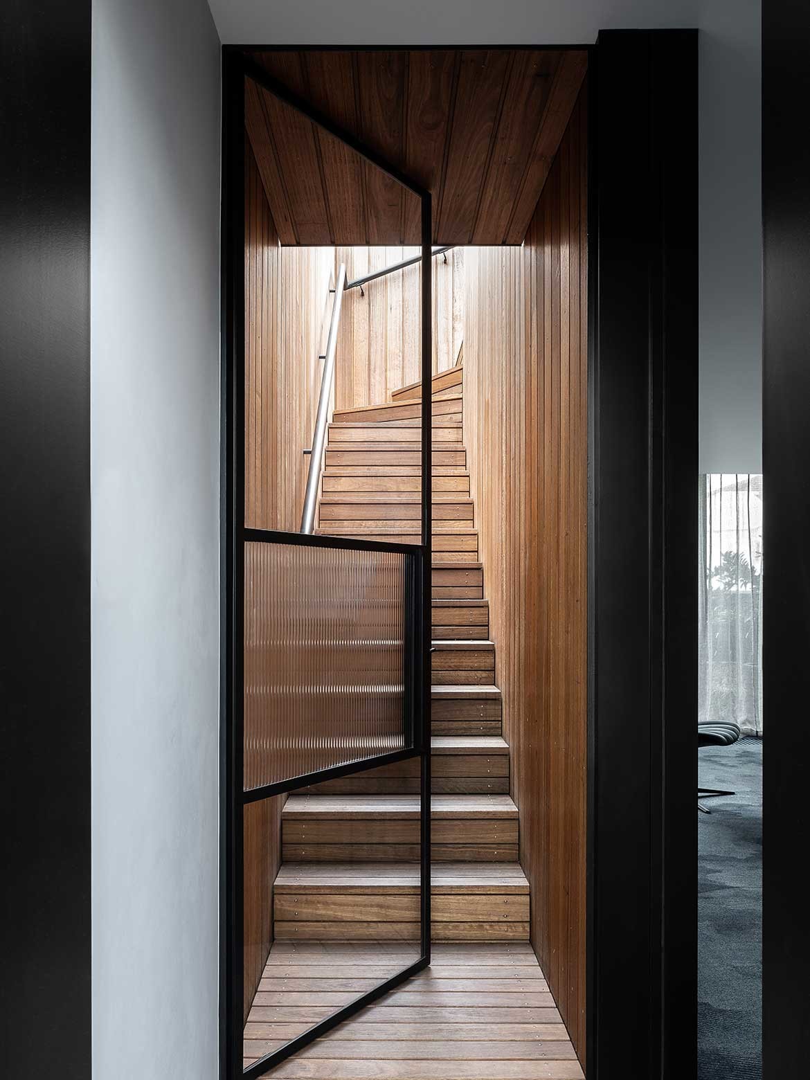
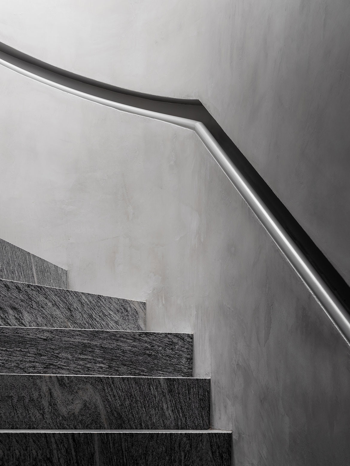
Lane also used the same stone for the stairs well: “We intentionally worked closely with artedomus, to bring that same stone down the staircase to the basement, all the grain pattern matched to appear like it was cut out of one block” It, moreover, makes for a fabulous visual dialogue with the adjacent stair surround, which was cut to suit the room as the house was built: “We literally sliced and created the staircase form and cutout on site and then finished and softened it with a beautiful concrete render” says Lane.
Countering the monolithic nature of the stairwell gesture, is a picture window of soft drapes, a divine blue Knoll sofa from Dedece and the insouciance of a floor to ceiling Typography lamp. A wall of black cabinetry neatly hides the television in plain sight.
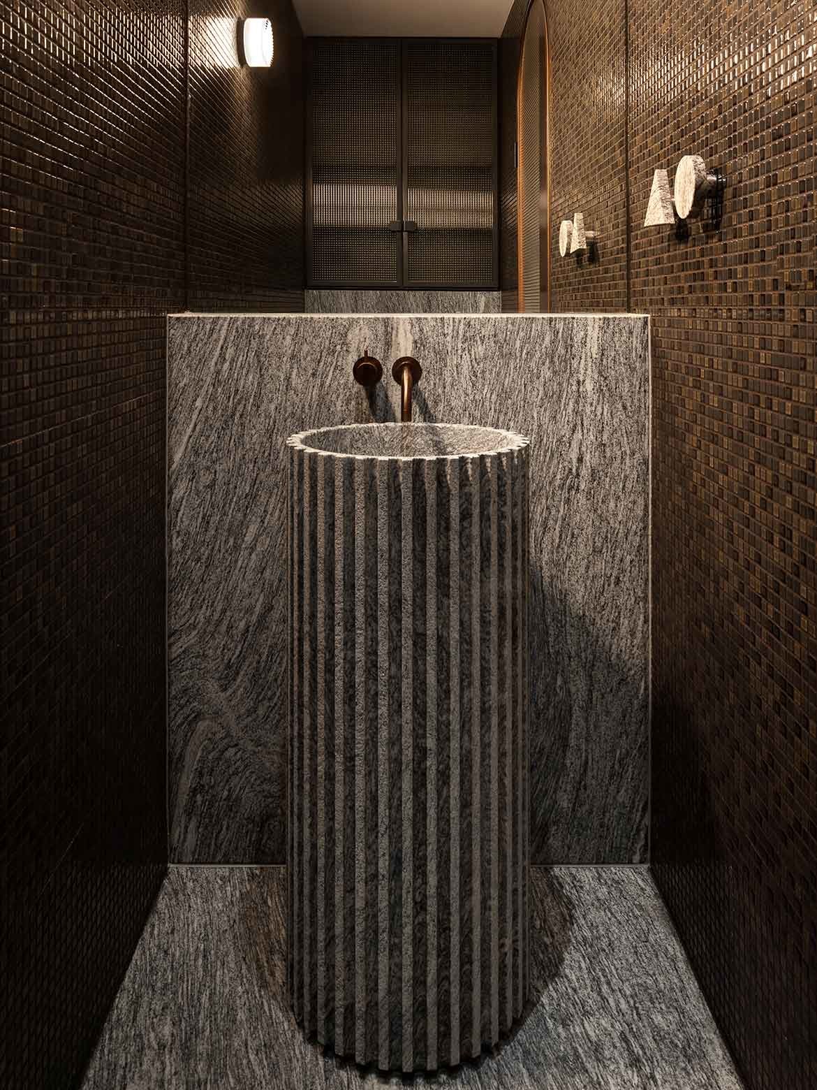
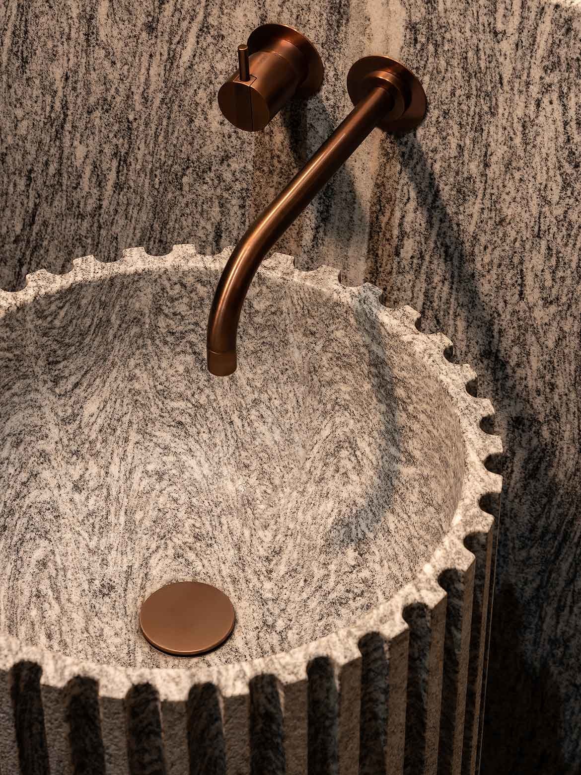
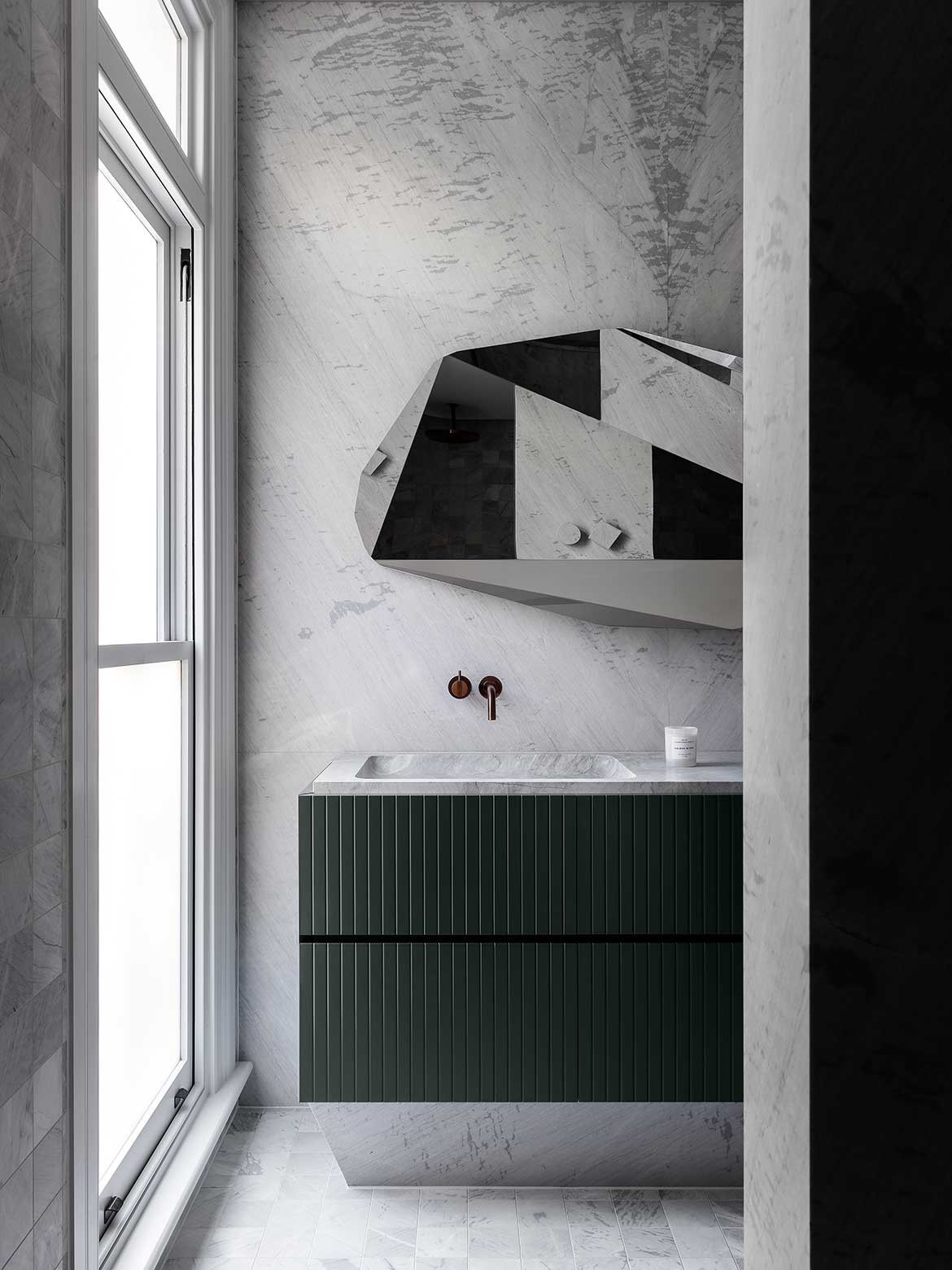
Kestie Lane Studio bathrooms are always extraordinary. For this project, the powder room in the basement is arguably the scene stealer with a bespoke wash basin. And, it almost didn’t happen.
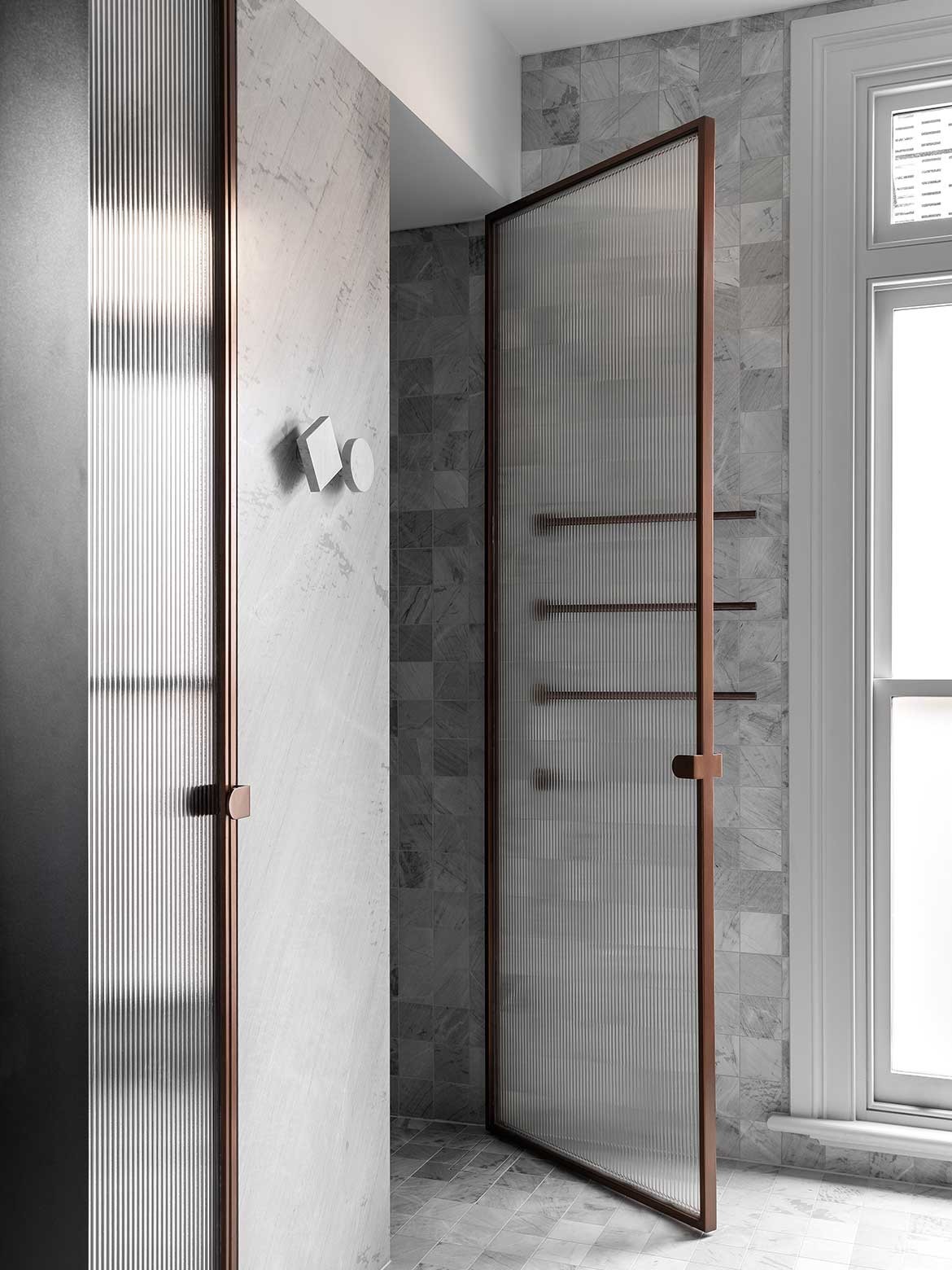
“I think the clients always just thought the basement was the entry from the car lift and where the laundry hides. We convinced them that the powder room although small could be a real statement, a ‘wow factor’. I love an interior that is unexpected to the design language,” says Lane, who used moody darkened glass and explored three finishes to deliver an exceptional room of stone, mirror and bronze.
Using leather finished granite for the floor, walls and door handle, the basin is carved from a single block. The face of the basin has been sandblasted to give a rough softness while the interior is honed to a smooth, welcoming finish. Her pairing of granite with a mosaic of bronze tiles, bronze tapware and detailing verges on the sublime.
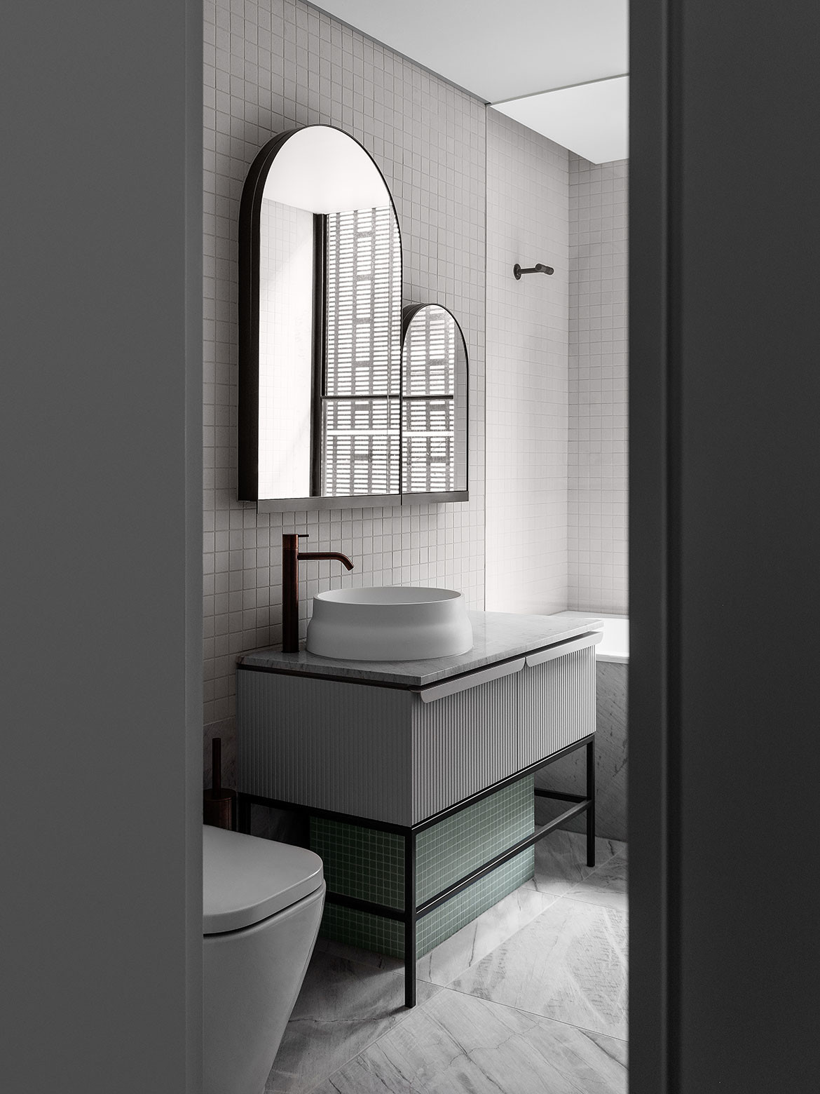
The ensuite and upper floor bathrooms are just as beautiful, but more attuned to providing everyday luxury: “I like to design the master ensuite like a retreat, like a wellness haven that feels therapeutic,” says Lane.
To this end, Dolomite Elba stone has been used to create a play between the grid of the tiles with the natural markings of the stone. A basin and under plinth are carved and honed from the same stone to continue the variation of form while maintaining the clarity of a minimal palette.
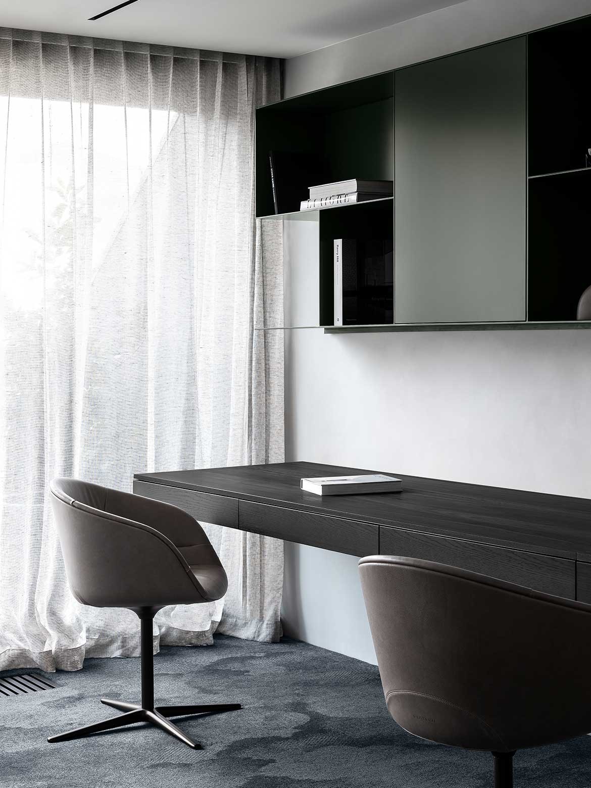
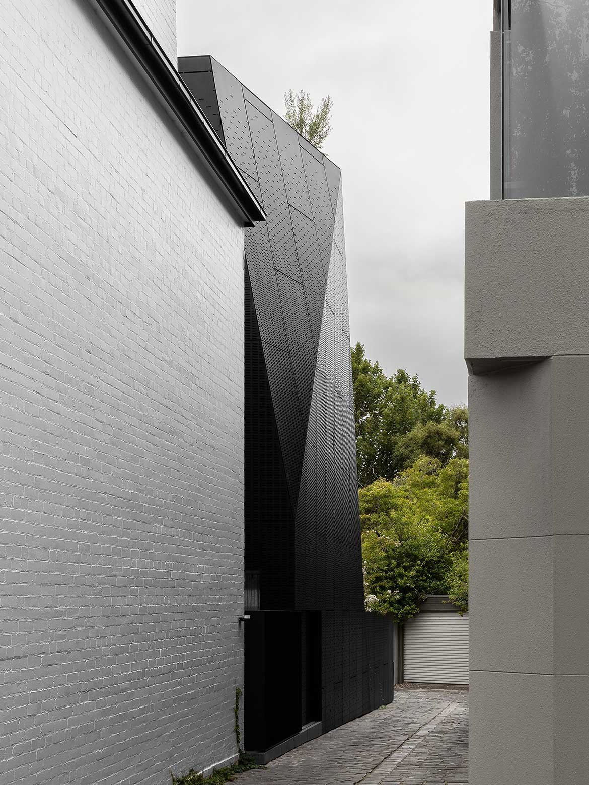
Responding to Matt Gibson’s architecture, the diagonal wall line in the study is countered by a subtle cloud motif in the deep blue carpet by Christian Lacroix. A pair of blue velvet Walter Knoll chairs with bronze detailing brings an unexpected sculptural quality, while leather Walter Knoll desk chairs are, while very beautiful, an unusual study choice.
It is this unconventionality that signatures her work, whether in her overlaying of natural stone with grids or her choice of soft furnishings, there are always surprises subtly woven into Kestie Lane Studio’s designs. Then there are the wow factors that simply astound.
Project details
Interiors – Kestie Lane Studio
Architecture – Matt Gibson Architectural Design
Builder – Visioneer
Photography – Timothy Kaye
We think you might like this project that cleverly uses up a small urban plot
