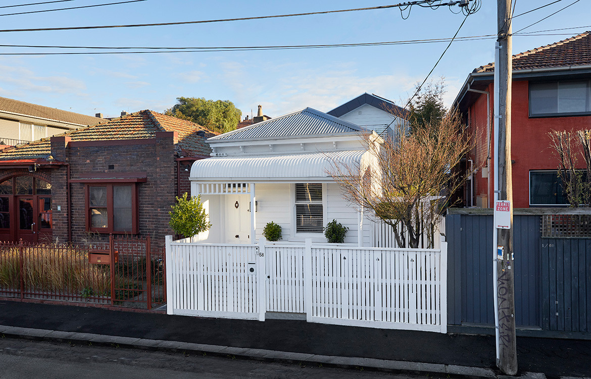
Built on a tight site and an awkward footprint, this classic weatherboard worker’s cottage in St Kilda had little room to move. So, when the client’s brief asked for more space and a feeling of openness, the design team at Jost Architects had their work cut out for them.
While the original house had all the charm and character of a worker’s cottage, a substandard 1980s extension had an inefficient layout, and a dreary backyard provided a plain and uninspiring aspect from the living, kitchen and dining areas. The client engaged Jost Architects to create new, comfortable and contemporary spaces that complemented the heritage of the cottage without mimicking it. “The client wanted a feeling of openness,” says Patrick Jost, director of Jost Architects. “However, it proved a challenge to fit all the contents of the brief into a tight space, due to the 140-square-metre footprint, the awkward tapering shape of the site and the heritage overlay.”
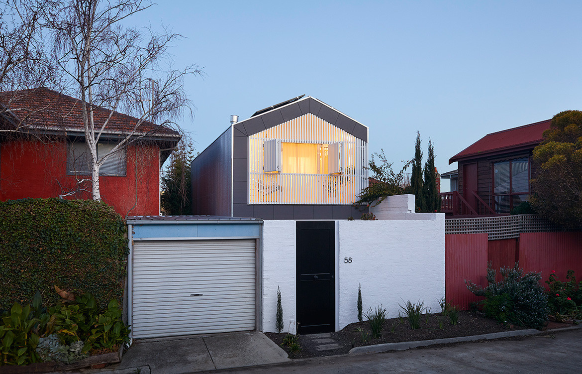
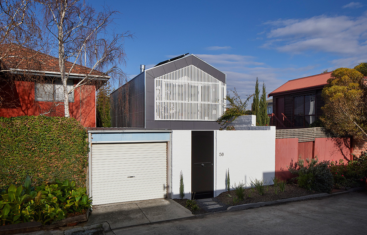
The design team applied some complex geometries to ensure the upper-level façades presented symmetrically at each end of the property.
Jost Architects retained and refurbished the two front bedrooms and bathroom on the ground floor and designed a two-storey addition with a new kitchen, living and dining area downstairs and a master suite and balconies upstairs. While the planning may sound simple enough, the tapering site meant the gutter line, roof ridge and ceiling and wall junctions weren’t parallel to each other or horizontal.
To counteract this, the design team applied some complex geometries to ensure the upper-level façades presented symmetrically at each end of the property. “This was all very carefully worked out so no one would notice the unusual form, although a couple of the carpenters who set out the framing had minor existential crises,” Pat jokes.
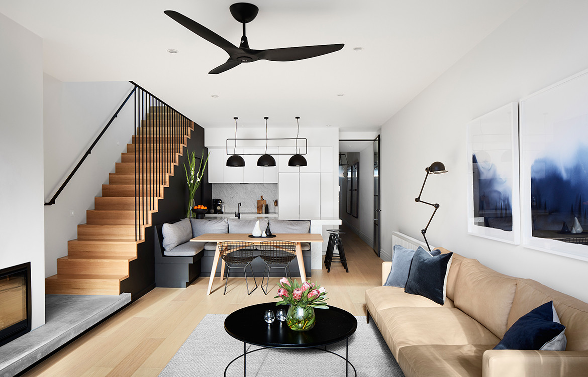
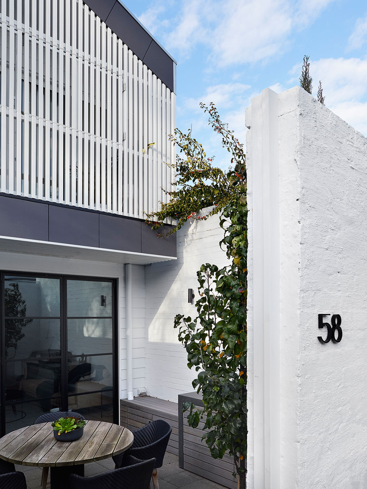
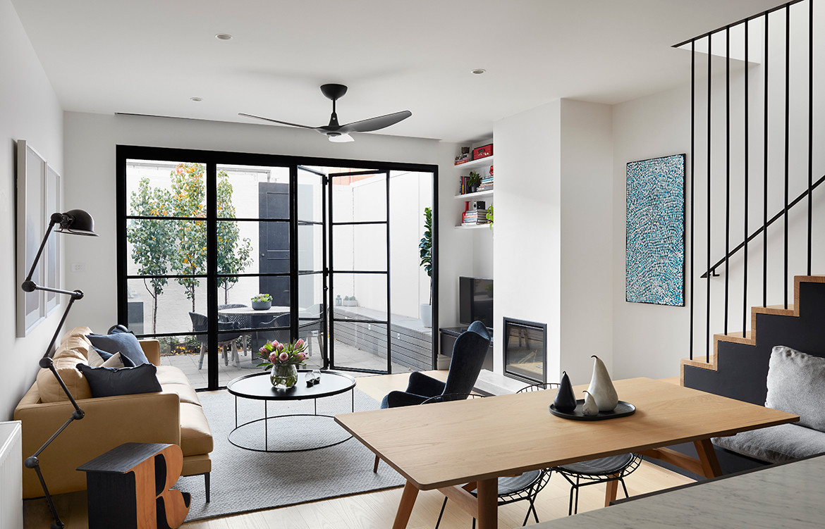
The kitchen/dining/living area promotes the desired sense of openness, with floor-to-ceiling sliding doors connecting it to the northwest-facing courtyard enclosed from the rear laneway. Careful planning and design maximised the functionality of the room. The banquette seat for the dining table abuts the kitchen bench, which has stool seating at the end, and the fireplace plinth doubles as the first (or final) step to the stairs.
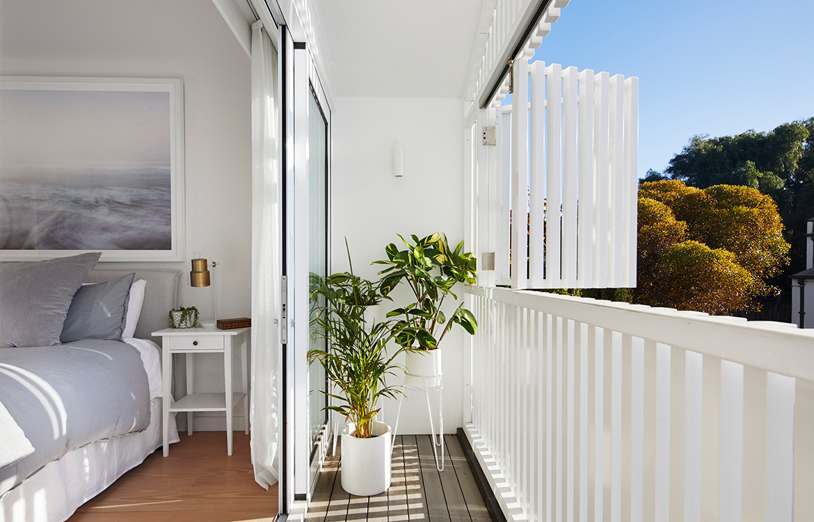
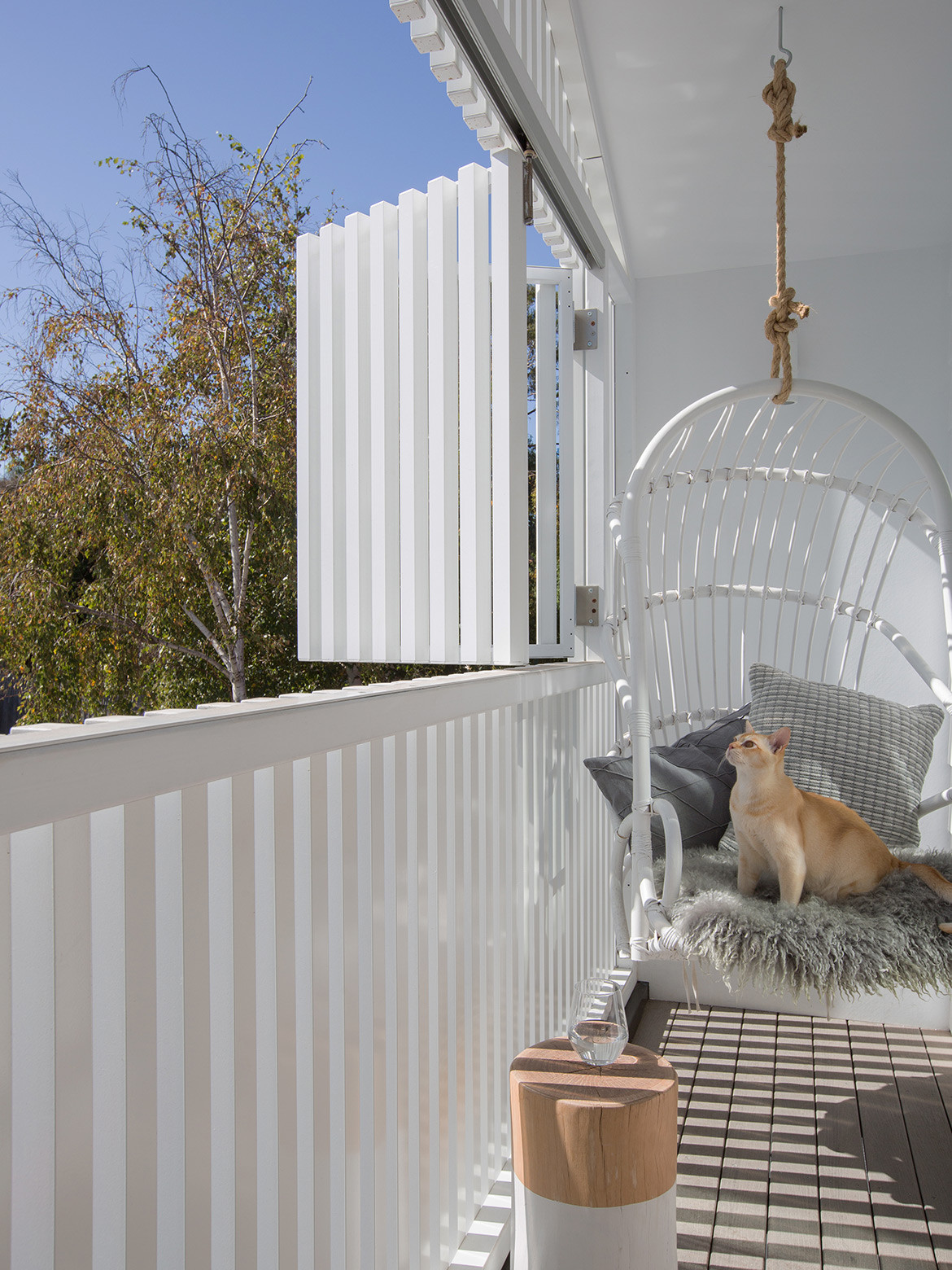
A screened in balcony with shutters enable the homeowner to engage with the activity of the laneway.
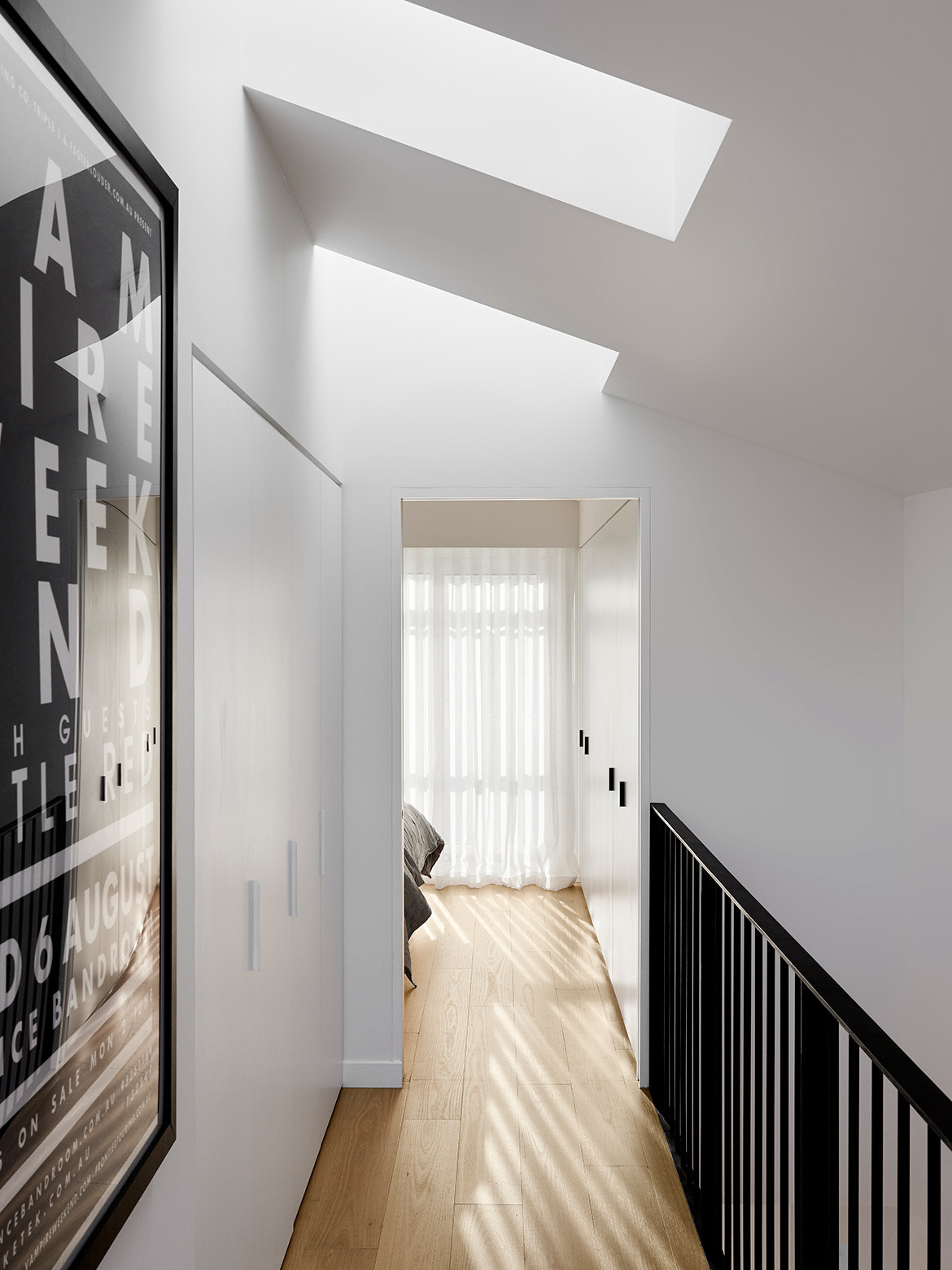
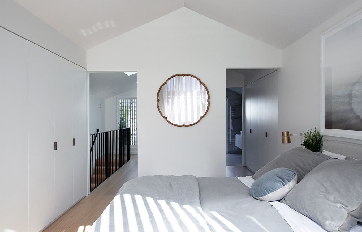
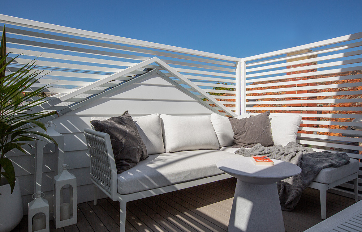
Upstairs required careful consideration to create an interior layout that suits the client’s brief within a form that complies with the heritage overlay and sits within the streetscape. The master bedroom is at the rear where it has a screened in balcony with shutters that enable the homeowner to engage with the activity of the laneway. The aluminium screen also provides privacy and protection from the afternoon summer sun. A walk-through robe leads to the ensuite at the front of the house, where a second balcony sits behind the ridgeline of the cottage roof and provides additional private outdoor space.
A palette of long-lasting and durable materials distinguishes the new addition from the existing dwelling, while not straying too far away from the original. Galvanised custom orb cladding wraps up and over the house, intersecting with the weatherboard cladding. “Both are familiar materials found on the classic Victorian worker’s cottages in this part of St Kilda,” Patrick says. Inside, decorative concrete with zoned hydronic heating, thermally broken aluminium and narrow-profile steel-frame double-glazed windows and sliding doors help maintain a thermally comfortable environment year-round.
Jost Architects
jostarchitects.com
Photography by Tom Roe and Shani Hodson
Dissection Information
Weathertex 200mm Classic Weatherboard smooth cladding system
Lysaght Galvanised Custom Orb metal sheet
Australian Sustainable Hardwoods “Australian Oak” Engineered Select Grade Flooring
Laminex white joinery with black and white edging
Carrara Marble kitchen benchtop
Dowel Jones King Dome Three Point pendant light
Large Bellis pendant light with chain from Schots
Haiku Series 60 from Big Ass Fans
We think you might also like Worker’s Cottage by Clayton Orszaczky
