Design is a key aspect of Aesop’s philosophy and branding. The Australian skincare and amenities brand has managed to communicate this quite clearly not only through its minimally packaged products, but also through the design of its stores throughout the world, where customers are treated to delightful visual and tactile experiences that entice them to keep returning.
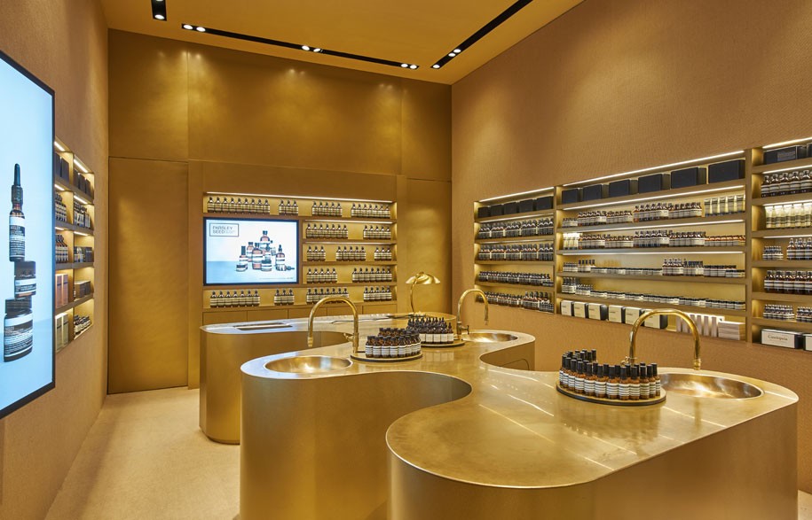
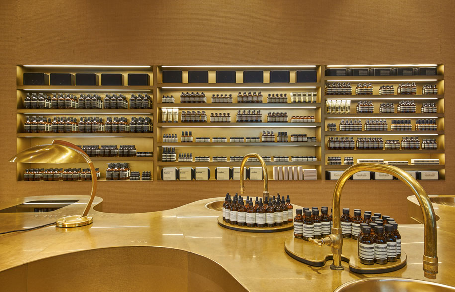
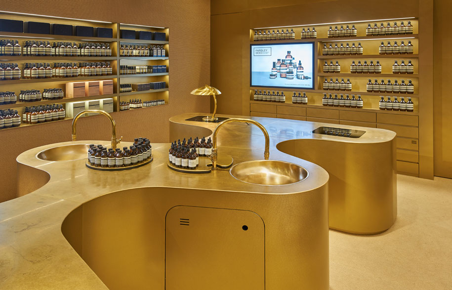
In Singapore, three new stores opened last year. Each has managed to draw influences from the tropical locale but in nuanced ways that eschew kitsch. The newest of this is at Raffles City, designed by Norwegian firm Snøhetta. The firm was inspired by the shopping mall’s location in the heart of the cultural district as well as Singapore’s history as a thriving port. The result is a dreamy palette of brassy, sandy tones reminiscent of “the romance of trade, exploration and tall ships, and the weathered durability of nautical materials,” as described in Aesop’s press statement.
Anchoring the store is a sculptural brass counter, with lamps and faucets coloured in a similar shade for a uniformity that almost renders this an art piece. Functionally, its undulating form allows staff and customers access to the products from the surrounding insert bays. Brass is also applied as wall shelving, while natural fibre carpet, with a subtle wavy pattern reminiscent of sailing rope or hessian storage sacks, wraps the space from floor to ceiling, reinforcing the maritime theme.
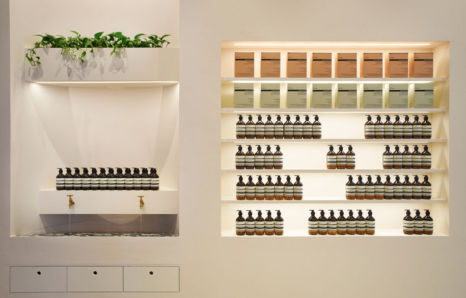
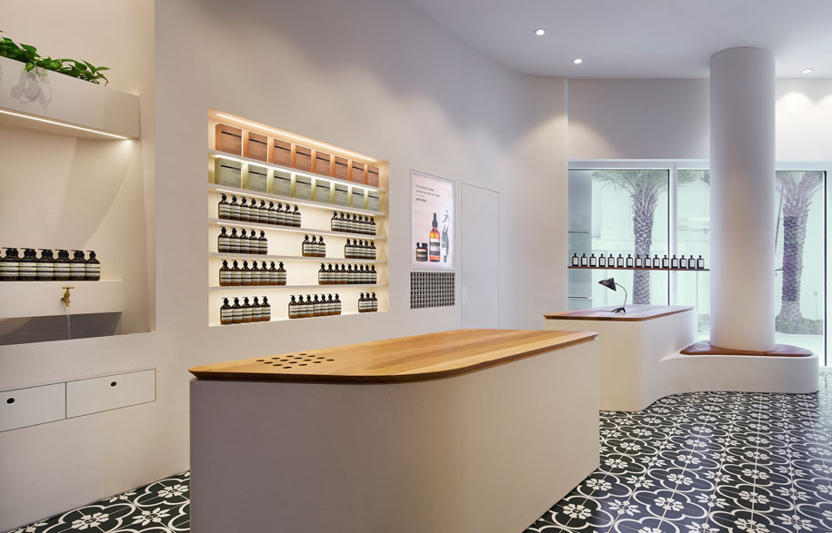
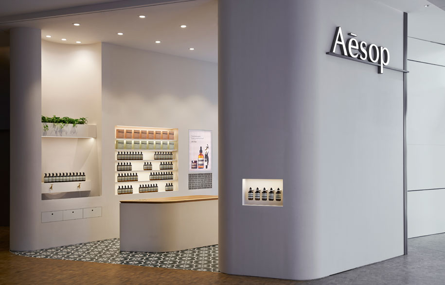
Just across the road at the newly opened Capitol Piazza shopping mall is a more flowerly – literally – store designed by Australian design practice Russell & George. Strongly defining the floor is a carpet of patterned Peranakan-inspired tiles with floral prints, which are commonly found in the interiors of old shophouses in Singapore. This element from the Peranakan culture is what drives the store’s design to complement the historic building’s Art Deco shell. The black-and-white tiles are accented by planting on the shelves, and with two accesses on each side of the store, the space feels like a courtyard thoroughfare. Oak, used for shelving and countertops add to the tropical feel while the curved edges of the standalone counters echo the shape of the store and its similarly curvaceous walls that gently guide the customer in.
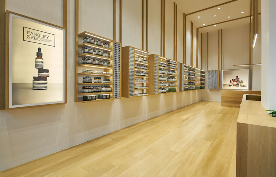
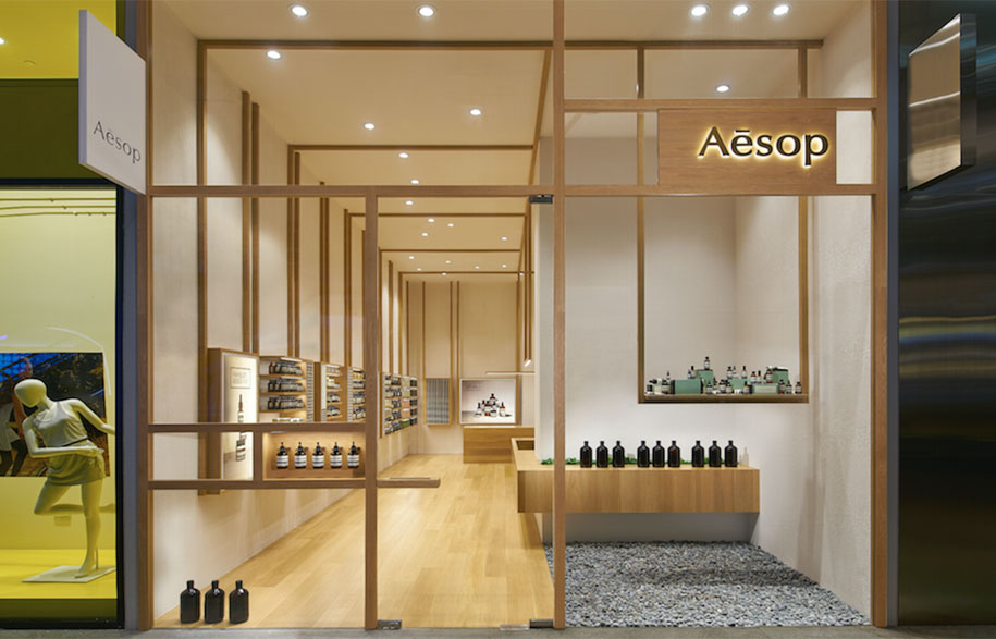
Also by Russell & George is the third store, housed within the large suburban Westgate retail centre. Oak timber is also a key material but applied in a different manner. Here, it references the area’s sawmilling past, and begins as a matrix of quadrilateral frames behind the store’s glass facade before continuing into the rest of the interior as a variety of shelving and display types – low, high counter block, window display niche, poster frame, ceiling light element. A leitmotif of lines reaching up from the shelving to the white walls and ceiling planes draws from traditional Japanese screening tectonics of exposed timber and white infill. It’s quite artistic and also very calming – a most suitable ambience for the brand’s botanical and laboratory generated products. This palette is also an abstracted rendering of the area’s transition from forested mangrove swamp to industrial precinct, which will, over time, be taken over by an evergreen climber.
With their carefully considered designs, these stores are an oasis to the sterility and uninspiring repetitiveness of their commercial bones, as well as veritable additions to Aesop’s multi-faceted, multi-textural online design bible – the Taxonomy of Design.
Aesop
aesop.com
