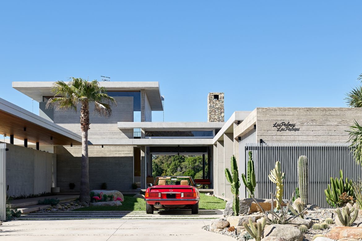
Conceived as an intimate home for two with room for guests, Las Palmas is essentially a response to the inspiration the couple found in a trip to Palm Springs and California. Visiting homes such as Kaufmann House by Richard Neutra and Frey House II by Albert Frey, the owners felt the mid-century style would suit their lifestyle well.
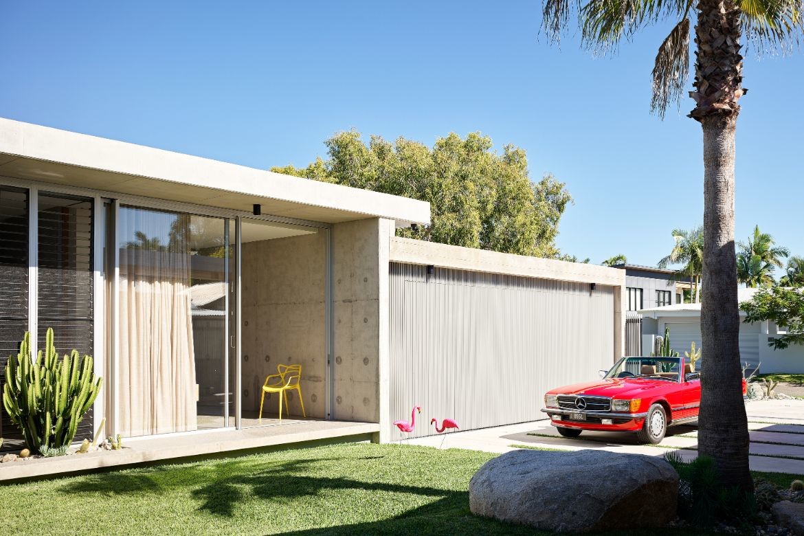
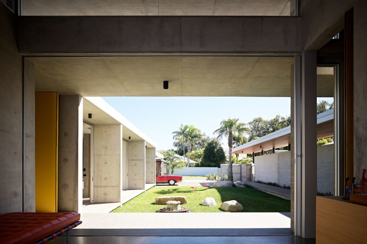
As such, the built form is unashamedly modernist, with strongly pronounced horizontal planes, simple forms and honest materiality. Mid-century cues are used throughout the project in details, level changes, furniture, and materials. Externally the design employs a robust and timeless palette of in situ-concrete walls and roofs, anodized aluminium battens, minimalistic balustrading, feature breeze blocks, and honed concrete steps and terracing.
Following tenets of mid-century architecture, the home pinwheels out from a central courtyard, however, the design has been broken at each end to allow a view from the street, through the house to the river beyond.
“The project in general is sympathetic to the public domain in balancing private and public. The owners were really keen to preserve that kind of idea, and you get this taste of how good the site is from well before arrival,” says Project Architect Oskar Booth, from Tim Ditchfield Architects.
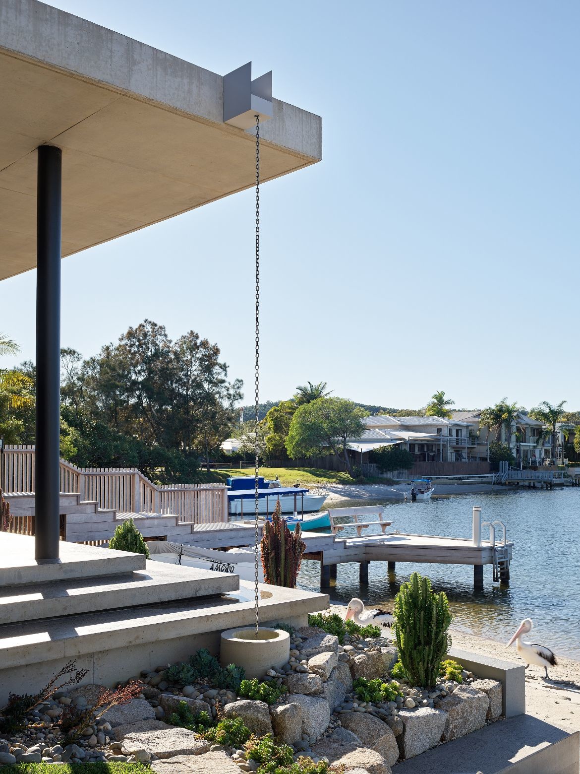
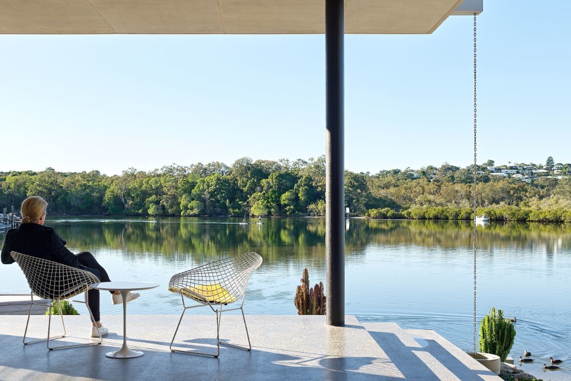
Adapting a desert style to South Eastern Queensland has entailed significant water redirection with downpipes and spitters concealed behind a facia beam. A concrete roof captures the main, while rain events are celebrated via by smaller falls cascading freely, feature spitters and chain drops.
Queensland’s abundance of sun has also been addressed with diurnally engaged nooks and courtyards. “Because of our Southeast Queensland climate, we set up a series of opportunities to experience the building at various times of the day,” says Booth.
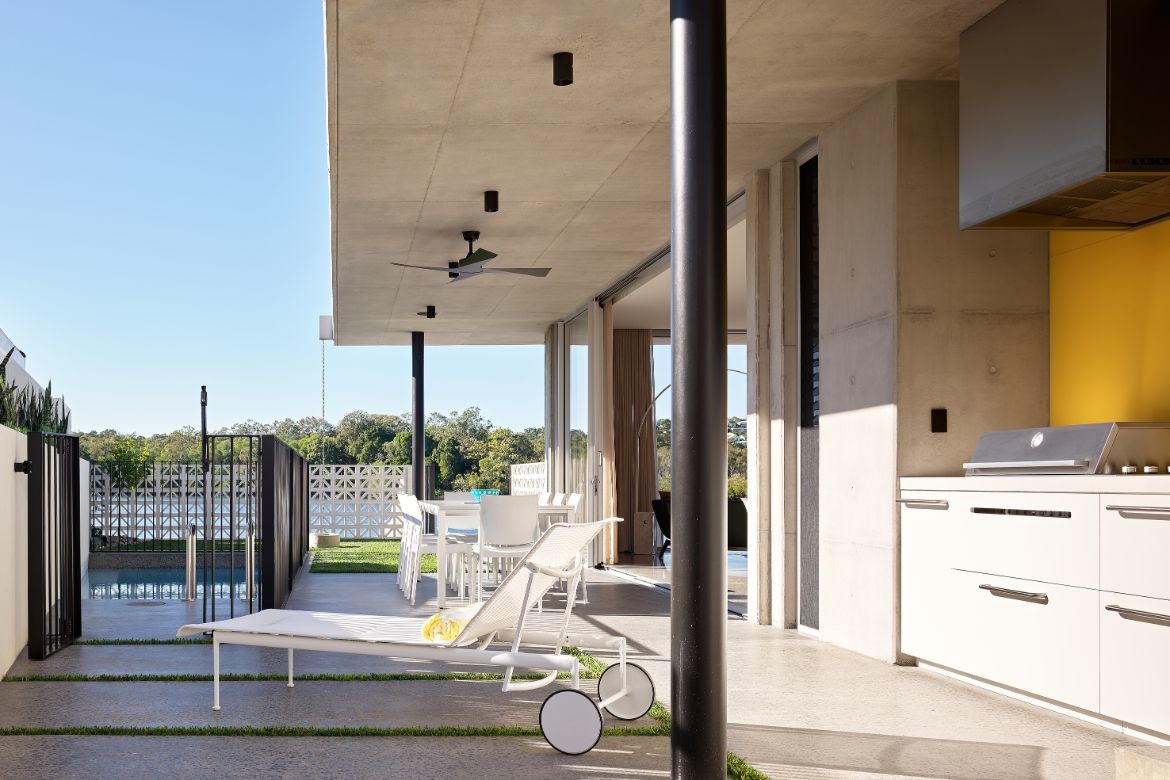
The central courtyard for example gets beautiful northern light that is fairly constant while the eastern edge gets lovely morning sun. The northern edge is shaded in summer and exposed in winter. The pool on the northern perimeter is intentionally small to allow a mid-sized courtyard with an exceptional outdoor kitchen. Breeze blocks in stark white make another nod to mid-century design, but have not been used to excess. Rather they quite specifically screen out neighbours and contain the pool space. They are moreover, quite delightful.
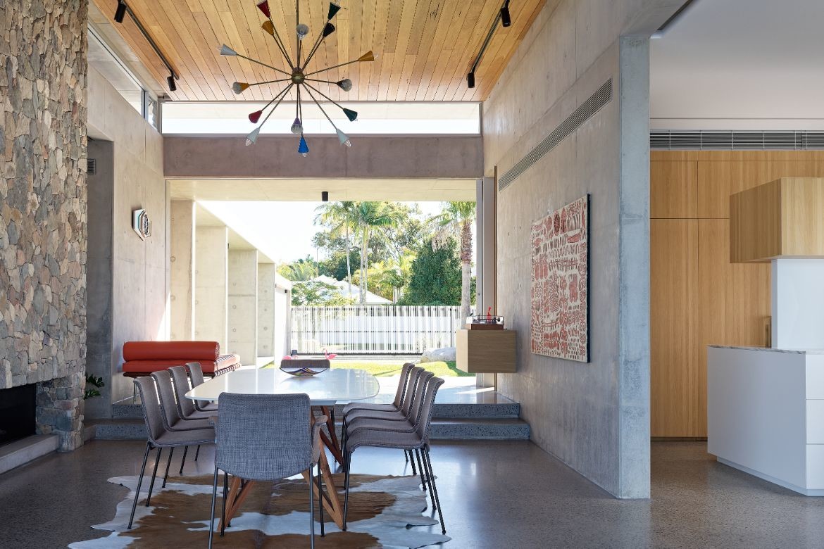
Site poured, the concrete has been worked with two distinct finishes from standard form boards and rough-sawn Oregon. There has been particular attention to disguising pour breaks with the outcome being a large wall of well-paced rhythmic shifts: “The texture when the sun hits those walls with board finish is very different from the flatter surfaces. There is a shadow play of texture and materiality that softens those large expanses,” says Booth.
Concrete was also selected for its robust nature as a home designed to be passed down through the family for the next 60-90 years: “Concrete does cause some criticism due to embodied energy, but if you take lifespan, generous eaves, good ventilation and good solar control, because it’s built to last, it should be very good on paper given a whole-of-life analysis,” says Booth of the very early decision to hero concrete throughout the project.
Sustainably augmenting this decision, the house is well appointed with 15kW of PV, Tesla Battery Systems. Ample thermal mass with shading and great cross-ventilation, which allows the users to rarely need artificial heating or cooling.
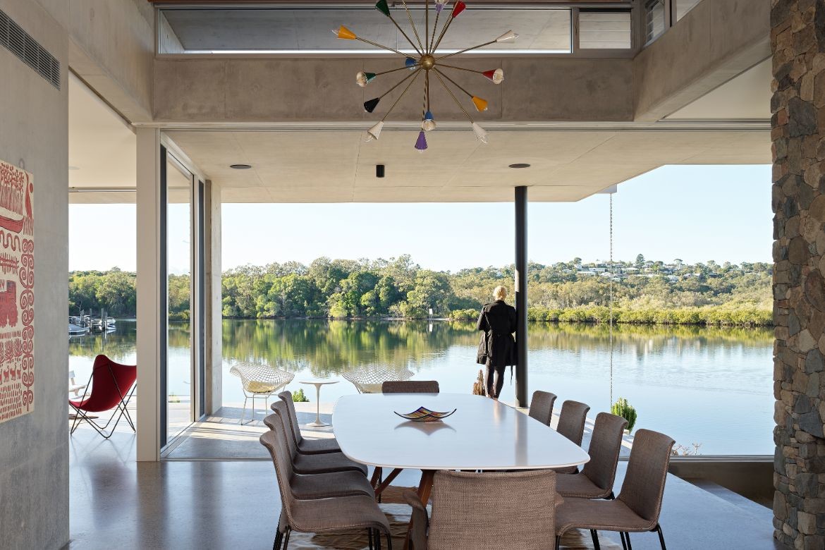
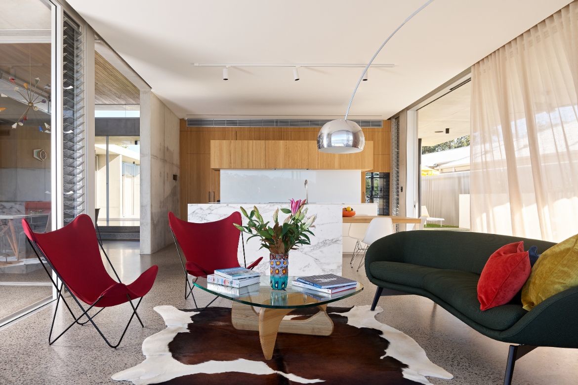
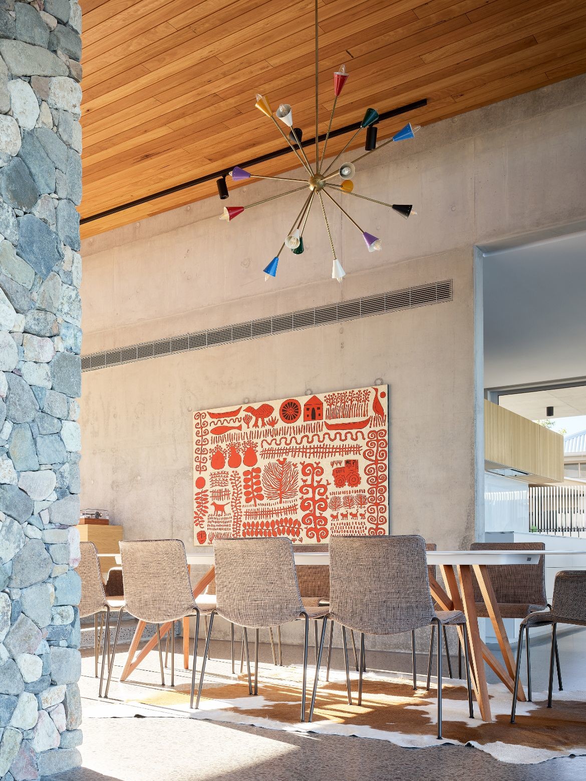
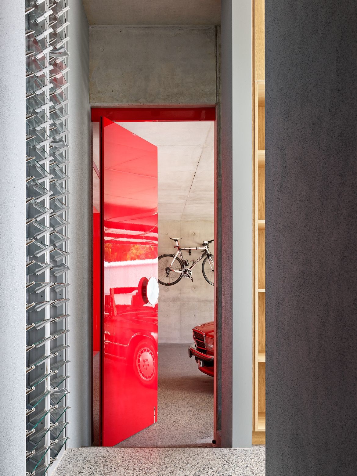
Furniture throughout is contemporary of the Knoll and Eames ilk, with the classic Arco floor lamp arching through the living space. More magnificent however is the multi-coloured vintage sputnik chandelier in the Stilnovo style, sourced from Spain. “Getting it to work with contemporary globes in that space, was one of the exciting moments of the project,” says Booth. Picking up the red and yellow from the lamp, floor-to-ceiling doors add vibrant colour to the home. The red garage door (perfectly matching the red vintage Mercedes within) is particularly fabulous.
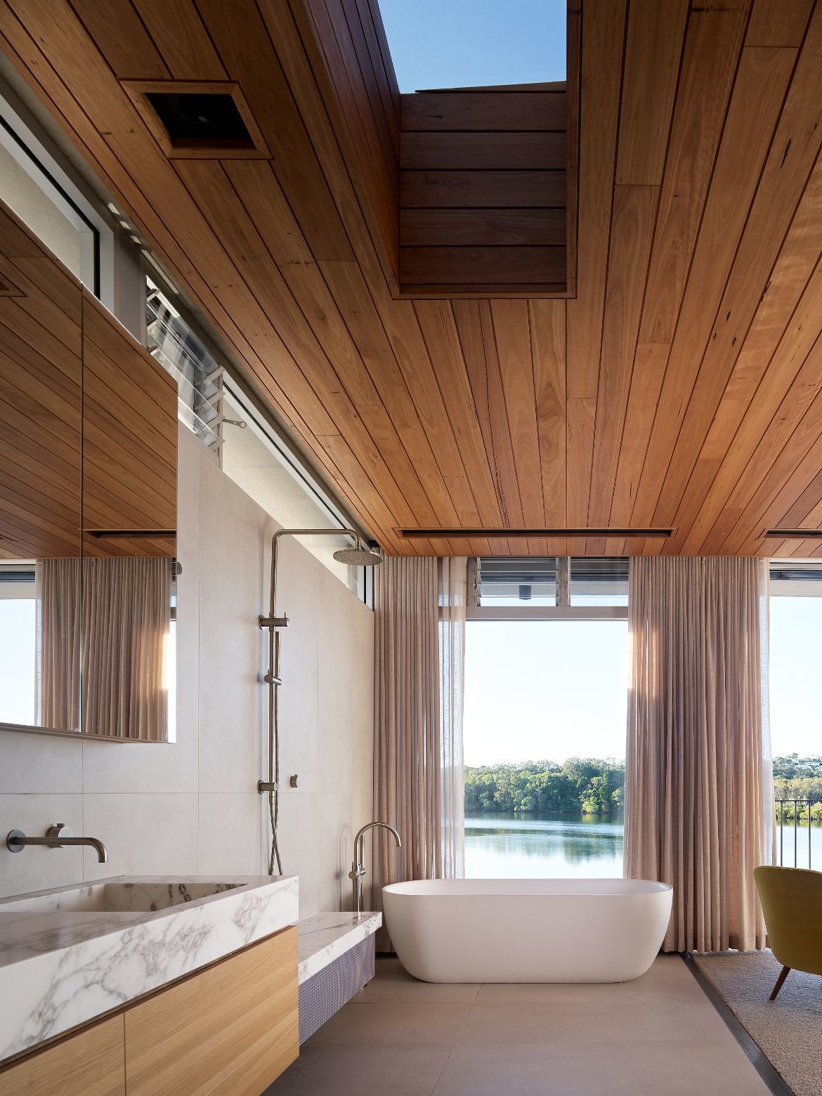
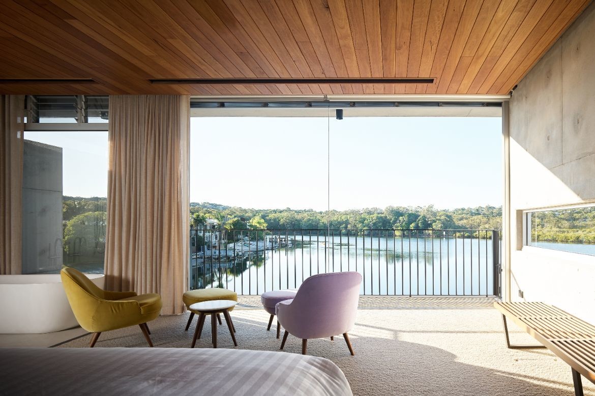
The upper floor bedroom is intimate and extraordinary with a large bath featured at the window side in the open plan. An external perforated Venetian gives fuller privacy options for when the river traffic is high.
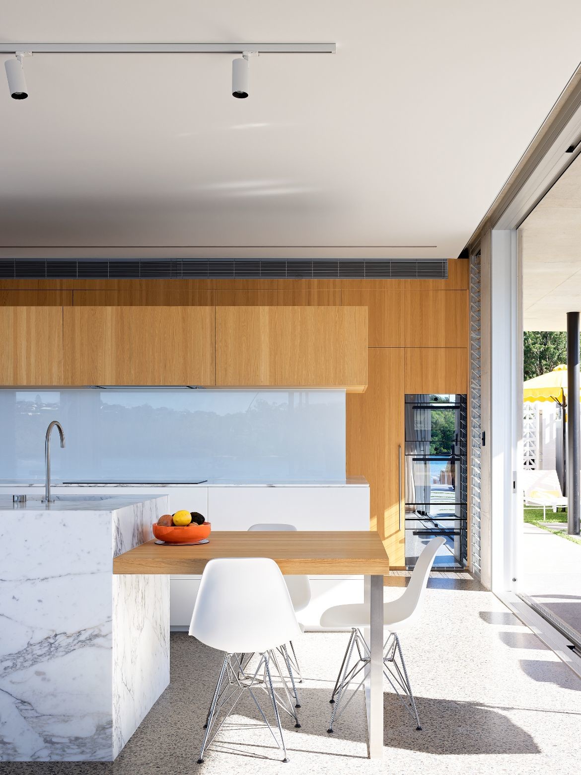
The kitchen is amazing with a two-sided configuration that sees a simple kitchen facing the living area while the working kitchen is behind a floating wall. A hidden door leads to a cellar.
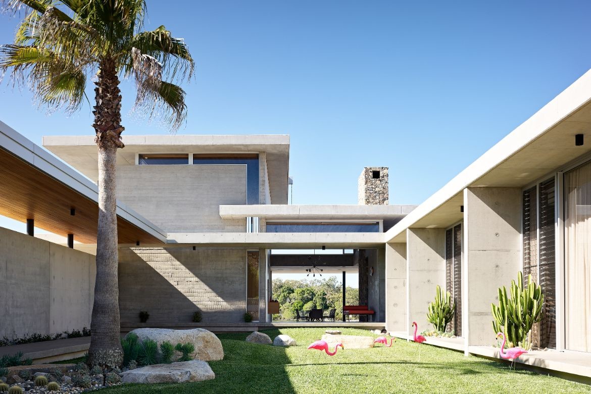
And then there is the stonework chimney, dry laid by an artisan stonemason working with local stone sourced from a defunct gold mine. This project is in fact excellent with hidden and thoughtful detailing and solutions throughout. It is also simply beautiful, appropriately scaled and cognisant of both legacy and community. Divine.
*This design commission was initially undertaken by Peter Dawson of Architectus, and full credit is acknowledged to him for the strong conceptual framework. Tim Ditchfield Architects resumed the design process at the schematic design stage, with some refinements to the conceptual planning.
Project details
Architecture & interiors – Tim Ditchfield Architects
Initial design – Peter Dawson (Architectus)
Photography – Scott Burrows
We think you might like this project, also by Tim Ditchfield Architects, in Noosa
