“The primary design driver for this project was to build a house that reflected the warmth and colour of the personalities of our clients and to fit the way they live now and in the way they might live in the future like a glove,” says Sally Timmins, co-founder of Melbourne architecture studio Timmins and Whyte.
However, the studio’s approach to all projects is to address not just the house but the entire site and its challenges. “We then start by working to harness natural light, views and access to landscape, and the flow of and proportion of spaces,” explains Timmins and Casa Cassata is a prime example of the way they work.
The house, located on a beautiful tree-lined street in Fitzroy, is blessed with a number of well preserved, single-storey, neighbouring heritage houses. However, this double-fronted Edwardian desperately needed an upgrade and a modernised extension.
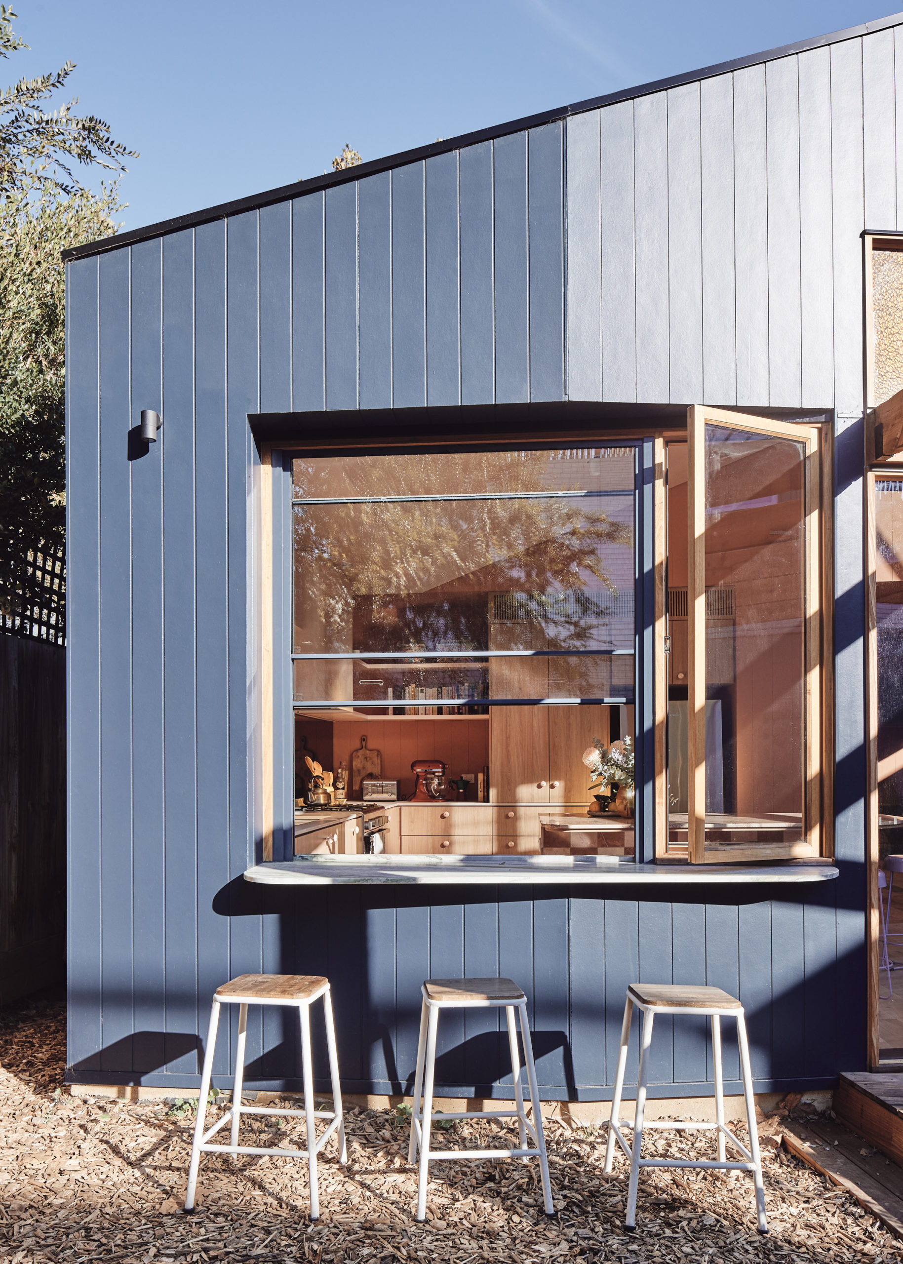
The clients, a professional, social couple with a young son, desired a warm interior that would support their love of cooking and entertaining. “They requested a house that would adapt their house to suit their needs,” explains Timmins, “whether it’s playing cards or ping pong at the dining table; with the windows open ventilating the space or opening up to a larger group via the large sliding door; or a making a drink for old school friends at the spritz bar.”
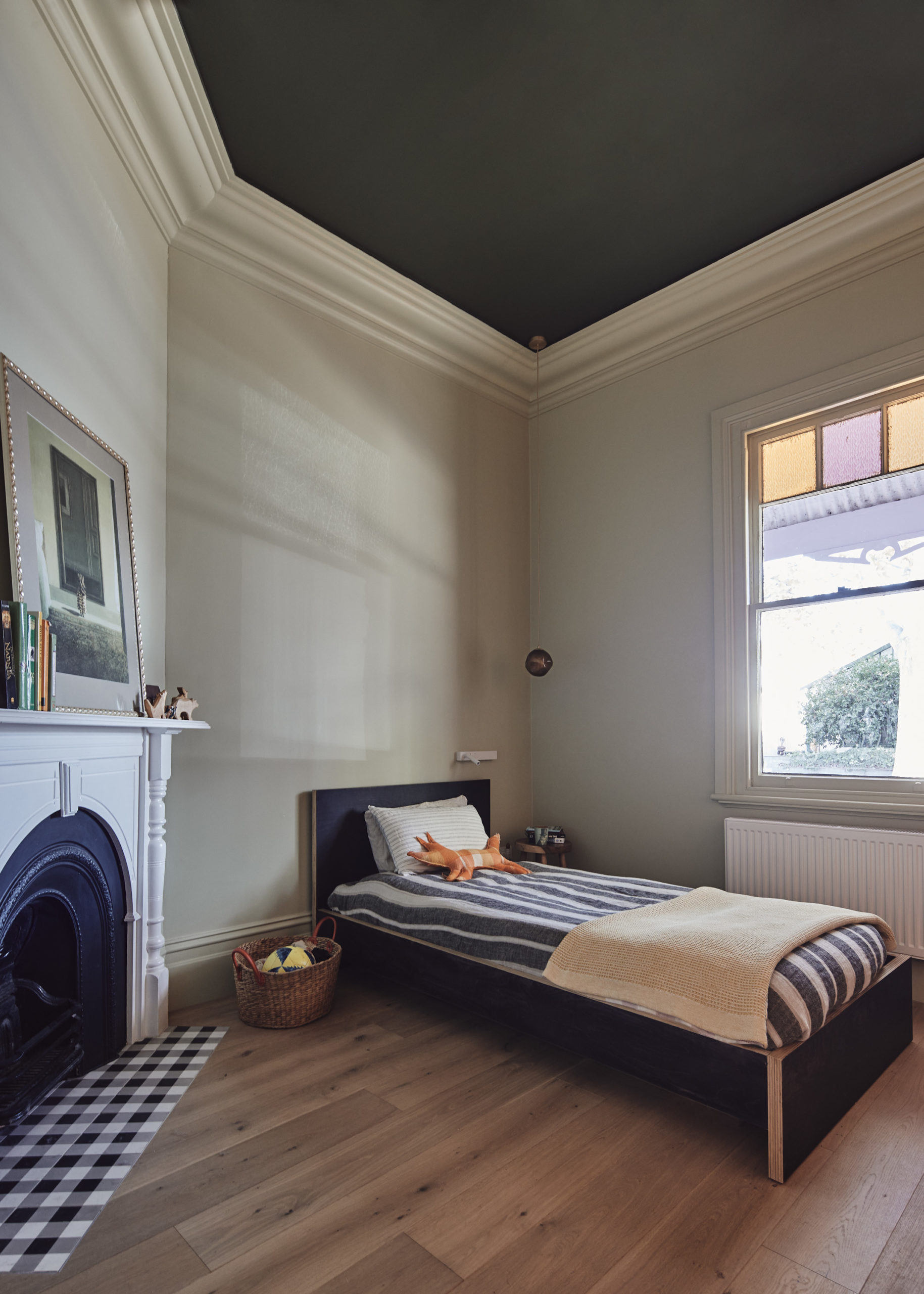
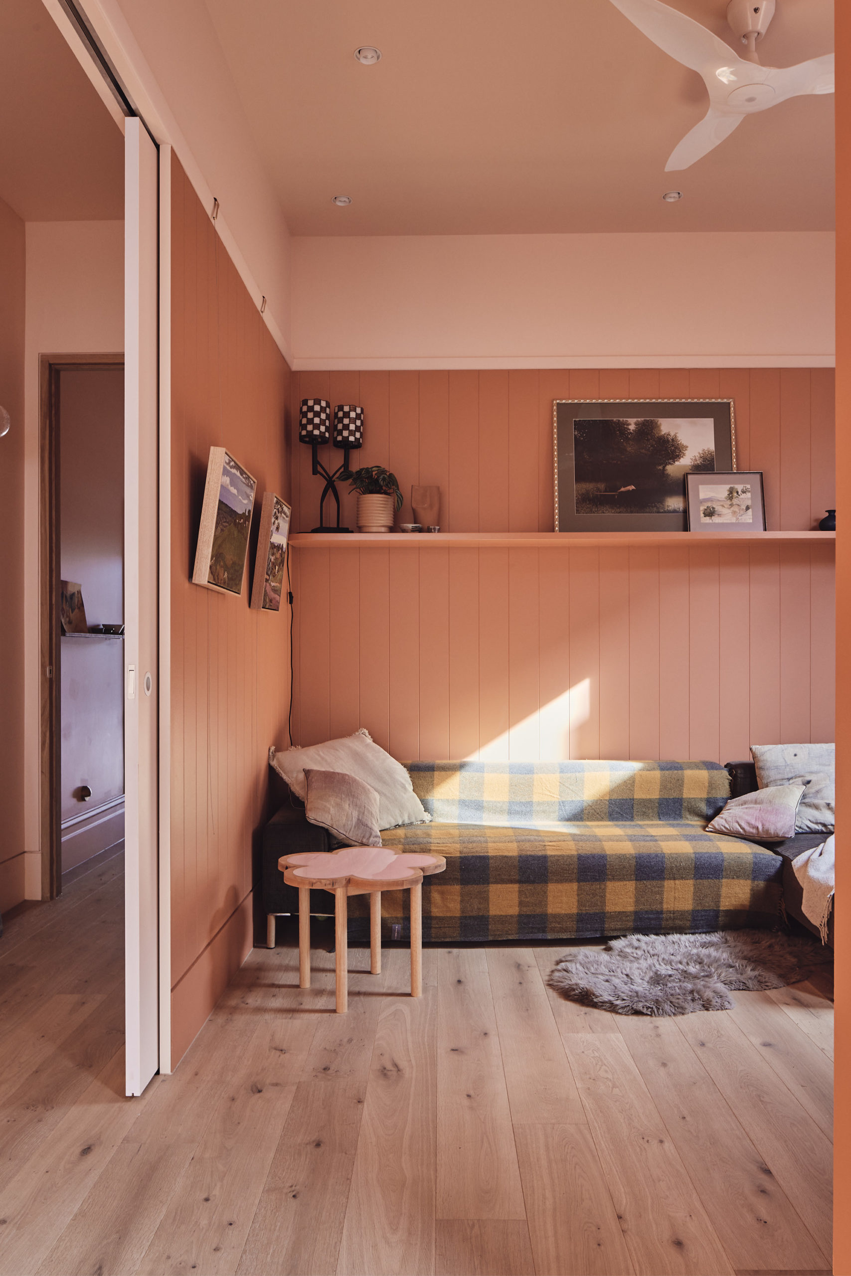
Starting at the front of the house, the original rooms were retained as bedrooms but now benefit from new insulation, flooring and a lick of paint. The two rooms to the rear were converted into a third bedroom/living area with large doors that either open up to the kitchen and dining area or remain closed to provide a more intimate living/tv/guest bedroom. The south-facing fourth room was converted into the powder room and laundry.
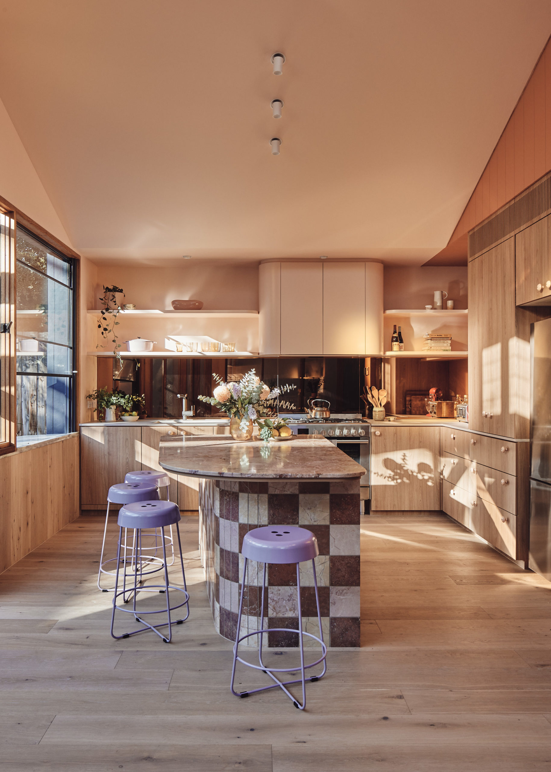
The most significant transformation, however, was the demolition of the existing kitchen, laundry and bathroom to make way for a new bathroom, dining and generous kitchen area. “The addition was designed to make the most of the garden on all sides,” explains Timmins.
“The outdoor space was the main reason for purchasing the house and land originally and to get light into all the spaces. In fact the client had mentioned a few times that she loves that she doesn’t need to turn any lights on until it’s dark outside.”
At this point, it’s worth noting that the challenge of bringing in significant light and providing privacy both proved to be the primary challenges from the outset given that the house sits between a double storey contemporary extension on the northern boundary and a single storey heritage house on the south with the rear site boundary flanked by a new build two storey house.
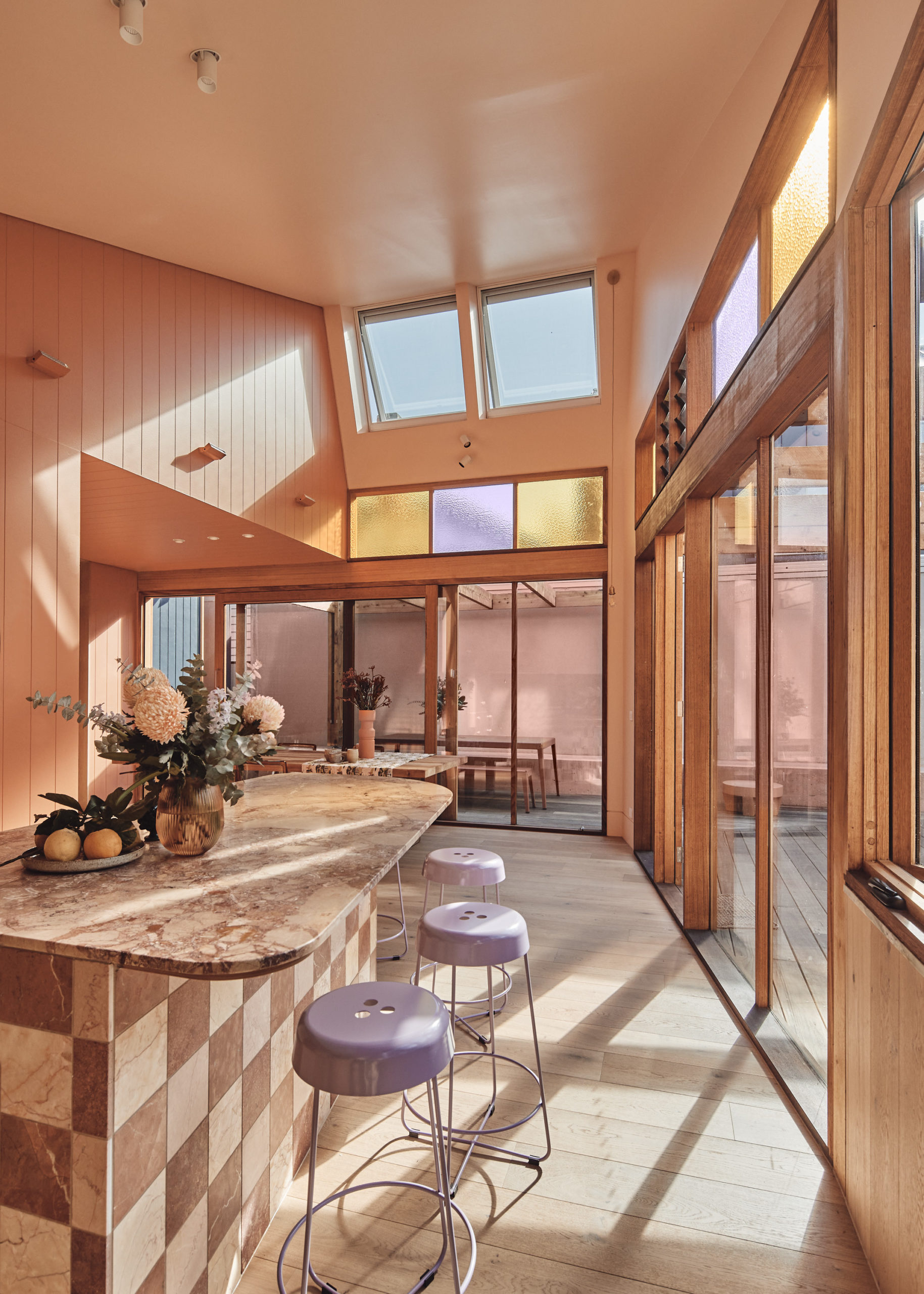
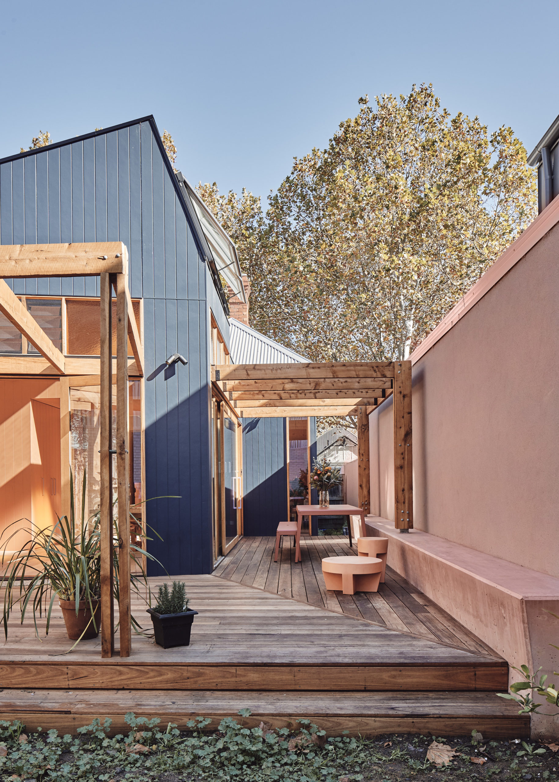
“To resolve these challenges, we set the dining space back off the northern boundary and created an L- shaped deck with a framework over it, which defines space and will form the structure for Jasmine to grow and shade cloth in warmer months,” explains Timmins. “We designed the roof to act as a funnel of light with two large openable skylights to the north.”
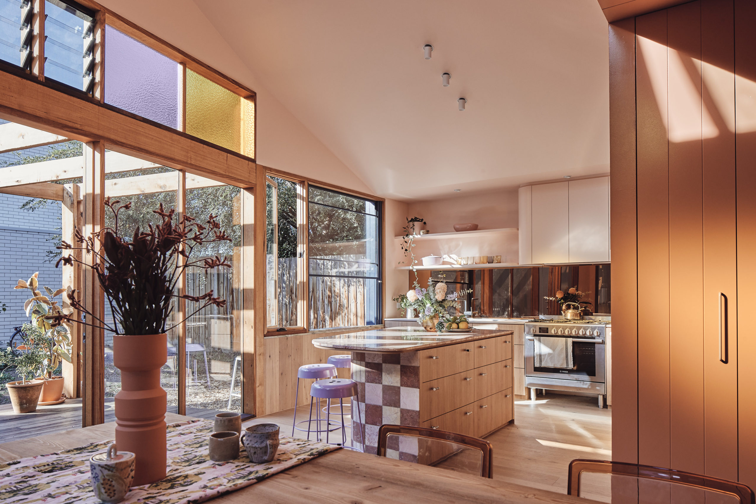
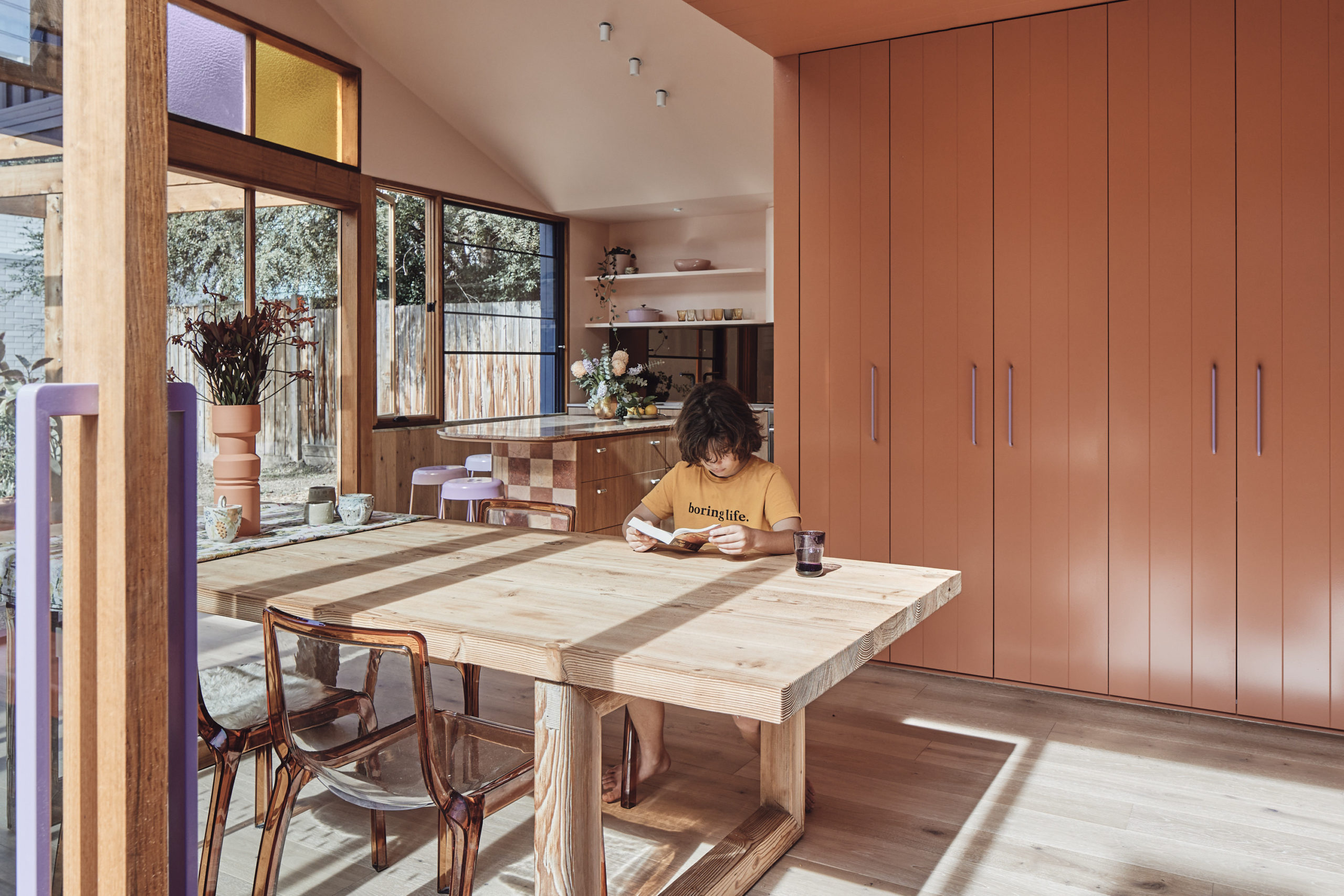
The original, traditional coloured glass windows provided the inspiration for scaled-up versions over the doors in the rear of the extension as well as obscuring the views to the neighbouring second storey level. “The large squares of pink and yellow glass also cast colourful light on the kitchen and dining space as the sun hits it from morning until the afternoon and can be seen from the street, through the open front door and beyond to the garden,” adds Timmins.
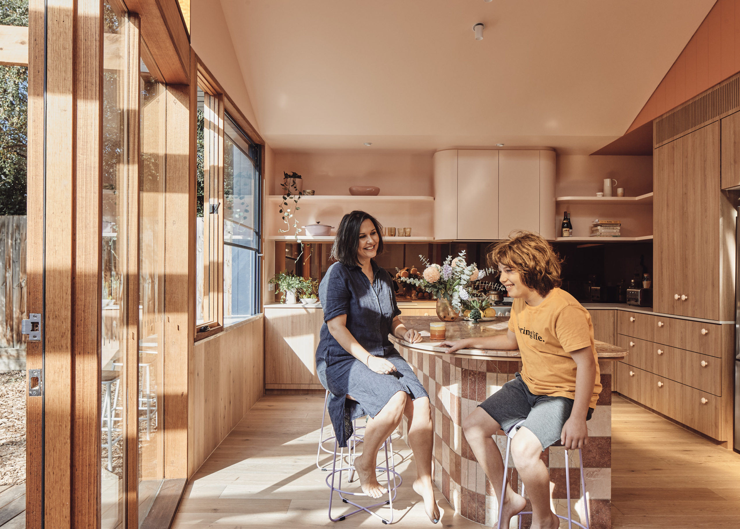
The two walls of timber-framed windows and the timber pergola that extends from them create a framework by which the private, functional areas of the house sit to the south; allowing the living spaces to transition from the inside of the home to the deck and garden embracing all day direct sunlight.
“The boundary wall of the neighbouring property to the north has been incorporated into the garden, with a pinky clay paint applied to this wall colour matching a nine metre long concrete seat which makes it feel like part of the clients’ house and therefore helps to create seclusion from the outside world,” continues Timmins.
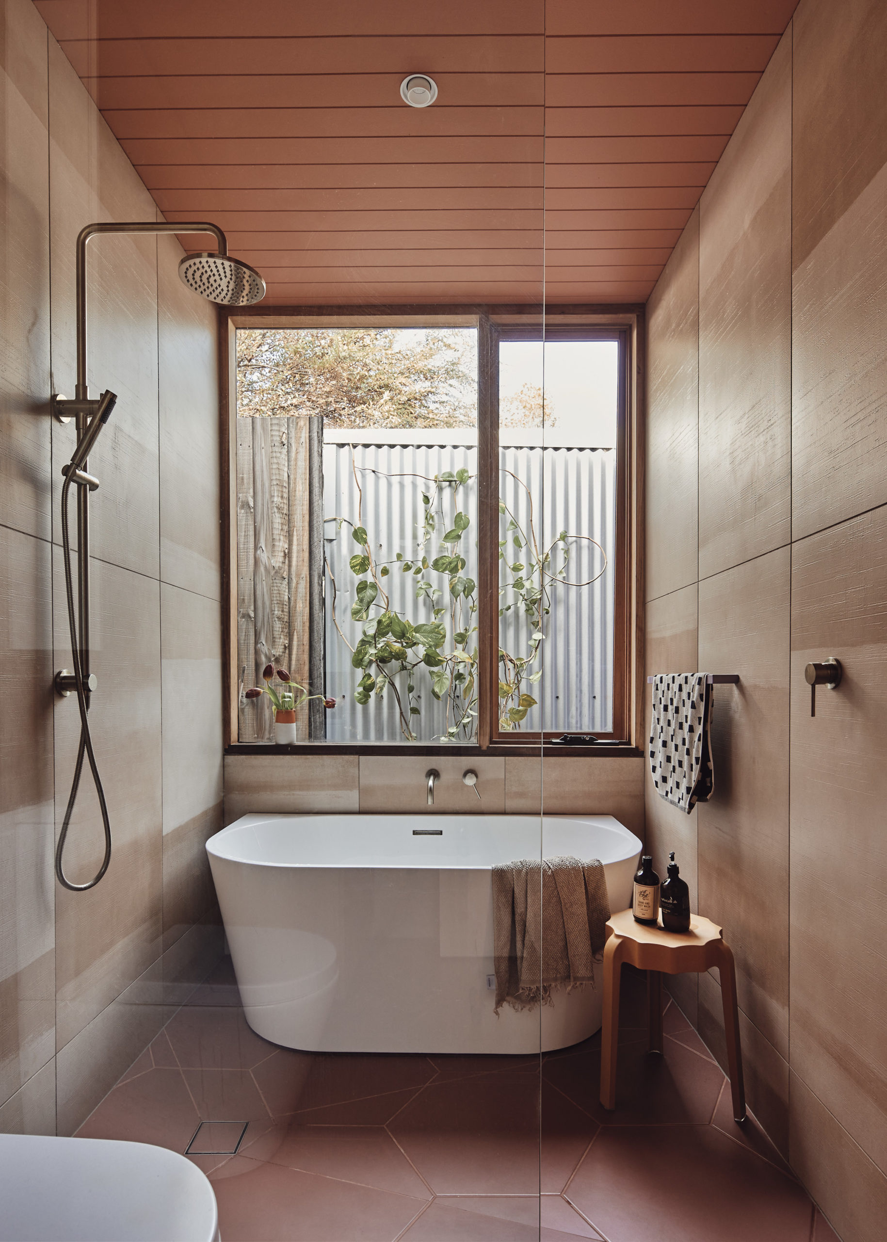
“In this way, rather than the large two storey houses with their boundary walls running almost full width of two sides of the garden they have become an integral part of the outdoor experience of the home.” In addition, V-joint lining boards wrap around the extension externally and continue inside to line the lowered ceiling between the original and new parts of the house, the bathroom ceiling, and up to the picture rail in the new living room – a thread which connects all of the new elements of the home.
While the additional footprint isn’t large, there is a unique feeling of generosity in the proportions of the home, due to the lofty height of the ceiling and the large expanses of glass. “Each space feels that way and could not have been achieved by adding an upstairs for superfluous bedrooms that would have drastically reduced the ceiling heights in the living spaces,” adds Timmins.
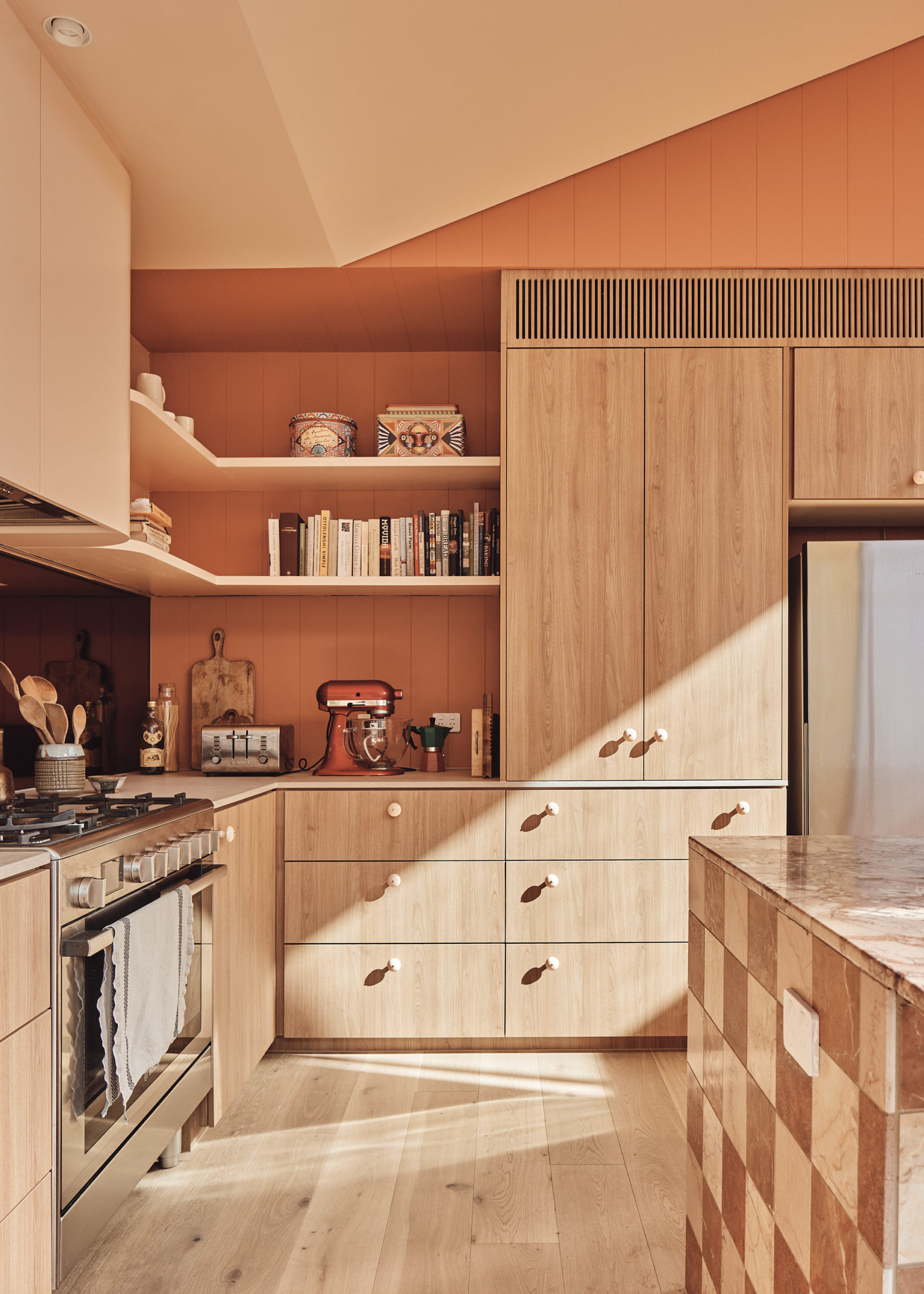
The warm and textural feel of Casa Cassata has been achieved by using natural and robust materials like timber that also align with the clients’ desire to create a home that felt like it had developed organically, completely avoiding a new, “sterile” aesthetic.
“It was particularly fun to work with Kristy as she also loves colour and texture and we were completely aligned with the aesthetics of the interior finishes and fixtures,” adds Timmins. “Our client’s time spent in Rome inspired the peachy-pink and terracotta walls, and finishes were handpicked in collaboration with them to create a sweet, colour-saturated and warm interior.”
The whimsical, chequered stone island bench, liquorice drawer pulls, lilac accents, curved geometries, confectionary-like colour palette and use of coloured glass and marble create the “dessert-like” experience inside. “The house’s overriding impression is that of warmth, light and colour – a little Italian holiday every day,” shares Timmins.

Project details
Architecture and interiors – Timmins and Whyte
Project team – Sally Timmins, David Whyte and Jane Nyam
Builder – Encore Projects
Photography – Peter Bennetts
