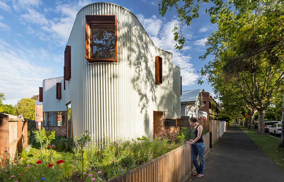
When architects design their own home it’s an opportunity to push their boundaries and test their ideas. This house is the new family home of architect Tim Hill of Tandem Design Studio. Completed in 2016, it was a chance for Tim to experiment and innovate and to create a house that reflected and expressed his interests: how it contributes to the visual language of the neighbourhood, integrates pocket gardens, encourages different readings of meaning and minimises the environmental impact of its design. It also demonstrates how constraints spur creativity as the awkward block of land gives rise to a form that evokes a variety of imaginative descriptions.
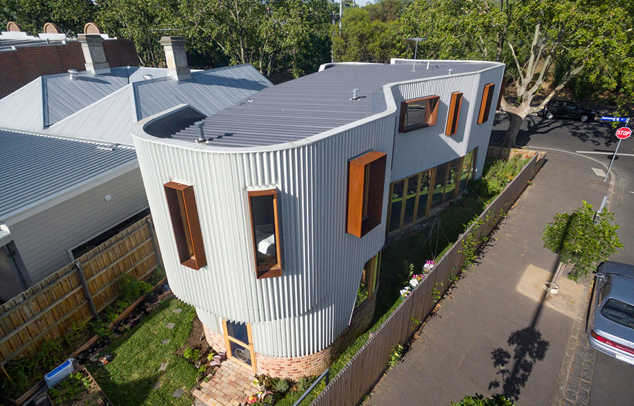
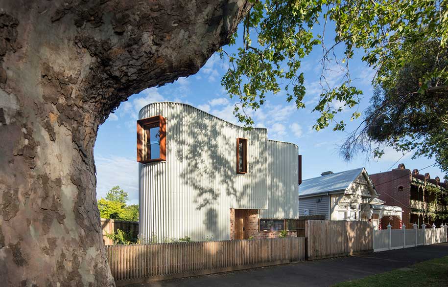
Faced with an irregular, triangular site, Tim designed the footprint of the house to somewhat mimic the shape of the block as it narrows in the rear, while its curving lines depart from its geometry and create fuller interior spaces. With dips and turns and dimples, the forms and volumes of the house, which remind Tim of a “coral bommie,” makes way for sunlit gardens and entrances.
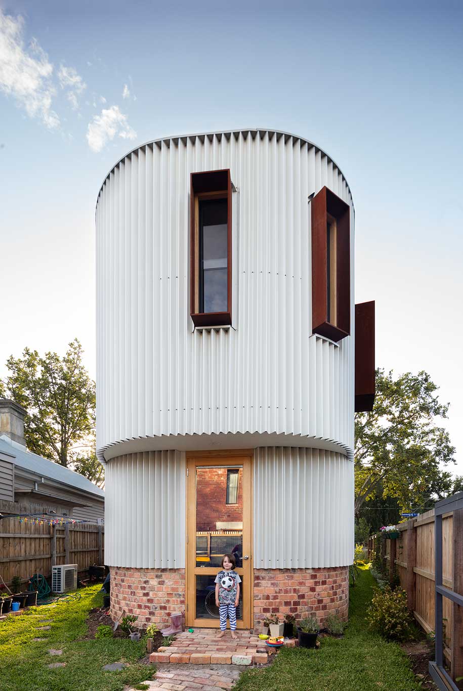
The house is clad in a pleated steel façade with a pearlescent metallic finish that enhances its sculptural form, “and looks like a whirling dress,” says Tim. The triangular ribs cast constantly changing shadows, and from a practical point of view they create diagonal bracing, stabilising the curving, asymmetric form. They also capture a layer of still air adding to the thermal performance of the envelope. Windows with deep rusted steel hoods pierce the façade and create private portholes.
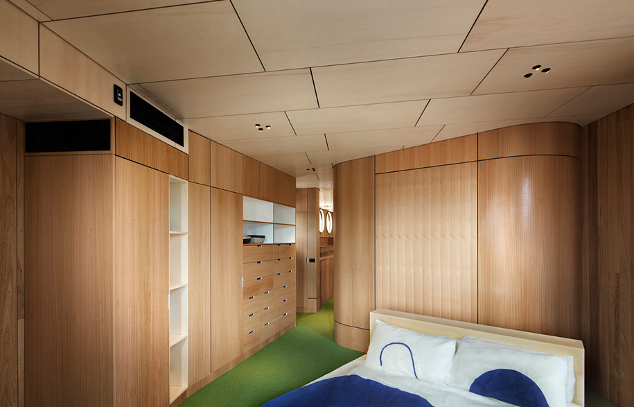
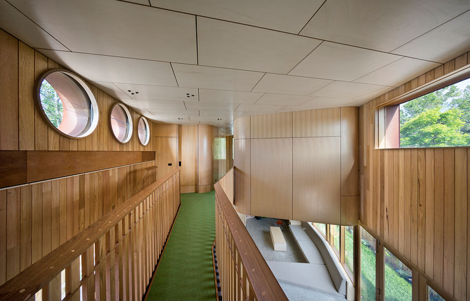
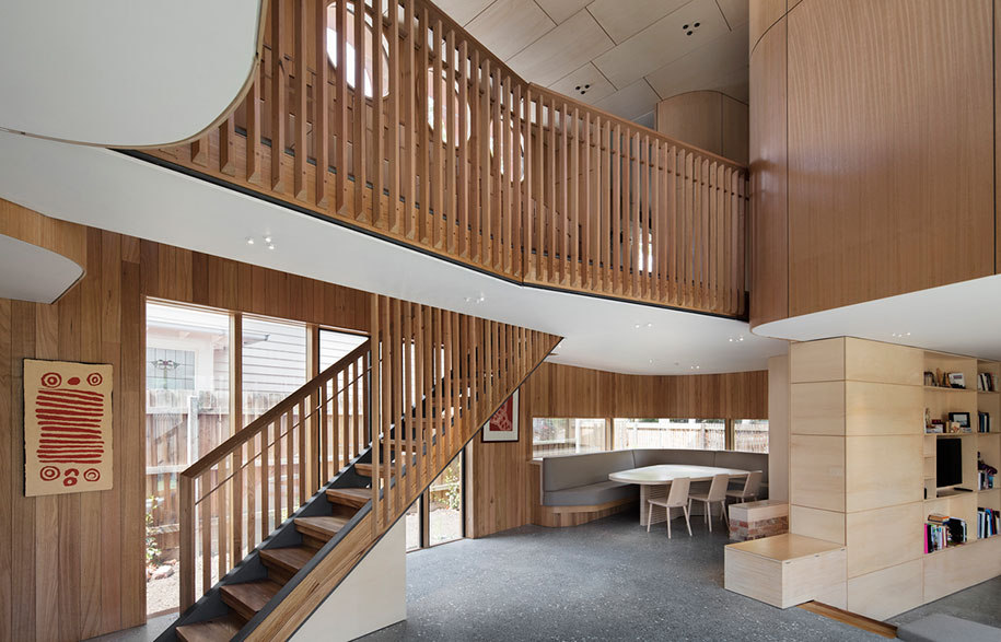
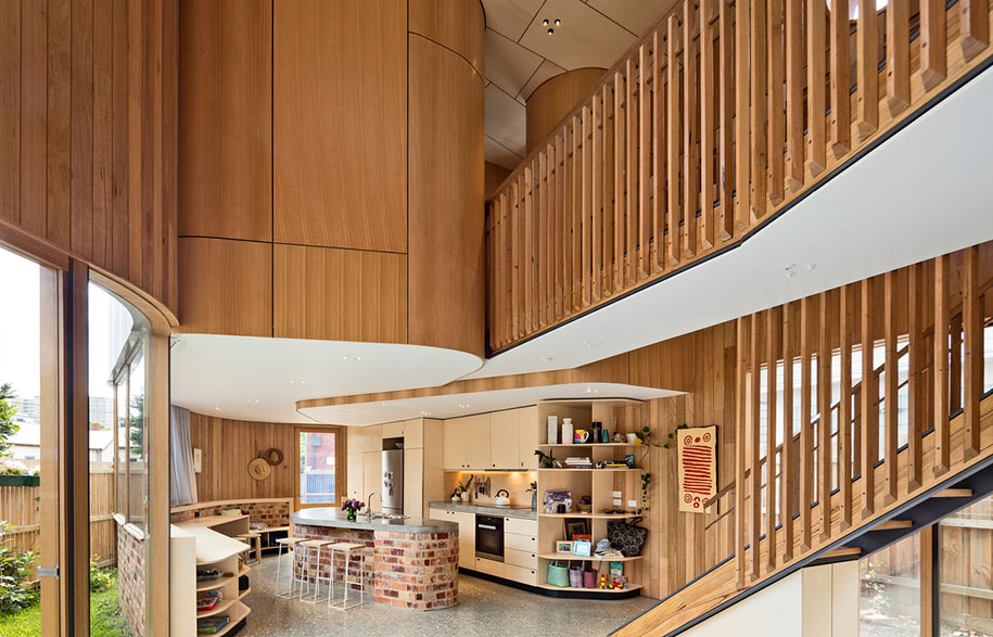
Inside, the ground level is one large and open area with a double-heighted atrium. The family come together to cook, socialise, play and eat in the sunken lounge, kitchen and dining area, while upstairs the bedrooms and bathrooms are contained within three pods accessed by a staircase and bridge that hovers about the atrium.
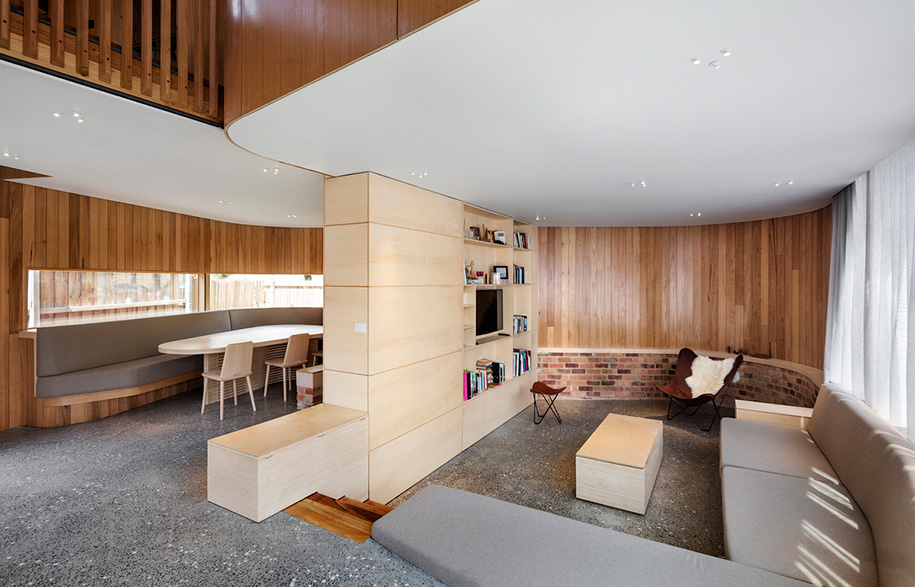
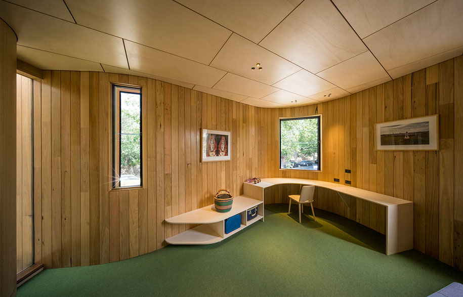
The interior spaces are as just as sinuous and curving as the exterior of the house as they push against each other. “The house is an integrated solution; every bit of it hinges on every other bit, from the way the interiors press and bulge to the built-in furniture I designed to fit the shapes that emerged,” Tim explains. “Visitors have expressed that it looks like a boat, and being inside is like looking out through a water drop, or hiding inside a musical instrument. The form encourages many different readings and people can find their own meaning in the work, rather than prescribing one.”
Tandem Design Studio
tandem-studio.net
Photography by John Gollings
