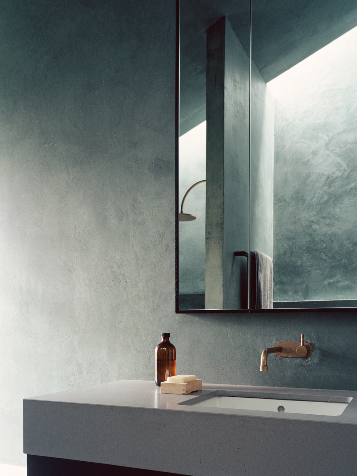
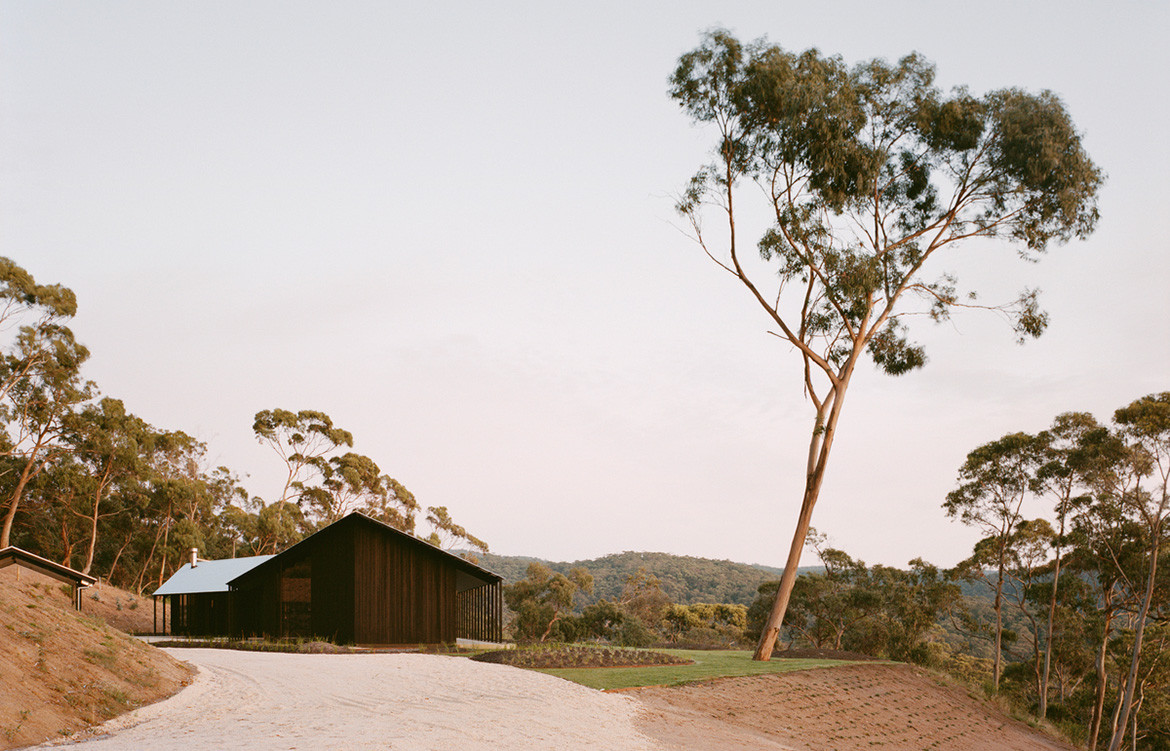
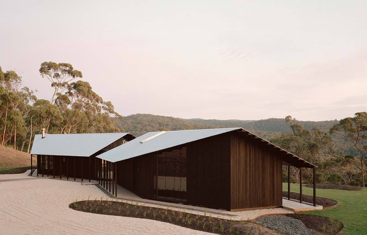
The Two Sheds House is located on 24 acres of bushland to the west of Lorne in Victoria. The clients, Roger and Jane, bought the land back in 2010 and spent seven years designing a house and obtaining a permit to build. Roger as the Managing Director of NH Architecture was very well placed to do so. In 2017 they engaged Dreamer to contribute to the interior design scheme.
Essentially, the clients wanted a weekend/holiday retreat away from Melbourne to provide respite from the fast pace of city living. Dreamer took a hands-on, personal approach to gain a deeper understanding of their client’s way of living. Many meetings took place at the client’s Melbourne house. “A number of times we walked around their home, discussed and observed the design of various elements from sliding doors, to light switches to fans,” says Ben Shields of Dreamer.
As it turns out, Roger and Jane sought not just a place to offer a change of scenery, but one that would also change up their daily routine and patterns of behaviour while they were there.
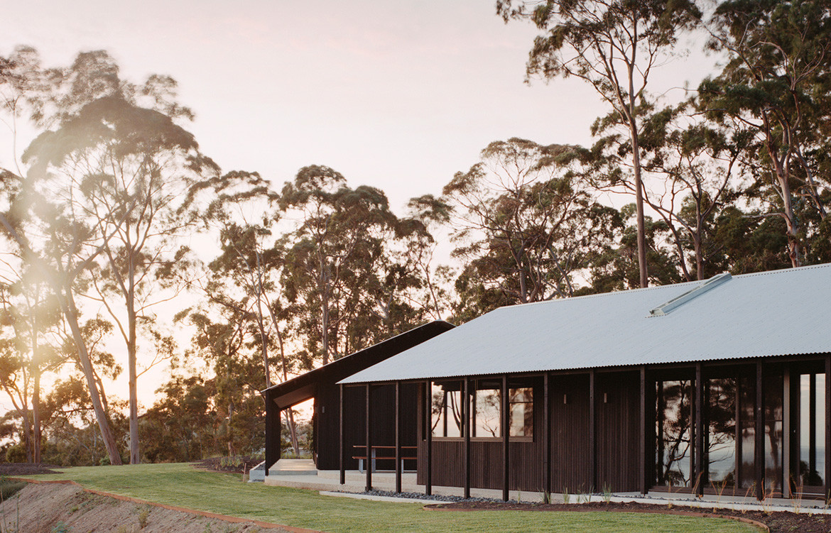
The gable form and external timber cladding on each structure mirror each other and set the tone for a reductive approach and minimal material palette that continues inside.
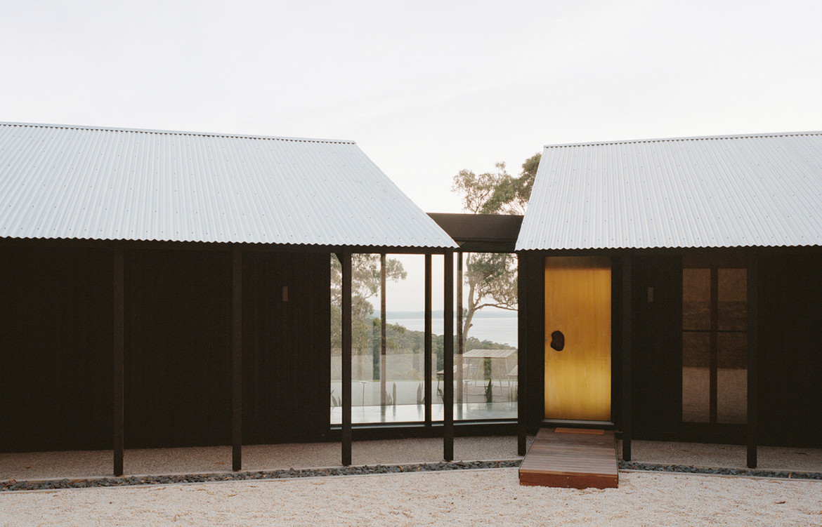
In their brief to Dreamer, they were very clear on a number of things, many of which were retained from the original plans. “Views to the hills and beach, privacy and constructability had all been carefully balanced in siting of the previous design. In addition, the clients and design team wanted to avoid any further time spent in town-planning,” says Ben. Programmatically, they wanted “crystal-clear zoning” between the living and sleeping quarters; open social spaces as well as places for quiet reflection; and for the house to feel connected to the landscape.
Other elements of the design were less tightly held on to: for one, the enormous footprint. Originally the house plans covered more than 500 square metres while in the final concept occupies just 220.
“Two Sheds House is a contemporary project, but with its gable roof form and verandah its lineage harks back to classic Australian cottages, sheds and cabins.”
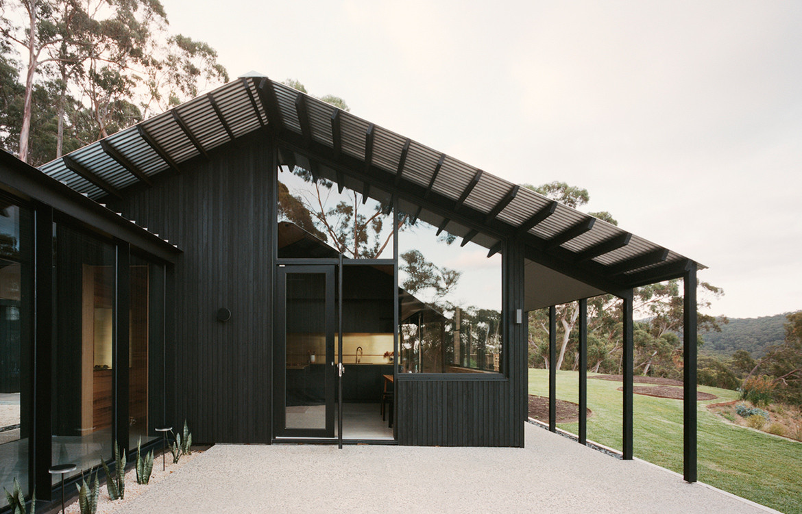
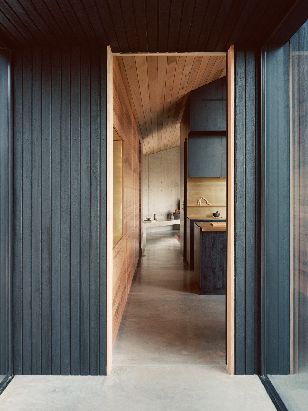
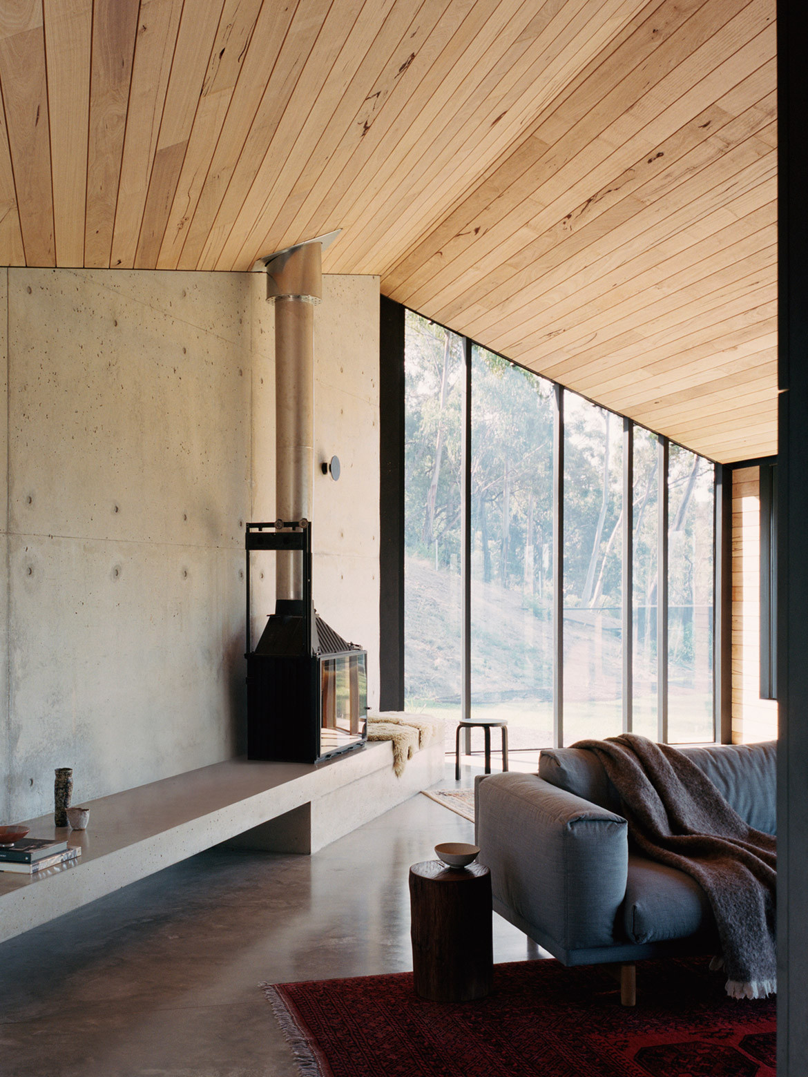
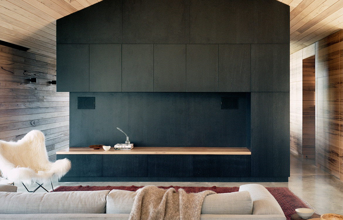
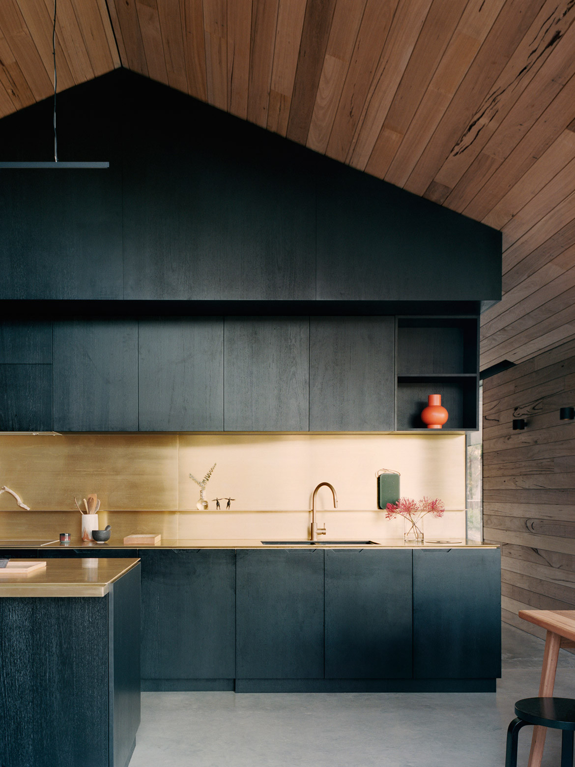
The main entry is at the centre of the two sheds. The left wing comprises the common living spaces. A large black box in the centre conceals the bathroom and laundry and creates two volumes either side; gently demarcating the spaces without disconnecting them. The living/lounge area is on the western side while the kitchen/dining area is closer to the centre of the plan.
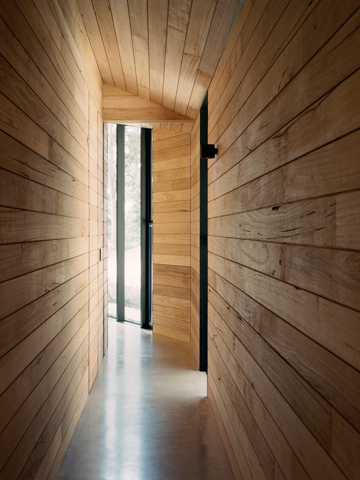
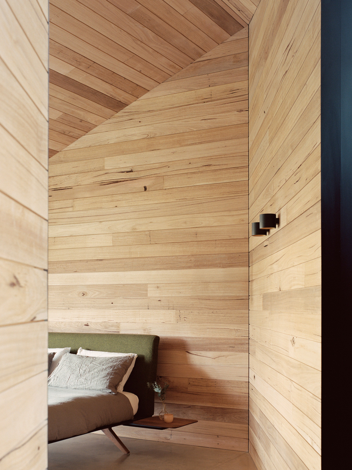
The eastern wing marks the sleeping quarters – three bedrooms and three ensuites. The two wings are connected internally via a glazed gallery and externally via a verandah. Both the north and south walls are lined with narrow verandahs that have become informal social spaces where the clients find themselves enjoying the outlook up to the hills or down towards the ocean.
The gable form and external timber cladding on each structure mirror each other and set the tone for a reductive approach and minimal material palette that continues inside. “This allowed us to create a series of special moments; whether parking the car, entering the building, putting your bags down, cooking the dinner or reading a book,” says Ben. “This simplicity of the project meant the focus was the creation of beautiful space.”
A large black box in the centre creates two volumes either side; gently demarcating the spaces without disconnecting them.
On a larger scale, Ben hopes the Two Sheds House can be an example of regionally appropriate architecture in Australia. “It is a contemporary project, but with its gable roof form and verandah its lineage harks back to classic Australian cottages, sheds and cabins,” he says. “These icons of rural built form and associated design elements are important to Australian culture. A design methodology that looks to the past in the creation of Australian rural housing may hold the key to ensuring successful buildings that connect to landscape, are climate-appropriate and flexible to future change.”
Back to the micro, and Jane and Roger, who sought reprieve from their busy lives, have found just that.
Dreamer
dreamerlab.com.au
Photography by Rory Gardiner
Dissection Information
Builder: GD Construction
Lead carpenters: Nathan Lewis & Mark Jolley from Birregurra
Joinery: Mawson Joinery
Structural Design: 4D Workshop
Civil Engineering: Tompkinson Group
Landscape Designer: Eckersley
Planning: Rosevear Planning Associates and Contour
Bushfire assessment BMO: Ecotide
Brasswork: Made Retail
Lighting from Inlite
Appliances from E&S
We think you might also like Kawau Island Bach by Crosson Architects
