When there’s a captivating view to take in, the role of the architect is clear, regardless of whether the space needs to be cool or warm, formal or relaxed. The view needs to achieve its purpose from wow to calm, while the interior maintains its integrity when night falls and the view shifts or the company settles in for conversation.
ÀNI Thailand by Charupan Wiriyawiwatt
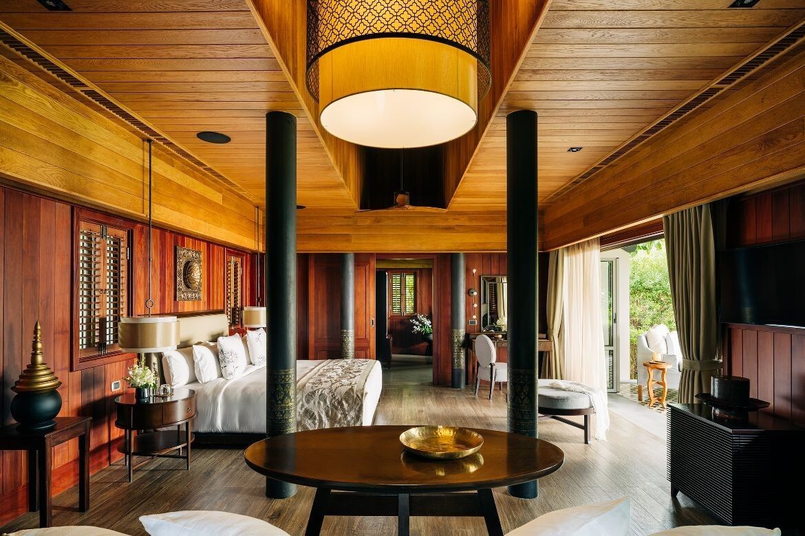
To reflect the bespoke nature of the ÀNI Thailand offering, Charupan Wiriyawiwatt, NagaConcepts (Thailand), lead on the project and his team, have conceived an architectural and interior design that truly encapsulates the brand but one that is sensitive to place, culture and people.
The design of the resort mirrors traditional Thai heritage architectural forms, however, there is a modern sensibility that combines to create a contemporary aesthetic that is both beautiful and highly functional.
Arrival to ÀNI Thailand is through a courtyard and a porte cochere with a lift and stairs that lead to the resort below. There is a spectacular panorama of Phang Nga Bay and the design and placement of all structures achieve maximum views from every vantage.
Sundance Rise House by Condon Scott
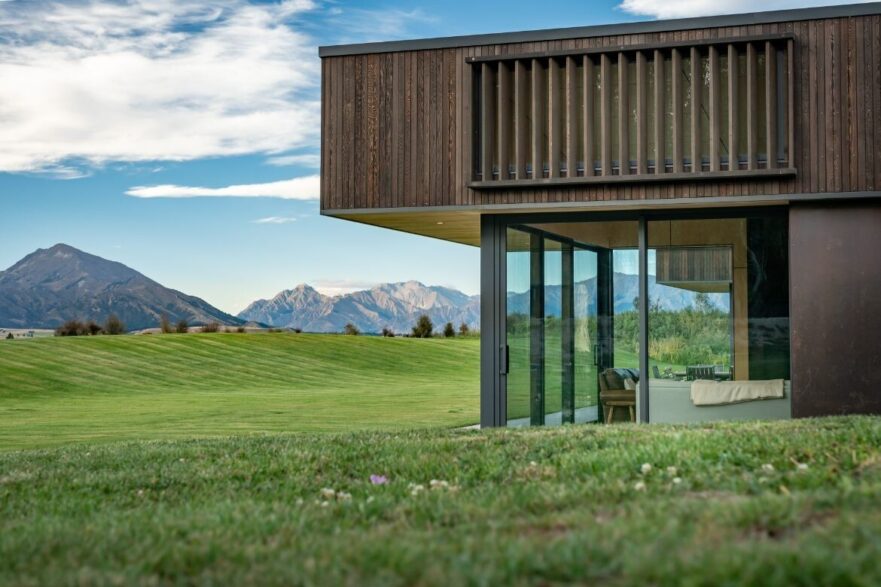
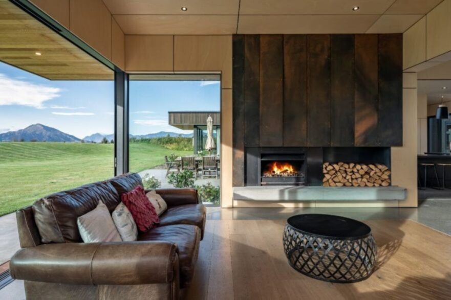
On one side, the lawn opens up to the mountain views, while on the other, a sheltered courtyard and swimming pool back onto a slight rise. This secluded patio encompasses an outdoor fireplace, making it a year-round entertainment space.
Built with comfort and spaciousness in mind, Sundance Rise House is a low-maintenance home that is ideally suited to the climate and the alpine landscape that surrounds it.
Whether relaxing on the expansive lawn, cooking in the gourmet kitchen, or soaking in the pool, this home is a true sanctuary.
Architecture and interiors – Condon Scott Architects
Photography – Simon Larkin
Old Oaks by Carole Whiting
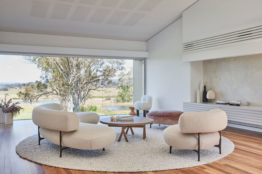
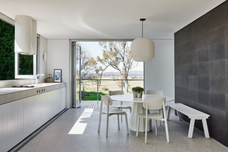
Throughout the rest of the home large expanses of glazing allows for fabulous light and sweeping views. Adding warmth and texture through timber, ceramic tiles and marble, Whiting has layered each room from Australian hardwood floors up: “It’s a nod to the views beyond,” says Whiting, adding, “We wanted to keep the house light and uncluttered with a modern edge.”
In the living room, a large felted wool rug (salsa Jamaica – Halcyon Lake) defines the space and creates the first of the circular motifs visited throughout. Piet Boon lounge and armchair (Mobel) continue the curve, as does the Arflex chair (Space), Vitra Cork Stool, Noguchi lamp and gorgeous lilac velvet pouf also by Piet Boon.
The home is in fact large with an indoor-outdoor room opening onto a large outdoor living space. For the interior portion, Whiting has reduced the palette to concrete with white tiles and cabinetry with a facing wall of deep slate grey. Here a Viccarbe Burin table from AJAR furniture is paired with Hux chairs, an artwork by Marcus Payne and large pendant light (Space).
Interior design – Carole Whiting
Photography – Pablo Veiga
Riverstone by Tim Ditchfield Architects
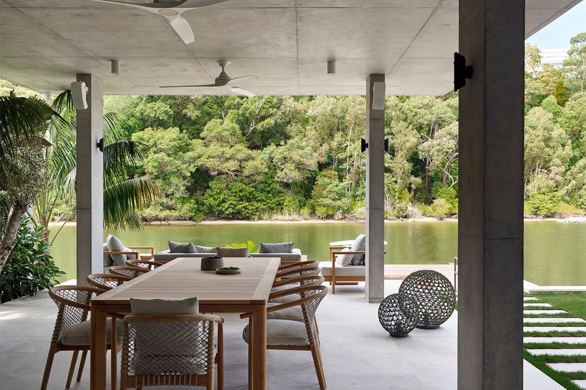
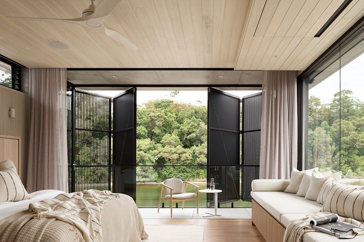
With a total floorplan of some 600 square metres, Riverstone has been designed for the site and to best capture the excellent vistas provided by the surrounding landscape that also includes a boundary with Noosa River. The streetscape of Riverstone is north-facing and the façade, a type of brise soleil, helps mitigate the strong sun and heat as well as providing privacy. The two large screens are bespoke, folded aluminium blades that form a series of modules stepped back and tessellated. It’s a striking visage but also a practical inclusion.
The exterior materiality is important as it also informs the interior palette. Slim linear travertine marble bricks cover the outside walls but are also employed within. The façade and the materials complement each other but also produce a very distinctive aesthetic for the structure.
Oskar Booth explains, “Our exterior palette was set in motion with the selection of the linear travertine as a key material, after exploring various brick and concrete options. The blonde travertine led us to pursue contrasting dark bronze screens and façade elements with exposed concrete fascias and neutral grey aluminium cladding linking the other materials together.”
Architecture and interiors – Tim Ditchfield Architects
Photography – Scott Burrows
The Seat by Atlas Architects
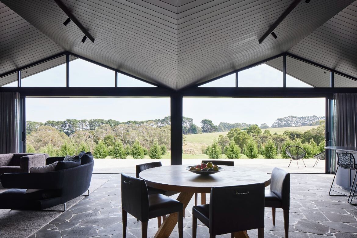
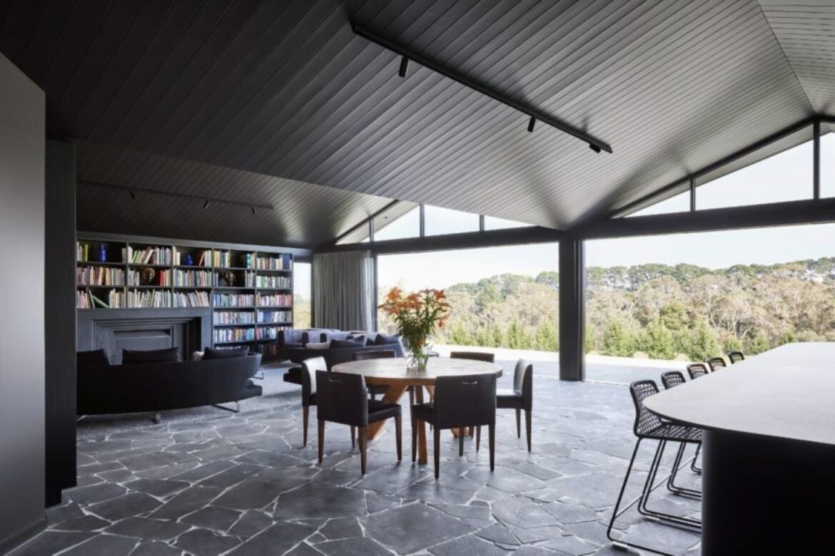
Although the existing home was, characteristically for Mornington Peninsula, picturesque in its setting amidst rolling hills and proximity to coastline, its orientation meant it turned its back on the best of the views. The first order of business for Atlas was to insert a new dimension that embraced and celebrated this aspect, ensuring that, wherever you are in the home, you are connected to nature.
The main challenge was to create a new addition to the home that integrated, but didn’t interfere with, the original farmhouse structure. To this end, Atlas conceived of a pergola frame that acts as a modern abstraction of the existing roofline. This steel fascia pergola envelopes the existing farmhouse and safeguards its private spaces for family use, while projecting towards the landscape and framing the natural surrounds “like an artwork”.
“While effectively encaging the house, it allows an extension of the roofline and provides privacy where it shelters the open space at the entrance, creating a northern courtyard,” says Vu. “Over time, the plants at its base will grow, creeping up to the roofline and enhancing the home’s privacy with flora so it feels contained but never confined.”
Architecture and interiors – Atlas Architects
Photography – Tess Kelly
Grange Residence by Conrad Architects and Lauren Tarrant Design
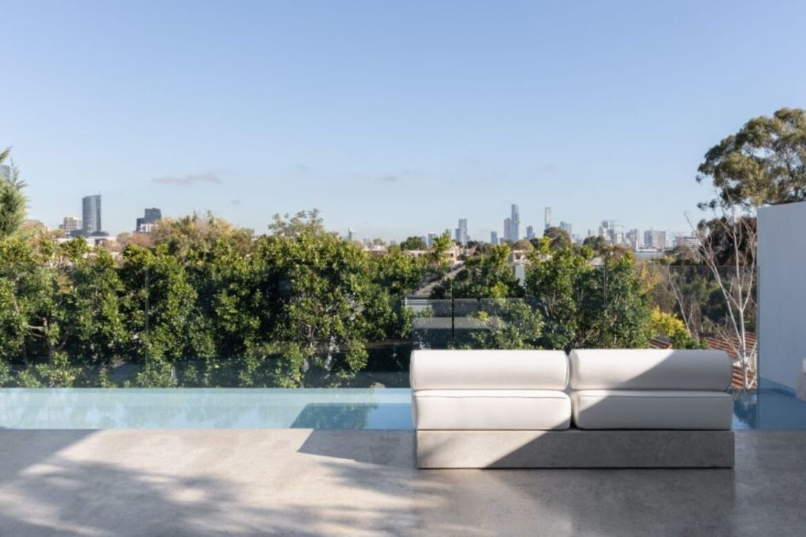
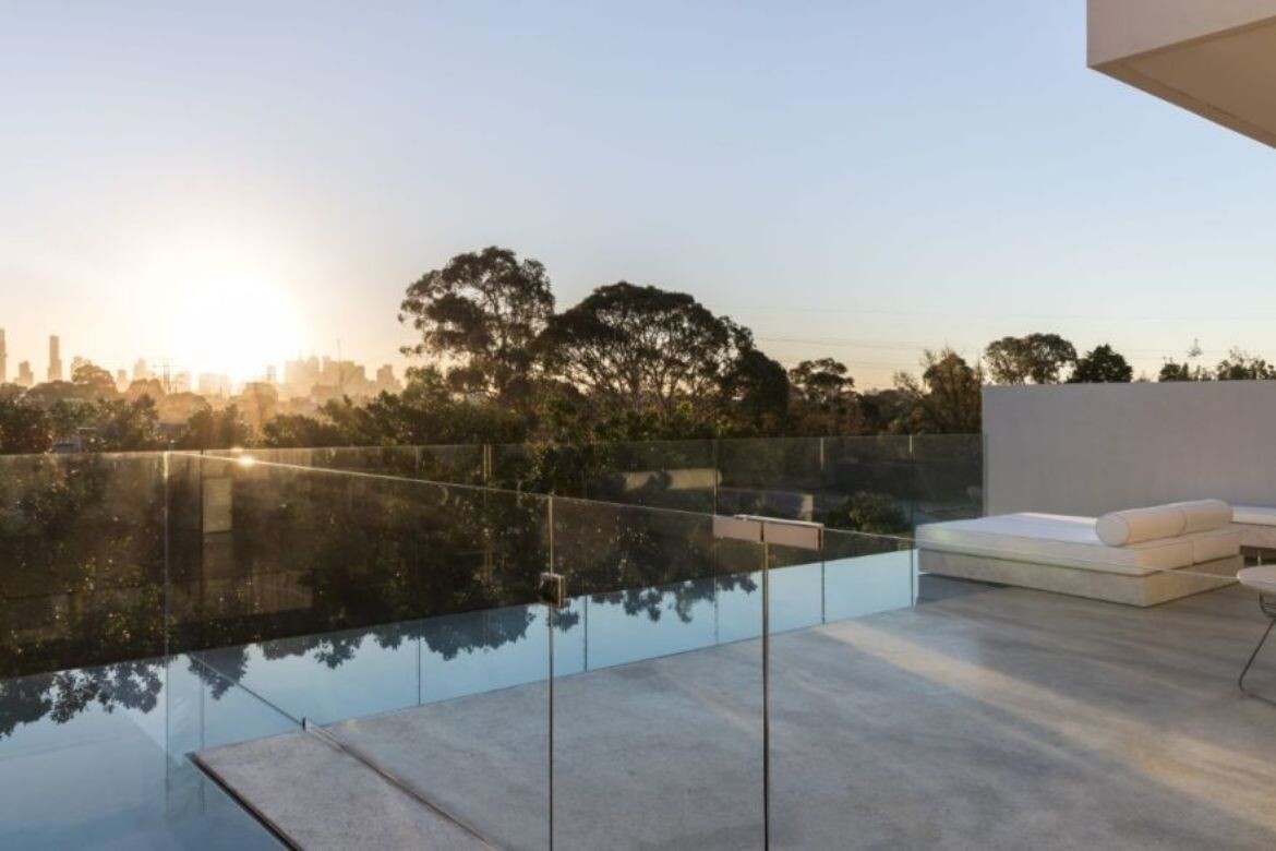
Entering the house through a walled private garden, the acid-etched Grigio Orsola marble of the façade continues into the interior. In doing so, the material acts to draw the eye across the room towards the terrace, pool and out to the view. Terrace furniture is unobtrusive with a B&B Italia, Tobi Ishi Outdoor Table in grey cement, paired with Travolino Awa side tables and custom upholstery by Lauren Tarrant Design. Each of the bedrooms on the mid-lower level opens directly to the landscape.
Architecture – Conrad Architects
Interiors – Lauren Tarrant Design
Photography – Timothy Kaye
Bay House by Castlepeake Architects
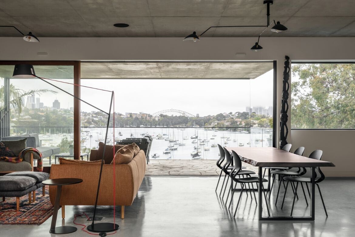
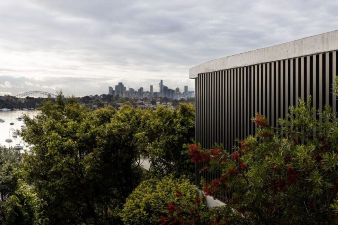
Bay House, located at the end of a narrow lane in the Sydney suburb of Longueville, offers stunning views of the city skyline and the Harbour Bridge. Seeing the potential and wanting to make the most of such stand-out surroundings, the owners appointed Castlepeake Architects to rework what was a poorly connected and inward-looking residence.
The brief was to revamp the structure to make it more efficient, with four main goals in mind: create full accessibility throughout the house; ensure a connection with the views, sunlight, and adjacent outdoor spaces; include the main living and sleeping area on one level for ease of use by the owners; and an accessible swimming pool at the lower level of the house.
Architecture – Castlepeake Architects
Photography – Felix Mooneeram
Heyington by Carr
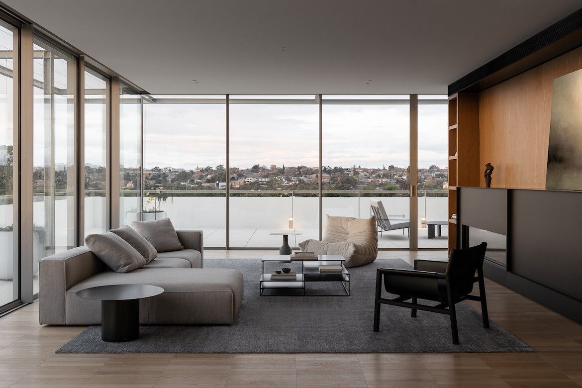
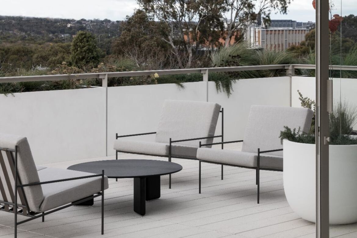
Clad in Portuguese limestone and rendered with detailed timber soffits, the sleek façade blends with Toorak’s vernacular while evoking a sense of warmth and spaciousness. Multiple stonemasons ensured the exterior limestone cladding is both immaculate and precise, yet practical to last the test of time.
It also promotes a deeper connection with natural elements, designed with timeless biophilic influences that, in years to come, will line its sharp lines with gorgeous greenery. The rich landscaping and planting schemes that Acre brought to the fold further embody the concept of a sanctuary.
It’s almost melodic entering Heyington, as the relationship between exterior and interior ties together with a promise of elevated living. The muted tonality of the apartments builds an air of calmness when looking in, and glazed floor-to-window ceilings give a connection to the landscape looking out.
Architecture & interiors – Carr
Photography – Timothy Kaye
Hotel Britomart by Chesire Architecture
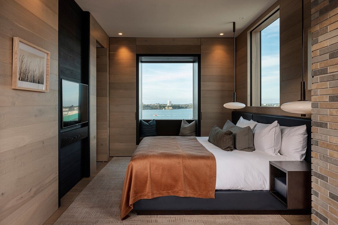
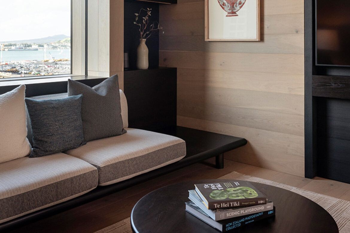
Heralded as the City of Sails, this sustainable Auckland project frames the view to optimum perfection, with each guest receiving a slight variation of crisp blue sea and racing white sails. That said, the Hotel Britomart in Auckland is a luxurious timber-lined cocoon-like escape. More than being beautiful, the 10-storey and 104-room hotel is New Zealand’s first 5 Green Star Hotel, certified by the Green Building Council.
The building is designed by Auckland-based Cheshire Architects. Its striking exterior is clad in 150,000 hand-made bricks, creating a sense of warmth, craft, and connection to its 150-year-old neighbours. Aptly described by Nat Cheshire, “The rooms are designed by texture and with natural materials…. they’re intended to be rooms that you can run your fingertips over,” she says.
Architecture and interiors – Cheshire Architects
