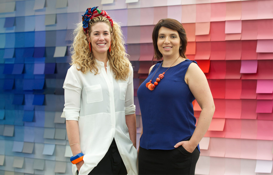
Our work presents us with a wide variety of new and exciting challenges and recently we’ve had the pleasure of working with Taubmans to create a space where people could experience the immense colour offering of the iconic brand, and this inspired us to consider how the Australian experience of colour is evolving.
To us, colour is about expressing personality and creating moods. It can talk to the environment of a building’s location in order to frame, celebrate and complement it. It can distinguish and define space in a way that is transformative.
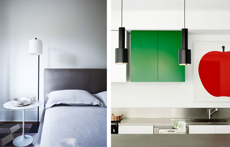
In our work, wall paint is the canvas that sets up the whole scheme. It is key. The ‘neutral base’ we often talk about is often the wall colour so it absolutely needs to be right. The selection of a solid neutral base should always take into account how light falls in and is reflected around the space, how much sun the space receives and this needs to be explored throughout different times of day.

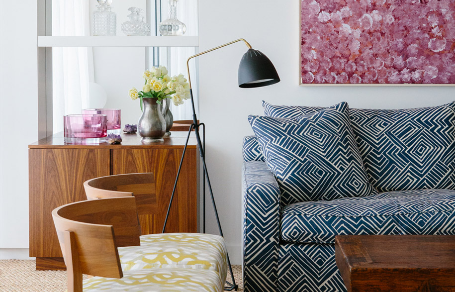
Australian colours are about lightness, brightness and freshness. The climate and the intense quality of our light and sun are a major influence on colour, creating a freshness of palette that is uniquely Australian. Colours including mustardy yellows, orchid pinks, burnt lilacs and the softest steel blues, deep navy and shades of greys are just a handful of our favourites to work with.
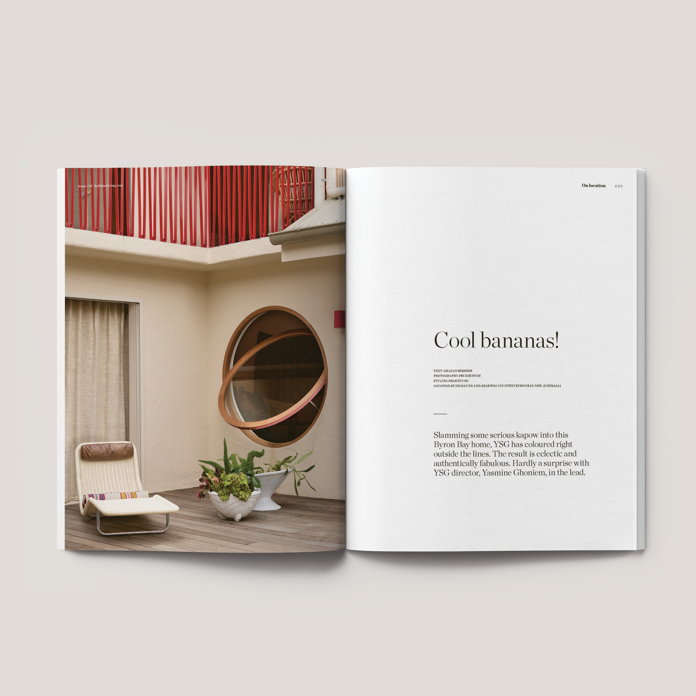
Australians have become noticeably braver in relation to their colour choices, and are also now more confident in articulating their thoughts and feelings about colour. Australian fashion, art and interiors have been dominated recently by clashing prints, ‘the colour pop’ movement, tropical fruits, tribal motifs and strong patterns – all with an exceptionally bold use of colour.
Softer palettes have also recently been reinvigorated with a hit of colour. Even neutral palettes are enjoying moments of bravery with soft mossy greens, burnt pinks and pale blues. When being brave with colour it pays to remember that you don’t have to be bright to be bold.

For us, colour is a key part of overall building design and the interior design process. The two are always linked, and exterior and interior colour should always be a holistic vision. The colour scheme of the architecture of a building should always talk to the interior design colour strategy or vice versa. A really good measure of a well-resolved scheme is if colour feels compatible with everything about the space and its environment.
When we experience colour, we are understanding and experiencing the pure joy that colour can bring to our lives and our spaces. It is about its transformative powers. It is about celebrating the mood it creates, its unique personality and its power to appeal differently to each and every one of us.
We hope that you continue to embrace colour as much as we do in your future projects.
Arent & Pyke
arentpyke.com

