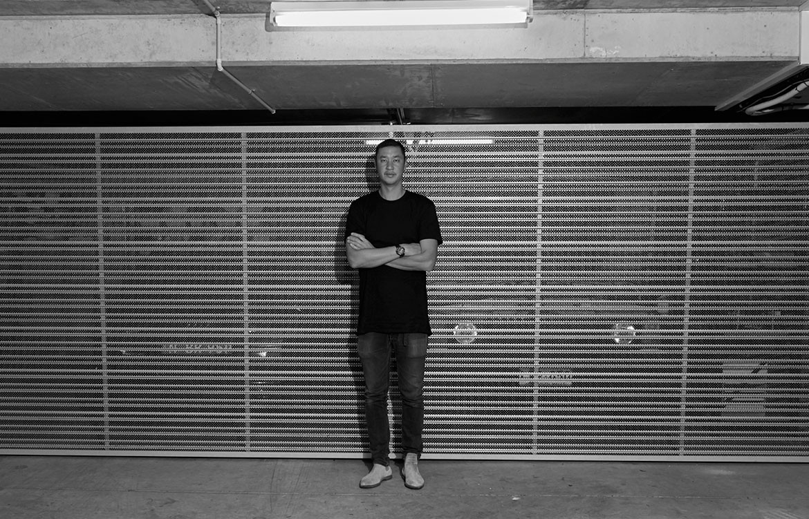
Kelvin Ho is a well-known and respected designer and founder of a Sydney-based architecture and interior design studio – though his clients are far from limited to Australia. In addition to residential architecture and retail design, Kelvin is also a frequent collaborator with Justin Hemmes and the Merivale Group for the interior design and architecture of many of their hospitality spaces and has also worked on the set design for productions with The Australian Ballet.
This, however, was all under the guise of Akin Creative, which he first founded in 2005. Almost a decade and a half later, and with firmly established following, Kelvin Ho has decided to relaunch his studio as Akin Atelier.
Editor Holly Cunneen spoke – for the second time – the to esteemed architect on what sparked the shift, why it was important, and how it was put in place.
Established in 2005, Akin Creative was a well-known – and well respected – architecture and design studio. What was the reasoning for the rebrand and what is the team hoping to achieve?
The rebrand articulated our process as a design firm and define the vision I have for Akin. The aim was for the new name to articulate, influence and guide the way we work. And we also wanted to become a spatial communications studio that explores the idea of each project being a visual and literary representation of our process.
What will be the key differences between Akin Atelier and Akin Creative?
The re-brand is an evolution that respects our history and takes us into the next stage of Akin. Akin Atelier provides more structure as we expand our services, while embracing the underlying values that have always defined Akin.
Rebranding seems like an involved and intense process. Can you talk us through the process and your experience?
The rebrand came during the discovery phase for the website. It was a luxury to look at the business from that perspective. While our core values hadn’t wavered, our process had greatly evolved. Our objective with the rebrand was to develop a visual language that represented our process.
Did you have a pre-existing relationship with Paradise Studio? [Brought on board to evolve the visual profile] What made them the right people for the job, and why did you choose to outsource this given the multi-disciplinary capabilities of your studio?
Paradise Studio explicitly understood Akin. We hadn’t worked together previously, so Paradise brought fresh perspective and new opinions, ultimately challenging any preconceptions or brief I had for our first website. Paradise had also never worked on branding for an architectural/interior design office, so the concepts felt left-of-centre which resonated. And having created identities for fashion, beauty and hospitality projects, Paradise understood the nature of our work and that of our clientele.
You mention one of your core values to be “enriching the lives of the people who use your spaces”: be they residential, commercial, hospitality or even set design. How do you do this?
We challenge those who use our spaces with unconventional elements in unexpected ways, but there is always a familiar element that creates comfort in new experiences.
Habitus really resonates with Luke Flynn’s statement that Akin Atelier “shapes space through architecture”. What does this mean to you?
Meaning the environment is inescapable. Realising that we work in the abstract, the most important part of the process is a clear and creative dialogue that threads each stage of a project together. We take a space and give it meaning and purpose. I believe this creates experience, which is what shapes or defines a space.
Is this the final iteration of Akin Atelier or are you open to the idea that there may be future evolutions in accord with the industry and its market?
There will be future incarnations of Akin. We work with clients who are constantly responding to shifts in the market. Our role as long-term creative partners is to adapt to – and forecast – our clients changing needs. Market changes aside, it’s important for myself and the Akin team to constantly evolve and challenge the way we operate as creatives.
Akin Atelier
akinatelier.com
Photography by Bartolomeo Celestino
We think you might also like bassike Paddington by Akin Atelier
