Ricci Bloch Architecture + Interiors
Architect Ricci Bloch only established her eponymous studio in 2016 and has already built a notable portfolio of quietly sophisticated projects. The small practice’s residential work is particularly memorable for capturing a quintessentially Sydney aesthetic that’s bright and breezy, effortless and elegant. Natural light floods interiors, material and colour palettes are tastefully pared back and the connection between inside and outside is always strong. Ricci and her team eschew superfluous detail for clean lines and sharp angles and in delivering their characteristically minimalist style, reveal a knack for making even the most compact of spaces function super efficiently.
Sharp House, Dover Heights
Photography by Tom Ferguson
Ritz & Ghougassian
The Melbourne-based dream team of Ritz & Ghougassian has created quite the buzz of late – and with good reason. Co-directors Gilad Ritz and Jean-Paul Ghougassian are responsible for designing some of the most exciting hospitality and residential projects to come out of the Victorian capital in the past three years. Their recently completed Highbury Grove House exemplifies the practice’s dynamic grasp of materiality, which heroes the singular material palettes that have come to define their distinct aesthetic. Concrete blockwork is the dominant material in the Highbury Grove project and it gives rise to an austere appearance that’s tempered by timber joinery and the use of white lightweight curtains. While Ritz and Ghougassian may take their architecture very seriously, they also have an infectious sense of humour that informs everything they do, ensuring their approach is peppered with playfulness and open conversation.
Highbury Grove House, Prahran
Photography by Tom Blachford
Ha Architecture, Product and Environment
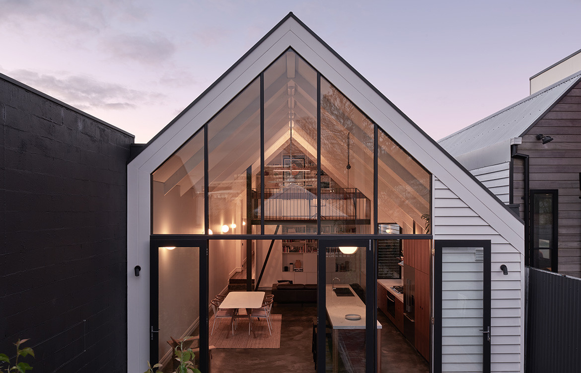
Originally from Adelaide and now based in Melbourne, Nick Harding established multi-disciplinary studio Ha in 2012. Since then, the architect and practice founder has been consistently building a body of residential work that exemplifies an understanding of affordable housing strategies and a commitment to sustainability in architecture. Ha’s small team is as well versed in delivering compact apartment renovations (see Yarra’s Edge Apartment) as it is in working with heritage constraints to design an addition to a classic Edwardian weatherboard (see The Kensington Cathedral). Strong spatial and material sensibilities prevail – regardless of the project’s size and scale – as does an intelligent design approach that never forces the outcome.

The Kensington Cathedral, Kensington
Photography by Dan Hocking
Yarra Edge’s Apartment, Docklands
Photography by Dan Hocking
Trias
Earlier this year, Trias’ Three Piece House picked up an award in the Residential Architecture – Houses (New) category of the 2018 NSW Architecture Awards. Not a bad achievement for the Sydney-based practice, which was only founded two years prior to the win by Jonathon Donnelly, Casey Bryant and Jennifer McMaster. The Co-directors bring a diverse range of skills and experience to the studio, which takes its name from Vitruvius’ principles of architecture, defined as firmness, commodity and delight. In adopting these values, they aim to create buildings that are solid, simple and beautiful. Truth be told, they’ve already achieved this goal and with projects currently underway in both Australia and the UK, it’s well worth waiting to see what they come up with next.
Three Piece House, Newcastle
Photography by Ben Hosking
Zuzana and Nicholas
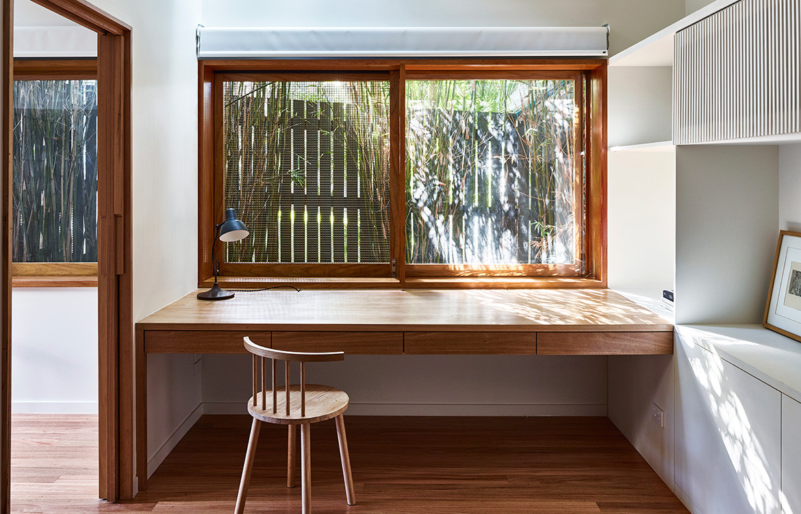
Zuzana Kovar and Nicholas Skepper met while studying at the University of Queensland and in 2013 the couple established Zuzana & Nicholas. Their Brisbane-based studio has a reputation for creativity and innovation, with both co-founders also maintaining an active research and exhibition practice. Along with their growing residential portfolio, this has made them the darlings of Australia’s vibrant emerging architecture scene. Zuzana & Nicholas’ projects may vary in size, but all are characterised by a fresh interpretation of Queensland’s classic architectural vernacular. Interiors are light and bright, material palettes are stripped back and spatial considerations are informed by clear connections to the outdoors. They’re very much interested in the way people live and how to facilitate the best outcome for each of their clients.

Norman Park House, Norman Park
Photography by Toby Scott
Monash Road House, Tarragindi
Photography by Toby Scott

