The Asia Pac region is pioneering some mega cool new directions in the hospitality space – and the international design community is noticing. Imaginative and intelligent lighting concepts play a huge role in this reputation, where our designers are creating instantly iconic alternatives to the standard humdrum downlights and oh-so-over-it Edison bulbs.
Instead, we are a region of inventors! Creative geniuses and radical thinkers taking the hospitality typology to new and unexpected places. Here, Habitus celebrates five Asia Pacific cafes (and the designers who created them) that showcase our collective talent in producing the world’s best cafe lighting design…
No.19 Ascot Vale by Biasol
Tribute design is a dicey game, kids. All it takes is a client brief that mentions “New York Deco” and suddenly you’re replicating the Chrysler building. There is a fine line between modernising a traditional design archetype and flat-out copy-pasting it.
In their recent effort for hospitality space No.19, local Melbourne studio Biasol have successfully produced a nostalgic design without completely ripping off the original. Having already designed one café for clients Domenic and Diana Caruso, the duo asked the studio to find them a property for their second venture.
Australia has a rich and diverse immigration history, where cultures from all over the world came seeking opportunity. This has impacted our design heritage immensely, where immigrants from Mediterranean areas of Europe in particular – such as Italy and Greece – meant that they brought with them their own aesthetic traditions that quickly became blended with a kind of Australi-ana twist. “Our concept was inspired by the Greek delicatessens that flourished around Melbourne in the 1950s,” Team Biasol notes. “Materially, concrete surfaces – the counter, walls and floor – give the space a warmth and sophistication.”
Though certainly inspired by vintage Greek-Australian eateries, Biasol worked to inject elements of nostalgia into the space while still producing a more modern, refined space in line with current hospitality culture.
“Its 4.5-metre-high ceilings and skylights allow daylight to flood the space throughout the day,” says Jean-Pierre Biasol, “while the rectangular layout offered a variety of possible layouts. We chose to combine pale concrete surfaces with warmer elements such as brass and wood. The concrete service counter, is definitely the heart of the space, accented with the hand-painted teal tiles, which were sourced from Morocco to add a level of Mediterranean authenticity.”
“Brass lamps sit atop of the counter, with a footrest in the same material snaking around its base. The golden material is used again for a sink set into the concrete surface, where customers can serve themselves water.”
“We took an integrated approach to this project, to make sure the architecture, interiors, branding and products worked well together, and produced a cohesive and memorable dining experience,” added the team.
Photography by Ari Hatzis
Flaggerdoot Bar & Doot Doot Doot Restaurant at the Jackalope Hotel by Carr Design
The demand for ‘transformative experiences’ in the luxury travel market requires the ability to transport and excite. They need to communicate, mesmerise, delight and surprise guests, whether they are a first-time punter or a seasoned traveller. These environments not only need to tell a story – but invite you to actively participate in that story, too.
In one of the most daring and avant-garde moves in the hotel industry to date, the Carr-designed Jackalope Hotel on Victoria’s Mornington Peninsula wine region provides an otherworldly experience rich with narrative and imagination. But how exactly has Carr built-in this ability to offer guests a ‘transformative experience’? From head to toe, the project is guided by the theme of ‘alchemy’ – a nod to its 18th century heritage as a working vineyard.
Nowhere is this technique more prevalent than the awe-inspiring lighting concepts in the hotel’s bar & lounge Flaggerdoot and fine-dining restaurant Doot Doot Doot. Celebrating the hotel’s origins, the signature bar, Flaggerdoot is housed within the original 18th century Federation cottage, its architecture having been thoroughly and sensitively restored. One of the most amazing features however is the geometric single-track lighting installation on the ceiling, referencing the alchemic nature of the space.
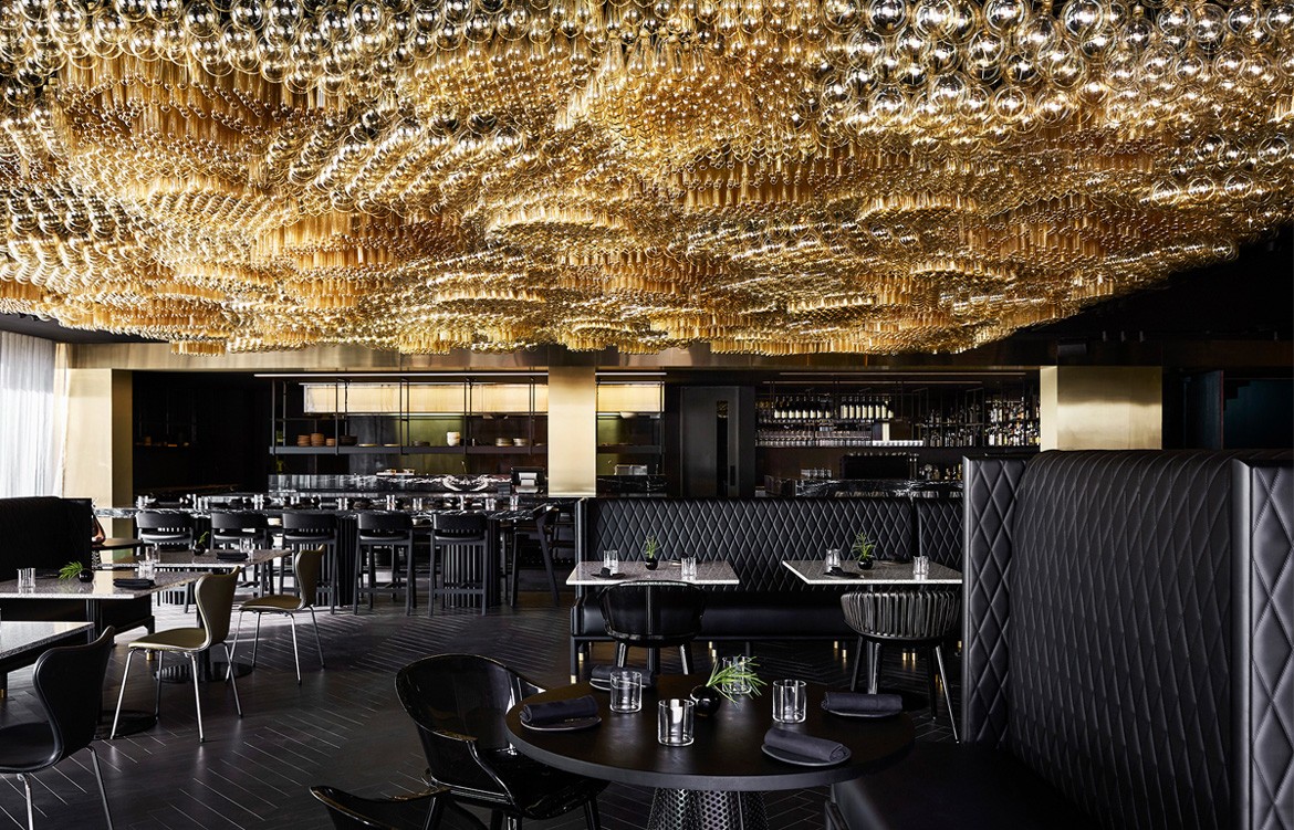
One thing I’m willing to bet you’ve definitely seen while scrolling through Instagram is the spectacular light installation on the Doot Doot Doot restaurant ceiling, collaboratively designed by Carr and Fabio Ongarato Design (FOD). Jewel-like in form, what you might not know is that the installation references fermentation and bubbling (again, another comment on the theme of alchemy) while celebrating the hotel’s own working winery and vineyard providing an immersive, interactive and tactile wine experience for guests.
This lighting design in particular may be one of (if not the) most magnificent feats of luminary design intelligence in Asia Pacific’s history.
Photography by Sharyn Cairns
Chifley Plaza, Sydney by SJB
Sydney’s famed Chifley Plaza shopping mall, by SJB, reimagines the retail experience with inspiration from the Manhattan Art Deco style of the original building itself. Since its inception, Chifley has been an iconic retail precinct in Sydney’s CBD, renowned for extraordinary marble detailing and high-end shopping. SJB has taken the interiors to a new level by retaining the aesthetic and historical nostalgia of the precinct and architecture while delivering a more modern interpretation of it.
On the upper floor, for example, an enormous backlit ceiling acts as a glowing skylight visible from all levels. Taking inspiration from iconic international public buildings like Le Bon Marche in Paris and The Guggenheim in New York, the patterned backlit ceiling acts as a focal point, throwing a lovely wash of light through the tri-level atrium void.
“We approached the design by understanding the problems, considering options and looking to historical references that might help unfold the answers,” says SJB director and design lead, Jonathan Richards. “For example, we loved the idea of a backlit ceiling to resolve the issue about low ceiling heights and a hidden food-court. It would be the draw-card on entering Chifley. The enveloping canopy of light also created a sense of marketplace.”
With this illuminated ceiling, SJB injected some more detailed and bespoke lighting elements into the space. Specifically, custom lighting was created by Brooklyn-based industrial designers Apparatus studio for the food court on the third floor. In designing these smaller details, Richards and team note that they “always like to be heavily involved in the prototyping of furniture, joinery and construction details”. Richards says: “The builders made 1:1 mockups that gave us the opportunity to finesse proportions, colours and materials to ensure the final outcome feels properly resolved and completely thought through.”
Photography by Felix Forest
Hightail Pub, Melbourne by Techne
Combine a hip food court with a luxe cocktail bar, and you might get something like Hightail – a new hotspot set to breathe life to a notoriously overlooked part of Melbourne. With the client having recently merged with 100 Burgers, the 950-seat space cleverly integrates individual kiosks for Belle’s Hot Chicken, Super Taco, and the ever-popular Mr. Burger. Catering to roughly 20,000 workers in the buildings above, Hightail was formed with the vision of providing the perfect backdrop for after-work drinks descending en masse.
Inspired by the classic and wonderfully vivid children’s book The Wateringhole by Greame Base, the venue playfully references the concept of ‘the wateringhole’ as both a feature of the natural landscape and to the old colloquial term for a public bar.
Hightail is a journey through texture, colour and form, creating a fun and unique experience. Two bars; a robust beer bar finished in concrete, cork and copper; and a more intimate wine bar adorned with brass, terracotta tiling, deep blue carpet and natural timber. Taking cues from Graeme Base’s lush illustrations, murals and rich layers of colour and texture bring an element of intrigue and tactility to the space.
While the stunning combinations of colour and texture are the substance of the space, it’s the clever and creative lighting that really sets the dining experience apart.
The entry for example, features a bright blue neon ‘Hightail’ sign, referencing the famous and iconic “neon bar sign” trope. Throughout the space, Hightail is littered with a series of deliberately miss-matching pendants above each of the tables as well as draped caravan-style bulb lighting throughout some of the private wine bar areas to give the space a more bohemian feel.
The pièce de résistance however, is most certainly the main bar, which mimics the flooring by cascading down from the ceiling in a vintage 50s diner-style aesthetic. Here each row is warmly backlit against the green timbre and tile structure, given off a luminous golden glow and acting as the monolithic centrepiece in an already eye-catching space.
Photography by Charlie Kinross
Bikini Bar, Bali by Travis Walton Architecture & Interior Design
With more than one million Australians visiting the Indonesian island of Bali each year and more than 10,000 Australians making it their main home, there’s something in the Bali waters right now, and it’s taken hold of the hospitality scene.
One of the latest additions to an already growing list of high-end hospo is Bikini Bar designed by Australian-based Travis Walton Architecture + Interior Design. The 120-seat bar and restaurant is the latest venue from restaurateurs 8 Degree Projects, headed by Australian expat Adam McAsey.
The four venues – Sisterfields cafe, BO$$ MAN burger shop, Expat coffee roasters and now Bikini – sit side by side, occupying one of the busiest corners of upmarket Seminyak. Of all the venues, Bikini shouts loudest to the street with a pink neon sign high above its forecourt declaring “U LOOK HOT IN (A) BIKINI.” The “A” flickers in and out of view, inviting two different readings – one of flattery and one of subtle instruction. The vivid display is a little reminiscent of the courtship behaviour you see by tropical male birds or young men in Kuta, but it is a purposeful tactic to capture the attentions of passers-by and encourage them inside.
Once through the front entry, visitors can pick a spot in the open-air cocktail lounge, with the “disco art-deco” service bar on the right and plush banquette seating on the left. The space has been designed as a place for people watching, and for many tourists this is exactly what they feel like doing on their first nights as they take in their surroundings.
Timber screens the soffit of the overhead private dining room and the bar front, while marble countertops, brass-lined stools and especially the art-deco style wall pendants above each of the booths speak of influences from New York and Miami. But sometimes the best lighting is hidden from sight!
Bikini Bar, for example, runs around the corner and into the purpose-built double-height concrete structure that houses the main dining space. The western and northern walls are flanked with curvy leather dining booths which feature indented backlighting which projects from the booths and up through to the walls and ceiling. The effect of this kinds of lighting concept is heightened by the western wall, which is almost completely cloaked in a mural by Melbourne artist Ash Keating, who filled up fire extinguishers with pink and white paint and sprayed the wall. The result is a dynamic curtain of illuminated colour from the hidden lights that appear to drip down the wall and flood the space with a pink fog.
Photography by Sean Fennessy

