Oriented around socialising, sunken lounges have entered the popular imagination associated with the (perceived) wholesomeness of the 1950s, the Mad Men-style 1960s and groovy 1970s. Recent years have seen a revival of the sunken lounge as architects create more intimate and interactive settings; a stronger connections to the outdoors; and define space and spatial hierarchy.
In Columbus, Indiana, Eero Saarinen’s Miller House, designed in 1957, is one of the most well-known conversation pits, recessed into the floor of the glass and steel modernist building. Way-out architect Bruce Goff was incorporating conversation pits way back in the 1920s, and Paul Rudolph was doing modernist and shagadelic sunken lounges from the 1950s through the 1970s. The Dick Van Dyke Show and The Mary Tyler Moore Show also featured sunken lounges, demonstrating their popular appeal. As Time reported in 1963:
“Back in the late 1950s, there was hardly a blueprint around that did not include specifications for a large, shallow hole to be sunk into the living-room floor…Its ostensible purpose: to create, in the vast tundra of the ‘living-dining-play area,’ a separate den-like arena that could either remain distinct or be absorbed at party time into the whole. There, while others went about frivolously at ground level, the more serious-minded could step down to form a sort of basement discussion group. Non-talkative families tucked pillows and blankets into it, called it a rest area. Some put the barbecue there, achieving a pit-within-a-pit effect. There seemed no end to the pit’s potential.”
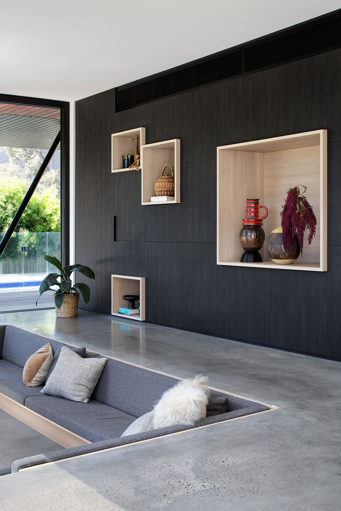
Residence by Junctions90. Photography by Christine Francis
That potential is being realised once again by architects today, creating living spaces that bring people together in more intimate social settings that encourage conversation and interaction, perhaps as a response to the prevalence of screens. Dina Malathounis of Junctions90 designed a sunken lounge to bring the family together. “The clients have two children and the space is set up for reading, watching television or just lounging about the open fire place depending on mood, and the family spends almost all of its time in this zone,” Dina explains.
Robinson Beach House by Cera Stribley Architects. Photography by Emily Bartlett
The conversation pit emerged at the same time as the post-war ranch house in America, which had a long and low profile and open floor plan. As in Miller House, submerging the living area was a way to delineate space. At Robinson Beach House, designed by Cera Stribley Architects, a conversation pit on the ground floor provides an informal living space for the kids. “The downstairs space is large. The sunken lounge creates a room within a room, while still preserving the views out to the pool and garden,” says Chris Stribley. “In winter the fireplace makes it the cosiest place in the house where the kids can play board games or watch films. In summer, being enveloped in cool concrete is the best escape from the Australian sun.”
Brighton House by Technē Architecture + Interior Design. Photography by Tom Blachford
A level change not only defines spaces without creating physical barriers, but also hierarchises space. Raised floors signify importance or grandeur, and sunken floors evoke intimacy. They also allow for a loftier feel as the floor-to-ceiling height increases. “There is a sense of theatricality and uniqueness to a sunken lounge and our clients were motivated by bold design ideas and points of difference,” says Nick Travers of Technē Architecture + Interior Design. For Brighton House, Technē designed a modernist pavilion extension with a glass-surrounded sunken lounge that sits level with the swimming pool. “It creates a cosy atmosphere within a structured space with built-in lounges, as opposed to the more usual situation of furnishings set within a room. It also gives a unique feeling in relation to the exterior ground level. The eye line is lower, which gives the inhabitants a different perspective.”
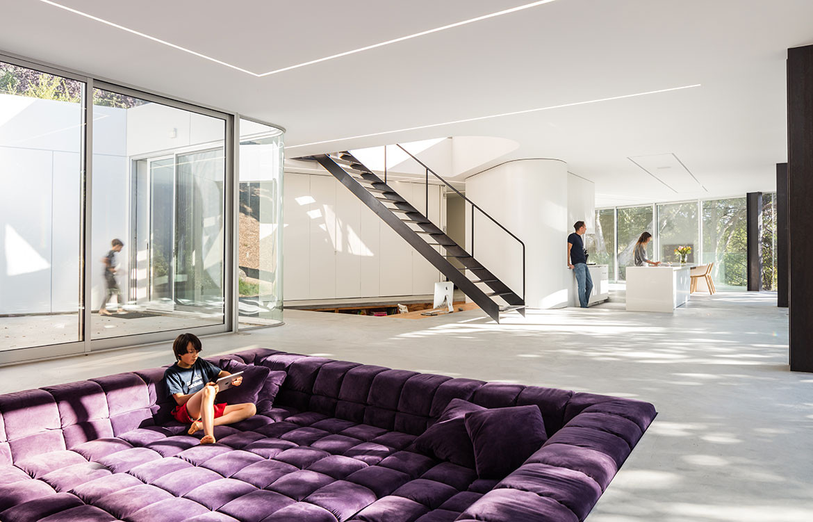
Pam & Paul’s House by Craig Steely Architects. Photography by Darren Bradley
In addition to the lower perspective, a conversation pit offers clearer sightlines through a space, maintaining the openness in a room. In California, Pam & Paul’s House, designed by Craig Steely Architects sits on a steep forest site with a cantilevered, glass-walled living area. “We chose to sink the living room (and office) to solve a problem: How to create an unobstructed view through the space and into the canopy of trees that wasn’t cluttered by furniture and objects. The television also rises out of the floor, continuing our preoccupation with purifying the view,” says Craig Steely. In this conversation pit, the cushions are moveable to create a soft, level space, or removing the centre ones creates more conventional sofa seating. “We almost didn’t do it because of the fadish nature of a conversation pit, but ultimately I’m glad we did because it solves the problem so elegantly and helps demarcate space in such an open plan,” Craig says.
For some classic and over-the-top examples of twentieth-century conversation pits check out Paul Rudolph’s modernist Cohen House (1955), glistening Edersheim Apartment (1970), cantilevering Bass Residence (1972) and carpet-covered Strutin Residence (1975). Some of Bruce Goff‘s later renditions include a suspended shag-covered sunken lounge (Bavinger House, 1955), a fire-and-water fountain (Nicol House, 1965) and a kitchen and bar (Ford Residence, 1965). And of course, Eero Saarinen’s TWA Terminal at JFK Airport has a sunken lounge that epitomises the golden era of the Jet Age.

We think you might also like A Labour of Love by Junctions90

