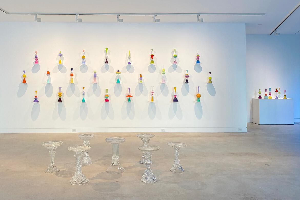
Auction houses and opportunity shops are the repository of so many wonderful dreams. The best crystal kept for special occasions, arriving as a trousseau, wedding gift or inherited treasure – they are the deeply loved, but never used, example of thwarted dreams.
Echoing a past where crystal was foundational to every good home, the latest show from Sydney-based assemblage artist Edward Waring conflates a more recent past of his mother’s world, where stories, coloured drinks and the hilarity of female camaraderie inform his memory.
“Waring has layered personal, social and cultural histories in these works. Many are titled with women’s names of an earlier era, a homage to the friends of Waring’s mother whom he remembers in their drinking and partying heyday; occasions where glasses were filled to the brim with colour and clinking to life,” notes Chloe Wolifson in her essay accompanying the exhibition.
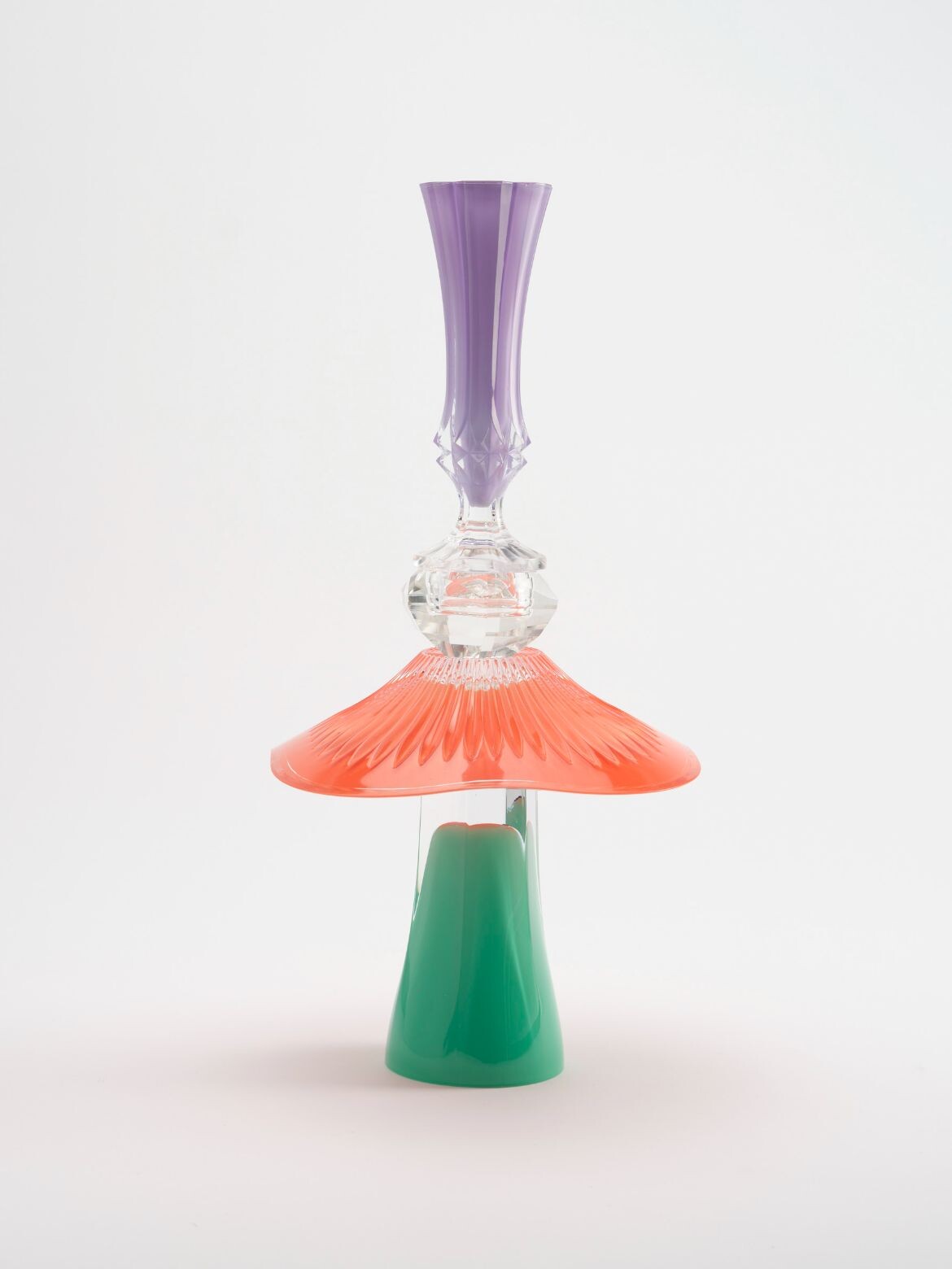
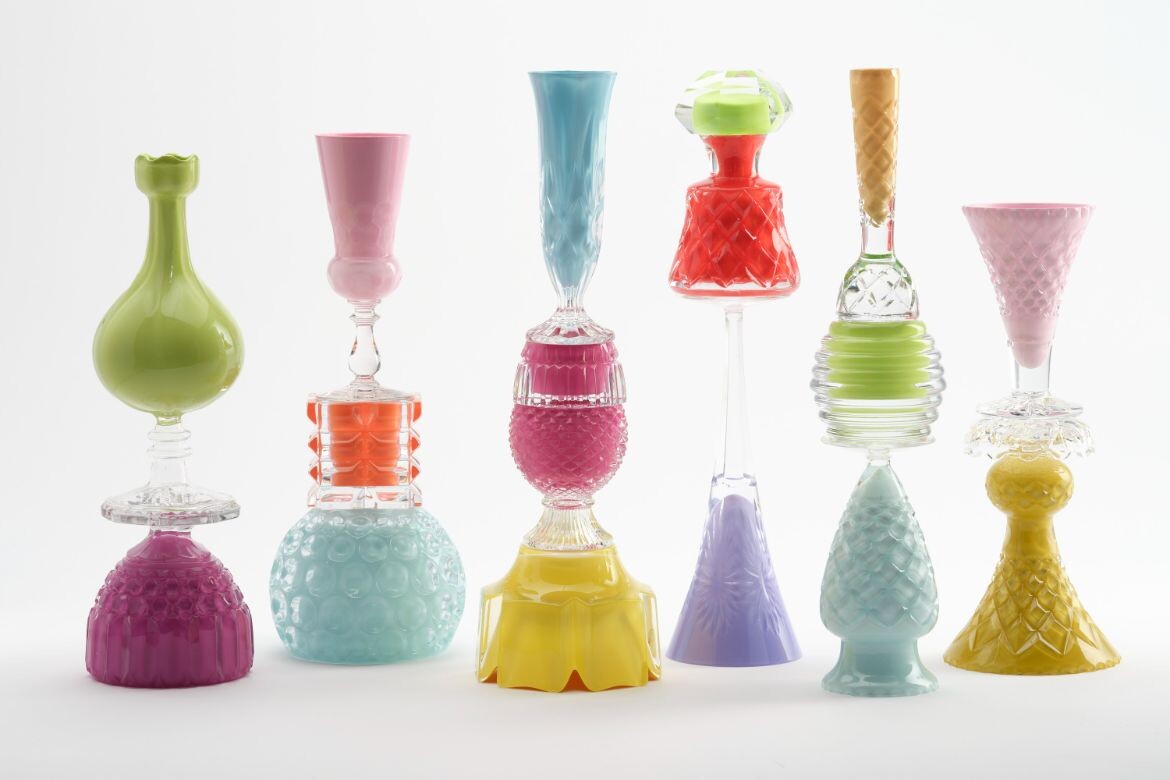
To this end, the treasured crystal is contextualised to the contemporary with saturated pastels built and arranged as sculptures, whereby each unique sculptural assemblage playfully intersects properties of light, weight, inversion and gravity.
The colours reference both the mid-century colour trends of crystal’s most prolific period and Mobilis comics of Waring’s youth. But they are also a homage to the coloured treats the crystal was designed for. As such, it is the pinks and greens of strawberry and lime Sundays and the vibrant tones of holiday jellies that Waring is playing with. And play he does with stacked and reconfigured arrangements that serve no functional purpose, other than to be a delight of eye candy.
“Working instinctively in his ‘crystal lab’ to find formal balance in combinations of dishes, vases, ashtrays and candle-holders, the objects of his fascination have been turned on their heads and accentuated through the introduction of colour,” notes Wolifson.
Rang Dizzy for example, is constructed from an upside-down flared sweets dish (a redundant term if ever there was one) with a tall cocktail glass (with a twist detail in the opposite direction to the base) on top. The form is emphasised with Waring’s vivid colour selection of kelly green, pastel raspberry (for the bobbly, raspberry-like section of the sweets dish) and teal for the flaring base.
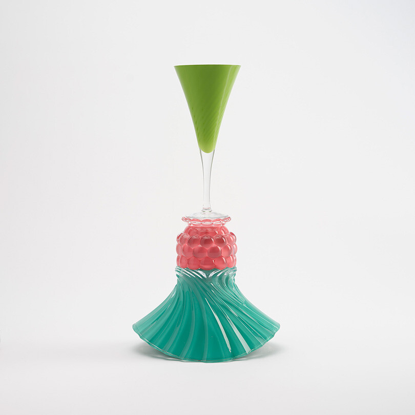
The combination is impressive, with the details of the crystal form, while amplified by colour and contrast, cohesively working to deliver a unified singular object. In essence, it is a shame to realise what they are made up of and asks if the magic lies in knowing or not knowing.
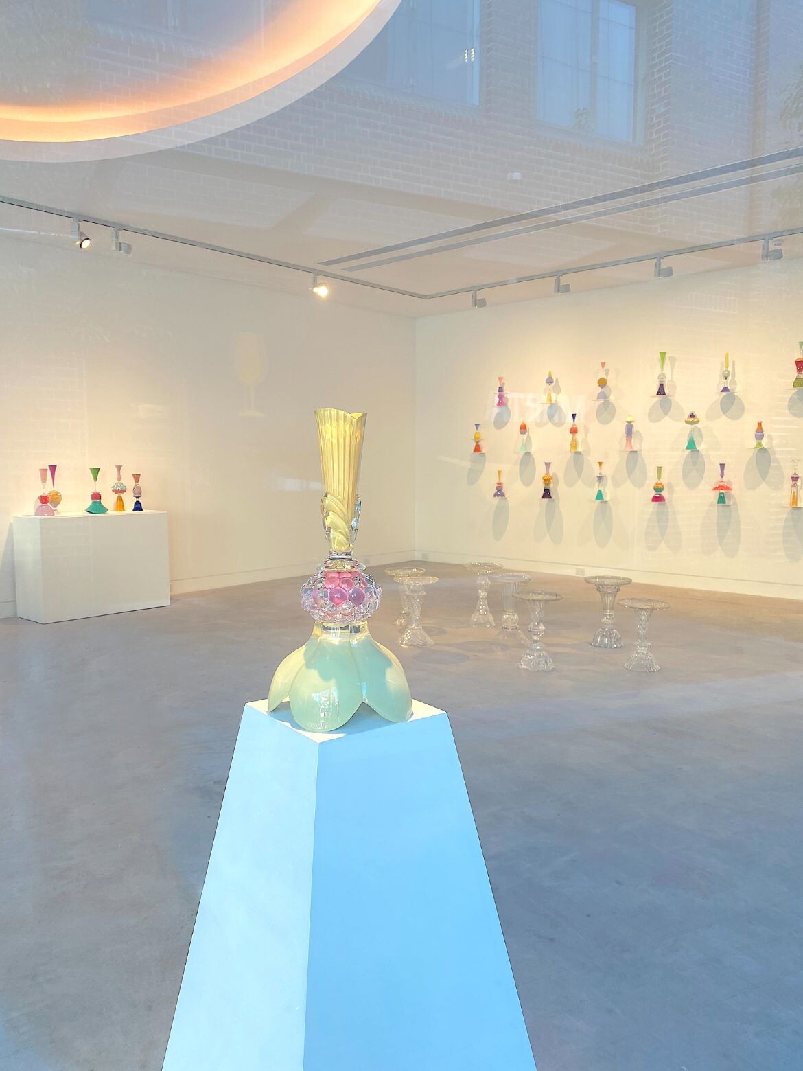
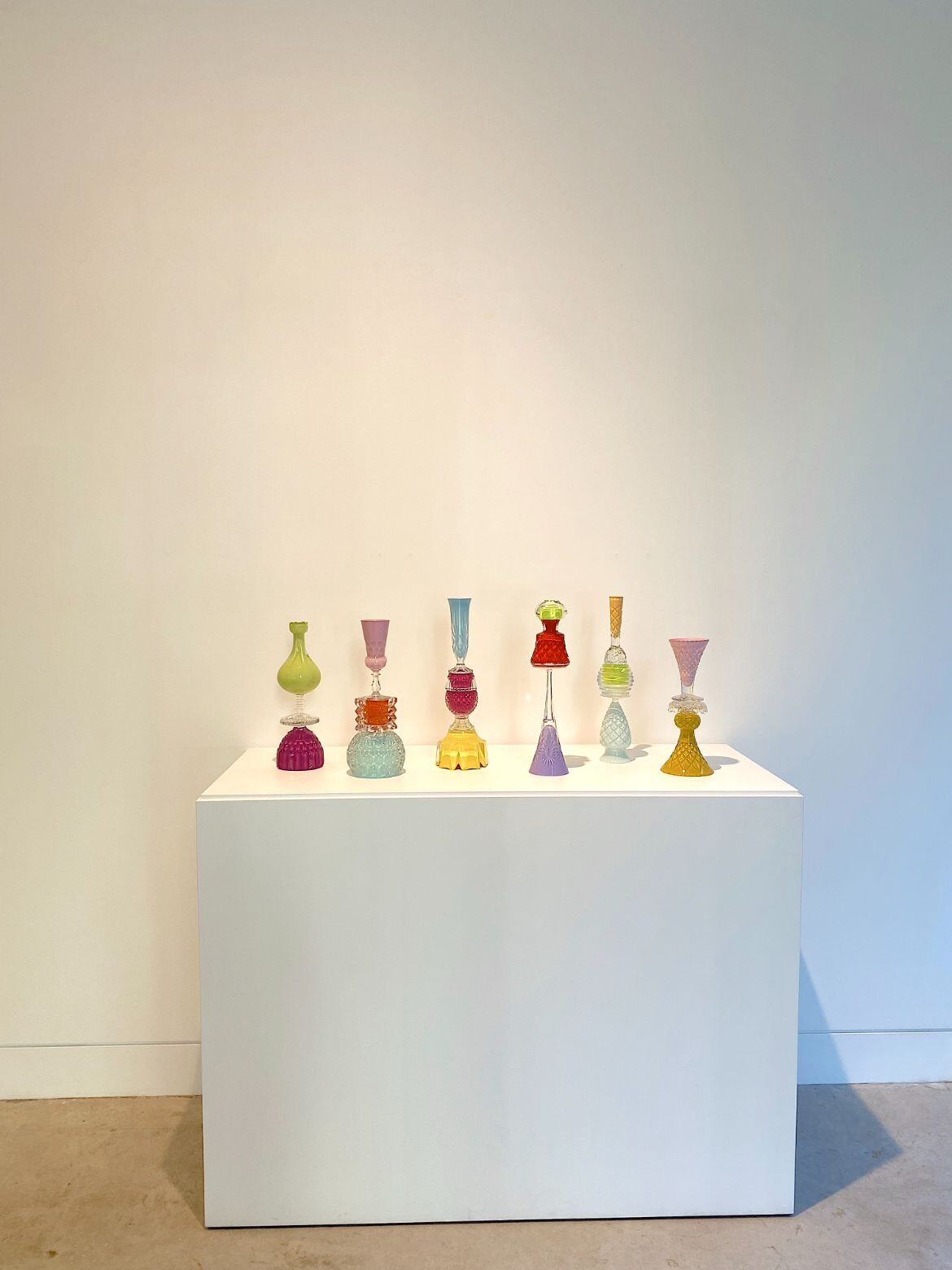
While each piece is charming, it is the groups of work that really impress. Here, Waring has brought groups of six (A Lenticular Slap) and four (Goodnight Ladies) constructions together as informal companions. The colours in these collections play across each other as a character-filled echo of a party of friends. And like friends, there is both a distinctness and correspondence between the pieces.
“Waring explores the role of memory and our relationship to the materials that accumulate around us across our lifetimes. The melancholy contained within these relics from a fading way of life makes way for a warmer nostalgia, in which they are filled with life and given new purpose,” says Gallery Sally Dan Cuthbert.
Accompanying the coloured pieces are a set of ‘Champagne Tables’, built from stacked, but uncoloured crystal, the side tables are fabulously cognisant of their own uselessness with large trifle bowls turned to the ground, while the once redundant trinket dish is given new life as the tabletop. Champagne Table 22, which seems to have a pair of dishes joined at the centre to create an orb is particularly impressive.
Gallery Sally Dan-Cuthbert was established in 2019 by director Sally Dan-Cuthbert. The first of its kind in Australia, the gallery represents local and international artists and designers, delivering an intergenerational programme of rigorous contemporary art and collectible design.
Gallery Sally Dan-Cuthbert
gallerysallydancuthbert.com
Photography courtesy Edward Waring and Gallery Sally Dan Cuthbert, Sydney
