Timothy Alouani-Roby: Please tell us about your visit to Milan this year – what were the highlights?
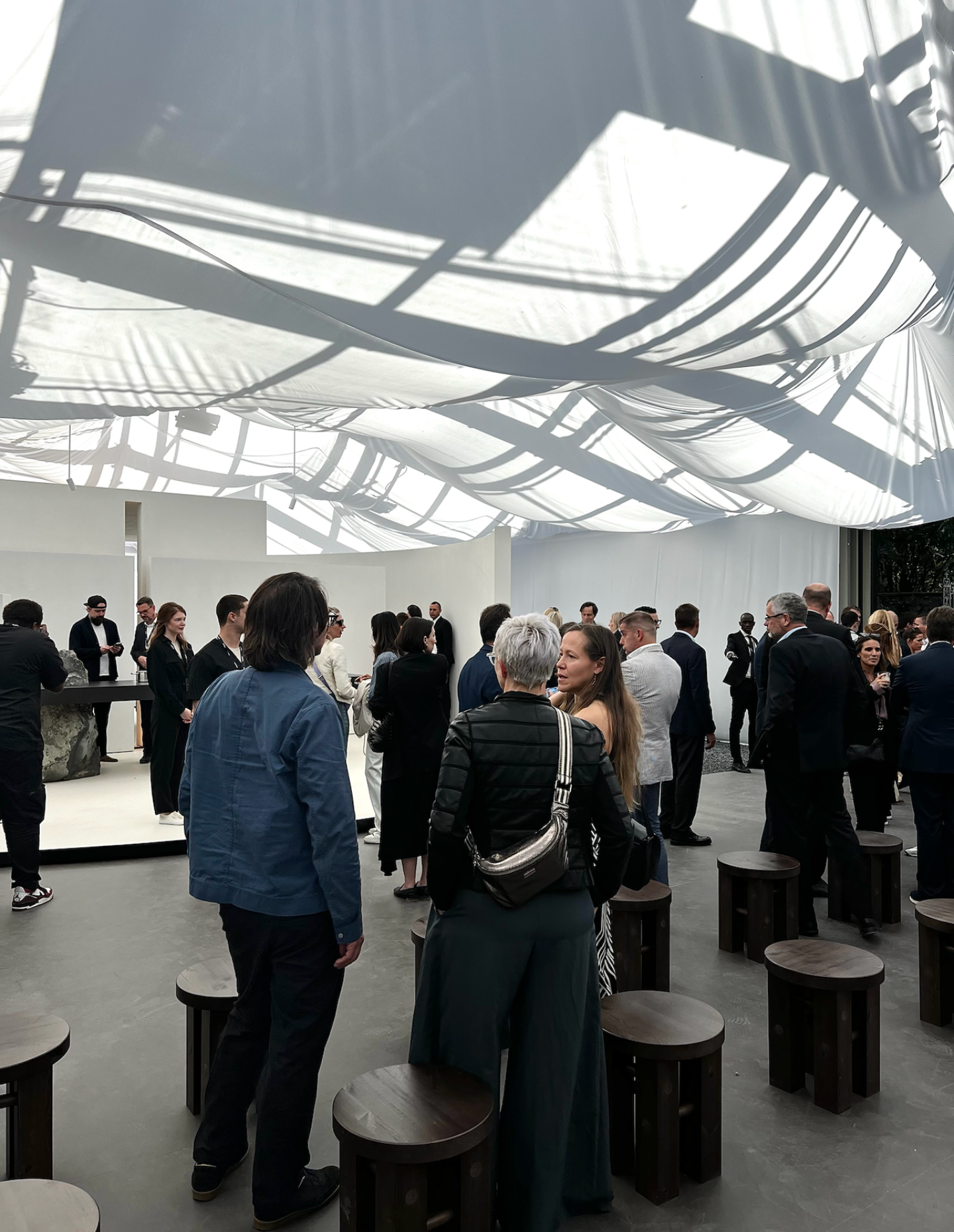
Kate McGlone: Bringing the world’s best design minds together in one city over a single week leaves one fatigued with beauty, innovation and inspiration. It isn’t about trends but the experiences and feelings that linger long after the event has concluded – the initiation of the creative compass that finds its way into your home, guided by the minds of those in this industry who are so committed to making a difference in an individual’s world. Amid the bustling streets filled with curiosity, understanding and a willingness to learn and be inspired, some of my highlights included visiting Villa Necchi, where Gaggenau showcased their Elevation of Gravity Exhibition in collaboration with creative agency Anomaly Berlin.
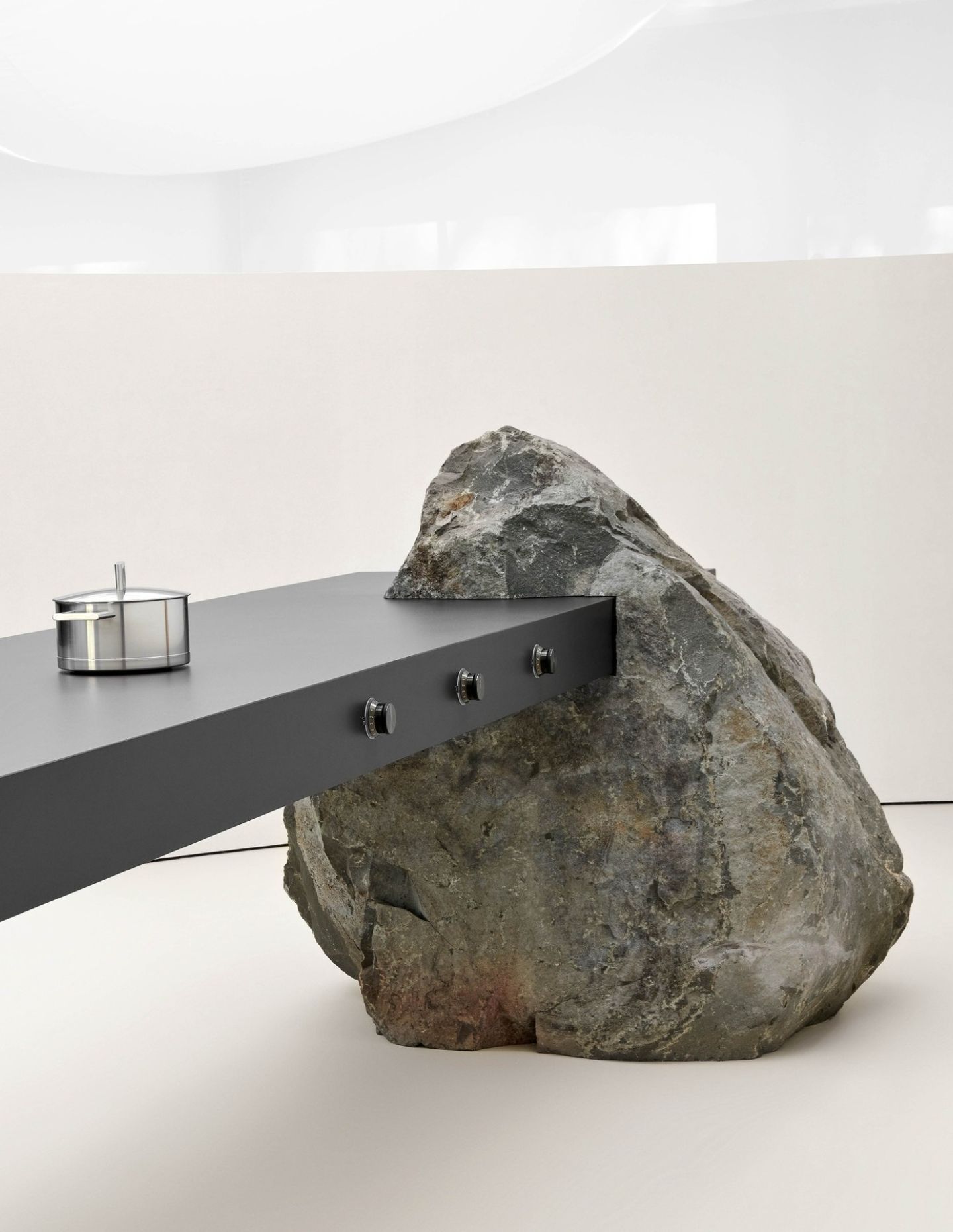
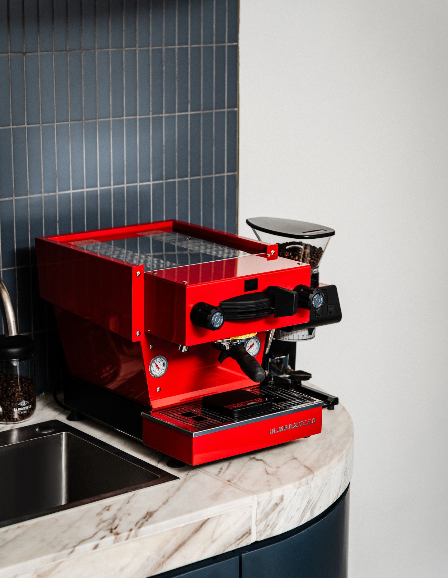
Gaggenau has reshaped how design minds interpret appliances. Each year, they find the ability to further refine and evolve the union of technology and design. Enveloped in a semi-transparent fabric, was a pavilion divided into two contrasting yet interconnected spaces, which represented the equilibrium between what exists and the aspiration of more and where Gaggenau showcased upcoming masterpieces, including a cooktop and worktop combined into one surface. This immersive space encourages exploration of living and being, and the beauty of design.
Gaggeanu’s showcase was a testament to the beauty and significance of appliances, demonstrating that they deserve to be honoured like heirloom furniture passed down through generations. Built to last, these designs harmonise creativity with technology.
Even more intriguingly, can you give us some ‘Burgundy Revelations’?
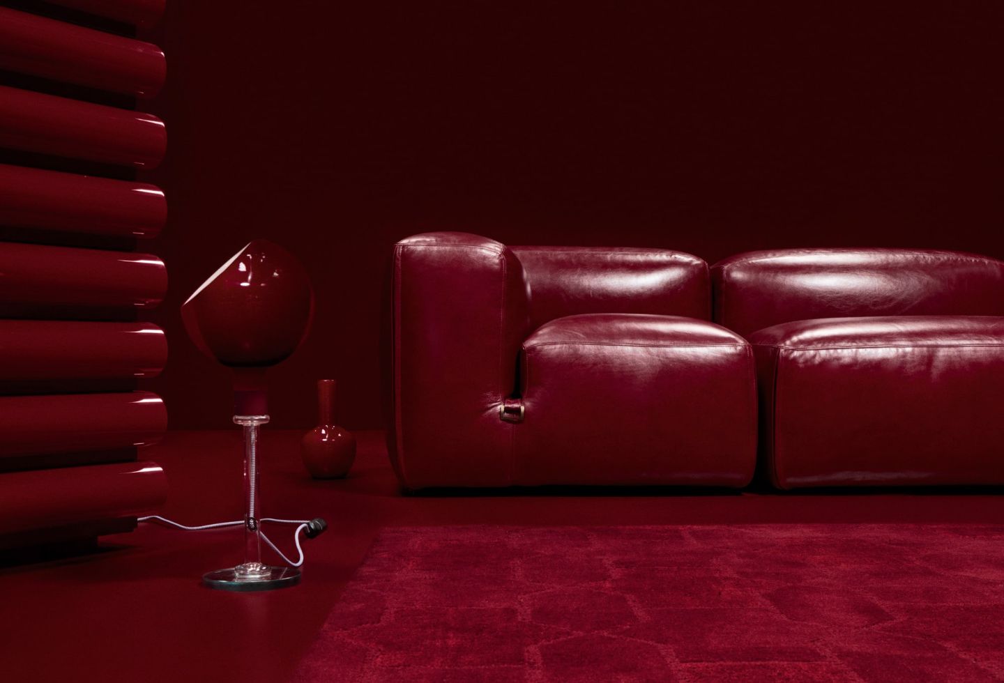
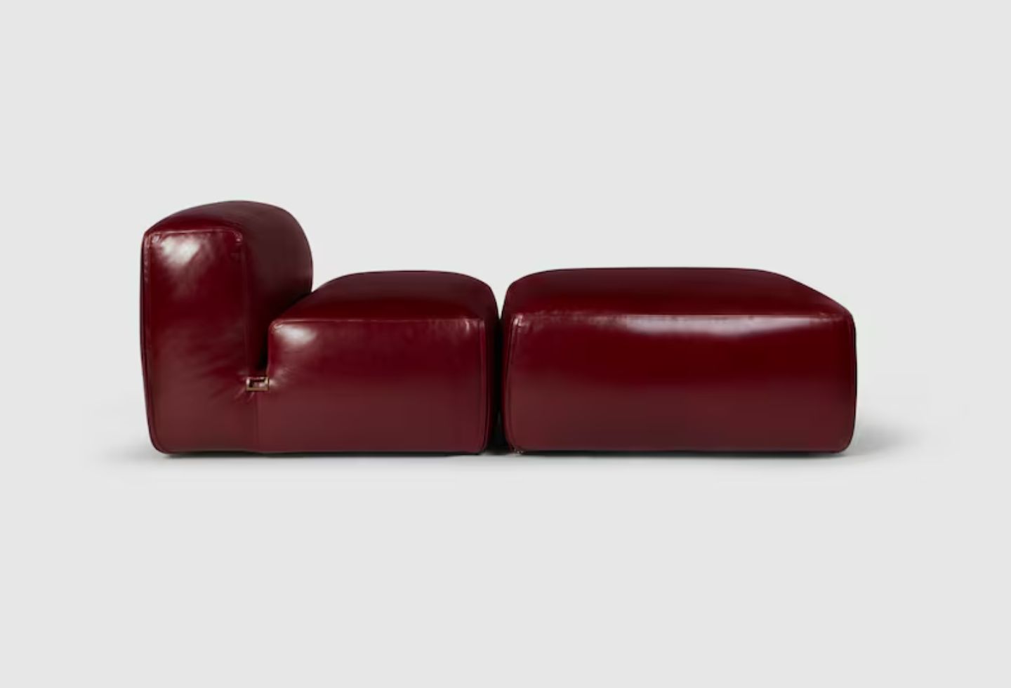
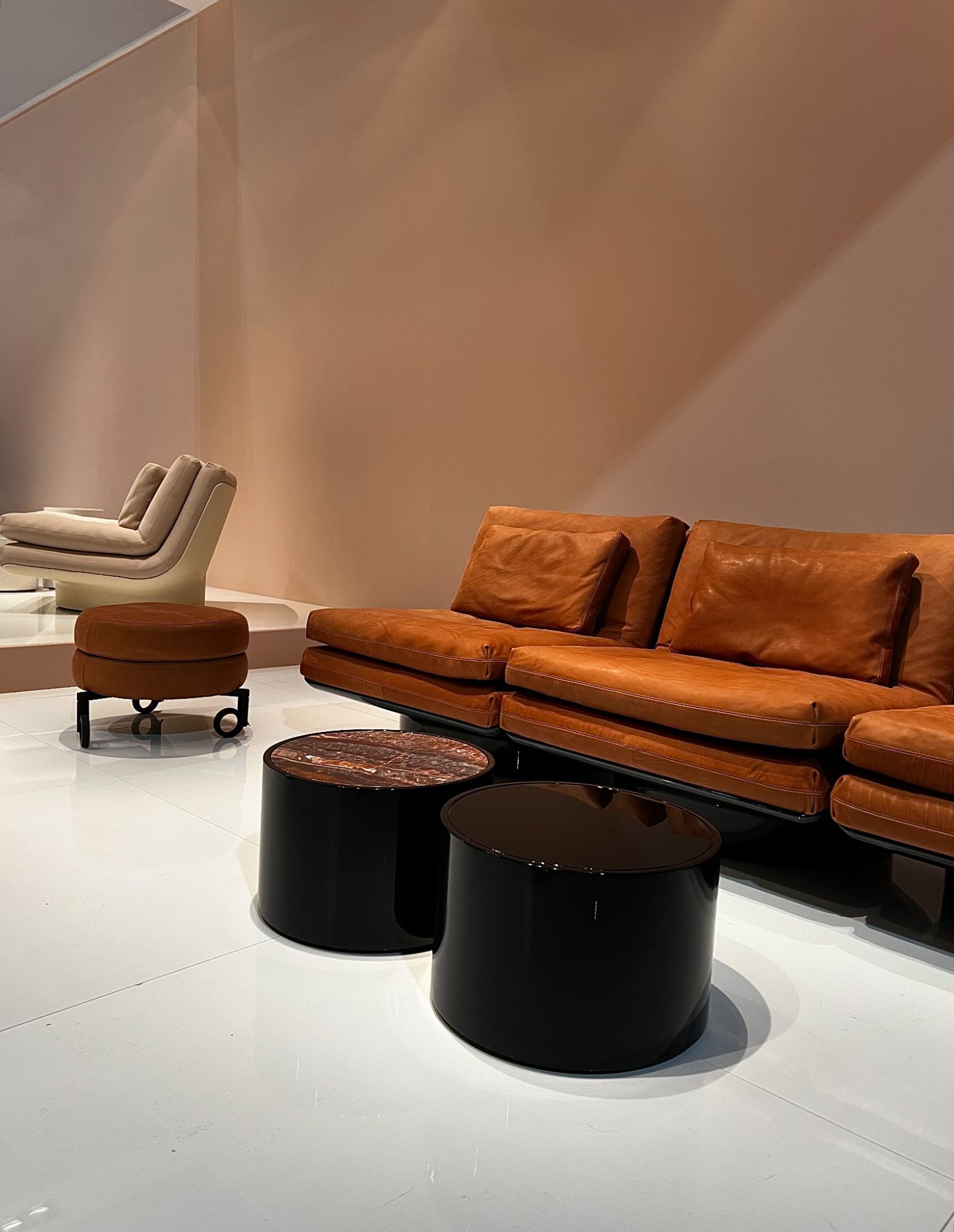
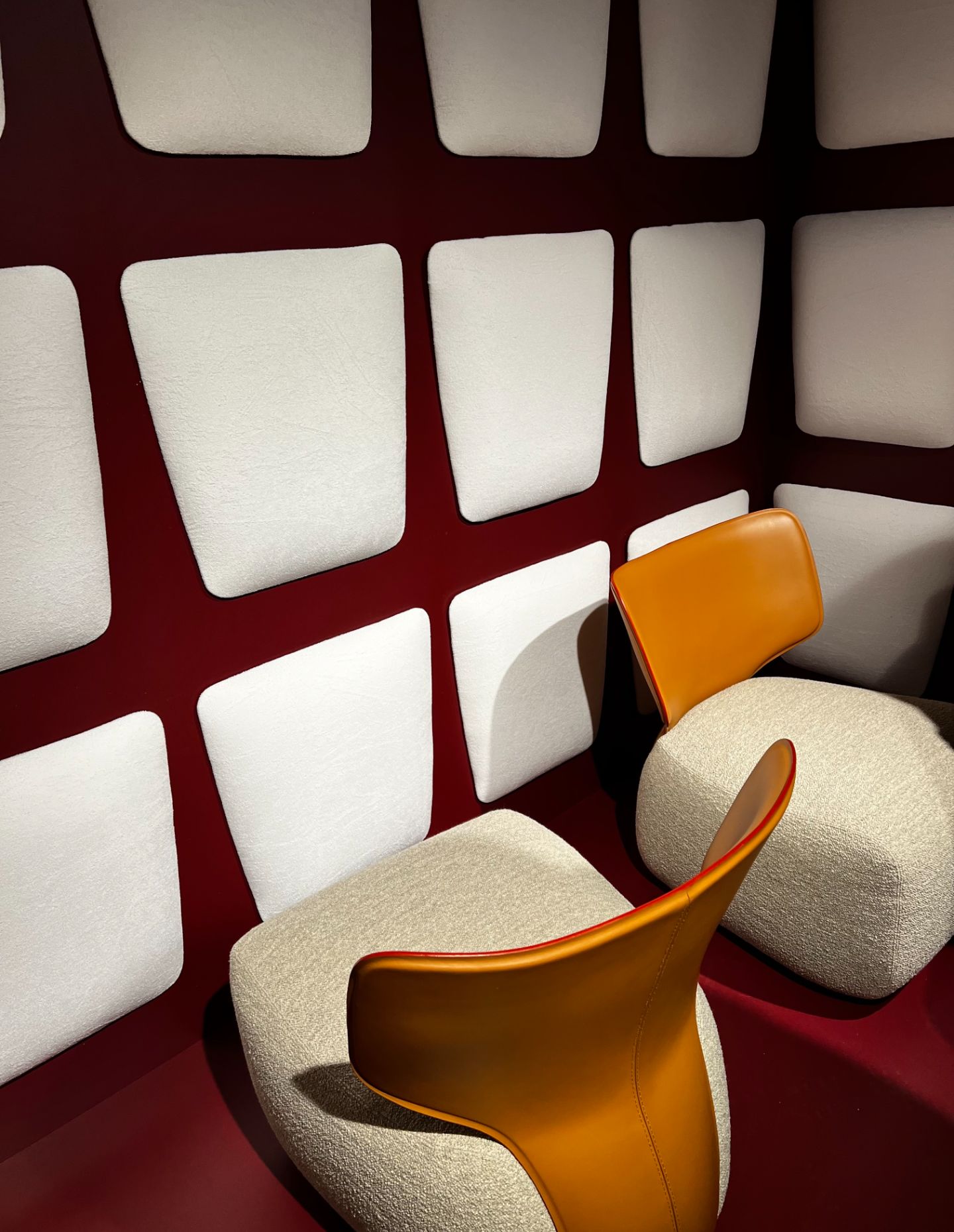
Burgundy emerged as a captivating muse at Milan Design Week 2024, whispering its allure through every corner. This deep, rich tone cast a provocative spell, effortlessly juxtaposed against the backdrop of seemingly natural and organic settings. From sculptural statements to fluid organic forms, burgundy’s presence was as seamless as it was tantalising. Its deep oxblood hue danced across surfaces, enhancing the bold materiality of resins and sleek upholstery, creating a symphony of elegance and daring creativity. Where else did this delicious colour reveal its magic? I stumbled upon its seductive embrace in myriad locations, each unveiling a new facet of its timeless charm.
Gucci presented a special project celebrating the golden age of Italian design, from an idea of Creative Director Sabato De Sarno and co-curated by Michela Pelizzari from P:S. The five icons from a bygone era are showcased in an exhibition conceived by architect Guillermo Santomà.
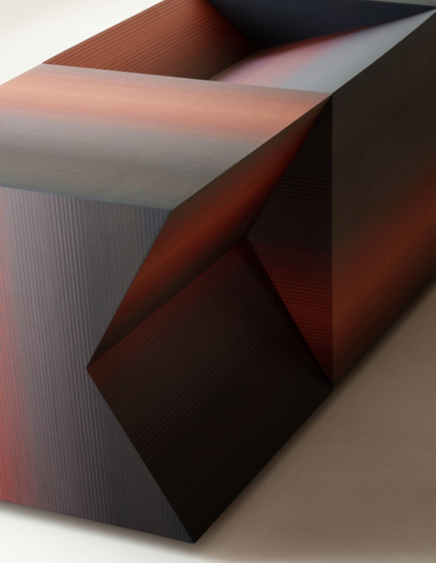
ALPI Tramonto, designed by Konstantin Grcic, extends the ALPI Arcobaleno and ALPI Raggiosole veneer collection. ALPI Tramonto is a new chromatic variant whose aesthetically pleasing blend of red, burgundy, brown and black is an ombré sequence formulated for its expressiveness. The new elements of the ALPIlignum Collection can be explored at the ALPI showroom on Via Solferino, and at the Salone del Mobile held at the fairground Fiera Milano Rho. Both exposition spaces were created by Piero Lissoni.
The Milan-based design firm Studioutte unveiled its second collection at Milan Design Week 2024 with a cinematic presentation at its Nolo-district headquarters. Titled ‘Sala D’Attesa’, the exhibition took the form of an imagined waiting room. Set on the ground floor of a conventional residential building, visitors crossed a courtyard filled with plants and bicycles, only to be ushered into a low-lit space that transported them into a captivating chamber where time stood still. Further north at the Rho Fiera, Studioutte presented its first collection with Vietnamese furniture brand Studio Eight.
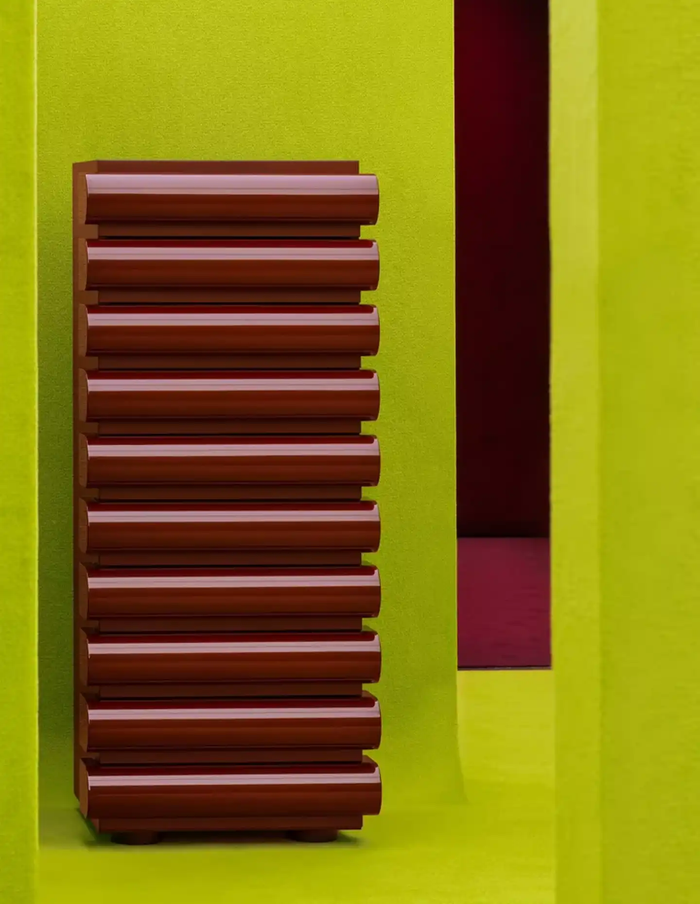
How recent is the burgundy trend in your opinion?
Burgundy has always had a place in design, its deep, rich hue evoking a sense of timeless elegance. However, its rise to popularity in recent years is synonymous with our evolving mood. As we emerged from the COVID-19 era, where the world sought the calm of spa-like environments – simplicity, harmony and a respite from chaos – we began to pair these neutral, earthy tones with the alluring and bold presence of burgundy.
At Milan Design Week 2024, this trend was amplified. The event highlighted how a space can balance aliveness, spontaneity and allure while still being a sanctuary from the busy world we find ourselves in. Burgundy, with its sunset-like richness, perfectly complements the natural tones that have long been a staple in design. Its presence, brought to life through upholstery, furniture pieces and statement joinery, mirrors our collective willingness to feel alive again, to interact, be daring, take risks and reap the rewards.
Although there have been subtle nods to burgundy in the past, its recent surge in popularity is a testament to its captivating charm. Thanks to the pioneers of design innovation in Milan, we now have the confidence to fully embrace this once-daring shade, appreciating its seamless blend of boldness and elegance.
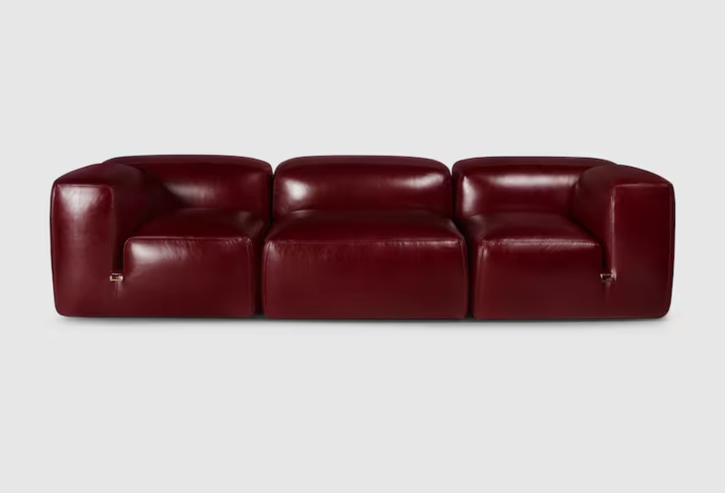
What does it mean for people thinking about their homes in Australia?
The exploration of burgundy, like any interior journey, should resonate with you on a deeply personal level – evoking a sense of excitement and ease. It is important to move beyond hesitation when considering the application of something bold in your space. For those who are non-committal, consider a statement furniture piece, object or feature appliance, carefully placed against a seamlessly neutral backdrop. For those who admire alluring, rich tones, I suggest highly reflective materials in feature joinery, further enhanced by considered lighting. A space you truly enjoy and that makes you feel a certain way is one worth committing to.
