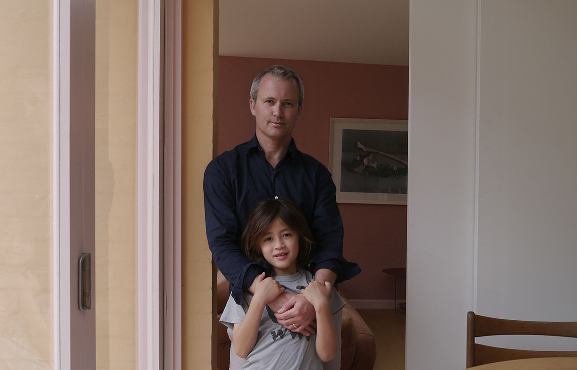
Skin and hair care that champions botanical extracts and essential oils native to the Australian outback, Leif Products has been an advocate for local design since day dot. The company originates – interestingly – from a design studio called Container Made. The two co-founders, Jonnie Vigar and Brenan Liston came from backgrounds in design and brand management respectively when they joined forces, along with designer Mark Evans, to form this design studio that worked largely in the space of beauty and skincare.
It wasn’t long ago when they decided to embark on this new challenge: to fill the containers themselves. Leif has since united a dedicated following of consumers who value design, gentle and natural ingredients, and cruelty free practises.
After working with the team at Leif on the recent Kitchen and Bathroom panel at Poliform, Sydney, Habitus caught up with Jonnie to get a deeper understanding of the company’s roots, and hear about its next exciting venture.
Can you tell me about the history of Leif; how did the company came into being?
Leif was born from our design studio Container Made, having created cosmetic packaging for other beauty brands Leif began as a form study without a client. A model of a narrow necked bottle sat in the studio for several years and visitors were so often drawn to it.
The process seems back to front but packaging is so important to how products, especially beauty products, are perceived it helped us think about what it could become. We feel there is a gap in the market for a modern product range that really hero’s Australian botanicals. It has been a steep learning curve but really rewarding to see how people engage with fully formed Leif.
What are your design roots as an individual and how do they serve Leif as a brand?
My background was in magazine design. Shortly after arriving from the UK I was asked to design a logo by hair stylist Kevin Murphy who was in the early stages of developing his own range of products. That same week I was introduced to Brenan Liston (my business partner) who’d just returned from NYC as a Design Director for Estée Lauder. It was a moment of synchronicity and we worked together to deliver not just the brand identity but also the unique package forms that have become well known.
We enjoyed the experience and opened our design studio with Mark Evans who joined as designer and quickly became the secret in our soup. Over the years we’ve worked across many projects and Leif benefits from this experience. Our desks sit together which means ideas can develop quickly; we all bring different skills but share the same thinking on design. After 18 years we still enjoy the process and friendship.
Tell us about the Leif x Heide Museum of Modern Art collaboration:
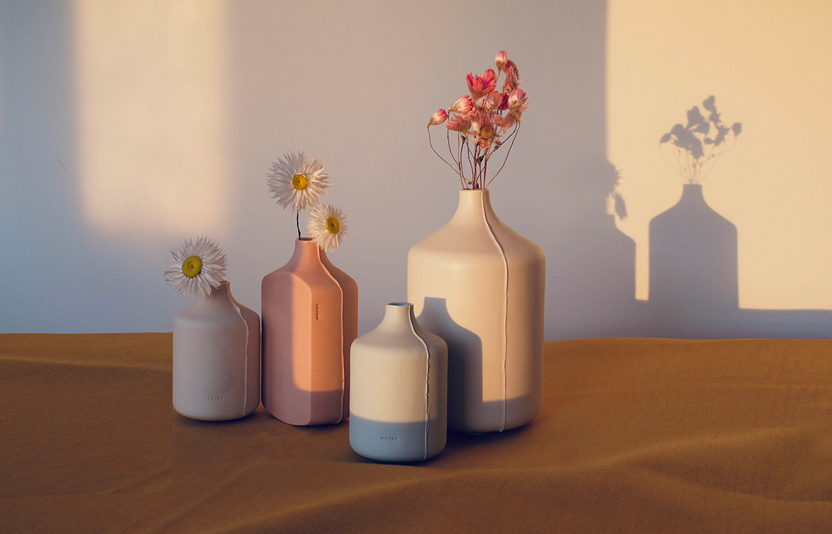
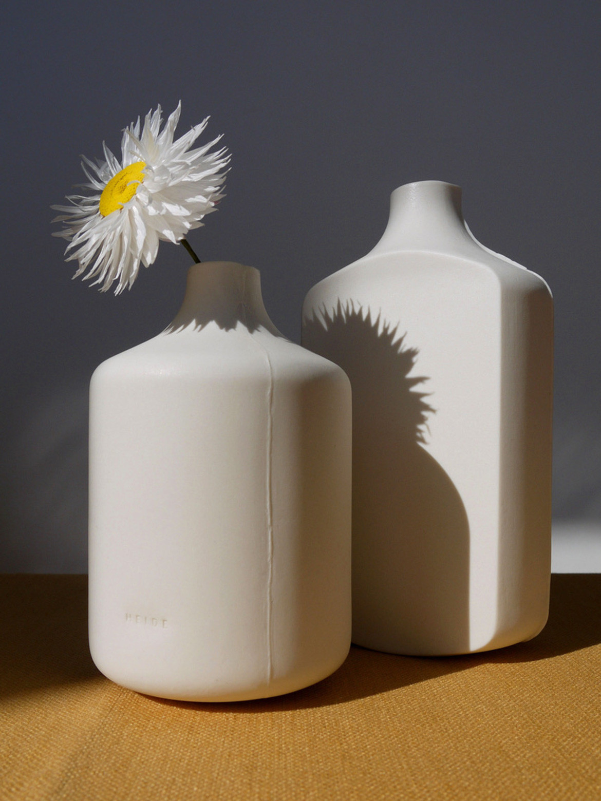
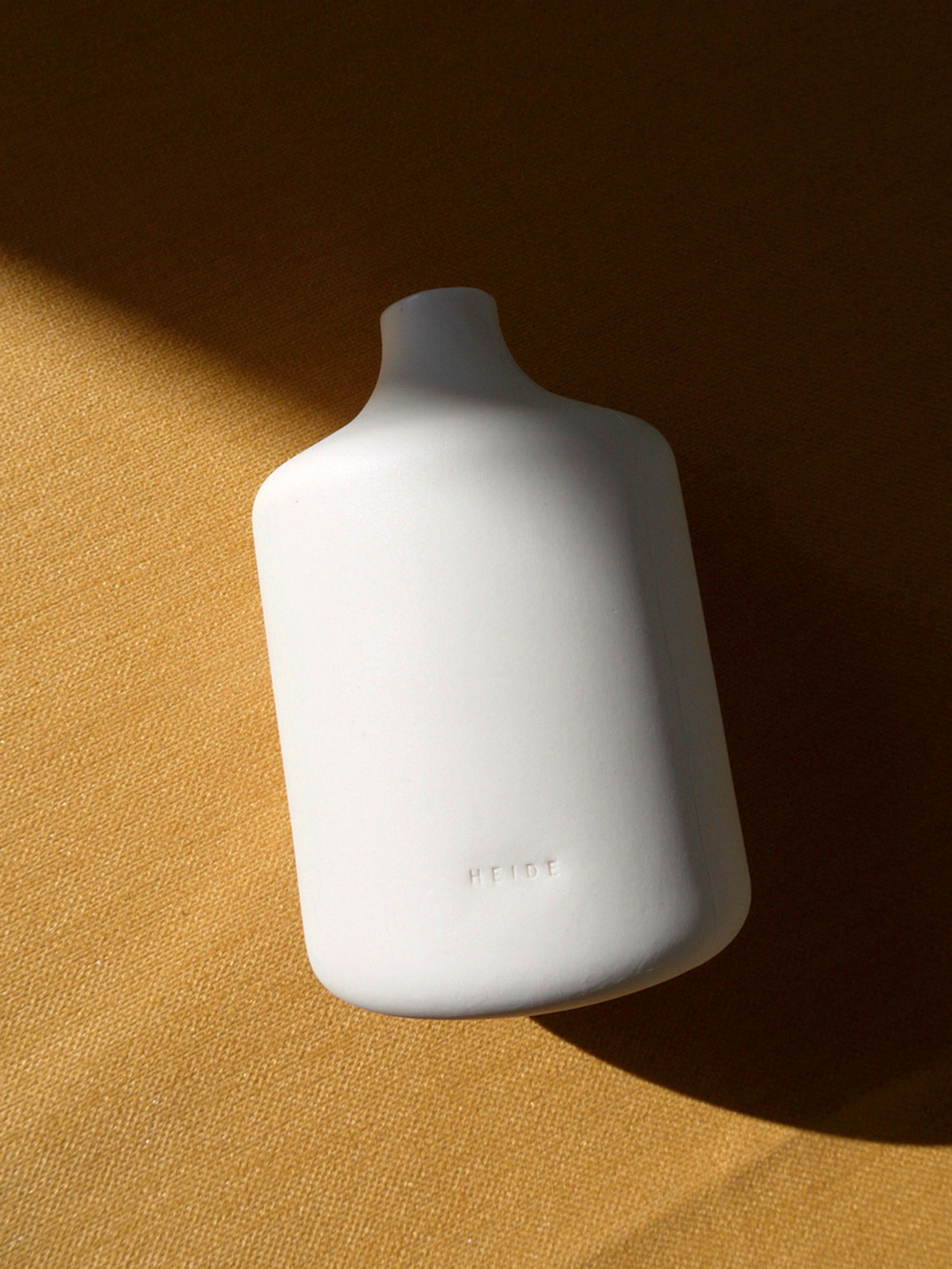
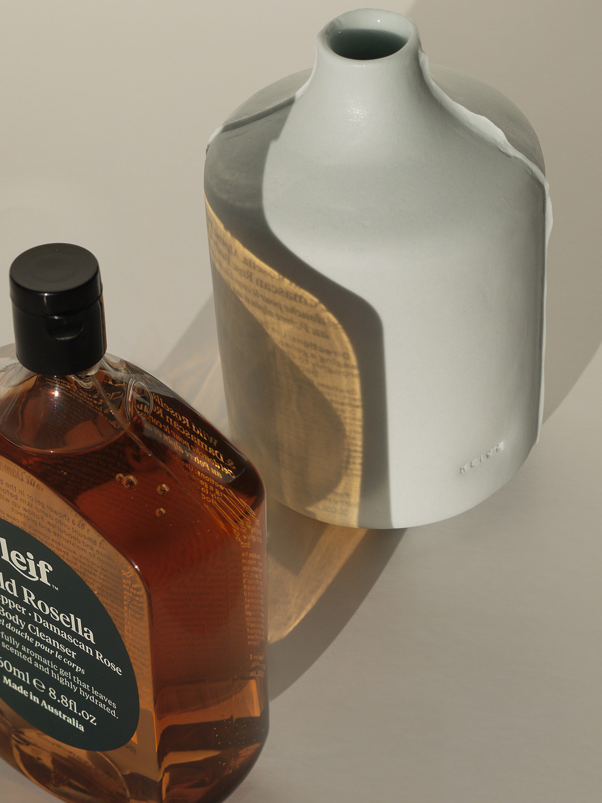
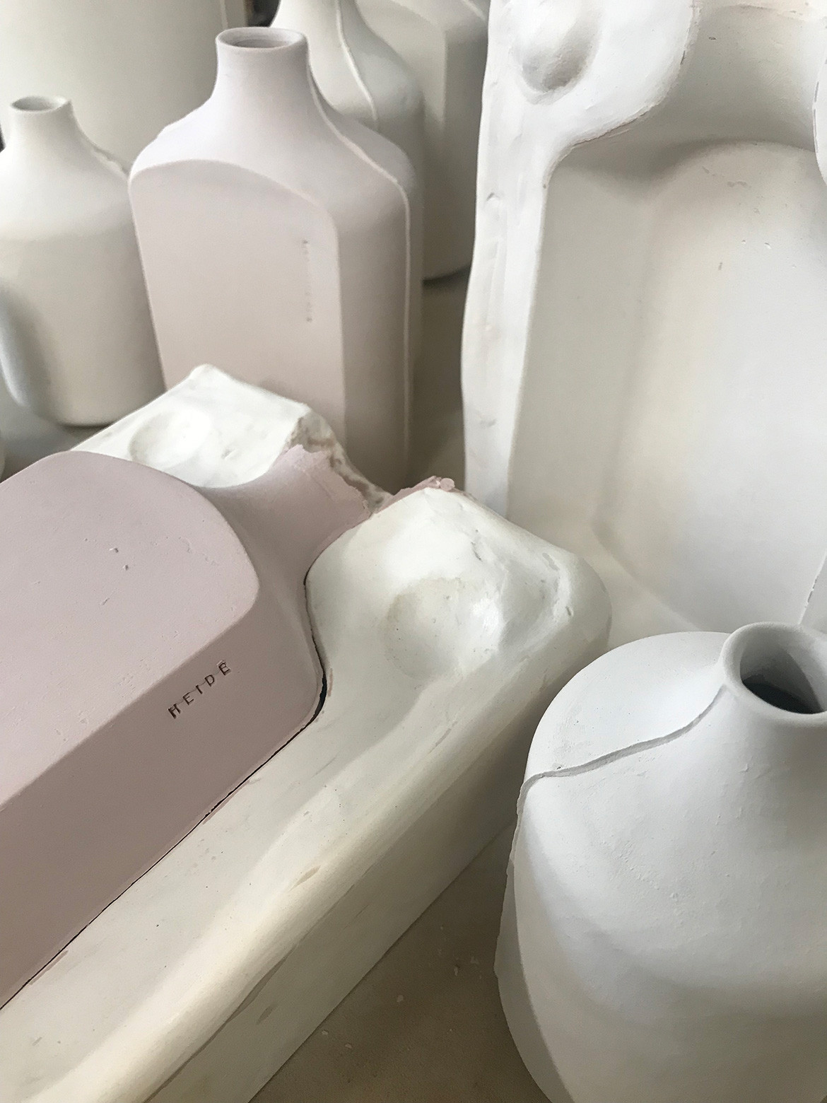
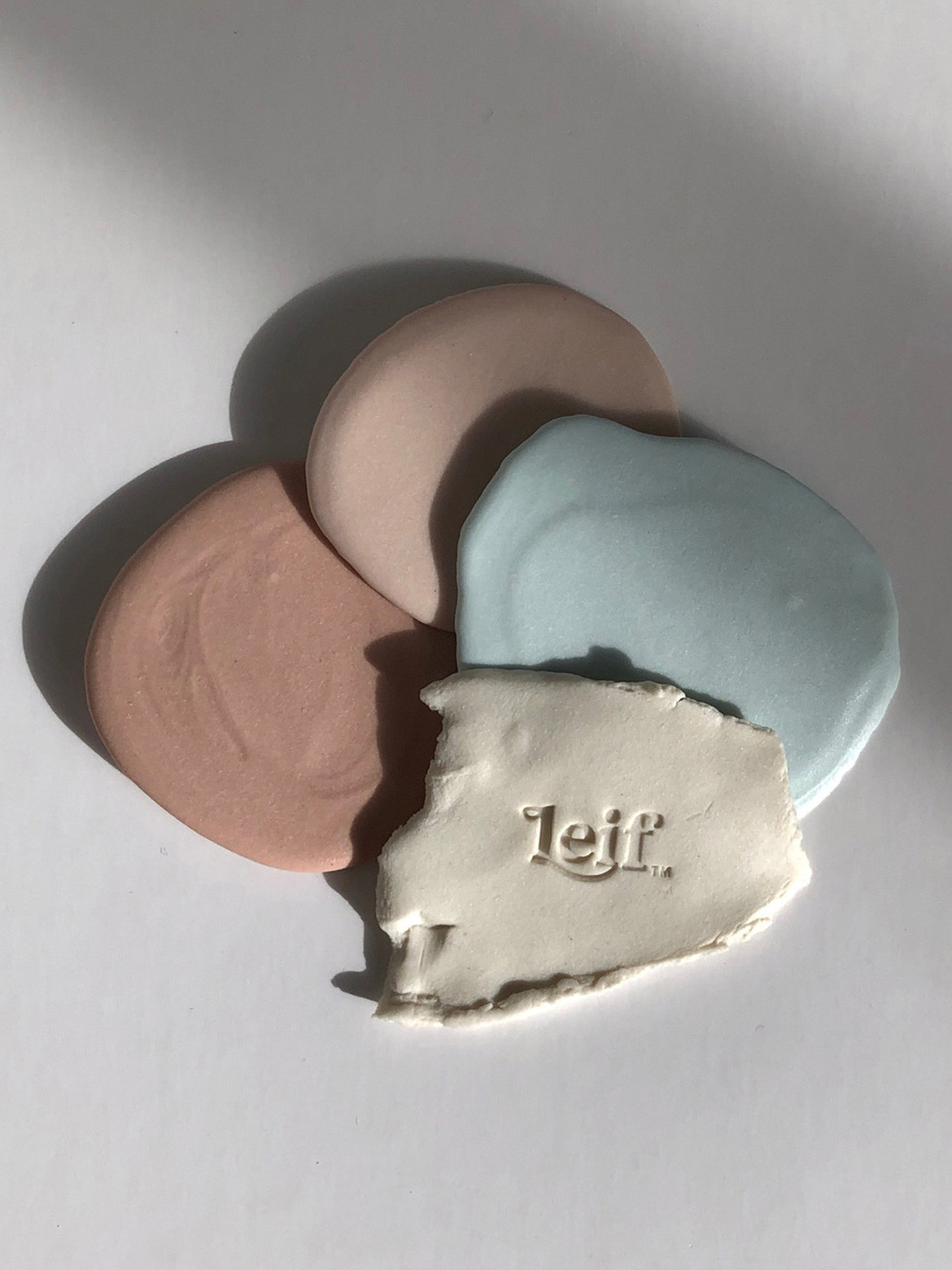
We’ve collaborated with the Heide Museum of Modern Art on creating a limited ceramic range inspired by the Leif bottle forms. The porcelain vessels have been crafted through the mix of modern and ancient techniques. The collection consists of three vases in four muted tones available exclusively through the Heide store. Each vessel was initially produced in PLA (a plant derived thermoplastic) using our studio’s 3D printer and brought to life in porcelain through slip-casting thanks to the hands of Sydney based ceramicist Deb Taylor.
How did the collaboration come about?
The connection initially came as a request from Heide asking if we’d contribute product for use in the bathrooms throughout the property, which we were very happy to do. We wanted to announce our amenities partnership with Heide with something meaningful that reflects Leif’s connection to design. Heide’s latest exhibit, An Idea Needing to Be Made, Contemporary Ceramics seemed perfect because the exhibit explores the idea of function, display and purpose of a vessel.
Tell us about this exhibition and what was so enticing
The exhibition is a focus on Australian contemporary ceramicist artists, with a foreground on Gwyn Hanssen Pigott and her reinterpretation of the vessel. There is a synergy between this exploration and Leif, as our bottle shape is one of our unique offerings. The exhibit is a shared appreciation for functional form and good design, and explores the concept of an everyday vessel being no less beautiful than an abstract object – just like the Leif bottle.
How does it align to the Leif mission?
We recently visited the museum and learnt how key Heide was in nurturing and promoting the modern art movement within Australia. The story of John & Sunday Reed and the artists that they, quite literally, took to heart is equal parts romance and tragedy. As we embark on our partnership with Heide, we hope to come up with unusual and creative ways to work together.
This capsule collection represents our shared passion for beauty in functionality, and making good design accessible and tangible in daily lives. It’s also an all-Australian line-up and supports small and local makers – qualities that definitely represent the Leif brand.
Tell us about the connection to ceramics?
Containers have been with us since the birth of civilisation and ceramics have played an important role throughout history. Anyone that has dabbled in a pottery class knows it is a therapeutic ‘slow’ craft, one that brings a sense of calm. This is how we hope people use our products, and that the aromatherapeutic properties of our formulas bring a peaceful moment to people’s busy lives.
I’m currently surrounded by ceramics at work and home. My wife recently took to hand building and the wheel so our house has an ever growing collection… the shed has been taken over and its been great seeing Val’s creativity extend beyond fashion!
What do you hope Leif can offer to the design community?
We hope to continue to partner with organisations and people in the Australian design field in unexpected ways. Australia has ancient and modern beauty, and we want to communicate this.
Are there any sustainability elements to your brand?
All our products are plant-based – we are 100 per cent vegan and cruelty free. Our formulas are biodegradable and made in Australia. We aim to use minimal packaging and our bottles are recyclable. We’re currently exploring ways to incorporate recycled materials into our packaging.
Leif Products
leifproducts.com
We think you might also like ceramic basins by Archier and Tasmanian ceramicist Lindsey Wherrett
