Timothy Alouani-Roby: Please tell us about the work you do and how it intersects with design.
Maxine Wylde: I am a content creator, and I am most known for using colour theory and colour palettes to assemble bright and vibrant outfits. Before this, I studied interior design so have always had a deep love for art, textures and colour, and often draw upon this as inspiration within my own styling choices and content.
What’s the latest design challenge you’ve taken on?
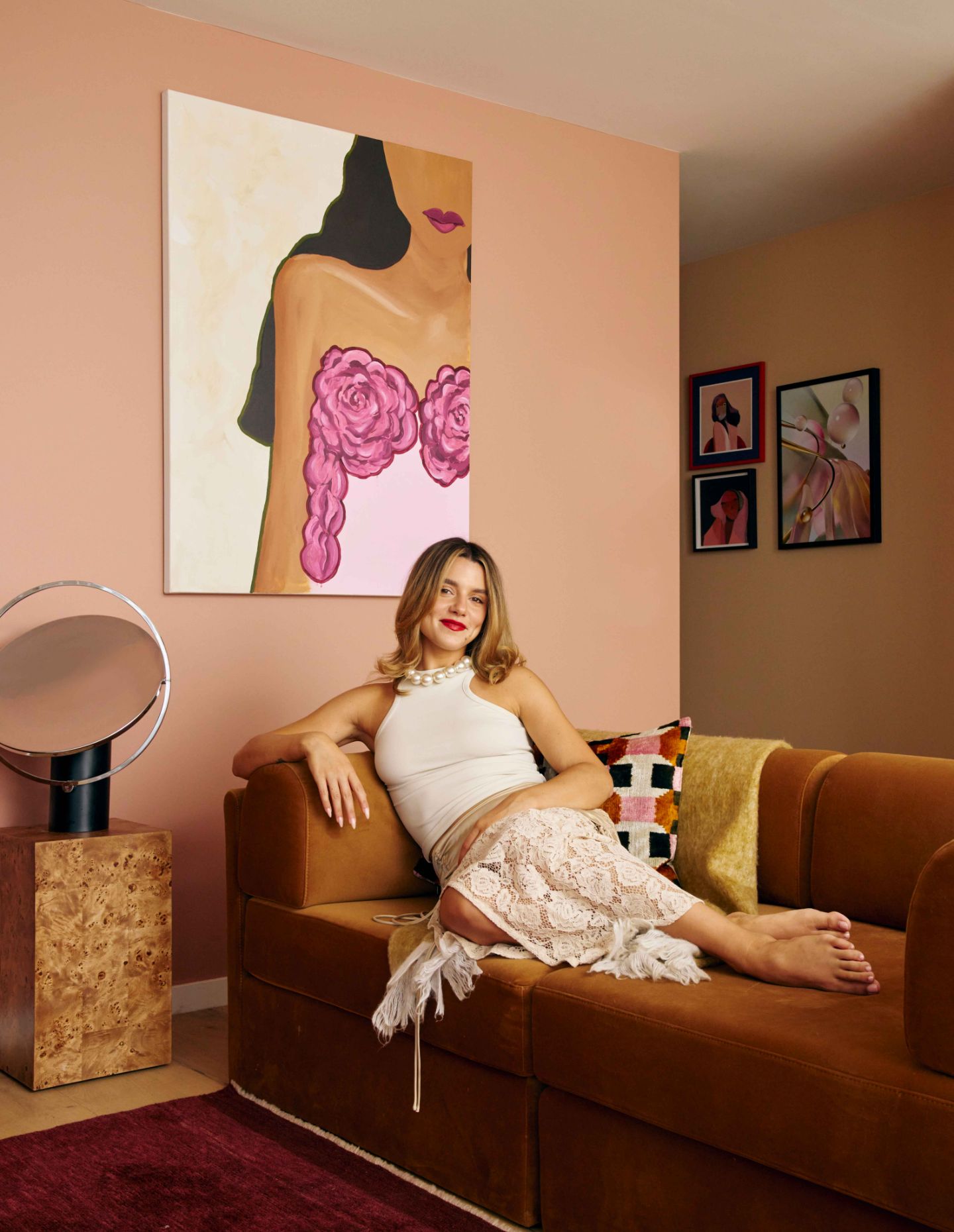
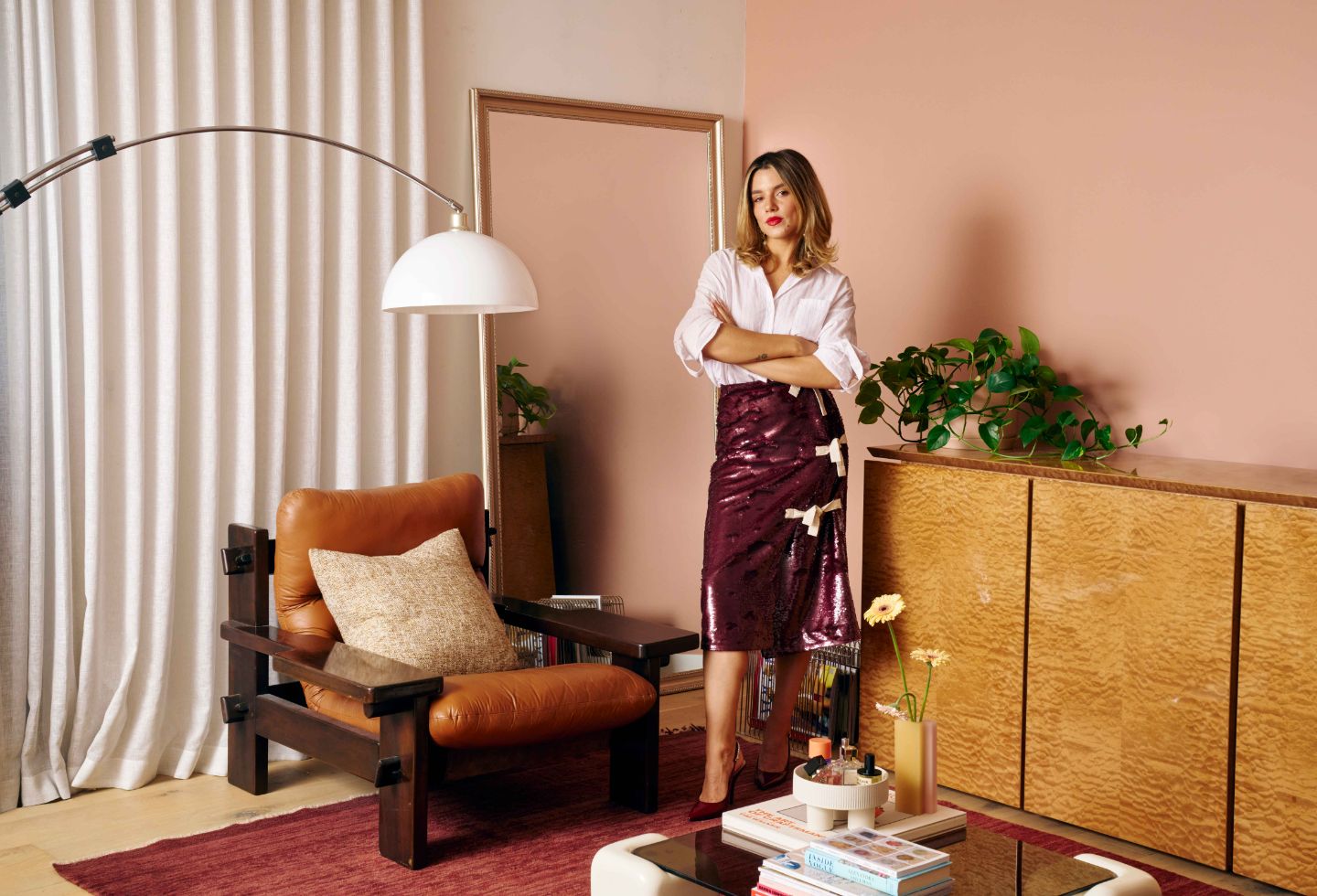
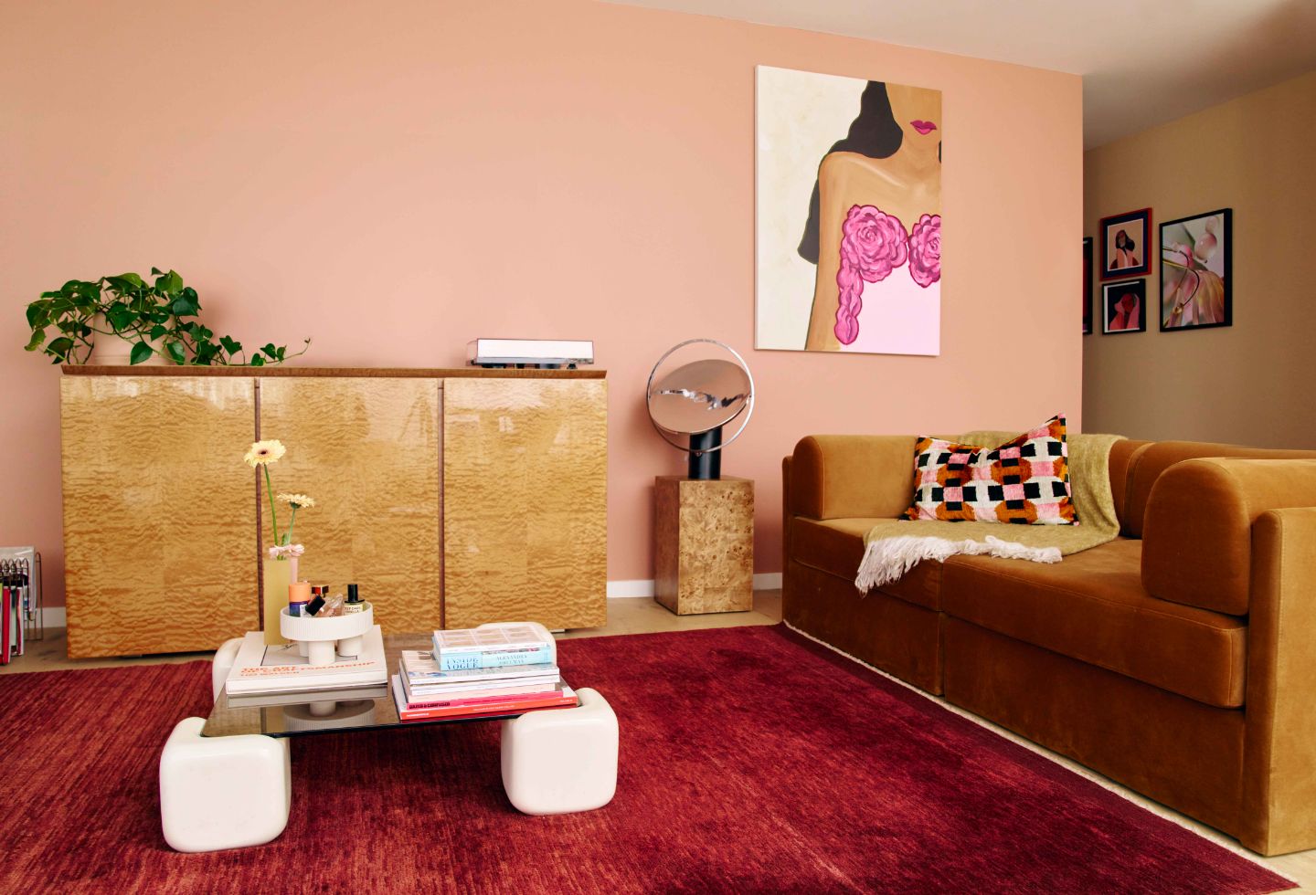
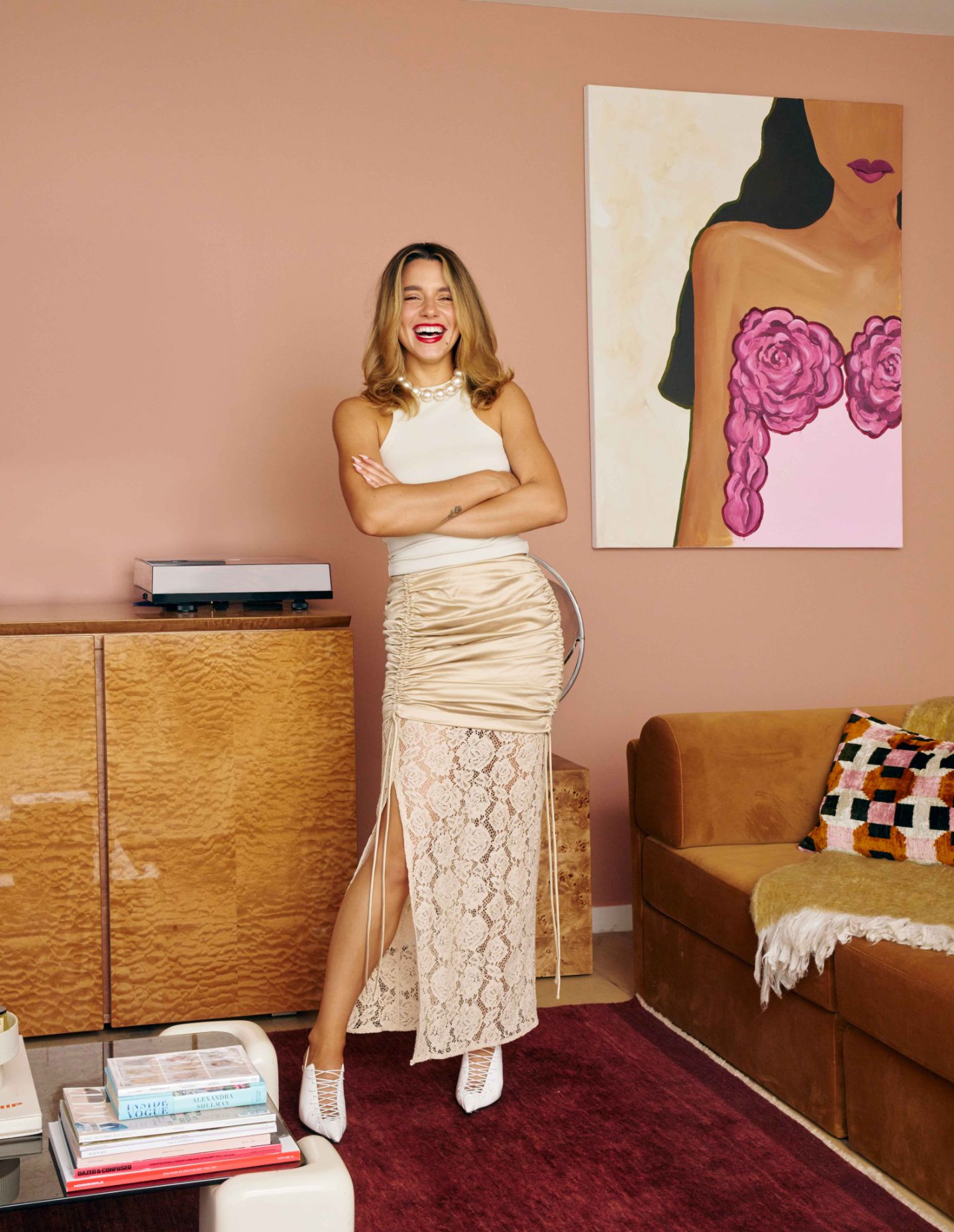
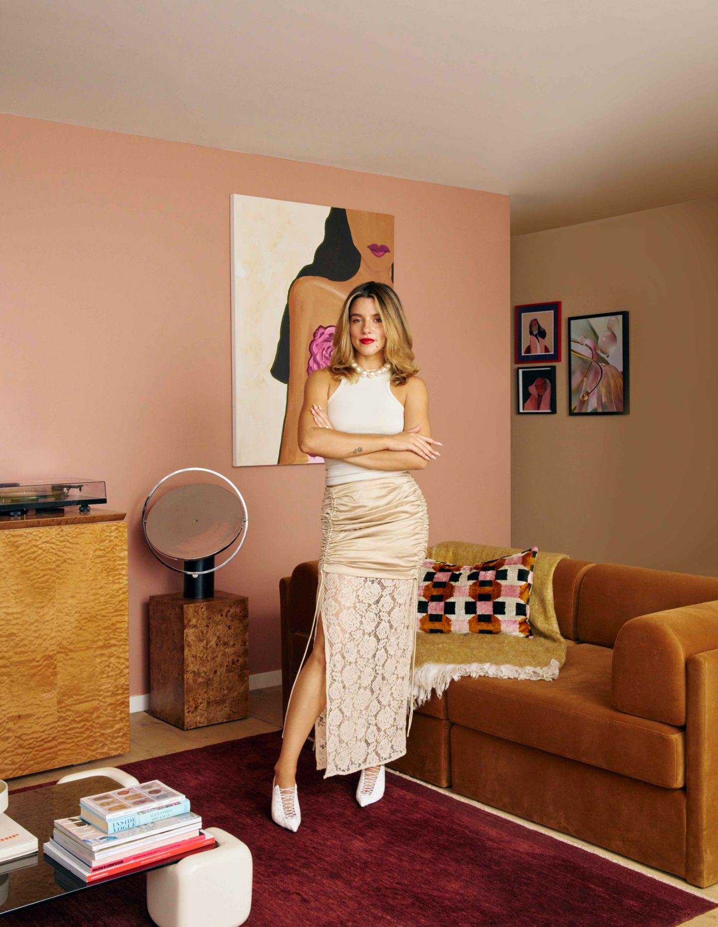
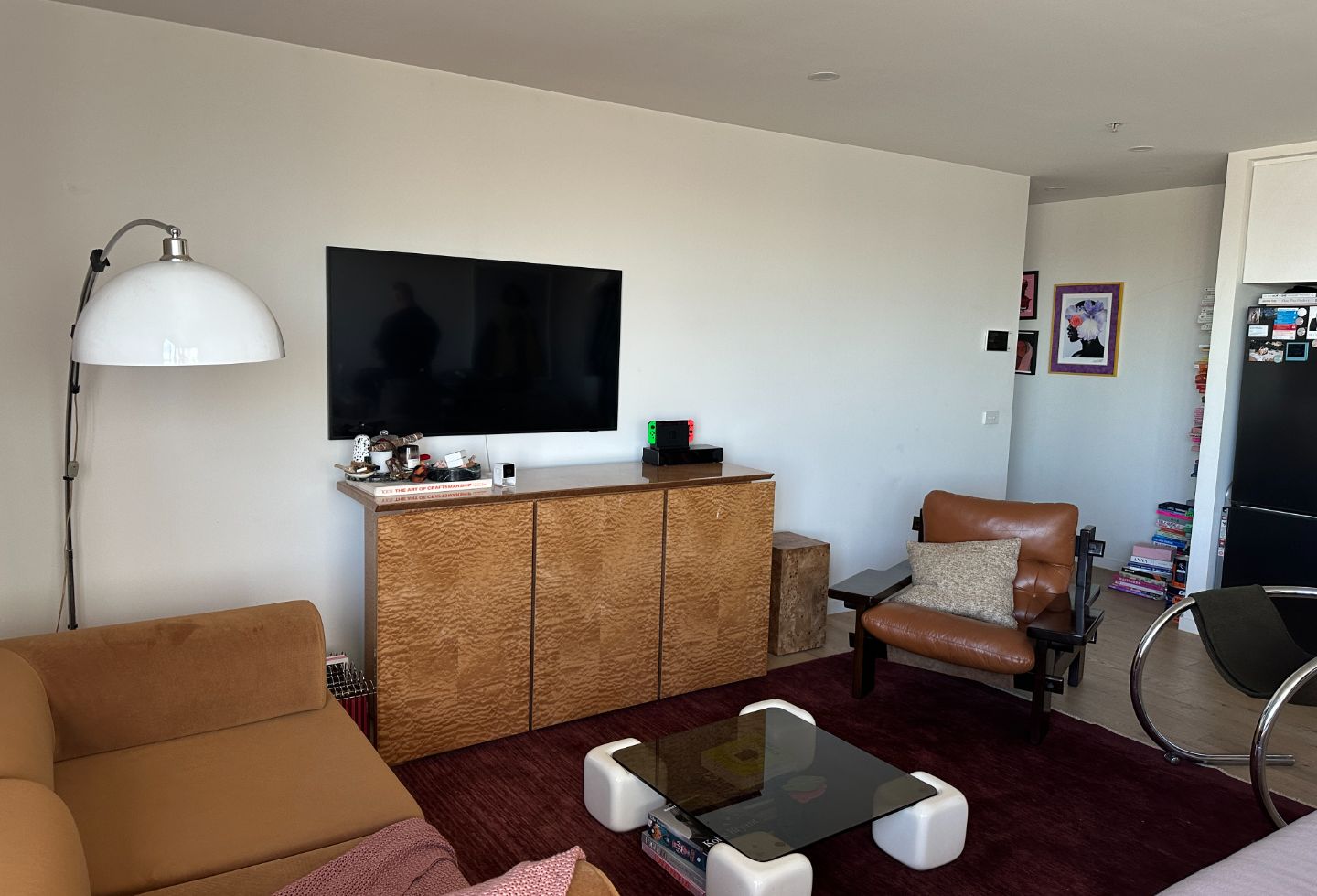
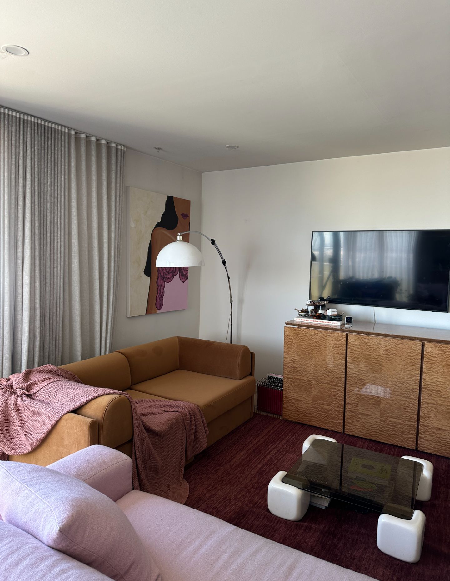
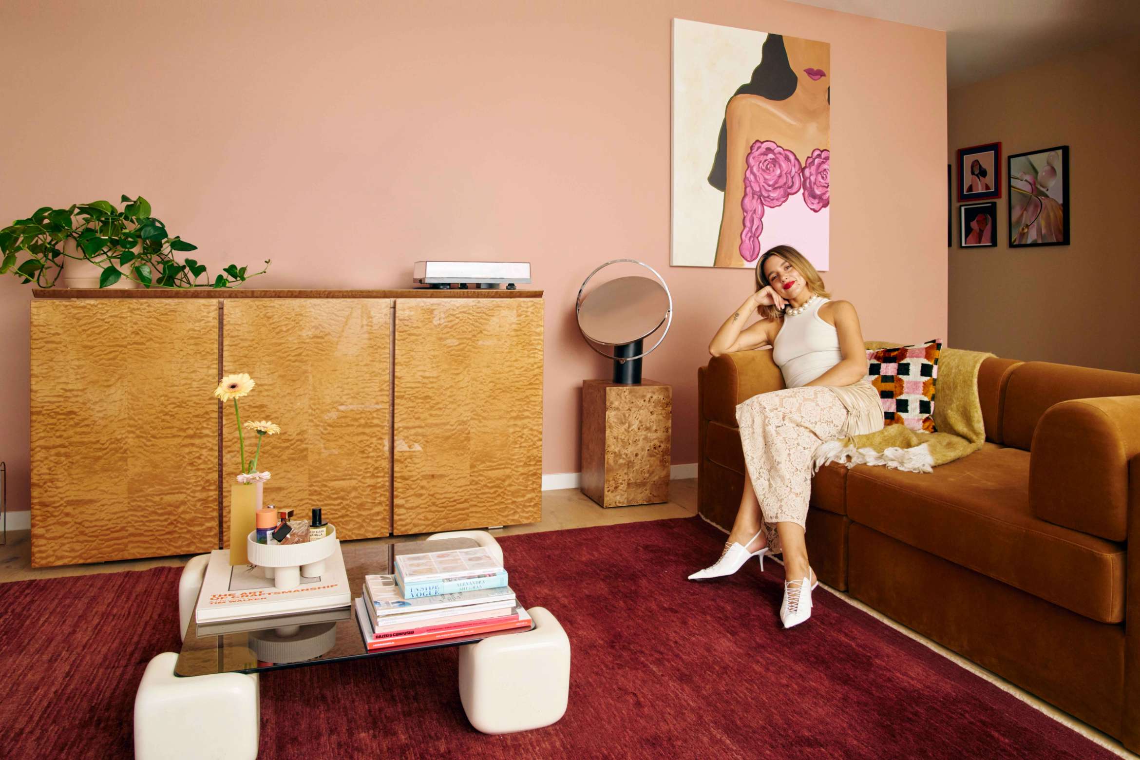
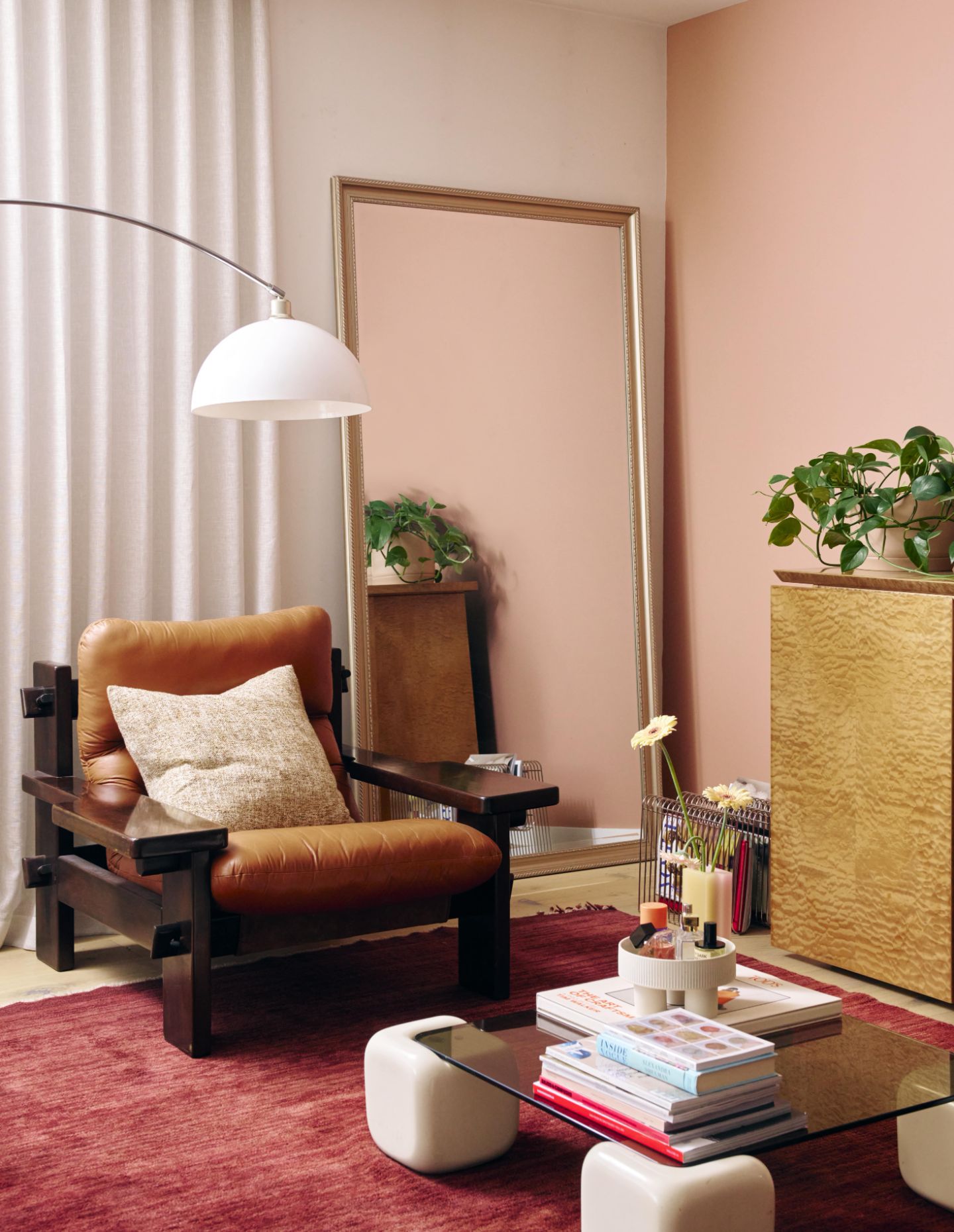
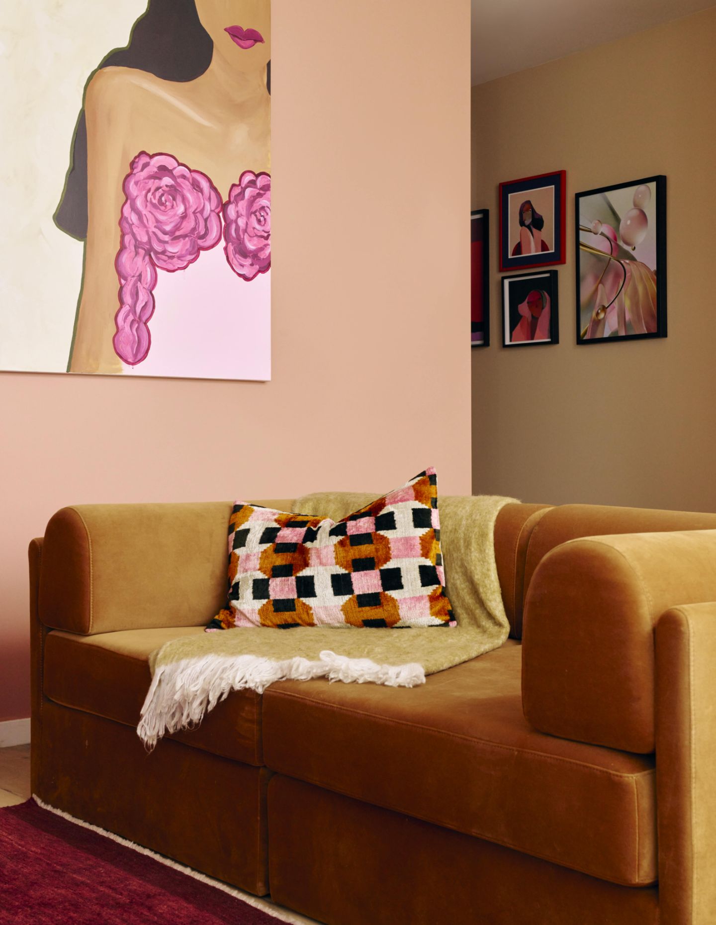
I recently restyled my living room and hallway. An incredible part of this design challenge was how I used paint and colour to completely transform the space and connect my existing furniture pieces together. To guide the colour choices I made and ensure the overall look felt cohesive, I worked within the confines of the Solstice palette from the 2024 Dulux Colour Forecast to guide the colour choices I made.
How do you see fashion and design as overlapping?
For me, fashion and design has always been a way of self-expression. Just like interior design, your fashion choices act as an extension of yourself (or your client) in pure physical form and you can be as restrained or bold as you want.
How important is colour for you?
Colour is obviously incredibly important for me, as colour and colour theory specifically have helped develop my style into what it is today. Styling, layering and creating an outfit is almost like painting. It’s my form of expression and I find it incredibly cathartic.
What choices have you made around colour for this project?
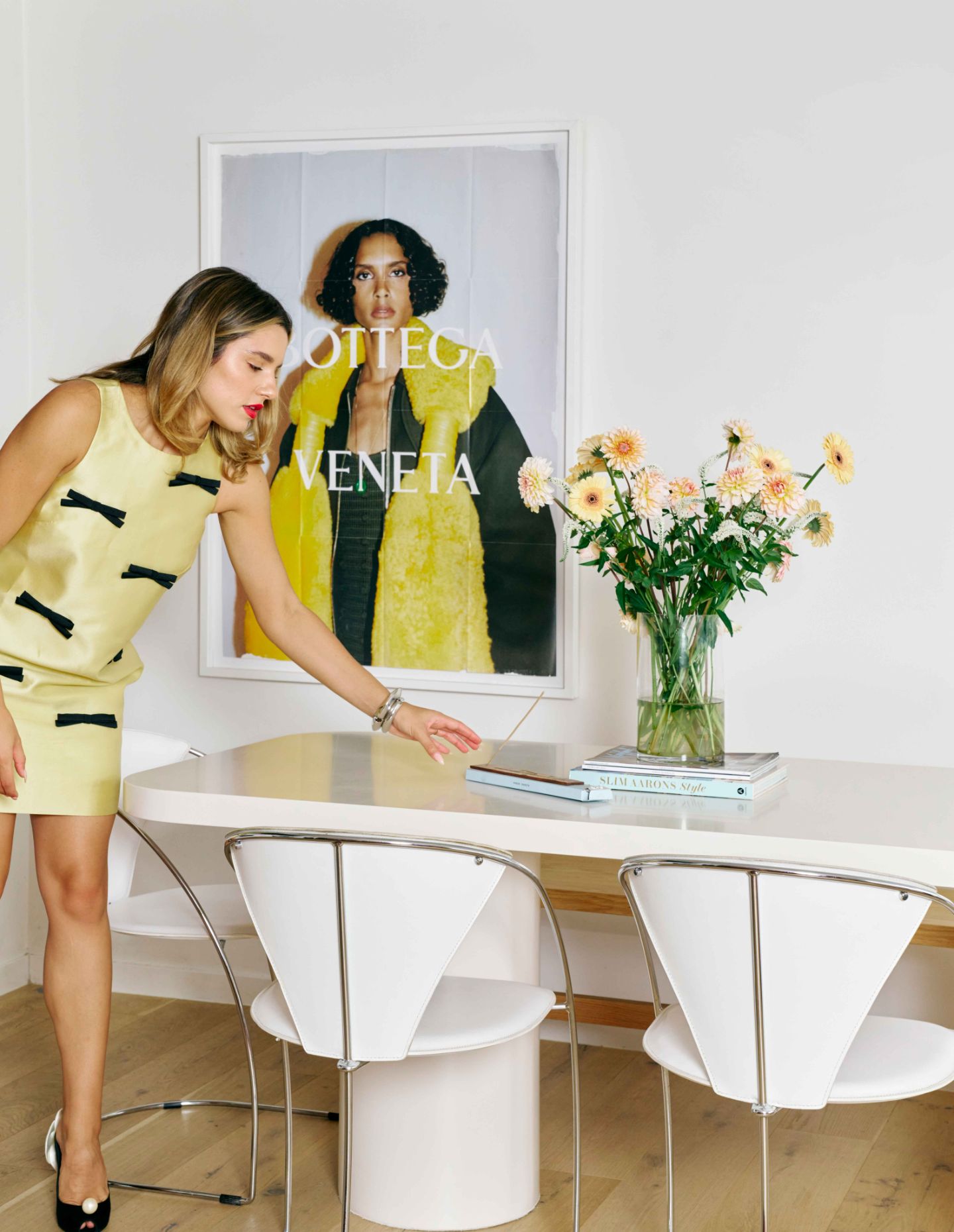
I wanted my colour makeover to connect my existing furniture pieces and found the Dulux Solstice palette married and complemented the space together best. Understanding how significantly colour can impact mood, I was conscious to bring in warm, affectionate and inviting shades. I chose Dulux Lama, a sandy neutral with orange undertones for my hallway, to work alongside Dulux Potters Pink, a soft and welcoming terracotta shade for my living room feature wall.
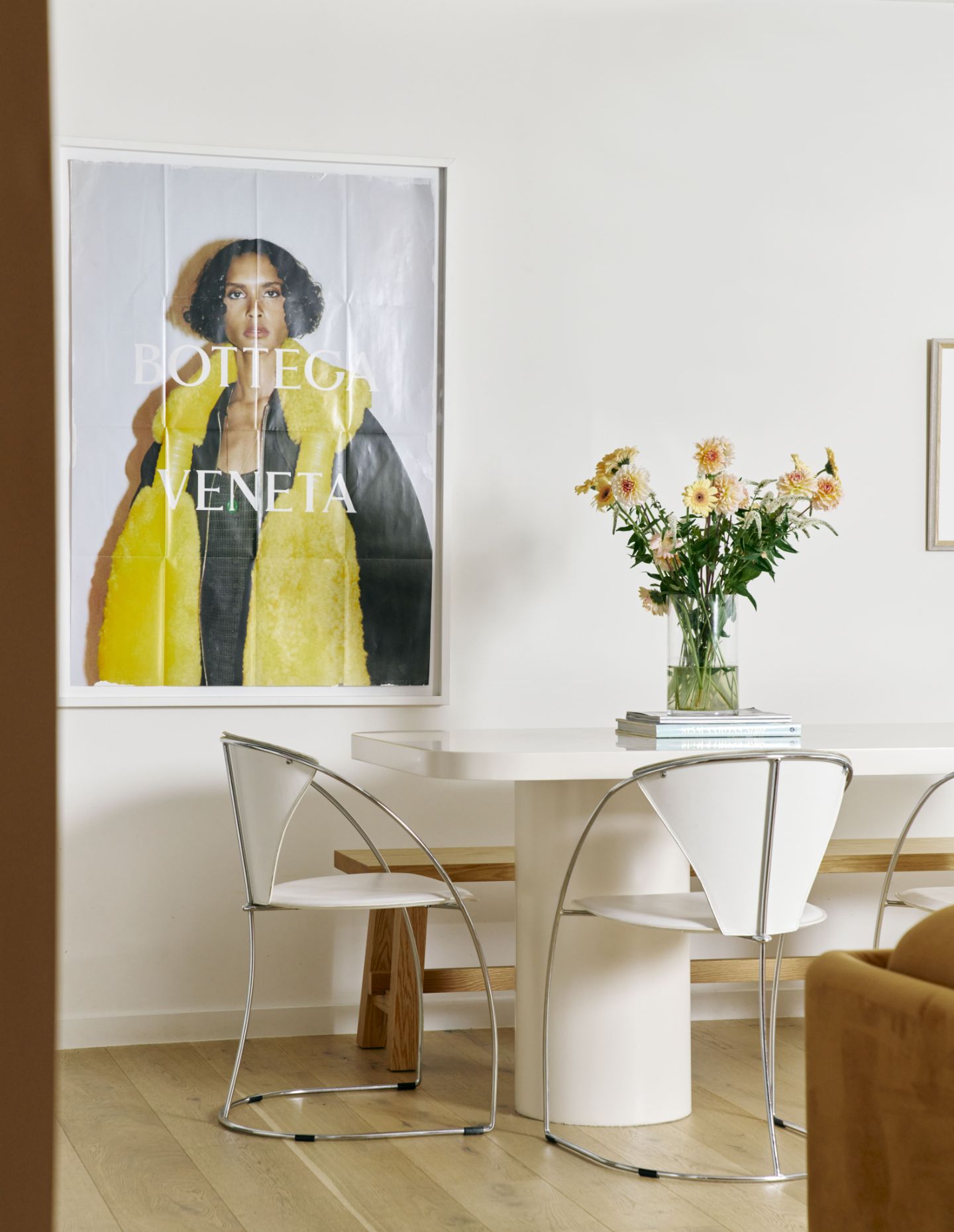
The contrast between these two shades adds visual depth and excitement to the space, while also amplifying the calming and cohesive feeling. Adding to the peaceful and cosy atmosphere, I chose Dulux Light Rice Half, a soft neutral with red undertones, on my previously dark blue dining table. I also have a table lamp that references Dulux Pure Blue – a soft baby blue – that adds tranquillity and freshness to the room to complete the look. I am so happy with the result as it really married the space together!
