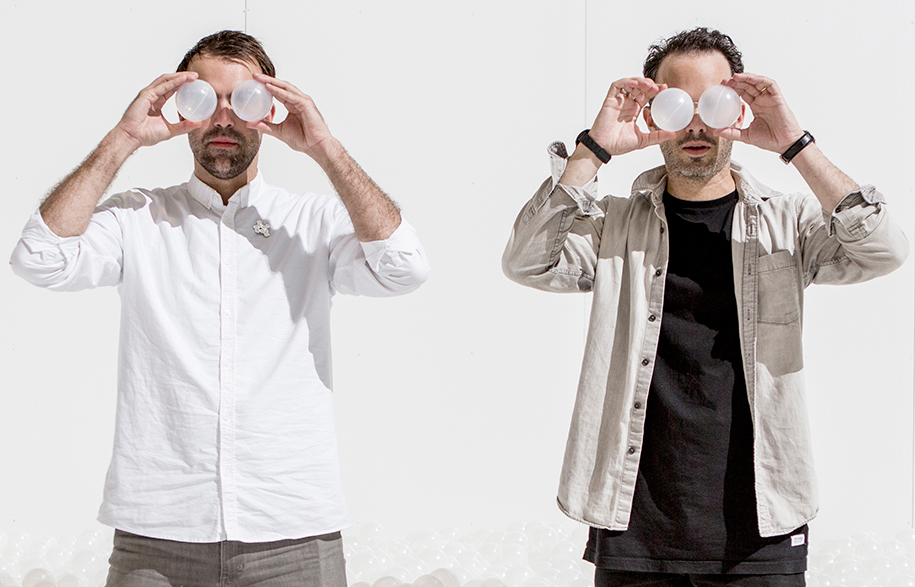
The Brooklyn based architect and artist duo describe their work as an ‘impossible voyage of an improbable crew to find an inconceivable creature’ – a reference to Lewis Carroll’s The Hunting of the Snark. In 2015, the pair partnered with COS at Solone to create a wild warren of white textile ribbons. Snarkitecture has reappeared in Milan this year in an intriguing collaboration and mentorship for a finalist prototype in the Lexus Design Award. The fully developed concept, TRACE, is a clock that uses liquid with UV rays and discolouration properties to visualise passing time, and was developed alongside London’s Studio Ayaskan.
Here Snarkitecture’s Daniel Arsham and Alex Mustonen discuss the boundaries of art and architecture, and the result of combining and crossing over two distinct disciplines.
MELBOURNE EDITOR, ALICE BLACKWOOD: Tell me a little bit about your background, and how you came to be in partnership together?
DANIEL ARSHAM: We met at school, I was in the art school, and Alex was in architecture school at The Cooper Union, a small college in New York. After school I continued on with my art practice, and there was a project that I was working on that involved a little more architecture than I was capable of handling, so I brought Alex in. And after that we started to see an area that was sort of in art and architecture – and that’s really where Snarkitecture derives from.
BLACKWOOD: Tell me about what that space means to you – I’ve seen examples of how architects in Australia try to play in that space, a lot of it comes down to public art, and graffiti art, and bringing that indoors. I think that you guys see it in a much more fluid fashion.
ALEX MUSTONEN: Sure – they don’t have to be separate. I think when we started we were interested in exploring the space between those two disciplines and making work that didn’t really have to be defined as either art or architecture. Previously we’d been working in the architectural space, but one of the questions in practice is that we can make these spaces in a way that there doesn’t have to be such a sharp distinction. That could be work that we’re making as a whole project, or work that we’re working in consultation or collaboration with.
BLACKWOOD: So where do you see the intersection between the two? Is it where you let the artist intercept space or structure, or is it really open to whatever the project calls for?
ARSHAM: It’s this idea about something that’s quite rigid and something that’s quite loose. Architecture being a discipline that often relies on quite a lot of rules and there is a lot of tradition, so we try to break that down a little. We tend to pay attention to a lot of materials, and to have a kind of reduction of materials that allows for a more simplified design aesthetic, so we’re focusing on just the one thing.
BLACKWOOD: Let’s put it in to real world context perhaps. What is the hook for your clients, what do they come to you for?
ARSHAM: We’re quite lucky, most people that come to us know what we do. They’re looking for something that already exists in our world, so briefs that we’re given are often quite open.
MUSTONEN: Which isn’t to say that they’re looking for us to replicate previous work, but to replicate an experience, or the success of that work. It is project specific, sometimes with some kind of brief, or sometimes completely carte blanche. We are approaching each project anew. In a very general sense, it is this idea of the unexpected, and memorable – they’re two words that we often consider when thinking about our work. At the end of the day both of those are about experience – being visually, physically, emotionally engaged with a space or an object, what ever the project might be.
BLACKWOOD: What is your idea of engagement, is it something that transports, something that makes us forget? What do you lean towards? Or is it very client specific?
ARSHAM: It does depend who we’re working with. To use COS as an example, they invited us to look at the collection they were working on, but they weren’t very specific beyond that. There were a lot of things about translucency, about a lightness of material, and the project that we created was very much based around those ideas.
Blackwood: You’re a studio that trades in the unexplored, and at the moment there is a lot of discussion around the future of retail. What is your feeling on the point?
ARSHAM: Most of the people that we work with understand that people are not buying their brands simply because they look good in them, or they’re interested in them – they’re buying in to an idea that’s larger than the clothing or what ever it is. They’re coming to us to create an experience that people want to go to be part of that world, they think of the brand more as a collection of ideas that you can be part of. We designed a store in New York where only one person could be in the store at a time – this is a secret project, we actually can’t talk about it! But it’s about a really heightened experience.
MUSTONEN: We are interested in really pushing the experience of what, say in this case, specifically retail can be, to the point where they are sort of unexplored, unexpected territories. But I don’t think that this should have to sacrifice the functionality of the space, and that goes back to this idea of a balance between precision and usefulness, and abstraction and reality. I think this is an area that we are continuing to explore – places that are unexpected, but that can also sell product for people, and that those two things don’t need to be mutually exclusive.
The design hunt continues in Milan here.
Header photo by Noah Kalina.
Snarkitecture
snarkitecture.com

