Timothy Alouani-Roby: You mention “the interaction between light, form and material,” and “the poetry of light.” Can you tell us more about how you understand the work you do?
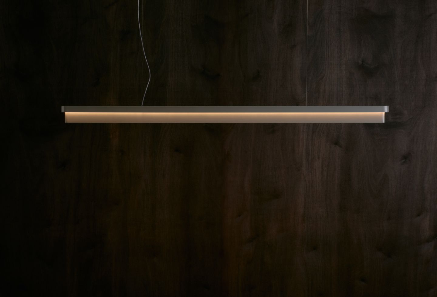
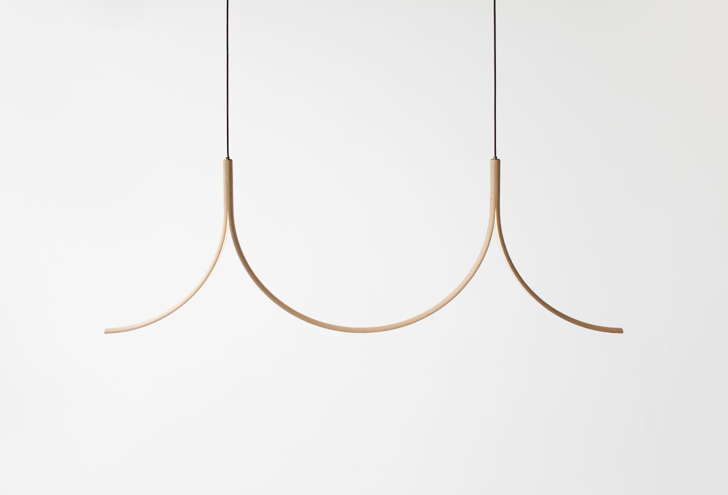
Samuel Burns: The integration of curved and sweeping forms has always revealed itself in the majority of my designs over the years. It’s not necessarily a conscious decision, but I try to draw inspiration from the natural environment in a lot of my work. I am drawn to the idea of introducing a sense of the natural world into interior spaces. I am inspired by both Scandinavian and Japanese design aesthetics. The new collection of designs released as part of Melbourne Design Week focused in on the ways light and shade can interact with these subtle curved forms – an investigation into gradients of light and shade.
Please tell us a little about your background, professionally and personally.
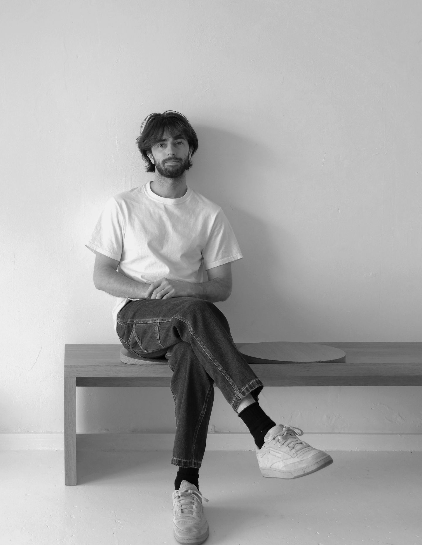
I have always had a keen interest in both art and design. After completing a Bachelor of Fine Art I went on to study Industrial Design in Melbourne. Completing these degrees provided a diverse range of creative and conceptual skills which I drawn upon in my practice. Sabu Studio was established in 2020, where I develop and produce a range of products from lighting to furniture. I also offer custom design and fabrication for clients with specific requirements.
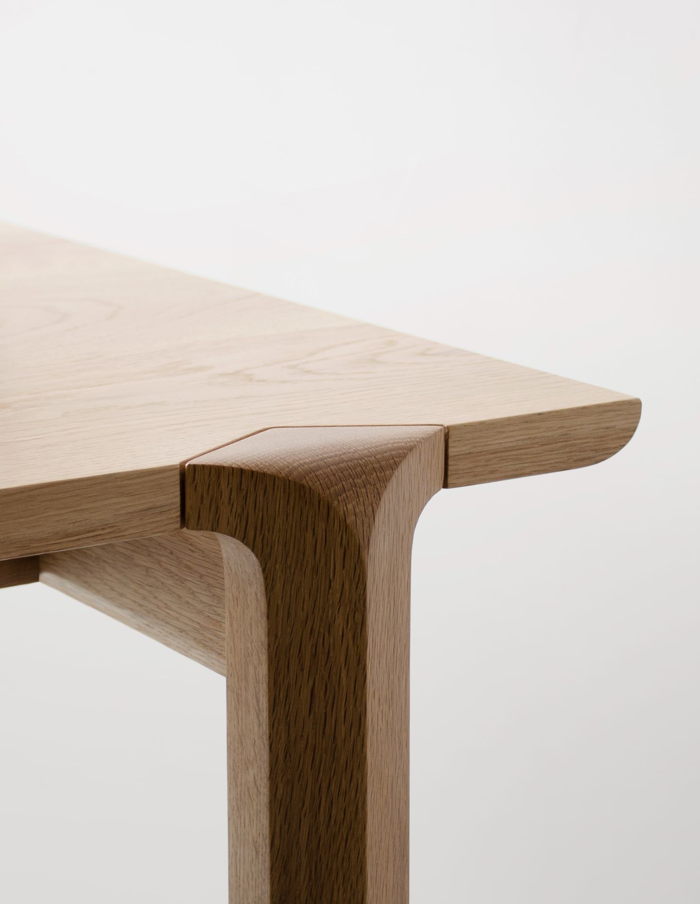
My design practice hopes to demonstrate an intimate engagement with materials and processes. I have decided to work as a designer-maker in order to gain an in-depth understanding of materials. It is my belief that craft and digital technologies should act in unison as complimentary processes in a design practice. These processes offer differing values and qualities, and have the potential to inform one another in order to define new concepts and forms. It is of vital importance to preserve craft within design practices, maintaining an honest approach to design.
How important was Melbourne Design Week for you?
For Melbourne Design Week 2024, Harley Hamilton and myself collaborated and exhibited ‘Plural’. We presented a collection of new works from both of our practices. MDW proved to be a great success – it was a great opportunity to present our work together to the public. We built an array of new relationships with other designers within Australia, as well as architects, interior designs and stylists. I will certainly be participating in Melbourne Design Week for years to come, it is a fantastic program presenting a really strong collection of design happening within Australia currently.
Can you tell us about some of your current pieces? What are you most proud of and why?
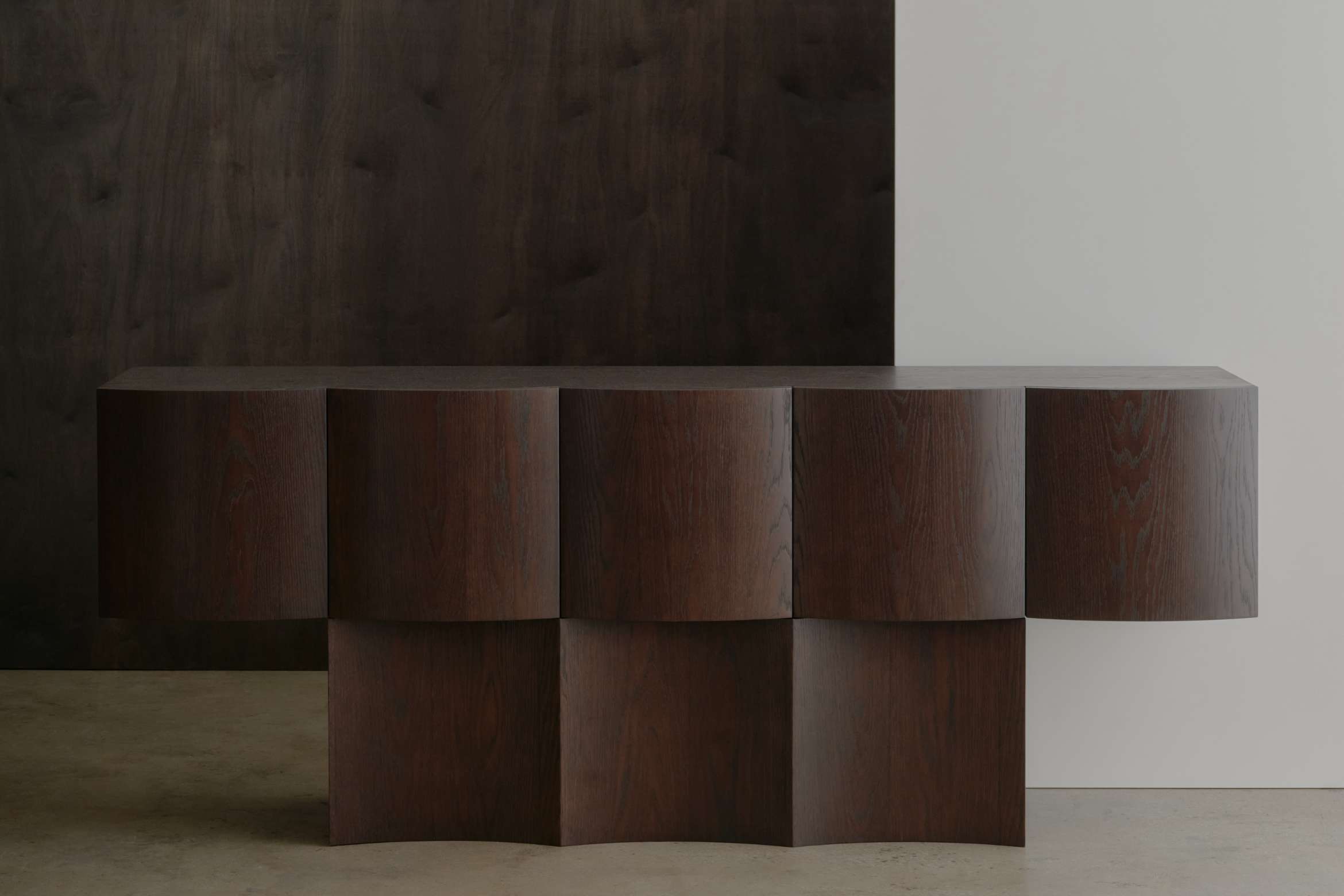
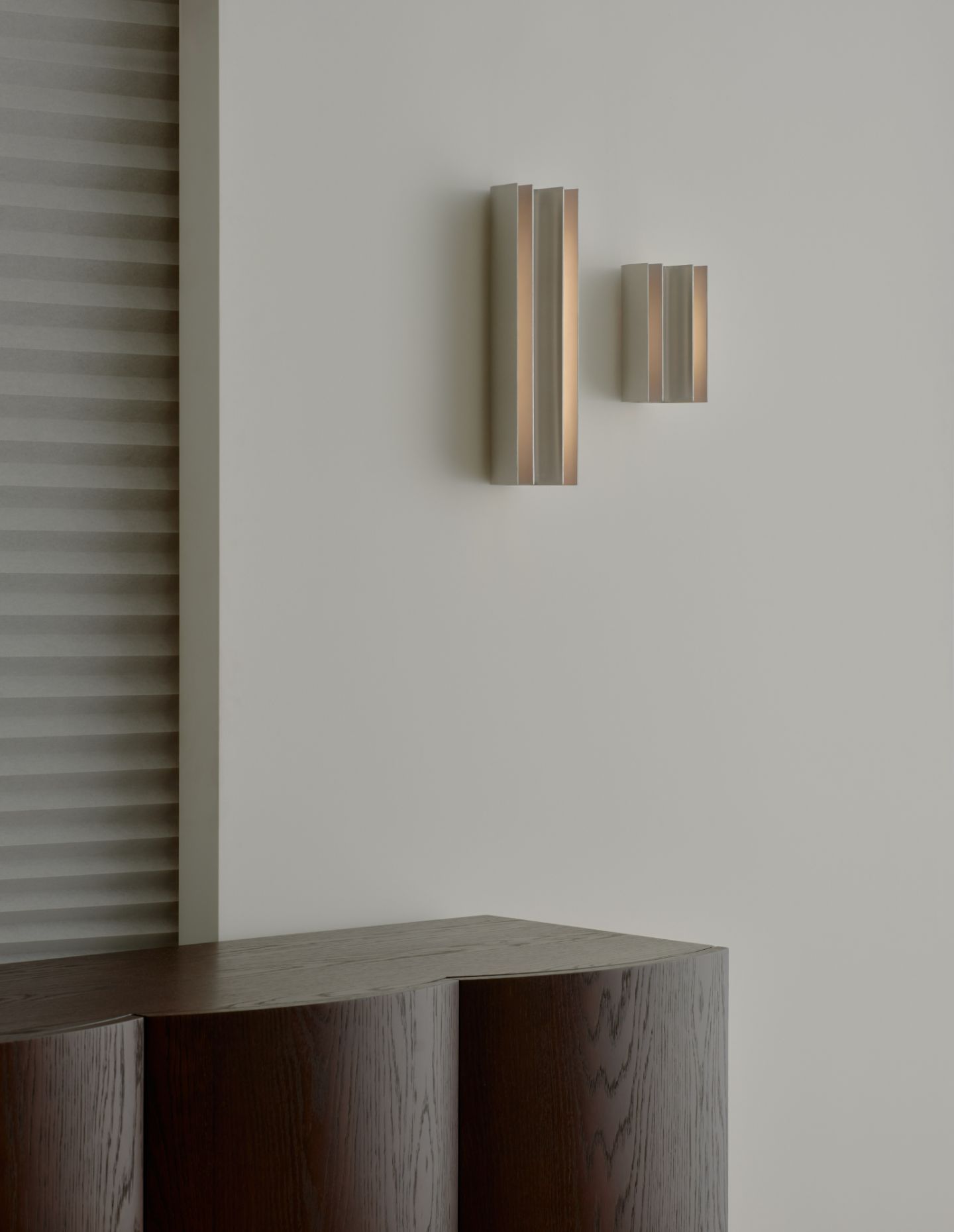
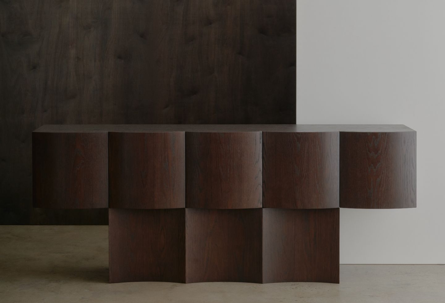
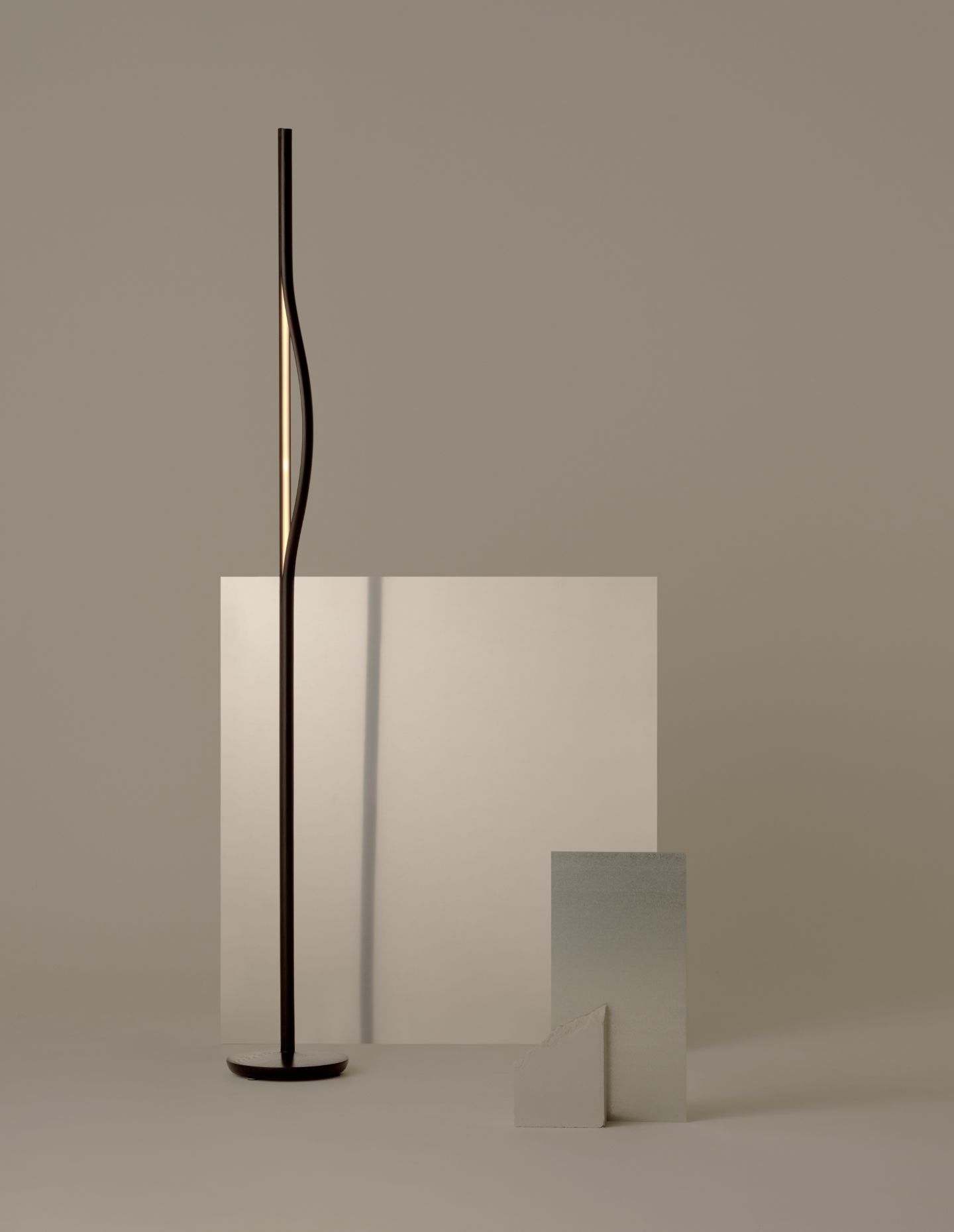
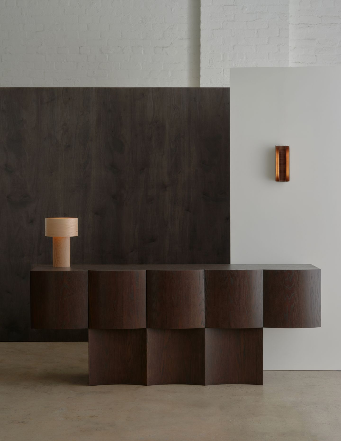
Personally, I feel the strongest pieces recently released as part of Melbourne Design Week would have to be the Miro Sconce and the Lune Cabinet.
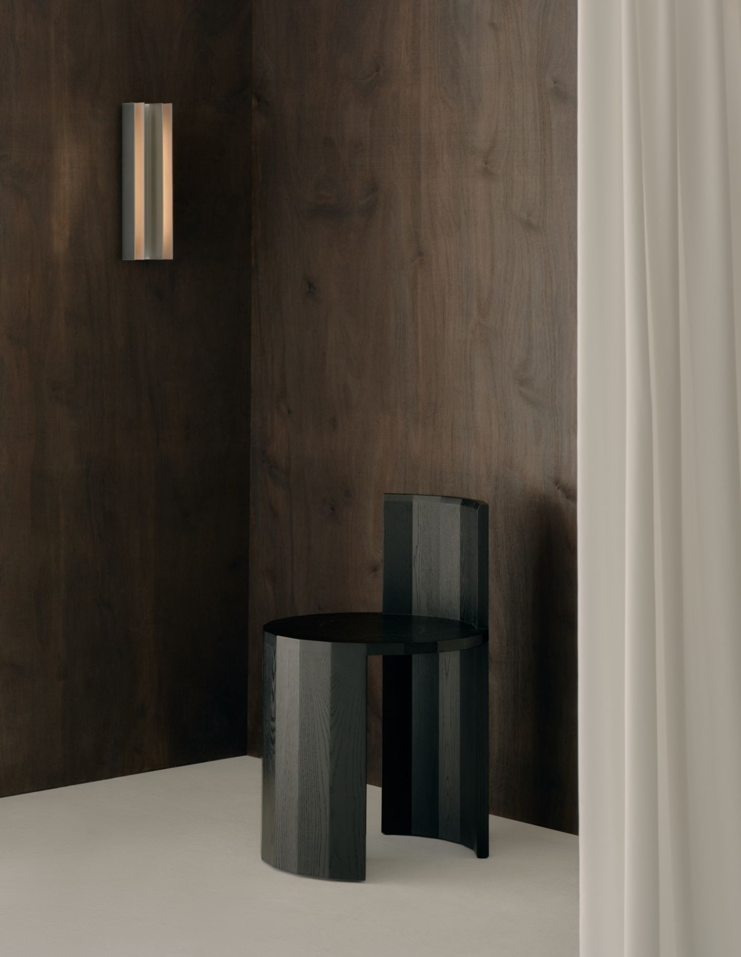
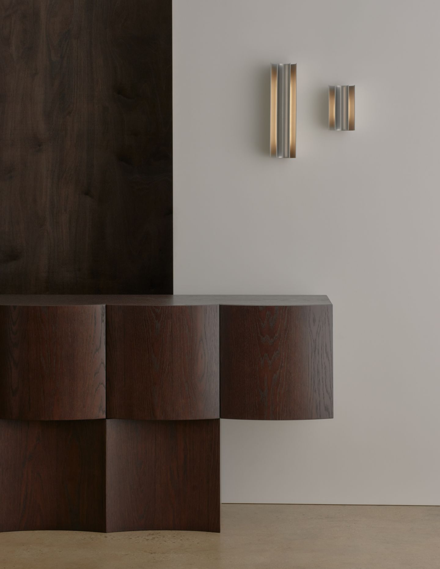
The design of the Miro Sconce has been formed from two concentric curved forms; these are nested together, and it is the space defined between these two forms where the light illuminates. The minimal and refined design of the Miro Sconce allows the ability for it to be situated in a diverse array of interior spaces, both residential and commercial. The various materials options allow and demonstrate varying light qualities and affects, whether that be the American Oak, Walnut or Aluminium. The light illuminates and highlights the materials qualities, the unique timber grain or the frosted aluminium surface.
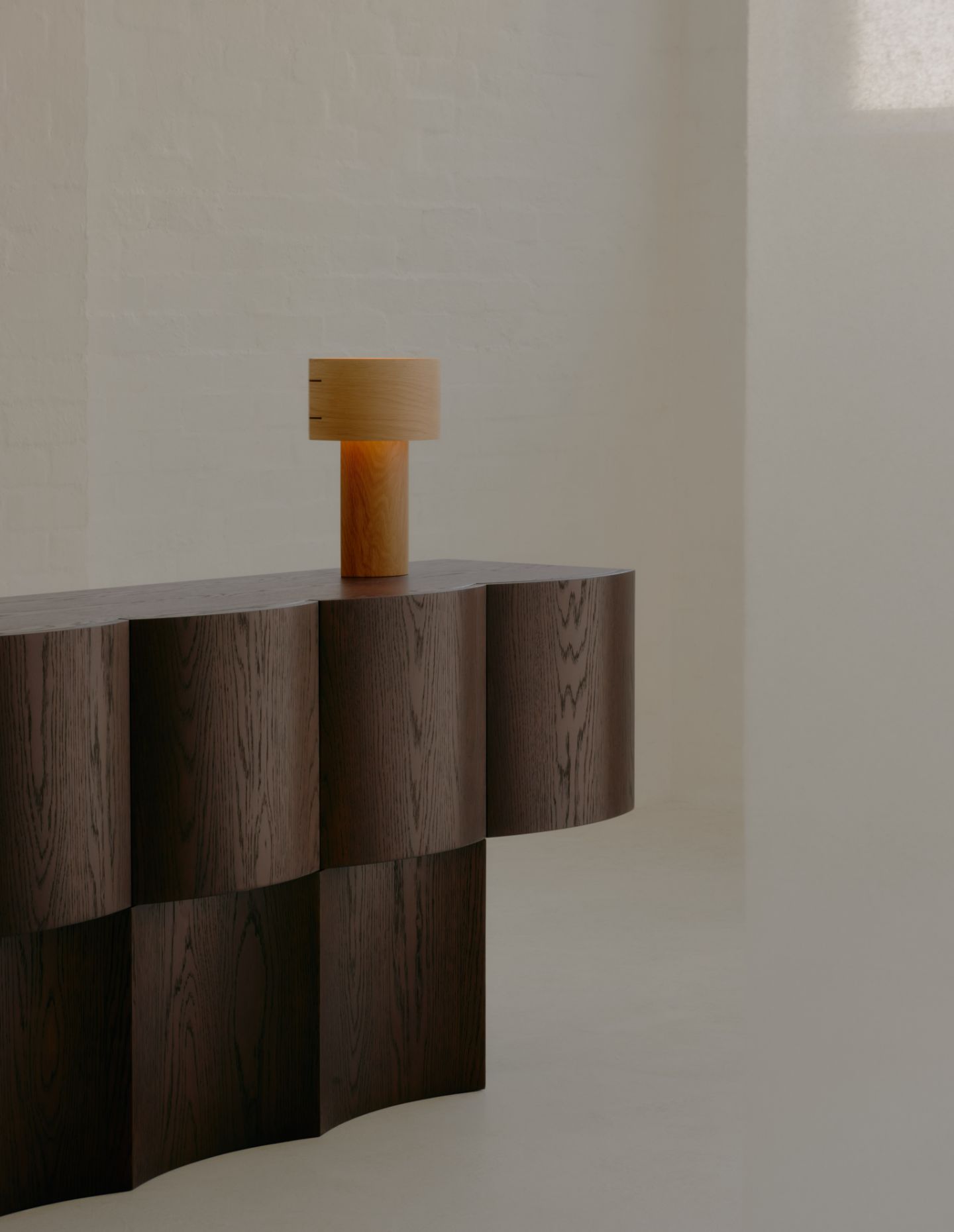
The minimal design of the Lune Cabinet, meanwhile, plays with the idea of light and how it interacts with both convex and concave curved panels, revealing gradients of light and shade across the surfaces. In addition to its structural features, the Lune Cabinet embodies minimal design aesthetics, adhering to the principle of simplicity and functionality. The Lune Cabinet’s structure adheres to a grid layout, characterized by its balance of concave and convex curves, which lend it a sense of dimensionality and shape. These subtle yet deliberate curves imbue the design with depth, creating an interplay of light and shadow across its surface.
How has your design work evolved over time, and what might the future hold?
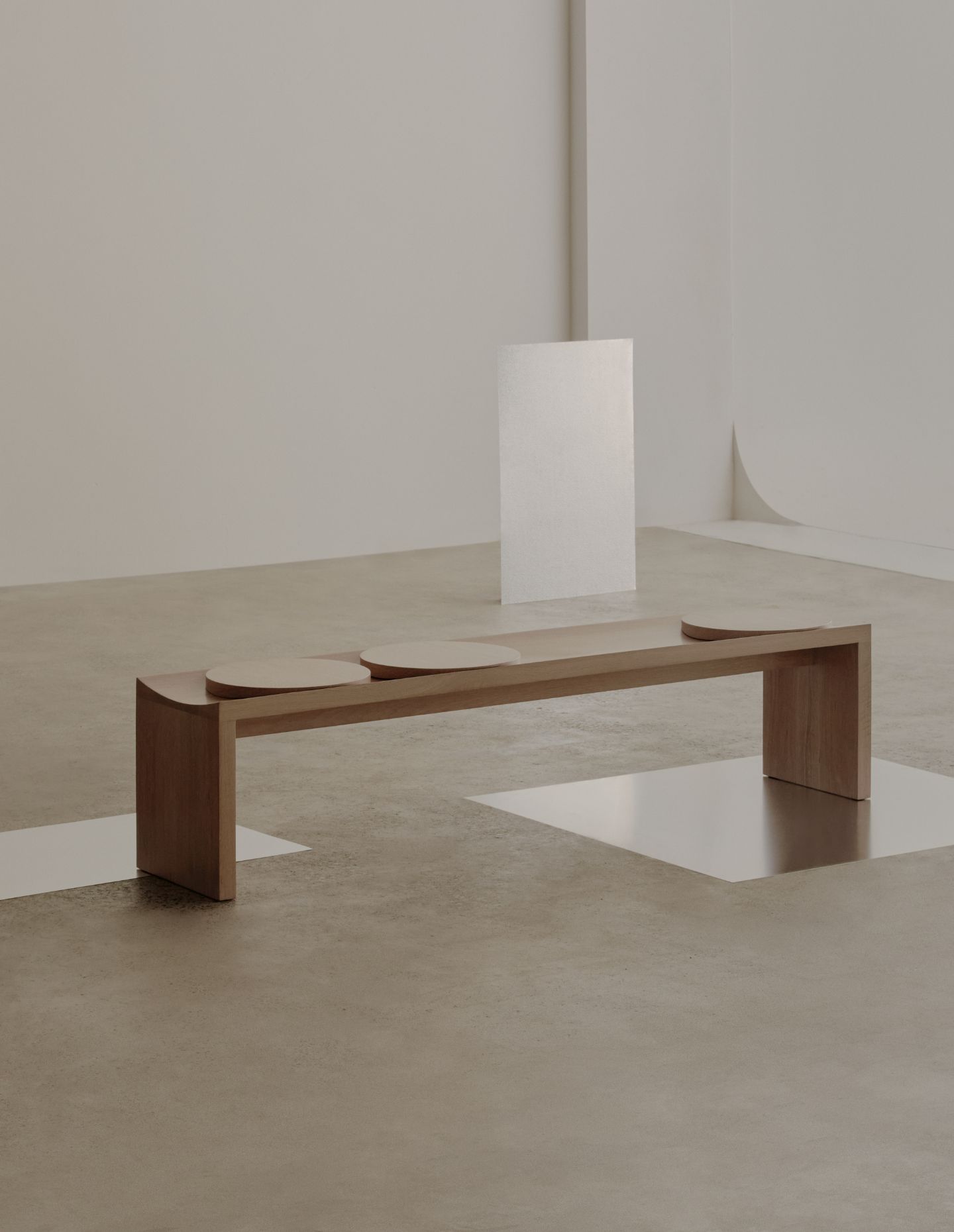
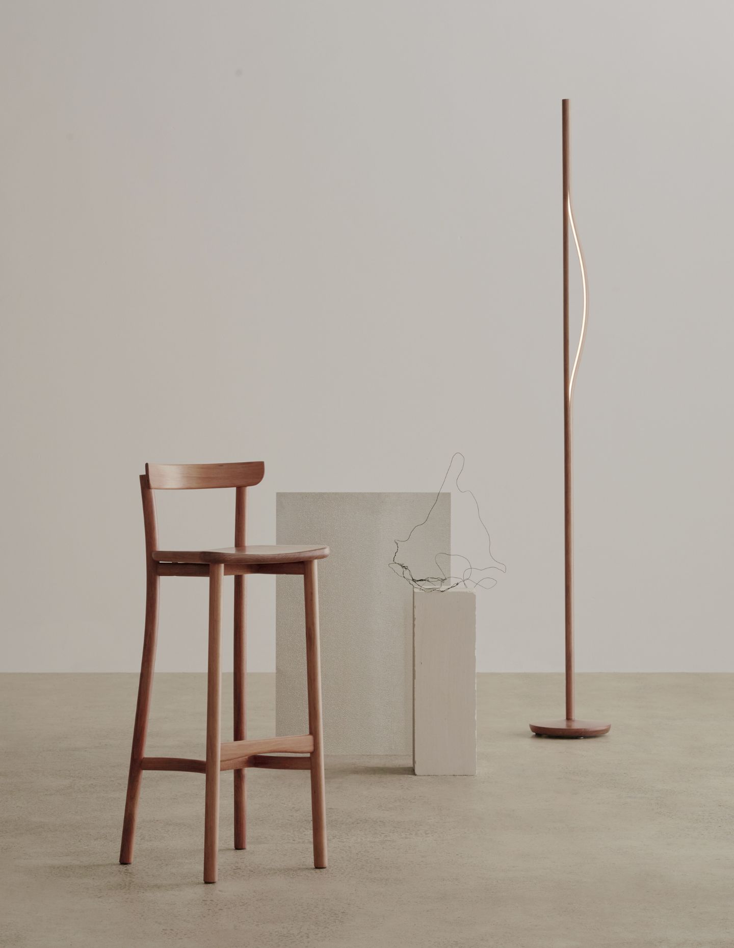
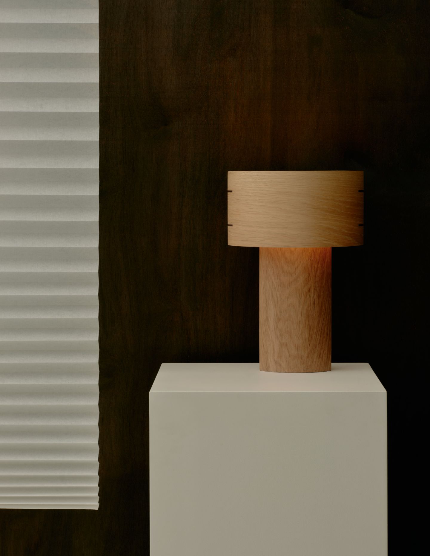
My design practice has progressed and developed over the last few years. The design aesthetic and ideas seem to be maturing, and I am liking the new direction in which Sabu Studio is going. The designs are becoming somewhat simpler and less complicated, both visually as well as from a technical perspective. The goal is to keep refining my design practice – I am drawn to the idea of utilising simple designs and ideas, yet demonstrating them in unique ways: simple forms integrated into unique designs.
Next up: Jessie French at MDW 2024
