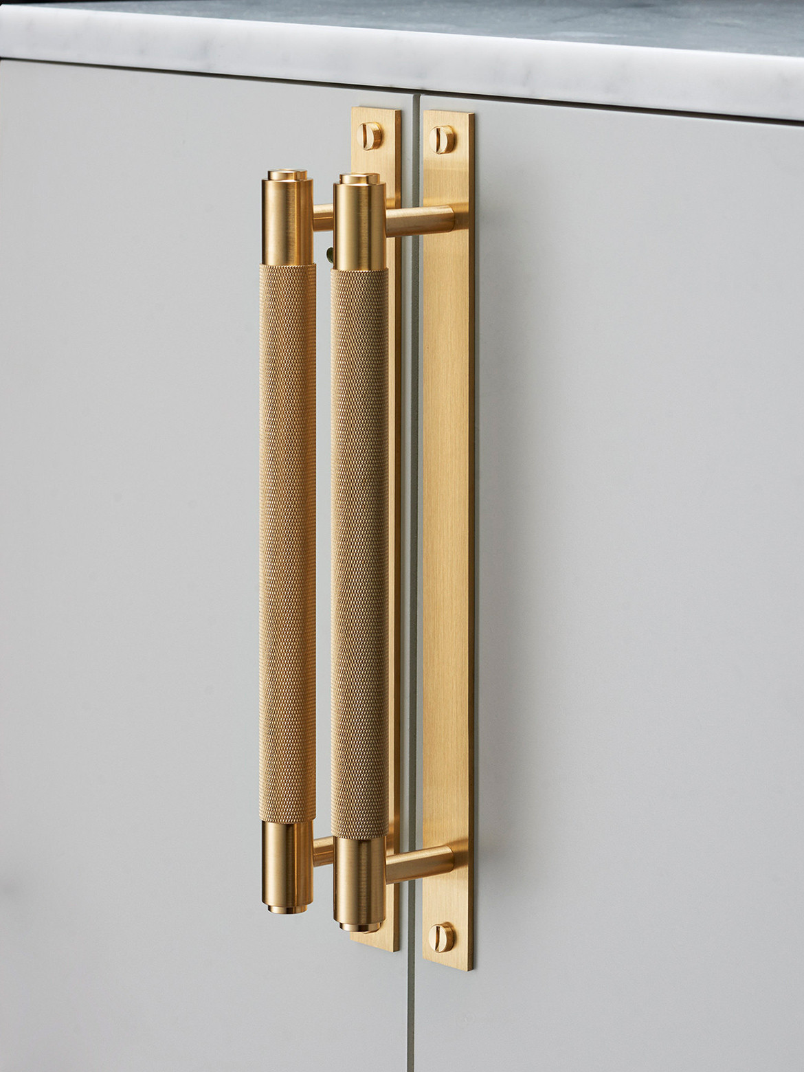
Buster + Punch are likely to be unlike anything else you’ve seen. Founded in 2012 by Massimo Minale, the trained architect and industrial designer has worked for some of the most globally successful architecture practices revered for innovative, unique, and purpose-driven design. Despite the world-class projects and architects one would imagine he would have been exposed to, he didn’t much care for the corporate lifestyle. Nor did he feel it personally conducive to creativity.
So like many creatives, he set out on his own. But unlike many creatives – and not for lack of trying – he created a brand that to this day enjoys a completely unique visual identity and brand offering. At its core, Buster + Punch is most well know for lighting, hardware, and electricity though it extends into homewares and accessories – plus the odd motorbike. The result of musings by a true design-preneur by any stretch of the imagination, today Buster + Punch is available in 78 countries including Australia through Living Edge.
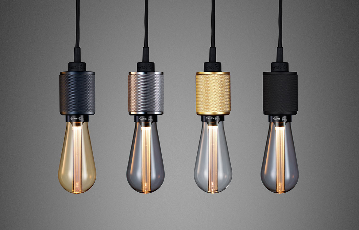
But the brand’s uniqueness isn’t found just in its design aesthetic – which could be described as edgy, out there, and very much tied to the music industry – but also in the unique structure of the business and the somewhat unconventional way in which it is run.
While Massimo’s connections, indeed friendships, with people in the music industry saw to early and organic success for the company, by 2014 it was still very much in an embryonic state despite being two years old. This is when the current CEO, Martin Preen, got a call that was to result in his joining the company. And from 2015, a very clear strategy was put in place.
In order for this to happen, they needed everyone involved to fully understand what the company and its products stood for. Since establishment this has been to turn ordinary, everyday products into the extra ordinary. Following this, a market analysis was necessary: where to focus; how to work the market; and how to learn from it.
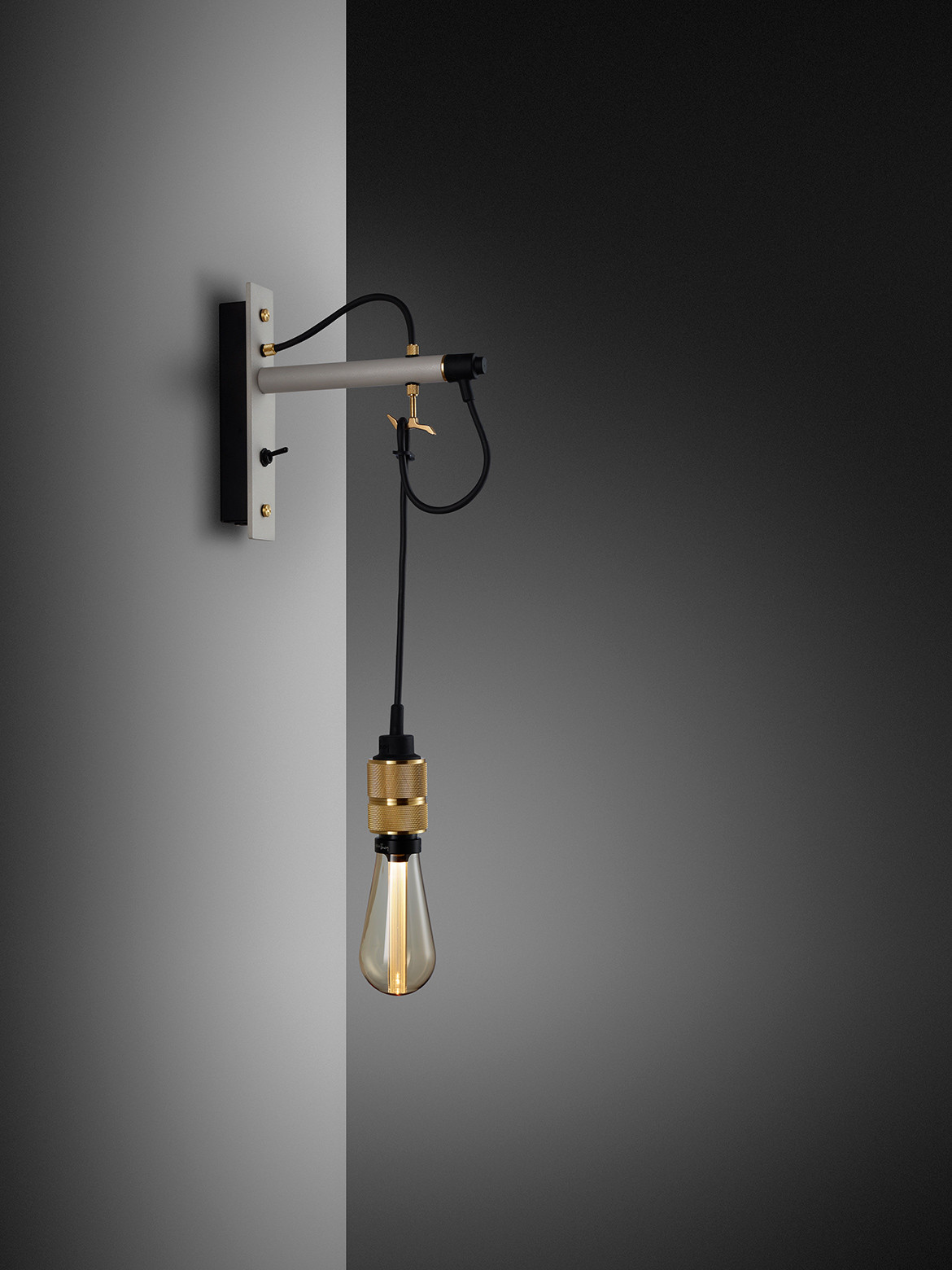
That last point is crucial. The customer base for Buster + Punch is extremely knowledgeable: they know design, they know what they like, and they’re willing to pay for great design. Their strong social media presence seems to suggest they’ve also captured the interest of a younger generation. While this audience might not be able to afford the product yet, they’re aspiring to it and that’s the key.
A clear and consistent visual identity runs through the stable of products that ties one design to any other. Between all the major product silos the individual pieces are nonetheless connected by design cues and brand signatures such as cross knurling and penny buttons. Buster + Punch’s attention to detail in the design stage is upheld during manufacture due to their unwavering personal and financial investment in quality control. There have been times when third parties have, with the best intentions, suggested ways to cut costs but Buster + Punch are strong willed and not looking to cut costs to increase profits, “That’s when you loose credibility,” cautions Martin.
The team is just as dedicated to maintaining a singe-focus approach to projects at all times. Rather than risk spreading itself selves too thin, in the pursuit if widening its reach, the company insist on fully completing one project to its high standards before moving on to the next. For example, it spent time strategizing its position in the market and grew a strong following in the U.K., it’s home. Following that, the team set their sights on the U.S. – now their second biggest market. And now? Now it’s Australia’s turn… so watch this space.
Buster + Punch
busterandpunch.com
