Undoubtedly the impact of the last few years has left a mark on what we seek in our homes. With chaos and uncertainty in the world, the desire to strip back the superfluous and have a home with meaningful connection is ever-more important.
The Dulux Colour Forecast 2023 reflects this thinking, further confirmed through a year’s worth of research. Each of the three new colour forecasts expresses the different ways that people are looking to bring personality into their homes.
“The palettes we can expect to see in our homes in 2023 are predominantly warm and nurturing, with nature continuing to be a key driver of trends. Brighter hues continue, however, they are deeper than last year,” shares Andrea Lucena-Orr, Dulux colour and communication manager, who collated the forecast in collaboration with Bree Leech.
Despite the variances in tones and brightness in each of the palettes, Lucena-Orr confirms that sustainability is an underlying driver across them all.
“There is a new kind of luxury and it’s driven by sourcing things that are ethically made and high quality,” she says.
Balance
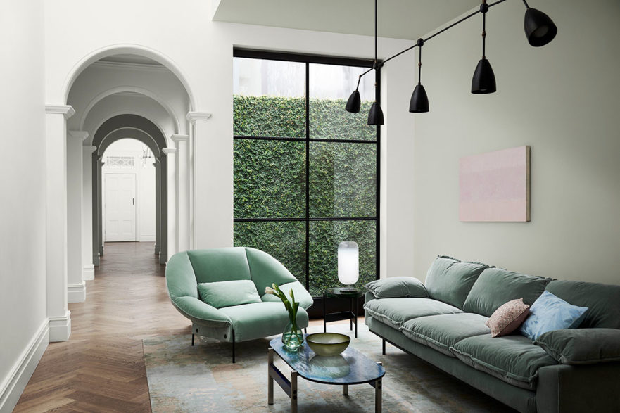
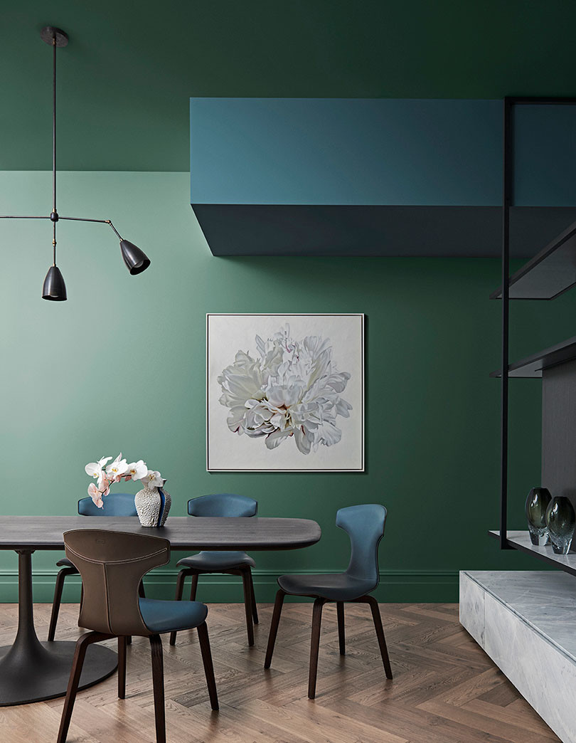
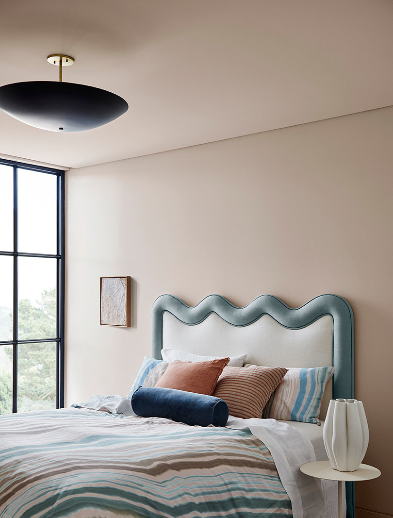
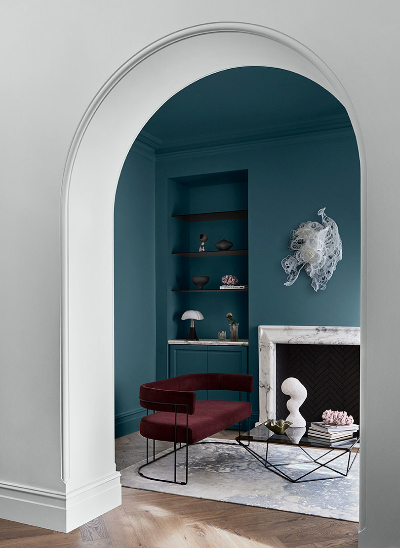
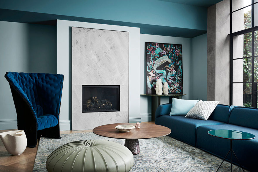
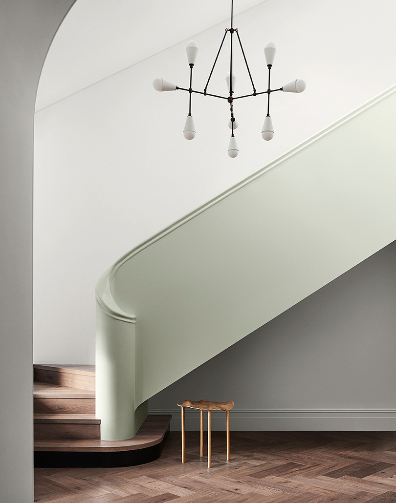
The Balance palette is all about creating a sense of calm and serenity, comprised of blues and greens, the range is reminiscent of the ocean. Intrigue and interest are introduced through complex pattern and texture, inspired by what occurs in nature.
Connect
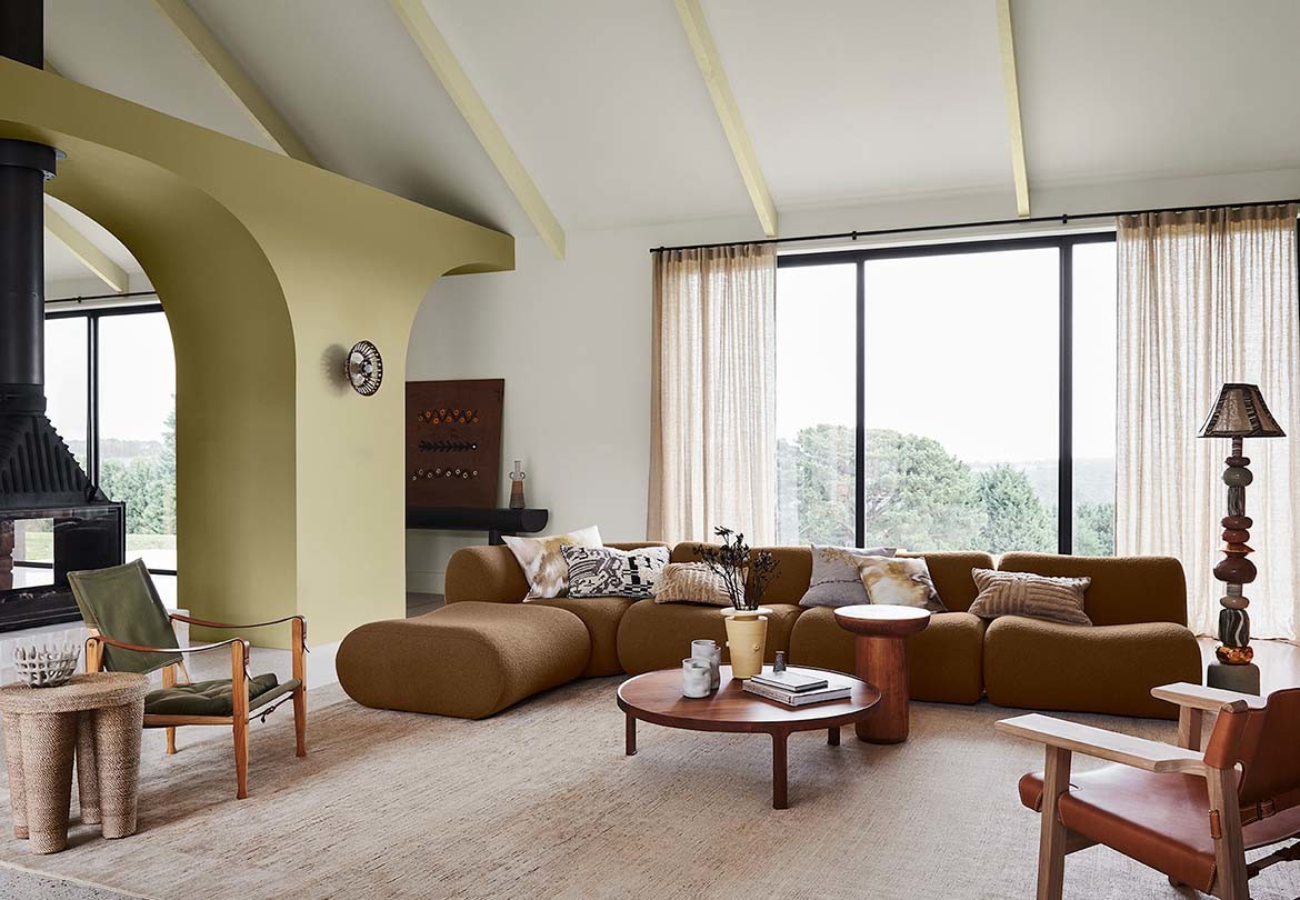
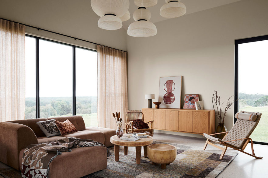
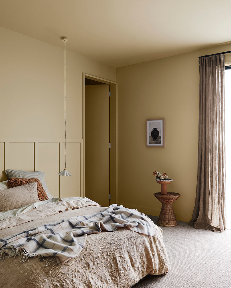
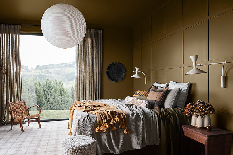
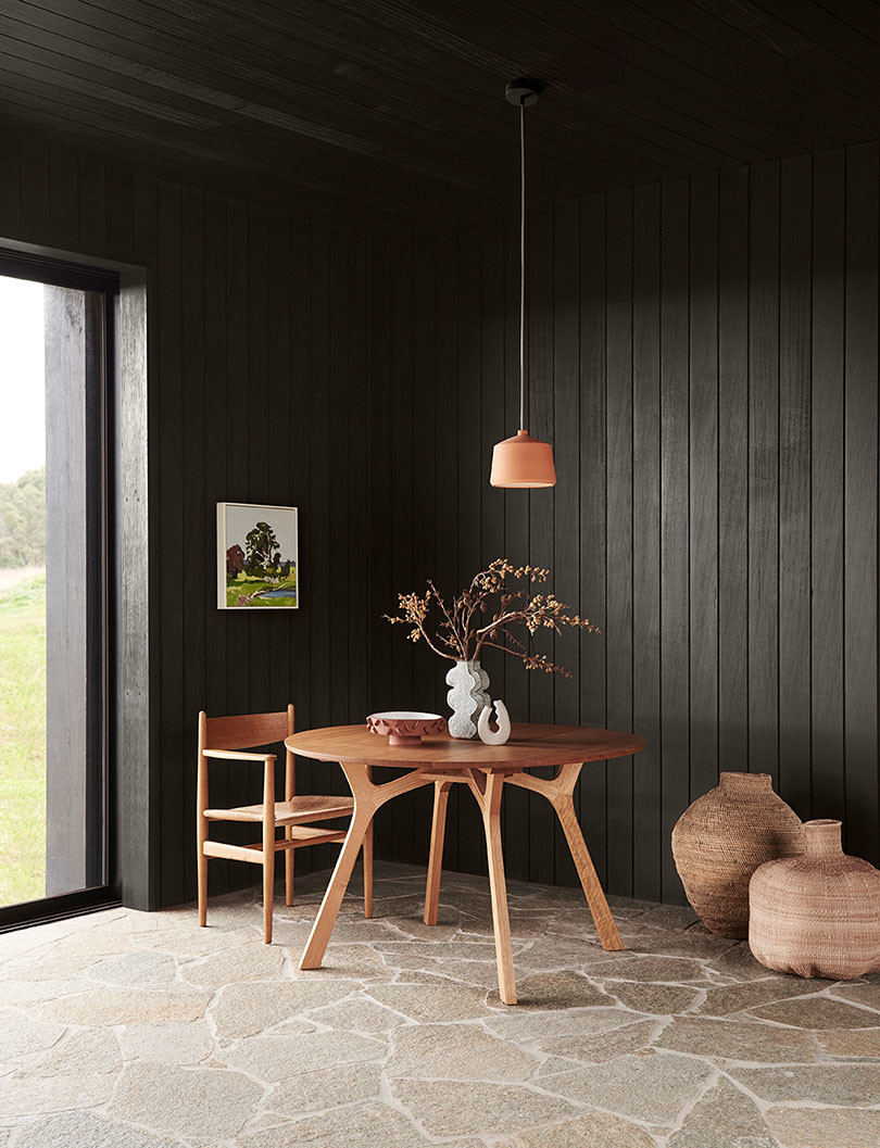
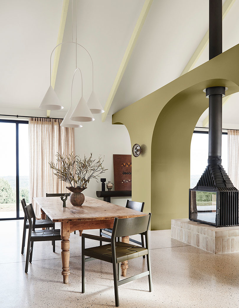
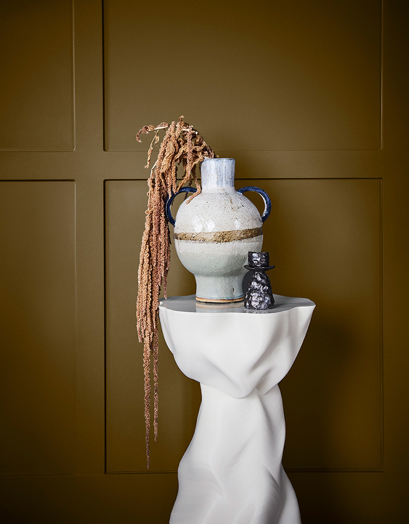
Earthy and warm, Connect draws its inspiration from the great outdoors. The multi-faceted layers of green as seen in the trees and rich browns of the earth. The revitalising effects of nature cannot be understated and bringing these tones into the home are all about creating a grounding sanctuary-like space.
Colours range from moss and wasabi greens to beige-coloured yellows and sandstone. Complementing the colours are natural materials like tan leather, rattan and timber.
Revive
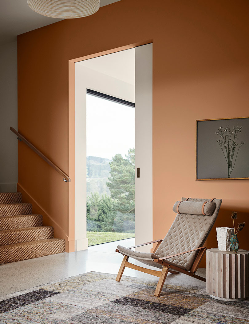
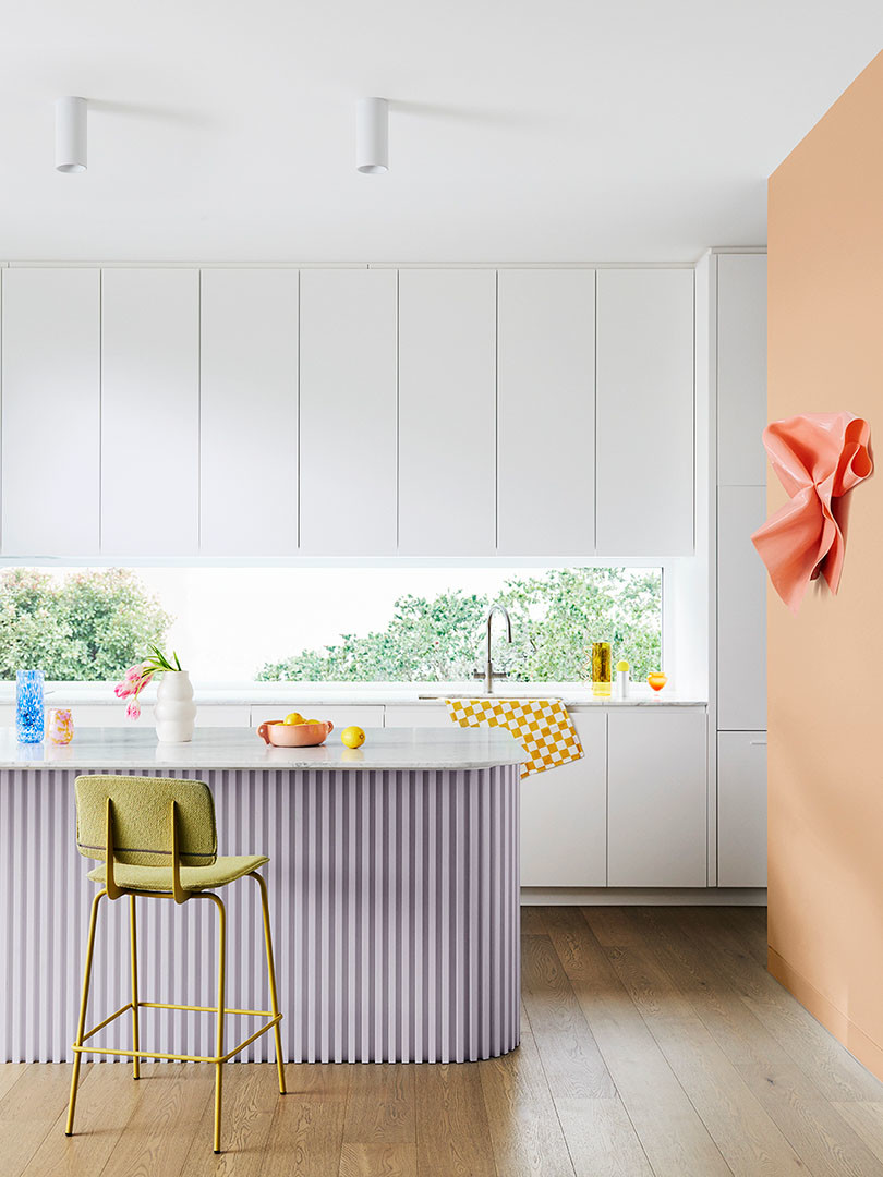
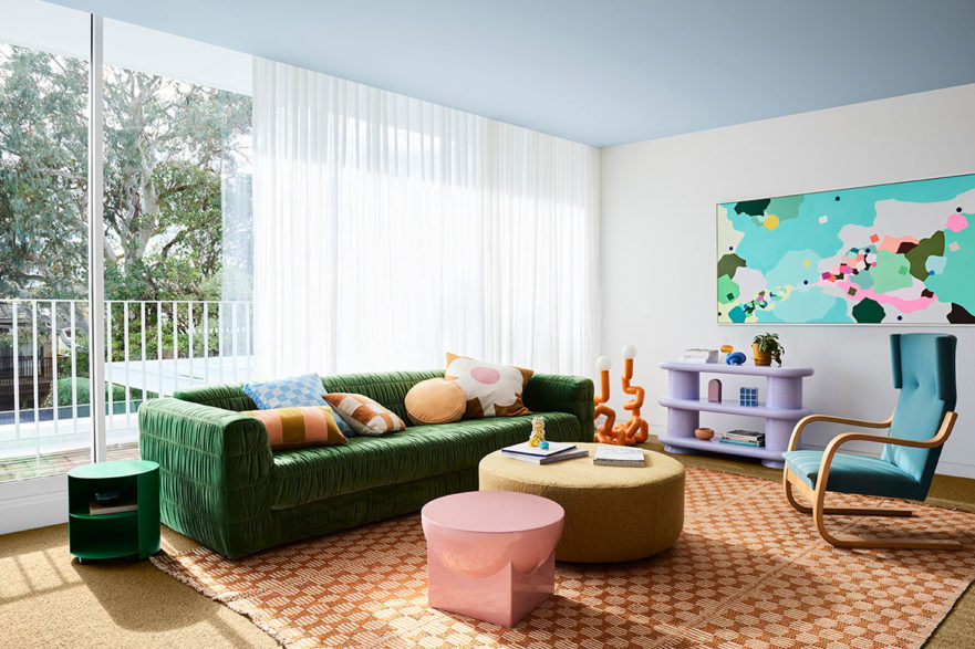
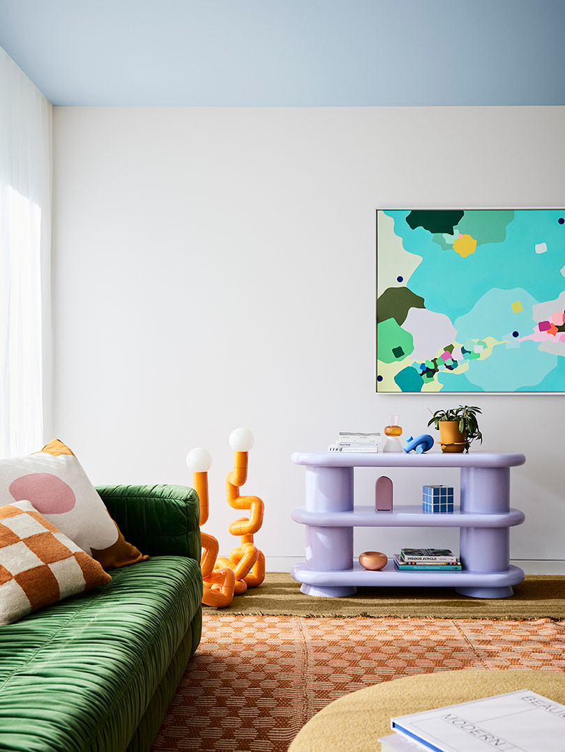
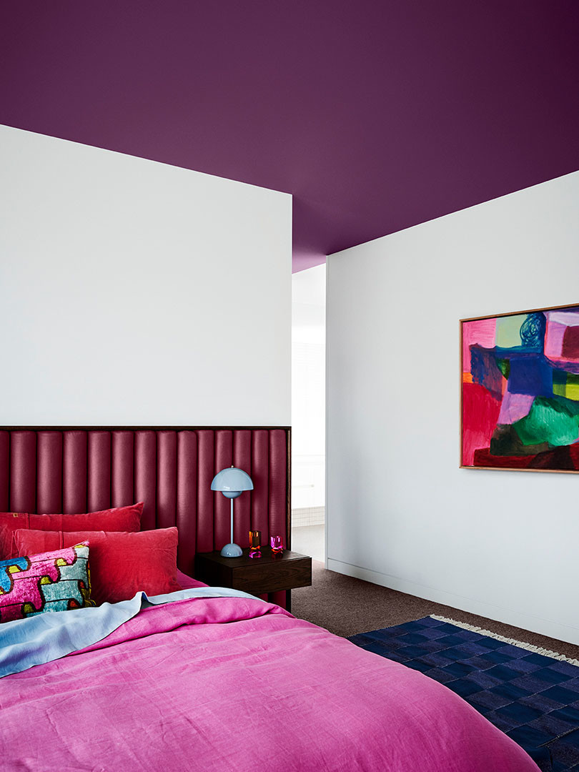
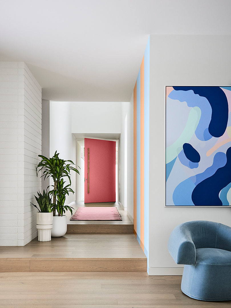
It’s not all soft and muted though. Revive is defined by playful and bright colours – think sunshine yellow, emerald, violet, burnt orange and rose pink.
A mood booster as an antidote to the pressure of the last couple of years, this palette is fun and frivolous, encouraging a lightness and freedom to use colour. Our homes should be places of unencumbered expression and this palette taps into that notion, with retro influences modernised in futuristic ways.
“There are no rules – just pick up a paintbrush and get creative!” says Leech. “If you’re new to colour … these curated palettes are designed to be used as schemes for paint, as well as soft furnishings, artwork and décor.”

Dulux
dulux.com.au
Styling – Bree Leech
Photography – Lisa Cohen
Look back on the Dulux Colour Forecast from last year
