Things are a-changing in Kuala Lumpur. With new guidelines allowing the increase in storey height, density and size, homes in affluent and mature residential enclaves like Damansara Heights have seen quite a transformation in recent years. As many standard double-storey houses built in the 1980s did not cater to current needs, they were mostly sold, demolished and rebuilt. For the owner of C-House, purchasing and combining two average residential plots (now totaling 1200-square-metres) was necessary to accommodate a growing, multi-generational family.
Accordingly, Design Collective Architects (DCA) was tasked to realise that dream home. “The building site was still in a state of flux with neighbouring homes putting up ‘for sale’ signs. Some having just been transacted and new houses are being planned,” explains Chan Mun Inn, architect and co founder of the firm. Hence, to fulfill all the spatial requirements while providing future-proofing flexibility, a “shifting boxes” design was suggested.
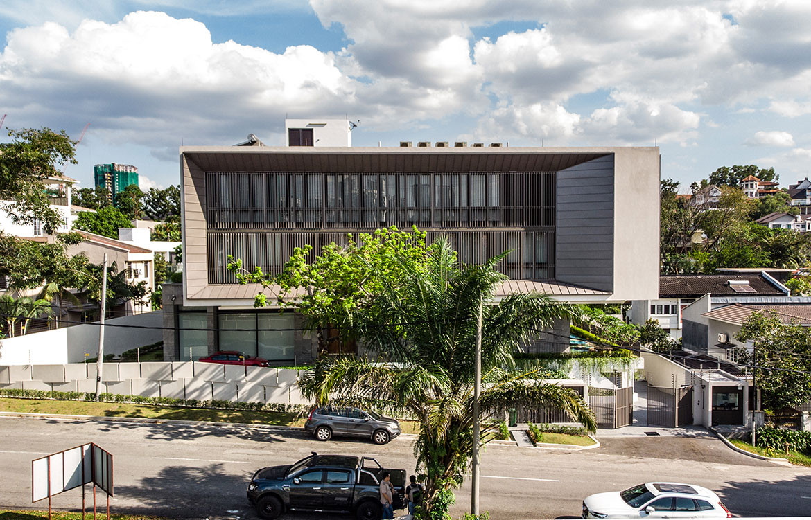
Essentially, the design calls for two rectilinear boxes placed on top of one another with the top one shifted out of alignment. This creates two extra outdoor spaces: a covered verandah along the ground floor with connections to the formal living and dining room; and a terrace on the upper level to accommodate the swimming pool. The two-storey, overhanging structure is supported by cantilevered slabs and beams with all of the bedrooms placed here.
Sounds easy, doesn’t it? But that’s only half of the challenge because feng shui also comes into play. For example, the placement of the family rooms had to take into consideration the five elements such as fire (the stove) and water (sinks in the kitchen), while the main entrance door had to be at a specific angle, resulting in the overall siting of the house being slightly skewed. However, to the architects’ credit, these requirements were communicated during the early stage of design and have been subtly woven into the fabric of the house without sticking out like a sore thumb.
C-House also took on a sustainable approach by adopting principles of natural ventilation. This is achieved by restricting the building depth to ensure the effective cross ventilation of fresh air through the house.
“The outdoor verandah, gardens, pool deck and rooms located on opposite sides are fitted with sliding doors and windows to allow for air to move through the building,” says Mun Inn. “The internal voids and staircases have also been designed as heat stacks to extract warm air upwards to be exhausted through openings above.”
To manage natural daylight and avoid excessive heat gain, vertical sun shading elements were introduced along the north-west facing front of the house. So, even under a hot afternoon sun, this area hardly needs airconditioning. Furthermore, locally sourced trees and shrubs have been placed throughout the landscaping of the gardens. Each plant plays its part in providing shading and screening while softening the hard architectural exterior.
C-House took three years to complete, but it was definitely worth the wait for the family, especially with the inclusion of the pièce de résistance: a two-storey high roof garden. It is created by having the façade wall recessed into the ‘frame’ of the building, while attached to the son’s bedroom and visible from the master bathroom. As it overhangs the neighbouring houses and conceals the rooflines, it frames the view of Kuala Lumpur city. Due to its south-western facing façade, the view out can also catch the setting sun and the amber skies during the evenings – that’s certainly a ‘top tier’ of living that any child (or adult) can hope for.

