We all know about free plan, but what about free section? This house over five levels (plus a roof terrace) plays with differing ceiling heights, split levels, three voids and a spread of functional spaces to create the sense of a continuous vertical space in what is a very narrow building.
The house was built for a three-generation family keen to maintain the Vietnamese tradition of multi-generational living in an age when it is threatened by smartphones, television and modern life generally. It is also a refuge from the noise and air pollution of Vietnam’s capital city, drawing in air and light from its voids, with ample internal green space including mature trees.

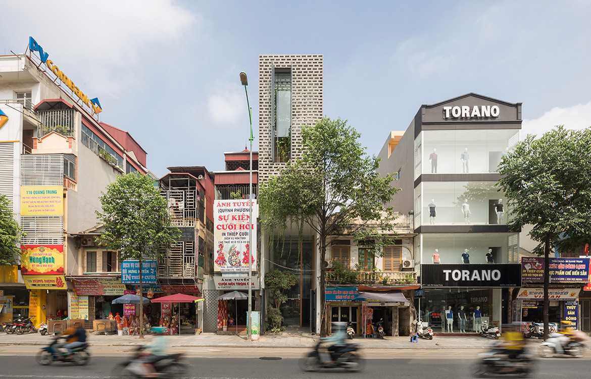
The inspiration for the house is also traditional, drawing as it does on the Vietnamese shophouse with its internal open courtyards. Like the shophouse it also incorporates commercial activity, in this case the ground and first floors that house a commercial enterprise. The building inherited the dimensions of the shophouse as well: the site is a mere 4.2 metres wide and 35 metres deep, much narrower than, say, its Singaporean counterpart. Hence, the ‘free section’ which counteracts any feeling of claustrophobia, not just by breaking up the floorplates and drawing in light and views, but also by spreading out household activities and so enabling greater levels of privacy.
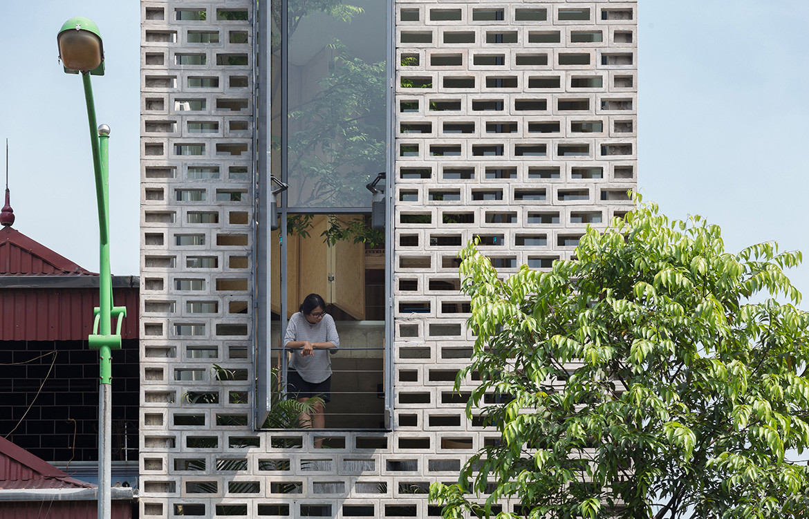
The façade is a combination of perforated concrete blocks and steel-framed glass. It incorporates two street-facing, double-height windows for light and views, but also to give the building some exterior character by breaking down the mass and alleviating some of the clutter of its immediate urban context.

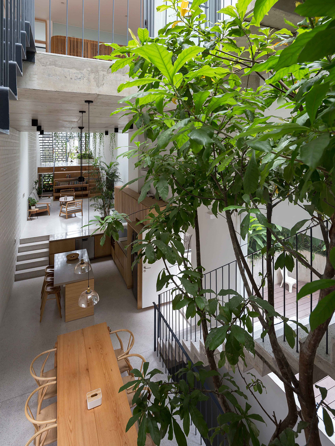
The domestic realm starts on the second floor (level three) and is planned to provide for the needs of three generations as well as providing a healthy environment, including passive climate control through its internal greenery and its voids. The common spaces – living room, library, dining, kitchen – are spread over the three levels with a continuous sense of connection both vertically and in plan due to the varying ceiling heights, split levels and staggered voids. Internal trees provide a cooling, calm ambience and work together with timber detailing and joinery to soften the concrete shell.
According to the architects the aim of the design was to achieve spatial harmony, maintain family tradition, respond to the local climate and provide a contemporary lifestyle tempered by the benefits of a living tradition. It is really a clever exercise in balancing privacy and community within a total floor space of just 220 square metres.

