Rapidly growing cities in South-East Asia and in Australia mean that space is in increasingly short supply – and getting more expensive. Urban infill is part of the solution, even in cities like Jakarta with already high density. But the key is making such mini-developments fit for purpose by offering the amenity necessary for a quality way of life.
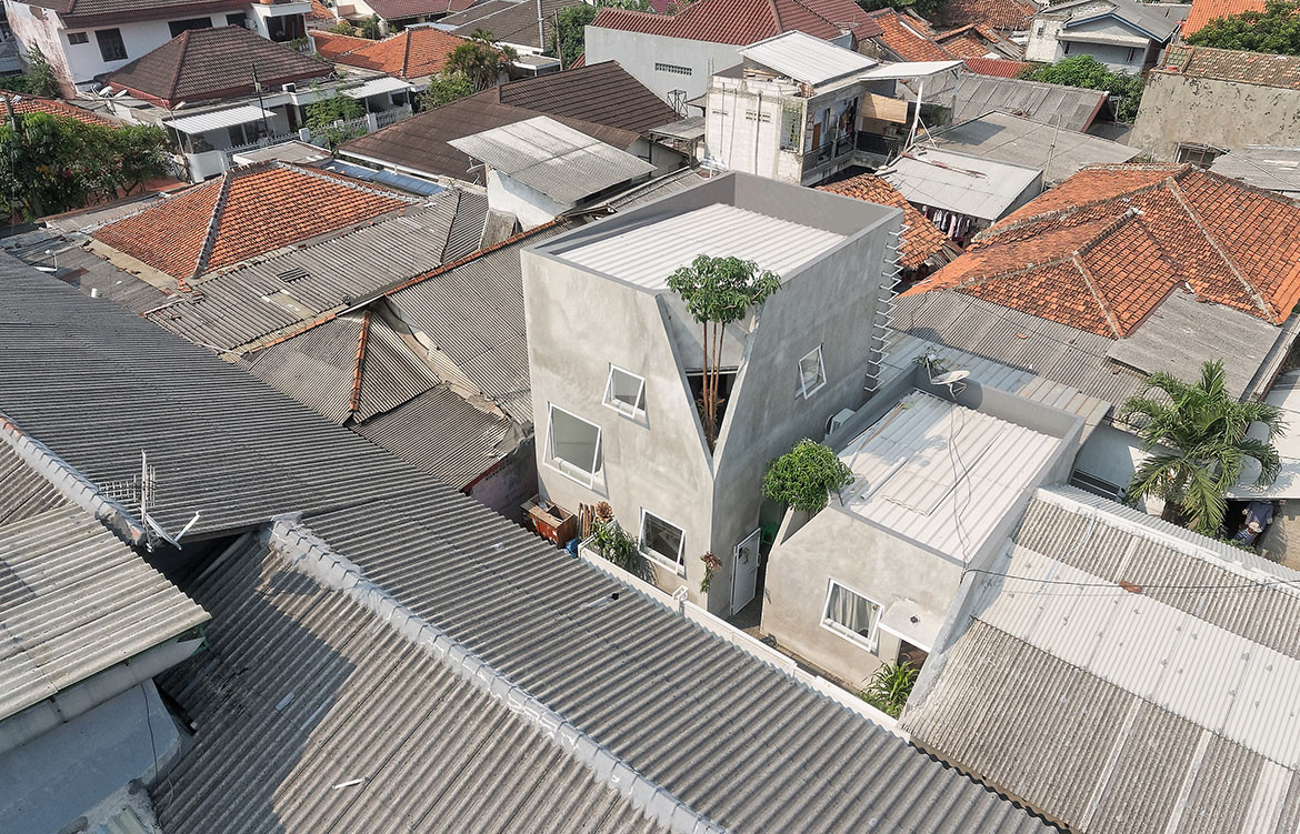
This house occupies just 73 square metres. In fact, it consists of two separate buildings, one two-storeys, the other a single level. The larger house is for a family of four, the other for a female relative. The location is a typical Jakarta rabbit warren with networks of narrow alleys linking to connecting streets. The Twins House is set in just such an alley, at 1.5 metres wide there is not enough room for cars to pass.

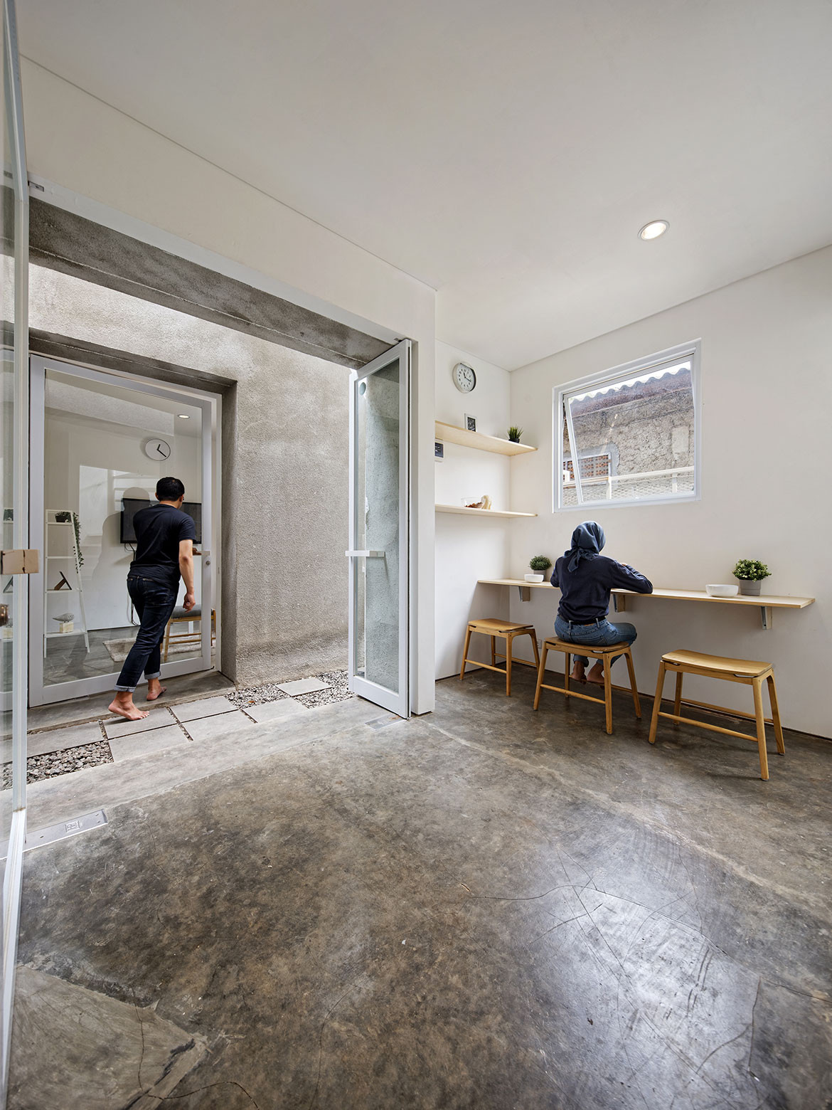
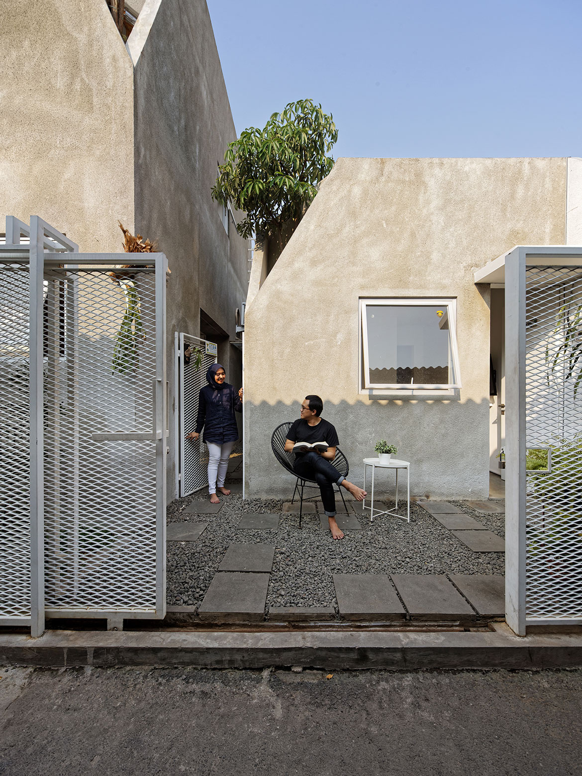
The ‘twins’ concept is of a brother and sister – two separate but related buildings. Just a very narrow pathway of gravel and concrete pavers separates the two homes, making them effectively two wings of the same house. There is no back yard and the front setback is tiny allowing just a narrow strip of garden, with the house separated from the street by a concrete wall and white steel mesh retractable gate.
Interestingly, in such an urban mélange, the Twins House acknowledges its context, not by attempting to reflect the built character of the neighbourhood – near impossible given the mad mix of structures – but by not standing out.
This is achieved partly by the nondescript grey concrete skin, but also by the way the architects have sliced out a corner from each of the structures. This breaks up the mass of the buildings and makes them visually more interesting and less imposing. But perhaps more importantly it provides the opportunity to create more precious green space, both inside and out.

In the living space on the first floor of the larger building there is a small triangular indoor garden with a central tree growing up and out – replicated in the living room of the smaller building. The additional benefit of these sliced out apertures, open to light and rain, is that – in conjunction with the narrow passageway between the buildings – air is circulated, helping to passively cool each building.
Inside, the buildings are a marvel of optimised planning, offering a surprising amount of privacy options. The main building offers two bedrooms, two bathrooms, a living room upstairs and a kitchen/dining space on the ground floor. The two households remain close, but separate and if the space inside – especially in the main building – seems constrained, the two levels with window openings compensate with prospect out.

