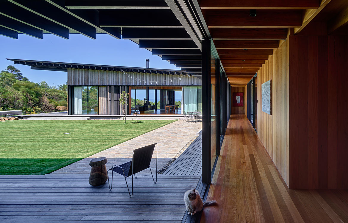
Moving from Sydney to Byron Bay delivered not only a change of pace for this family, but a house that reflects the way they live while embracing the incredible landscape.
This idyllic site at Byron Bay is perched above the township. Only a 10-minute drive from the town centre, there are impressive views over the Pacific Ocean and the national park. For the clients, a couple with two children, the purchase of this sprawling plot came immediately after one of their holidays.
And although the couple were keen to build a new house as their permanent home, they had never worked with an architect before. “They found my shingle on a front fence a few doors down from their Sydney abode. They certainly didn’t come with a series of tear sheets from magazines of houses I had designed,” says architect Virginia Kerridge, who developed the brief for the home with the client.
While there were initial discussions to renovate the existing house, thought to be built in the 2000s, the site offered the potential to create something considerably more, both in terms of framing views, but also the accommodation and amenities required.
“Our initial schematics were aligned to the way they wanted to live, and importantly, make the most of the outdoors,” says Kerridge. “They love nature and have a strong connection to Indigenous culture,” she adds. Given the siting at the peak of rolling hills, Kerridge was mindful of the north-east winds that take hold in the afternoon. A low-slung courtyard-style house seemed an appropriate plan: one that included separate spaces for the children.
Given the climate, it was also imperative to provide cross-ventilation during the warmer months of the year, along with protected outdoor areas that would lend themselves to alfresco dining. “The owners first came up with the name Contemplation House, resonating a sense of calmness and tranquillity,” says Kerridge, who worked closely with landscape architect Jane Irwin on this project.
Entrance to the Byron Bay house is through a discrete doorway to a cathedral-like lobby, with a parasol-shaped ceiling finished with chunky timber beams. And while this space is relatively internalised, it quickly opens up to the sea views with a manicured lawn in the foreground.
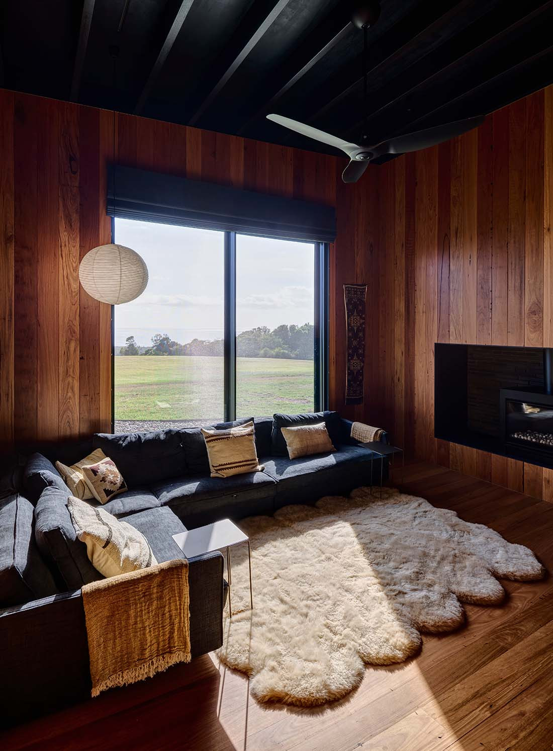
There is a strong expression of timber both inside and out on this home – pre-aged, recycled jarrah for the exterior cladding while recycled blackbutt timber has been used internally on floors and walls.
As with the blurring of the inside and outside spaces, the materials such as exterior jarrah almost ‘dissolve’ at one end with a series of timber pillars that creates protection for an outdoor room for the children.
Other interstitial spaces include a glazed link with louvred glass windows and a partially glazed roof that’s referred to as a retreat/ contemplation space. “We ensured that each room in the house, including the ensuite to the main bedroom, took advantage of these views,” says Kerridge, pointing out the deep elliptical shaped bath in the ensuite.
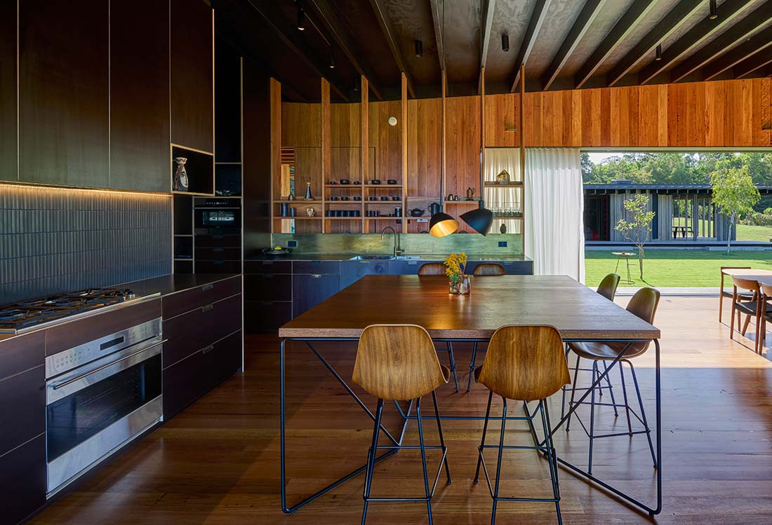
While there are separate living areas for the parents and children, the main pavilion takes the form of an open-plan kitchen, dining and living area. Rather than partitioning these spaces, Kerridge loosely separated the dining and living area with a double-fronted glass and iron fireplace, framed by low steel shelving.
The kitchen, with its sombre palette of dark brown Formply, is also open to both the dining area and through to the main passage, detailed in a Japanese manner with open timber shelves. “I wanted the natural light to enter from all aspects, which also allowed us to go with a darker palette of materials for the kitchen,” says Kerridge, who included steel benches and a brass splashback.
Other unexpected flourishes of colour shine through in a number of orange/ vermillion painted feature walls that were chosen as a backdrop for some of the couple’s artwork. The placement of a north-facing terrace, adjacent to the dining area, also allows the family to dine outside all year around. Covered and with built-in heating, this terrace includes an outdoor kitchen.
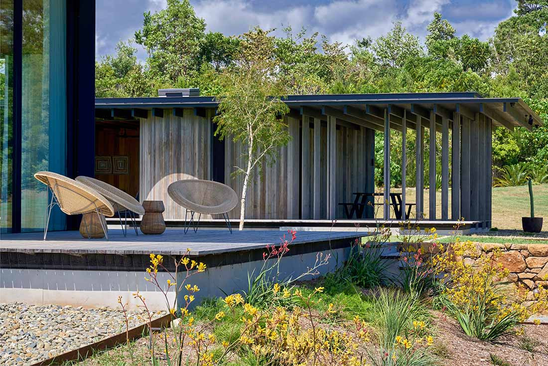
However, Kerridge was also mindful of taking advantage of the other outdoor spaces to ensure maximum use even when the north-east winds gain momentum in the afternoon. And for the few spaces that don’t have vistas, including the couple of curvaceous bathrooms, there are generous skylights that forge an immediate connection to the sky.
Kerridge didn’t start this project with a definitive brief. However, in the initial discussions she quickly established the way the owners wanted to live. “Part of the pleasure of designing bespoke houses is getting to know your clients and being able to respond to their needs. The brief becomes apparent in a relatively short time,” she adds.
