In a dwelling designed by Asolidplan, a central atrium connects a multi-generational family.
Having stayed near one another for many years, this three-generation family in Singapore appreciated the closeness. When the client bought a piece of land to build a house on, keeping the family together was an integral consideration for the project.
“My family, my parents and my aunt used to stay in three separate flats in the same housing block. Essentially, I wanted to recreate that scenario. In this way, we had dinner together every day and helped one another out while retaining our privacy and independence.
“We’re close-knit. I didn’t want a house for entertaining but one that my whole family can live happily in,” shares the client, who is married with a young child.

Part of the brief to the architect Quck Zhong Yi of Asolidplan, who is also a childhood friend, was for their family to have their own quarters on the third storey, accessed via a separate entrance.
The second storey is for the grandparents and aunt, while the first storey is dedicated to communal use. Another challenge from the client was to have ample greenery and gardens, as apartment living offers little access to green expanses.
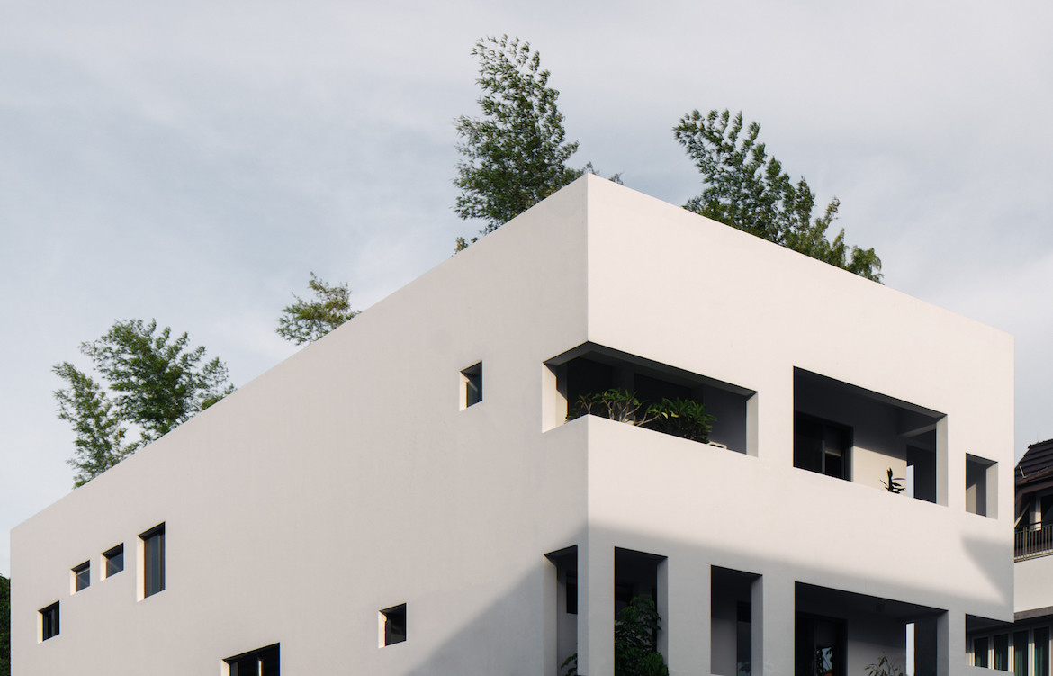
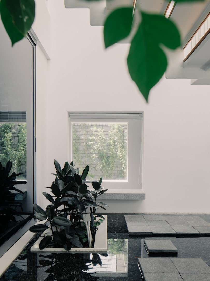
In response, Quck conceived an architecture that is as clear in thought as it is rich in experience. The parti is a white box punctuated with apertures in varying sizes. The centre of the plan is defined by a garden opened up with a smattering of skylights.
“The house is a landscaped, double-skinned building with an outer envelope enclosing both a layer of greenery and an indoor courtyard garden. This shields the house from the harsh western sun and blurs the boundary between indoors and outdoors,” says Quck.
The simple materiality of gleaming alabaster plaster and paint throws emphasis on the massing, layered spaces and greenery.
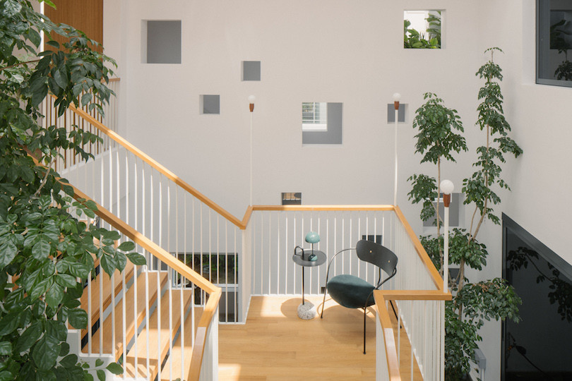
Within the internal garden climbs the main staircase. Instead of a purely utilitarian access device, it offers spectacle and embodies a public character. The Escher-like quality of the bold, tectonic structure joins function and aesthetics. Enlarged landings expand the staircase’s use as a balcony on which to enjoy the garden and the theatrics of light and shadow against the white walls.
“While the programme of the house is stratified, the three-storey central courtyard connects it in multiple ways. The staircase connects the first and second storeys, widening around indoor trees and rising above a water feature.
“A sky bridge crosses the courtyard to connect the front and rear wings of the third-level living quarters. This creates ample opportunities for family members to visually connect with one another without being overbearing,” says Quck.
A secondary linear staircase links the front porch to the third-storey dwelling before continuing to the rooftop garden. The green trajectory actually begins from the main gate.
The house is located in a cul-de-sac with a generous frontal set back, which Quck made verdant with abounding landscaping. Thus, coming home, one is made to amble through a garden that feels immediately soothing and relaxing.
While they appear random, the arrangement of the windows was actually carefully calibrated. “On the outer skin, low, horizontal ribbon windows provide sun-shading at the west-facing façades, while large apertures receive daylight for the internal vegetation. Windows on the inner skin frame views of the interior softscape and the park across the canal behind the house. Windows also look into the central courtyard, providing a few rooms with three-sided cross ventilation and visibility within the house,” explains Quck.
Due to the microclimate created by all of the elements in the home – the double skin, water feature, windows, triple-volume courtyard with ventilated skylight, the roof garden and greenery – the house is breezy and cool despite its west-facing orientation.
It mimics the effect of a tropical vernacular house with large eaves in a contemporary manner. “[The house] sits within the current movement of biophilic design and a rediscovered affinity toward living with greenery and natural ventilation,” says Quck. Instead of maximising the built floor area, it prioritises on the quality of the spaces.
Quck shares that, “The relationship of the living spaces with the environment – sun, sky, breeze, nature – is designed to strike a balance: bright daylight without excessive heat, access to nature while enjoying clean indoor spaces. And for a relatively compact house with many occupants, each seems to have found their own space, as well as rapport with the outdoors.”
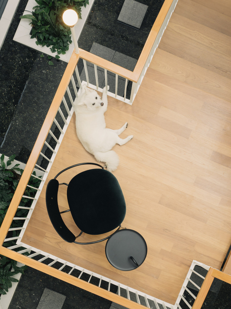
The client agrees. While he doesn’t partake in gardening himself, preferring instead to just admire it, the rest of the family enjoys it. He muses: “My parents love the ground-level garden. My aunt loves pottering around in her vegetable patch at the back of the house. The rooftop garden is my wife’s corner of the house where she takes the dog daily. Everybody loves the central courtyard as we can see one another every morning. It also makes for a megaphone that allows us to call each other from different locations.”
