Architect Henry Berresford has carved up the floor plan on this 1970s double-brick house to sculpt light in and create a home where nature and family life unfolds.
House Flower is the result of a loose brief and a highly engaged builder and client. The project came to architect Henry Berresford, principal of Berresford Architecture, through the builder Jarrod Denny of Build by Design, and the stage for collaboration was set right from the get-go.
Brett and Kate, the clients, are a young couple with two kids who had previously worked with an architect to redesign their last home. Being passionate about design, and as Berresford confirms, “interested in the process and the outcome”, there was respect for what good design could achieve. Working somewhat back to front, the clients engaged Berresford to do preliminary schemes for houses they were looking to buy in order to get a sense of what would be possible, along with input from the builder.
The house they landed on in Sydney’s Como is set on a quiet street in a leafy area. “It’s a two storey, double-brick property. It’s a very solid home with good bones,” confirms Berresford.
But the counterpoint to that solidity is the fact that the original dwelling had tiny windows and a poor link to the back garden. “It was quite dark inside and the circulation was just an afterthought,” says Berresford. From the very beginning meetings involved the builder and the client, where practicalities would be discussed, and construction feasibility was reviewed – all feeding into the final design proposal. The main component of the brief was to “open up the house to the back garden and to reorganise the circulation so arriving would be a more enjoyable experience,” says Berresford.
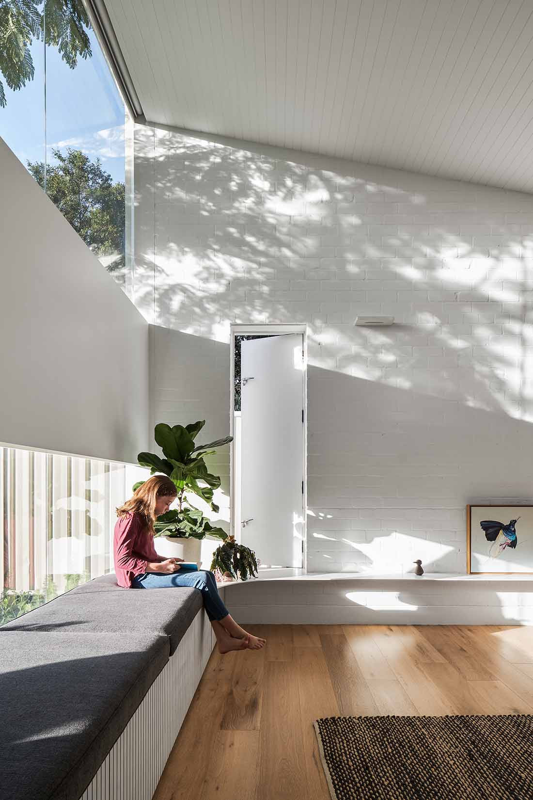
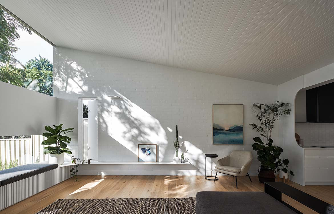
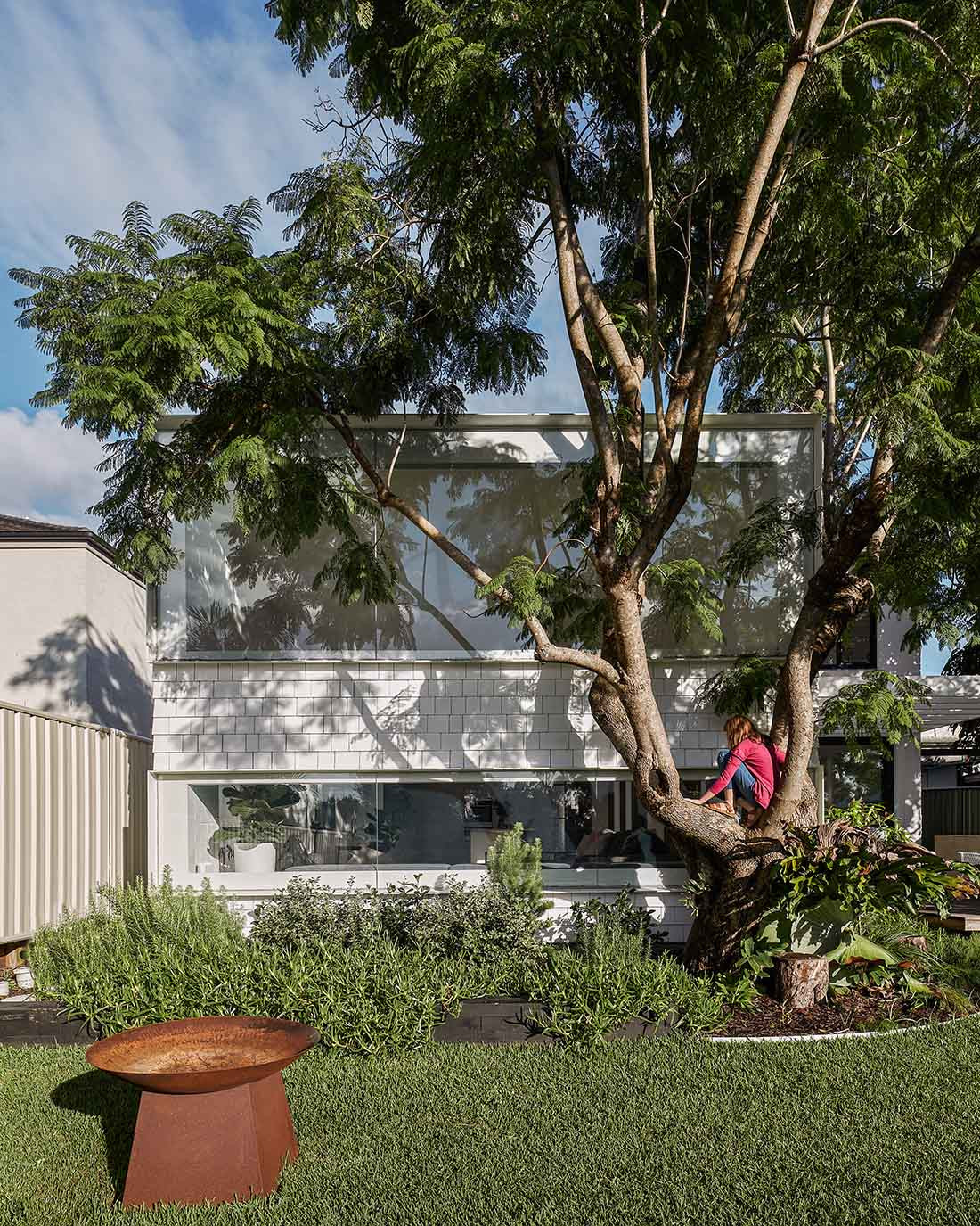
From the street front the house hasn’t been touched, including an original studio building on the site, which will be reworked in the next phase of the development. But swing around to the rear and the entire back has been redesigned, with a “wedge” form added. The wedge’s roofline stretches up while light is captured through two bands of windows. The large upper band catches the morning sun, with dappled shade cast down into the living space from a mature Jacaranda tree that was saved and incorporated into the design. The lower band – while slightly skinnier – looks straight out to the garden and verdant foliage.
“We didn’t want them just staring out at the neighbour. The lower band is about having an intimate view to green space, while the upper band offers an expansive connection to the sky and clouds,” says Berresford.
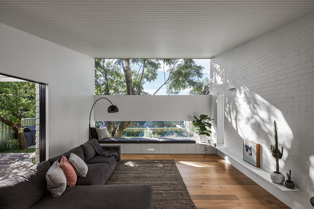
A central courtyard space furthers the connection between inside and out yet feels protected in the way it nestles into the plan. Deliberately different, the new addition is clad in timber Cedar shingles, which the owner painstakingly painted white. The form and blocking of the shingles were chosen for the way they subtly reference the original brick while bringing a modern and fresh element. Taking the same pattern to the interior, the tiled splashback in the kitchen mimics the shingled façade.
The kitchen acts as a “pivot point” to the whole downstairs area. As the most used and most valuable space for the clients, getting the right location was important. A wall of joinery and sightlines out across the whole area make it a practical command centre.
The lead character of House Flower is undoubtedly light and the way it has been crafted to dance throughout the interior at different times of day; a reminder of time passing and a visceral connection to the outdoors. But the supporting roles on this project – that of a collaborative builder and a passionate client – ensured this renovation came to life.
