Adrian Norris and Edwina Robinson founded Aje in 2008, creating a women’s fashion brand that melded a tough and feminine aesthetic, and bridged a divide between effortless Australian style and European elegance.
Each collection centres around hand-loomed and handwoven fabrications, handsewn embellishments and hand-painted prints, so design studio We Are Triibe translated this emphasis on materials and craftsmanship into the design of Aje’s latest retail outlet in Perth.
“The Aje brand has a strong focus on high-quality materials and craftsmanship in its garments. We wanted to convey this in a retail space whereby the materials would be expressive of the Aje brand and essence,” explain Jessica d’Abadie and Christina Symes, directors of We Are Triibe.
Having designed Aje’s Brisbane and Adelaide boutiques, Jessica and Christina have a strong understanding of the Aje style and aesthetic.
“With this in mind, we pushed the boundaries for this space to create an elevated and unique design that incorporated strong detailing and a meticulous material selection,” Jessica says.
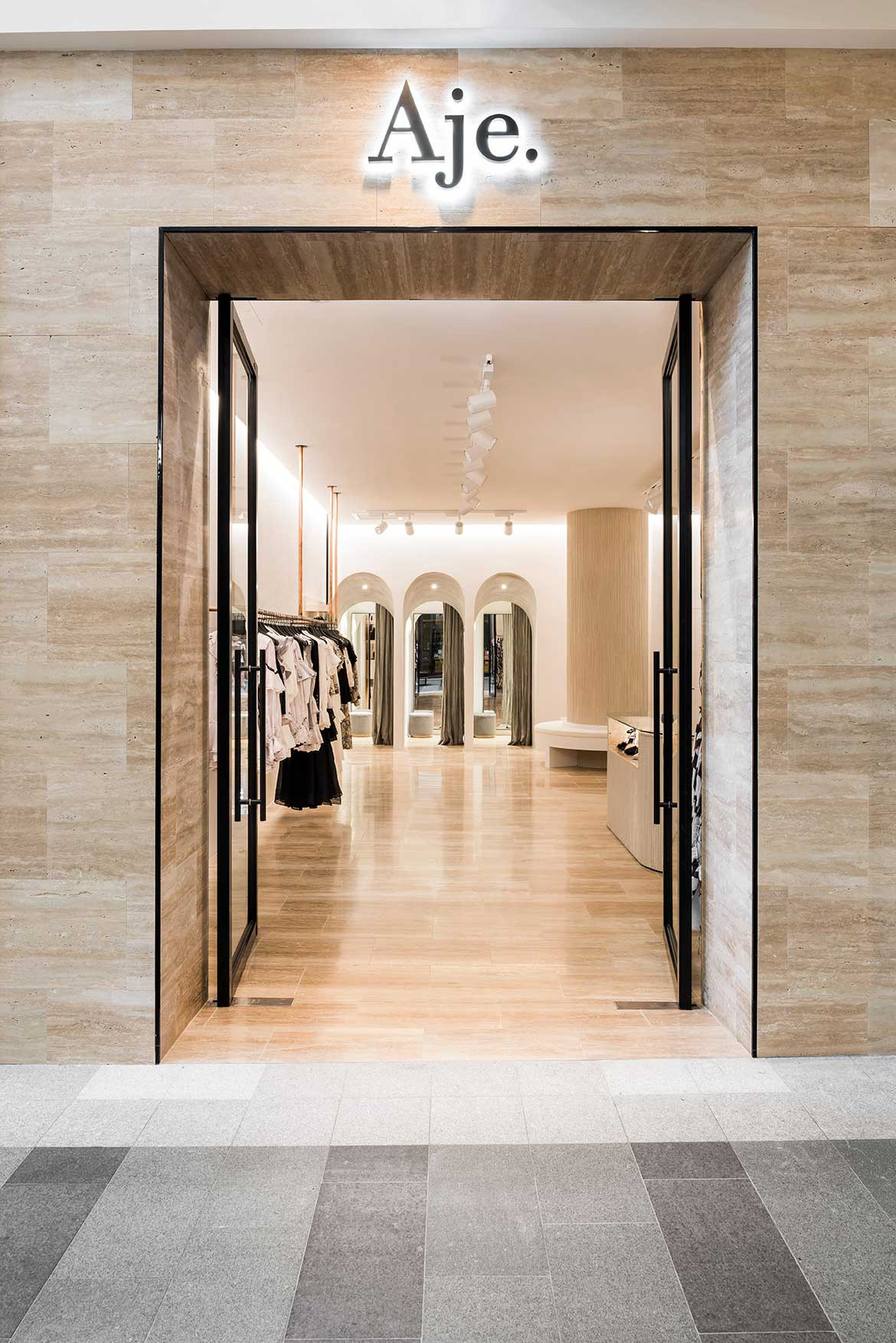
The location in Claremont Quarter, a new high-end shopping mall, set the tone for drawing customers into a luxurious and sensory-driven retail experience, with the use of natural, neutral and tactile materials directly inspired by the Aje collection.
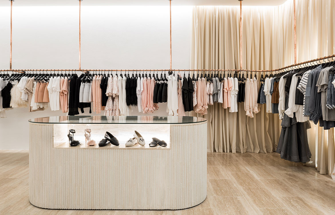
“We placed an emphasis on layering with texture and tone, while keeping the colour palette very subtle,” says Jessica. This includes ceramic tiles; travertine flooring, cladding and on the shelving and point-of-sale units; heavily draped curtains; detailed joinery; and copper piping for hanging merchandise.
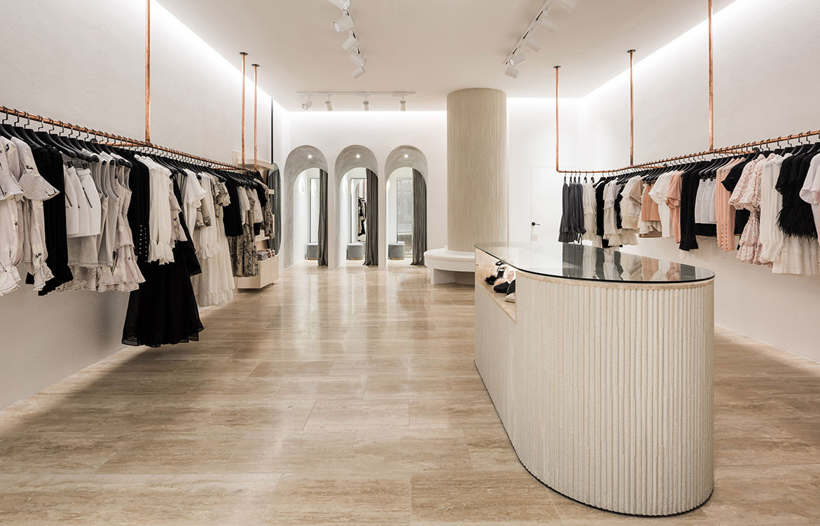
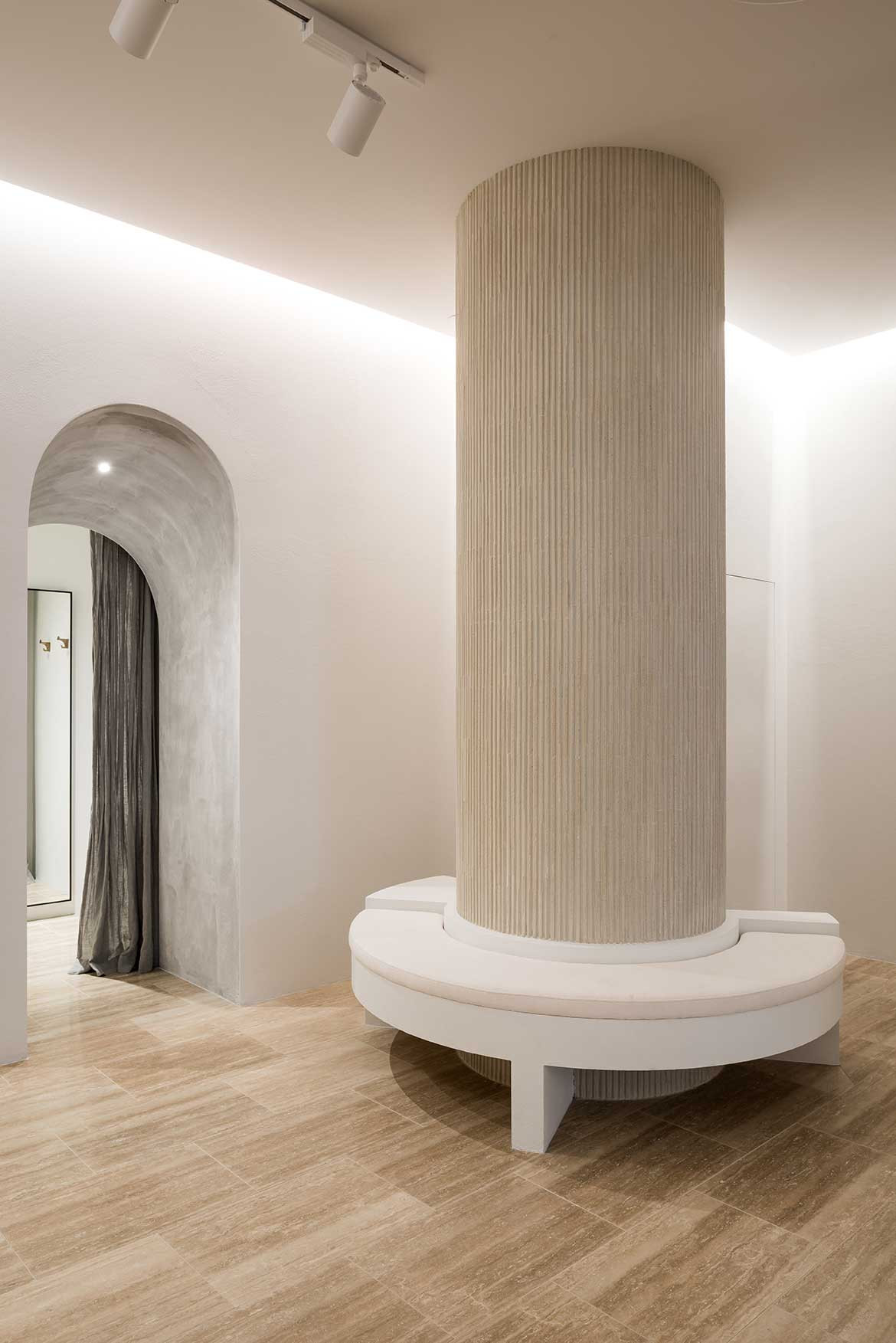
A large structural rectangular column in the small store presented a challenge at the outset of the project, however, Jessica and Christina transformed the obstacle into a feature.
“We turned it into a rounded column, clad it in Japanese ceramic tiles and integrated the seating around it for customers to take a moment of reprieve,” says Jessica.
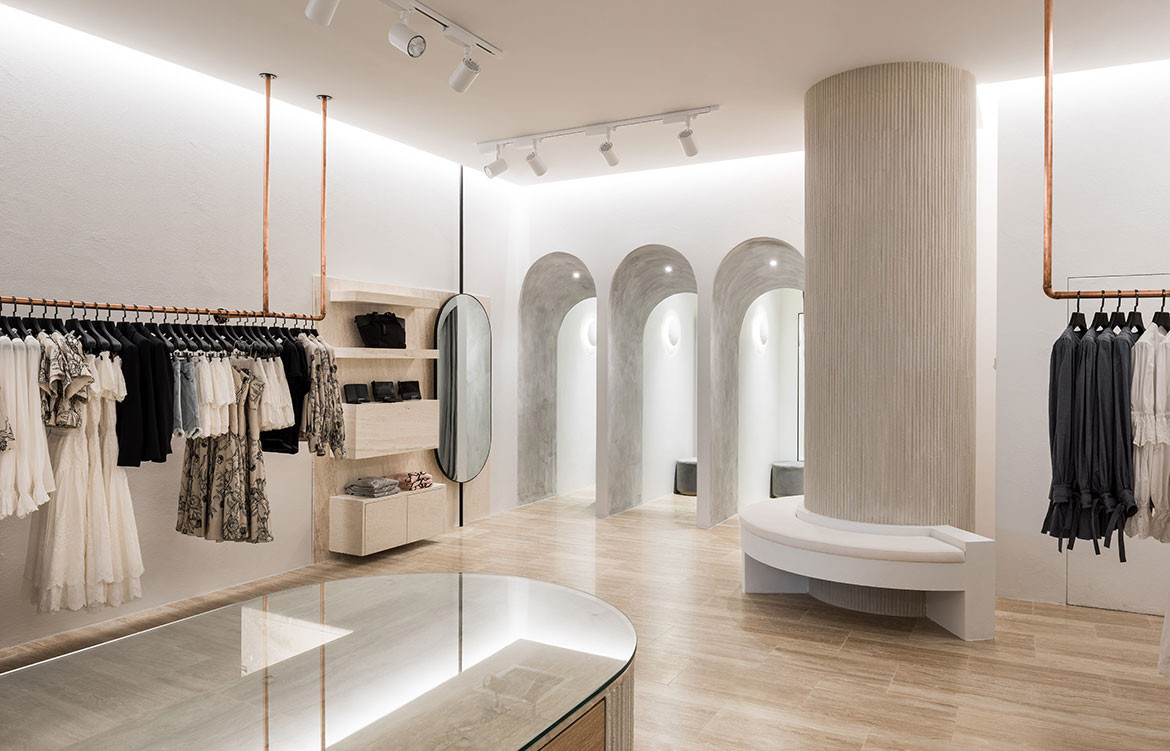
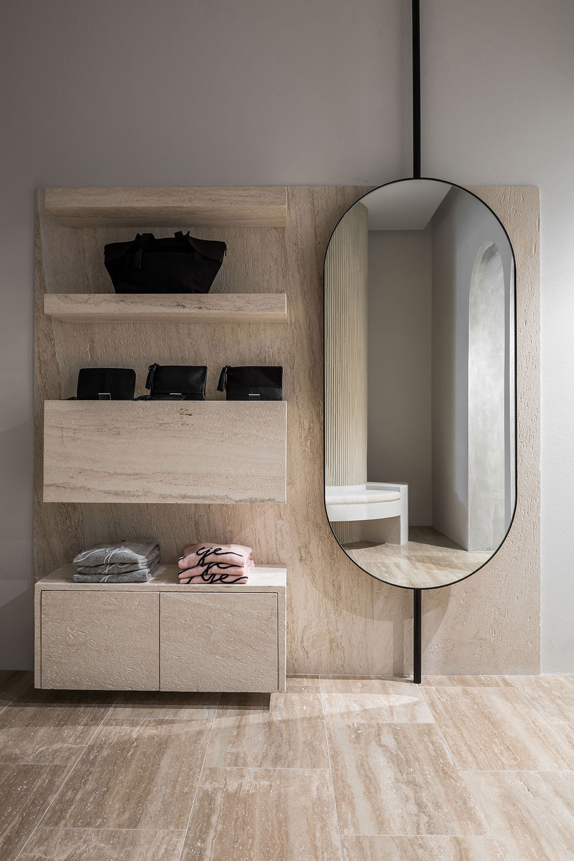
They also applied the ceramic tiles around the point-of-sale unit, which is designed to accommodate display space and encourage circulation. Rounded corners complement the column, and open and concealed shelving is integrated under the counter for product and storage.
The soft rounded lines are also rendered in the entryways of the dressing rooms, which have a subtly pitched arched ceiling to draw the eye towards them. A draped curtain at the back of the dressing rooms adds a textured layer against the concrete render.
Materials matter for Aje, and by using tonal and textured materials, We Are Triibe have rendered the “raw beauty, tough femininity and effortless cool” style of the brand’s clothing in its retail store.
We Are Triibe
wearetriibe.com
Photography by Dion Robeson
