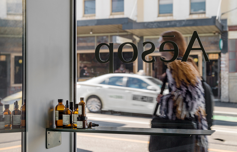
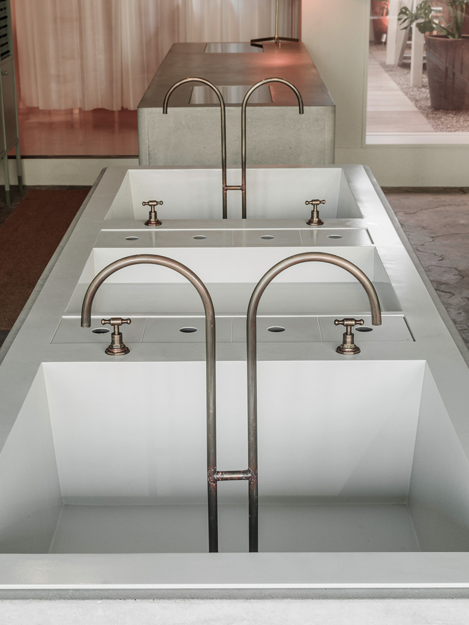
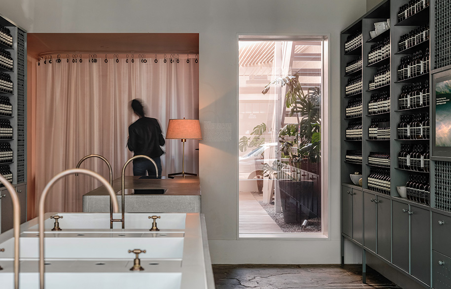
Situated among an eclectic neighbourhood of creative retailers, restaurants and galleries, Aesop’s new Gertrude Street store is something of a sensory relief. Imbued with muted tones and a pared-back approach to materials, the interior exudes a tranquil sensibility belying its proximity to a busy intersection.
The new fit out presented Clare Cousins Architects a unique second opportunity to interpret the brand on site, after creating the initial design 10 years ago.
“It was so great to be able to revisit the project,” says Clare Cousins. “So much has changed here in the last decade.”
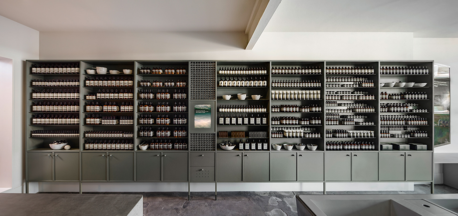
In keeping with Aesop’s global presence, the revitalised Fitzroy store embodies the brand’s characteristic persona: contemplative, deeply considered and nuanced. Though understated, the design traverses a lot, conceptually speaking – expressing themes of nostalgia, restorative solitude and community within a relatively small footprint.
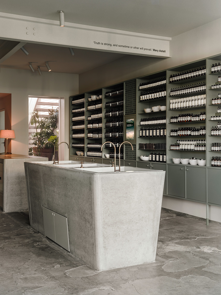
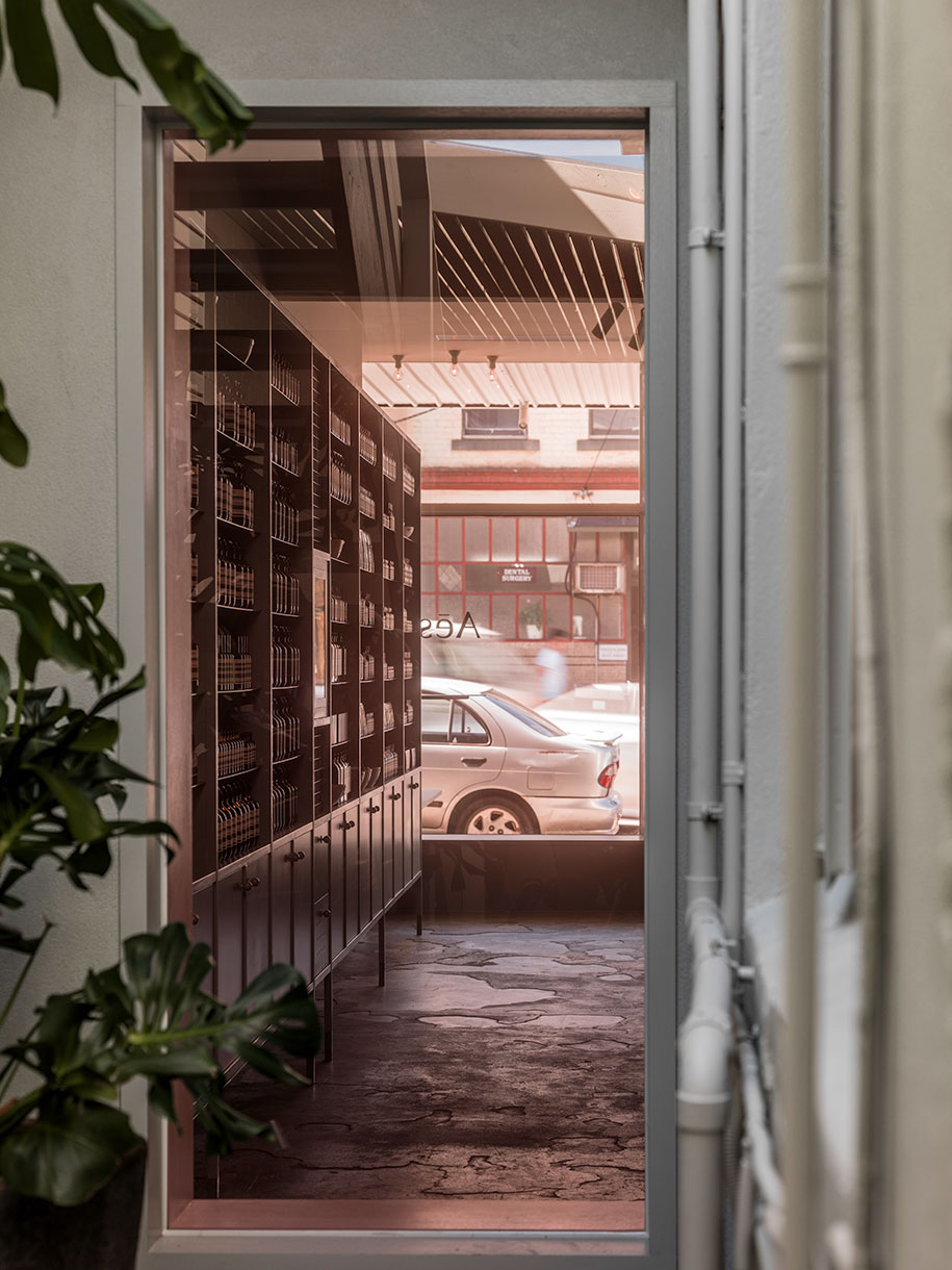
Walls of slim line joinery showcase Aesop’s iconic bottles in a rhythmic fashion, with shelves and doors hand painted both inside and out. Faintly visible brushstrokes assert the value of skilled craftsmanship. Small knob handles reference the style of old terrace cabinetry – some of the oldest surviving examples of heritage housing in this era stand further up the street.
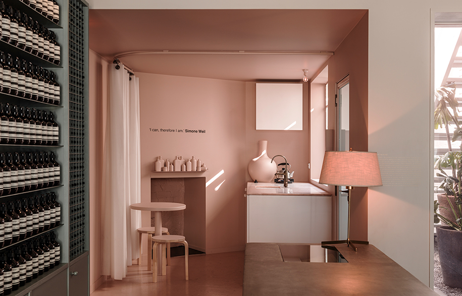
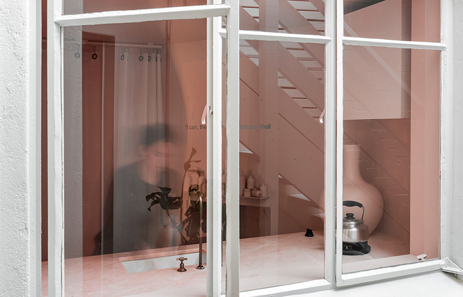
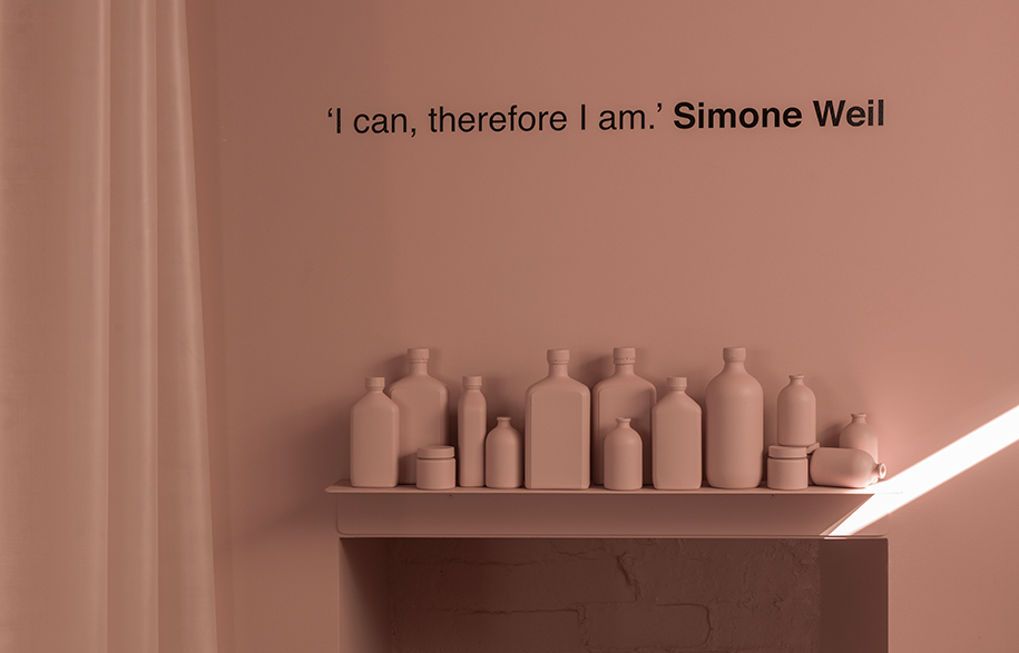
Underpinning the design is the idea of threshold, and dissolving barriers. Here, the colour pink is used to abstract and elevate details of ordinary life: a rose-coloured pane of glass at the centre of the store gives a tinted view into the little courtyard garden beyond, while a small kitchenette to the rear is immersed in pastel pink. Artfully composed and decked in gorgeous salmon-hued marble, this space assumes the familiarity of a domestic kitchen, and acts as a casual sitting area for staff.
Aesop
aesop.com.au
Clare Cousins Architects
clarecousins.com.au
Photography by Trevor Mein
