We have come to expect so much from our kitchens and bathrooms. The heart of the home and its sanctuary have always been central to our daily lives, providing the framework in which we cook, clean, relax and eat.
But two years into a global pandemic and it’s evident we need more from these two spaces. They have to work harder because the amount of time we now spend at home has increased. So what will the newest and best kitchen and bathroom designs from our region look like moving forward?
Unsurprisingly, the aesthetic is bold and there’s plenty of scope for personal expression. From a practical perspective, the emphasis is on astute functionality and the capacity for each room to be multi-purpose.
The kitchen-as-office trend has taken off (as can be expected), and these days it’s often hard to differentiate between a residential bathroom and something you’d find in a day spa.
Issues of hygiene are foremost in everyone’s mind, storage solutions are smarter and so is the technology.
It’s about creating a ‘kind home’ through sensible yet innovative design, a personal, intimate space shared with those we love that will truly take care of us – mind, body and soul.
Colours and surfaces
Although the days of whitewashed kitchens and bathrooms aren’t completely gone, architects and designers are favouring colour palettes that are brighter and more daring.
Maximalism is having a moment and it manifests in loud yet refined schemes that incorporate sorbet pastels, rich earthy tones or deep cool shades. Terrazzo is still in vogue, marble is absolutely everywhere and the best projects are the boldest.
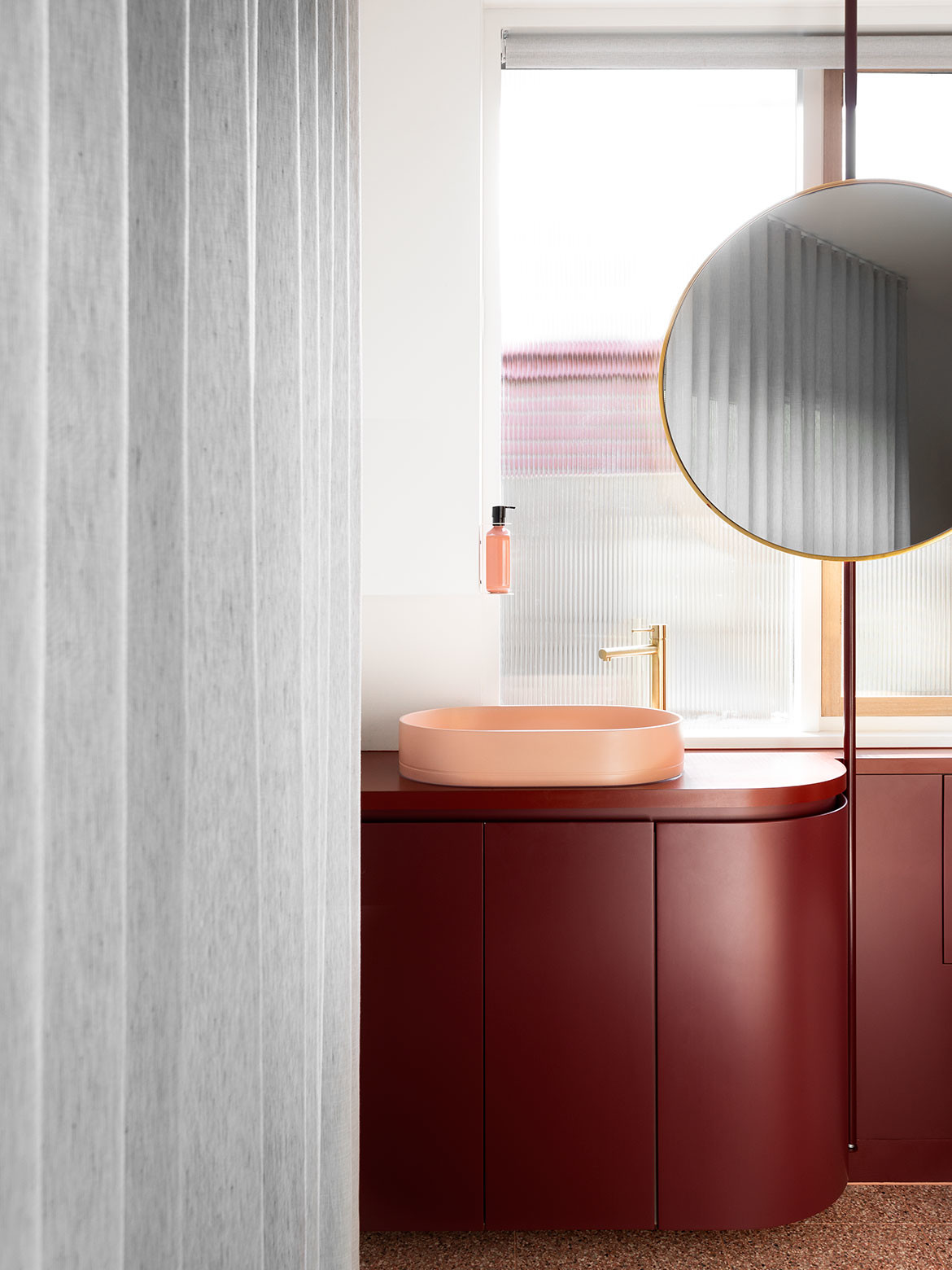
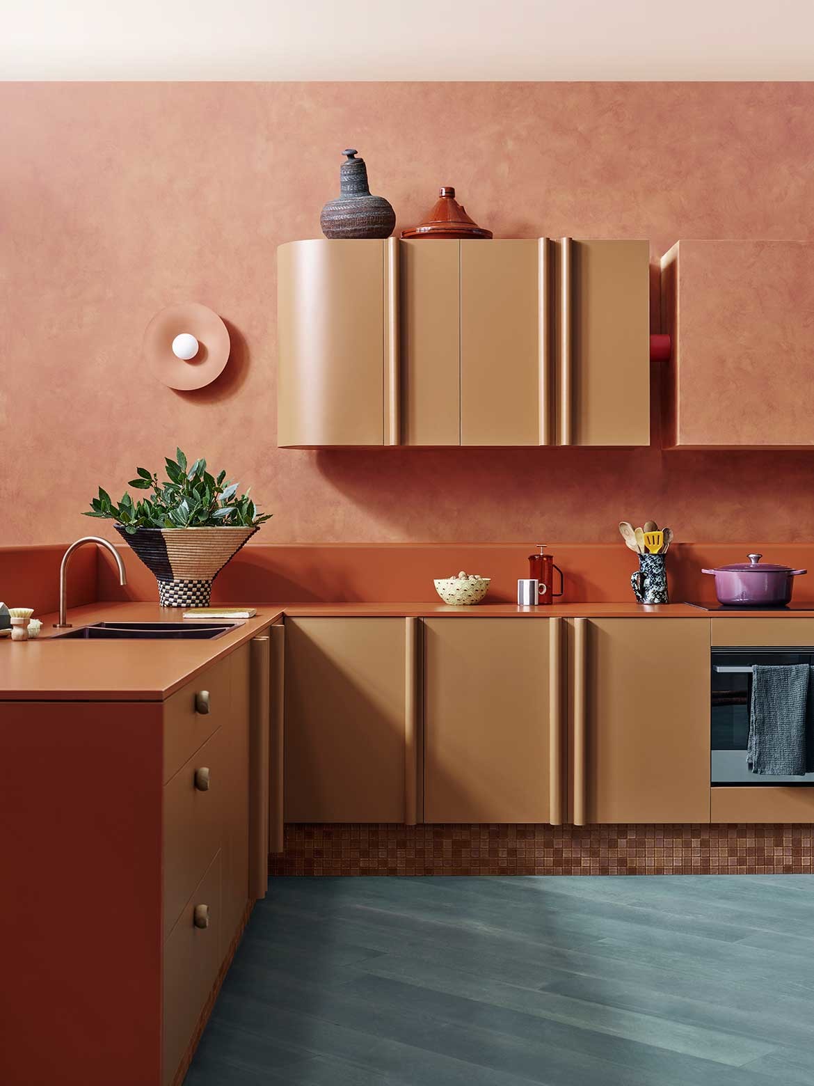
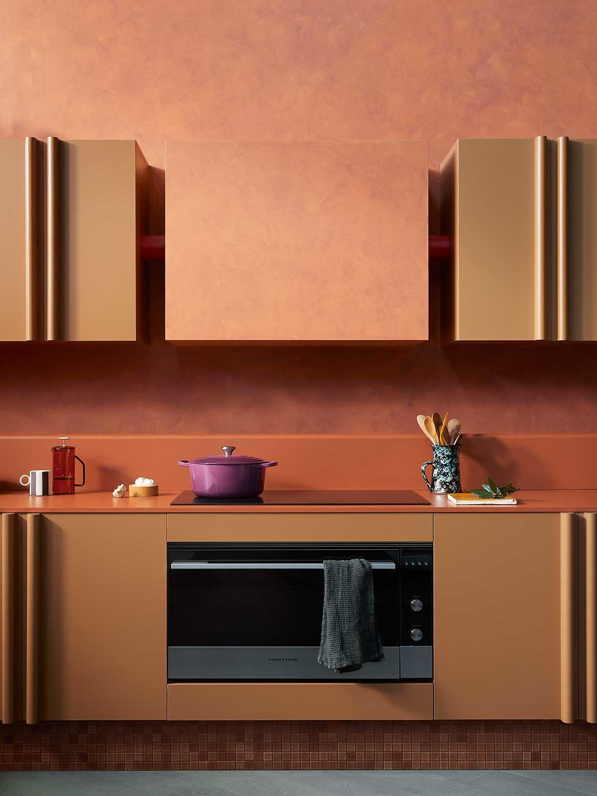
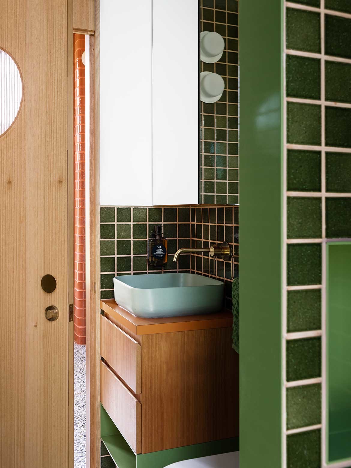
WOWOWA’s signature colour-laden style is on show in Pony bathroom, for example, while the deep clay of The Fantales Kitchen by YSG Studio (in collaboration with Laminex) champions a singularly bold application.
As Yasmine Saleh Ghoniem, YSG Studio’s director, explains, “There’s something so luscious about deep block colours and the way the combination of colours creates a sense of surprise while enjoying the calming process of cooking.”
Of course, issues of hygiene are at the forefront and many manufacturers are engineering products that feature surface technology to better protect end users, while easy-to-clean surfaces continue to surge in popularity.
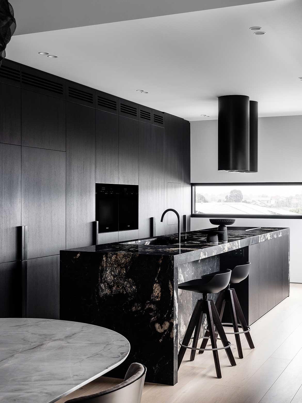
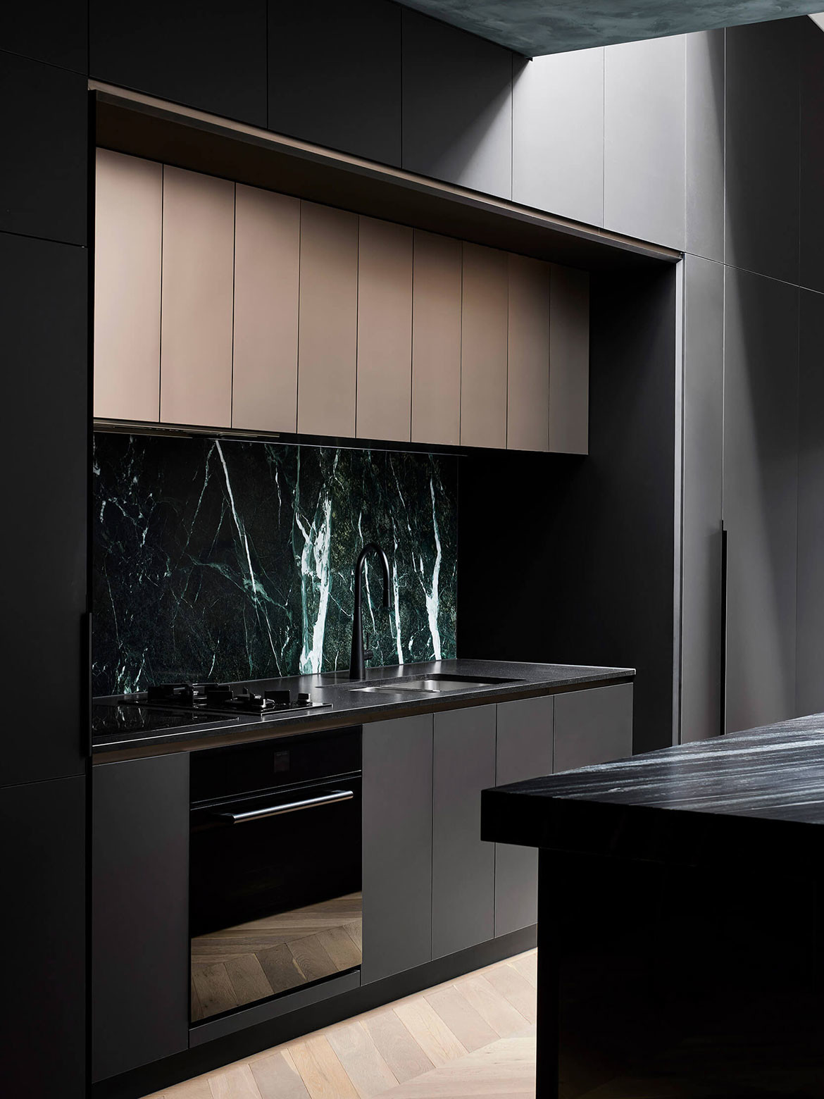
No less luscious than vivid colour is the use of black in new kitchens, such as Scalpellino House by Biasol, where the dark joinery, island and rangehood create a welcoming atmosphere.
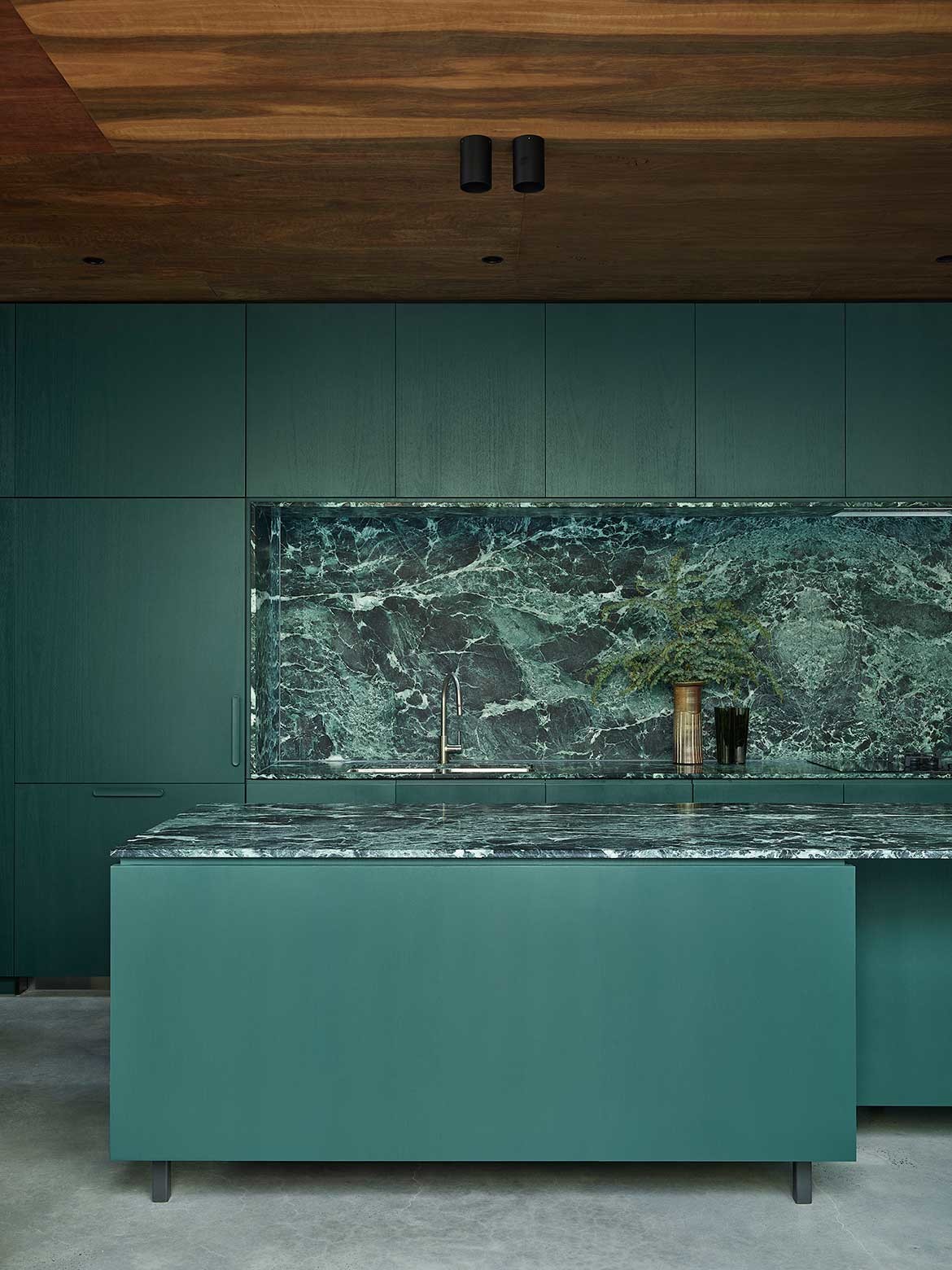
In Lande Architects’ Malvern House, the combination of dark green joinery and a heavily veined green marble splashback and island benchtop makes for a striking backdrop to everyday family life, all with a distinct monochrome application.
In the bathroom, marble is also being used to its most dramatic effect. Creamy palettes are complemented by beautiful marble in muted tones.
These hues are often applied generously, from joinery surface through to wall finish, and incorporate marble in matching tones. The overall effect makes for an immersive, saturated and utterly luxurious experience.
Related: The latest in kitchens and bathrooms – straight from Milan
Details and finishes
Quality craftsmanship and an artisanal sensibility are evident throughout the very best new kitchen and bathroom designs. These bespoke qualities and ideas integrate elements that add visual flair. This is often achieved through multilayered material palettes that mix different textures.
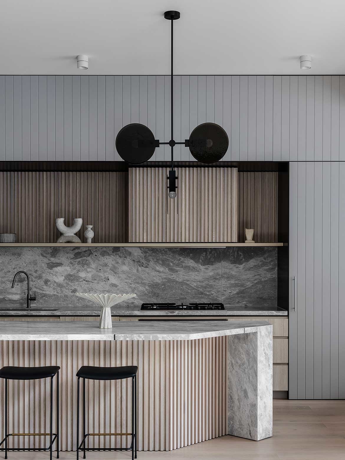
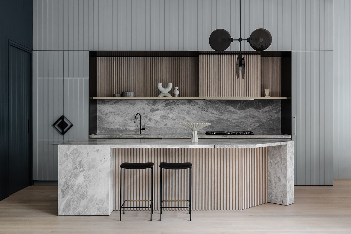
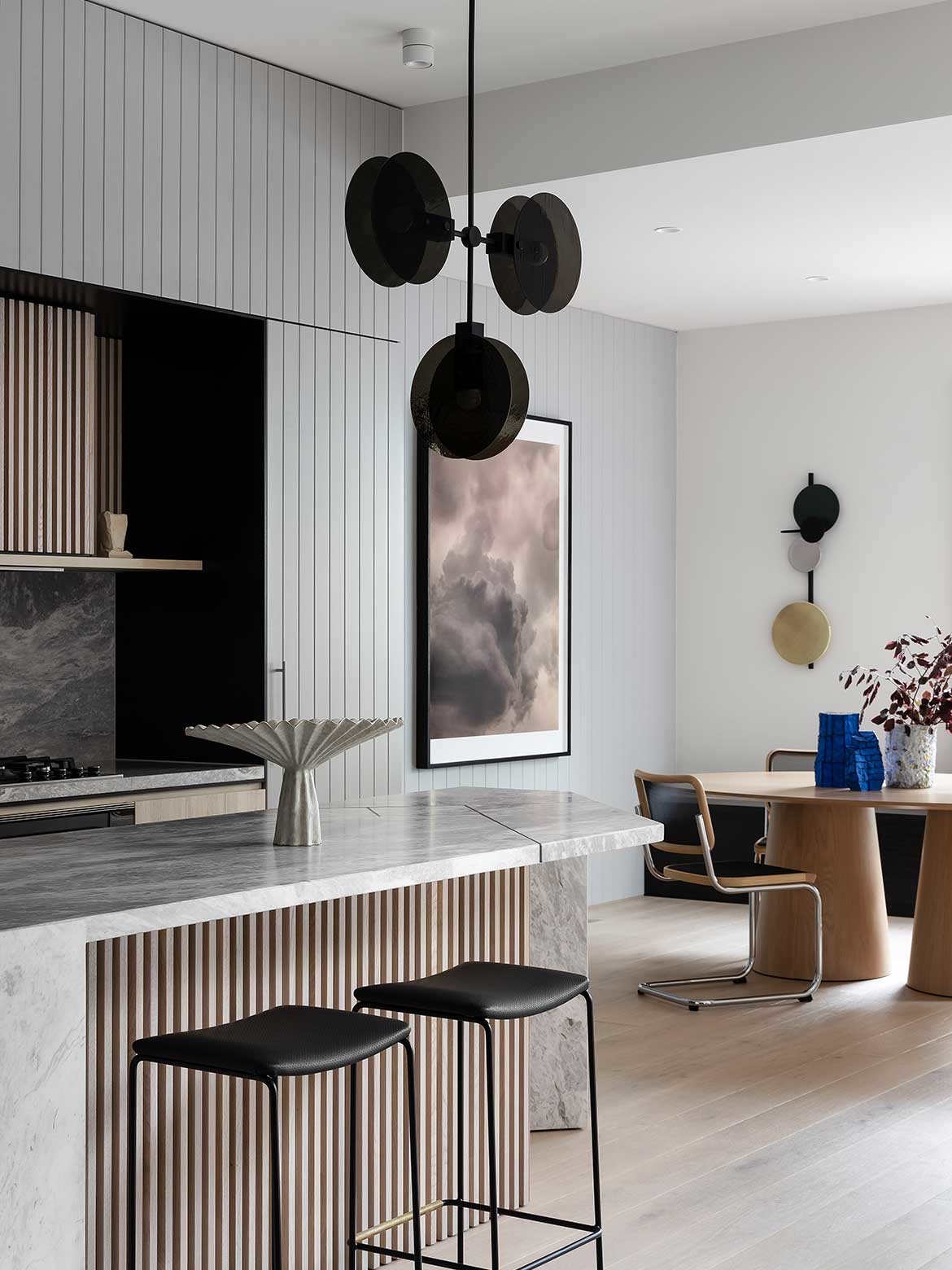
Details are refined and kitchens like Grid House by Doherty Design Studio – with timber panelling that makes the island appear as a custom piece of furniture – highlights that material detailing will never go out of style.
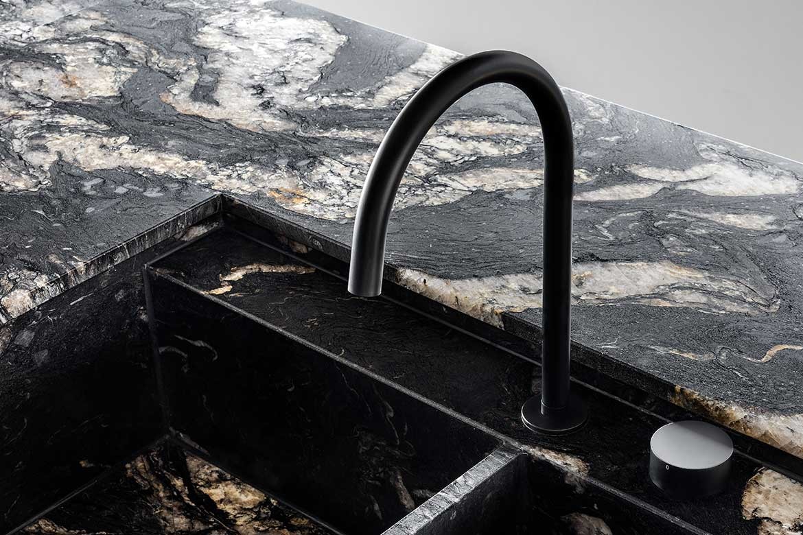
The kitchen is not only a good looking space, it’s a harder working space and this is why architects and designers are ensuring every feature, from the tapware and rangehood to the splashback and benchtops, meet the individual needs of their client.
As Edwina Withers, director of Boffi Studio Sydney and Melbourne, explains, “The calibre of craftsmanship defines an interior and while the kitchen is traditionally a gathering place, it’s also a space that needs to function at the highest level to make sure creativity can flourish and that every step of a recipe is made accessible.”
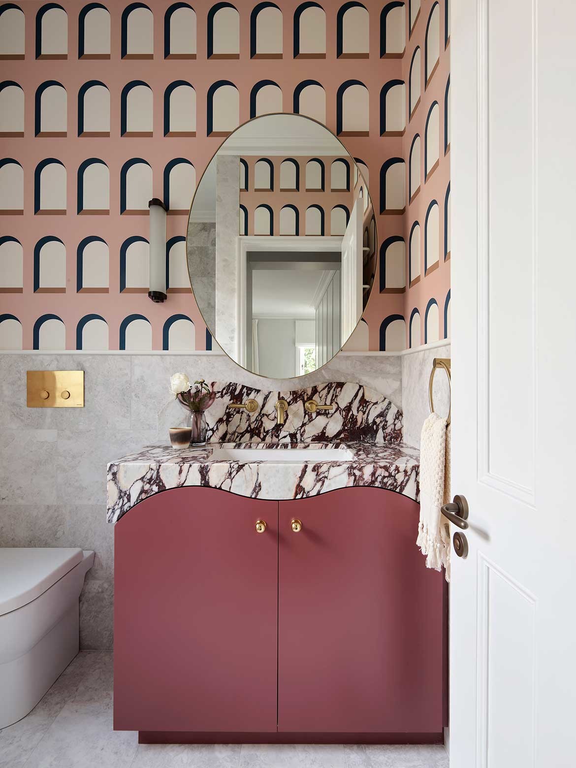
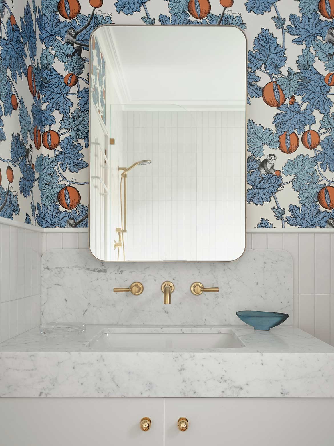
In the bathroom, details and finishes are confidently showcased, with wallpaper making a comeback. The kit-kat-shaped tile is popular, as are ones featuring patterns or a gloss finish, while tapware makes a statement in either black, brass or copper.
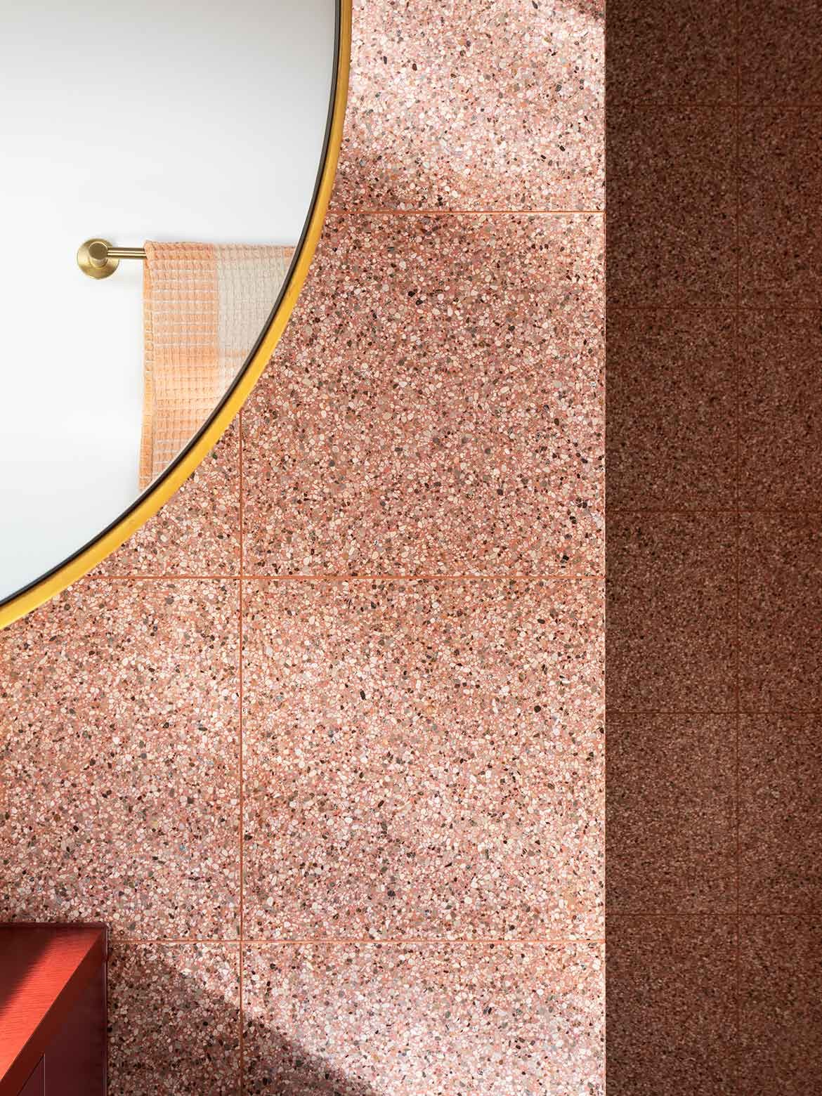
But custom elements are what stand out. Arent & Pyke’s Darley House bathrooms combine many of these details, with the pink room also showcasing unique vanity units.
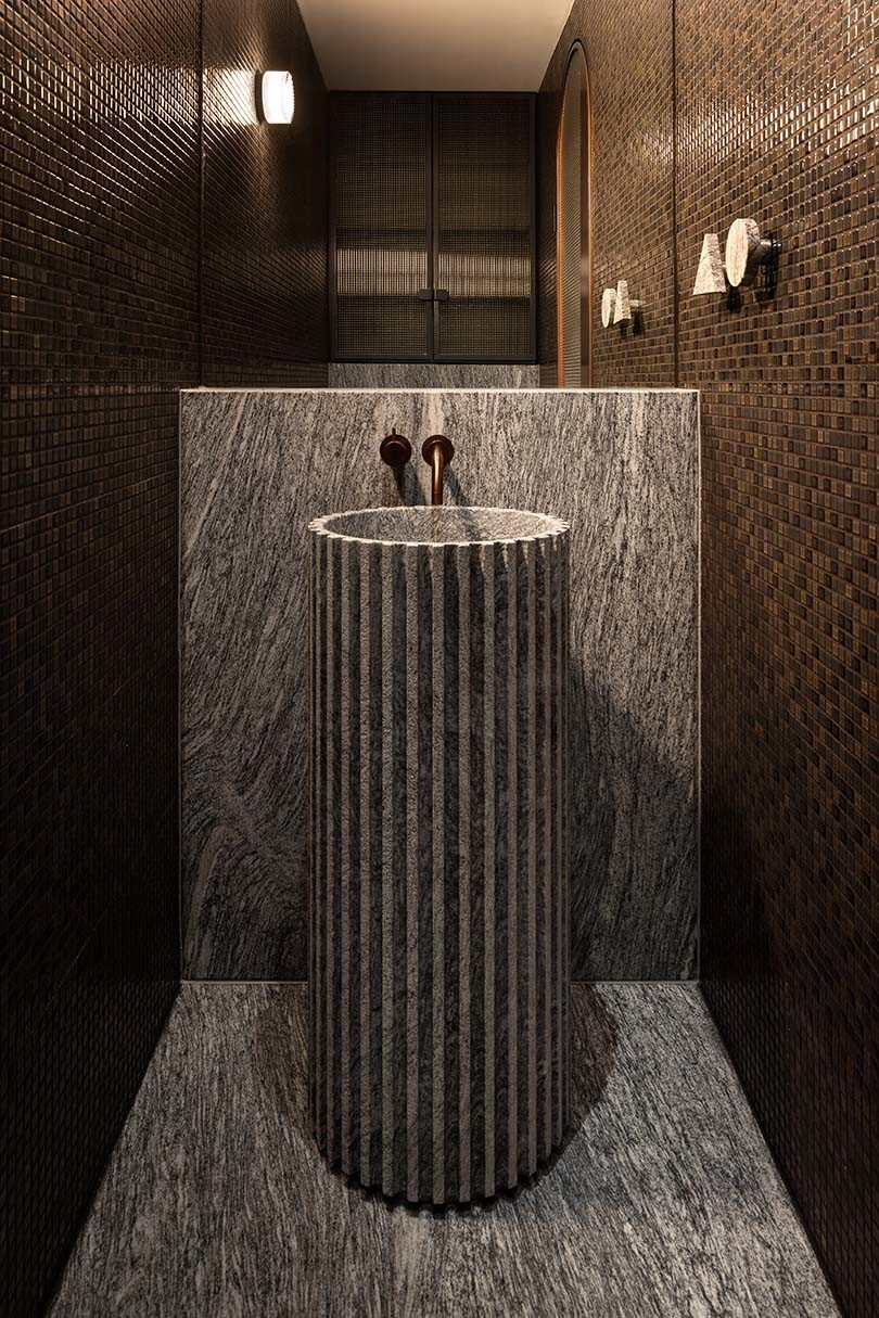
South Yarra Residence by Kestie Lane Studio pushes custom features in the bathroom even further with a highly resolved basin intricately carved in stone. It adds a sense of dynamism and drama.
Functionality and usability
The functionality and usability of kitchens and bathrooms have taken on renewed priority as issues of comfort and accessibility prevail during the pandemic. Clear circulation paths, multi-functional pieces of furniture and intelligent planning are reimagining these spaces into active hubs that seemingly never sleep.
But nothing has impacted the way we live recently as much as the working-from-home phenomenon, and while this has posed a challenge within smaller spaces, it’s also allowed for greater innovation.
Kitchen island benches have become a statement feature intentionally designed to double as a workbench, with plenty of room for two people to sit and work at their laptops.
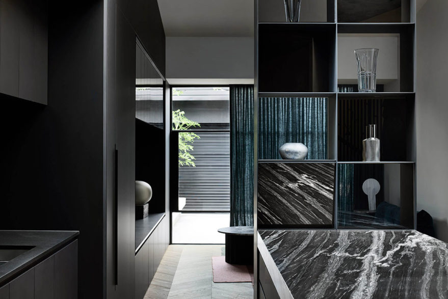
Butler’s pantries are still popular and the trend for broken plan living is growing, perfectly exemplified in Splinter Society’s Villa Italia. In this space, open shelving is used to break up the kitchen and lounge areas, allowing for small private nooks that still feel connected.
Biophilic design elements, such as the incorporation of greenery, natural colours and materials, and the inclusion of water features can improve a sense of wellbeing by establishing a connection with nature and the outdoors.
“Creating spaces that provoke an emotive response and offer places for solitude and relaxation is important,” says Laminex’s General Manager Sales & Marketing Sacha Leagh-Murray.
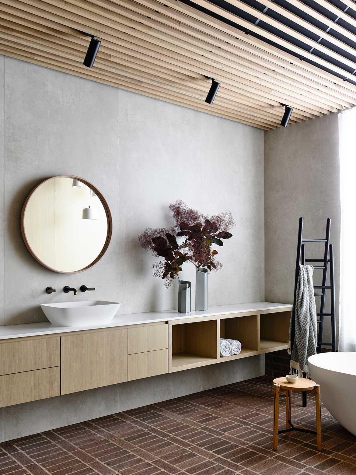
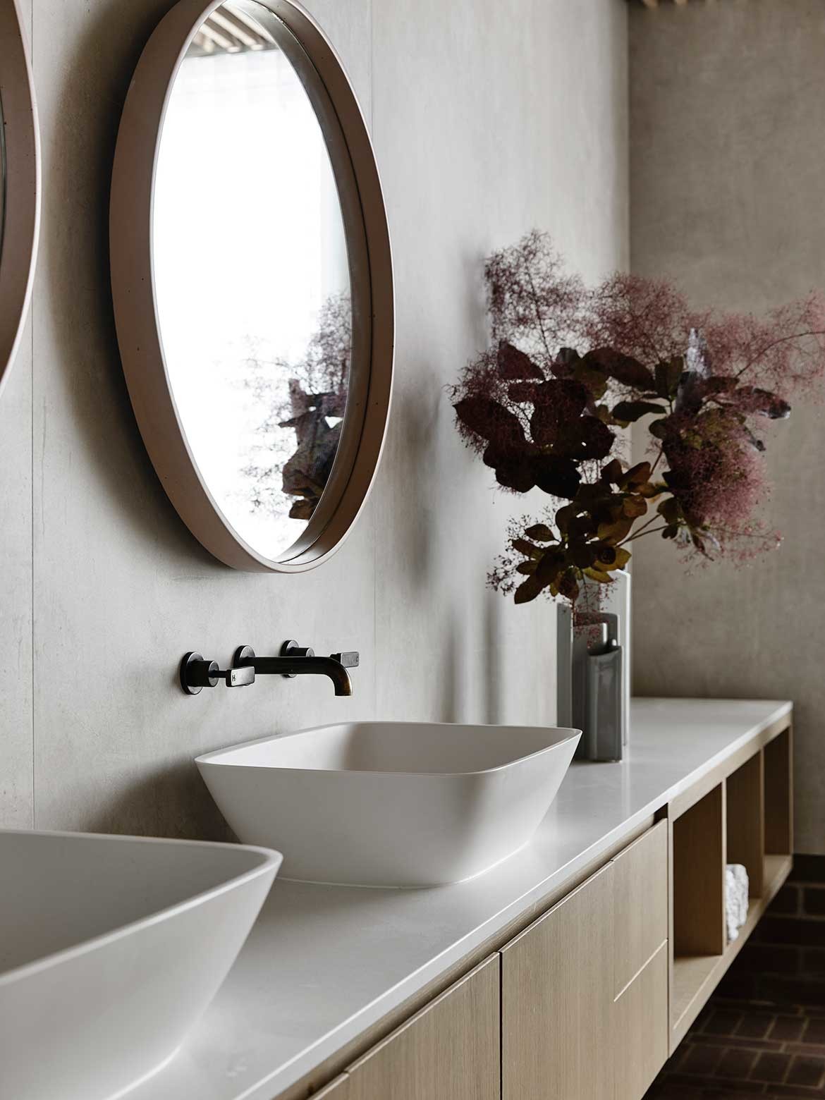
Zen-like sanctuaries like Architects EAT’s Carpenter’s Square House bathroom highlights how a spacious layout and neutral materiality continues to have an impact on contemporary design.
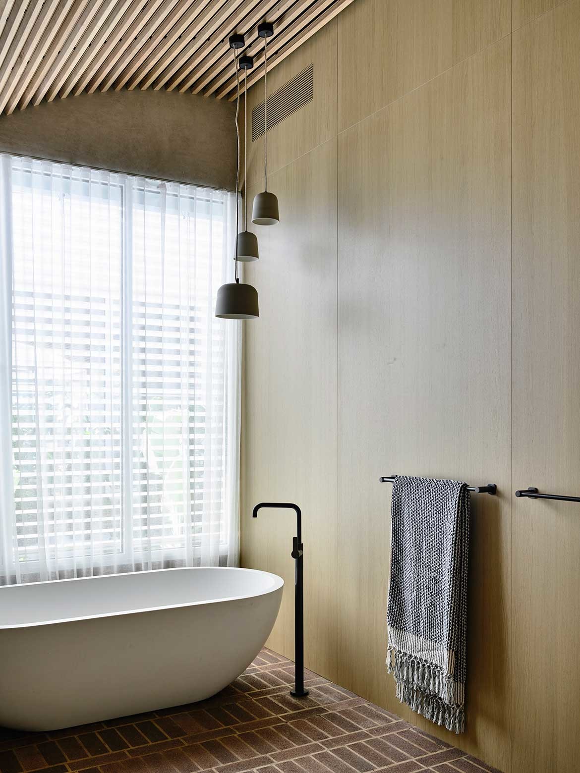
In fact, this space exemplifies the idea of ‘Japandi’ aesthetics that operate at the intersection of Japanese minimalism and Scandinavian functionality.
It also features hard-working storage solutions in the form of smart joinery, all of which work to provide a place of comfort and retreat.
This story originally appeared in Habitus issue #54, the Kitchen & Bathroom special.
