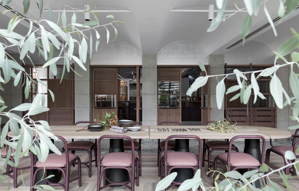
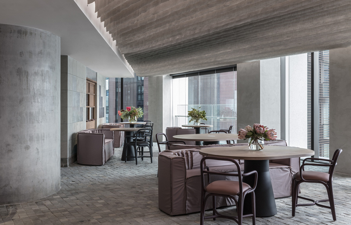
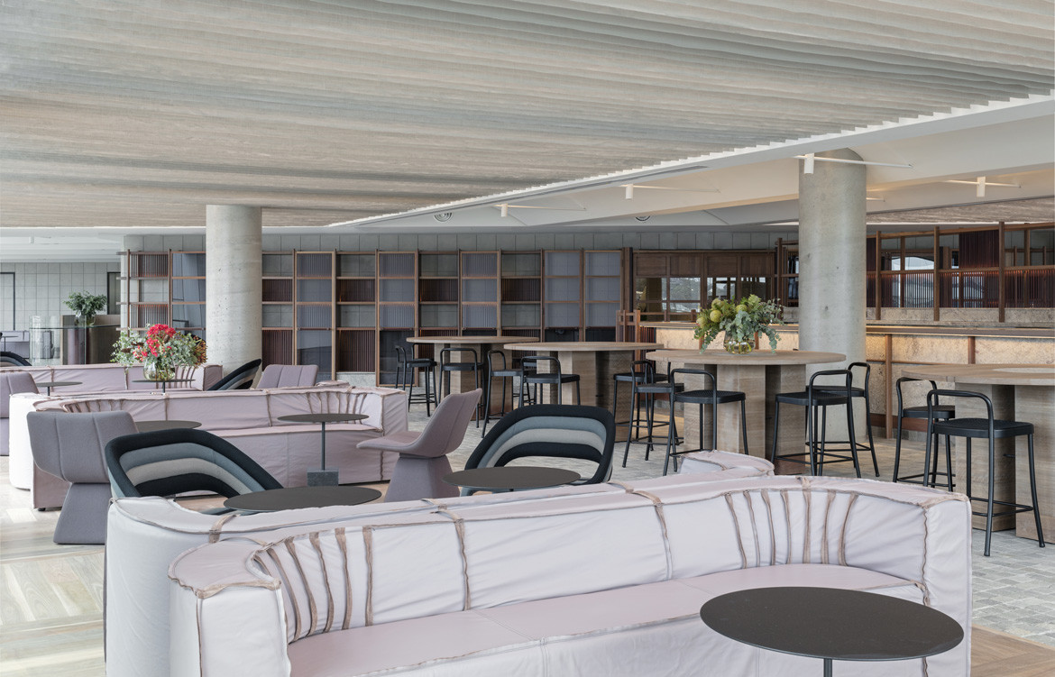
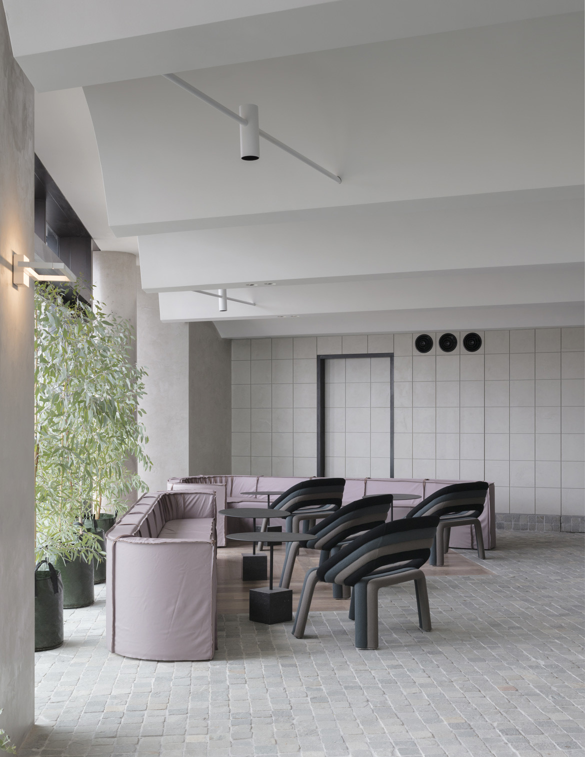
Evocative of place – specifically, Sydney Harbour and its surrounding bushland – 12-Micron draws on the colours, tones and textures of a Spotted Gum, exploring a uniquely Sydney interior from stone floors to floating clouds and bark like leathers. Beautifully realised, the subtle and elegantly luxurious space features careful planning to allow everyone, including staff, spectacular harbour views.
Wanting to know more about the process of achieving such a warm, welcome atmosphere in a highly planned – and only very recently opened – area of Sydney’s CBD, we spoke to Kirsten Stanisich of Richards Stanisich on design in Barrangaroo.
SW: What was the initial brief?
KS: The client’s brief was to create an “Australian Restaurant”. As part of the Barangaroo foreshore, it was essential that a Sydney aesthetic be developed to harmonise, but not compete, with the harbour views.
Did the concept change/evolve throughout the process?
We had a pretty tight design programme for the project, so there was only time for some minor developments to the brief, but we did develop the design throughout the process. Since completion the restaurant has found a large market for events, and currently we are designing minor alterations to accommodate this and I’ve found this a very challenging process to go back to the project so soon after completion.
What was your design approach to the project? What was the strategic thinking behind design in Barrangaroo?
We had a very short time frame of five days between receiving our clients’ brief and presenting the first concept. We started by looking at the site context on the edge of the Sydney CBD and Sydney Harbour. There is a strong connection between the built urban environment of the city and the natural topography of the harbour.
We looked at a concept of a gridded overlay, often used by artists, interior designers and architects to represent urbanisation and contrasted this against the tones, colours and textures of a Spotted Gum Eucalyptus, an indigenous tree that grows along quite a lot of the east coast of Australia, including Sydney Harbour.
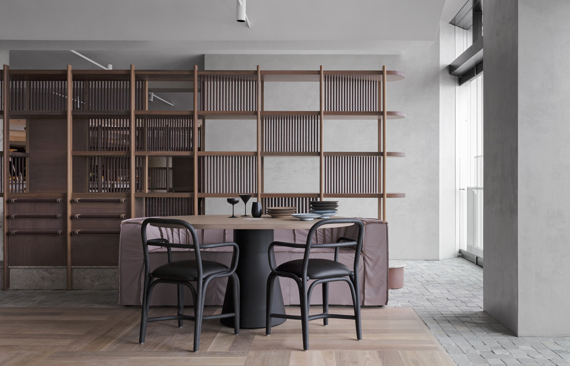
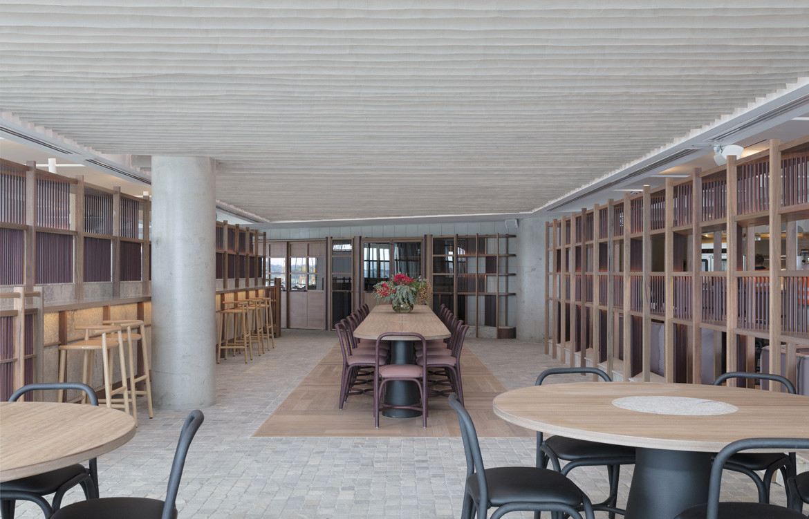
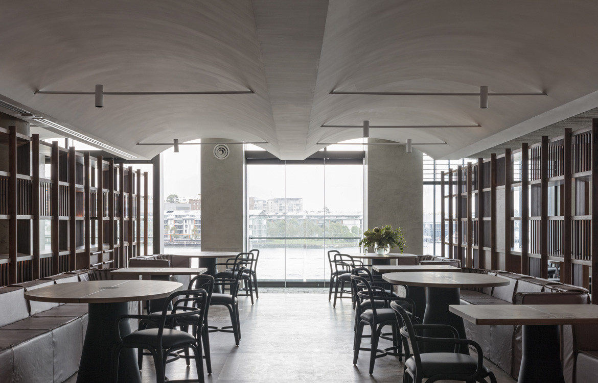
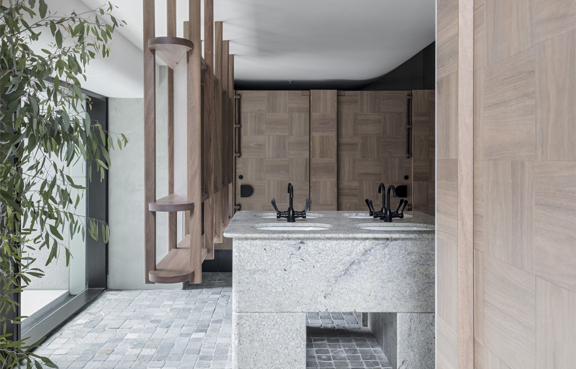
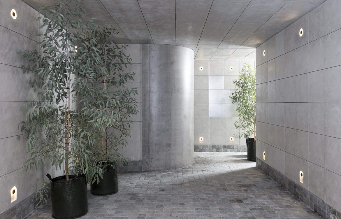
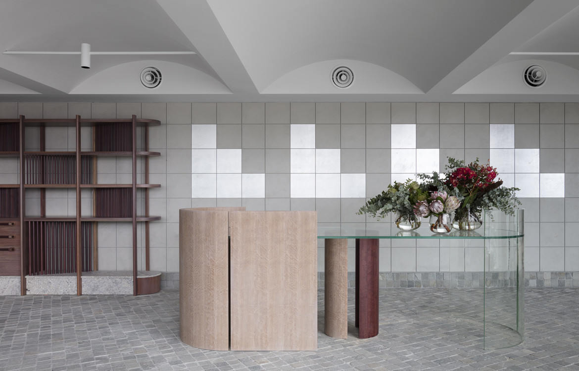
We divided the plan with a series of screened joinery elements which, all construction from solid and veneered spotted gum in natural, soft limed and plum stained finishes and drew on the connection to the outdoors with the use of a rough cobble floor in soft green and blue. The table layout was developed to activate either side of the dining space with views of the harbour and the open kitchen.
What was challenging about 12-Micron, and how did you resolve those challenges?
The restaurant has been designed around a complexity of programmatic challenges, from restrictions limiting any construction within one metre of the façade, complex services requirements, operational flows, developing spaces for small and large seating groups.
The biggest challenge was addressing the scale of the space and developing a ceiling concept which addressed the low ceilings heights between 2.4 and 2.8 metres high. We designed a series of vaulted ceilings inserted between fabric style pergola spaces, which were developed to evoke the experience of a eucalypt canopy and to give some movement to the space. The result was a sculptural approach to the ceiling where the contrast in shapes and depth are effective because of the lowered heights.
Is there anything else interesting about this project that people might not know?
Part of the client brief was to design a luxurious restaurant and we wanted to translate this into our Australian sense of luxury. I think this is about a place with an extra special sense of occasion but without a sense of exclusivity. I hope we achieved that.
Richards Stanisich
richardsstanisich.com.au
12 Micron
12 Micron12micron.com.au
Photography by Felix Forest
We think you might also like Cantala Apartments by SJB
