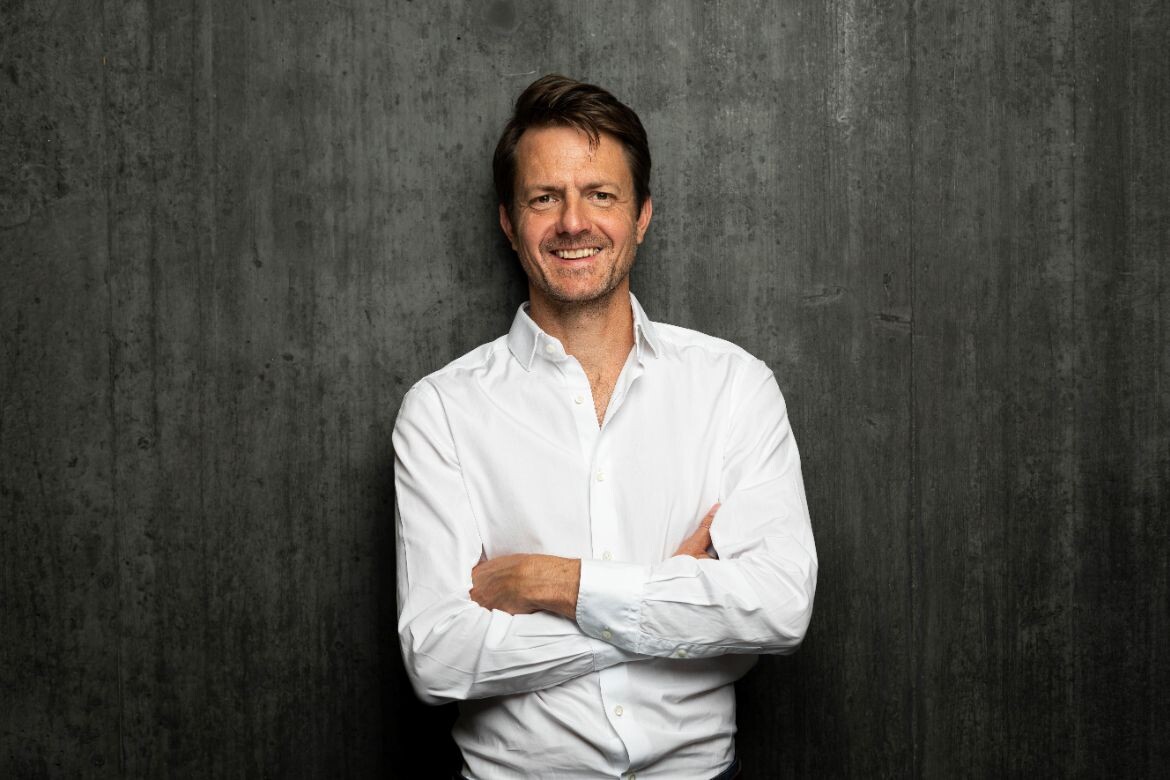
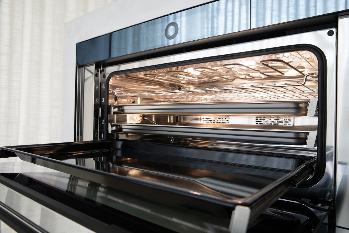
“It’s like a soccer team,” says V-ZUG’s Head of Corporate Design, Martin Von Freeden. “You can bring together the best players but at the beginning, the first game, they don’t play perfect. So it means you have to work together, to have up and downs and to learn from each other. There is the managing and the power of the team is growing, and this is part of the process.”
Von Freeden states this with a charming matter-of-factness that belies the preconditions that allowed him to bring that team together and give them time to grow: a supportive executive, a five-year development timeframe, a company with a century-long history in engineering smarts, and all underpinned by the DNA of Swiss Design (see Part One of this three part series for more). His next step was to bolster his already interdisciplinary V-ZUG design team with increased strength in User Experience (UX) and User Interface (UI) knowledge to achieve what was a key goal of the project: customer individualisation.
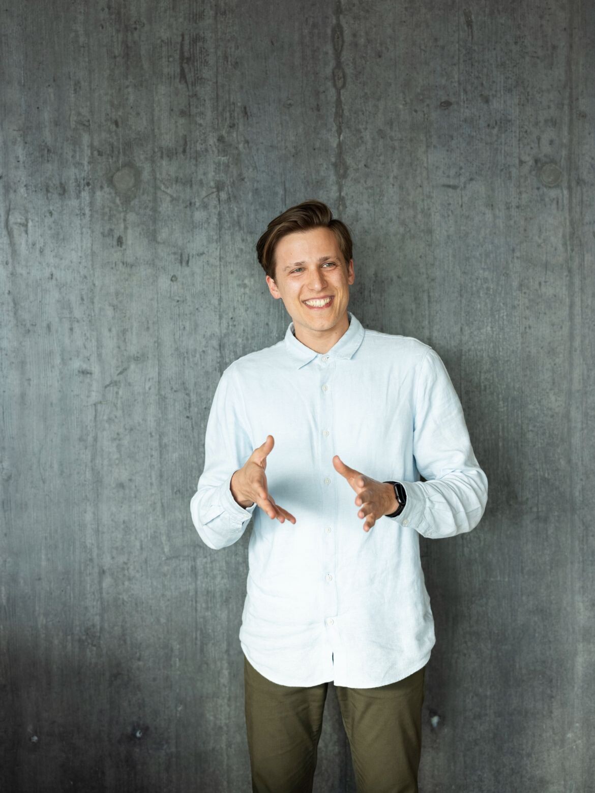
Once such import was Kevin Perlinger, who arrived with a background in digital production in the fashion industry and, as a Stuttgart native, deep links to the automotive sector. Perlinger happily admits his appreciation of cooking appliances was limited to the stoves he had encountered in various rented apartments since his university days: “Which is, you have two settings; either it’s raw, or it’s totally burned,” he laughs.
So one of the most satisfying aspects of developing the new collection for him was learning about steam cooking, which V-ZUG pioneered 30 years ago and has taken to a new level with Excellence – look out for the CombiSteam Grand and the PowerSteam which are being launched in Australian in 2023. Perlinger spent hours with the V-ZUG engineers and product developers understanding the intelligence behind this method of cooking and was blown away by the environmental and health benefits; he wanted to bring what he calls “the magic” of the technology to the user in a simplified manner.
“I tried to translate this into a design language on the gadget itself so people can get this experience, like I experienced all this knowledge, but in an easier way,” he says. “But there’s people on the one side who say, ‘I don’t want to be controlled by the appliance, I’m the dictator here’. But the other pole is ‘I have no clue how to cook’. So you need to be open for both of them, and the individualisation helps in that those people can pick what they want.”
The challenge was in delivering this level of personalisation in a seamless way through the digital interface, which was taking shape in the form of an aesthetic and tactile solution that became known as the ‘circle slider’. Key was using the different cooking and customer personas developed within V-ZUG that drew on extensive customer research and encompassed a typical set of users. Perlinger’s task was to immerse himself in the thinking of these personas – named Frédéric, Irene, Barbara and Susanne – and how they might navigate the oven’s interface from their various perspectives and choices.
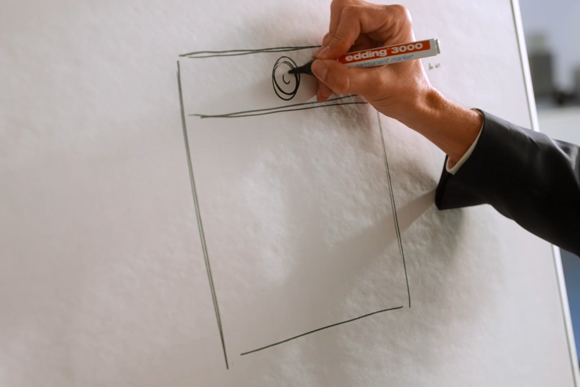
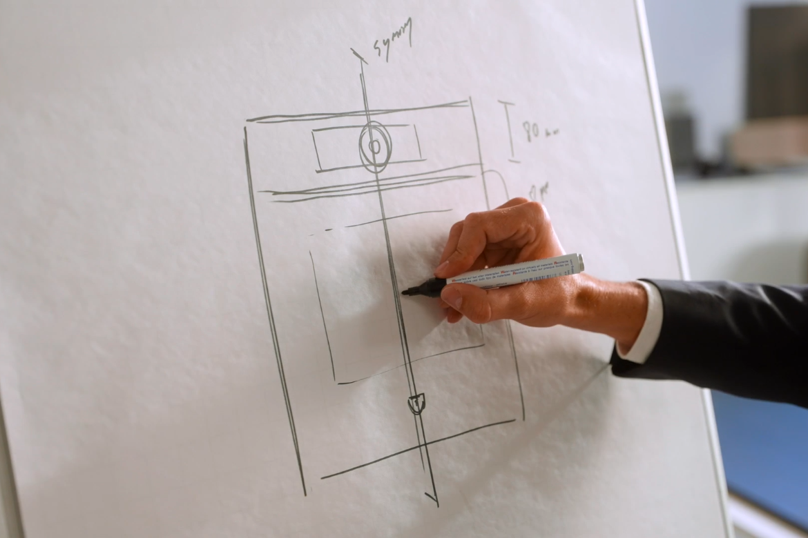
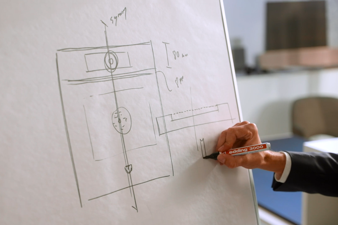
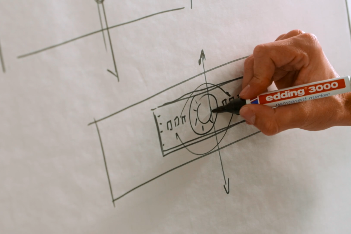
“And out of those clusters, we made a low fidelity prototype,” says Perlinger. “It was visual, but not with pictures and colours and all the stuff. It was just hard-coded; you can click on it, and then you have the information. And then we test it again with these people or with those people.”
Many hours of trials with test users delivered a football field’s worth of cake consumed by Perlinger and his colleagues, as well significant insights that fed back into the development of the products to make life easier for everyday use. At this stage, Gunnar Donis joined the team as a super-sub UX/UI Designer with an extensive background in the use of touchscreens in the medical and automotive industries, and holding patents in graphical user interfaces. He offered a fresh set of eyes, and a kind of designated ‘mindful adversary’ in terms of judging the products’ intuitiveness at that point.
“I said, ‘Guys, please think about what we are generating like an iceberg’,” says Donis. “The icons on the interface, this is one sixth of [the product’s] power, above the water’s surface. And the other five sixths – the thoughts behind the system – need to be below the water’s surface. This is really tough work.”

However Donis says refining the interface and working through the subsequent iterations following test customer insights was made easier by the design team’s co-location with other disciplines in the company.
“One of the advantages of being the boutique manufacturer that we are, it means the factory is not that kind of a thing where you start to walk through it in the morning and then in the afternoon you might reach the other gate,” says Donis. “In five minutes, I can go around everything […] So when you have questions, about whether something is feasible and so on, you know whom you need to talk to to get a direct answer and you don’t need to wait for two or three weeks. This is really impressive to me, it works very well.”
The end result is a collection that embodies the V-ZUG concept of ‘simplexity’ – but also longevity, which we explore in Part 3 with a focus on materiality and sustainability. Let’s go to that bridge by closing with Perlinger’s modus operandi:
“My goal is that the customer in 15 years still can take a look on the screen and say, ‘Oh, this is great’, and not say, ‘Oh, this is so 2020’. It needs to be very timeless, it needs to fulfill functions of course, as well as a certain beauty. And how the products have a lifecycle, how they keep with new cooking trends, is through the software.”
